CSS垂直居中和水平居中的几种方法
垂直居中
方法一
这个方法把div 的显示方式设置为表格,因此我们可以使用表格的 vertical-align属性。
<!DOCTYPE html>

<html lang="en">

<head>

    <meta charset="UTF-8">

    <meta name="viewport" content="width=device-width, initial-scale=1.0">

    <meta http-equiv="X-UA-Compatible" content="ie=edge">

    <title>垂直居中</title>

    <style type="text/css">

    body{

        background:#ccc;

    }

        #wrapper {

            display: table;    /*here*/

            background:blue;

        }

        #container {

            display: table-cell;       /*here*/

            vertical-align: middle;    /*here*/

            background: yellow;

            height:300px;

        }

    </style>

</head>

<body>

    <div id="wrapper">

        <div id="container">

            <p>我要用表格属性垂直居中</p>

            <p>我要用表格属性垂直居中</p>

            <p>我要用表格属性垂直居中</p>

        </div>

    </div>

</body>

</html>
实现如图:
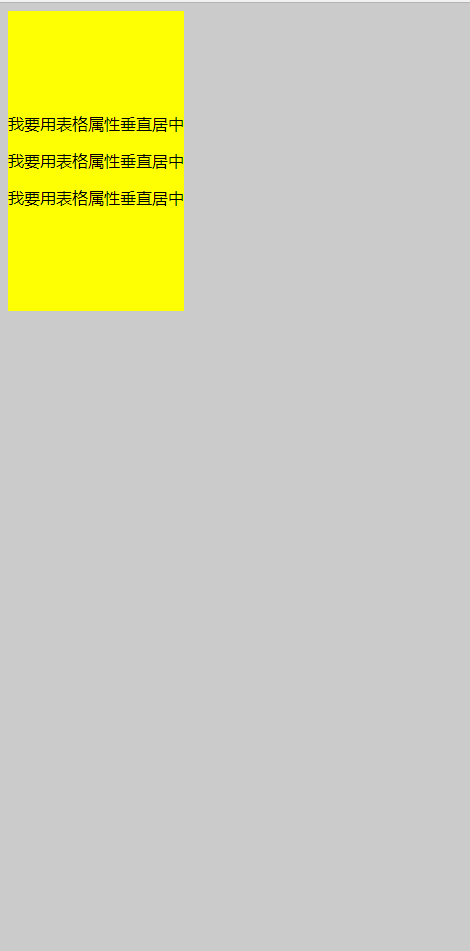
能在本身里垂直居中;
优点:
container 可以动态改变高度(不需在 CSS 中定义)。当 wrapper 里没有足够空间时,container 不会被截断
缺点:
Internet Explorer(甚至 IE8 )中无效,许多嵌套标签(其实还好)。
方法二
这个方法使用绝对定位的 div,top 设置为 50%, margin-top 设置为负的 content 高度。这意味着对象必须在 CSS 中指定固定的高度。
因为有固定高度,或许你想给 content 指定 overflow:auto,这样如果 content 太多的话,就会出现滚动条,以免content 溢出。
<!DOCTYPE html>

<html lang="en">

<head>

    <meta charset="UTF-8">

     <title>垂直居中</title>

    <style type="text/css">

    body{

        background: #ccc;

    }

     #container {

    position: absolute;

    top: 50%;

    height: 200px;

    margin-top: -100px; /* negative half of the height */

    background: yellow;

}

    </style>

</head>

<body>

        <div id="container">

            <p>我要用绝对定位垂直居中</p>

            <p>我要用绝对定位垂直居中</p>

            <p>我要用绝对定位垂直居中</p>

        </div>

</body>

</html>
效果图:
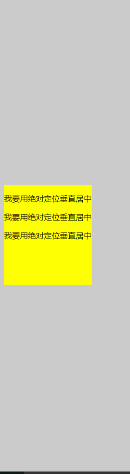
相对于父元素垂直居中;
优点:
- 适用于所有浏览器
- 不需要嵌套标签
缺点:
- 没有足够空间时,
content会消失(类似div在body内,当用户缩小浏览器窗口,滚动条不出现的情况)
方法三
这个方法使用了一个 position:absolute,有固定宽度和高度的 div。这个 div 被设置为 top:0; bottom:0;。但是因为它有固定高度,其实并不能和上下都间距为 0,因此 margin:auto;会使它居中。使用 margin:auto;使块级元素垂直居中是很简单的
<!DOCTYPE html>

<html lang="en">

<head>

    <meta charset="UTF-8">

    <title>垂直居中</title>

    <style type="text/css">

        body{

            background: #ccc;

        }

     #container {

        position: absolute;

        top: 0;

        bottom: 0;

        margin: auto;

        height: 200px;

        background: yellow;

        /*width: 70%;*/

    }

</style>

</head>

<body>

    <div id="container">

        <p>我要用绝对定位垂直居中</p>

        <p>我要用绝对定位垂直居中</p>

        <p>我要用绝对定位垂直居中</p>

    </div>

</body>

</html>
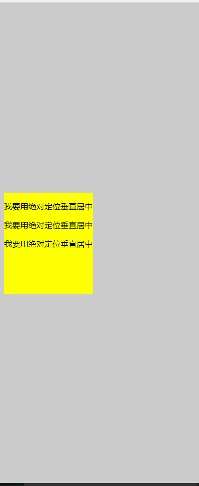
效果图:
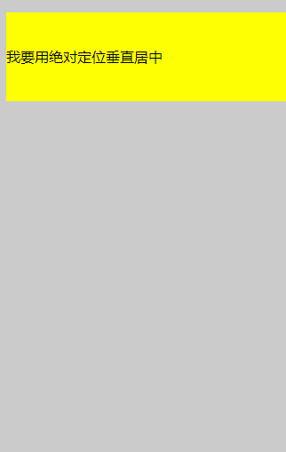
方法四:将单行文本垂直居中
这个方法只能将单行文本置中。只需要简单地把 line-height 设置为那个对象的 height 值就可以使文本居中了。
<!DOCTYPE html>

<html lang="en">

<head>

    <meta charset="UTF-8">

    <title>垂直居中</title>

    <style type="text/css">

        body{

            background: #ccc;

        }

     #container {

        height: 100px;

        line-height: 100px;

        background: yellow;

        /*width: 70%;*/

    }

</style>

</head>

<body>

    <div id="container">

        <p>我要用绝对定位垂直居中</p>

    </div>

</body>

</html>
效果图:
水平居中
方法一:行内元素水平居中
只需要把行内元素包裹在一个属性display为block的父层元素中,并且把父层元素添加如下属性即可:
.parent {

    text-align:center;

}
示例:
<!DOCTYPE HTML>
<html>
<head>
<meta charset="utf-8">
<title>定宽行内元素水平居中</title>
<style>
div{
border:1px solid red;
margin:20px;
}
div.txtCenter,div.imgCenter{
text-align:center;
} </style>
</head> <body>
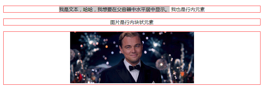
<div class="txtCenter"><span style='background: #ccc;'>我是文本,哈哈,我想要在父容器中水平居中显示。</span>
<span>我也是行内元素</span>
</div>
<div class="imgCenter"><span>图片是行内块状元素</span></div>
<div class="imgCenter"><img src="http://img.mukewang.com/52da54ed0001ecfa04120172.jpg" /></div>
</body>
</html>
效果图:
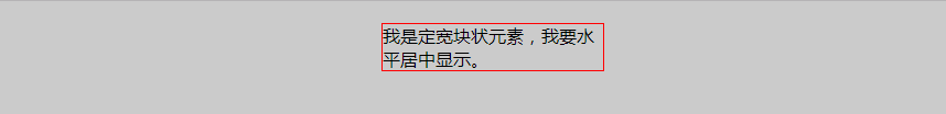
方法二:定宽块状元素水平居中
满足定宽和块状两个条件的元素是可以通过设置“左右margin”值为“auto”来实现居中的
.item {

    margin: 10px auto;

}
示例:
<!DOCTYPE HTML>

<html>

<head>

<meta http-equiv="Content-Type" content="text/html; charset=utf-8">

<title>定宽块状元素水平居中</title>

<style>

body{

    background: #ccc;

}

div{

    border:1px solid red;

    width:200px;

    margin:20px auto;

}

</style>

</head>

<body>

<div>我是定宽块状元素,我要水平居中显示。</div>

</body>

</html>
效果图:
方法三:不定宽块状元素水平居中(多个块状元素水平居中)
将元素的display属性设置为inline-block,并且把父元素的text-align属性设置为center即可:
<!DOCTYPE HTML>

<html>

<head>

<meta charset="utf-8">

<title>不定宽块状元素水平居中</title>

<style>

.container{

    text-align:center;

    background: #ccc;

}

.container ul{

    list-style:none;

    margin:0;

    padding:0;

    display:inline-block;

}

.container li{

    margin-right:8px;

    display:inline-block;

}

</style>

</head>

<body>

<div class="container">

    <ul>

        <li><a href="#">1</a></li>

        <li><a href="#">2</a></li>

        <li><a href="#">3</a></li>

    </ul>

</div>

</body>

</html>
效果图:

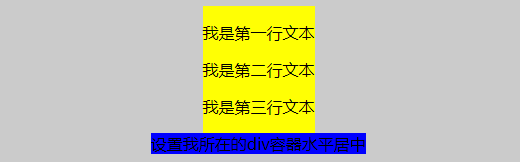
方法三:不定宽块状元素水平居中
利用table标签的长度自适应性---即不定义其长度也不默认父元素body的长度(table其长度根据其内文本长度决定),因此可以看做一个定宽度块元素,然后再利用定宽度块状居中的margin的方法,使其水平居中。
.parent{

  display:table;

  margin:0 auto;

}
示例:
<!DOCTYPE HTML>

<html>

<head>

<meta charset="utf-8">

<title>不定宽块状元素水平居中</title>

<style>

.parent,.wrap{

  display:table;

  margin:0 auto;

}

.parent{

background:yellow;

}

.wrap{

    background:#ccc;

}

</style>

</head>

<body>

<div class='parent'>

        <p>我是第一行文本</p>

        <p>我是第二行文本</p>

        <p>我是第三行文本</p>

</div>

<div class="wrap">

  设置我所在的div容器水平居中

</div>

</body>

</html>
效果图:
方法四:不定宽块状元素水平居中
通过给父元素设置float,然后给父元素设置 position:relative 和 left:50%,子元素设置 position:relative 和 left: -50% 来实现水平居中。
.container{

    float:left;

    position:relative;

    left:50%

}

.container ul{

    position:relative;

    left:-50%;

}
示例:
<!DOCTYPE HTML>

<html>

<head>

<meta charset="utf-8">

<title>不定宽块状元素水平居中</title>

<style>

.container,.wrap{

    float:left;

  position:relative;

  left:50%

}

body{

  background: #ccc;

}

.container ul,.wrap-center{

  background:yellow;

  margin:0;

  padding:0;

  position:relative;

  left:-50%;

}

ul,li{

  list-style: none;

}

a{

  text-decoration:none;

}

.wrap{

    clear:both;

    }

</style>

</head>

<body>

<div class="container">

  <ul>

      <li><a href="#">1</a></li>

        <li><a href="#">2</a></li>

        <li><a href="#">3</a></li>

    </ul>

</div>

<!--下面是代码任务区-->

<div class="wrap">

    <div class="wrap-center">我们来学习一下这种方法。</div>

</div>

</body>

</html>
效果图: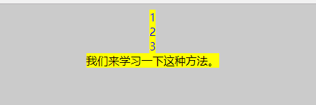
定宽定高块状元素垂直水平居中
方案一:
父元素设置为:position: relative;
子元素设置为:position: absolute;
距上50%,据左50%,然后减去元素自身宽度的距离就可以实现 top:50%;left:50%;margin:-height/2 0 0 -width/2;
<!DOCTYPE HTML>

<html>

<head>

<meta http-equiv="Content-Type" content="text/html; charset=utf-8">

<title>定宽块状元素水平居中</title>

<style>

body{

    background: #ccc;

}

div{

    position: absolute;

    top: 50%;

    left:50%;

    height: 200px;

    width:200px;

    margin: -100px 0  0 -100px; /* negative half of the height */

    border:1px solid red;

/*

    margin:0 auto;*/

}

</style>

</head>

<body>

<div>我是定宽块状元素,我要垂直水平居中显示。</div>

</body>

</html>

2.flex布局
<!DOCTYPE HTML>

<html>

<head>

<meta http-equiv="Content-Type" content="text/html; charset=utf-8">

<title>定宽块状元素水平居中</title>

<style>

body{

    background: #ccc;

}

div{

    height: 400px;

    width:400px;

    border:1px solid red;

    display:flex;

    justify-content: center;

    align-items: center;

}

p{

    height:100px;

    width:100px;

    border:1px solid blue;

}

</style>

</head>

<body>

<div><p>我是定宽块状元素,我要垂直水平居中显示。</p></div>

</body>

</html>

3.表格属性垂直水平居中
<!DOCTYPE html>

<html lang="en">

<head>

    <meta charset="UTF-8">

    <meta name="viewport" content="width=device-width, initial-scale=1.0">

    <meta http-equiv="X-UA-Compatible" content="ie=edge">

    <title>垂直居中</title>

    <style type="text/css">

    body{

        background:#ccc;

    }

        #wrapper {

            display: table;    /*here*/

            border:1px solid yellow;

        }

        #container {

            display: table-cell;       /*here*/

            vertical-align: middle;    /*here*/

            text-align: center;

            /*background: yellow;*/

            height:200px;

            width:300px;

            border:1px solid red;

        }

    </style>

</head>

<body>

    <div id="wrapper">

        <div id="container">

            <p>我要用表格属性垂直水平居中</p>

            <p>我要用表格属性垂直水平居中</p>

            <p>我要用表格属性垂直水平居中</p>

        </div>

    </div>

</body>

</html>

CSS垂直居中和水平居中的几种方法的更多相关文章
- css实现垂直水平居中的5种方法
css实现垂直水平居中的5种方法 给父元素设置table-cell,text-align,vertical-align #big{ width: 200px; height: 200px; borde ...
- CSS中隐藏内容的3种方法及属性值
CSS中隐藏内容的3种方法及属性值 (2011-02-11 13:33:59) 在制作网页时,隐藏内容也是一种比较常用的手法,它的作用一般有:隐藏文本/图片.隐藏链接.隐藏超出范围的内容.隐藏弹出 ...
- css划隔横线的两种方法
css划隔横线的两种方法 方法一:用DIV,代码如下:(推荐此方法) <div style="width:800px;height:1px;margin:0px auto;pa ...
- 用 CSS 隐藏页面元素的 5 种方法
原文链接:用 CSS 隐藏页面元素的 5 种方法,转载请注明来源! 用 CSS 隐藏页面元素有许多种方法.你可以将 opacity 设为 0.将 visibility 设为 hidden.将 disp ...
- 【转】css清除浮动float的三种方法总结,为什么清浮动?浮动会有那些影响?
摘要: css清除浮动float的三种方法总结,为什么清浮动?浮动会有那些影响? 一.抛一块问题砖(display: block)先看现象: 分析HTML代码结构: <div class ...
- CSS以图换字的9种方法
前面的话 CSS以图换字的技术,很久都没人提起了.它是一种在h1标签内,使用图像替换文本元素的技术,使页面在设计和可访问性之间达到平衡.本文将详细介绍CSS以图换字的9种方法 文字隐藏 在h1标签中, ...
- CSS 隐藏页面元素的 几 种方法总结
用 CSS 隐藏页面元素有许多种方法.你可以将 opacity 设为 0.将 visibility 设为 hidden.将 display 设为 none 或者将 position 设为 absolu ...
- CSS中隐藏内容的3种方法
CSS中隐藏内容的3种方法 一般有:隐藏文本/图片.隐藏链接.隐藏超出范围的内容.隐藏弹出层.隐藏滚动条.清除错位和浮动等. 1.使用display:none来隐藏所有内容 display:none可 ...
- css清除浮动float的几种方法
摘要: css清除浮动float的三种方法总结,为什么清浮动?浮动会有那些影响? 一.抛一块问题砖(display: block)先看现象: 这里我没有给最外层的DIV.outer 设置高度, ...
随机推荐
- cakephp2.3.8中何为component
大胆假设,小心求证 记得这句话是以前读高三的时候,一个数学老师(圆头,有点胖胖的老师,不是很记得),经常挂在嘴边的一句话, 对于我们不理解,或者说是无法确定的东西,我们不妨先大胆地去假 ...
- go-import下划线的作用
原文:http://studygolang.com/articles/4356 ------------------------------------------------------------ ...
- 016 ppp authentication
Press RETURN to get started! Router>en Router#config t Enter configuration commands, one pe ...
- C#.NET 如何快速输入一个对象事件对应的方法
直接在Textbox图像对象中找到这个对象的KeyPress方法,然后输入触发的事件名称.效率更高,不容易出错. "void TypeAreaKeyPress(object sender, ...
- Ext sqlserver C# 数据库备份还原代码,给大家参考下
<%@ Page Language="C#" Inherits="System.Web.Mvc.ViewPage<dynamic>" %& ...
- 阿里云CentOS7.3搭建多用户私有git服务器(从安装git开始)
起因 自己会有练手的不敢公开的项目,就自己搭建个服务器放自己的渣代码了. 在经历了连不上服务器.没有访问权限.没法提交以后,我打通了任督二脉. 我这个git服务器适合条件:1.就那么几个人小项目,不是 ...
- 用nginx搭建基于rtmp或者http的flv、mp4流媒体服务器
http://itindex.NET/detail/48702-nginx-rtmp-http 一.流媒体播放方式 1. HTTP方式 这种方式要下载FLV视频文件到本地播放,一旦FLV视频文件下载 ...
- 【409】Linux 系统 Testrun
文件名:Testrun #!/bin/sh PROG=./puzzle case $1 in 1) T=Tests/bad* ;; 2) T=Tests/sol* ;; 3) T=Tests/unso ...
- /bin/bash: jar: command not found(转载)
转自:http://blog.csdn.net/zhangdaiscott/article/details/23138023 /bin/bash: jar: command not found 解决办 ...
- AutoCAD2013 以上利用AccoreConsole+ c# NetApi 批量处理图纸
AccoreConsole听起来有点拗口,其中文名可以叫做AutoCAD控制台或者无头AutoCAD.一句话概括,它是快速启动AutoCAD运行微环境,高效的处理图纸.你可以如同DOS命令行一样操作命 ...