WPF 重写ListBox(透明效果)
<UserControl d:DesignHeight="460" d:DesignWidth="300"
x:Name="UCcontrol">
<UserControl.Resources>
<!-- ScrollViewer -->
<Style x:Key="ScrollBarThumb" TargetType="Thumb">
<Setter Property="OverridesDefaultStyle" Value="true" />
<Setter Property="BorderBrush" Value="Gray" />
<Setter Property="IsTabStop" Value="false" />
<Setter Property="Opacity" Value="1" />
<Setter Property="Template">
<Setter.Value>
<ControlTemplate TargetType="Thumb">
<Rectangle x:Name="recThumb" Fill="{TemplateBinding BorderBrush}" RadiusX="3" RadiusY="3" />
<ControlTemplate.Triggers>
<Trigger Property="IsDragging" Value="True">
<Setter Property="Fill" TargetName="recThumb" Value="#606060" />
</Trigger>
</ControlTemplate.Triggers>
</ControlTemplate>
</Setter.Value>
</Setter>
</Style>
<Style x:Key="VerticalScrollBarPageButton"
TargetType="RepeatButton">
<Setter Property="OverridesDefaultStyle" Value="true" />
<Setter Property="Background" Value="Transparent" />
<Setter Property="Focusable" Value="false" />
<Setter Property="IsTabStop" Value="false" />
<Setter Property="Opacity" Value="0" />
<Setter Property="Template">
<Setter.Value>
<ControlTemplate TargetType="RepeatButton">
<Rectangle Fill="{TemplateBinding Background}" Width="{TemplateBinding Width}" Height="{TemplateBinding Height}" />
</ControlTemplate>
</Setter.Value>
</Setter>
</Style>
<Style x:Key="HorizontalScrollBarPageButton"
TargetType="RepeatButton">
<Setter Property="OverridesDefaultStyle" Value="true" />
<Setter Property="Background" Value="Transparent" />
<Setter Property="Focusable" Value="false" />
<Setter Property="IsTabStop" Value="false" />
<Setter Property="Opacity" Value="0" />
<Setter Property="Template">
<Setter.Value>
<ControlTemplate TargetType="RepeatButton">
<Rectangle Fill="{TemplateBinding Background}" Width="{TemplateBinding Width}" Height="{TemplateBinding Height}" />
</ControlTemplate>
</Setter.Value>
</Setter>
</Style>
<Style x:Key="for_scrollbar"
TargetType="ScrollBar">
<Setter Property="Stylus.IsPressAndHoldEnabled" Value="false" />
<Setter Property="Stylus.IsFlicksEnabled" Value="false" />
<Setter Property="Background" Value="Transparent" />
<Setter Property="Margin" Value="0,1,0,6" />
<Setter Property="Width" Value="10" />
<Setter Property="MinWidth" Value="10" />
<Setter Property="Opacity" Value="0" />
<Setter Property="Template">
<Setter.Value>
<ControlTemplate TargetType="ScrollBar">
<Grid x:Name="Bg" SnapsToDevicePixels="true">
<Track x:Name="PART_Track" IsEnabled="{TemplateBinding IsMouseOver}" IsDirectionReversed="true">
<Track.DecreaseRepeatButton>
<RepeatButton Style="{StaticResource VerticalScrollBarPageButton}" Command="{x:Static ScrollBar.PageUpCommand}" />
</Track.DecreaseRepeatButton>
<Track.IncreaseRepeatButton>
<RepeatButton Style="{StaticResource VerticalScrollBarPageButton}" Command="{x:Static ScrollBar.PageDownCommand}" />
</Track.IncreaseRepeatButton>
<Track.Thumb>
<Thumb Style="{StaticResource ScrollBarThumb}" />
</Track.Thumb>
</Track>
</Grid>
</ControlTemplate>
</Setter.Value>
</Setter>
<Style.Triggers>
<Trigger Property="Orientation" Value="Horizontal">
<Setter Property="Background" Value="Transparent" />
<Setter Property="Margin" Value="1,0,6,0" />
<Setter Property="Height" Value="10" />
<Setter Property="MinHeight" Value="10" />
<Setter Property="Width" Value="Auto" />
<Setter Property="Opacity" Value="0" />
<Setter Property="Template">
<Setter.Value>
<ControlTemplate TargetType="ScrollBar">
<Grid x:Name="Bg" SnapsToDevicePixels="true">
<Track x:Name="PART_Track" IsEnabled="{TemplateBinding IsMouseOver}">
<Track.DecreaseRepeatButton>
<RepeatButton Style="{StaticResource HorizontalScrollBarPageButton}" Command="{x:Static ScrollBar.PageLeftCommand}" />
</Track.DecreaseRepeatButton>
<Track.IncreaseRepeatButton>
<RepeatButton Style="{StaticResource HorizontalScrollBarPageButton}" Command="{x:Static ScrollBar.PageRightCommand}" />
</Track.IncreaseRepeatButton>
<Track.Thumb>
<Thumb Style="{StaticResource ScrollBarThumb}" />
</Track.Thumb>
</Track>
</Grid>
</ControlTemplate>
</Setter.Value>
</Setter>
</Trigger>
</Style.Triggers>
</Style>
<Style TargetType="ScrollViewer">
<Setter Property="BorderBrush" Value="Black" />
<Setter Property="BorderThickness" Value="0" />
<Setter Property="Template">
<Setter.Value>
<ControlTemplate TargetType="ScrollViewer">
<Border BorderBrush="{TemplateBinding BorderBrush}"
BorderThickness="{TemplateBinding BorderThickness}"
SnapsToDevicePixels="True">
<Grid Background="{TemplateBinding Background}">
<ScrollContentPresenter
Cursor="{TemplateBinding Cursor}"
Margin="{TemplateBinding Padding}"
ContentTemplate="{TemplateBinding ContentTemplate}" />
<ScrollBar x:Name="PART_VerticalScrollBar"
Opacity="1"
HorizontalAlignment="Right"
Maximum="{TemplateBinding ScrollableHeight}"
Orientation="Vertical"
Style="{StaticResource for_scrollbar}"
ViewportSize="{TemplateBinding ViewportHeight}"
Value="{TemplateBinding VerticalOffset}"
Visibility="{TemplateBinding ComputedVerticalScrollBarVisibility}"
Width="10" />
<ScrollBar x:Name="PART_HorizontalScrollBar"
Opacity="1"
Maximum="{TemplateBinding ScrollableWidth}"
Orientation="Horizontal"
Style="{StaticResource for_scrollbar}"
VerticalAlignment="Bottom"
Value="{TemplateBinding HorizontalOffset}"
ViewportSize="{TemplateBinding ViewportWidth}"
Visibility="{TemplateBinding ComputedHorizontalScrollBarVisibility}"
Height="10" />
</Grid>
</Border>
<ControlTemplate.Triggers>
<EventTrigger RoutedEvent="ScrollChanged">
<BeginStoryboard>
<Storyboard>
<DoubleAnimation
Storyboard.TargetName="PART_VerticalScrollBar"
Storyboard.TargetProperty="Opacity"
To="1"
Duration="0:0:1" />
<DoubleAnimation
Storyboard.TargetName="PART_VerticalScrollBar"
Storyboard.TargetProperty="Opacity"
To="0"
Duration="0:0:1"
BeginTime="0:0:1" />
</Storyboard>
</BeginStoryboard>
</EventTrigger>
<EventTrigger RoutedEvent="MouseEnter"
SourceName="PART_VerticalScrollBar">
<BeginStoryboard>
<Storyboard>
<DoubleAnimation
Storyboard.TargetName="PART_VerticalScrollBar"
Storyboard.TargetProperty="Opacity"
To="1"
Duration="0:0:1" />
</Storyboard>
</BeginStoryboard>
</EventTrigger>
<EventTrigger RoutedEvent="MouseLeave"
SourceName="PART_VerticalScrollBar">
<BeginStoryboard>
<Storyboard>
<DoubleAnimation
Storyboard.TargetName="PART_VerticalScrollBar"
Storyboard.TargetProperty="Opacity"
To="0"
Duration="0:0:1" />
</Storyboard>
</BeginStoryboard>
</EventTrigger>
</ControlTemplate.Triggers>
</ControlTemplate>
</Setter.Value>
</Setter>
</Style>
<local:FontWeightConverter x:Key="FontWeightConverterStyle" />
<local:ThicknessConverter x:Key="ThicknessConverterStyle" />
<local:OpacityConverter x:Key="OpacityConverterStyle" />
<!--item-->
<DataTemplate x:Key="rect">
<Grid Name="gd" Height="60">
<Border Name="border"
ToolTip="{Binding BSM}"
Background="#495A5A"
BorderBrush="White"
BorderThickness="0,0,0,1"
Opacity="{Binding Path=DM,Converter={StaticResource OpacityConverterStyle}}"
MouseLeftButtonDown="border_MouseLeftButtonDown">
</Border>
<StackPanel Orientation="Horizontal"
Margin="{Binding Path=DM,Converter={StaticResource ThicknessConverterStyle}}">
<TextBlock FontWeight="{Binding Path=DM,Converter={StaticResource FontWeightConverterStyle}}"
HorizontalAlignment="Center"
VerticalAlignment="Center"
ToolTip="{Binding MC,Mode=TwoWay}"
Text="{Binding MC,Mode=TwoWay}"
FontSize="24"
Foreground="White"
Margin="5,0" />
</StackPanel>
</Grid>
<DataTemplate.Triggers>
<!--鼠标移入-->
<MultiTrigger>
<MultiTrigger.Conditions>
<Condition Property="IsMouseOver" Value="True"/>
</MultiTrigger.Conditions>
<Setter TargetName="gd" Property="Background" Value="Black"/>
<Setter TargetName="gd" Property="Opacity" Value="0.5"/>
</MultiTrigger>
</DataTemplate.Triggers>
</DataTemplate>
<!--item 方式-->
<ItemsPanelTemplate x:Key="items">
<StackPanel Orientation="Vertical" VerticalAlignment="Top"
HorizontalAlignment="Left" />
</ItemsPanelTemplate>
</UserControl.Resources>
<Grid>
<Grid.RowDefinitions>
<RowDefinition Height="50"/>
<RowDefinition Height="*"/>
</Grid.RowDefinitions> <Border Panel.ZIndex="0"
BorderThickness="2"
BorderBrush="White"
Width="{Binding ElementName=UCcontrol,Path=Width}"
Height="{Binding ElementName=UCcontrol,Path=Height}"
CornerRadius="10" Opacity="0.5" Grid.RowSpan="2">
<Border.Background>
<LinearGradientBrush EndPoint="0.5,1"
MappingMode="RelativeToBoundingBox"
StartPoint="0.5,0">
<GradientStop Color="#FF787D79"/>
<GradientStop Offset="1"/>
</LinearGradientBrush>
</Border.Background>
</Border> <TextBlock Text="行政区划"
Margin="15,0,0,0"
FontSize="28"
Foreground="White"
HorizontalAlignment="Left"
VerticalAlignment="Bottom"
Grid.Row="0"
/> <ListBox Name="Lbox"
Margin="10"
VerticalContentAlignment="Bottom"
VerticalAlignment="Bottom"
Panel.ZIndex="1"
BorderThickness="0"
ScrollViewer.HorizontalScrollBarVisibility="Hidden"
ScrollViewer.VerticalScrollBarVisibility="Auto"
ItemTemplate="{StaticResource ResourceKey=rect}"
ItemsPanel="{StaticResource ResourceKey=items}"
Background="Transparent"
Grid.Row="1">
<ListBox.Style>
<Style>
<Style.Resources>
<SolidColorBrush x:Key="{x:Static SystemColors.HighlightBrushKey}"
Color="Black" Opacity="0.8"/>
</Style.Resources>
</Style>
</ListBox.Style>
<ListBox.ItemContainerStyle>
<Style x:Name="s" TargetType="ListBoxItem">
<Setter Property="Width" Value="{Binding ElementName=UCcontrol,Path=Width}"/>
<Setter Property="HorizontalContentAlignment" Value="Stretch"/>
<Setter Property="HorizontalAlignment" Value="Stretch"/>
<Setter Property="VerticalContentAlignment" Value="Stretch"/>
<Setter Property="VerticalAlignment" Value="Stretch"/>
</Style>
</ListBox.ItemContainerStyle>
</ListBox>
</Grid>
</UserControl>
using System;

using System.Collections.Generic;

using System.Collections.ObjectModel;

using System.Linq;

using System.Text;

using System.Threading.Tasks;

using System.Windows;

using System.Windows.Controls;

using System.Windows.Data;

using System.Data;

using System.Windows.Documents;

using System.Windows.Input;

using System.Windows.Media;

using System.Windows.Media.Imaging;

using System.Windows.Navigation;

using System.Windows.Shapes;

namespace Kingo.Land.JCJG.Controls

{

    /// <summary>

    /// UCListBox.xaml 的交互逻辑

    /// </summary>

    public partial class UCListBox : UserControl

    {

        private string OracleConn = System.Configuration.ConfigurationManager.AppSettings["OracleConn"];

        public XZQModelList XZQ = new XZQModelList();

        public UCListBox()

        {

            InitializeComponent();

            Init();

        }

        public void Init()

        {

            DataTable dt0 = GetData("select distinct CMC,CDM from tb_hcqy");

            foreach (DataRow item0 in dt0.Rows)

            {

                XZQ.Add(new Controls.XZQModel

                {

                    MC = item0["CMC"].ToString(),

                    DM = item0["CDM"].ToString(),

                });

                DataTable dt1 = GetData("select distinct XMC,XDM from tb_hcqy where CMC='" + item0["CMC"].ToString() + "'");

                foreach (DataRow item1 in dt1.Rows)

                {

                    XZQ.Add(new Controls.XZQModel

                    {

                        MC = item1["XMC"].ToString(),

                        DM = item1["XDM"].ToString(),

                    });

                }

            }

            //将P1数据绑定给listbox控件

            Lbox.ItemsSource = XZQ;

        }

        //选中行政区

        private void border_MouseLeftButtonDown(object sender, MouseButtonEventArgs e)

        {

            var bor = (sender as Border).ToolTip;

        }

        public DataTable GetData(string sql)

        {

            Kingo.Common.DBOperator.IRDBHelper dbHelper = Kingo.Common.DBOperator.RDBFactory.CreateDbHelper(OracleConn, Kingo.Common.DBOperator.DatabaseType.Oracle);

            DataTable d = dbHelper.ExecuteDatatable("goodgoodstudy", sql, true);

            dbHelper.DisConnect();

            return d;

        }

    }

    public class XZQModelList : ObservableCollection<XZQModel>

    {

    }

    /// <summary>

    /// 用来存放原始影像表部分数据

    /// </summary>

    public class XZQModel

    {

        /// <summary>

        /// 行政区 标识码

        /// </summary>

        public string BSM { get; set; }

        /// <summary>

        /// 行政区名称

        /// </summary>

        public string MC { get; set; }

        /// <summary>

        /// 行政区父级Id

        /// </summary>

        public string DM { get; set; }

    }

    /// <summary>

    /// 定义转换器,将ListBox中市级的变为加粗字体

    /// </summary>

    [ValueConversion(typeof(string), typeof(FontWeight))]

    public class FontWeightConverter : IValueConverter

    {

        public object Convert(object value, Type targetType, object parameter, System.Globalization.CultureInfo culture)

        {

            if (value.ToString().Length != )

                return FontWeights.Normal;

            else

                return FontWeights.Black;

        }

        public object ConvertBack(object value, Type targetType, object parameter, System.Globalization.CultureInfo culture)

        {

            throw new NotImplementedException();

        }

    }

    /// <summary>

    /// 转换器 位置

    /// </summary>

    [ValueConversion(typeof(string), typeof(Thickness))]

    public class ThicknessConverter : IValueConverter

    {

        public object Convert(object value, Type targetType, object parameter, System.Globalization.CultureInfo culture)

        {

            if (value.ToString().Length == )

                return new Thickness(, , , );

            else

                return new Thickness(, , , );

        }

        public object ConvertBack(object value, Type targetType, object parameter, System.Globalization.CultureInfo culture)

        {

            throw new NotImplementedException();

        }

    }

    /// <summary>

    /// 转换器 透明度

    /// </summary>

    [ValueConversion(typeof(string), typeof(double))]

    public class OpacityConverter : IValueConverter

    {

        public object Convert(object value, Type targetType, object parameter, System.Globalization.CultureInfo culture)

        {

            if (value.ToString().Length == )

                return 0.2;

            else

                return 0.1;

        }

        public object ConvertBack(object value, Type targetType, object parameter, System.Globalization.CultureInfo culture)

        {

            throw new NotImplementedException();

        }

    }

}
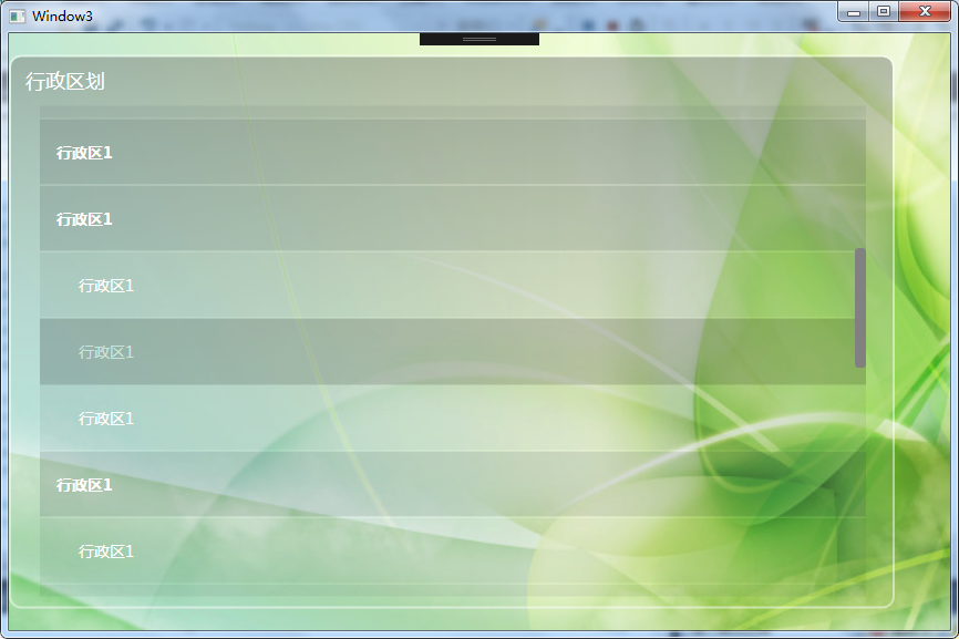
<UC:UCListBox HorizontalAlignment="Left" Height="500" Width="600"/>
效果:
WPF 重写ListBox(透明效果)的更多相关文章
- WPF中ListBox滚动时的缓动效果
原文:WPF中ListBox滚动时的缓动效果 上周工作中遇到的问题: 常规的ListBox在滚动时总是一格格的移动,感觉上很生硬. 所以想要实现类似Flash中的那种缓动的效果,使ListBox滚动时 ...
- 如何在WPF控件上应用简单的褪色透明效果?
原文 https://dailydotnettips.com/how-to-create-simple-faded-transparent-controls-in-wpf/ 使用OpacityMask ...
- WPF通过不透明蒙板切割显示子控件
版权声明:本文为博主原创文章,遵循 CC 4.0 BY-SA 版权协议,转载请附上原文出处链接和本声明.本文链接:https://blog.csdn.net/Backspace110/article/ ...
- WPF ItemsControl ListBox ListView比较
在进行列表信息展示时,WPF中提供多种列表可供选择.这篇博客将对WPF ItemsControl, ListBox, ListView进行比较. 相同点: 1. 这三个控件都是列表型控件,可以进行列表 ...
- WPF 有趣的动画效果
WPF 有趣的动画效果 这一次我要呈上一个简单的文章,关于给你的WPF apps加入美丽的光线动画,可是我对动画这东西可能有点入迷了. 实际上.我对动画如此的入迷,以至 ...
- WPF Windows背景透明其中的文字保持不透明
原文:WPF Windows背景透明其中的文字保持不透明 版权声明:本文为博主原创,未经允许不得转载.交流.源码资料加群:161154103 https://blog.csdn.net/mpegfou ...
- Android课程---Android设置透明效果的三种方法(转)
1.使用Android系统自带的透明效果资源 <Button android:background="@android:color/transparent"/> ...
- Unity3D ShaderLab 使用alpha参数创建透明效果
Unity3D ShaderLab 使用alpha参数创建透明效果 其实Unity为了方便我们的工作,为我们内置了很多参数.比如马上用到的透明功能. 准备场景新建Shader Material ,一张 ...
- 用CSS实现Firefox 和IE 都支持的Alpha透明效果
有的时候,为了实现一些特殊效果,需要将页面元素变透明,本文介绍的就是用 CSS 实现 Firefox 和 IE 都支持的 Alpha 透明效果.CSS: filter:alpha(opacity=50 ...
随机推荐
- LeetCode刷题 fIRST MISSING POSITIVE
Given an unsorted integer array,find missing postive integer. For example , Given [1,2,0]return 3, a ...
- oracle数据库连接 ORA-12638:身份证明检索失败
连数据库的时候突然报了一个这个 查找各种办法,发现自己从10g换成了11g,不过这个没有什么关系,跟oracle的安全设置有关系, 首先从开始菜单找到Net Manager 打开,选择本地,概要文件, ...
- 第九节 java7JDK的常用封装类型
一.Java Scanner类 /初始化一个 scanner 对象. Scanner scanner = new Scanner(System.in); //判断语法 boolean b = scan ...
- C#获取程序运行时间
需要用到System.Diagnostics名称空间中的Stopwatch类! Stopwatch类其中有一个属性ElapsedMilliseconds.该属性是获取当前运行时间,以毫秒为单位! 其中 ...
- Android:layout属性大全
Android layout属性大全 第一类:属性值 true或者 false android:layout_centerHrizontal 水平居中android:layout_centerVert ...
- Java学习笔记40(sql:将数据库内数据存入对象中)
新建一个数据表: use qy97; create table student( id int primary key auto_increment, sname ), gander ), age i ...
- asp.net button控件 使用JS的 disabled
今天想用JS禁用asp.net的button控件,查了好久,都是一行代码.... document.getElementById("Button1").disabled ...
- ASP.NET MVC 阻止通过Url直接访问服务器上的静态文件
某些情况下我们需要在服务器上保存一些静态文件,比如用户上传到服务器的文件,如果刚好这些文件的保存目录是应用程序目录下的一个子目录的话,别人就可以通过Url直接访问这个文件. 例如:在应用程序目录下的U ...
- 非常好的开源C项目tinyhttpd(500行代码)
编译命令 gcc -W -Wall -lpthread -o httpd httpd.c 源码 #include <stdio.h> #include <sys/socket.h&g ...
- Go语言for循环语句
for循环语句解释与使用 首先我们定义sum:=0 格式:for i:=1;i<=100;i++{ sum+=i } for 循环100次,首先执行i=1,然后判断i<100,再执行sum ...