说实在的研究Xamarin到现在,自己就没设计出一款好的UI,基本都在研究后台逻辑之类的!作为Xamarin爱好者,一些简单的页面布局知识还是必备的。
布局常见标签:
- StackLayout
- AbsoluteLayout
- RelativeLayout
- Grid
- ScrollView
主要拿个人最喜欢的StackLayout和Grid做说明。
1、StackLayout
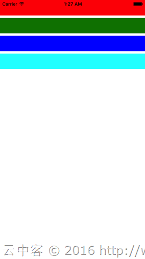
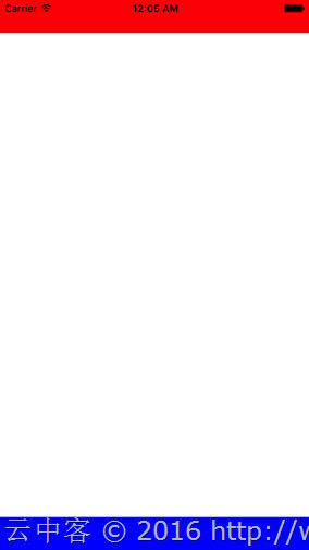
通过它可以设置内部子元素的纵向或者横向布局,默认为纵向。
<?xml version="1.0" encoding="utf-8"?> <ContentPage xmlns="http://xamarin.com/schemas/2014/forms" xmlns:x="http://schemas.microsoft.com/winfx/2009/xaml" xmlns:prism="clr-namespace:Prism.Mvvm;assembly=Prism.Forms" prism:ViewModelLocator.AutowireViewModel="True" x:Class="LayoutTest.Views.MainPage" Title="MainPage"> <StackLayout> <BoxView Color="Red"/> <BoxView Color="Green"/> <BoxView Color="Blue"/> <BoxView Color="Aqua"/> </StackLayout> </ContentPage>
显示结果
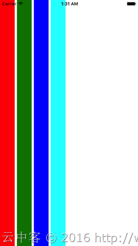
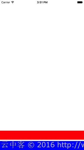
1.1、通过设置Orientation的属性可以切换纵向Vertical(默认)与横向Horizontal显示。
设置Horizontal(横向)看看效果:
<?xml version="1.0" encoding="utf-8"?> <ContentPage xmlns="http://xamarin.com/schemas/2014/forms" xmlns:x="http://schemas.microsoft.com/winfx/2009/xaml" xmlns:prism="clr-namespace:Prism.Mvvm;assembly=Prism.Forms" prism:ViewModelLocator.AutowireViewModel="True" x:Class="LayoutTest.Views.MainPage" Title="MainPage"> <StackLayout Orientation="Horizontal"> <BoxView Color="Red"/> <BoxView Color="Green"/> <BoxView Color="Blue"/> <BoxView Color="Aqua"/> </StackLayout> </ContentPage>
显示结果
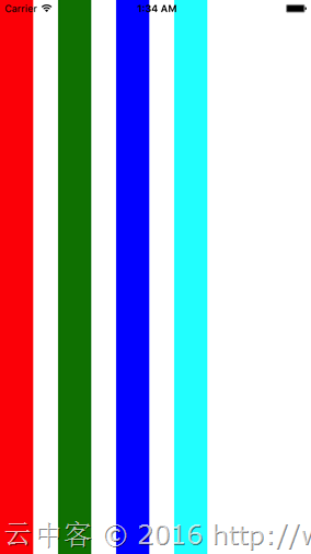
1.2、通过Spacing可以设置子元素间的间隔空白大小。
<?xml version="1.0" encoding="utf-8"?> <ContentPage xmlns="http://xamarin.com/schemas/2014/forms" xmlns:x="http://schemas.microsoft.com/winfx/2009/xaml" xmlns:prism="clr-namespace:Prism.Mvvm;assembly=Prism.Forms" prism:ViewModelLocator.AutowireViewModel="True" x:Class="LayoutTest.Views.MainPage" Title="MainPage"> <StackLayout Orientation="Horizontal"
Spacing
="30"> <BoxView Color="Red"/> <BoxView Color="Green"/> <BoxView Color="Blue"/> <BoxView Color="Aqua"/> </StackLayout> </ContentPage>
显示结果
1.3、通过HorizontalOptions和VerticalOptions可以设置子元素在Stacklayout里面的布局位置。
HorizontalOptions和VerticalOptions可以指定如下值:
- Start: 开始位置布局元素
- Center: 居中布局元素
- End: 结束位置布局元素
- Fill: 扩展元素占用整个布局宽带 (默认设置)
- StartAndExpand: 开始位置布局元素并填充空白
- CenterAndExpand: 居中布局元素并填充空白
- EndAndExpand: 结束位置布局元素并填充空白
- FillAndExpand: 填充所有空白
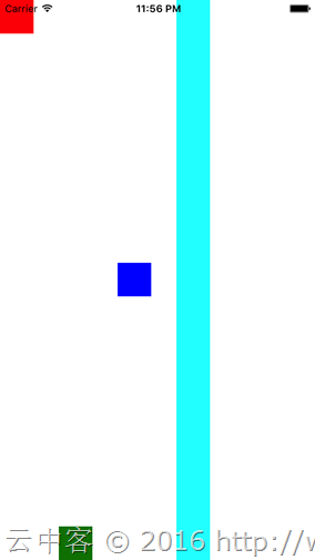
首先看看Start,End,Center,Fill的效果:
<?xml version="1.0" encoding="utf-8"?> <ContentPage xmlns="http://xamarin.com/schemas/2014/forms" xmlns:x="http://schemas.microsoft.com/winfx/2009/xaml" xmlns:prism="clr-namespace:Prism.Mvvm;assembly=Prism.Forms" prism:ViewModelLocator.AutowireViewModel="True" x:Class="LayoutTest.Views.MainPage" Title="MainPage"> <StackLayout Orientation="Horizontal"
Spacing
="30"> <BoxView Color="Red" VerticalOptions="Start"/> <BoxView Color="Green" VerticalOptions="End"/> <BoxView Color="Blue" VerticalOptions="Center"/> <BoxView Color="Aqua" VerticalOptions="Fill"/> </StackLayout> </ContentPage>
显示结果
接下来看看AndExpand相关的设置。
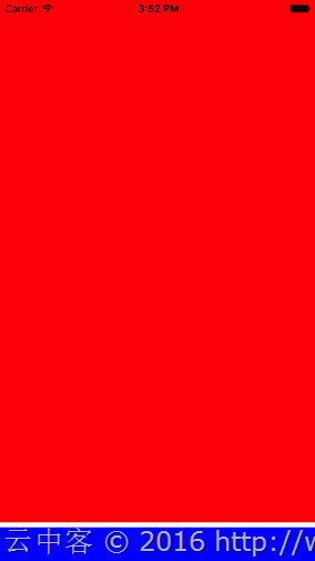
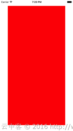
首先设置StartAndExpand
<?xml version="1.0" encoding="utf-8"?> <ContentPage xmlns="http://xamarin.com/schemas/2014/forms" xmlns:x="http://schemas.microsoft.com/winfx/2009/xaml" xmlns:prism="clr-namespace:Prism.Mvvm;assembly=Prism.Forms" prism:ViewModelLocator.AutowireViewModel="True" x:Class="LayoutTest.Views.MainPage" Title="MainPage"> <StackLayout> <BoxView Color="Red" VerticalOptions="StartAndExpand"/> <BoxView Color="Blue"/> </StackLayout> </ContentPage>
显示结果
EndAndExpand情况
<?xml version="1.0" encoding="utf-8"?> <ContentPage xmlns="http://xamarin.com/schemas/2014/forms" xmlns:x="http://schemas.microsoft.com/winfx/2009/xaml" xmlns:prism="clr-namespace:Prism.Mvvm;assembly=Prism.Forms" prism:ViewModelLocator.AutowireViewModel="True" x:Class="LayoutTest.Views.MainPage" Title="MainPage"> <StackLayout> <BoxView Color="Red" VerticalOptions="EndAndExpand"/> <BoxView Color="Blue"/> </StackLayout> </ContentPage>
显示结果
FillAndExpand情况
<?xml version="1.0" encoding="utf-8"?> <ContentPage xmlns="http://xamarin.com/schemas/2014/forms" xmlns:x="http://schemas.microsoft.com/winfx/2009/xaml" xmlns:prism="clr-namespace:Prism.Mvvm;assembly=Prism.Forms" prism:ViewModelLocator.AutowireViewModel="True" x:Class="LayoutTest.Views.MainPage" Title="MainPage"> <StackLayout> <BoxView Color="Red" VerticalOptions="FillAndExpand"/> <BoxView Color="Blue"/> </StackLayout> </ContentPage>
显示结果
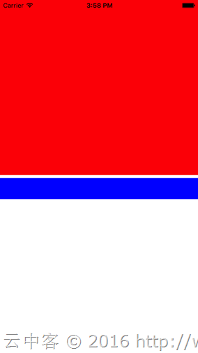
多个AndExpand设置的时候,空白大小是均等分配。比如下面两个控件分别设置为FillAndExpand与StartAndExpand,上半部分全是红色填充,后半部分开始位置为蓝色。
<?xml version="1.0" encoding="utf-8"?> <ContentPage xmlns="http://xamarin.com/schemas/2014/forms" xmlns:x="http://schemas.microsoft.com/winfx/2009/xaml" xmlns:prism="clr-namespace:Prism.Mvvm;assembly=Prism.Forms" prism:ViewModelLocator.AutowireViewModel="True" x:Class="LayoutTest.Views.MainPage" Title="MainPage"> <StackLayout> <BoxView Color="Red" VerticalOptions="FillAndExpand"/> <BoxView Color="Blue" VerticalOptions="StartAndExpand"/> </StackLayout> </ContentPage>
显示结果
通过多个StackLayout配合也可以实现复杂的布局

代码
<?xml version="1.0" encoding="utf-8"?> <ContentPage xmlns="http://xamarin.com/schemas/2014/forms" xmlns:x="http://schemas.microsoft.com/winfx/2009/xaml" xmlns:prism="clr-namespace:Prism.Mvvm;assembly=Prism.Forms" prism:ViewModelLocator.AutowireViewModel="True" x:Class="LayoutTest.Views.MainPage" Title="MainPage"> <ContentPage.Padding> <OnPlatform x:TypeArguments="Thickness"
iOS
="0, 20, 0, 0"/> </ContentPage.Padding> <StackLayout> <!-- 第1个项目 --> <StackLayout Orientation="Horizontal"
VerticalOptions
="Start"> <BoxView Color="Red"/> <StackLayout HorizontalOptions="FillAndExpand"> <StackLayout Orientation="Horizontal"> <StackLayout Orientation="Vertical"
VerticalOptions
="FillAndExpand"> <StackLayout Orientation="Horizontal"> <Label Text="@lxb"/> <Label Text="@Xamarin" HorizontalOptions="FillAndExpand" /> </StackLayout> <Label Text="xxxxxxxxxxxxxx"/> </StackLayout> </StackLayout> <StackLayout Orientation="Horizontal"
HorizontalOptions
="EndAndExpand"> <Button Text="Like" HorizontalOptions="End"/> <Button Text="RT" HorizontalOptions="End"/> <Button Text="Quote" HorizontalOptions="End"/> </StackLayout> </StackLayout> </StackLayout> <!-- 第2个项目 --> <StackLayout Orientation="Horizontal"
VerticalOptions
="Start"> <BoxView Color="Red"/> <StackLayout HorizontalOptions="FillAndExpand"> <StackLayout Orientation="Horizontal"> <StackLayout Orientation="Vertical"
VerticalOptions
="FillAndExpand"> <StackLayout Orientation="Horizontal"> <Label Text="@lxb"/> <Label Text="@Xamarin" HorizontalOptions="FillAndExpand" /> </StackLayout> <Label Text="xxxxxxxxxxxxxx"/> </StackLayout> </StackLayout> <StackLayout Orientation="Horizontal"
HorizontalOptions
="EndAndExpand"> <Button Text="Like" HorizontalOptions="End"/> <Button Text="RT" HorizontalOptions="End"/> <Button Text="Quote" HorizontalOptions="End"/> </StackLayout> </StackLayout> </StackLayout> </StackLayout> </ContentPage>
2、Grid
Grid相当于表格布局,这在网页布局用的最多。通过RowDefinitions属性的RowDefinition定义一行,通过ColumnDefinitions属性的ColumnDefinition定义一列。默认情况下是平均分配各个单元格大小。各个控件通过设置Grid.Row和Grid.Colum可以指定显示在哪个单元格。
比如下面三行三列的例子:
<?xml version="1.0" encoding="utf-8"?> <ContentPage xmlns="http://xamarin.com/schemas/2014/forms" xmlns:x="http://schemas.microsoft.com/winfx/2009/xaml" xmlns:prism="clr-namespace:Prism.Mvvm;assembly=Prism.Forms" prism:ViewModelLocator.AutowireViewModel="True" x:Class="LayoutTest.Views.MainPage" Title="MainPage"> <ContentPage.Padding> <OnPlatform x:TypeArguments="Thickness" iOS="20" /> </ContentPage.Padding> <Grid> <Grid.RowDefinitions> <RowDefinition /> <RowDefinition /> <RowDefinition /> </Grid.RowDefinitions> <Grid.ColumnDefinitions> <ColumnDefinition /> <ColumnDefinition /> <ColumnDefinition /> </Grid.ColumnDefinitions> <BoxView Color="Red" /> <BoxView Color="Blue" Grid.Row="0" Grid.Column="1" /> <BoxView Color="Aqua" Grid.Row="0" Grid.Column="2" /> <BoxView Color="Maroon" Grid.Row="1" Grid.Column="0" /> <BoxView Color="Navy" Grid.Row="1" Grid.Column="1" /> <BoxView Color="Silver" Grid.Row="1" Grid.Column="2" /> <BoxView Color="Purple" Grid.Row="2" Grid.Column="0" /> <BoxView Color="Lime" Grid.Row="2" Grid.Column="1" /> <BoxView Color="Yellow" Grid.Row="2" Grid.Column="2" /> </Grid> </ContentPage>
显示结果
2.1、大小设置
RowDefinition可以设置行高度Height,ColumnDefinition可以设置列宽度Width。设置的值可以为数字(固定大小),也可以为1*,2*之类带*的(按比例分配大小),也可以设置为Auto(自动调整大小)。比如下面的例子:
<?xml version="1.0" encoding="utf-8"?> <ContentPage xmlns="http://xamarin.com/schemas/2014/forms" xmlns:x="http://schemas.microsoft.com/winfx/2009/xaml" xmlns:prism="clr-namespace:Prism.Mvvm;assembly=Prism.Forms" prism:ViewModelLocator.AutowireViewModel="True" x:Class="LayoutTest.Views.MainPage" Title="MainPage"> <ContentPage.Padding> <OnPlatform x:TypeArguments="Thickness"
iOS
="0, 20, 0, 0"/> </ContentPage.Padding> <Grid> <!-- 行定义 --> <Grid.RowDefinitions> <RowDefinition Height="15" /> <!-- 固定 --> <RowDefinition Height="1*" /> <!-- 1比2分配 --> <RowDefinition Height="2*" /> </Grid.RowDefinitions> <!-- 列定义 --> <Grid.ColumnDefinitions> <ColumnDefinition Width="Auto" /> <!-- 根据布局自动设置 --> <ColumnDefinition Width="*" /> <!-- 默认值*(和1*一样) --> <ColumnDefinition /> </Grid.ColumnDefinitions> <BoxView Color="Red" /> <!-- 默认设置在0,0单元格 --> <BoxView Color="Blue" Grid.Row="0"
Grid.Column
="1" /> <BoxView Color="Aqua" Grid.Row="0"
Grid.Column
="2" /> <BoxView Color="Maroon" Grid.Row="1"
Grid.Column
="0" /> <BoxView Color="Navy" Grid.Row="1"
Grid.Column
="1" /> <BoxView Color="Silver" Grid.Row="1"
Grid.Column
="2" /> <BoxView Color="Purple" Grid.Row="2"
Grid.Column
="0" /> <BoxView Color="Lime" Grid.Row="2"
Grid.Column
="1" /> <BoxView Color="Yellow" Grid.Row="2"
Grid.Column
="2" /> </Grid> </ContentPage>
显示结果
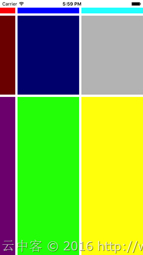
2.2、复数行,复数列设置
Grid.RowSpan设置复数行,Grid.ColumnSpan设置复数列。
<?xml version="1.0" encoding="utf-8"?> <ContentPage xmlns="http://xamarin.com/schemas/2014/forms" xmlns:x="http://schemas.microsoft.com/winfx/2009/xaml" xmlns:prism="clr-namespace:Prism.Mvvm;assembly=Prism.Forms" prism:ViewModelLocator.AutowireViewModel="True" x:Class="LayoutTest.Views.MainPage" Title="MainPage"> <ContentPage.Padding> <OnPlatform x:TypeArguments="Thickness"
iOS
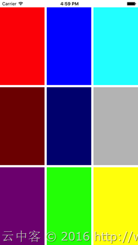
="0, 20, 0, 0"/> </ContentPage.Padding> <Grid> <!-- 行定义 --> <Grid.RowDefinitions> <RowDefinition /> <RowDefinition /> <RowDefinition /> </Grid.RowDefinitions> <!-- 列定义 --> <Grid.ColumnDefinitions> <ColumnDefinition /> <ColumnDefinition /> <ColumnDefinition /> </Grid.ColumnDefinitions> <BoxView Color="Red" Grid.RowSpan="2" Grid.ColumnSpan="3" /> <BoxView Color="Blue" Grid.Row="2" Grid.Column="1" Grid.ColumnSpan="2"/> </Grid> </ContentPage>
显示效果

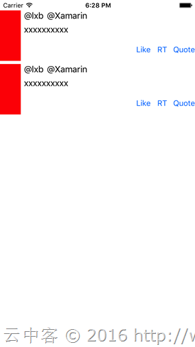
同样可以简单实现上面StackLayout的布局。
<?xml version="1.0" encoding="utf-8"?> <ContentPage xmlns="http://xamarin.com/schemas/2014/forms" xmlns:x="http://schemas.microsoft.com/winfx/2009/xaml" xmlns:prism="clr-namespace:Prism.Mvvm;assembly=Prism.Forms" prism:ViewModelLocator.AutowireViewModel="True" x:Class="LayoutTest.Views.MainPage" Title="MainPage"> <ContentPage.Padding> <OnPlatform x:TypeArguments="Thickness" iOS="0, 20, 0, 0" /> </ContentPage.Padding> <StackLayout VerticalOptions="Start"> <Grid> <!-- 行定义 --> <Grid.RowDefinitions> <RowDefinition Height="Auto" /> <RowDefinition Height="Auto" /> <RowDefinition Height="Auto" /> </Grid.RowDefinitions> <!-- 列定义 --> <Grid.ColumnDefinitions> <ColumnDefinition Width="Auto" /> <ColumnDefinition /> <ColumnDefinition Width="Auto" /> <ColumnDefinition Width="Auto" /> <ColumnDefinition Width="Auto" /> </Grid.ColumnDefinitions> <BoxView Color="Red" Grid.RowSpan="3" /> <StackLayout Orientation="Horizontal" Grid.Column="1" Grid.ColumnSpan="4"> <Label Text="@lxb" /> <Label Text="@Xamarin" /> </StackLayout> <Label Grid.Row="1" Grid.Column="1" Grid.ColumnSpan="4" Text="xxxxxxxxxx" /> <Button Grid.Row="2" Grid.Column="2" Text="Like" /> <Button Grid.Row="2" Grid.Column="3" Text="RT" /> <Button Grid.Row="2" Grid.Column="4" Text="Quote" /> </Grid> <Grid> <!-- 行定义 --> <Grid.RowDefinitions> <RowDefinition Height="Auto" /> <RowDefinition Height="Auto" /> <RowDefinition Height="Auto" /> </Grid.RowDefinitions> <!-- 列定义 --> <Grid.ColumnDefinitions> <ColumnDefinition Width="Auto" /> <ColumnDefinition /> <ColumnDefinition Width="Auto" /> <ColumnDefinition Width="Auto" /> <ColumnDefinition Width="Auto" /> </Grid.ColumnDefinitions> <BoxView Color="Red" Grid.RowSpan="3" /> <StackLayout Orientation="Horizontal" Grid.Column="1" Grid.ColumnSpan="4"> <Label Text="@lxb" /> <Label Text="@Xamarin" /> </StackLayout> <Label Grid.Row="1" Grid.Column="1" Grid.ColumnSpan="4" Text="xxxxxxxxxx" /> <Button Grid.Row="2" Grid.Column="2" Text="Like" /> <Button Grid.Row="2" Grid.Column="3" Text="RT" /> <Button Grid.Row="2" Grid.Column="4" Text="Quote" /> </Grid> </StackLayout> </ContentPage>
显示效果
3、余白设置
余白通过使用Padding和Margin进行设置。Padding是设置控件外侧余白,Margin是设置控件内侧余白。
3.1、设置方法
- 四个方向一个值设置
- 左右和上下两个值设置
- 四个方向不同值设置
(比如:
【20】:四个方向都自为20;
【20,10】左右为20,上下为10;
【10,15,20,25】左部余白为10,上部余白15,右余白为20,下部余白25。)
<?xml version="1.0" encoding="utf-8"?> <ContentPage xmlns="http://xamarin.com/schemas/2014/forms" xmlns:x="http://schemas.microsoft.com/winfx/2009/xaml" xmlns:prism="clr-namespace:Prism.Mvvm;assembly=Prism.Forms" prism:ViewModelLocator.AutowireViewModel="True" x:Class="LayoutTest.Views.MainPage" Title="MainPage"> <ContentPage.Padding> <OnPlatform x:TypeArguments="Thickness" iOS="20" /> </ContentPage.Padding> <Grid Margin="20,10"> <BoxView Color="Red"/> </Grid> </ContentPage>
页面距离边框20,Grid左右距离页面20,上下距离页面10。
总结
使用xamarin.forms开发应用,只要掌握使用StackLayout与Grid布局,基本上可以实现各种想要的布局。当然要想UI很漂亮,图片设计是必须的。
- Xamarin+Prism开发详解七:Plugin开发与打包测试
有了上章[Xamarin+Prism开发详解六:DependencyService与IPlatformInitializer的关系]的基础,现在来理解Plugin开发就简单了. 本文实例代码地址:ht ...
- Xamarin+Prism开发详解四:简单Mac OS 虚拟机安装方法与Visual Studio for Mac 初体验
Mac OS 虚拟机安装方法 最近把自己的电脑升级了一下SSD固态硬盘,总算是有容量安装Mac 虚拟机了!经过心碎的安装探索,尝试了国内外的各种安装方法,最后在youtube上找到了一个好方法. 简单 ...
- Xamarin+Prism开发详解一:PCL跨平台类库与Profile的关系
在[Xamarin+Prism小试牛刀:定制跨平台Outlook邮箱应用]中提到过以下错误,不知道大伙还记得不: 无法安装程序包"Microsoft.Identity.Client 1.0. ...
- Xamarin+Prism开发详解三:Visual studio 2017 RC初体验
Visual studio 2017 RC出来一段时间了,最近有时间就想安装试试,随带分享一下安装使用体验. 1,卸载visual studio 2015 虽然可以同时安装visual studio ...
- Xamarin+Prism开发详解六:DependencyService与IPlatformInitializer的关系
祝各位2017年事业辉煌!开年第一篇博客,继续探索Xamarin.Forms… 为什么我做Xamarin开发的时候中意于Prism.Forms框架?本章为你揭晓. 实例代码地址:https://git ...
- Xamarin+Prism开发详解二:Xaml文件如何简单绑定Resources资源文件内容
我们知道在UWP里面有Resources文件xxx.resx,在Android里面有String.Xml文件等.那跨平台如何统一这些类别不一的资源文件以及Xaml设计文件如何绑定这些资源?应用支持多国 ...
- Xamarin+Prism开发详解八:自动化测试之NUnit实践
自动化测试很重要!很重要!以前多是手动测试,没有写过测试用例.这样的结果就是发现bug改了之后关联的其他功能又要从新测一遍.这样既浪费时间与成本,而且很无聊.之所以选择NUnit是公司需要,现在.ne ...
- 在【Xamarin+Prism开发详解三:Visual studio 2017 RC初体验】中分享了Visual studio 2017RC的大致情况,同时也发现大家对新的Visual Studio很是感兴趣。于是发时间深入研究了一下Visual Studio 2017RC 是不是和微软Connect()://2016上说得一样神。
总共列出了12点,耐心点慢慢看! 1,添加了不少[代码样式]的设置项目. 通过合理的设置每个人都能写出优美的代码,而且团队项目也可以达到统一代码风格. this首选项:可以设置[字段,属性,方法,事件 ...
- HTTPS加密协议详解(一):HTTPS基础知识
转自:https://blog.csdn.net/hherima/article/details/52469267------------------------------专栏导航:-------- ...
随机推荐
- MIP开发常见问题解答
校验相关 1. MIP 页面的 <a>链接校验报错,MIP 是强制 target="_blank" 吗? 如果想直接跳转MIP页,可以用mip-link 组件:MIP ...
- [NodeJS] 优缺点及适用场景讨论
概述: NodeJS宣称其目标是“旨在提供一种简单的构建可伸缩网络程序的方法”,那么它的出现是为了解决什么问题呢,它有什么优缺点以及它适用于什么场景呢? 本文就个人使用经验对这些问题进行探讨. 一. ...
- Android Studio —— 重装 HAXM
Android Studio -- 重装 HAXM 版权声明:本文为博主原创文章,未经博主允许不得转载. 微博:厉圣杰 文中如有纰漏,欢迎大家留言指出. Android SDK 自带模拟器一直以慢.卡 ...
- CSS知识总结(七)
CSS常用样式 5.背景样式 1)背景颜色 background-color : transparent | color 常用值:①英文单词,②十六进制,③RGB或RGBA 另外,还有一种是 渐变色彩 ...
- python 数据类型 ----字典
字典由一对key:value 组成的 python中常用且重量级的数据类型 1. key , keys, values 字典由一对key:value 组成的 python中常用且重量级的数据类型 1. ...
- javaScript之BOM操作1
<!doctype html> <html lang="en"> <head> <meta charset="UTF-8&quo ...
- CSS三个定位——常规、浮动、绝对定位
.dage { width: 868px; background: #5B8C75; border: 10px solid #A08C5A; margin-top: -125px; margin-le ...
- 升级npm
查看npm的所有版本 运行命令: npm view npm versions 命令运行后,会输出到目前为止npm的所有版本. [ '1.1.25', '1.1.70', '1.1.71', '1.2. ...
- Tableau未必最佳,国内BI也能突破重围!
如今,百度一下商业智能或BI工具,总能看到Tableau的身影.并不是Tableau的营销做得好,而是国内对于商业智能工具的认知和选择似乎都落在了Tableau身上.导致不管业内业外都对商业智能的概念 ...
- vim的一些常用命令(一)
先确认在Normal模式下,如不确认,请按几次Esc. :sy on/clear sy表示语法高亮,on是打开.clear是取消. :set go= set表示一般性设置,go是gui option的 ...