Python之matplotlib库学习:实现数据可视化
1. 安装和文档
pip install matplotlib
为了方便显示图像,还使用了ipython qtconsole方便显示。具体怎么弄网上搜一下就很多教程了。
pyplot模块是提供操作matplotlib库的经典Python接口。
# 导入pyplot

import matplotlib.pyplot as plt
2. 初探pyplot
plot()的参数表
matplotlib.pyplot.plot(*args, **kwargs)
The following format string characters are accepted to control the line style or marker:
| character | description |
|---|---|
| '-' | solid line style |
| '--' | dashed line style |
| '-.' | dash-dot line style |
| ':' | dotted line style |
| '.' | point marker |
| ',' | pixel marker |
| 'o' | circle marker |
| 'v' | triangle_down marker |
| '^' | triangle_up marker |
| '<' | triangle_left marker |
| '>' | triangle_right marker |
| '1' | tri_down marker |
| '2' | tri_up marker |
| '3' | tri_left marker |
| '4' | tri_right marker |
| 's' | square marker |
| 'p' | pentagon marker |
| '*' | star marker |
| 'h' | hexagon1 marker |
| 'H' | hexagon2 marker |
| '+' | plus marker |
| 'x' | x marker |
| 'D' | diamond marker |
| 'd' | thin_diamond marker |
| ' | ' |
| '_' | hline marker |
The following color abbreviations are supported:
| character | color |
|---|---|
| ‘b’ | blue |
| ‘g’ | green |
| ‘r’ | red |
| ‘c’ | cyan |
| ‘m’ | magenta |
| ‘y’ | yellow |
| ‘k’ | black |
| ‘w’ | white |
演示
plt.axis([0,5,0,20]) # [xmin,xmax,ymin,ymax]对应轴的范围

plt.title('My first plot') # 图名

plt.plot([1,2,3,4], [1,4,9,16], 'ro') # 图上的点,最后一个参数为显示的模式

Out[5]: [<matplotlib.lines.Line2D at 0x24e0a5bc2b0>]

plt.show() # 展示图片

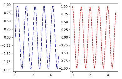
In [11]: t = np.arange(0, 2.5, 0.1)

    ...: y1 = list(map(math.sin, math.pi*t))

    ...: y2 = list(map(math.sin, math.pi*t + math.pi/2))

    ...: y3 = list(map(math.sin, math.pi*t - math.pi/2))

    ...:

In [12]: plt.plot(t, y1, 'b*', t, y2, 'g^', t, y3, 'ys')

Out[12]:

[<matplotlib.lines.Line2D at 0x24e0a8469b0>,

 <matplotlib.lines.Line2D at 0x24e0a58de48>,

 <matplotlib.lines.Line2D at 0x24e0a846b38>]

In [13]: plt.show()

In [14]: plt.plot(t,y1,'b--',t,y2,'g',t,y3,'r-.')

Out[14]:

[<matplotlib.lines.Line2D at 0x24e0a8b49e8>,

 <matplotlib.lines.Line2D at 0x24e0a8b4c88>,

 <matplotlib.lines.Line2D at 0x24e0a8b95c0>]

In [15]: plt.show()

3. 处理多个Figure和Axes对象
subplot(nrows, ncols, plot_number)
In [19]: plt.subplot(2,1,1)

    ...: plt.plot(t,y1,'b-.')

    ...: plt.subplot(2,1,2)

    ...: plt.plot(t,y2,'r--')

    ...:

Out[19]: [<matplotlib.lines.Line2D at 0x24e0b8f47b8>]

In [20]: plt.show()
In [30]: plt.subplot(2,1,1)

    ...: plt.plot(t,y1,'b-.')

    ...: plt.subplot(2,1,2)

    ...: plt.plot(t,y2,'r--')

    ...:

Out[30]: [<matplotlib.lines.Line2D at 0x24e0bb9fc88>]

In [31]: plt.show()

4. 添加更多元素
4.1. 添加文本
添加标题:title()
添加轴标签:xlabel()和ylabel()
在图形的坐标添加文本:text(x, y, string, fontdict=None, **kwargs),分别表示坐标和字符串以及一些关键字参数。
还可以添加LaTeX表达式,绘制边框等。
In [40]: plt.axis([0,5,0,20])

    ...: plt.title('_Kazusa', fontsize=20, fontname='Times New Roman')

    ...: plt.xlabel('x_axis', color='orange')

    ...: plt.ylabel('y_axis', color='gray')

    ...: plt.text(1, 1.5, 'A')

    ...: plt.text(2, 4.5, 'B')

    ...: plt.text(3, 9.5, 'C')

    ...: plt.text(4, 16.5, 'D')

    ...: plt.text(0.5, 15, r'$y=x^2$', fontsize=20, bbox={'facecolor':'yellow','alpha':0.2})

    ...: plt.plot([1,2,3,4],[1,4,9,16],'ro')

    ...:

Out[40]: [<matplotlib.lines.Line2D at 0x24e0bf03240>]

In [41]: plt.show()

4.2. 其他元素
网格:grid(True) 表示显示网格
图例:matplotlib.pyplot.legend(*args, **kwargs)
图例的位置参数:
loc : int or string or pair of floats, default: ‘upper right’
The location of the legend. Possible codes are:
| Location String | Location Code |
|---|---|
| ‘best’ | 0 |
| ‘upper right’ | 1 |
| ‘upper left’ | 2 |
| ‘lower left’ | 3 |
| ‘lower right’ | 4 |
| ‘right’ | 5 |
| ‘center left’ | 6 |
| ‘center right’ | 7 |
| ‘lower center’ | 8 |
| ‘upper center’ | 9 |
| ‘center’ | 10 |
Alternatively can be a 2-tuple giving x, y of the lower-left corner of the legend in axes coordinates (in which case bbox_to_anchor will be ignored).
In [44]: plt.axis([0,5,0,20])

    ...: plt.title('_Kazusa', fontsize=20, fontname='Times New Roman')

    ...: plt.xlabel('x_axis', color='orange')

    ...: plt.ylabel('y_axis', color='gray')

    ...: plt.text(1, 1.5, 'A')

    ...: plt.text(2, 4.5, 'B')

    ...: plt.text(3, 9.5, 'C')

    ...: plt.text(4, 16.5, 'D')

    ...: plt.text(0.5, 10, r'$y=x^2$', fontsize=20, bbox={'facecolor':'yellow','alpha':0.2})

    ...: plt.plot([1,2,3,4],[1,4,9,16],'ro')

    ...: plt.grid(True)

    ...: plt.plot([1,2,3,4],[0.6,2.3,14.5,15.8], 'g^')

    ...: plt.plot([1,2,3,4],[0.2,9.7,11.6,13.9],'b*')

    ...: plt.legend(['First series', 'Sencond series', 'Third series'], loc=0)

    ...:

Out[44]: <matplotlib.legend.Legend at 0x24e0c02a630>

In [45]: plt.show()

5. 保存
%save mycode 44

# %save魔术命令后,跟着文件名和代码对于的命令提示符号码。例如上面In [44]: plt.axis([0,5,0,20])号码就是44,运行之后会在工作目录生成'mycode.py'文件,还可以是'数字-数字',即保存从一个行数到另一个行数的代码

ipython qtconsole -m mycode.py

#可以打开之前的代码

%load mycode.py

#可以加载所有代码

%run mycode.py

#可以运行代码
#保存图片的话,可以在生成图标的一系列命令之后加上savefig()函数把图标保存为PNG格式。

#在保存图像命令之前不要使用plt.show()否则会得到空白图像

In [30]: plt.subplot(2,1,1)

    ...: plt.plot(t,y1,'b-.')

    ...: plt.subplot(2,1,2)

    ...: plt.plot(t,y2,'r--')

    ...: plt.savefig('pic.png')
6. 线形图
替换坐标轴的刻度的标签:xticks()和yticks()。传入的参数第一个是存储刻度的位置的列表,第二个是存储刻度的标签的列表。要正确显示标签,要使用含有LaTeX表达式的字符串。
显示笛卡尔坐标轴:首先用gca()函数获取Axes对象。通过这个对象,指定每条边的位置:上下左右,可选择组成图形边框的每条边。使用set_color()函数,设置颜色为'none'(这里我不删除而是换了个颜色方便确认位置),删除根坐标轴不符合的边(右上)。用set_positon()函数移动根x轴和y轴相符的边框,使其穿过原点(0,0)。
annotate()函数可以添加注释。第一个参数为含有LaTeX表达式、要在图形中显示的字符串;随后是关键字参数。文本注释跟它所解释的数据点之间的距离用xytext关键字参数指定,用曲线箭头将其表示出来。箭头的属性由arrowprops关键字参数指定。
In [57]: x = np.arange(-2*np.pi, 2*np.pi, 0.01)

    ...: y1 = np.sin(3*x)/x

    ...: y2 = np.sin(2*x)/x

    ...: y3 = np.sin(x)/x

    ...: plt.plot(x,y1,color='y')

    ...: plt.plot(x,y2,color='r')

    ...: plt.plot(x,y3,color='k')

    ...: plt.xticks([-2*np.pi, -np.pi, 0, np.pi, 2 * np.pi], [r'$-2\pi$', r'$-\pi$', r'$0$', r'$+\pi$', r'$+2\pi$'])

    ...: plt.yticks([-1, 0, +1, +2, +3], [r'$-1$', r'$0$', r'$+1$', r'$+2$', r'$+3$'])

    ...: # 设置坐标轴标签

    ...: plt.annotate(r'$\lim_{x\to 0}\frac{\sin(x)}{x}=1$', xy=[0,1], xycoords='data', xytext=[30,30], fontsize=18, textcoords='offset points', arrowprops=dict(arrowstyle="->",connectionstyle="arc3,rad=.2")) # 设置注释

    ...:

    ...: ax = plt.gca()

    ...: ax.spines['right'].set_color('r')

    ...: ax.spines['top'].set_color('b')

    ...: ax.xaxis.set_ticks_position('bottom')

    ...: ax.spines['bottom'].set_position(('data',0))

    ...: ax.yaxis.set_ticks_position('left')

    ...: ax.spines['left'].set_position(('data',0))

    ...: ax.spines['bottom'].set_color('g')

    ...: ax.spines['left'].set_color('k') # 设置笛卡尔坐标轴

    ...:

In [58]: plt.show()

为pandas数据结构绘制线形图##
把DataFrame作为参数传入plot()函数,就可以得到多序列线形图。
In [60]: data = {'series1':[1,3,4,3,5], 'series2':[2,4,5,2,4], 'series3':[5,4,4,1,5]}

    ...: df = pd.DataFrame(data)

    ...: x = np.arange(5)

    ...: plt.axis([0,6,0,6])

    ...: plt.plot(x,df)

    ...: plt.legend(data, loc=0)

    ...:

Out[60]: <matplotlib.legend.Legend at 0x24e0dbda668>

In [61]: plt.show()


7. 直方图
hist()可以用于绘制直方图。
In [4]: array = np.random.randint(0, 50, 50)

In [5]: array

Out[5]:

array([43,  1, 16,  9, 22, 15,  1, 12,  9, 25, 37, 47, 31, 15, 25, 43,  3,

       28, 21, 23, 11, 10, 14, 27, 10, 19, 40, 44, 26, 49, 13, 35, 19, 48,

        7, 21, 37, 47,  2,  4, 15, 20, 47, 11,  2, 49, 31, 31,  1, 46])

In [8]: n, bins, patches = plt.hist(array, bins=10) # hist()第二个参数便是划分的面元个数,n表示每个面元有几个数字,bins表示面元的范围,patches表示每个长条

In [10]: n

Out[10]: array([ 7.,  5.,  8.,  4.,  4.,  5.,  3.,  3.,  4.,  7.])

In [11]: bins

Out[11]:

array([  1. ,   5.8,  10.6,  15.4,  20.2,  25. ,  29.8,  34.6,  39.4,

        44.2,  49. ])

In [13]: for patch in patches:

    ...:     print(patch)

    ...:

Rectangle(1,0;4.8x7)

Rectangle(5.8,0;4.8x5)

Rectangle(10.6,0;4.8x8)

Rectangle(15.4,0;4.8x4)

Rectangle(20.2,0;4.8x4)

Rectangle(25,0;4.8x5)

Rectangle(29.8,0;4.8x3)

Rectangle(34.6,0;4.8x3)

Rectangle(39.4,0;4.8x4)

Rectangle(44.2,0;4.8x7)

In [9]: plt.show()

8. 条状图
bar()函数可以生成垂直条状图
barh()函数可以生成水平条状图,设置的时候坐标轴参数和垂直条状图相反,其他都是一样的。
8.1 普通条状图
In [24]: index = np.arange(5)

    ...: values = [5,7,3,4,6]

    ...: plt.bar(index, values)

    ...: plt.title('_Kazusa')

    ...: plt.xticks(index,['A','B','C','D','E'])

    ...: plt.legend('permutation', loc = 0)

    ...:

Out[24]: <matplotlib.legend.Legend at 0x22abd7a7a20>

In [25]: plt.show()

8.2 多序列条状图
In [34]: index = np.arange(5)

    ...: val1 = [5,7,3,4,6]

    ...: val2 = [6,6,4,5,7]

    ...: val3 = [5,6,5,4,6]

    ...: gap = 0.31 # 把每个类别占的空间(总空间为1)分成多个部分,例如这里有三个,因为要增加一点空间区分相邻的类别,因此取0.31

    ...: plt.axis([0,5,0,8])

    ...: plt.title('_Kazusa')

    ...: plt.bar(index+0.2, val1, gap, color='b')

    ...: plt.bar(index+gap+0.2, val2, gap, color='y')

    ...: plt.bar(index+2*gap+0.2, val3, gap, color='k')

    ...: plt.xticks(index+gap+0.2, ['A','B','C','D','E']) # index+gap即标签偏移gap的距离

    ...:

Out[34]:

([<matplotlib.axis.XTick at 0x22abd72a6d8>,

  <matplotlib.axis.XTick at 0x22abd93fba8>,

  <matplotlib.axis.XTick at 0x22abd9f95f8>,

  <matplotlib.axis.XTick at 0x22abda5e400>,

  <matplotlib.axis.XTick at 0x22abda5edd8>],

 <a list of 5 Text xticklabel objects>)

In [35]: plt.show()

8.3 对序列堆积条状图
有时候需要表示总和是由几个条状图相加得到,因此堆积图表示比较合适。
使用bar()的时候添加参数bottom= 来确定下面是什么。
In [41]: arr1 = np.array([3,4,5,3])

    ...: arr2 = np.array([1,2,2,5])

    ...: arr3 = np.array([2,3,3,4])

    ...: index = np.arange(4)

    ...: plt.axis([0,4,0,15])

    ...: plt.title('_Kazusa')

    ...: plt.bar(index + 0.5, arr1, color='r')

    ...: plt.bar(index + 0.5, arr2, color='b', bottom=arr1)

    ...: plt.bar(index + 0.5, arr3, color='y', bottom=(arr1+arr2))

    ...: plt.xticks(index + 0.5, ['A','B','C','D','E'])

    ...:

Out[41]:

([<matplotlib.axis.XTick at 0x22abd953a90>,

  <matplotlib.axis.XTick at 0x22abda95550>,

  <matplotlib.axis.XTick at 0x22abdb99320>,

  <matplotlib.axis.XTick at 0x22abdbff630>],

 <a list of 4 Text xticklabel objects>)

In [42]: plt.show()


8.4 为DataFrame绘制条状图
In [47]: data = {'arr1':[1,3,4,3,5], 'arr2':[2,4,5,2,4], 'arr3':[1,3,5,1,2]}

    ...: df = pd.DataFrame(data)

    ...: df.plot(kind='bar') # 若要堆积图,变成 df.plot(kind='bar', stacked=True)

    ...:

Out[47]: <matplotlib.axes._subplots.AxesSubplot at 0x22abdcb3cf8>

In [48]: plt.show()

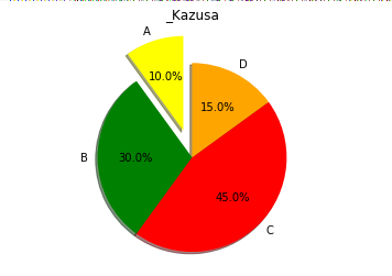
9. 饼图
pie()函数可以制作饼图
In [51]: labels = ['A','B','C','D'] # 标签

    ...: values = [10,30,45,15] # 数值

    ...: colors = ['yellow', 'green', 'red', 'orange'] # 颜色

    ...: explode = [0.3, 0, 0, 0] # 突出显示,数值0~1

    ...: plt.title('_Kazusa')

    ...: plt.pie(values, labels=labels, colors=colors, explode=explode, startangle=90, shadow=True, autopct='%1.1f%%') # shadow表示阴影, autopct表示显示百分比, startangle表示饼旋转的角度

    ...: plt.axis('equal')

    ...:

Out[51]:

(-1.1007797083302826,

 1.1163737124158366,

 -1.1306395753855039,

 1.4003625034945653)

In [52]: plt.show()
10. 等值线图
由一圈圈封闭的曲线组成的等值线图表示三维结构的表面,其中封闭的曲线表示的是一个个处于同一层级或z值相同的数据点。
contour()函数可以生成等值线图。
In [57]: dx = 0.01; dy = 0.01

    ...: x = np.arange(-2.0, 2.0, dx)

    ...: y = np.arange(-2.0, 2.0, dy)

    ...: X, Y = np.meshgrid(x, y) # 这里meshigrid(x,y)的作用是产生一个以向量x为行,向量y为列的矩阵,而x是从-2开始到2,每间隔dx记下一个数据,并把这些数据集成矩阵X;同理y则是从-2到2,每间隔dy记下一个数据,并集成矩阵Y

    ...: def f(x,y): # 生成z的函数

    ...:     return (1 - y**5 + x**5) * np.exp(-x**2 - y**2)

    ...: C = plt.contour(X, Y, f(X,Y), 8, colors='black') # 8表示分层的密集程度,越小越稀疏,colors表示最开始是什么颜色

    ...: plt.contourf(X, Y, f(X,Y), 8) # 使用颜色,8的意义同上

    ...: plt.clabel(C, inline=1, contsize=10) # 生成等值线的标签

    ...: plt.colorbar() # 侧边的颜色说明

    ...:

Out[57]: <matplotlib.colorbar.Colorbar at 0x22abf289470>

In [58]: plt.show()

11. 3D图
3D图的Axes对象要替换为Axes3D对象。
from mpl_toolkits.mplot3d import Axes3D
11.1. 3D曲面
plot_surface(X, Y, Z, *args, **kwargs)可以显示面
| Argument | Description |
|---|---|
| X, Y, Z | Data values as 2D arrays |
| rstride | Array row stride (step size) |
| cstride | Array column stride (step size) |
| rcount | Use at most this many rows, defaults to 50 |
| ccount | Use at most this many columns, defaults to 50 |
| color | Color of the surface patches |
| cmap | A colormap for the surface patches. |
| facecolors | Face colors for the individual patches |
| norm | An instance of Normalize to map values to colors |
| vmin | Minimum value to map |
| vmax | Maximum value to map |
| shade | Whether to shade the facecolors |
In [9]: fig = plt.figure()

   ...: ax = Axes3D(fig)

   ...: X = np.arange(-2, 2, 0.1)

   ...: Y = np.arange(-2, 2, 0.1)

   ...: X, Y = np.meshgrid(X, Y)

   ...: def f(x,y):

   ...:     return (1 - y ** 5 + x ** 5) * np.exp(-x ** 2 - y ** 2)

   ...: ax.plot_surface(X, Y, f(X,Y), rstride=1, cstride=1) # rstide/cstride表示 行/列数组的跨度

   ...: ax.view_init(elev=30,azim=125) # elev指定从哪个高度查看曲面,azim指定曲面旋转的角度

   ...:

In [10]: pt.show()

11.2. 3D散点图
Axes3D.scatter(xs, ys, zs=0, zdir='z', s=20, c=None, depthshade=True, *args, **kwargs)可以使用散点图
| Argument | Description |
|---|---|
| xs, ys | Positions of data points. |
| zs | Either an array of the same length as xs and ys or a single value to place all points in the same plane. Default is 0. |
| zdir | Which direction to use as z (‘x’, ‘y’ or ‘z’) when plotting a 2D set. |
| s | Size in points^2. It is a scalar or an array of the same length as x and y. |
| c | A color. c can be a single color format string, or a sequence of color specifications of length N, or a sequence of N numbers to be mapped to colors using the cmap and norm specified via kwargs (see below). |
| depthshade | Whether or not to shade the scatter markers to give the appearance of depth. Default is True. |
In [16]: x1 = np.random.randint(30, 40, 100)

    ...: y1 = np.random.randint(30, 40, 100)

    ...: z1 = np.random.randint(10, 20, 100)

    ...: x2 = np.random.randint(50, 60, 100)

    ...: y2 = np.random.randint(50, 60, 100)

    ...: z2 = np.random.randint(10, 20, 100)

    ...: x3 = np.random.randint(30, 40, 100)

    ...: y3 = np.random.randint(30, 40, 100)

    ...: z3 = np.random.randint(40, 50, 100)

    ...: fig = plt.figure()

    ...: ax = Axes3D(fig)

    ...: ax.scatter(x1, y1, z1)

    ...: ax.scatter(x2, y2, z2, c = 'r', marker = '^')

    ...: ax.scatter(x3, y3, z3, c = 'y', marker = '*')

    ...: ax.set_xlabel('X axis')

    ...: ax.set_ylabel('Y axis')

    ...: ax.set_zlabel('Z axis')

    ...:

Out[16]: <matplotlib.text.Text at 0x1b0218fda90>

In [17]: plt.show()

11.3. 3D条状图
bar()函数
Axes3D.bar(left, height, zs=0, zdir='z', *args, **kwargs)
| Argument | Description |
|---|---|
| left | The x coordinates of the left sides of the bars. |
| height | The height of the bars. |
| zs | Z coordinate of bars, if one value is specified they will all be placed at the same z. |
| zdir | Which direction to use as z (‘x’, ‘y’ or ‘z’) when plotting a 2D set. |
In [22]: x = np.arange(5)

    ...: y1 = np.random.randint(0, 10, 5)

    ...: y2 = y1 + np.random.randint(0, 3, 5)

    ...: y3 = y2 + np.random.randint(0, 3, 5)

    ...: y4 = y3 + np.random.randint(0, 3, 5)

    ...: y5 = y4 + np.random.randint(0, 3, 5)

    ...: clr = ['yellow', 'red', 'blue', 'black', 'green']

    ...: fig = plt.figure()

    ...: ax = Axes3D(fig)

    ...: ax.bar(x, y1, 0, zdir = 'y', color = clr)

    ...: ax.bar(x, y2, 10, zdir = 'y', color = clr)

    ...: ax.bar(x, y3, 20, zdir = 'y', color = clr)

    ...: ax.bar(x, y4, 30, zdir = 'y', color = clr)

    ...: ax.bar(x, y5, 40, zdir = 'y', color = clr)

    ...: ax.set_xlabel('x Axis')

    ...: ax.set_ylabel('y Axis')

    ...: ax.set_zlabel('z Axis')

    ...: ax.view_init(elev=40)

    ...:

In [23]: plt.show()

12. 多面板图形
12.1. 在其他子图中显示子图
把主Axes对象(主图表)跟放置另一个Axes对象实例的框架分开。用figure()函数取到Figure对象,用add_axes()函数在它上面定义两个Axes对象。
add_axes(*args, **kwargs)

rect = l,b,w,h # (分别是左边界,下边界,宽,高)

fig.add_axes(rect)
In [28]: fig = plt.figure()

    ...: ax = fig.add_axes([0.1,0.1,0.8,0.8])

    ...: inner_ax = fig.add_axes([0.6,0.6,0.25,0.25])

    ...: x1 = np.arange(10)

    ...: y1 = np.array([1,2,7,1,5,2,4,2,3,1])

    ...: x2 = np.arange(10)

    ...: y2 = np.array([1,2,3,4,6,4,3,4,5,1])

    ...: ax.plot(x1,y1)

    ...: inner_ax.plot(x2,y2)

    ...:

Out[28]: [<matplotlib.lines.Line2D at 0x1b022ac94a8>]

In [29]: plt.show()

12.2. 子图网格
class matplotlib.gridspec.GridSpec(nrows, ncols, left=None, bottom=None, right=None, top=None, wspace=None, hspace=None, width_ratios=None, height_ratios=None)
add_subplot(*args, **kwargs)
In [30]: gs = plt.GridSpec(3,3) # 分成多少块

    ...: fig = plt.figure(figsize=(8,8)) # 指定图的尺寸

    ...: x1 = np.array([1,3,2,5])

    ...: y1 = np.array([4,3,7,2])

    ...: x2 = np.arange(5)

    ...: y2 = np.array([3,2,4,6,4])

# 可以看做分作一个3*3的格子,每次给一个表分配格子,[row,col],[0,0]表示左上角

    ...: p1 = fig.add_subplot(gs[1,:2])

    ...: p1.plot(x1, y1, 'r')

    ...: p2 = fig.add_subplot(gs[0,:2])

    ...: p2.bar(x2, y2)

    ...: p3 = fig.add_subplot(gs[2,0])

    ...: p3.barh(x2, y2, color='b')

    ...: p4 = fig.add_subplot(gs[:2,2])

    ...: p4.plot(x2, y2, 'k')

    ...: p5 = fig.add_subplot(gs[2,1:])

    ...: p5.plot(x1, y1, 'b^', x2, y2, 'yo')

    ...:

Out[30]:

[<matplotlib.lines.Line2D at 0x1b022c8a940>,

 <matplotlib.lines.Line2D at 0x1b022cdc4a8>]

 In [32]: plt.show()


Python之matplotlib库学习:实现数据可视化的更多相关文章
- Python之matplotlib库学习
matplotlib 是python最著名的绘图库,它提供了一整套和matlab相似的命令API,十分适合交互式地进行制图.而且也可以方便地将它作为绘图控件,嵌入GUI应用程序中. 它的文档相当完备, ...
- numpy, matplotlib库学习笔记
Numpy库学习笔记: 1.array() 创建数组或者转化数组 例如,把列表转化为数组 >>>Np.array([1,2,3,4,5]) Array([1,2,3,4,5]) ...
- 【python】numpy库和matplotlib库学习笔记
Numpy库 numpy:科学计算包,支持N维数组运算.处理大型矩阵.成熟的广播函数库.矢量运算.线性代数.傅里叶变换.随机数生成,并可与C++/Fortran语言无缝结合.树莓派Python v3默 ...
- Python基础——matplotlib库的使用与绘图可视化
1.matplotlib库简介: Matplotlib 是一个 Python 的 2D绘图库,开发者可以便捷地生成绘图,直方图,功率谱,条形图,散点图等. 2.Matplotlib 库使用: 注:由于 ...
- 小白学 Python 数据分析(15):数据可视化概述
人生苦短,我用 Python 前文传送门: 小白学 Python 数据分析(1):数据分析基础 小白学 Python 数据分析(2):Pandas (一)概述 小白学 Python 数据分析(3):P ...
- Python Seaborn综合指南,成为数据可视化专家
概述 Seaborn是Python流行的数据可视化库 Seaborn结合了美学和技术,这是数据科学项目中的两个关键要素 了解其Seaborn作原理以及使用它生成的不同的图表 介绍 一个精心设计的可视化 ...
- Python的Matplotlib库简述
Matplotlib 库是 python 的数据可视化库import matplotlib.pyplot as plt 1.字符串转化为日期 unrate = pd.read_csv("un ...
- python 金融应用(三)数据可视化
matplotlib 库( http://www.matp1otlìb.org )的基本可视化功能. 主要是2-D绘图.金融绘图和3-D绘图 一.2-D绘图 1.1一维数据集 #导入所需要的包impo ...
- python爬虫解析库学习
一.xpath库使用: 1.基本规则: 2.将文件转为HTML对象: html = etree.parse('./test.html', etree.HTMLParser()) result = et ...
随机推荐
- Vertica变化Local时间到GMT时间
在Vertica的数据库的使用过程中碰到这么一种场景.程序从不同一时候区的集群中收集数据写入同一张表,然后我们须要把这些数据依照GMT时间来显示. 此时我们能够通过Vertica提供TIME ZONE ...
- Google CFO 辞职信
Google CFO 辞职信 After nearly 7 years as CFO, I will be retiring from Google to spend more time with ...
- WPF查找父元素子元素
原文:WPF查找父元素子元素 /// <summary> /// WPF中查找元素的父元素 /// </summary> /// &l ...
- zend-form笔记
Zend-Form组件包含以下几个对象: 1.Elements:包含了name和attributes, 2.Fieldsets:继承自elements,但允许包含其他fieldset和elements ...
- 数组/LINQ/List/ObservableCollection
private static void AddIndustryTypes(sectorCode[] result) { var industryTypes = (from t in result se ...
- Windows程序设计画图实现哆啦A梦
在看雪论坛上看到的一个帖子,很喜欢,转载一下.原文地址:http://bbs.pediy.com/showthread.php?t=138630哆啦A梦是画出来的,不知道作者算这些坐标位置算了多久,真 ...
- iOS UITableView动态隐藏或显示Item
通过改变要隐藏的item的高度实现隐藏和显示item 1.创建UITableView #import "ViewController.h" @interface ViewContr ...
- epplus输出成thml
using System; using System.Collections.Generic; using System.Linq; using System.Web; using System.We ...
- SQLServer 可更新订阅数据在线架构更改(增加字段)方案
原文:SQLServer 可更新订阅数据在线架构更改(增加字段)方案 之前一直查找冲突发布和订阅数据不一致的原因,后来发现多少数据库升级引起,因为一直以来都是在发布数据库增加字段,订阅也会自动同步.在 ...
- 零元学Expression Blend 4 - Chapter 35 讨厌!!我不想一直重复设定!!『Template Binding』使用前後的差异
原文:零元学Expression Blend 4 - Chapter 35 讨厌!!我不想一直重复设定!!『Template Binding』使用前後的差异 因为先前写到自制Button时需特别注意T ...