css 边框颜色渐变的半圆
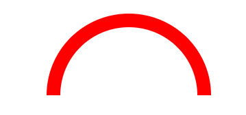
1.需求有这么个东西,个人不习惯背景图片来解决,开始了css尝试。
 <!DOCTYPE html>

 <html>

     <head>

         <meta charset="UTF-8">

         <title>边框渐变的拱形</title>

         <style>

             .circle{

                 width: 200px;

                 /*height: 200px;*/

                 line-height: 100px;

                 text-align: center;

                 margin: 100px;

                 /*background-color: red;*/

             }

             .semi-circle {

                 border-radius: 200px 200px 0 0 ;

                 height: 100px;

                 border: 20px solid red;

                 border-bottom: 0;

                 /*border-image: -moz-linear-gradient(green,blue);

                 border-image: -webkit-linear-gradient(green,blue);

                 border-image: linear-gradient(to right,green,blue) 30 30;*/

             }

         </style>

     </head>

     <body>

         <div class="circle semi-circle"></div>

     </body>

 </html>
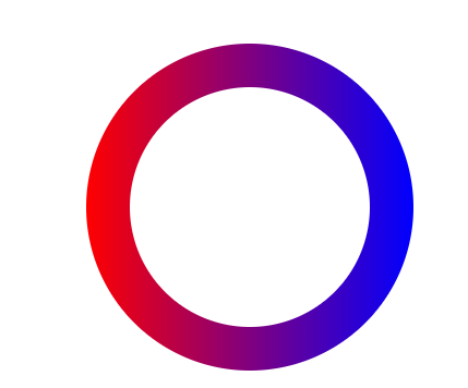
2.基于上图 尝试用背景渐变来解决,so border-image上了,(不要问为啥不用border-color),但是圆角没有了,因为他们都是对border的设置。后从网上看到有伪类去做的背景渐变的按钮。
 <!DOCTYPE html>

 <html>

     <head>

         <meta charset="UTF-8">

         <title>边框渐变的拱形</title>

         <style>

             .border{

               position: relative;

                 border: 4px solid transparent;

                 border-radius: 16px;

                 background: linear-gradient(orange, violet);

                 background-clip: padding-box;

                 padding: 10px;

                 /* just to show box-shadow still works fine */

                 box-shadow: 0 3px 9px black, inset 0 0 9px white;

             }

             .border::after{

                 position: absolute;

                 top: -4px; bottom: -4px;

                 left: -4px; right: -4px;

                 background: linear-gradient(red, blue);

                 content: '';

                 z-index: -1;

                 border-radius: 16px;

             }

         </style>

     </head>

     <body>

         <div class="border"></div>

     </body>

 </html>
效果如下:

3.然后开始改造
 <!DOCTYPE html>

 <html>

     <head>

         <meta charset="UTF-8">

         <title>边框渐变的拱形</title>

         <style>

             .border1{

                 width: 200px;

                 height: 200px;

                 margin:100px auto;

               position: relative;

                 border: 1px solid transparent;

                 border-radius: 200px;

                 background: white;

                 background-clip: padding-box;

                 padding: 10px;

             }

             .border1::after{

                 position: absolute;

                 top: -40px;

                 bottom: -40px;

                 left: -40px;

                  right: -40px;

                 background: linear-gradient(to right,red, blue);

                 content: '';

                 z-index: -1;

                 border-radius: 200px;

             }

         </style>

     </head>

     <body>

         <div class="border1"></div>

     </body>

 </html>
4.再次改造
 <!DOCTYPE html>

 <html>

     <head>

         <meta charset="UTF-8">

         <title>边框渐变的拱形</title>

         <style>

             .border2{

                 width: 200px;

                 height: 100px;

                 margin:100px auto;

               position: relative;

                 border: 1px solid transparent;

                 border-bottom: 0;

                 border-radius: 200px 200px 0 0;

                 background: white;

                 background-clip: padding-box;

                 padding: 10px;

             }

             .border2::after{

                 position: absolute;

                 top: -40px;

                 bottom: 0px;

                 left: -40px;

                  right: -40px;

                 background: linear-gradient(to right,red, blue);

                 content: '';

                 z-index: -1;

                 border-radius: 200px 200px 0 0;

             }

         </style>

     </head>

     <body>

         <div class="border2"></div>

     </body>

 </html>
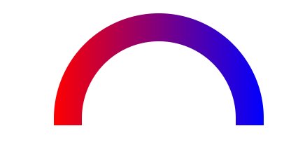
最终达到想要的效果。
css 边框颜色渐变的半圆的更多相关文章
- css边框颜色渐变
在实际开发中,我们经常遇见边框需要背景渐变的实现要求,那么如何去实现呢,今天给大家分享依稀几种情况 1.直角的背景渐变 <!DOCTYPE html> <html lang=&quo ...
- css3实现背景颜色渐变,文字颜色渐变,边框颜色渐变
css3的渐变可以使用2个或者多个指定的颜色之间显示平稳的过渡的效果.这篇文章主要介绍下css3实现背景颜色渐变,文字颜色渐变,边框颜色渐变的方法,以便大家学习参考! 1.css背景颜色渐变 代码: ...
- css文字颜色渐变的3种实现
在web前端开发过程中,UI设计师经常会设计一些带渐变文字的设计图,在以前我们只能用png的图片来代替文字,今天可以实现使用纯CSS实现渐变文字了.下面就介绍3中实现方式供大家参考! 基础样式: .g ...
- CSS 竖线颜色渐变
<!DOCTYPE html><html lang="en"><head><meta charset="UTF-8"& ...
- css背景颜色渐变
1.效果 2.代码 /* 基本色 */ background: #3FB0AC; /* chrome 2+, safari 4+; multiple color stops */ background ...
- css颜色渐变在不同浏览器的设置
在web开发中,难免会遇到浏览器之间的兼容问题,关于Css设置颜色渐变下面有解决的办法,直接上代码: 适用于谷歌浏览器: background: -webkit-gradient(linear, 0 ...
- CSS和JS两种颜色渐变文字效果代码
js实现颜色渐变文字效果代码: <!-- js颜色渐变色文字 --> <div id="moml"> <div style="text-al ...
- 第四界css大会 黑魔法-css网格背景、颜色拾取器、遮罩、文字颜色渐变、标题溢出渐变等
1.css网格背景 <!DOCTYPE html> <html lang="en"> <head> <meta charset=" ...
- css盒子模型之边框宽度,边框颜色与边框样式
/* width和height只是设置盒子内容区的大小,而不是盒子的整个大小, 盒子可见框的大小由内容区,内边距和边框共同决定. */ .box1 { /* 设置内容区的宽度为400px */ wid ...
随机推荐
- iOS平台设置系统状态栏(通知栏、顶部状态栏)样式背景颜色或透明
5+App开发 状态栏 配置系统状态栏样式 iOS平台可支持对系统状态栏样式的配置,在应用manifest.json文件的plus->distribute->apple下添加UIStatu ...
- 【翻译】JavaScript循环和作用域
我的翻译小站:https://www.zcfy.cc/article/javascript-loops-and-scope 翻译原文链接:https://flaviocopes.com/javascr ...
- Hdu4632 Palindrome subsequence 2017-01-16 11:14 51人阅读 评论(0) 收藏
Palindrome subsequence Problem Description In mathematics, a subsequence is a sequence that can be d ...
- hdu 5037 周期优化
http://acm.hdu.edu.cn/showproblem.php?pid=5037 有只青蛙踩石子过河,河宽m,有n个石子坐标已知.青蛙每次最多跳L.现在可以在河中再放一些石子,使得青蛙过河 ...
- html监听,键盘事件
<script type="text/javascript" language=JavaScript charset="UTF-8"> v ...
- 我也谈谈.NET程序员工资低
我从2011年下半年预谋转型,2012春季正式转型到iOS,看了<经过本人 6 年.net 工作经验证明 .net 工资确实比 Java 低>这篇文章,一下子有很多感慨. 我不好意思算我干 ...
- python 查找字符串同时包含数字和字母的最长子字符串的几种实现方法
有个字符串$sd1#111$svda123!!!221&eSSDSDG,包含特殊字符.数字和字母,输出最长的子字符串和他的长度 例如上面的字符串同时包含数字和字母的字符串是svda123,长度 ...
- 如何使用T-SQL备份还原数据库及c#如何调用执行?
准备材料:Microsoft SQL Server一部.需要还原的bak文件一只 一.备份 数据库备份语句:user master backup database 数据库名 to disk='保存路径 ...
- 在Asp.Net MVC中使用NPOI插件实现对Excel的操作(导入,导出,合并单元格,设置样式,输入公式)
前言 NPOI 是 POI 项目的.NET版本,它不使用 Office COM 组件,不需要安装 Microsoft Office,目前支持 Office 2003 和 2007 版本. 1.整个Ex ...
- In file included from adlist.c:34:0: zmalloc.h:50:31: 致命错误:jemalloc/jemalloc.h:没有那个文件或目录
问题: In file included from adlist.c:34:0:zmalloc.h:50:31: 致命错误:jemalloc/jemalloc.h:没有那个文件或目录 解决: make ...