前端CSS3布局display:flex用法
前端CSS3布局display:flex用法
先附上代码
点击查看代码
<!DOCTYPE html>

<html>

  <head>

    <meta charset="utf-8">

    <title>display:flex</title>

    <style>

      .flex-box {

        background-color: aquamarine;

      }

      .flex-box>div {

        background-color: lightgray;

        width: 100px;

        height: 100px;

        text-align: center;

        border: 1px solid red;

      }

    </style>

  </head>

  <body>

    <div class="flex-box">

      <div>1</div>

      <div>2</div>

      <div>3</div>

      <div>4</div>

      <div>5</div>

      <div>6</div>

      <div>7</div>

      <div>8</div>

    </div>

  </body>

</html>
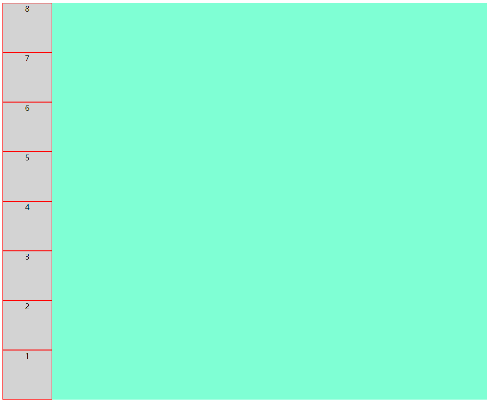
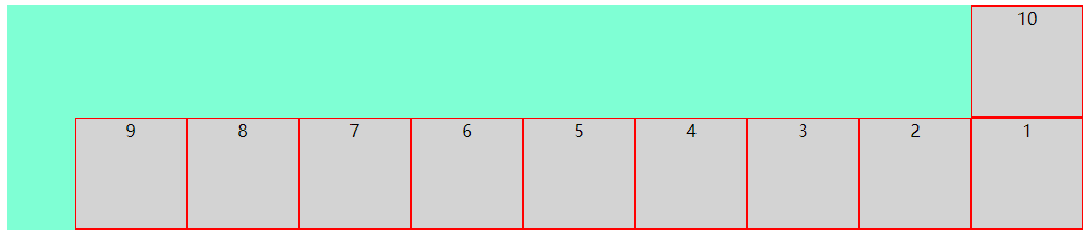
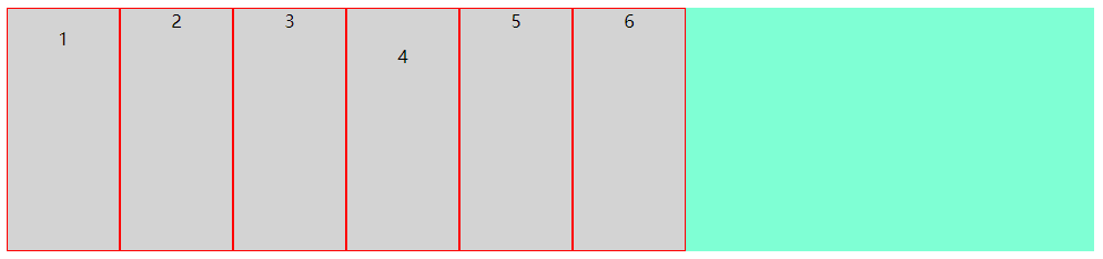
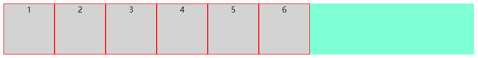
运行效果
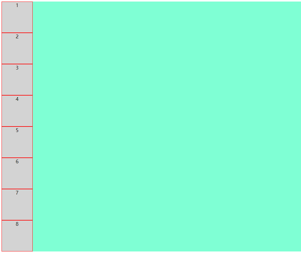
8个小方块呈纵向排列
好,接下来我们看看display:flex到底有哪些好处
先在flex-box中设置display:flex,看看效果
上代码
点击查看代码
.flex-box {

    background-color: aquamarine;

    display: flex;

}
效果图
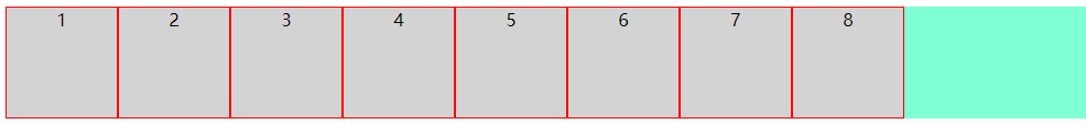
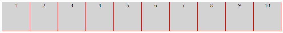
仅仅设置了display: flex,8个小方块呈横向排列了
接下来详解flex布局的几个常用属性
flex-direction
flex-wrap
flex-flow
justify-content
align-items
1. flex-direction
该属性决定小方块按横向或纵向排列
(1):row(决定小方块横向排列,起点在左端)
上代码
点击查看代码
.flex-box {

    background-color: aquamarine;

    display: flex;

    flex-direction: row;

}
效果图
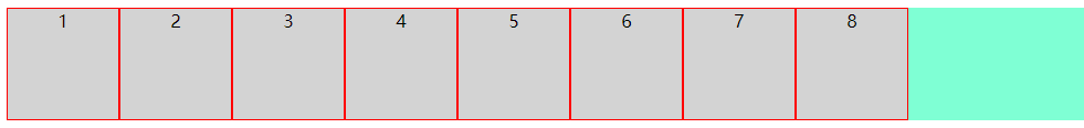
可以看到,样式并没有什么变化,这是因为row是flex-direction的默认排列方式
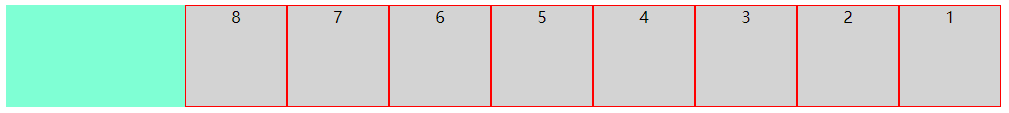
(2):row-reverse(决定小方块横向排列,起点在右端)
上代码
点击查看代码
.flex-box {

    background-color: aquamarine;

    display: flex;

    flex-direction: row-reverse;

}
效果图
(3):column(决定小方块纵向排列,起点在上端)
上代码
点击查看代码
.flex-box {

    background-color: aquamarine;

    display: flex;

    flex-direction: column;

}
效果图
(4):column-reverse(决定小方块纵向排列,起点在下端)
上代码
点击查看代码
.flex-box {

    background-color: aquamarine;

    display: flex;

    flex-direction: column-reverse;

}
效果图
到此,flex-direction属性就讲完了
接下来讲解flex-wrap
2. flex-wrap
该属性决定小方块是否换行,默认不换行,内容会被挤压
(1):nowrap(决定小方块不换行,起点在上端,内容会被挤压)
上代码
点击查看代码
.flex-box {

    background-color: aquamarine;

    display: flex;

    flex-wrap: nowrap;

}
效果图
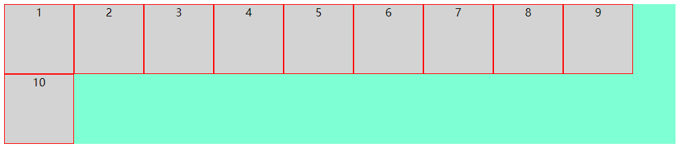
(2):wrap(决定小方块换行,起点在上端,内容不会被挤压,)
上代码
点击查看代码
.flex-box {

    background-color: aquamarine;

    display: flex;

    flex-wrap: wrap;

}
效果图
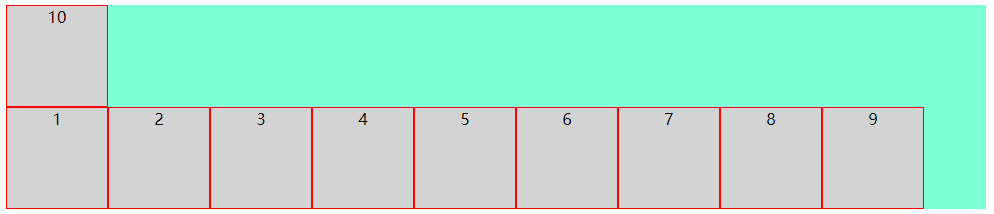
(3):wrap-reverse(决定小方块换行,起点在下端,内容不会被挤压,)
上代码
点击查看代码
.flex-box {

    background-color: aquamarine;

    display: flex;

    flex-wrap: wrap-reverse;

}
效果图
3. flex-flow
该属性是用于同时设置 flex-direction 和 flex-wrap 属性的简写属性
包含如下几种可能
row nowrap|wrap|wrap-reverse
row-reverse nowrap|wrap|wrap-reverse
column nowrap|wrap|wrap-reverse
column-reverse nowrap|wrap|wrap-reverse
由于可能太多了,下面只列举了一种,但小编试过了,所有的可能都是对的
(1):row-reverse wrap-reverse(决定小方块呈横向排列且起点在右端,换行且起点在下端,内容不会被挤压)
上代码
点击查看代码
.flex-box {

    background-color: aquamarine;

    display: flex;

    flex-flow: row-reverse wrap-reverse;

}
效果图
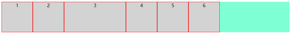
4. justify-content
该属性决定小方块在纵轴上的对齐方式
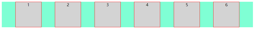
(1):flex-start(决定小方块左对齐)
上代码
点击查看代码
.flex-box {

    background-color: aquamarine;

    display: flex;

    justify-content: flex-start;

}
效果图
(2):center(决定小方块中心对齐)
上代码
点击查看代码
.flex-box {

    background-color: aquamarine;

    display: flex;

    justify-content: center;

}
效果图
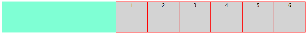
(3):flex-end(决定小方块右对齐)
上代码
点击查看代码
.flex-box {

    background-color: aquamarine;

    display: flex;

    justify-content: flex-end;

}
效果图
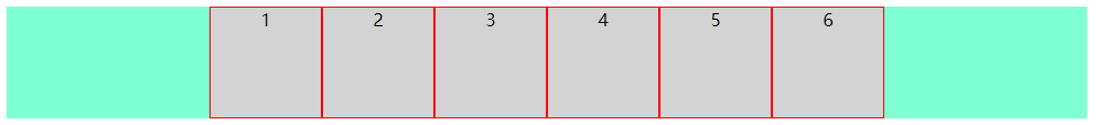
(4):space-around(决定小方块之间的间隔比小方块与边框的间隔大一倍)
上代码
点击查看代码
.flex-box {

    background-color: aquamarine;

    display: flex;

    justify-content: space-around;

}
效果图
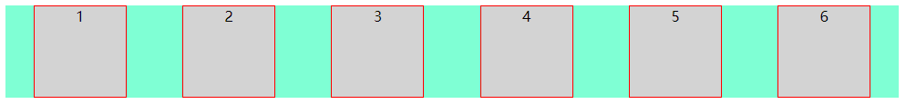
(5):space-between(决定小方块两端对齐,小方块之间间隔相等)
上代码
点击查看代码
.flex-box {

    background-color: aquamarine;

    display: flex;

    justify-content: space-between;

}
效果图
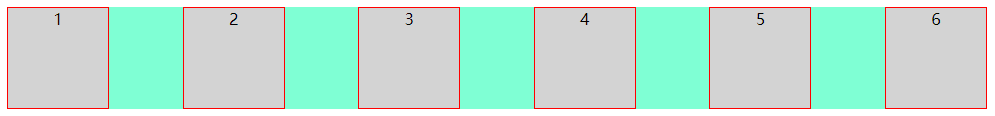
(6):space-evenly(决定小方块之间的间隔相等)
上代码
点击查看代码
.flex-box {

    background-color: aquamarine;

    display: flex;

    justify-content: space-evenly;

}
效果图
5. align-items
该属性决定小方块在横轴上的对齐方式
(1):flex-start(决定小方块上对齐)
上代码
点击查看代码
.flex-box {

    background-color: aquamarine;

    display: flex;

    align-items: flex-start;

}
效果图
(2):center(决定小方块中心对齐)
上代码
点击查看代码
.flex-box {

    background-color: aquamarine;

    display: flex;

    align-items: center;

}
效果图
(3):flex-end(决定小方块下对齐)
上代码
点击查看代码
.flex-box {

    background-color: aquamarine;

    display: flex;

    align-items: flex-end;

}
效果图
(4):baseline(决定小方块第一行文字的基线对齐)
上代码
点击查看代码
.flex-box {

    background-color: aquamarine;

    display: flex;

    align-items: baseline;

}
效果图
(5):stretch(决定小方块占满整个容器的高度)
注意:小方块的高度应不设置或设置为auto
上代码
点击查看代码
.flex-box {

    background-color: aquamarine;

    display: flex;

    align-items: stretch;

}
效果图
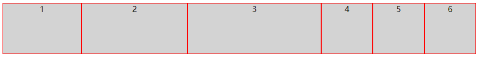
以上是容器的属性,接下来我们讲解小方块的属性
order
flex-grow
flex-shrink
flex-basis
flex
align-self
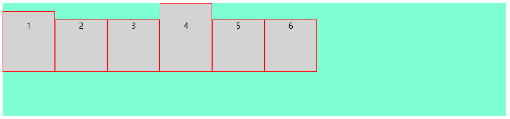
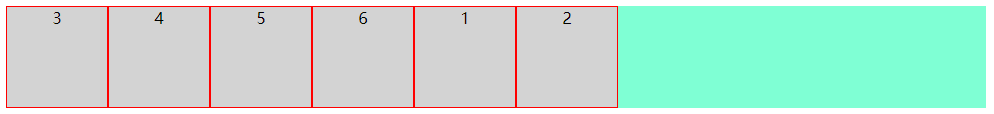
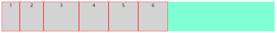
(1):order(决定小方块显示的顺序,默认为0)
注意:小方块order不设置或设置为0的优先级比设置为1的优先级高
注意:该值必须为数字
上代码
点击查看代码
<div class="flex-box">

  <div style="order: 1">1</div>

  <div style="order: 2">2</div>

  <div style="order: 0">3</div>

  <div>4</div>

  <div>5</div>

  <div>6</div>

</div>
效果图
(2):flex-grow(决定某个小方块相对于其它小方块将增长多少)
注意:该值必须为数字,数值越大,增长越多
上代码
点击查看代码
<div class="flex-box">

  <div style="flex-grow: 1">1</div>

  <div style="flex-grow: 2">2</div>

  <div style="flex-grow: 3">3</div>

  <div>4</div>

  <div>5</div>

  <div>6</div>

</div>
效果图
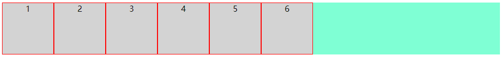
将窗口变长

(3):flex-shrink(决定某个小方块相对于其它小方块将收缩多少)
注意:该值必须为数字,数值越大,收缩越多
上代码
点击查看代码
<div class="flex-box">

  <div style="flex-shrink: 1">1</div>

  <div style="flex-shrink: 2">2</div>

  <div style="flex-shrink: 3">3</div>

  <div>4</div>

  <div>5</div>

  <div>6</div>

</div>
效果图
将窗口缩小
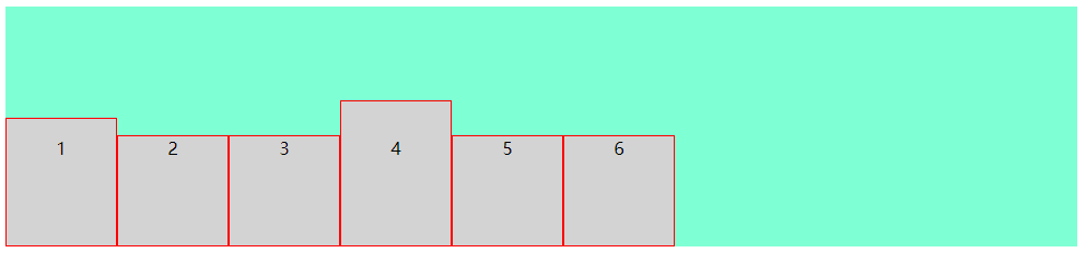
(4):flex-basis(决定某个小方块的初始长度)
上代码
点击查看代码
<div class="flex-box">

  <div style="flex-basis: 60px">1</div>

  <div style="flex-basis: 80px">2</div>

  <div style="flex-basis: 120px">3</div>

  <div>4</div>

  <div>5</div>

  <div>6</div>

</div>
效果图
(5):flex(flex-grow、flex-shrink 和 flex-basis 属性的简写属性)
上代码
点击查看代码
<div class="flex-box">

  <div>1</div>

  <div>2</div>

  <div style="flex: 0 0 200px">3</div>

  <div>4</div>

  <div>5</div>

  <div>6</div>

</div>
效果图
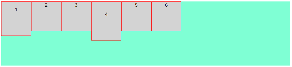
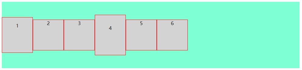
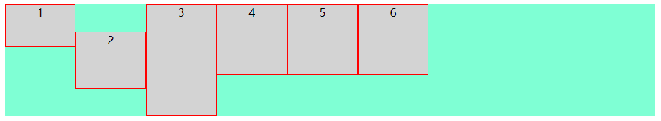
(6):align-self(决定某个小方块的对齐方式,将覆盖容器的 align-items 属性所设置的默认对齐方式)
上代码
点击查看代码
<div class="flex-box">

  <div style="align-self: flex-start; height: 60px;">1</div>

  <div style="align-self: center;  height: 80px;">2</div>

  <div style="align-self: flex-end;  height: 160px;">3</div>

  <div>4</div>

  <div>5</div>

  <div>6</div>

</div>
效果图
至此,display:flex的常用用法就讲完了
前端CSS3布局display:flex用法的更多相关文章
- 前端CSS3布局display:grid用法
前端CSS3布局display:flex用法 1. 先附上代码 点击查看代码 <!DOCTYPE html> <html> <head> <meta char ...
- CSS弹性盒布局(display:flex)
CSS弹性布局(display:flex) 参考: http://www.runoob.com/w3cnote/flex-grammar.html https://www.jianshu.com/p/ ...
- css3 伸缩布局 display:flex等
<!DOCTYPE html> <html lang="en"> <head> <meta charset="UTF-8&quo ...
- 弹性盒布局display:flex详解
一:弹性盒子 随着响应式设计的流行,网站开发者在设计网页布局时往往要考虑到页面在适配不同分辨率的浏览器时其内部组件位置大小都会产生变化,因此需要设计者根据窗口尺寸来调整布局,从而改变组件的尺寸和位置, ...
- css3布局属性flex
html代码如下: <ul class="ul_box"> <li><a href="#">html</a>&l ...
- css display:flex 属性
一:display:flex 布局 display:flex 是一种布局方式.它即可以应用于容器中,也可以应用于行内元素.是W3C提出的一种新的方案,可以简便.完整.响应式地实现各种页面布局.目前,它 ...
- CSS3:布局display属性的flex(弹性布局)
CSS3:布局display属性的flex(弹性布局) 一.简介 Flex是Flexible Box的缩写,意为"弹性布局",用来为盒状模型提供最大的灵活性.设为Flex布局以后, ...
- 浅谈CSS3中display属性的Flex布局
浅谈CSS3中display属性的Flex布局 最近在学习微信小程序,在设计首页布局的时候,新认识了一种布局方式display:flex 1 .container { 2 display: fle ...
- 【分享】谈CSS3中display属性的flex布局
最近在学习微信小程序(重新学习微信小程序),在设计首页布局的时候,新认识了一种布局方式display:flex .guide-top{ height: 36%; display: flex; /*fl ...
随机推荐
- Pullword 中文分词
安装 npm install pullword 使用 var defaultOptions = { url: 'http://api.pullword.com/post.php', /* api ...
- 抽象方法不能为private,final或者static,为什么?
4)抽象方法不能为private,final或者static, native, synchrozied为什么?[新手可忽略不影响继续学习]马克-to-win:抽象方法的最实质的意义在于被未来的子类覆盖 ...
- java静态方法和实例方法的区别
静态方法(方法前冠以static)和实例方法(前面未冠以static)的区别 调用静态方法或说类方法时,可以使用类名做前缀,也可以使用某一个具体的对象名:通常使用类名.static方法只能处理sta ...
- Virtual Function(虚函数)in c++
Virtual Function(虚函数)in c++ 用法: virtual void log() { std::cout << "hello world!" < ...
- FreeRTOS+CubeMX编程实践
一.关于FreeRTOS 1.什么是FreeRTOS? FreeRTOS是一个轻量级的操作系统.FreeRTOS提供的功能包括:任务管理.时间管理.信号量.消息队列.内存管理.记录功能等,可基本满足较 ...
- 在UnityUI中绘制线状统计图
##先来个效果图 觉得不好看可以自己调整 ##1.绘制数据点 线状图一般由数据点和连线组成 在绘制连线之前,我们先标出数据点 这里我选择用Image图片来绘制数据点 新建Canvas,添加空物体Gra ...
- NodeJS学习日报day4——模块化
// console.log(module); // 执行顺序不同,结果也不同 // module.exports = { // name : 'Cra2iTeT', // hi() { // con ...
- JavaScript学习总结2-对象
JavaScript中对象除了最后一个属性以外都在结尾加逗号,同时所有属性都要在{ }内 1 <!DOCTYPE html> 2 <html lang="en"& ...
- gin框架使用【4.请求参数】
GET url: http://127.0.0.1:8080/users?id=1&name=卷毛狒狒 package mainimport ( "github.com/gin-go ...
- 快速排序算法 - go实现
在分析redis集群中大Key的时候,通常都采用分析rdb文件的方式:但是这种方式需要在每一台redis服务器上部署分析程序及分析脚本,而像salt之类的工具运维没有开放给我们使用,一台一台部署不好管 ...