Boostrap(2)
网页布局
1.网格布局
网格布局就是把网页分为许多小格子,看起来像table,然后在每个小格子中放我们的内容。当然,我们也可以指定一片区域使用网格系统。网格布局主要是应用在移动设备上的,使用方法如下:
- 使用行来创建列的水平组
- 行必须放置在 .container class 内
- 每行会自动产生十二个列,内容需要跨列需使用col-xs-4等类
- 内容应该放置在列内,且唯有列可以是行的直接子元素
示例代码
 <!doctype html>

 <html>

 <head>

 <meta charset="utf-8">

 <title>start</title>

 <link href="../CSS/bootstrap.min.css" rel="stylesheet" type="text/css">

 <script type="text/javascript" src="../js/jquery-1.11.2.min.js"></script>

 <script type="text/javascript" src="../js/bootstrap.js"></script>

 <meta name="viewport" content="width=device-width,initial-scale=1"/>

 <!--[if lt IE 9]>

         <script src="http://html5shim.googlecode.com/svn/trunk/html5.js"></script>

         <![endif]-->

 </head>

 <body>

 <div class="container">

   <h1 class="page-header">布局<small>使用bootstrap网格系统布局</small></h1>

   <p>这是一个段落</p>

   <div class="row">

     <div class="col-xs-6">

       <h2 class="page-header">区块一</h2>

       <p>这是一个段落</p>

     </div>

     <div class="col-xs-4">

       <h2 class="page-header">区块二</h2>

       <p>这是一个段落</p>

     </div>

     <div class="col-xs-2">

       <h2 class="page-header">区块三</h2>

       <p>这是一个段落</p>

     </div>

   </div>

 </div>

 </body>

 </html>
效果:
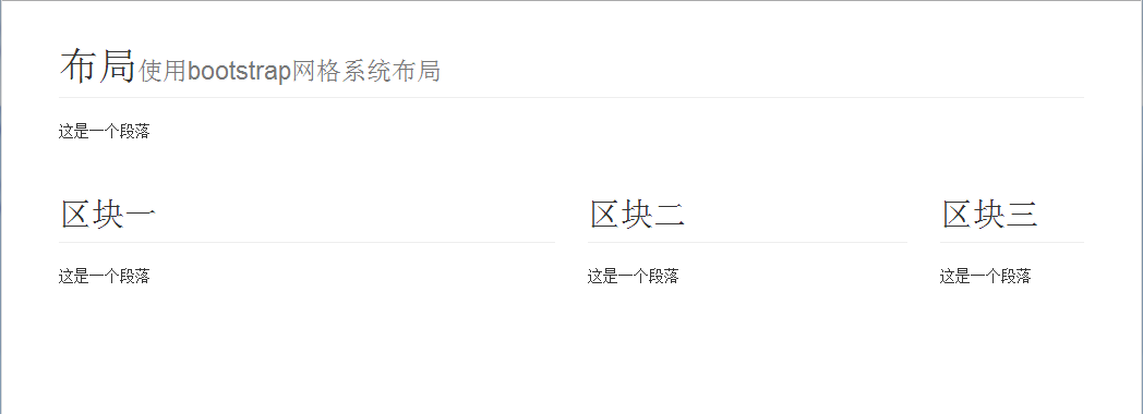
我们会发现第一个最宽,第二个次之,第三个最小。
关于网格布局的详细说明可以参考以下链接: 链接1
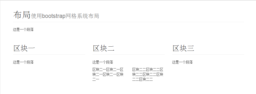
2.嵌套布局
在下面的示例代码中我们可以看到,在一个网格中,我们有加入了新的网格(class="row"),这就是所谓的嵌套布局,加入的网格每行仍然是12格。
 <!doctype html>

 <html>

 <head>

 <meta charset="utf-8">

 <title>start</title>

 <link href="../CSS/bootstrap.min.css" rel="stylesheet" type="text/css">

 <script type="text/javascript" src="../js/jquery-1.11.2.min.js"></script>

 <script type="text/javascript" src="../js/bootstrap.js"></script>

 <meta name="viewport" content="width=device-width,initial-scale=1"/>

 <!--[if lt IE 9]>

         <script src="http://html5shim.googlecode.com/svn/trunk/html5.js"></script>

         <![endif]-->

 </head>

 <body>

 <div class="container">

   <h1 class="page-header">布局<small>使用bootstrap网格系统布局</small></h1>

   <p>这是一个段落</p>

   <div class="row">

     <div class="col-xs-4">

       <h2 class="page-header">区块一</h2>

       <p>这是一个段落</p>

     </div>

     <div class="col-xs-4">

       <h2 class="page-header">区块二</h2>

       <p>这是一个段落</p>

       <div class="row">

         <div class="col-xs-6"> 区块二一区块二一区块二一区块二一区块二一 </div>

         <div class="col-xs-6"> 区块二二区块二二区块二二区块二二区块二二区块二二 </div>

       </div>

     </div>

     <div class="col-xs-4">

       <h2 class="page-header">区块三</h2>

       <p>这是一个段落</p>

     </div>

   </div>

 </div>

 </body>

 </html>
效果:
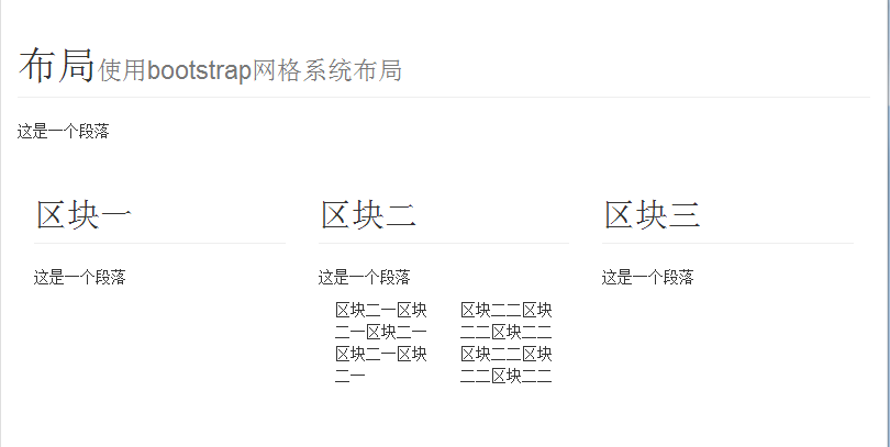
3.流动布局
使用流动布局会根据页面窗口的大小自动去缩放,我们知道网格是放在容器中的,前面的容器大小是固定的,比如(720px之类的),使用流动布局容器的大小则使用的是百分比。
<!doctype html>

<html>

<head>

<meta charset="utf-8">

<title>start</title>

<link href="../CSS/bootstrap.min.css" rel="stylesheet" type="text/css">

<script type="text/javascript" src="../js/jquery-1.11.2.min.js"></script>

<script type="text/javascript" src="../js/bootstrap.js"></script>

<meta name="viewport" content="width=device-width,initial-scale=1"/>

<!--[if lt IE 9]>

        <script src="http://html5shim.googlecode.com/svn/trunk/html5.js"></script>

        <![endif]-->

</head>

<body>

<div class="container-fluid">

  <h1 class="page-header">布局<small>使用bootstrap网格系统布局</small></h1>

  <p>这是一个段落</p>

  <div class="row-fluid">

    <div class="col-xs-4">

      <h2 class="page-header">区块一</h2>

      <p>这是一个段落</p>

    </div>

    <div class="col-xs-4">

      <h2 class="page-header">区块二</h2>

      <p>这是一个段落</p>

      <div class="row-fluid">

        <div class="col-xs-6"> 区块二一区块二一区块二一区块二一区块二一 </div>

        <div class="col-xs-6"> 区块二二区块二二区块二二区块二二区块二二区块二二 </div>

      </div>

    </div>

    <div class="col-xs-4">

      <h2 class="page-header">区块三</h2>

      <p>这是一个段落</p>

    </div>

  </div>

</div>

</body>

</html>
效果:(流动布局和固定布局在显示效果差异上并不明显,这和网页的复杂程度有关)
4.响应式布局
由于上网设备的差异(电脑,笔记本,手机),同一个页面在不同设备上的显示效果不同,甚至很糟糕。为了避免这种情况,可以使用响应式布局。响应式布局就是根据屏幕尺寸的大小来使用不同的css。
<!doctype html>

<html>

<head>

<meta charset="utf-8">

<title>start</title>

<link href="../CSS/bootstrap.min.css" rel="stylesheet" type="text/css">

<script type="text/javascript" src="../js/jquery-1.11.2.min.js"></script>

<script type="text/javascript" src="../js/bootstrap.js"></script>

<meta name="viewport" content="width=device-width,initial-scale=1"/>

<!--[if lt IE 9]>

        <script src="http://html5shim.googlecode.com/svn/trunk/html5.js"></script>

<![endif]-->

<style>

    body{

        background:#F90E24;

    }

    @media(max-width:500px){

        body{

            background:#592BF7;

        }

    }

</style>

</head>

<body>

</body>

</html>
代码中的@media(max-width:500px)表示屏幕大小在0-500px时,使用大括号中的css代码。相应的@media(min-width:500px)表示屏幕在500px以上的时,使用相应的样式。
bootstrap中也提供了响应式的css,不过需要去官网定制 下面的链接也提供了响应式的css文件下载。http://bootstrap.ninghao.net/getting-started.html
Boostrap(2)的更多相关文章
- Boostrap入门(一)
1.第一步:下载Boostrap有关文件 Boostrap中文网:http://www.bootcss.com/ -->--> 2.第二步: 如下代码:引入相关文件即可. <!DOC ...
- Boostrap
基本认知: Boostrap绝对是目前最流行用得最广泛的一款框架.它是一套优美,直观并且给力的web设计工具包,可以用来开发跨浏览器兼容并且美观大气的页面. Bootstrap的优缺点: 缺点: 1. ...
- 【转】Validate + Boostrap tooltip 表单验证示例
一.工具准备: 1.boostrap: 下载地址 http://getbootstrap.com/ jquery: jQuery版本需大于或等于1.8.0 jquery.validate.min.j ...
- 用H5+Boostrap做简单的音乐播放器
前言:这个是综合一下我最近在学的东西做的小Demo,到实际使用还有距离,但是用来练手巩固知识点还是不错的,最近在二刷JS书和Boostrap.css的源码,做完这个Demo也算是暂告一段落,接下来是j ...
- vue.js+boostrap最佳实践
一.为什么要写这篇文章 最近忙里偷闲学了一下vue.js,同时也复习了一下boostrap,发现这两种东西如果同时运用到一起,可以发挥很强大的作用,boostrap优雅的样式和丰富的组件使得页面开发变 ...
- 我发现调用boostrap的弹框
在引用了boostrap.js和boostrap.css之后 本来boostrap是基于jQuery的.但是我们的项目里没有用jQuery,而是用的zepto. 调用boostrap的弹框有两种方式: ...
- Boostrap栅格系统
Boostrap排版.链接样式设置了基本的全局样式.分别是:为body元素设置 布局容器:Bootstrap需要为页面内容和栅格系统包裹一个:container容器.Bootstrap提供了两个作此用 ...
- boostrap中lg,md,sm,xs
boostrap中lg,md,sm,xs分别表示多少px? .col-xs- 超小屏幕 手机 (<768px).col-sm- 小屏幕 平板 (≥768px).col-md- 中等屏幕 桌面显示 ...
- AngularJS Boostrap Pagination Sample
首先,样式是这样的 首先,Service端是Webapi REST JSON格式 第二,我们建立一个Wrapper Class,这里你也可以定义一个Generic<T>,作为示例,我们这里 ...
- H5+Boostrap的音乐播放器
H5+Boostrap做简单的音乐播放器 前言:这个是综合一下我最近在学的东西做的小Demo,到实际使用还有距离,但是用来练手巩固知识点还是不错的,最近在二刷JS书和Boostrap.css的源码,做 ...
随机推荐
- 001.linux下clock()检测程序运行时间
#include <stdio.h> #include <time.h> int main() { int i; int k; clock_t start,end; //clo ...
- phpcmsv9 标题颜色显示问题
在解决标题颜色问题之前首先要注意到 标题字段为title,副标题为fu_title. 如果一个文章想在首页推荐,又想在栏目首页推荐,并且这两个推荐位置的标题长度不一样,那只能用副标题区别,这样就可以在 ...
- Hive variable demo
create table ori_trans (account string, maker string, tdate string) partitioned by (country string); ...
- Ajax与用户交互的存储格式JSON
数据存储是JavaScript的核心功能,这是一个在学习前期的一个容易让人迷惑的问题.它并不是那种像页面滑动.幻灯片展示.淡入淡出等吸引人眼球的特效.适当的存放好数据,就有利于我们组织起结构,又能使应 ...
- QEMU启动时插入tap虚拟网卡
1.利用brctl命令创建虚拟网桥br0 brctl addbr br0 ifconfig br0 up //上述两条命令分开执行会导致网络断开 2.将虚拟网桥br0与物理网卡eth0绑定 brctl ...
- PHP中的include和require
1.include语句 使用include语句可以告诉PHP提取特定的文件,并载入它的全部内容 <?php inlude "fileinfo.php"; //此处添加其他代码 ...
- UVALive 5966 Blade and Sword -- 搜索(中等题)
题意:给一幅地图,P为起点,D为终点,'*'为传送阵,到达传送阵可以传到任意一个其他的传送阵,传到以后可以正常走或者再传回来,问P->D最短步数. 分析:这题一定要细心,分析要到位才能搞定,错一 ...
- 三维网格形变算法(Laplacian-Based Deformation)
网格上顶点的Laplace坐标(均匀权重)定义为:,其中di为顶点vi的1环邻域顶点数. 网格Laplace坐标可以用矩阵形式表示:△=LV,其中,那么根据网格的Laplace坐标通过求解稀疏线性方程 ...
- 对访问修饰关键字public, protected, internal and private的说明
对访问修饰关键字public, protected, internal and private的说明1.msdn: Internal types or members are accessible o ...
- iOS获取窗口当前显示的控制器
解决类似网易新闻客户端收到新闻推送后,弹出一个UIAlert,然后跳转到新闻详情页面这种需求 1.提供一个UIView的分类方法,这个方法通过响应者链条获取view所在的控制器 - (UIViewCo ...