【转载】How to Use t-SNE Effectively —— (机器学习数据可视化) t-SNE使用指南
原文地址:https://distill.pub/2016/misread-tsne/
说明: 原文是比较有名的一个指南性博文,讲的就是t-SNE技术的一些使用注意事项和说明,属于说明性文章,内容很不错。
原文是可以进行可视化交互操作这个t-SNE算法示例的,喜欢进行手动交互操作改算法例子的可以跳转到原文。
=================================================
How to Use t-SNE Effectively
Although extremely useful for visualizing high-dimensional data, t-SNE plots can sometimes be mysterious or misleading. By exploring how it behaves in simple cases, we can learn to use it more effectively.
A popular method for exploring high-dimensional data is something called t-SNE, introduced by van der Maaten and Hinton in 2008 [1]. The technique has become widespread in the field of machine learning, since it has an almost magical ability to create compelling two-dimensonal “maps” from data with hundreds or even thousands of dimensions. Although impressive, these images can be tempting to misread. The purpose of this note is to prevent some common misreadings.
We’ll walk through a series of simple examples to illustrate what t-SNE diagrams can and cannot show. The t-SNE technique really is useful—but only if you know how to interpret it.
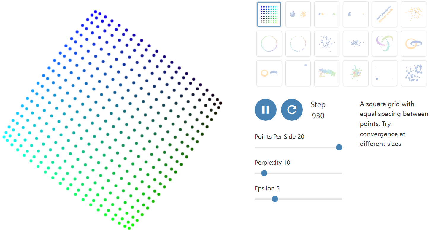
Before diving in: if you haven’t encountered t-SNE before, here’s what you need to know about the math behind it. The goal is to take a set of points in a high-dimensional space and find a faithful representation of those points in a lower-dimensional space, typically the 2D plane. The algorithm is non-linear and adapts to the underlying data, performing different transformations on different regions. Those differences can be a major source of confusion.
A second feature of t-SNE is a tuneable parameter, “perplexity,” which says (loosely) how to balance attention between local and global aspects of your data. The parameter is, in a sense, a guess about the number of close neighbors each point has. The perplexity value has a complex effect on the resulting pictures. The original paper says, “The performance of SNE is fairly robust to changes in the perplexity, and typical values are between 5 and 50.” But the story is more nuanced than that. Getting the most from t-SNE may mean analyzing multiple plots with different perplexities.
That’s not the end of the complications. The t-SNE algorithm doesn’t always produce similar output on successive runs, for example, and there are additional hyperparameters related to the optimization process.
==========================================
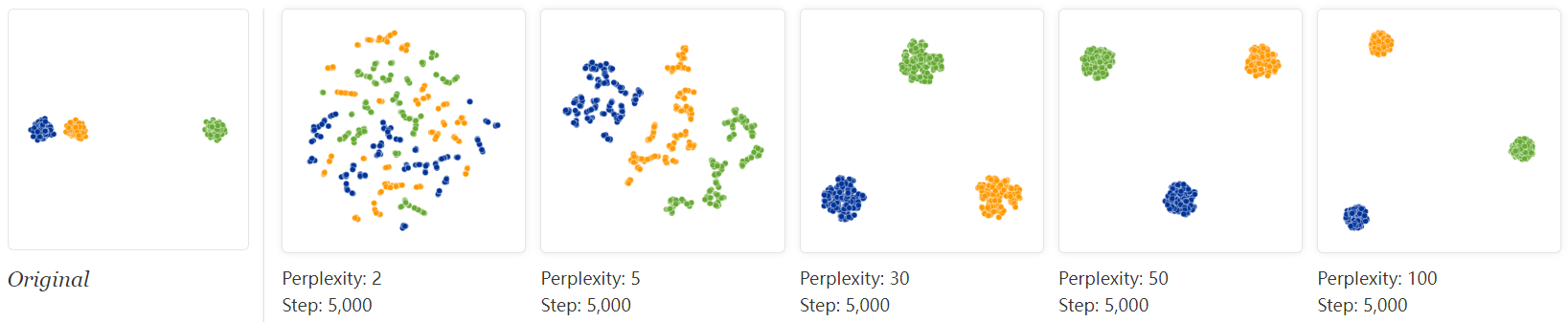
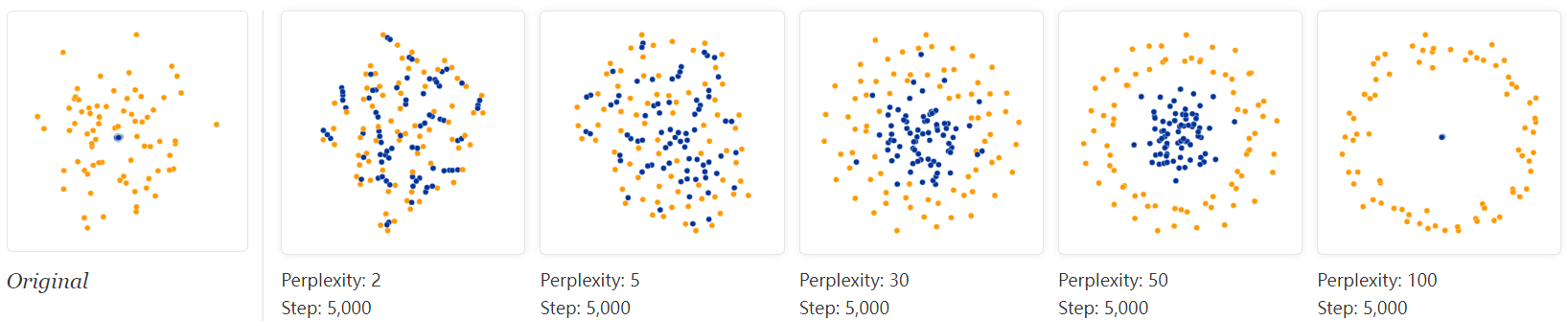
1. Those hyperparameters really matter
Let’s start with the “hello world” of t-SNE: a data set of two widely separated clusters. To make things as simple as possible, we’ll consider clusters in a 2D plane, as shown in the lefthand diagram. (For clarity, the two clusters are color coded.) The diagrams at right show t-SNE plots for five different perplexity values.
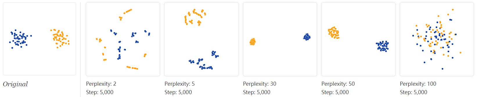
With perplexity values in the range (5 - 50) suggested by van der Maaten & Hinton, the diagrams do show these clusters, although with very different shapes. Outside that range, things get a little weird. With perplexity 2, local variations dominate. The image for perplexity 100, with merged clusters, illustrates a pitfall: for the algorithm to operate properly, the perplexity really should be smaller than the number of points. Implementations can give unexpected behavior otherwise.
Each of the plots above was made with 5,000 iterations with a learning rate (often called “epsilon”) of 10, and had reached a point of stability by step 5,000. How much of a difference do those values make? In our experience, the most important thing is to iterate until reaching a stable configuration.
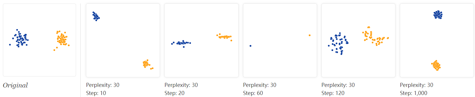
The images above show five different runs at perplexity 30. The first four were stopped before stability. After 10, 20, 60, and 120 steps you can see layouts with seeming 1-dimensional and even pointlike images of the clusters. If you see a t-SNE plot with strange “pinched” shapes, chances are the process was stopped too early. Unfortunately, there’s no fixed number of steps that yields a stable result. Different data sets can require different numbers of iterations to converge.
Another natural question is whether different runs with the same hyperparameters produce the same results. In this simple two-cluster example, and most of the others we discuss, multiple runs give the same global shape. Certain data sets, however, yield markedly different diagrams on different runs; we’ll give an example of one of these later.
From now on, unless otherwise stated, we’ll show results from 5,000 iterations. That’s generally enough for convergence in the (relatively small) examples in this essay. We’ll keep showing a range of perplexities, however, since that seems to make a big difference in every case.
=================================================
2. Cluster sizes in a t-SNE plot mean nothing
So far, so good. But what if the two clusters have different standard deviations, and so different sizes? (By size we mean bounding box measurements, not number of points.) Below are t-SNE plots for a mixture of Gaussians in plane, where one is 10 times as dispersed as the other.

Surprisingly, the two clusters look about same size in the t-SNE plots. What’s going on? The t-SNE algorithm adapts its notion of “distance” to regional density variations in the data set. As a result, it naturally expands dense clusters, and contracts sparse ones, evening out cluster sizes. To be clear, this is a different effect than the run-of-the-mill fact that any dimensionality reduction technique will distort distances. (After all, in this example all data was two-dimensional to begin with.) Rather, density equalization happens by design and is a predictable feature of t-SNE.
The bottom line, however, is that you cannot see relative sizes of clusters in a t-SNE plot.
=================================================
3. Distances between clusters might not mean anything
What about distances between clusters? The next diagrams show three Gaussians of 50 points each, one pair being 5 times as far apart as another pair.
At perplexity 50, the diagram gives a good sense of the global geometry. For lower perplexity values the clusters look equidistant. When the perplexity is 100, we see the global geometry fine, but one of the cluster appears, falsely, much smaller than the others. Since perplexity 50 gave us a good picture in this example, can we always set perplexity to 50 if we want to see global geometry?
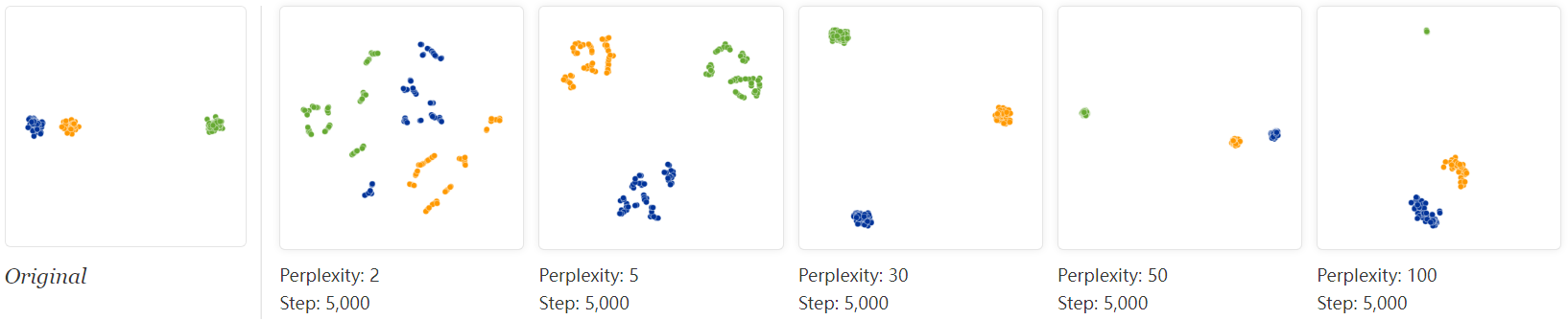
Sadly, no. If we add more points to each cluster, the perplexity has to increase to compensate. Here are the t-SNE diagrams for three Gaussian clusters with 200 points each, instead of 50. Now none of the trial perplexity values gives a good result.
It’s bad news that seeing global geometry requires fine-tuning perplexity. Real-world data would probably have multiple clusters with different numbers of elements. There may not be one perplexity value that will capture distances across all clusters—and sadly perplexity is a global parameter. Fixing this problem might be an interesting area for future research.
The basic message is that distances between well-separated clusters in a t-SNE plot may mean nothing.
=================================================
4. Random noise doesn’t always look random.
A classic pitfall is thinking you see patterns in what is really just random data. Recognizing noise when you see it is a critical skill, but it takes time to build up the right intuitions. A tricky thing about t-SNE is that it throws a lot of existing intuition out the window. The next diagrams show genuinely random data, 500 points drawn from a unit Gaussian distribution in 100 dimensions. The left image is a projection onto the first two coordinates.
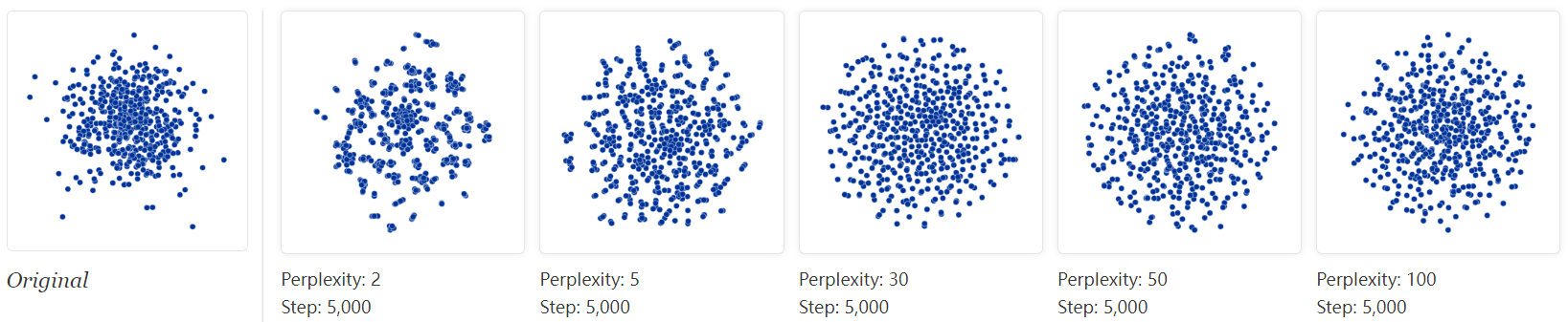
The plot with perplexity 2 seems to show dramatic clusters. If you were tuning perplexity to bring out structure in the data, you might think you’d hit the jackpot.
Of course, since we know the cloud of points was generated randomly, it has no statistically interesting clusters: those “clumps” aren’t meaningful. If you look back at previous examples, low perplexity values often lead to this kind of distribution. Recognizing these clumps as random noise is an important part of reading t-SNE plots.
There’s something else interesting, though, which may be a win for t-SNE. At first the perplexity 30 plot doesn’t look like a Gaussian distribution at all: there’s only a slight density difference across different regions of the cloud, and the points seem suspiciously evenly distributed. In fact, these features are saying useful things about high-dimensional normal distributions, which are very close to uniform distributions on a sphere: evenly distributed, with roughly equal spaces between points. Seen in this light, the t-SNE plot is more accurate than any linear projection could be.
=================================================
5. You can see some shapes, sometimes
It’s rare for data to be distributed in a perfectly symmetric way. Let’s take a look at an axis-aligned Gaussian distribution in 50 dimensions, where the standard deviation in coordinate i is 1/i. That is, we’re looking at a long-ish ellipsoidal cloud of points.
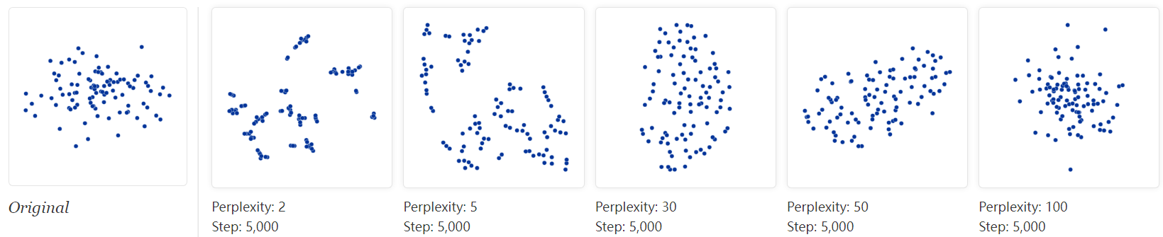
For high enough perplexity values, the elongated shapes are easy to read. On the other hand, at low perplexity, local effects and meaningless “clumping” take center stage. More extreme shapes also come through, but again only at the right perplexity. For example, here are two clusters of 75 points each in 2D, arranged in parallel lines with a bit of noise.
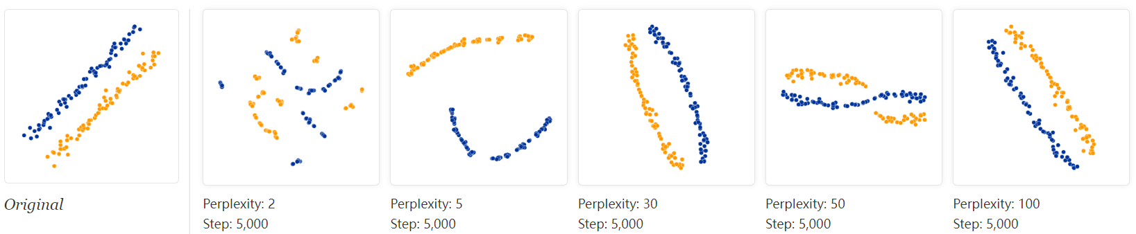
For a certain range of perplexity the long clusters look close to correct, which is reassuring.
Even in the best cases, though, there’s a subtle distortion: the lines are slightly curved outwards in the t-SNE diagram. The reason is that, as usual, t-SNE tends to expand denser regions of data. Since the middles of the clusters have less empty space around them than the ends, the algorithm magnifies them.
=================================================
6. For topology, you may need more than one plot
Sometimes you can read topological information off a t-SNE plot, but that typically requires views at multiple perplexities. One of the simplest topological properties is containment. The plots below show two groups of 75 points in 50 dimensional space. Both are sampled from symmetric Gaussian distributions centered at the origin, but one is 50 times more tightly dispersed than the other. The “small” distribution is in effect contained in the large one.
The perplexity 30 view shows the basic topology correctly, but again t-SNE greatly exaggerates the size of the smaller group of points. At perplexity 50, there’s a new phenomenon: the outer group becomes a circle, as the plot tries to depict the fact that all its points are about the same distance from the inner group. If you looked at this image alone, it would be easy to misread these outer points as a one-dimensional structure.
What about more complicated types of topology? This may be a subject dearer to mathematicians than to practical data analysts, but interesting low-dimensional structures are occasionally found in the wild.
Consider a set of points that trace a link or a knot in three dimensions. Once again, looking at multiple perplexity values gives the most complete picture. Low perplexity values give two completely separate loops; high ones show a kind of global connectivity.
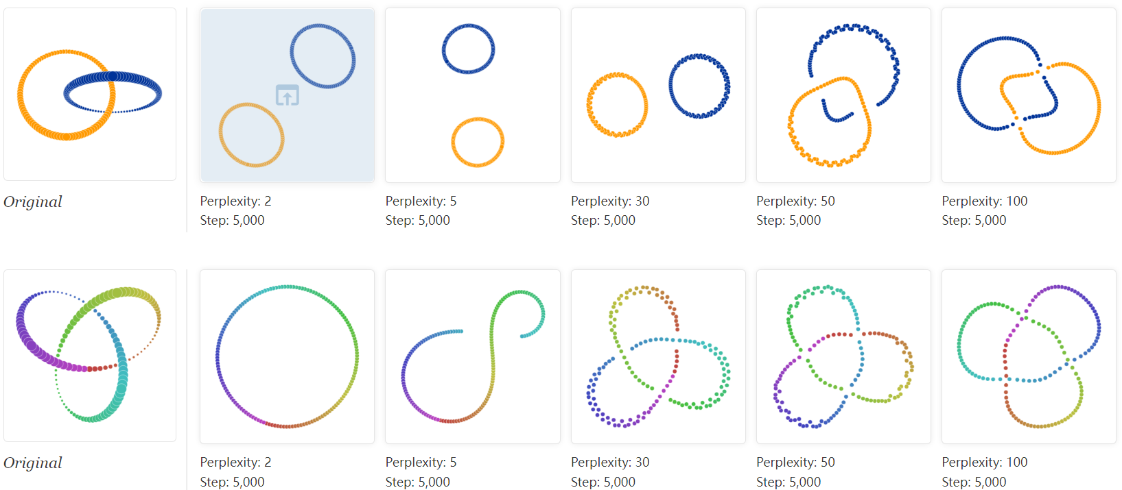
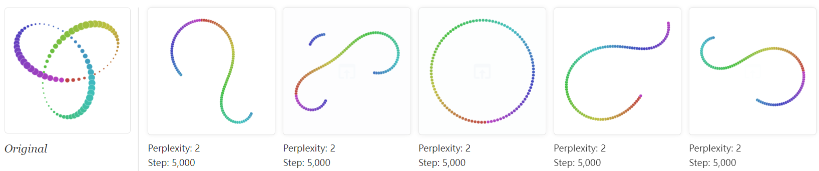
The trefoil knot is an interesting example of how multiple runs affect the outcome of t-SNE. Below are five runs of the perplexity-2 view.
The algorithm settles twice on a circle, which at least preserves the intrinsic topology. But in three of the runs it ends up with three different solutions which introduce artificial breaks. Using the dot color as a guide, you can see that the first and third runs are far from each other.
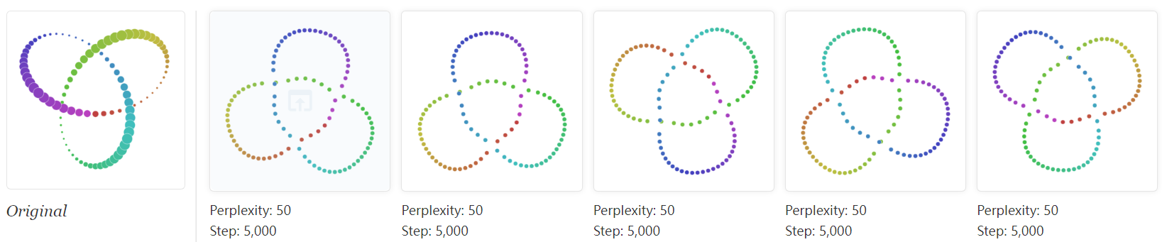
Five runs at perplexity 50, however, give results that (up to symmetry) are visually identical. Evidently some problems are easier than others to optimize.
=================================================
Conclusion
There’s a reason that t-SNE has become so popular: it’s incredibly flexible, and can often find structure where other dimensionality-reduction algorithms cannot. Unfortunately, that very flexibility makes it tricky to interpret. Out of sight from the user, the algorithm makes all sorts of adjustments that tidy up its visualizations. Don’t let the hidden “magic” scare you away from the whole technique, though. The good news is that by studying how t-SNE behaves in simple cases, it’s possible to develop an intuition for what’s going on.
=================================================
【转载】How to Use t-SNE Effectively —— (机器学习数据可视化) t-SNE使用指南的更多相关文章
- 机器学习-数据可视化神器matplotlib学习之路(五)
这次准备做一下pandas在画图中的应用,要做数据分析的话这个更为实用,本次要用到的数据是pthon机器学习库sklearn中一组叫iris花的数据,里面组要有4个特征,分别是萼片长度.萼片宽度.花瓣 ...
- 机器学习-数据可视化神器matplotlib学习之路(四)
今天画一下3D图像,首先的另外引用一个包 from mpl_toolkits.mplot3d import Axes3D,接下来画一个球体,首先来看看球体的参数方程吧 (0≤θ≤2π,0≤φ≤π) 然 ...
- 机器学习-数据可视化神器matplotlib学习之路(三)
之前学习了一些通用的画图方法和技巧,这次就学一下其它各种不同类型的图.好了先从散点图开始,上代码: from matplotlib import pyplot as plt import numpy ...
- 机器学习-数据可视化神器matplotlib学习之路(二)
之前学习了matplotlib的一些基本画图方法(查看上一节),这次主要是学习在图中加一些文字和其其它有趣的东西. 先来个最简单的图 from matplotlib import pyplot as ...
- 机器学习-数据可视化神器matplotlib学习之路(一)
直接上代码吧,说明写在备注就好了,这次主要学习一下基本的画图方法和常用的图例图标等 from matplotlib import pyplot as plt import numpy as np #这 ...
- 机器学习实战 | SKLearn最全应用指南
作者:韩信子@ShowMeAI 教程地址:http://www.showmeai.tech/tutorials/41 本文地址:http://www.showmeai.tech/article-det ...
- [机器学习]-[数据预处理]-中心化 缩放 KNN(二)
上次我们使用精度评估得到的成绩是 61%,成绩并不理想,再使 recall 和 f1 看下成绩如何? 首先我们先了解一下 召回率和 f1. 真实结果 预测结果 预测结果 正例 反例 正例 TP 真 ...
- Facets:一款Google开源机器学习数据集可视化工具
Homepage/演示网站:https://pair-code.github.io/facets/ Pypi:https://pypi.org/project/facets-overview/ Git ...
- 机器学习 —— 数据预处理
对于学习机器学习算法来说,肯定会涉及到数据的处理,因此一开始,对数据的预处理进行学习 对于数据的预处理,大概有如下几步: 步骤1 -- 导入所需库 导入处理数据所需要的python库,有如下两个库是非 ...
- 机器学习PAL数据可视化
机器学习PAL数据可视化 本文以统计全表信息为例,介绍如何进行数据可视化. 前提条件 完成数据预处理,详情请参见数据预处理. 操作步骤 登录PAI控制台. 在左侧导航栏,选择模型开发和训练 > ...
随机推荐
- 使用Vagrant创建CentOS虚拟机
使用Vagrant创建CentOS虚拟机 Vagrant是一款由HashiCorp公司提供的,用于快速构建虚拟机环境的软件.本节我们将使用Vagrant结合Oracle VM VirtualBox快速 ...
- AlertManager解析:构建高效告警系统
本文深入探讨了AlertManager的技术细节和实际应用,从基本概念.核心组件.工作流程,到与Prometheus的集成和实战案例,旨在为专业人士提供一个全面的AlertManager技术和应用指南 ...
- c++ 线程使用
C++中的线程可以通过标准库提供的thread类实现.该类提供了创建和管理线程的方法和函数. 创建线程的方法: #include <thread> ... // 创建一个线程,其执行函数为 ...
- 淘宝二面:千万级数据中如何用Redis维护热点数据"?
MySQL里有千万条数据,但是Redis中只存10万的数据,如何保证redis中的数据都是热点数据? 我是小宋, 一个只熬夜但不秃头的Java程序员.关注我,带你轻松过面试.提升简历亮点(14个dem ...
- NVIDIA Jetson AGX Xavier 从刷机之后到配置环境
特殊的配置环境需求: cuda-10.2.python 3.6.9.torch 1.7.0.torchversion 0.8.1,剩下的顺其自然即可(逃. 顺便说一句,里面的指令请一行一行仔细复制粘贴 ...
- Legacy (线段树优化建图)
题目链接:Legacy - 洛谷 | 计算机科学教育新生态 (luogu.com.cn) 题解: 考虑题目中一个点向区间连边,如真的对区间中的每一点分别连边后跑最短路,时间空间都要炸. 因为是一个点向 ...
- Meilisearch 安装和使用教程
如今搜索功能已成为几乎所有应用不可或缺的一部分.无论是电商平台.内容管理系统,还是企业内部知识库,用户都期待能够快速.准确地找到他们需要的信息.然而,传统的搜索解决方案往往面临着诸多挑战:响应速度慢. ...
- Nginx 高性能架构解析
本文详细探讨了Nginx的反向代理.负载均衡和性能优化技术,包括配置优化.系统优化.缓存机制和高并发处理策略,旨在帮助专业从业者深入理解并有效应用Nginx. 关注TechLead,复旦博士,分享云服 ...
- MES 与 PLC 的几种交互方式
在 MES 开发领域,想要从 PLC 获取数据就必须要和 PLC 有信号交互.高效准确的获取 PLC 数据一直是优秀 MES 系统开发的目标之一.初涉相关系统开发的工程师往往不能很好的理解 PLC 和 ...
- LabVIEW的自定义按钮
下载几张图片: 比较好的 网站1:https://www.iconfont.cn/ 网站2:https://yesicon.app/ 选用windows风格按钮控件进行自定义, 自定义的图片分别放入这 ...