CSS Core Technology
1. Selector
Different types of selectors:
Selectors can be divided into the following categories:
- Simple selectors: Match one or more elements based on element type,
class, orid.
- Attribute selectors: Match one or more elements based on their attributes/attribute values.
These attribute selectors try to match an exact attribute value:
[attr]: This selector will select all elements with the attributeattr, whatever its value.[attr=val]: This selector will select all elements with the attributeattr, but only if its value isval.[attr~=val]: This selector will select all elements with the attributeattr, but only if the valuevalis one of a space-separated list of values contained inattr's value, for example a single class in a space-separated list of classes.
Ingredients for my recipe: <i lang="fr-FR">Poulet basquaise</i>

<ul>

  <li data-quantity="1kg" data-vegetable>Tomatoes</li>

  <li data-quantity="3" data-vegetable>Onions</li>

  <li data-quantity="3" data-vegetable>Garlic</li>

  <li data-quantity="700g" data-vegetable="not spicy like chili">Red pepper</li>

  <li data-quantity="2kg" data-meat>Chicken</li>

  <li data-quantity="optional 150g" data-meat>Bacon bits</li>

  <li data-quantity="optional 10ml" data-vegetable="liquid">Olive oil</li>

  <li data-quantity="25cl" data-vegetable="liquid">White wine</li>

</ul>
/* All elements with the attribute "data-vegetable"

   are given green text */

[data-vegetable] {

  color: green;

}

/* All elements with the attribute "data-vegetable"

   with the exact value "liquid" are given a golden

   background color */

[data-vegetable="liquid"] {

  background-color: goldenrod;

}

/* All elements with the attribute "data-vegetable",

   containing the value "spicy", even among others,

   are given a red text color */

[data-vegetable~="spicy"] {

  color: red;

}
- Pseudo-classes: Match one or more elements that exist in a certain state, such as an element that is being hovered over by the mouse pointer, or a checkbox that is currently disabled or checked, or an element that is the first child of its parent in the DOM tree.
A CSS pseudo-class is a keyword, preceded by a colon (:), added to the end of selectors to specify you want to style the selected elements, and only when they are in certain state. For example, you might want to style an element only when it is being hovered over by the mouse pointer, or a checkbox when it is disabled or checked, or an element that is the first child of its parent in the DOM tree.
:active:checked:focus
etc.
/* These styles will style our link

   in all states */

a {

  color: blue;

  font-weight: bold;

}

/* We want visited links to be the same color

   as non visited links */

a:visited {

  color: blue;

}

/* We highlight the link when it is

   hovered (mouse), activated

   or focused (keyboard) */

a:hover,

a:active,

a:focus {

  color: darkred;

  text-decoration: none;

}
- Pseudo-elements: Match one or more parts of content that are in a certain position in relation to an element, for example the first word of each paragraph, or generated content appearing just before an element.
Pseudo-elements are very much like pseudo-classes, but they have differences. They are keywords, this time preceded by two colons (::), that can be added to the end of selectors to select a certain part of an element.
::after::before::first-letter::first-line::selection::backdrop
/* All elements with an attribute "href", which values

   start with "http", will be added an arrow after its

   content (to indicate it's an external link) */

[href^=http]::after {

  content: '⤴';

}
- Combinators: These are not exactly selectors themselves, but ways of combining two or more selectors in useful ways for very specific selections. So for example, you could select only paragraphs that are direct descendants of divs, or paragraphs that come directly after headings.
Using one selector at a time is useful, but can be inefficient in some situations. CSS selectors become even more useful when you start combining them to perform fine-grained selections. CSS has several ways to select elements based on how they are related to one another. Those relationships are expressed with combinators as follows (A and B represent any selector seen above):
| Name | Syntax | Selects |
|---|---|---|
| Multiple selector | A, B | Any element matching A and/or B (see also Multiple selectors on one rule, below). |
| Descendant selector | A B | Any element matching B that is a descendant of an element matching A (that is: a child, or a child of a child, etc.) |
| Child selector | A > B | Any element matching B that is a direct child of an element matching A. |
| Adjacent sibling selector | A + B | Any element matching B that is the next sibling of an element matching A (that is: the next child of the same parent.) |
| General sibling selector | A ~ B | Any element matching B that is one of the next siblings of an element matching A (that is: one of the next children of the same parent.) |
- Multiple selectors: Again, these are not separate selectors; the idea is that you can put multiple selectors on the same CSS rule, separated by commas, to apply a single set of declarations to all the elements selected by those selectors.
You have seen multiple examples of this in action already, but let's spell it out clearly for clarification. You can write multiple selectors separated by commas, to apply the same rule to multiple sets of selected elements at once. For example:
h1, h2, h3, h4, h5, h6 {

  font-family: helvetica, 'sans serif';

}
2. Priority & Specificity
One quick way to figure out how “powerful” a CSS rule is, is by measuring the specificty of the selectors:
- #id selectors are worth 100
- .class selectors are worth 10
- tag selectors are worth 1
The selector with the highest “score” will prevail, no matter the order in which the CSS rules appear.
Universal selector (*), combinators (+, >, ~, ' ') and negation pseudo-class (:not()) have no effect on specificity. (The selectors declared inside :not() do, however.)
Inline styles added to an element (e.g., style="font-weight:bold") always overwrite any styles in external stylesheets, and thus can be thought of as having the highest specificity.
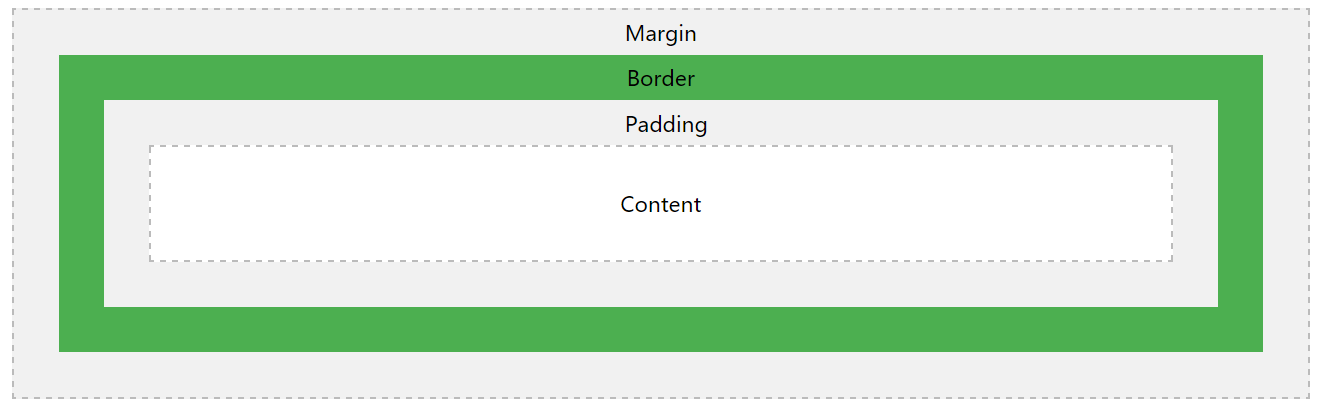
3. Box Model
All HTML elements can be considered as boxes. In CSS, the term "box model" is used when talking about design and layout.
The CSS box model is essentially a box that wraps around every HTML element. It consists of: margins, borders, padding, and the actual content.
Important: When you set the width and height properties of an element with CSS, you just set the width and height of the content area. To calculate the full size of an element, you must also add padding, borders and margins.
The total width of an element should be calculated like this:
Total element width = width + left padding + right padding + left border + right border + left margin + right margin
The total height of an element should be calculated like this:
Total element height = height + top padding + bottom padding + top border + bottom border + top margin + bottom margin
Note for old IE: Internet Explorer 8 and earlier versions, include padding and border in the width property. To fix this problem, add a <!DOCTYPE html> to the HTML page.
The image below illustrates the box model:
4. FlexBox
Flexible boxes, or flexbox, is a new layout mode in CSS3. Use of flexbox ensures that elements behave predictably when the page layout must accommodate different screen sizes and different display devices.
Since flexbox is a whole module and not a single property, it involves a lot of things including its whole set of properties. Some of them are meant to be set on the container (parent element, known as "flex container") whereas the others are meant to be set on the children (said "flex items").
If regular layout is based on both block and inline flow directions, the flex layout is based on "flex-flow directions". Please have a look at this figure from the specification, explaining the main idea behind the flex layout.

Basically, items will be laid out following either the main axis (from main-start to main-end) or the cross axis (from cross-start to cross-end).
- main axis - The main axis of a flex container is the primary axis along which flex items are laid out. Beware, it is not necessarily horizontal; it depends on the flex-direction property (see below).
- main-start | main-end - The flex items are placed within the container starting from main-start and going to main-end.
- main size - A flex item's width or height, whichever is in the main dimension, is the item's main size. The flex item's main size property is either the ‘width’ or ‘height’ property, whichever is in the main dimension.
- cross axis - The axis perpendicular to the main axis is called the cross axis. Its direction depends on the main axis direction.
- cross-start | cross-end - Flex lines are filled with items and placed into the container starting on the cross-start side of the flex container and going toward the cross-end side.
- cross size - The width or height of a flex item, whichever is in the cross dimension, is the item's cross size. The cross size property is whichever of ‘width’ or ‘height’ that is in the cross dimension.
Define a flew container:
.container {

  display: flex; /* or inline-flex */

}
The following table lists the CSS properties used with flexbox:
| Property | Description |
|---|---|
| display | Specifies the type of box used for an HTML element |
| flex-direction | Specifies the direction of the flexible items inside a flex container |
| justify-content | Horizontally aligns the flex items when the items do not use all available space on the main-axis |
| align-items | Vertically aligns the flex items when the items do not use all available space on the cross-axis |
| flex-wrap | Specifies whether the flex items should wrap or not, if there is not enough room for them on one flex line |
| align-content | Modifies the behavior of the flex-wrap property. It is similar to align-items, but instead of aligning flex items, it aligns flex lines |
| flex-flow | A shorthand propert for flex-direction and flex-wrap |
| order | Specifies the order of a flexible item relative to the rest of the flex items inside the same container |
| align-self | Used on flex items. Overrides the container's align-items property |
| flex | Specifies the length of a flex item, relative to the rest of the flex items inside the same container |
Browser support for Flexible Box as below:

Refers:
http://www.w3school.com/cssref/css_selectors.asp
https://www.quanzhanketang.com/cssref/css_selectors.html
https://developer.mozilla.org/en-US/docs/Learn/CSS/Introduction_to_CSS/Selectors
https://developer.mozilla.org/en-US/docs/Web/CSS/Specificity
https://css-tricks.com/snippets/css/a-guide-to-flexbox/
CSS Core Technology的更多相关文章
- 为什么 web 开发人员需要迁移到. NET Core, 并使用 ASP.NET Core MVC 构建 web 和 webservice/API
2018 .NET开发者调查报告: .NET Core 是怎么样的状态,这里我们看到了还有非常多的.net开发人员还在观望,本文给大家一个建议.这仅代表我的个人意见, 我有充分的理由推荐.net 程序 ...
- 前端CSS规范整理_转载、、、
一.文件规范 1.文件均归档至约定的目录中. 具体要求通过豆瓣的CSS规范进行讲解: 所有的CSS分为两大类:通用类和业务类.通用的CSS文件,放在如下目录中: 基本样式库 /css/core 通用U ...
- 15 个有趣的 JavaScript 与 CSS 库
原文转载:http://www.codeceo.com/article/15-interesting-js-css-framework.html 1. Wing Wing 是一个微型(压缩后仅有4KB ...
- css规范大全
一.文件规范 1.文件均归档至约定的目录中 所有的CSS分为两大类:通用类和业务类.通用的CSS文件,放在如下目录中: 基本样式库 /css/core 通用UI元素样式库 /css/lib JS组件相 ...
- [转]前端CSS规范整理
一.文件规范 1.文件均归档至约定的目录中. 具体要求通过豆瓣的CSS规范进行讲解: 所有的CSS分为两大类:通用类和业务类.通用的CSS文件,放在如下目录中: 基本样式库 /css/core 通用 ...
- 前端CSS规范大全
一.文件规范 1.文件均归档至约定的目录中(具体要求以豆瓣的CSS规范为例进行讲解): 所有的CSS分为两大类:通用类和业务类.通用的CSS文件,放在如下目录中: 基本样式库 /css/core 通用 ...
- Web前端开发中的各种CSS规范
Reference: http://yusi123.com/2866.html 一.文件规范 1.文件均归档至约定的目录中(具体要求以豆瓣的CSS规范为例进行讲解): 所有的CSS分为两大类:通用类和 ...
- 前端css规范
文章整理了Web前端开发中的各种CSS规范,包括文件规范.注释规范.命名规范.书写规范.测试规范等. 一.文件规范 1.文件均归档至约定的目录中(具体要求以豆瓣的CSS规范为例进行讲解): 所有的CS ...
- Professional C# 6 and .NET Core 1.0 - Chapter 42 ASP.NET Web API
本文内容为转载,重新排版以供学习研究.如有侵权,请联系作者删除. 转载请注明本文出处: -------------------------------------------------------- ...
随机推荐
- Mybatis Generator主要配置详解
MyBatis 的代码生成主要配置文档[具体] <?xml version="1.0" encoding="UTF-8"?> <!DOCTYP ...
- java 每间隔一段时间执行一段代码
Java中java.util.Timer类中有若干个schedule的重载方法,其中 void schedule(TimerTask task, long delay, long period ) 安 ...
- Virtualization Essentials---Understanding hypervisor
Original link from : http://searchservervirtualization.techtarget.com/tip/Understanding-hosted-and-b ...
- unzip解压war包并覆盖
unzip -o blog.war -d BLOG 参数: -o 不进行询问直接覆盖 -d 压缩文件解压到BLOG文件夹下 详细使用语法: unzip [-Z] [-opts[modifiers]] ...
- java如何快速创建List
几个快速添加list的方法 1. 使用Collections.addAll()方法,前提还是需要手动 new ArrayList ArrayList<String> s = new Arr ...
- 2018-计算机系机试(第二批)-A-最大数
单点时限: 1.0 sec 内存限制: 256 MB 输入 n 个整数,输出其中最大数的值. 例如:3 个整数 1 ,2 和 6 的最大值是 6 . 输入格式 每一行的第一个数是 n (1≤n≤20 ...
- VIM快速复制多行
在vim中快速复制粘贴多行 用vim写代码时,经常遇到这样的场景,复制多行,然后粘贴. 这样做:1. 将光标移动到要复制的文本开始的地方,按v进入可视模式.2. 将光标移动到要复制的文本的结束的地 ...
- python从零开始 -- 第2篇之python版本差异
python从零开始 -- 第2篇之python版本差异 第0篇开始,咱们就说选择 python 3.x,一般来说,咱们面临选择的时候总是想了解更多一点,并且版本之间的对比能引申出很多有意思的故事和知 ...
- word中插入myth type公式行距变大的问题
在写文章时,我遇到了在word中插入myth type公式时,行距明显变大的问题,我通过改变段落中的行距没有解决问题,在网上查了一下,找到一些解决方法,仅供参考. 解决办法
- 从码云上下载react项目并配置成可运行状态
(第一次写,如有不足之处,欢迎指出) 一.下载项目: 1.首先保证安装了git, 2.然后在本地想要存放项目位置打开git(Git Bash Here),再复制码云中如图所示的地址: 3.在git中输 ...