web前端----css属性
一、文本
1.文本颜色:color
颜色属性被用来设置文字的颜色。
颜色是通过CSS最经常的指定:
- 十六进制值 - 如: #FF0000
- 一个RGB值 - 如: RGB(255,0,0)
- 颜色的名称 - 如: red
2.水平对齐方式
text-align 属性规定元素中的文本的水平对齐方式。
- left 把文本排列到左边。默认值:由浏览器决定。
- right 把文本排列到右边。
- center 把文本排列到中间。
- justify 实现两端对齐文本效果。
二、文本其他操作
text-align:cnter 文本居中

line heigth 垂直居中 :行高,和高度对应
vertical-align:设置图片与文本的距离
text-decoration:none 去掉超链接下划线

font-style:oblique 或者italic....(设置字体的样式为斜体)font-size: 10px;

line-height: 200px;   文本行高 通俗的讲,文字高度加上文字上下的空白区域的高度 50%:基于字体大小的百分比

vertical-align:-4px  设置元素内容的垂直对齐方式 ,只对行内元素有效,对块级元素无效

text-decoration:none       text-decoration 属性用来设置或删除文本的装饰。主要是用来删除链接的下划线

font-family: 'Lucida Bright'

font-weight: lighter/bold/border/

font-style: oblique

text-indent: 150px;      首行缩进150px

letter-spacing: 10px;  字母间距

word-spacing: 20px;  单词间距

text-transform: capitalize/uppercase/lowercase ; 文本转换,用于所有字句变成大写或小写字母,或每个单词的首字母大写

*/
三、背景属性
background-color:背景颜色
background-image:url('11.jpg'); 背景图片链接
background-repeat:repeat-x; x轴平铺
background-repeat:no-repeat; 不重复
background-position:400px 200px 调整背景的位置(距左。距右)
background-position: center:center; 背景居中简写:background:#ffffff url('1.png') no-repeat right top;
<!DOCTYPE html>

<html lang="en">

<head>

    <meta charset="UTF-8">

    <title>背景处理</title>

    <style>

        .c1{

            width: 100px;

            height: 100px;

            border: 1px solid red;

            background: url("xhr.jpg")  -206px -29px;

            /*可在那个网页上右击点击检查,调试*/

            /*background-position: center; */

            /*定位*/

        }

    </style>

</head>

<body>

<div class="c1">

</div>

</body>

</html>
背景调试小黄人的眼睛
四、边框属性
常用属性
简写:border :1px soild red;
deshed:虚线
只加有一个方向的:border-right :1px soild red;
五、列表属性
去掉列表前面的标志:ul li{list-style:none;}
去掉列表前面的空格:ul{padding:0}
上面两行也可写成下面一行
去掉盒子上面的间隙:*{margin:0; padding :0;}
<!DOCTYPE html>

<html lang="en">

<head>

    <meta charset="UTF-8">

    <title>Title</title>

    <style>

        ul li{

            font-family: 华文中宋;

            list-style: none; //去掉点

            /*list-style: circle;//空心圆*/

            /*list-style: disc;//实心圆(默认也是实心圆)*/

        }

        ul{

            padding: 0; //把字体移到前面

        }

    </style>

</head>

<body>

<div>

    <ul>

        <li>第一章</li>

        <li>第二章</li>

        <li>第三章</li>

        <li>第四章</li>

    </ul>

</div>

</body>

</html>
六、display属性
display属性
1.将块级标签设置成内联标签:disply:inline;
2.将内联标签设置成块级标签:disply:block;
3.内联块级标签:像块级一样可设长宽,也可像内联一样在一行显示:display:inline-block;
4.display:none; 吧不想让用户看到的给隐藏了(很重要的一个属性)
5.visibility :hiddon; 也是隐藏
注意与visibility:hidden的区别:
visibility:hidden:可以隐藏某个元素,但隐藏的元素仍需占用与未隐藏之前一样的空间。也就是说,该元素虽然被隐藏了,但仍然会影响布局。
display:none:可以隐藏某个元素,且隐藏的元素不会占用任何空间。也就是说,该元素不但被隐藏了,而且该元素原本占用的空间也会从页面布局中消失。
<!DOCTYPE html>

<html lang="en">

<head>

    <meta charset="UTF-8">

    <title>Title</title>

    <style>

        .c1{

            width: 100px;

            height:100px;

            background-color: rebeccapurple;

        }

        .c2{

            width: 100px;

            height:100px;

            background-color: burlywood;

        }

        .c3{

            width: 100px;

            height:100px;

            background-color: crimson;

            display: inline;

        }

        .c4{

            width: 100px;

            height:100px;

            background-color: gray;

        }

        .s1{

             display: block;

            width: 200px;

            height: 200px;

            background-color: royalblue;

            /*visibility: hidden;*/  //隐藏了其他的不会顶上去

            display:none; //隐藏了其他的会顶上去

        }

    </style>

</head>

<body>

<div class="c4">div</div>

<span class="s1">span</span>

<div class="c1">年后</div>

<div class="c2">年后</div>

<div class="c3">年后</div>

</body>

</html>
举例
七、外边距(margin)和内边距(padding)
1.盒子模型
- margin: 用于控制元素与元素之间的距离;margin的最基本用途就是控制元素周围空间的间隔,从视觉角度上达到相互隔开的目的。
- padding: 用于控制内容与边框之间的距离;
- Border(边框): 围绕在内边距和内容外的边框。
- Content(内容): 盒子的内容,显示文本和图像。
2.margin(外边距)
单边外边距属性:
margin-top:100px;

margin-bottom:100px;

margin-right:50px;

margin-left:50px;
简写属性:
margin:10px 20px 20px 10px;

        上边距为10px

        右边距为20px

        下边距为20px

        左边距为10px

margin:10px 20px 10px;

        上边距为10px

        左右边距为20px

        下边距为10px

margin:10px 20px;

        上下边距为10px

        左右边距为20px

margin:25px;

        所有的4个边距都是25px
居中应用
margin: 0 auto;
3.padding(内边距)
单独使用填充属性可以改变上下左右的填充。缩写填充属性也可以使用,一旦改变一切都改变。
设置同margine;
思考1:body的外边距
边框在默认情况下会定位于浏览器窗口的左上角,但是并没有紧贴着浏览器的窗口的边框,这是因为body本身也是一个盒子(外层还有html),在默认情况下, body距离html会有若干像素的margin,具体数值因各个浏览器不尽相同,所以body中的盒子不会紧贴浏览器窗口的边框了,为了验证这一点,加上:
body{

    border: 1px solid;

    background-color: cadetblue;

}
>>>>解决方法:
body{

    margin: 0;

}
八、边距的塌陷问题
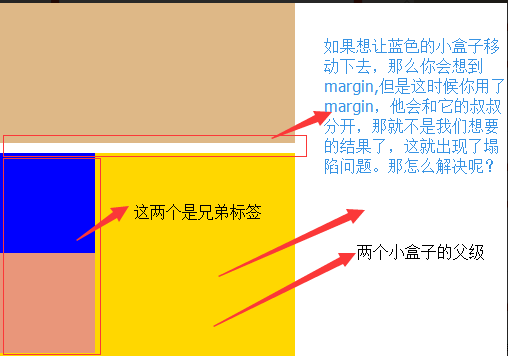
1、兄弟div:
上面div的margin-bottom和下面div的margin-top会塌陷,也就是会取上下两者margin里最大值作为显示值
2、父子div:
if 父级div中没有border,padding,inlinecontent,子级div的margin会一直向上找,直到找到某个标签包括border,padding,inline content中的其中一个,然后按此div 进行margin;
解决方法
解决方法

        这两种会改变结构

            1.加上padding

            2.加上border

        不改变结构

            3.overflow:hidden
<!DOCTYPE html>

<html lang="en">

<head>

    <meta charset="UTF-8">

    <title>Title</title>

    <style>

        body{

            margin: 0;

        }

        .outer{

            background-color: gold;

            width: 300px;

            height: 300px;

            /*第一种解决方法:但是改变了结构padding: 10px;*/

            /*第二种方法:加个border*/ /*border: 1px solid;*/

           /*第三种方法*/

            overflow: hidden;

        }

        .box1{

            width: 100px;

            height: 100px;

            background-color: blue;

             /*如果父级标签什么都没有,那么就会找叔叔的*/

            margin-top:10px;

        }

        .box2{

            width: 100px;

            height: 100px;

            background-color: darksalmon;

            /*如果这样的话就合适呢,对着就下去了*/

            margin-top: 10px;

        }

    </style>

</head>

<body>

<div style="background-color: burlywood; width:300px; height

:300px"></div>

<div class="outer">

    <div class="box1"></div>

    <div class="box2"></div>

</div>

</body>

</html>
示例
处理后的结果如图:
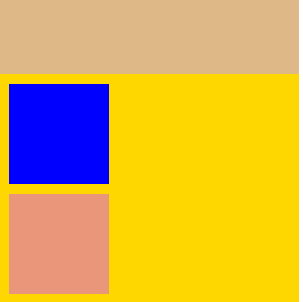
溢出问题
<!DOCTYPE html>
<html lang="en">
<head>
<meta charset="UTF-8">
<title>css属性操作</title>
<style>
.c1{
border: 1px solid;
background-color: blueviolet;
width: 100%;
height:200px;
/*text-align: center;*/
/*设置两端对齐*/
text-align: justify;
line-height: 200px;
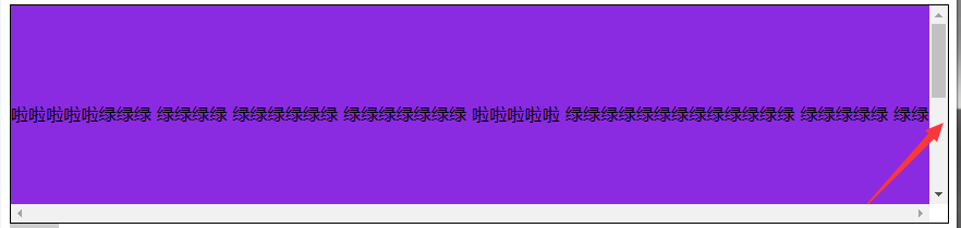
/*如果你写的多了,会溢出来*/
/*第一种方法:overflow: hidden;*/
overflow: scroll;
}
.btn{
width: 45px;
height: 70px;
background-color: gray;
/*设置透明度*/
opacity: 0.4;
text-align: center;
line-height: 70px;
/*行高和高度对应*/ }
</style>
</head>
<body>
<div class="c1">啦啦啦啦啦绿绿绿
绿绿绿绿 绿绿绿绿绿绿 绿绿绿绿绿绿绿
啦啦啦啦啦 绿绿绿绿绿绿绿绿绿绿绿绿绿
绿绿绿绿绿 绿绿绿绿绿绿绿绿绿绿绿绿
绿绿绿 绿绿绿绿绿绿绿绿 绿绿绿绿绿
绿绿绿绿 绿绿绿绿绿绿 绿绿lllllllllllllllllllllll
绿绿绿绿绿</div>
<div class="btn"> < </div>
</body>
</html>
溢出例子

解决溢出的方法
解决溢出的方法

        overflow:auto;

     overflow: hidden;

        overflow:scoll; #加上滚动条
九、清除浮动
clear语法:
clear:none | left | right | both
1.clear:left 清除的是左边的浮动
2.clear:both :保证左右两边都没有浮动
注意:
排序的时候是一个标签一个标签的排
如果上一个是浮动的,就紧贴个上一个
如果上一个不是浮动的,就和上一个保持垂直不变
十、float属性
布局关键点:如何能够让可以调节长度的元素(标签)在一行显示
如果上一个是浮动的,那么就紧贴这
如果上一个不是浮动的,那么就保持垂直距离不变
基本浮动规则
先来了解一下block元素和inline元素在文档流中的排列方式。
block元素通常被现实为独立的一块,独占一行,多个block元素会各自新起一行,默认block元素宽度自动填满其父元素宽度。block元素可以设置width、height、margin、padding属性;
inline元素不会独占一行,多个相邻的行内元素会排列在同一行里,直到一行排列不下,才会新换一行,其宽度随元素的内容而变化。inline元素设置width、height属性无效
- 常见的块级元素有 div、form、table、p、pre、h1~h5、dl、ol、ul 等。
- 常见的内联元素有span、a、strong、em、label、input、select、textarea、img、br等
所谓的文档流,指的是元素排版布局过程中,元素会自动从左往右,从上往下的流式排列。
脱离文档流,也就是将元素从普通的布局排版中拿走,其他盒子在定位的时候,会当做脱离文档流的元素不存在而进行定位。
假如某个div元素A是浮动的,如果A元素上一个元素也是浮动的,那么A元素会跟随在上一个元素的后边(如果一行放不下这两个元素,那么A元素会被挤到下一行);如果A元素上一个元素是标准流中的元素,那么A的相对垂直位置不会改变,也就是说A的顶部总是和上一个元素的底部对齐。此外,浮动的框之后的block元素元素会认为这个框不存在,但其中的文本依然会为这个元素让出位置。 浮动的框之后的inline元素,会为这个框空出位置,然后按顺序排列。
<!DOCTYPE html>

<html lang="en">

<head>

    <meta charset="UTF-8">

    <title>Title</title>

    <style>

        *{

            margin: 0;

        }

        .r1{

            width: 300px;

            height: 100px;

            background-color: #7A77C8;

            float: left;

        }

        .r2{

            width: 200px;

            height: 200px;

            background-color: wheat;

            /*float: left;*/

        }

        .r3{

            width: 100px;

            height: 200px;

            background-color: darkgreen;

            float: left;

        }

    </style>

</head>

<body>

<div class="r1"></div>

<div class="r2"></div>

<div class="r3"></div>
示例
非完全脱离文档流
左右结构div盒子重叠现象,一般是由于相邻两个DIV一个使用浮动一个没有使用浮动。一个使用浮动一个没有导致DIV不是在同个“平面”上,但内容不会造成覆盖现象,只有DIV形成覆盖现象。
<!DOCTYPE html>

<html lang="en">

<head>

    <meta charset="UTF-8">

    <title>Title</title>

    <style>

        *{

            margin: 0;

        }

        .r1{

            width: 100px;

            height: 100px;

            background-color: #7A77C8;

            float: left;

        }

        .r2{

            width: 200px;

            height: 200px;

            background-color: wheat;

        }

    </style>

</head>

<body>

<div class="r1"></div>

<div class="r2">region2</div>
>>>>解决方法:要么都不使用浮动;要么都使用float浮动;要么对没有使用float浮动的DIV设置margin样式。
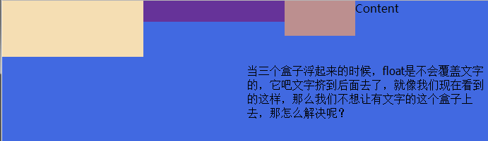
十一、float父级的塌陷问题
float它不是完全脱离,它是半脱离的。像是文字环绕的就是用float实现的。float是不覆盖文字的
半脱离的,吧文字给挤过去了。
<!DOCTYPE html>

<html lang="en">

<head>

    <meta charset="UTF-8">

    <title>Title</title>

    <style>

        .c1{

            width: 100px;

            height: 60px;

            background-color: blue;

            float: left;

        }

        .c2{

            width: 200px;

            height: 30px;

            background-color: aqua;

            float: left;

        }

         .c3{

            width: 200px;

            height: 100px;

            background-color: crimson;

             float: left;

        }

    </style>

</head>

<body>

<div class="c1"></div>

<div class="c2"></div>

<div class="c3"></div>

<div class="content">

    content

</div>

</body>

</html>
float塌陷
解决方案
解决方案

    1.<div style='clear:both'></div>

    也可以不加div

    2.用after

    .header:after{

        content:""; #内容为空

        display:block; #块级标签

        clear:both; #清楚浮动的功能

    }

    约定的名字:clearfix

    .clearfix:after{

        content:""; #内容为空

        display:block; #块级标签

        clear:both; #清楚浮动的功能(可以做到一个自动切换的功能)

    }
解决问题以后的
<!DOCTYPE html>
<html lang="en">
<head>
<meta charset="UTF-8">
<title>Title</title>
<style>
*{
margin: 0;
padding: 0;
}
.header{
/*height: 30px;*/
}
.box1{
width: 200px;
height: 80px;
background-color: wheat;
float: left;
}
.box2{
width: 200px;
height: 30px;
background-color: rebeccapurple;
float: left;
}
.box3{
width: 100px;
height: 50px;
background-color: rosybrown;
float: left;
} .content{
width: 100%;
height: 200px;
background-color: royalblue;
} .clearfix:after{
content: "";
display: block;
clear: both;
}
</style>
</head>
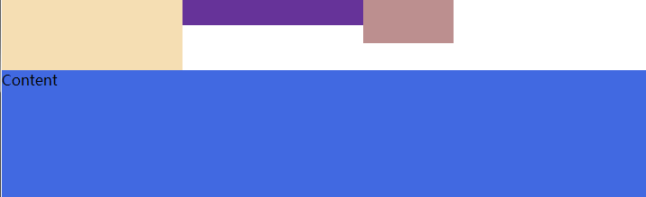
<body> <div class="header clearfix">
<div class="box1"></div>
<div class="box2"></div>
<div class="box3"></div> </div>
<div class="content">
Content
</div>
</body>
</html>
十二、position(定位)属性
position的四种属性
1.static:默认位置
2.fixed:完全脱离文档流,固定定位(以可视窗口为参照物)
3.relative:相对定位(参照的是自己本身的位置),没有脱离文档流,没有顶上去,会保持自己的位置不动。可以使用top left 进行定位
4.absolute:绝对定位:脱离了文档流(参照的是按已定位的父级标签定位,如果找不到会按body的去找)
注意:将定位标签设置为absolute,将他的父级标签设置为定位标签 (relative)
field举例(做一个返回顶部的样式。不管你拉不拉滚动条,他都会固定位置不变给它加一个)
<!DOCTYPE html>

<html lang="en">

<head>

    <meta charset="UTF-8">

    <title>固定位置</title>

    <style>

        .c1{

            background-color: limegreen;

            width:100%;

            height: 1000px;

        }

        .returntop{

            width: 100px;

            height: 40px;

            background-color: gray;

            /*透明度*/

            /*opacity: 0.4;*/

            color: white;

            text-align: center;

            line-height: 40px;

            position: fixed;

            bottom:50px;

            right: 20px;

        }

    </style>

</head>

<body>

<div class="c1"></div>

<div class="returntop">返回顶部>></div>

</body>

</html>
固定位置
相对位置,绝对位置例子
===============

一开始父级没有定位、

<!DOCTYPE html>

<html lang="en">

<head>

    <meta charset="UTF-8">

    <title>绝对定位</title>

    <style>

        *{

            margin: 0;

        }

        .box1 ,.box2,.box3{

            width: 200px;

            height: 200px;

        }

        .box1{

            background-color: blueviolet;  position: relative;

        }

        .box2{

            background-color: darksalmon;

            position: relative;

            /*position: absolute;*/

            left: 200px;

            /*right: 200px;*/

            top: 200px;

        }

        .box3{

            background-color: lime;

        }

    </style>

</head>

<body>

<div class="box1"></div>

<div class="box2"></div>

<div class="box3"></div>

</body>

</html>
一开始父级标签没有定位
<!--父级有了定位-->

<!--================-->

<!DOCTYPE html>

<html lang="en">

<head>

    <meta charset="UTF-8">

    <title>绝对定位</title>

    <style>

        .father{

            position: relative;

        }

        *{

            margin: 0;

        }

        .box1 ,.box2,.box3{

            width: 200px;

            height: 200px;

        }

        .box1{

            background-color: blueviolet;  position: relative;

        }

        .box2{

            background-color: darksalmon;

            /*position: relative;*/

            position: absolute;

            left: 200px;

            /*right: 200px;*/

            top: 200px;

        }

        .box3{

            background-color: lime;

            position: absolute;

        }

    </style>

</head>

<body>

<div class="box1"></div>

<div class="father">

    <div class="box2"></div>

</div>

<div class="box3"></div>

</body>

</html>
父级标签有了定位
十三、float和position的区别
float:半脱离文档流

position:全脱离文档流
web前端----css属性的更多相关文章
- Web前端-CSS必备知识点
Web前端-CSS必备知识点 css基本内容,类选择符,id选择符,伪类,伪元素,结构,继承,特殊性,层叠,元素分类,颜色,长度,url,文本,字体,边框,块级元素,浮动元素,内联元素,定位. 链接: ...
- WEB前端 CSS(非布局)
目录 WEB前端 CSS CSS引入方式 CSS结构 CSS选择器 直接选择器 组合选择器 分组选择器 也叫并集选择器 属性选择器 伪类选择器 伪元素选择器 CSS选择器是一个查找的过程,高效的查找影 ...
- 零基础学WEB前端-CSS
CSS指层叠样式表(Cascading Style Sheets),CSS 是标准的布局语言,用来控制元素的尺寸.颜色.排版.CSS 由 W3C 发明,用来取代基于表格的布局.框架以及其他非标准的表现 ...
- web前端—css面试题
1.CSS 选择符有哪些? 2.CSS 优先级的选择过程? 优先级复合就近原则,同权重的情况下有限选择最近的属性. 载入样式的话是以最后载入的定位为准. 优先级: !important > id ...
- [Web 前端] CSS篇之2. 清除浮动,什么时候需要清除浮动,清除浮动都有哪些方法
cp: https://blog.csdn.net/zengyonglan/article/details/53304487 2. 清除浮动,什么时候需要清除浮动,清除浮动都有哪些方法 ? 一.什么时 ...
- Bootstrap 简介(Web前端CSS框架)
目录1.简介2.特点3.组件4.Javascript插件5.定制自己的框架代码6.Bootstrap Less 1.简介Bootstrap是Twitter推出的一个开源的用于前端开发的工具包.它由Tw ...
- web前端css定位position和浮动float
最近做了几个项目:配资公司,ecmal商城等,客户对前台要求都很高.所以,今天来谈谈css的基础,以及核心,定位问题. div.h1或p元素常常被称为块级元素.这意味着这些元素显示为一块内容,即“块框 ...
- Bootstrap(Web前端CSS框架)
官方定义: Bootstrap is the most popular HTML, CSS, and JS framework for developing responsive, mobile fi ...
- web前端——CSS详解
简介 CSS(Casading Style Sheet)是一组HTML元素外观的设置规则,用于控制web页面的表现形式,一般被翻译为"级联样式表"或"层叠样式表" ...
随机推荐
- webconfig的配置说明
转自 :http://www.cnblogs.com/kissdodog/archive/2013/04/16/3025315.html <?xml version="1.0" ...
- TFS二次开发05——下载文件(DownloadFile)
前面介绍了怎样读取TFS上目录和文件的信息,怎么建立服务器和本地的映射(Mapping). 本节介绍怎样把TFS服务器上的文件下载到本地. 下载文件可以有两种方式: using Microsoft.T ...
- HOJ 1438 The Tower of Babylon(线性DP)
The Tower of Babylon My Tags Cancel - Seperate tags with commas. Source : University of Ulm Internal ...
- POJ-1414 Life Line (暴力搜索)
Life Line Time Limit: 1000MS Memory Limit: 10000K Total Submissions: 855 Accepted: 623 Description L ...
- hdu4513完美队形II manacher
吉哥又想出了一个新的完美队形游戏! 假设有n个人按顺序站在他的面前,他们的身高分别是h[1], h[2] ... h[n],吉哥希望从中挑出一些人,让这些人形成一个新的队形,新的队形若满足以下三点要 ...
- HDU 3182 - Hamburger Magi - [状压DP]
题目链接:http://acm.hdu.edu.cn/showproblem.php?pid=3182 Time Limit: 2000/1000 MS (Java/Others) Memory Li ...
- android stream media
http://www.cnblogs.com/skyseraph/archive/2012/03/31/2427593.html http://www.cnblogs.com/lingyunhu/p/ ...
- js 通过html()及text()方法获取并设置p标签的显示值
html()方法 此方法类似于JavaScript中的innerHTML属性,可以用来读取或者设置某个元素中的HTML内容.要获取某个元素的内容,可以这样: 复制代码 代码如下: var p_html ...
- GP服务中无Tasks
发布GP服务,之后执行GP服务时,发现无Tasks,如下图所示 正常情况应该如下图 问题原因在于,arcmap与server版本不一致~~ (10.4.1arcmap 与 10.2.2 server) ...
- 懂点PS技巧,你会减少很多痛苦
UI设计 不像平面设计那样随性, 期间可以用点技巧来减少痛苦. 1. 设置网格线 保持像素完美 不在1:1分辨率下也能保持像素完美,可以通过创建网格线来避免虚边的出现. 编辑 > 首选项 > ...