wpf datepicker 样式
在项目中用到的
<Style TargetType="{x:Type DatePicker}">
<Setter Property="Foreground" Value="Black"/>
<Setter Property="Width" Value=""/>
<Setter Property="Height" Value=""/>
<Setter Property="Focusable" Value="False"/>
<Setter Property="VerticalContentAlignment" Value="Center"/>
<Setter Property="IsTodayHighlighted" Value="True"/>
<Setter Property="SelectedDateFormat" Value="Short"/>
<Setter Property="Background" Value="White"/>
<Setter Property="BorderThickness" Value=""/>
<Setter Property="BorderBrush" Value="#D2D6D9"/>
<Setter Property="CalendarStyle" Value="{DynamicResource DatePickerCalendar}"/>
<Setter Property="Template">
<Setter.Value>
<ControlTemplate TargetType="{x:Type DatePicker}">
<Border BorderBrush="{TemplateBinding BorderBrush}" BorderThickness="{TemplateBinding BorderThickness}" Background="{TemplateBinding Background}" >
<VisualStateManager.VisualStateGroups>
<VisualStateGroup x:Name="CommonStates">
<VisualState x:Name="Normal"/>
<VisualState x:Name="Disabled">
<Storyboard>
<DoubleAnimation Duration="" To="" Storyboard.TargetProperty="Opacity" Storyboard.TargetName="PART_DisabledVisual"/>
</Storyboard>
</VisualState>
</VisualStateGroup>
</VisualStateManager.VisualStateGroups>
<Grid x:Name="PART_Root" HorizontalAlignment="{TemplateBinding HorizontalContentAlignment}" VerticalAlignment="{TemplateBinding VerticalContentAlignment}">
<Grid.Resources>
<SolidColorBrush x:Key="DisabledBrush" Color="#A5FFFFFF"/>
<ControlTemplate x:Key="DropDownButtonTemplate" TargetType="{x:Type Button}">
<Grid>
<VisualStateManager.VisualStateGroups>
<VisualStateGroup x:Name="CommonStates">
<VisualStateGroup.Transitions>
<VisualTransition GeneratedDuration=""/>
<VisualTransition GeneratedDuration="0:0:0.1" To="MouseOver"/>
<VisualTransition GeneratedDuration="0:0:0.1" To="Pressed"/>
</VisualStateGroup.Transitions>
<VisualState x:Name="Normal"/>
<VisualState x:Name="MouseOver">
<Storyboard>
<ColorAnimation Duration="" To="#FF448DCA" Storyboard.TargetProperty="(Border.Background).(SolidColorBrush.Color)" Storyboard.TargetName="Background"/>
<ColorAnimationUsingKeyFrames BeginTime="" Duration="00:00:00.001" Storyboard.TargetProperty="(Border.Background).(GradientBrush.GradientStops)[3].(GradientStop.Color)" Storyboard.TargetName="BackgroundGradient">
<SplineColorKeyFrame KeyTime="" Value="#7FFFFFFF"/>
</ColorAnimationUsingKeyFrames>
<ColorAnimationUsingKeyFrames BeginTime="" Duration="00:00:00.001" Storyboard.TargetProperty="(Border.Background).(GradientBrush.GradientStops)[2].(GradientStop.Color)" Storyboard.TargetName="BackgroundGradient">
<SplineColorKeyFrame KeyTime="" Value="#CCFFFFFF"/>
</ColorAnimationUsingKeyFrames>
<ColorAnimationUsingKeyFrames BeginTime="" Duration="00:00:00.001" Storyboard.TargetProperty="(Border.Background).(GradientBrush.GradientStops)[1].(GradientStop.Color)" Storyboard.TargetName="BackgroundGradient">
<SplineColorKeyFrame KeyTime="" Value="#F2FFFFFF"/>
</ColorAnimationUsingKeyFrames>
</Storyboard>
</VisualState>
<VisualState x:Name="Pressed">
<Storyboard>
<ColorAnimationUsingKeyFrames BeginTime="" Duration="00:00:00.001" Storyboard.TargetProperty="(Border.Background).(SolidColorBrush.Color)" Storyboard.TargetName="Background">
<SplineColorKeyFrame KeyTime="" Value="#FF448DCA"/>
</ColorAnimationUsingKeyFrames>
<DoubleAnimationUsingKeyFrames BeginTime="" Duration="00:00:00.001" Storyboard.TargetProperty="(UIElement.Opacity)" Storyboard.TargetName="Highlight">
<SplineDoubleKeyFrame KeyTime="" Value=""/>
</DoubleAnimationUsingKeyFrames>
<ColorAnimationUsingKeyFrames BeginTime="" Duration="00:00:00.001" Storyboard.TargetProperty="(Border.Background).(GradientBrush.GradientStops)[1].(GradientStop.Color)" Storyboard.TargetName="BackgroundGradient">
<SplineColorKeyFrame KeyTime="" Value="#EAFFFFFF"/>
</ColorAnimationUsingKeyFrames>
<ColorAnimationUsingKeyFrames BeginTime="" Duration="00:00:00.001" Storyboard.TargetProperty="(Border.Background).(GradientBrush.GradientStops)[2].(GradientStop.Color)" Storyboard.TargetName="BackgroundGradient">
<SplineColorKeyFrame KeyTime="" Value="#C6FFFFFF"/>
</ColorAnimationUsingKeyFrames>
<ColorAnimationUsingKeyFrames BeginTime="" Duration="00:00:00.001" Storyboard.TargetProperty="(Border.Background).(GradientBrush.GradientStops)[3].(GradientStop.Color)" Storyboard.TargetName="BackgroundGradient">
<SplineColorKeyFrame KeyTime="" Value="#6BFFFFFF"/>
</ColorAnimationUsingKeyFrames>
<ColorAnimationUsingKeyFrames BeginTime="" Duration="00:00:00.001" Storyboard.TargetProperty="(Border.Background).(GradientBrush.GradientStops)[0].(GradientStop.Color)" Storyboard.TargetName="BackgroundGradient">
<SplineColorKeyFrame KeyTime="" Value="#F4FFFFFF"/>
</ColorAnimationUsingKeyFrames>
</Storyboard>
</VisualState>
<VisualState x:Name="Disabled"/>
</VisualStateGroup>
</VisualStateManager.VisualStateGroups>
<Grid Background="Transparent" FlowDirection="LeftToRight" HorizontalAlignment="Center" Height="" Margin="" VerticalAlignment="Center" Width="">
<Grid.ColumnDefinitions>
<ColumnDefinition Width="20*"/>
<ColumnDefinition Width="20*"/>
<ColumnDefinition Width="20*"/>
<ColumnDefinition Width="20*"/>
</Grid.ColumnDefinitions>
<Grid.RowDefinitions>
<RowDefinition Height="23*"/>
<RowDefinition Height="19*"/>
<RowDefinition Height="19*"/>
<RowDefinition Height="19*"/>
</Grid.RowDefinitions>
<Border x:Name="Highlight" Visibility="Hidden" BorderBrush="#FF45D6FA" BorderThickness="" Grid.ColumnSpan="" CornerRadius="0,0,1,1" Margin="-1" Opacity="" Grid.Row="" Grid.RowSpan=""/>
<Border x:Name="Background" Visibility="Hidden" BorderBrush="#FFFFFFFF" BorderThickness="" Background="#FF1F3B53" Grid.ColumnSpan="" CornerRadius=".5" Margin="0,-1,0,0" Opacity="" Grid.Row="" Grid.RowSpan=""/>
<Border x:Name="BackgroundGradient" Visibility="Hidden" BorderBrush="#BF000000" BorderThickness="" Grid.ColumnSpan="" CornerRadius=".5" Margin="0,-1,0,0" Opacity="" Grid.Row="" Grid.RowSpan="">
<Border.Background>
<LinearGradientBrush EndPoint=".7,1" StartPoint=".7,0">
<GradientStop Color="#FFFFFFFF" Offset=""/>
<GradientStop Color="#F9FFFFFF" Offset="0.375"/>
<GradientStop Color="#E5FFFFFF" Offset="0.625"/>
<GradientStop Color="#C6FFFFFF" Offset=""/>
</LinearGradientBrush>
</Border.Background>
</Border>
<Rectangle Visibility="Hidden" Grid.ColumnSpan="" Grid.RowSpan="" StrokeThickness="">
<Rectangle.Fill>
<LinearGradientBrush EndPoint="0.3,-1.1" StartPoint="0.46,1.6">
<GradientStop Color="#FF4084BD"/>
<GradientStop Color="#FFAFCFEA" Offset=""/>
</LinearGradientBrush>
</Rectangle.Fill>
<Rectangle.Stroke>
<LinearGradientBrush EndPoint="0.48,-1" StartPoint="0.48,1.25">
<GradientStop Color="#FF494949"/>
<GradientStop Color="#FF9F9F9F" Offset=""/>
</LinearGradientBrush>
</Rectangle.Stroke>
</Rectangle>
<Path Grid.ColumnSpan="" Grid.Column="" Data="M 0 0 L 4 6 L 8 0" Stroke="{TemplateBinding BorderBrush}" StrokeThickness="{TemplateBinding BorderThickness}" HorizontalAlignment="Center" Margin="4,3,4,3" Grid.Row="" Grid.RowSpan="" RenderTransformOrigin="0.5,0.5" VerticalAlignment="Center"/>
<Ellipse Visibility="Hidden" Grid.ColumnSpan="" Fill="#FFFFFFFF" HorizontalAlignment="Center" Height="" StrokeThickness="" VerticalAlignment="Center" Width=""/>
<Border x:Name="DisabledVisual" Visibility="Hidden" BorderBrush="#B2FFFFFF" BorderThickness="" Grid.ColumnSpan="" CornerRadius="0,0,.5,.5" Opacity="" Grid.Row="" Grid.RowSpan=""/>
</Grid>
</Grid>
</ControlTemplate>
</Grid.Resources>
<Grid.ColumnDefinitions>
<ColumnDefinition Width="*"/>
<ColumnDefinition Width="Auto"/>
</Grid.ColumnDefinitions>
<!--<Button x:Name="PART_Button" Grid.Column="" Foreground="{TemplateBinding Foreground}" Focusable="False" HorizontalAlignment="Left" Margin="3,0,3,0" Grid.Row="" Template="{StaticResource DropDownButtonTemplate}" VerticalAlignment="Center" Width=""/>-->
<Button x:Name="PART_Button" Grid.Column="" Foreground="{TemplateBinding Foreground}" Focusable="False" HorizontalAlignment="Left" Margin="3,0,3,0" Grid.Row="" VerticalAlignment="Center" Width="" Height="" Background="Transparent" >
<Button.Content>
<Image Source="/View/Resources/pop_ico_calendar.png" Height=""/>
</Button.Content>
</Button>
<DatePickerTextBox x:Name="PART_TextBox" Text="{TemplateBinding Tag}" Grid.Column="" IsHitTestVisible="False" Focusable="False" HorizontalContentAlignment="Center" Grid.Row="" VerticalContentAlignment="Center" FontStyle="Normal" FontSize="" Foreground="#484C50" Height="" BorderThickness="0,0,2,0" BorderBrush="#F0F0F0" Background="Transparent" />
<Grid x:Name="PART_DisabledVisual" Grid.ColumnSpan="" Grid.Column="" IsHitTestVisible="False" Opacity="" Grid.Row="" Height="">
<Grid.ColumnDefinitions>
<ColumnDefinition Width="*"/>
<ColumnDefinition Width="Auto"/>
</Grid.ColumnDefinitions>
<!--<Rectangle Grid.Column="" Fill="#A5FFFFFF" RadiusY="" Grid.Row="" RadiusX=""/>-->
<!--<Rectangle Grid.Column="" Fill="#A5FFFFFF" Height="" Margin="3,0,3,0" RadiusY="" Grid.Row="" RadiusX="" Width=""/>-->
<Popup x:Name="PART_Popup" AllowsTransparency="True" Placement="Bottom" PlacementTarget="{Binding ElementName=PART_TextBox}" StaysOpen="False"/>
</Grid>
</Grid>
</Border>
<ControlTemplate.Triggers>
<DataTrigger Binding="{Binding Source={x:Static SystemParameters.HighContrast}}" Value="false">
<Setter Property="Foreground" TargetName="PART_TextBox" Value="{Binding Foreground, RelativeSource={RelativeSource TemplatedParent}}"/>
</DataTrigger>
<Trigger Property="IsMouseOver" Value="True">
<Setter Property="Opacity" Value="0.8"/>
</Trigger>
<Trigger Property="IsDropDownOpen" Value="True">
<Setter Property="Opacity" Value=""/>
</Trigger>
</ControlTemplate.Triggers>
</ControlTemplate>
</Setter.Value>
</Setter>
</Style>
效果如下: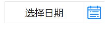
wpf datepicker 样式的更多相关文章
- 求助 WPF ListViewItem样式问题
求助 WPF ListViewItem样式问题 .NET 开发 > Windows Presentation Foundation Вопрос 0 Нужно войти <Style ...
- WPF GroupBox 样式分享
原文:WPF GroupBox 样式分享 默认样式 GroupBox 样式分享" title="WPF GroupBox 样式分享"> 添加样式后 GroupBox ...
- WPF DataGrid 样式设置
隔行换色,鼠标单击,悬浮样式都有,其具体效果如图 1 所示. 图 1 WPF DataGrid 样式设置效果图 其中: 界面设计代码下所示 ? + 查看代码 1 2 3 4 5 6 7 8 9 10 ...
- WPF DataGrid 样式分享
原文:WPF DataGrid 样式分享 隔行换色,鼠标单击,悬浮样式都有 先看效果: 代码: <DataGrid AutoGenerateColumns="False" N ...
- wpf 导出Excel Wpf Button 样式 wpf简单进度条 List泛型集合对象排序 C#集合
wpf 导出Excel 1 private void Button_Click_1(object sender, RoutedEventArgs e) 2 { 3 4 ExportDataGrid ...
- 自定义WPF 窗口样式
原文:自定义WPF 窗口样式 Normal 0 false 7.8 pt 0 2 false false false EN-US ZH-CN X-NONE 自定义 Window 在客户端程序中,经常需 ...
- WPF中样式和行为和触发器
原文:WPF中样式和行为和触发器 样式简介:样式(style)是组织和重用格式化选项的重要工具,不是使用重复的标记填充XAML,以便设置外边距.内边距.颜色以及字体等细节.而是创建一系列封装所有这些细 ...
- WPF DatePicker默认显示当前日期,格式化为年月日
原文:WPF DatePicker默认显示当前日期 WPF的日历选择控件默认为当前日期,共有两种方法,一种静态,一种动态. 静态的当然写在DatePicker控件的属性里了,动态的写在对应的cs文件里 ...
- WPF自定义样式篇-DataGrid
WPF自定义样式篇-DataGrid 先上效果图: 样式: <!--DataGrid样式--> <Style TargetType="DataGrid"& ...
随机推荐
- luoguP3951 小凯的疑惑/P2662 牛场围栏
其实就是当年sxy给我讲的墨墨的等式,只是当时比较菜听得似懂非懂. 小凯的疑惑 去年noipday1t1,当时随便猜了个结论结果猜对了,现在瞎证一下,答案是a*b-a-b. 设a为a,b中较小的一个, ...
- 谈谈E语言
基于中国文化底蕴的编程语言, 绝对不是E语言那个样子. 基于中文的编程,必将是计算机届的一次原子爆炸!
- Vue.js框架的基础指令
Vue.js 渐进式 javascript 框架,可以独立完成前后端分离式web项目的javascript框架 js是页面脚本语言,用来控制或是辅助页面搭建,vue是js功能的集合体. 三大主流前端框 ...
- jquery操作html元素之( 尺寸)
jQuery 提供多个处理尺寸的重要方法: width() height() innerWidth() innerHeight() outerWidth() outerHeight() jQuery ...
- css玩转文字
<div style=" direction:rtl; unicode-bidi:bidi-override">文字被反转过来了</div> 执行后的效果为 ...
- ECMAScript1.2 表达式|语句|break|continue
表达式 一个表达式可以产生一个值,有可能是运算,函数调用, 有可能是字面量,表达式可以放在任何需要值的地方. 语句 语句可以理解为一个行为,循环语句和判断语句就是典型的语句. 一个程序有很多个语句组成 ...
- springDataJpa的官方API
一 . Core concepts(核心概念) 1.springdata中的中心接口是——Repository.这个接口没有什么重要的功能(原句称没什么惊喜的一个接口).主要的作用就是标记和管理.其 ...
- 【转】tomcat系统架构分析
https://blog.csdn.net/wsl211511/article/details/51622991
- 网页布局WEB标准的HTML结构化
您正在学习WEB标准CSS网页布局吗?是不是还不能完全掌握纯CSS布局?通常有两种需要您特别注意: 第一种可能是你还没有理解CSS处理页面的原理.在你考虑你的页面整体表现效果前,你应当先考虑内容的语义 ...
- netty 文件传输
FileServer package com.zhaowb.netty.ch13_1; import io.netty.bootstrap.ServerBootstrap; import io.net ...