自定义仿 QQ 健康计步器进度条
自定义仿 QQ 健康计步器进度条
版权声明:本文为博主原创文章,未经博主允许不得转载。
微博:厉圣杰
源码:CircleProgress
文中如有纰漏,欢迎大家留言指出。
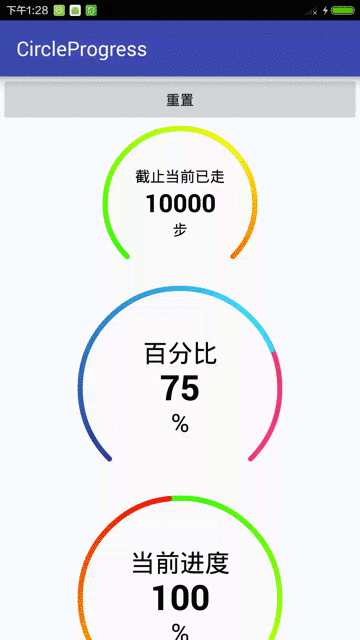
闲着没事,趁上班时间偷偷撸了一个圆形进度条,可以实现仿 QQ 健康计步器的圆形进度条,虽然网上这类控件很多,但毕竟是别人写的代码,总没自己写的用起来爽,所以还是选择再造一次轮子。该控件基本满足日常需求,但不支持设置圆弧半径,半径由 View 自行计算得出。
效果
首先上控件的效果图,没图说个屁啊,是不?

实现
主要实现逻辑如下:
- 文字定位及绘制
- 圆弧的绘制及角度的计算
- 圆弧颜色渐变
- 动画效果的实现
具体逻辑请见代码:
public class CircleProgress extends View {

    private static final String TAG = CircleProgress.class.getSimpleName();

    private Context mContext;

    //默认大小

    private int mDefaultSize;

    //是否开启抗锯齿

    private boolean antiAlias;

    //绘制标题

    private TextPaint mHintPaint;

    private CharSequence mHint;

    private int mHintColor;

    private float mHintSize;

    //绘制单位

    private TextPaint mUnitPaint;

    private CharSequence mUnit;

    private int mUnitColor;

    private float mUnitSize;

    //绘制数值

    private TextPaint mValuePaint;

    private float mValue;

    private float mMaxValue;

    private int mPrecision;

    private String mPrecisionFormat;

    private int mValueColor;

    private float mValueSize;

    //绘制圆弧

    private Paint mArcPaint;

    private int mArcColor1, mArcColor2, mArcColor3;

    private float mArcWidth;

    private float mStartAngle, mSweepAngle;

    private RectF mRectF;

    //渐变

    private Matrix mRotateMatrix;

    //渐变的颜色是360度,如果只显示270,那么则会缺失部分颜色

    private SweepGradient mSweepGradient;

    private int[] mGradientColors = {Color.GREEN, Color.YELLOW, Color.RED};

    //当前进度,[0.0f,1.0f]

    private float mPercent;

    //动画时间

    private long mAnimTime;

    //属性动画

    private ValueAnimator mAnimator;

    //绘制背景圆弧

    private Paint mBgArcPaint;

    private int mBgArcColor;

    private float mBgArcWidth;

    //圆心坐标,半径

    private float mFloatX, mFloatY, mRadius;

    //在屏幕上的坐标

    private int[] mLocationOnScreen = new int[2];

    public CircleProgress(Context context, AttributeSet attrs) {

        super(context, attrs);

        init(context, attrs);

    }

    private void init(Context context, AttributeSet attrs) {

        mContext = context;

        mDefaultSize = MiscUtil.dipToPx(mContext, 150);

        mAnimator = new ValueAnimator();

        getLocationOnScreen(mLocationOnScreen);

        mRectF = new RectF();

        initAttrs(attrs);

        initPaint();

        setValue(mValue);

    }

    private void initAttrs(AttributeSet attrs) {

        TypedArray typedArray = mContext.obtainStyledAttributes(attrs, R.styleable.CircleProgressBar);

        antiAlias = typedArray.getBoolean(R.styleable.CircleProgressBar_antiAlias, false);

        mHint = typedArray.getString(R.styleable.CircleProgressBar_hint);

        mHintColor = typedArray.getColor(R.styleable.CircleProgressBar_hintColor, Color.BLACK);

        mHintSize = typedArray.getDimension(R.styleable.CircleProgressBar_hintSize, 15);

        mValue = typedArray.getFloat(R.styleable.CircleProgressBar_value, 0);

        mMaxValue = typedArray.getFloat(R.styleable.CircleProgressBar_maxValue, 0);

        //内容数值精度格式

        mPrecision = typedArray.getInt(R.styleable.CircleProgressBar_precision, 0);

        mPrecisionFormat = getPrecisionFormat(mPrecision);

        mValueColor = typedArray.getColor(R.styleable.CircleProgressBar_valueColor, Color.BLACK);

        mValueSize = typedArray.getDimension(R.styleable.CircleProgressBar_valueSize, 60);

        mUnit = typedArray.getString(R.styleable.CircleProgressBar_unit);

        mUnitColor = typedArray.getColor(R.styleable.CircleProgressBar_unitColor, Color.BLACK);

        mUnitSize = typedArray.getDimension(R.styleable.CircleProgressBar_unitSize, 15);

        // 设置渐变色

        mArcColor1 = typedArray.getColor(R.styleable.CircleProgressBar_arcColor1, Color.GREEN);

        mArcColor2 = typedArray.getColor(R.styleable.CircleProgressBar_arcColor2, Color.YELLOW);

        mArcColor3 = typedArray.getColor(R.styleable.CircleProgressBar_arcColor3, Color.RED);

        mGradientColors = new int[]{mArcColor1, mArcColor2, mArcColor3};

        mArcWidth = typedArray.getDimension(R.styleable.CircleProgressBar_arcWidth, 15);

        mStartAngle = typedArray.getFloat(R.styleable.CircleProgressBar_startAngle, 270);

        mSweepAngle = typedArray.getFloat(R.styleable.CircleProgressBar_sweepAngle, 360);

        mBgArcColor = typedArray.getColor(R.styleable.CircleProgressBar_bgArcColor, Color.WHITE);

        mBgArcWidth = typedArray.getDimension(R.styleable.CircleProgressBar_bgArcWidth, 15);

        //mPercent = typedArray.getFloat(R.styleable.CircleProgressBar_percent, 0);

        mAnimTime = typedArray.getInt(R.styleable.CircleProgressBar_animTime, 1000);

        typedArray.recycle();

    }

    private String getPrecisionFormat(int precision) {

        return "%." + precision + "f";

    }

    private void initPaint() {

        mHintPaint = new TextPaint();

        // 设置抗锯齿,会消耗较大资源,绘制图形速度会变慢。

        mHintPaint.setAntiAlias(antiAlias);

        // 设置绘制文字大小

        mHintPaint.setTextSize(mHintSize);

        // 设置画笔颜色

        mHintPaint.setColor(mHintColor);

        // 从中间向两边绘制,不需要再次计算文字

        mHintPaint.setTextAlign(Paint.Align.CENTER);

        mValuePaint = new TextPaint();

        mValuePaint.setAntiAlias(antiAlias);

        mValuePaint.setTextSize(mValueSize);

        mValuePaint.setColor(mValueColor);

        // 设置Typeface对象,即字体风格,包括粗体,斜体以及衬线体,非衬线体等

        mValuePaint.setTypeface(Typeface.DEFAULT_BOLD);

        mValuePaint.setTextAlign(Paint.Align.CENTER);

        mUnitPaint = new TextPaint();

        mUnitPaint.setAntiAlias(antiAlias);

        mUnitPaint.setTextSize(mUnitSize);

        mUnitPaint.setColor(mUnitColor);

        mUnitPaint.setTextAlign(Paint.Align.CENTER);

        mArcPaint = new Paint();

        mArcPaint.setAntiAlias(antiAlias);

        mArcPaint.setColor(mArcColor1);

        // 设置画笔的样式,为FILL,FILL_OR_STROKE,或STROKE

        mArcPaint.setStyle(Paint.Style.STROKE);

        // 设置画笔粗细

        mArcPaint.setStrokeWidth(mArcWidth);

        // 当画笔样式为STROKE或FILL_OR_STROKE时,设置笔刷的图形样式,如圆形样式

        // Cap.ROUND,或方形样式 Cap.SQUARE

        mArcPaint.setStrokeCap(Paint.Cap.ROUND);

        mRotateMatrix = new Matrix();

        mBgArcPaint = new Paint();

        mBgArcPaint.setAntiAlias(antiAlias);

        mBgArcPaint.setColor(mBgArcColor);

        mBgArcPaint.setStyle(Paint.Style.STROKE);

        mBgArcPaint.setStrokeWidth(mBgArcWidth);

        mBgArcPaint.setStrokeCap(Paint.Cap.ROUND);

    }

    @Override

    protected void onMeasure(int widthMeasureSpec, int heightMeasureSpec) {

        super.onMeasure(widthMeasureSpec, heightMeasureSpec);

        //设置默认内边距,防止圆弧与边界重叠

        int padding = MiscUtil.dipToPx(mContext, 5);

        setPadding(padding, padding, padding, padding);

        //因为是画圆,所以宽高相等

        int measuredWidth = MiscUtil.measure(widthMeasureSpec, mDefaultSize);

        int measuredHeight = MiscUtil.measure(heightMeasureSpec, mDefaultSize);

        //求最小值作为实际值

        int size = Math.min(measuredWidth, measuredHeight);

        setMeasuredDimension(measuredWidth + getPaddingLeft() + getPaddingRight(),

                measuredHeight + getPaddingTop() + getPaddingBottom());

        //获取圆的相关参数

        mFloatX = mLocationOnScreen[0] + size / 2 + getPaddingLeft();

        mFloatY = mLocationOnScreen[1] + size / 2 + getPaddingTop();

        //求圆弧和背景圆弧的最大宽度

        float maxArcWidth = Math.max(mArcWidth, mBgArcWidth);

        //减去圆弧的宽度,否则会造成部分圆弧绘制在外围,通过clipPadding属性可以解决

        mRadius = size / 2 - maxArcWidth;

        //绘制圆弧的边界

        mRectF.left = mLocationOnScreen[0] + getPaddingLeft();

        mRectF.top = mLocationOnScreen[1] + getPaddingTop();

        mRectF.right = mRectF.left + size;

        mRectF.bottom = mRectF.top + size;

        updateArcPaint();

    }

    @Override

    protected void onDraw(Canvas canvas) {

        super.onDraw(canvas);

        drawText(canvas);

        drawArc(canvas);

    }

    /**

     * 绘制内容文字

     *

     * @param canvas

     */

    private void drawText(Canvas canvas) {

        // 计算文字宽度,由于Paint已设置为居中绘制,故此处不需要重新计算

        // float textWidth = mValuePaint.measureText(mValue.toString());

        // float x = mFloatX - textWidth / 2;

        float y = mFloatY - (mValuePaint.descent() + mValuePaint.ascent()) / 2;

        canvas.drawText(String.format(mPrecisionFormat, mValue), mFloatX, y, mValuePaint);

        if (mHint != null) {

            float hy = mFloatY * 2 / 3 - (mHintPaint.descent() + mHintPaint.ascent()) / 2;

            canvas.drawText(mHint.toString(), mFloatX, hy, mHintPaint);

        }

        if (mUnit != null) {

            float uy = mFloatY * 4 / 3 - (mUnitPaint.descent() + mUnitPaint.ascent()) / 2;

            canvas.drawText(mUnit.toString(), mFloatX, uy, mUnitPaint);

        }

    }

    private void drawArc(Canvas canvas) {

        // 绘制背景圆弧

        // 从进度圆弧结束的地方开始重新绘制,优化性能

        float currentAngle = mSweepAngle * mPercent;

        canvas.drawArc(mRectF, mStartAngle, mSweepAngle, false, mBgArcPaint);

        // 第一个参数 oval 为 RectF 类型,即圆弧显示区域

        // startAngle 和 sweepAngle  均为 float 类型,分别表示圆弧起始角度和圆弧度数

        // 3点钟方向为0度,顺时针递增

        // 如果 startAngle < 0 或者 > 360,则相当于 startAngle % 360

        // useCenter:如果为True时,在绘制圆弧时将圆心包括在内,通常用来绘制扇形

        canvas.drawArc(mRectF, mStartAngle, currentAngle, false, mArcPaint);

    }

    /**

     * 更新圆弧画笔

     */

    private void updateArcPaint() {

        // 设置渐变

        mSweepGradient = new SweepGradient(mFloatX, mFloatY, mGradientColors, null);

        // 矩阵变化,-5是因为开始颜色可能会与结束颜色重叠

        mRotateMatrix.setRotate(mStartAngle - 5, mFloatX, mFloatY);

        mSweepGradient.setLocalMatrix(mRotateMatrix);

        mArcPaint.setShader(mSweepGradient);

    }

    public boolean isAntiAlias() {

        return antiAlias;

    }

    public CharSequence getHint() {

        return mHint;

    }

    public void setHint(CharSequence hint) {

        mHint = hint;

    }

    public CharSequence getUnit() {

        return mUnit;

    }

    public void setUnit(CharSequence unit) {

        mUnit = unit;

    }

    public float getValue() {

        return mValue;

    }

    /**

     * 设置当前值

     *

     * @param value

     */

    public void setValue(float value) {

        if (value > mMaxValue) {

            value = mMaxValue;

        }

        float start = mPercent;

        float end = value / mMaxValue;

        startAnimator(start, end, mAnimTime);

    }

    private void startAnimator(float start, float end, long animTime) {

        mAnimator.setDuration(animTime);

        mAnimator = ValueAnimator.ofFloat(start, end);

        mAnimator.addUpdateListener(new ValueAnimator.AnimatorUpdateListener() {

            @Override

            public void onAnimationUpdate(ValueAnimator animation) {

                mPercent = (float) animation.getAnimatedValue();

                mValue = mPercent * mMaxValue;

                if (BuildConfig.DEBUG) {

                    Log.d(TAG, "onAnimationUpdate: percent = " + mPercent

                            + ";currentAngle = " + (mSweepAngle * mPercent)

                            + ";value = " + mValue);

                }

                invalidate();

            }

        });

        mAnimator.start();

    }

    /**

     * 获取最大值

     *

     * @return

     */

    public float getMaxValue() {

        return mMaxValue;

    }

    /**

     * 设置最大值

     *

     * @param maxValue

     */

    public void setMaxValue(float maxValue) {

        mMaxValue = maxValue;

    }

    /**

     * 获取精度

     *

     * @return

     */

    public int getPrecision() {

        return mPrecision;

    }

    public void setPrecision(int precision) {

        mPrecision = precision;

        mPrecisionFormat = getPrecisionFormat(precision);

    }

    public int[] getGradientColors() {

        return mGradientColors;

    }

    /**

     * 设置渐变

     *

     * @param gradientColors

     */

    public void setGradientColors(int[] gradientColors) {

        mGradientColors = gradientColors;

        updateArcPaint();

    }

    public long getAnimTime() {

        return mAnimTime;

    }

    public void setAnimTime(long animTime) {

        mAnimTime = animTime;

    }

    /**

     * 重置

     */

    public void reset() {

        startAnimator(mPercent, 0.0f, 1000L);

    }

    @Override

    protected void onDetachedFromWindow() {

        super.onDetachedFromWindow();

        //释放资源

    }

}
XML 配置
通过 XML 可以配置出多种效果,支持配置属性如下:
<declare-styleable name="CircleProgressBar">

   <!-- 是否开启抗锯齿 -->

   <attr name="antiAlias" format="boolean" />

   <!-- 绘制内容相应的提示语 -->

   <attr name="hint" format="string|reference" />

   <attr name="hintSize" format="dimension" />

   <attr name="hintColor" format="color|reference" />

   <!-- 绘制内容的单位 -->

   <attr name="unit" format="string|reference" />

   <attr name="unitSize" format="dimension" />

   <attr name="unitColor" format="color|reference" />

   <!-- 绘制内容的数值 -->

   <attr name="maxValue" format="float" />

   <attr name="value" format="float" />

   <!-- 精度,默认为0 -->

   <attr name="precision" format="integer" />

   <attr name="valueSize" format="dimension" />

   <attr name="valueColor" format="color|reference" />

   <!-- 圆弧颜色,设置多个可实现渐变 -->

   <attr name="arcColor1" format="color|reference" />

   <attr name="arcColor2" format="color|reference" />

   <attr name="arcColor3" format="color|reference" />

   <!-- 圆弧宽度 -->

   <attr name="arcWidth" format="dimension" />

   <!-- 圆弧起始角度,3点钟方向为0,顺时针递增,小于0或大于360进行取余 -->

   <attr name="startAngle" format="float" />

   <!-- 圆弧度数 -->

   <attr name="sweepAngle" format="float" />

   <!-- 当前进度百分比 -->

   <!--<attr name="percent" format="float"/>-->

   <!-- 设置动画时间 -->

   <attr name="animTime" format="integer" />

   <!-- 背景圆弧颜色 -->

   <attr name="bgArcColor" format="color|reference" />

   <!-- 背景圆弧宽度 -->

   <attr name="bgArcWidth" format="dimension" />

</declare-styleable>
代码配置
考虑到圆弧大小、圆弧起始角度等属性一般不可能动态改变,所以通过代码并不能设置 CircleProgress 的全部属性。具体支持方法可以查看 CircleProgress.java 中的 setter 方法。
后记
该控件还有许多值得改进的地方,如:对重绘的优化。
自定义仿 QQ 健康计步器进度条的更多相关文章
- 仿iReader切换皮肤进度条
仿iReader切换皮肤进度条 标签(空格分隔): 自定义View [TOC] 本以为使用paint.setXfermode(new PorterDuffXfermode(Mode.XOR));可以轻 ...
- 自定义VIew——漂亮的圆形进度条
package com.example.firstapp; import java.text.DecimalFormat; import android.annotation.SuppressLint ...
- Android 自定义view --圆形百分比(进度条)
转载请注明出处:http://blog.csdn.net/wingichoy/article/details/50334595 注:本文由于是在学习过程中写的,存在大量问题(overdraw onDr ...
- 自定义View实现钟摆效果进度条PendulumView
转载请注明出处:http://blog.csdn.net/fightlei/article/details/52556755 在网上看到了一个IOS组件PendulumView,实现了钟摆的动画效果. ...
- 我的Android进阶之旅------>Android如何通过自定义SeekBar来实现视频播放进度条
首先来看一下效果图,如下所示: 其中进度条如下: 接下来说一说我的思路,上面的进度拖动条有自定义的Thumb,在Thumb正上方有一个PopupWindow窗口,窗口里面显示当前的播放时间.在Seek ...
- 利用贝塞尔曲线绘制(UIBezierPath)自定义iOS动态速度表,可以自定义刻度,刻度值,进度条样式
GitHub的Demo下载地址 使用UIBezierPath画图步骤: 创建一个UIBezierPath对象 调用-moveToPoint:设置初始线段的起点 添加线或者曲线去定义一个或者多个子路径 ...
- 自定义垂直拖动的seekbar进度条
系统自定义的seekbar为横向拖动的样式,需要纵向的时则需要自己定义,网上很多说了重写系统SeekBar中onDraw()的方法,但是我使用的时候不知道为什么拖动条和点偏离了,不在一条直线上,好气. ...
- 仿IOS圆形下载进度条
/** * Created by C058 on 2016/5/25. */ public class MyHoriztalProgressBar extends ProgressBar { priv ...
- flex自定义preloader预加载进度条
flex默认的preloader已经很不错了,可是有时候还是需要自定义的. 需要在要出现自定义预加载的程序的<mx:Application>标签里加入preloader="& ...
随机推荐
- 可持久化Trie树初步
可持久化Trie树和可持久化线段树很像,依次插入信息,通过减法来进行历史版本查询. 2015年11月27日 bzoj3261 最大异或和 我们需要计算 a[p] xor a[p+1] xor ... ...
- NewTonJson.Net的使用
1.引用“Newtonsoft.Json” 4.0 版本 2.基础类 using System; using System.Collections.Generic; using System.Linq ...
- android 菜单的总结
安卓菜单有三种菜单. 选项菜单: 点击系统菜单按钮会触发 上下文菜单:长按屏幕触发 子菜单:某一个菜单的下一级菜单 具体的描叙:http://blog.csdn.net/zqiang_55/artic ...
- 微软2017MVP大礼包拆箱攻略
容我本周偷个懒,晒个大礼包就糊弄过去了.13号晚上拿到的大礼包,激动的没敢拆,一直等到娃睡着了,才偷偷打开了快递,忍了两天没忍住,上来晒图得瑟一下,请各位轻拍,谢谢! 1.大礼包的盒子(联邦快递的盒子 ...
- Mysql中如何创建、删除授权用户
在mysql数据库下使用create user创建新用户,例如: 新创建后的用户没有任何授权.使用grant命令授权xushouwei访问数据库databaseweb下的所有表,密码为xsw12345 ...
- Zepto.js-表单方法
加载模块:form.js serialize serialize() ⇒ string 在Ajax post请求中将用作提交的表单元素的值编译成 URL编码的 字符串. serializeArray ...
- 使用spring的JavaMailSender发送邮件
一:pom.xml <!-- java邮件 --> <dependency> <groupId>javax.mail</group ...
- 【续】强行在C# Winform中渲染Cocos2d-x 3.6
[前言] 上一篇讲了怎么把Cocos2d-x 3.6渲染进MFC窗体,这里来讲一下怎么在C# Winform中做到同样的功能.如果你不熟悉MFC的使用但对C# Winform比较在行,请往下看. 这一 ...
- cookie、session、sessionid的区别
我们都知道银行,银行的收柜台每天要接待客户存款/取款业务,可以有几种方案: 1.凭借柜台职员的记忆,由收柜台职员来为每位顾客办理存款/取款业务,单凭职员的记忆力,要记到每位顾客的相貌,并迅速这个顾客当 ...
- 基于Daydream technical preview GVR13开发Daydream,Cardboard的Android应用
本文用Unity的Daydream Preview GVR13版本开发同时兼容Daydream和Cardboard的Android应用,Android Studio版本为2.2.3. 下载最新Dayd ...