TabTopAutoLayout【自定义顶部选项卡区域(带下划线)(动态选项卡数据且可滑动)】
版权声明:本文为HaiyuKing原创文章,转载请注明出处!
前言
自定义顶部选项卡布局LinearLayout类,实现带下划线且可滑动效果。【实际情况中建议使用RecyclerView】
备注:如果配合Fragment的话,MainActivity中的写法需要灵活处理。
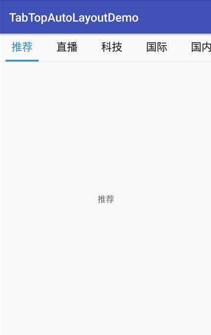
效果图
代码分析
TabTopAutoLayout:底部选项卡布局类——自定义的LinearLayout子类;实现了各个选项卡的布局、状态切换、点击事件的回调。
需要注意:注释掉params.weight = 1;
        //设置要添加的子布局view的参数

        LayoutParams params = new LayoutParams(LayoutParams.WRAP_CONTENT, LayoutParams.WRAP_CONTENT);

//        params.weight = 1;//在tab_item文件的根节点RelativeLayout中是无法添加的,而这个是必须要写上的,否则只会展现一个view

        params.gravity = Gravity.CENTER;
下划线的宽度值需要在代码中设置
            //===========设置选项卡控件的下划线【不能使用View,否则setWidth不能用】==========

            final TextView top_underline = (TextView) toptabitemView.findViewById(R.id.top_underline);

            //设置下划线的宽度值==根布局的宽度

            top_title.measure(View.MeasureSpec.UNSPECIFIED, View.MeasureSpec.UNSPECIFIED);

            Log.w("why", "top_title.getMeasuredWidth()="+top_title.getMeasuredWidth());

            toptabLayout.measure(View.MeasureSpec.UNSPECIFIED, View.MeasureSpec.UNSPECIFIED);

            Log.w("why", "toptabLayout.getMeasuredWidth()="+toptabLayout.getMeasuredWidth());

            top_underline.setWidth(toptabLayout.getMeasuredWidth());//手动设置下划线的宽度值
可滑动效果是在activity_main布局文件中实现的
    <!-- 可滑动的顶部选项卡区域 -->

    <HorizontalScrollView

        android:layout_width="match_parent"

        android:layout_height="wrap_content"

        android:scrollbars="none">

        <com.why.project.tabtopautolayoutdemo.views.tab.TabTopAutoLayout

            android:id="@+id/id_titleLayout"

            android:layout_width="wrap_content"

            android:layout_height="match_parent"

            android:gravity="center_vertical"

            android:orientation="horizontal"

            />

    </HorizontalScrollView>
使用步骤
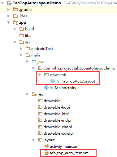
一、项目组织结构图
注意事项:
1、 导入类文件后需要change包名以及重新import R文件路径
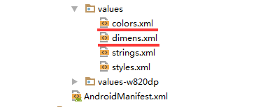
2、 Values目录下的文件(strings.xml、dimens.xml、colors.xml等),如果项目中存在,则复制里面的内容,不要整个覆盖
二、导入步骤
将TabTopAutoLayout.java文件复制到项目中
package com.why.project.tabtopautolayoutdemo.views.tab;

import android.content.Context;

import android.util.AttributeSet;

import android.util.Log;

import android.view.Gravity;

import android.view.LayoutInflater;

import android.view.View;

import android.widget.LinearLayout;

import android.widget.RelativeLayout;

import android.widget.TextView;

import com.why.project.tabtopautolayoutdemo.R;

import java.util.ArrayList;

import java.util.Arrays;

import java.util.List;

/**

 * Created by HaiyuKing

 * Used 顶部动态选项卡数据且可滑动

 */

public class TabTopAutoLayout extends LinearLayout {

    private Context mContext;

    //选项卡标题

    //CharSequence与String都能用于定义字符串,但CharSequence的值是可读可写序列,而String的值是只读序列。

    private CharSequence[] toptab_Titles = {""};

    //选项卡的各个选项的view的集合:用于更改背景颜色

    private List<View> toptab_Items = new ArrayList<View>();

    //选项卡的各个选项的标题的集合:用于切换时改变文字颜色

    private List<TextView> topTab_titles = new ArrayList<TextView>();

    //选项卡的各个选项的下划线的集合:用于切换时改变下划线颜色

    private List<View> topTab_underlines = new ArrayList<View>();

    public TabTopAutoLayout(Context context, AttributeSet attrs) {

        super(context, attrs);

        mContext = context;

        List<CharSequence> toptab_titleList = new ArrayList<CharSequence>();

        toptab_titleList = Arrays.asList(toptab_Titles);

        //初始化view:创建多个view对象(引用tab_bottom_item文件),设置图片和文字,然后添加到这个自定义类的布局中

        initAddBottomTabItemView(toptab_titleList);

    }

    //初始化控件

    private void initAddBottomTabItemView(List<CharSequence> tabTitleList){

        int countChild = this.getChildCount();

        if(countChild > 0){

            this.removeAllViewsInLayout();//清空控件

            //将各个选项的view添加到集合中

            toptab_Items.clear();

            //将各个选项卡的各个选项的标题添加到集合中

            topTab_titles.clear();

            //将各个选项卡的各个选项的下划线添加到集合中

            topTab_underlines.clear();

        }

        //设置要添加的子布局view的参数

        LayoutParams params = new LayoutParams(LayoutParams.WRAP_CONTENT, LayoutParams.WRAP_CONTENT);

//        params.weight = 1;//在tab_item文件的根节点RelativeLayout中是无法添加的,而这个是必须要写上的,否则只会展现一个view

        params.gravity = Gravity.CENTER;

        for(int index=0;index<tabTitleList.size();index++){

            final int finalIndex = index;

            //============引用选项卡的各个选项的布局文件=================

            View toptabitemView = LayoutInflater.from(mContext).inflate(R.layout.tab_top_auto_item, this, false);

            //===========选项卡的根布局==========

            RelativeLayout toptabLayout = (RelativeLayout) toptabitemView.findViewById(R.id.toptabLayout);

            //===========设置选项卡的文字==========

            final TextView top_title = (TextView) toptabitemView.findViewById(R.id.top_title);

            //设置选项卡的文字

            top_title.setText(tabTitleList.get(index));

            //===========设置选项卡控件的Tag(索引)==========用于后续的切换更改图片和文字

            top_title.setTag("tag"+index);

            //===========设置选项卡控件的下划线【不能使用View,否则setWidth不能用】==========

            final TextView top_underline = (TextView) toptabitemView.findViewById(R.id.top_underline);

            //设置下划线的宽度值==根布局的宽度

            top_title.measure(View.MeasureSpec.UNSPECIFIED, View.MeasureSpec.UNSPECIFIED);

            Log.w("why", "top_title.getMeasuredWidth()="+top_title.getMeasuredWidth());

            toptabLayout.measure(View.MeasureSpec.UNSPECIFIED, View.MeasureSpec.UNSPECIFIED);

            Log.w("why", "toptabLayout.getMeasuredWidth()="+toptabLayout.getMeasuredWidth());

            top_underline.setWidth(toptabLayout.getMeasuredWidth());//手动设置下划线的宽度值

            //添加选项卡各个选项的触发事件监听

            toptabitemView.setOnClickListener(new OnClickListener() {

                public void onClick(View v) {

                    //设置当前选项卡状态为选中状态

                    //修改View的背景颜色

                    setTabsDisplay(finalIndex);

                    //添加点击事件

                    if(topTabSelectedListener != null){

                        //执行activity主类中的onBottomTabSelected方法

                        topTabSelectedListener.onTopTabSelected(finalIndex);

                    }

                }

            });

            //把这个view添加到自定义的布局里面

            this.addView(toptabitemView,params);

            //将各个选项的view添加到集合中

            toptab_Items.add(toptabitemView);

            //将各个选项卡的各个选项的标题添加到集合中

            topTab_titles.add(top_title);

            //将各个选项卡的各个选项的下划线添加到集合中

            topTab_underlines.add(top_underline);

        }

    }

    /**

     * 设置底部导航中图片显示状态和字体颜色

     */

    public void setTabsDisplay(int checkedIndex) {

        int size = topTab_titles.size();

        for(int i=0;i<size;i++){

            TextView topTabTitle = topTab_titles.get(i);

            View top_underline = topTab_underlines.get(i);

            //设置选项卡状态为选中状态

            if(topTabTitle.getTag().equals("tag"+checkedIndex)){

                //修改文字颜色

                topTabTitle.setTextColor(getResources().getColor(R.color.tab_text_selected_top));

                //修改下划线的颜色

                top_underline.setBackgroundColor(getResources().getColor(R.color.tab_auto_selected_top));

            }else{

                //修改文字颜色

                topTabTitle.setTextColor(getResources().getColor(R.color.tab_text_normal_top));

                //修改下划线的颜色

                top_underline.setBackgroundColor(getResources().getColor(R.color.tab_auto_normal_top));

            }

        }

    }

    /**设置显示的选项卡集合*/

    public void setTabList(ArrayList<CharSequence> toptab_titleList){

        initAddBottomTabItemView(toptab_titleList);

    }

    private OnTopTabUnderLineSelectListener topTabSelectedListener;

    //自定义一个内部接口,用于监听选项卡选中的事件,用于获取选中的选项卡的下标值

    public interface OnTopTabUnderLineSelectListener{

        void onTopTabSelected(int index);

    }

    public void setOnTopTabSelectedListener(OnTopTabUnderLineSelectListener topTabSelectedListener){

        this.topTabSelectedListener = topTabSelectedListener;

    }

}
TabTopAutoLayout
将tab_top_auto_item.xml文件复制到项目中
<?xml version="1.0" encoding="utf-8"?>

<!-- 带有下划线的顶部选项卡子项的布局文件(选择图片界面) -->

<RelativeLayout xmlns:android="http://schemas.android.com/apk/res/android"

    android:id="@+id/toptabLayout"

    android:layout_width="wrap_content"

    android:layout_height="wrap_content"

    android:gravity="center"

    android:paddingTop="@dimen/tab_top_auto_padding"

    android:paddingLeft="@dimen/tab_top_auto_padding"

    android:paddingRight="@dimen/tab_top_auto_padding"

    >

    <!-- 标题 -->

    <TextView

        android:id="@+id/top_title"

        android:layout_width="wrap_content"

        android:layout_height="wrap_content"

        android:gravity="center"

        android:text=""

        android:textSize="@dimen/tab_top_auto_title_size"

        android:textColor="@color/tab_text_normal_top"

        android:layout_alignParentTop="true"

        android:layout_centerHorizontal="true" />

    <!-- 下划线-->

    <!-- android:background="@color/tab_underline_selected_top" -->

    <TextView

        android:id="@+id/top_underline"

        android:layout_width="match_parent"

        android:layout_height="@dimen/tab_top_auto_height"

        android:background="@color/tab_auto_normal_top"

        android:layout_below="@id/top_title"

        android:layout_centerHorizontal="true"

        android:layout_marginTop="@dimen/tab_top_auto_padding"

        />

</RelativeLayout>
tab_top_auto_item
在colors.xml文件中添加以下代码:【后续可根据实际情况更改背景颜色、文字颜色值】
<?xml version="1.0" encoding="utf-8"?>

<resources>

    <color name="colorPrimary">#3F51B5</color>

    <color name="colorPrimaryDark">#303F9F</color>

    <color name="colorAccent">#FF4081</color>

    <!-- *********************************顶部选项卡区域********************************* -->

    <!-- 顶部选项卡下划线背景色 -->

    <color name="tab_auto_normal_top">#00ffffff</color>

    <color name="tab_auto_selected_top">#3090d9</color>

    <!-- 顶部选项卡文本颜色 -->

    <color name="tab_text_normal_top">#191919</color>

    <color name="tab_text_selected_top">#3090d9</color>

</resources>
在dimens.xml文件中添加以下代码:【后续可根据实际情况更改底部选项卡区域的高度值、文字大小值】
<resources>

    <!-- Default screen margins, per the Android Design guidelines. -->

    <dimen name="activity_horizontal_margin">16dp</dimen>

    <dimen name="activity_vertical_margin">16dp</dimen>

    <!-- *********************************顶部选项卡区域********************************* -->

    <!-- 选项卡的内边距 -->

    <dimen name="tab_top_auto_padding">10dp</dimen>

    <!-- 选项卡标题的文字大小 -->

    <dimen name="tab_top_auto_title_size">18sp</dimen>

    <!-- 选项卡标题的下划线高度 -->

    <dimen name="tab_top_auto_height">3dp</dimen>

</resources>
至此,TabTopAutoLayout类集成到项目中了。
三、使用方法
在Activity布局文件中引用TabTopAutoLayout布局类【注意:需要重新引用TabTopAutoLayout类的完整路径】
<?xml version="1.0" encoding="utf-8"?>

<LinearLayout

    xmlns:android="http://schemas.android.com/apk/res/android"

    xmlns:tools="http://schemas.android.com/tools"

    android:id="@+id/activity_main"

    android:layout_width="match_parent"

    android:layout_height="match_parent"

    android:orientation="vertical"

    tools:context="com.why.project.tabtopautolayoutdemo.MainActivity">

    <!-- 可滑动的顶部选项卡区域 -->

    <HorizontalScrollView

        android:layout_width="match_parent"

        android:layout_height="wrap_content"

        android:scrollbars="none">

        <com.why.project.tabtopautolayoutdemo.views.tab.TabTopAutoLayout

            android:id="@+id/id_titleLayout"

            android:layout_width="wrap_content"

            android:layout_height="match_parent"

            android:gravity="center_vertical"

            android:orientation="horizontal"

            />

    </HorizontalScrollView>

    <View

        android:layout_width="match_parent"

        android:layout_height="1sp"

        android:background="#e9e9e9"

        />

    <!-- 切换区域 -->

    <TextView

        android:id="@+id/tv_show"

        android:layout_width="match_parent"

        android:layout_height="match_parent"

        android:gravity="center"

        android:text=""/>

</LinearLayout>
在Activity中使用如下
package com.why.project.tabtopautolayoutdemo;

import android.os.Bundle;

import android.support.v7.app.AppCompatActivity;

import android.util.Log;

import android.widget.TextView;

import com.why.project.tabtopautolayoutdemo.views.tab.TabTopAutoLayout;

import java.util.ArrayList;

public class MainActivity extends AppCompatActivity {

    private static final String TAG = "MainActivity";

    private TabTopAutoLayout id_titleLayout;

    private ArrayList<CharSequence> tabTitleList = new ArrayList<CharSequence>();

    /**保存的选项卡的下标值*/

    private int savdCheckedIndex = 0;

    /**当前的选项卡的下标值*/

    private int mCurrentIndex = -1;

    private TextView tv_show;//显示选中的选项卡的文本

    @Override

    protected void onCreate(Bundle savedInstanceState) {

        super.onCreate(savedInstanceState);

        setContentView(R.layout.activity_main);

        //初始化控件

        initView();

        //初始化数据

        initData();

        //初始化控件的点击事件

        initEvent();

    }

    @Override

    protected void onResume() {

        // TODO Auto-generated method stub

        super.onResume();

        Log.w(TAG, "{onResume}");

        //设置保存的或者初始的选项卡标红显示

        SwitchTab(savdCheckedIndex);

        mCurrentIndex = -1;//解决按home键后长时间不用,再次打开显示空白的问题

        //设置保存的或者初始的选项卡展现对应的fragment

        ShowFragment(savdCheckedIndex);

    }

    /**

     * 初始化控件

     * */

    private void initView(){

        id_titleLayout = (TabTopAutoLayout) findViewById(R.id.id_titleLayout);

        tv_show = (TextView) findViewById(R.id.tv_show);

    }

    /**初始化数据*/

    private void initData() {

        tabTitleList.add("推荐");

        tabTitleList.add("直播");

        tabTitleList.add("科技");

        tabTitleList.add("国际");

        tabTitleList.add("国内");

        tabTitleList.add("体育");

        tabTitleList.add("教育");

        tabTitleList.add("军事");

        tabTitleList.add("财经");

        tabTitleList.add("社会");

        tabTitleList.add("专题");

        id_titleLayout.setTabList(tabTitleList);

    }

    /**

     * 初始化点击事件

     * */

    private void initEvent(){

        //每一个选项卡的点击事件

        id_titleLayout.setOnTopTabSelectedListener(new TabTopAutoLayout.OnTopTabUnderLineSelectListener() {

            @Override

            public void onTopTabSelected(int index) {

                ShowFragment(index);//独立出来,用于OnResume的时候初始化展现相应的Fragment

            }

        });

    }

    /**控制切换选项卡*/

    public void SwitchTab(int checkedIndex){

        if(id_titleLayout != null){

            id_titleLayout.setTabsDisplay(checkedIndex);

        }

    }

    /**

     * 显示选项卡对应的Fragment*/

    public void ShowFragment(int checkedIndex) {

        if (mCurrentIndex == checkedIndex) {

            return;

        }

        //隐藏全部碎片

        hideFragments();

        //=============To Do根据实际情况显示不同的区域=============

        tv_show.setText(tabTitleList.get(checkedIndex).toString());

        savdCheckedIndex = checkedIndex;

        mCurrentIndex = checkedIndex;

    }

    /**隐藏全部碎片

     * 需要注意:不要在OnResume方法中实例化碎片,因为先添加、显示,才可以隐藏。否则会出现碎片无法显示的问题*/

    private void hideFragments() {

        //=============根据实际情况进行处理=============

        tv_show.setText("");

    }

    /**

     * http://blog.csdn.net/caesardadi/article/details/20382815

     * */

    // 自己记录fragment的位置,防止activity被系统回收时,fragment错乱的问题【按home键返回到桌面一段时间,然后在进程里面重新打开,会发现RadioButton的图片选中状态在第二个,但是文字和背景颜色的选中状态在第一个】

    //onSaveInstanceState()只适合用于保存一些临时性的状态,而onPause()适合用于数据的持久化保存。

    protected void onSaveInstanceState(Bundle outState) {

        //http://www.cnblogs.com/chuanstone/p/4672096.html?utm_source=tuicool&utm_medium=referral

        //总是执行这句代码来调用父类去保存视图层的状态”。其实到这里大家也就明白了,就是因为这句话导致了重影的出现

        //super.onSaveInstanceState(outState);

        outState.putInt("selectedCheckedIndex", savdCheckedIndex);

        outState.putInt("mCurrentIndex", mCurrentIndex);

    }

    @Override

    protected void onRestoreInstanceState(Bundle savedInstanceState) {

        savdCheckedIndex = savedInstanceState.getInt("selectedCheckedIndex");

        mCurrentIndex = savedInstanceState.getInt("mCurrentIndex");

        super.onRestoreInstanceState(savedInstanceState);

    }

}
混淆配置
无
参考资料
暂时空缺
项目demo下载地址
https://github.com/haiyuKing/TabTopAutoLayoutDemo
TabTopAutoLayout【自定义顶部选项卡区域(带下划线)(动态选项卡数据且可滑动)】的更多相关文章
- TabTopUnderLineLayout【自定义顶部选项卡(带下划线)】
版权声明:本文为HaiyuKing原创文章,转载请注明出处! 前言 自定义顶部选项卡布局LinearLayout类,实现带下划线样式的效果. 备注:如果配合Fragment的话,MainActivit ...
- FragmentTabHostUnderLineDemo【FragmentTabHost带下划线】
版权声明:本文为HaiyuKing原创文章,转载请注明出处! 前言 使用FragmentTabHost实现顶部选项卡(带下划线效果)展现. 效果图 代码分析 1.该Demo中采用的是FragmentT ...
- 关于python中带下划线的变量和函数 的意义
总结: 变量: 1. 前带_的变量: 标明是一个私有变量, 只用于标明, 外部类还是可以访问到这个变量 2. 前带两个_ ,后带两个_ 的变量: 标明是内置变量, 3. 大写加下划线的变量: ...
- delphi 仅带下划线的TEdit控件
在做录入框的时候,很希望有一个只带下划线的文本框,网上介绍的很多,有自己做组件的,须不知Delphi下只需要简单设置几个属性即可达到目的.
- geotools导入shp文件到Oracle数据库时表名带下划线的问题解决
问题: 最近在做利用geotools导入shp文件到Oracle表中,发现一个问题Oracle表名带下划线时导入失败,问题代码行: dsOracle.getFeatureWriterAppend(or ...
- [转]关于python中带下划线的变量和函数的意义
Python 的代码风格由 PEP 8 描述.这个文档描述了 Python 编程风格的方方面面.在遵守这个文档的条件下,不同程序员编写的 Python 代码可以保持最大程度的相似风格.这样就易于阅读, ...
- Python里的单下划线,双下划线,以及前后都带下划线的意义
Python里的单下划线,双下划线,以及前后都带下划线的意义: 单下划线如:_name 意思是:不能通过from modules import * 导入,如需导入需要:from modules imp ...
- 【转】关于python中带下划线的变量和函数 的意义
http://www.blogjava.net/lincode/archive/2011/02/02/343859.html 总结: 变量: 1. 前带_的变量: 标明是一个私有变量, 只用于标明 ...
- 带下划线的 HTTP Header无法获取到可能是因为nginx
背景:新版本修改了个功能是在老版本的基础上做的,同一个接口,需要兼容老版本,因此让前台在header中封装了 version版本号,client_type 客户端类型,根据这两个字段判断接口要走的逻辑 ...
随机推荐
- Python 下载win32api 模块
终端输入 pip install pypiwin32
- Java 读书笔记 (十三) for each 循环
JDK 1.5引进了一种新的循环类型,被称为foreach循环或者加强型循环,它能在不使用下标的情况下遍历数组. 实例: public class TestArray{ public static v ...
- CSS操作笔记
编写css样式:1. 标签的style属性2. 写在head里面 style标签中写样式- id选择区#i1{background-color: #2459a2;height: 48px;}- cla ...
- nsq源码阅读笔记之nsqd(四)——Channel
与Channel相关的代码主要位于nsqd/channel.go, nsqd/nsqd.go中. Channel与Topic的关系 Channel是消费者订阅特定Topic的一种抽象.对于发往Topi ...
- ConcurrentHashMap简介
ConcurrentHashMap为了高并发而设计,相比于HashTable和HashMap有更多优势.HashTable是同步的,在多线程环境下,能保证程序执行的正确性,每次同步执行的时候都要锁住整 ...
- 使用bat打开多个cmd窗口执行gulp、node
一.使用场景 使用场景:项目发布前 操作步骤: 1.执行gulp,对文件进行压缩.合并等操作: 2.在1执行完成后,对1中合并的文件如default.css进行多主题色的自动生成,在这里使用node处 ...
- 用js制作数码时钟
实现效果 实现效果 图片素材 图片素材 原理分析 用setInterval(fn, 1000)来循环刷新图片. 用date对象的getHours().getMinutes().getSeconds() ...
- bootstrap小知识
栅格系统 1. row必须放到container和container-fluid里面 2. 你的内容应当放置于"列(column)"内,并且,只有"列(column)&q ...
- 带logo图片或不带logo图片的二维码生成与解析,亲测成功
最近公司需要实现二维码功能,本人经过一顿百度,终于实现了,因有3个功能:不带logo图片.带logo图片.解析二维码,篇幅较长,请耐心读之,直接复制粘贴即可. 前提:myeclipse10:jar包: ...
- Java注解(二):实战 - 直接使用对象列表生成报表
通过对Java注解(一):介绍,思想及优点学习了解,相信大家对Java注解有一定程度的了解,本篇文章将实战项目中的应用来加深对Java注解的了解. 本实例实现根据指定字段的JavaBean,生成对应列 ...