数据可视化之 tick_params( 参数 )
参考:https://blog.csdn.net/helunqu2017/article/details/78736554/
初学数据可视化,遇到了tick_params() 里面传参数问题,找了一些资料,觉得这个简单明了,非常好用,推荐看下!
1.tick_params语法
Axes.tick_params(axis=’both’, **kwargs)
参数:
axis : {‘x’, ‘y’, ‘both’} Axis on which to operate; default is ‘both’. (axis:轴)
reset : bool If True, set all parameters to defaults before processing other keyword arguments. Default is False.
which : {‘major’, ‘minor’, ‘both’} Default is ‘major’; apply arguments to which ticks.
direction : {‘in’, ‘out’, ‘inout’} Puts ticks inside the axes, outside the axes, or both.
length : float Tick length in points.
width : float Tick width in points.
color : color Tick color; accepts any mpl color spec.
pad : float Distance in points between tick and label.
labelsize : float or str Tick label font size in points or as a string (e.g., ‘large’).
labelcolor : color Tick label color; mpl color spec.
colors : color Changes the tick color and the label color to the same value: mpl color spec.
zorder : float Tick and label zorder.
bottom, top, left, right : bool or {‘on’, ‘off’} controls whether to draw the respective ticks.
labelbottom, labeltop, labelleft, labelright : bool or {‘on’, ‘off’} controls whether to draw the respective tick labels.
labelrotation : float Tick label rotation
2.tick_params例子:
参数axis的值为’x’、’y’、’both’,分别代表设置X轴、Y轴以及同时设置,默认值为’both’。
ax1.tick_params(axis=’x’,width=2,colors=’gold’)
ax2.tick_params(axis=’y’,width=2,colors=’gold’)
ax3.tick_params(axis=’both’,width=2,colors=’gold’) 
参数which的值为 ‘major’、’minor’、’both’,分别代表设置主刻度线、副刻度线以及同时设置,默认值为’major’ (主刻度线、副刻度线类似于厘米尺。CM与MM的区别)
ax1.tick_params(which=’major’,width=2,colors=’gold’)
ax2.tick_params(which=’minor’,width=2,colors=’gold’)
ax3.tick_params(which=’both’,width=2,colors=’gold’)

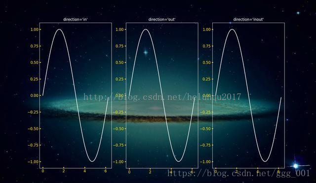
参数direction的值为’in’、’out’、’inout’,分别代表刻度线显示在绘图区内侧、外侧以及同时显示
ax1.tick_params(direction=’in’,width=2,length=4,colors=’gold’)
ax2.tick_params(direction=’out’,width=2,length=4,colors=’gold’)
ax3.tick_params(direction=’inout’,width=2,length=4,colors=’gold’)
length和width
参数length和width分别用于设置刻度线的长度和宽度
ax2.tick_params(width=4,colors=’gold’)
ax3.tick_params(length=10,colors=’gold’)

参数pad用于设置刻度线与标签间的距离
ax2.tick_params(pad=1,colors=’gold’)
ax3.tick_params(pad=10,colors=’gold’)

参数color、labelcolor、colors分别用于设置刻度线的颜色、刻度线标签的颜色以及同时设置刻度线及标签颜色
ax1.tick_params(width=4,color=’gold’)
ax2.tick_params(width=4,labelcolor=’gold’)
ax3.tick_params(width=4,colors=’gold’)

参数labelsize用于设置刻度线标签的字体大小
ax1.tick_params(labelsize=’medium’)
ax2.tick_params(labelsize=’large’)
ax3.tick_params(labelsize=15)

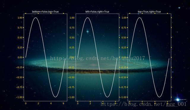
参数bottom, top, left, right的值为布尔值,分别代表设置绘图区四个边框线上的的刻度线是否显示
ax1.tick_params(bottom=False,top=True,width=4,colors=’gold’)
ax2.tick_params(left=False,right=True,width=4,colors=’gold’)
ax3.tick_params(top=True,right=True,width=4,colors=’gold’)
参数labelbottom, labeltop, labelleft, labelright的值为布尔值,分别代表设置绘图区四个边框线上的刻度线标签是否显示
ax1.tick_params(labelbottom=False,labeltop=True,width=4,colors=’gold’)
ax2.tick_params(labelleft=False,labelright=True,width=4,colors=’gold’)
ax3.tick_params(labeltop=True,labelright=True,width=4,colors=’gold’)

数据可视化之 tick_params( 参数 )的更多相关文章
- 【Data Visual】一文搞懂matplotlib数据可视化
一文搞懂matplotlib数据可视化 作者:白宁超 2017年7月19日09:09:07 摘要:数据可视化主要旨在借助于图形化手段,清晰有效地传达与沟通信息.但是,这并不就意味着数据可视化就一定因为 ...
- 【Matplotlib】数据可视化实例分析
数据可视化实例分析 作者:白宁超 2017年7月19日09:09:07 摘要:数据可视化主要旨在借助于图形化手段,清晰有效地传达与沟通信息.但是,这并不就意味着数据可视化就一定因为要实现其功能用途而令 ...
- 基于matplotlib的数据可视化 - 笔记
1 基本绘图 在plot()函数中只有x,y两个量时. import numpy as np import matplotlib.pyplot as plt # 生成曲线上各个点的x,y坐标,然后用一 ...
- (在模仿中精进数据可视化05)疫情期间市值增长top25公司
本文完整代码及数据已上传至我的Github仓库https://github.com/CNFeffery/FefferyViz 1 简介 新冠疫情对很多实体经济带来冲击的同时,也给很多公司带来了新的增长 ...
- 数据可视化案例 | 如何打造数据中心APP产品
意识到数据探索带来的无尽信息,越来越多的企业开始建立自有的数据分析平台,打造数据化产品,实现数据可视化. 在零售商超行业,沃尔玛"啤酒与尿布"的故事已不再是传奇.无论是大数据还是小 ...
- 前端数据可视化echarts.js使用指南
一.开篇 首先这里要感谢一下我的公司,因为公司需求上面的新颖(奇葩)的需求,让我有幸可以学习到一些好玩有趣的前端技术,前端技术中好玩而且比较实用的我想应该要数前端的数据可视化这一方面,目前市面上的数据 ...
- [译]学习IPython进行交互式计算和数据可视化(五)
第四章:交互式绘图接口 本章我们将展示Python的绘图功能以及如何在IPython中交互式地使用它们. NumPy为处理大量的多维数组结构的数据提供了高效的方法.但是看行行列列的数字总不如直接看曲线 ...
- [译]学习IPython进行交互式计算和数据可视化(三)
第二章 在本章中,我们将详细学习IPython相对以Python控制台带来的多种改进.特别的,我们将会进行下面的几个任务: 从IPython中使用系统shell以在shell和Python之间进行强大 ...
- 用ElasticSearch和Protovis实现数据可视化
搜索引擎最重要的目的,嗯,不出意料就是搜索.你传给它一个请求,然后它依照相关性返回你一串匹配的结果.我们可以根据自己的内容创造各种请求结构,试验各种不同的分析器,搜索引擎都会努力尝试提供最好的结果. ...
随机推荐
- 在sparkStreaming实时存储时的问题
1.实时插入mysql时遇到的问题,使用的updateStaeBykey有状态的算子 必须设置checkpoint 如果报错直接删掉checkpoint 在创建的时候自己保存偏移量即可 再次启动时读 ...
- VMware centos7 如何配置静态ip并且可上网
注:此贴使用NAT方式配置上网模式. 1.设置虚拟机的网络适配器为NAT模式: 2.修改VMware的“虚拟网络编辑器”: 打开后选择NAT模式,勾选,然后点击NAT设置: NAT默认设置了188网段 ...
- phtyon
https://www.liaoxuefeng.com/wiki/0014316089557264a6b348958f449949df42a6d3a2e542c000/0014316399410395 ...
- list set map区别及适用场景
list与Set.Map区别及适用场景 1.List,Set都是继承自Collection接口,Map则不是 2.List特点:元素有放入顺序,元素可重复 ,Set特点:元素无放入顺序,元素不可重 ...
- Sonar 配置及部署(windows系统)
Sonar 是一个用于代码质量管理的开放平台.通过插件机制,Sonar 可以集成不同的测试工具,代码分析工具,以及持续集成工具. 与持续集成工具(例如 Hudson/Jenkins 等)不同,Sona ...
- jquery AJAX数据传输路径写法~
$.post('{:url("index/index/logininfo")}',{'username':name,'password':pwd},function(data){ ...
- Vue-admin工作整理(十九):从数字渐变组件谈第三方JS库Count-to的使用
1.组件封装基础 npm install countup@latest 2.组件中使用id值 3.组件中获得dom 如何封装一个组件,在组件中用到需要传入HTML元素ID值的JS库时如何处理,如何获取 ...
- springboot2.0配置连接池(hikari、druid)
springboot2.0配置连接池(hikari.druid) 原文链接:https://www.cnblogs.com/blog5277/p/10660689.html 原文作者:博客园--曲高终 ...
- C#File类常用文件操作以及一个模拟的控制台文件管理系统
重温一下C#中File类的一些基本操作: File类,是一个静态类,主要是来提供一些函数库用的. 使用时需要引入System.IO命名空间. 一.常用操作: 1.创建文件方法 //参数1:要创建的文件 ...
- 他山之石,calling by share——python中既不是传址也不是传值
事情是这样的,Python里是传址还是传值令人疑惑,限于本人没有C基础,所以对大家的各类水平层次不一的解答难以确信. 第一个阶段: 在读<python基础教程第二版>的时候感到疑惑,然后群 ...