ch7对表单和数据表格使用样式
对数据表格应用样式
1、表格特有的元素
- caption:基本上用做表格的标题。summary:可应用于表格的标签,用来描述表格的内容(与image的alt文本相似)
- <table class="cal" summary="A calandar style date picker">
- <caption>
- <a href="#" class="prev"><</a> January 2008 <a href="#" class="next">></a>
- </caption>
- </table>
- <table class="cal" summary="A calandar style date picker">
thead、tbody和tfoot使开发人员能够将表格划分为逻辑部分,可以将所有列标题放在thead元素中,这样可以对这个特殊区域单独应用样式。如果使用thead或tfoot元素,那么必须至少使用一个tbody元素。在一个表格中只能使用一个thead和tfoot元素,但是可以使用多个tbody将复杂的表格划分为更容易管理的几个部分。
行和列标题应该使用th标记而不是td,但是如果某些内容既是数据又是标题,那么它仍然应该使用td,表格标题可以设置值为row或col的scope属性,定义他们是行标题还是列标题,它们还可以设置值rowgroup或colgroup,表示他们与多行或多列相关
- <thead>
- <tr>
- <th scope="col">S</th>
- <th scope="col">M</th>
- <th scope="col">T</th>
- <th scope="col">W</th>
- <th scope="col">T</th>
- <th scope="col">F</th>
- <th scope="col">S</th>
- </tr>
- </thead>
- <thead>
- col和colgroup:tr能狗对整行应用样式,但是很难对整列应用样式。colgroup能够对使用col元素定义的一个或多个列进行分组,但是支持col和colgroup元素的浏览器并不多
- <colgroup>
- <col id="sun" />
- <col id="mon" />
- <col id="tue" />
- <col id="wed" />
- <col id="thur" />
- <col id="fri" />
- <col id="sat" />
- </colgroup>
- <colgroup>
2、数据表格标记
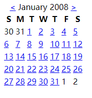
下面代码可以创建出一个日历表格的基本轮廓:
- <table class="cal" summary="A calandar style date picker">
- <caption>
- <a href="#" class="prev"><</a> January 2008 <a href="#" class="next">></a>
- </caption>
- <colgroup>
- <col id="sun" />
- <col id="mon" />
- <col id="tue" />
- <col id="wed" />
- <col id="thur" />
- <col id="fri" />
- <col id="sat" />
- </colgroup>
- <thead>
- <tr>
- <th scope="col">S</th>
- <th scope="col">M</th>
- <th scope="col">T</th>
- <th scope="col">W</th>
- <th scope="col">T</th>
- <th scope="col">F</th>
- <th scope="col">S</th>
- </tr>
- </thead>
- <tbody>
- <tr>
- <td>30</td>
- <td>31</td>
- <td><a href="#">1</a></td>
- <td><a href="#">2</a></td>
- <td><a href="#">3</a></td>
- <td><a href="#">4</a></td>
- <td><a href="#">5</a></td>
- </tr>
- <tr>
- <td><a href="#">6</a></td>
- <td><a href="#">7</a></td>
- <td class="selected"><a href="#">8</a></td>
- <td><a href="#">9</a></td>
- <td><a href="#">10</a></td>
- <td><a href="#">11</a></td>
- <td><a href="#">12</a></td>
- </tr>
- <tr>
- <td><a href="#">13</a></td>
- <td><a href="#">14</a></td>
- <td><a href="#">15</a></td>
- <td><a href="#">16</a></td>
- <td><a href="#">17</a></td>
- <td><a href="#">18</a></td>
- <td><a href="#">19</a></td>
- </tr>
- <tr>
- <td><a href="#">20</a></td>
- <td><a href="#">21</a></td>
- <td><a href="#">22</a></td>
- <td><a href="#">23</a></td>
- <td><a href="#">24</a></td>
- <td><a href="#">25</a></td>
- <td><a href="#">26</a></td>
- </tr>
- <tr>
- <td><a href="#">27</a></td>
- <td><a href="#">28</a></td>
- <td><a href="#">29</a></td>
- <td><a href="#">30</a></td>
- <td><a href="#">31</a></td>
- <td>1</td>
- <td>2</td>
- </tr>
- </tbody>
- </table>
结果如下:
3、对表格应用样式
- border-collapse:设置表格的边框是否被合并为一个单一的边框,还是象在标准的 HTML 中那样分开显示。
值 描述 separate 默认值。边框会被分开。不会忽略 border-spacing 和 empty-cells 属性。 collapse 如果可能,边框会合并为一个单一的边框。会忽略 border-spacing 和 empty-cells 属性。 inherit 规定应该从父元素继承 border-collapse 属性的值。 separate时:
collapse时:
border-spacing:该属性指定分隔边框模型中单元格边界之间的距离。在指定的两个长度值中,第一个是水平间隔,第二个是垂直间隔。除非 border-collapse 被设置为 separate,否则将忽略这个属性。尽管这个属性只应用于表,不过它可以由表中的所有元素继承。
值 描述 length length 规定相邻单元的边框之间的距离。使用 px、cm 等单位。不允许使用负值。
如果定义一个 length 参数,那么定义的是水平和垂直间距。
如果定义两个 length 参数,那么第一个设置水平间距,而第二个设置垂直间距。
inherit 规定应该从父元素继承 border-spacing 属性的值。
CSS规范有两个表格边框模型:单独的和叠加的。单独模型:在各个单元周围有边框;叠加模型:单元格共享边框。用border-collapse属性来设置。
在本例中希望使用双边框创建斜面效果,所以将border-collapse设置为separate,然后让表格中的所有文本居中,删除默认的内边距和外边距。使用border-spacing控制按元个之间的距离。
4、添加视觉样式
让表格标题更像常规的标题:增加自豪并粗体,通过垂直内边距增加标题上下的空间。
- .cal caption {
- font-size: 1.25em;
- padding-top: 0.692em;
- padding-bottom: 0.692em;
- background-color: #d4dde6;
- }
确定月份两边的前一个和下一个链接的位置:
- .cal caption[rel="prev"] {
- float: left; /*向左浮动*/
- margin-left: 0.2em; /*设置水平外边距*/
- }
- .cal caption[rel="next"] {
- float: right; /*向右浮动*/
- margin-lright: 0.2em; /*设置水平外边距*/
- }
- .cal caption a:link,
- .cal caption a:visited {
- text-decoration: none;
- color: #333;
- padding: 0 0.2em; /*内边距让点击区域更突出*/
- }
- .cal caption a::hover,
- .cal caption a::active,
- .cal caption a::focus {
- background-color: #6d8ab7; /*悬停等操作时改变背景颜色*/
- }
区别表格标题的第一行:背景较浅,添加下划线,文本略小:
- .cal thead th {
- background-color: #d4dde6;
- border-bottom: 1px solid #a9bacb;
- font-size: 0.875em;
- }
设置表格体的文本是灰色的,表示不可以选择它们,为文本设置文本阴影:
- .cal tbody {
- color: #a4a4a4;
- text-shadow: 1px 1px 1px white;
- }
- .cal tbody td {
- border-top: 1px solid #e0e0e1;
- border-right: 1px solid #9f9fa1;
- border-bottom: 1px solid #acacad;
- border-left: 1px solid #dfdfe0;
- }
- .cal tbody a {
- display: block;
- text-decoration: none;
- color: #333;
- font-weight: bold;
- padding: 0.385em 0.692em 0.308em 0.692em;
- }
- .cal tbody a:hover,
- .cal tbody a:focus,
- .cal tbody a:active,
- .cal tbody .selected a:link,
- .cal tbody .selected a:visited,
- .cal tbody .selecteda:hover,
- .cal tbody .selected a:focus,
- .cal tbody .selected a:active {
- background-color: #6d8ab7;
- color: white;
- text-shaow:1px 1px 2px #22456b
- }
一个总的CSS样式:
- <style type="text/css">
- body {
- font-family: "myriad pro", arial, helvetica, sans-serif;
- font-size:16px;
- line-height:1.125em; /* Baseline grid of 18px */
- }
- /* tables may still need 'cellspacing="0"' in the markup */
- table.cal {
- border-collapse: collapse;
- border-spacing:;
- text-align: center;
- border-bottom: 1px solid #666;
- }
- .cal caption {
- font-size:1.3em;
- padding-top: 0.692em; /* 9px */
- padding-bottom: 0.692em; /* 9px */
- }
- .cal thead th {
- border-top: 3px solid #666;
- border-bottom: 3px solid #666;
- padding-top: 0.692em; /* 9px */
- padding-bottom: 0.692em; /* 9px */
- }
- /* @group Header */
- .cal caption a:link,
- .cal caption a:visited,
- .cal caption a:hover,
- .cal caption a:active,
- .cal caption a:focus {
- background-color: #CCC;
- text-decoration: none;
- color: black;
- padding: 0 0.2em;
- }
- .cal caption a:hover,
- .cal caption a:active,
- .cal .caption a:focus {
- background-color: blue;
- color: white;
- }
- /* @end */
- /* @group Days */
- .cal tbody {
- color: #999;
- }
- .cal tbody a:link,
- .cal tbody a:visited,
- .cal tbody a:hover,
- .cal tbody a:focus,
- .cal tbody a:active {
- display: block;
- text-decoration: none;
- color: black;
- font-weight: bold;
- padding: 0.385em 0.692em 0.308em 0.692em; /* 5px 9px 4px 9px */
- }
- .cal tbody a:hover,
- .cal tbody a:focus,
- .cal tbody a:active {
- /*outline: 1px solid #ccc;*/
- background-color: #CCC;
- color: black;
- }
- .cal tbody .selected a:link,
- .cal tbody .selected a:visited,
- .cal tbody .selecteda:hover,
- .cal tbody .selected a:focus,
- .cal tbody .selected a:active {
- background-color: blue;
- color: white;
- }
- </style>
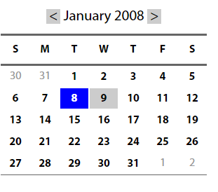
结果为:
简单的表格布局
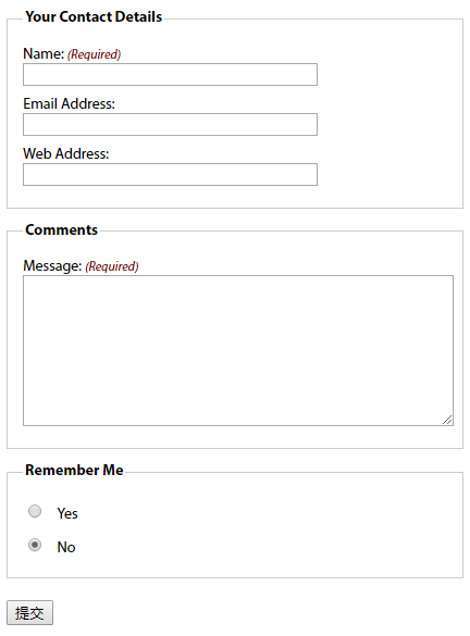
1、有用的表单元素
- fieldset:对相关的信息块进行分组(上图中有两个fieldset,一个用于联系人详细信息,一个用于注释)。lengend设置fieldset的标题
- 表单标签label:阅读器会正确的将表单元素和它的标签关联起来。将表单元素和它的标签关联的两种方式:
- <!--控件和标签关联需要id属性,将表单数据发送回服务器需要name属性-->
- <!--隐式方式:把表单元素嵌套在label元素中-->
- <label>email <input name="email" type="text"/><label>
- <!--显式方式:把label的for属性值设置为控件的id值-->
- <label for="email" >email <label>
- <input name="email" id="email" type="text"/>
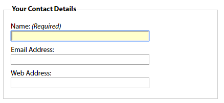
2、基本布局
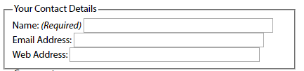
- <fieldset>
- <legend>Your Contact Details</legend> <!--为fieldset设置标题-->
- <div>
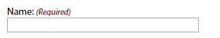
- <label for="author">Name: <em class="required">(Required)</em></label> <!--em强调斜体,for和id的值相同-->
- <input name="author" id="author" type="text" />
- </div>
- <div>
- <label for="email">Email Address:</label> <!--for和id的值相同-->
- <input name="email" id="email" type="text" />
- </div>
- <div>
- <label for="url">Web Address:</label> <!--for和id的值相同-->
- <input name="url" id="url" type="text" />
- </div>
- </fieldset>
没有应用样式:
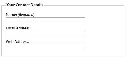
应用样式:
- fieldset {
- margin: 1em 0; /*使用外边距进行垂直分隔*/
- padding: 1em;
- border : 1px solid #ccc;
- }
- legend {
- font-weight: bold; /*加粗legend元素*/
- }
- label {
- display: block; /*标签在默认情况下是行内元素,将他们的display设置为block会使它们产生自己的块框,使输入元素转到下一行*/
- cursor: pointer; /*设置标签的光标样式*/
- }
- input {
- width: 20em; /*显式设置输入框的宽度,使其一致*/
- }
结果:
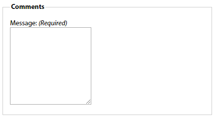
3、其他元素
文本区域:
- <fieldset>
- <legend>Comments</legend>
- <div>
- <label for="text">Message: <em class="required">(Required)</em></label>
- <textarea name="text" id="text" cols="20" rows="10"></textarea>
- </div>
- </fieldset>
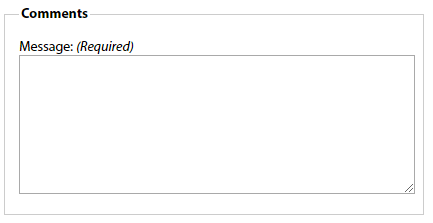
应用样式:
- textarea {
- width: 100%;
- height: 10em;
- }
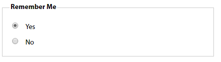
单选按钮和复选框:通常不把标签放在上方,而是放在右边。上述的代码将所有的输入框宽度都设置为20em,为区别输入元素,最好的办法是给它们分配一个类:例如给单选按钮分配类名radio
- <fieldset id="remember-me">
- <legend>Remember Me</legend>
- <div>
- <!--通过让标签围绕控件让标签和控件出现在同一行-->
- <label for="remember-yes"><input id="remember-yes" class="radio" name="remember" type="radio" value="yes" />Yes</label>
- </div>
- <div>
- <label for="remember-no"><input id="remember-no" class="radio" name="remember" type="radio" value="no" checked="checked" />No</label>
- </div>
- </fieldset>

应用样式:
- input.radio, input.submit {
- width: auto; <!--将单选按钮的宽度设置为auto,覆盖前面对输入元素的设置-->
- }
- #remember-me .radio {
- margin-right: 1em; <!--在单选按钮中添加一点外边距,使得标签之间提供适当的距离-->
- }
4、修饰
元素获得焦点时改变背景颜色,帮助用户找到要填写的表单域:
- input[type="text"]:focus, textarea:focus {
- background: #ffc;
- }
必填域:可在必填域的旁边放上有样式的文本或星号,适合这一信息的元素是em和strong,对这一信息应用样式:
- label .required {
- font-size: 0.75em; <!--减小字号-->
- color:#760000; <!--让文本变为红色-->
- }
总代码:
- <!DOCTYPE html>
- <html lang="en">
- <head>
- <meta charset="UTF-8">
- <title>Title</title>
- <style type="text/css">
- body {
- font: 62.5%/1 "Myriad Pro", Frutiger, "Lucida Grande", "Lucida Sans", "Lucida Sans Unicode", Verdana, sans-serif;
- }
- form {
- font-size: 1.4em;
- width: 30em;
- }
- /* fieldset styling */
- fieldset {
- margin: 1em 0; /* space out the fieldsets a little*/
- padding: 1em;
- border : 1px solid #ccc;
- }
- /* legend styling */
- legend {
- font-weight: bold;
- }
- form div {
- padding: 0.4em 0;
- }
- /* style for labels */
- label {
- display: block;
- cursor: pointer;
- }
- /*style for required labels */
- label .required {
- font-size: 0.75em;
- color:#760000;
- }
- input {
- width: 20em;
- }
- textarea {
- width: 100%;
- height: 10em;
- }
- input.radio, input.submit {
- width: auto;
- }
- #remember-me .radio {
- margin-right: 1em;
- }
- /* style form elements on focus */
- input[type="text"]:focus, textarea:focus {
- background: #ffc;
- }
- </style>
- </head>
- <body>
- <form id="comments_form" action="#" method="post">
- <fieldset>
- <legend>Your Contact Details</legend>
- <div>
- <label for="author">Name: <em class="required">(Required)</em></label>
- <input name="author" id="author" type="text" />
- </div>
- <div>
- <label for="email">Email Address:</label>
- <input name="email" id="email" type="text" />
- </div>
- <div>
- <label for="url">Web Address:</label>
- <input name="url" id="url" type="text" />
- </div>
- </fieldset>
- <fieldset>
- <legend>Comments</legend>
- <div>
- <label for="text">Message: <em class="required">(Required)</em></label>
- <textarea name="text" id="text" cols="20" rows="10"></textarea>
- </div>
- </fieldset>
- <fieldset id="remember-me">
- <legend>Remember Me</legend>
- <div>
- <label for="remember-yes"><input id="remember-yes" class="radio" name="remember" type="radio" value="yes" />Yes</label>
- </div>
- <div>
- <label for="remember-no"><input id="remember-no" class="radio" name="remember" type="radio" value="no" checked="checked" />No</label>
- </div>
- </fieldset>
- <div>
- <input id="submit" class="submit" name="submit" type="submit"/>
- </div>
- </form>
- </body>
- </html>
复杂的表单布局
将标签个表单元素水平布置:
与上述示例不同的地方:将标签向左浮动,并为标签设置宽度,让所有表单元素排齐
- label {
- float: left;
- width: 10em;
- }
如果表单标签可能跨多行,应该清理div容器,避免它们干扰下一组标签和弄乱布局。
- form div {
- clear: left; /*clear规定元素的哪一侧不允许其他元素浮动*/
- }
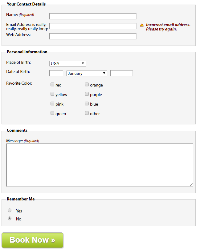
1、可访问的数据输入元素(Personal Information中的Date of Birth部分)
- <div>
- <label for="dateOfBirth">Date of Birth:</label>
- <input name="dateOfBirth" id="dateOfBirth" type="text" />
- <label id="monthOfBirthLabel" for="monthOfBirth">Month of Birth:</label>
- <select name="monthOfBirth" id="monthOfBirth">
- <option value="1">January</option>
- <option value="2">February</option>
- <option value="3">March</option>
- </select>
- <label id="yearOfBirthLabel" for="yearOfBirth">Year of Birth:</label>
- <input name="yearOfBirth" id="yearOfBirth" type="text" />
- </div>
在收集日期信息的表单元素中,不希望月和年的标签显示:需要隐藏Month of Birth和Year of Birth标签
- 将标签的display属性设置为none会阻止标签的显示,但是也会阻止屏幕阅读器访问它们
- 通过值较大的负文本缩进将标签定位到屏幕外,并将标签的宽度设置为零。
- #monthOfBirthLabel, #yearOfBirthLabel {
- text-indent: -1000em;
- width:;
- }
- #monthOfBirthLabel, #yearOfBirthLabel {
单独设置各个表单控件的尺寸,并用外边距控制它们的水平边距:
- #dateOfBirth {
- width: 3em;
- margin-right: 0.5em;
- }
- #monthOfBirth {
- width: 10em;
- margin-right: 0.5em;
- }
- #yearOfBirth {
- width: 5em;
- }
2、多列复选框(Personal Information中的Favorite Color部分)
将大的复选框组或单选按钮创建成两列:
为创建列效果,要将复选框分成两组,每一组放在一个div中各有一个col类,然后将这两个div放在一个具有描述性ID的fieldset中。
- <fieldset id="favoriteColor">
- <h2>Favorite Color:</h2>
- <div class="col">
- <div>
- <label><input class="checkbox" id="red" name="red" type="checkbox" value="red" />red</label>
- </div>
- <div>
- <label><input class="checkbox" id="yellow" name="yellow" type="checkbox" value="yellow" />yellow</label>
- </div>
- <div>
- <label><input class="checkbox" id="pink" name="pink" type="checkbox" value="pink" />pink</label>
- </div>
- <div>
- <label><input class="checkbox" id="green" name="green" type="checkbox" value="green" />green</label>
- </div>
- </div>
- <div class="col">
- <div>
- <label><input class="checkbox" id="orange" name="orange" type="checkbox" value="orange" />orange</label>
- </div>
- <div>
- <label><input class="checkbox" id="purple" name="purple" type="checkbox" value="purple" />purple</label>
- </div>
- <div>
- <label><input class="checkbox" id="blue" name="blue" type="checkbox" value="blue" />blue</label>
- </div>
- <div>
- <label><input class="checkbox" id="other" name="other" type="checkbox" value="other" />other</label>
- </div>
- </div>
- </fieldset>
因为之前已经创建了基本的fieldset样式,所以需要先覆盖这些样式,将内边距和外边距设置为零,去掉边框设置背景颜色为透明:
- #favoriteColor {
- margin:;
- padding:;
- border: none;
- background: transparent;
- }
将标题用作标签:
- #favoriteColor h2 {
- width: 10em;
- float: left;
- font-size: 1em;
- font-weight: normal;
- }
将两个div向左浮动,创建出两列的布局:
- #favoriteColor .col {
- width: 8em;
- float: left;
- clear: none; /*因为在表单中的所有div在默认情况下已经被清理了,所以需要用clear: none覆盖那个声明*/
- }
复选框的标签不需要浮动,需要覆盖那个声明:
- #favoriteColor label {
- float: none;
- }
3、提交按钮
通常使用一个type值为submit的input元素,也可以使用button元素替代input元素
- <div>
- <button type="submit">Book Now »</button>
- </div>
- <style>
- button {
- width: 200px;
- height: 50px;
- border: 1px solid #989898;
- -moz-border-radius: 6px;
- -webkit-border-radius: 6px;
- border-radius: 6px;
- background: url(img/button-bg.png) #c5e063 bottom left repeat-x;
- -moz-box-shadow: 2px 2px 2px #ccc;
- -webkit-box-shadow: 2px 2px 2px #ccc;
- box-shadow: 2px 2px 2px #ccc;
- color: #fff;
- font-size: 26px;
- font-weight: bold;
- text-shadow: 1px 1px 1px #666;
- }
- </style>
4、表单反馈(Your Contact Details中的email部分)
反馈信息突出显示忘了填写或填写错误的域:常用方法是在域的旁边添加一个错误信息。
将反馈文本放在一个em中,将这个em放在源代码中文本输入元素的后面,为使其正确排列,em和前面的input元素要浮动。许多阅读器会忽略表单元素之间的文本,除非把文本挡在标签中,为避免此问题,最好的方法是将错误信息放在表单标签中,然后使用css进行定位:
- <div>
- <label for="email">Email Address is really, really, really really long: <em class="feedback">Incorrect email address. Please try again.</em></label>
- <input name="email" id="email" type="text" />
- </div>
对其应用样式:
- form div {
- position: relative; /*为对em进行定位,需要将表单中所有段落的position设置为relative,从而创建一个新的定位上下文*/
- width: 100%;
- padding: 0.4em 0;
- clear: both;
- }
- label .feedback {
- position: absolute; /*对em进行绝对定位,让它出现在文本输入元素的右边*/
- left: 30em; /*标签宽度为10em,文本框宽度为20em,所以em的左位置设置为30em*/
- right:;
- top: 0.5em;
- font-weight: bold;
- color:#760000;
- padding-left: 20px;
- background: url(img/error.png) no-repeat left top;
- }
总的代码:
- <!DOCTYPE html>
- <html lang="en">
- <head>
- <meta charset="UTF-8">
- <title>Title</title>
- <style type="text/css">
- <!--
- body {
- font: 62.5%/1 "Myriad Pro", Frutiger, "Lucida Grande", "Lucida Sans", "Lucida Sans Unicode", Verdana, sans-serif;
- }
- .clear {
- clear: both;
- }
- form {
- font-size: 1.4em;
- width: 45em;
- }
- /* fieldset styling */
- fieldset {
- margin: 1em 0; /* space out the fieldsets a little*/
- padding: 1em;
- border : 1px solid #ccc;
- background-color:#F5F5F5
- }
- /* legend styling */
- legend {
- font-weight: bold;
- }
- form div {
- position: relative;
- width: 100%;
- padding: 0.4em 0;
- clear: both;
- }
- /* style for labels */
- label {
- float: left;
- clear: left;
- width: 10em;
- }
- /* style for required labels */
- label .required {
- font-size: 0.83em;
- color:#760000;
- }
- /* style error messages */
- label .feedback {
- position: absolute;
- left: 31em;
- right: 0;
- top: 0.5em;
- font-weight: bold;
- color:#760000;
- padding-left: 20px;
- background: url(img/error.png) no-repeat left top;
- }
- /* :KLUDGE: Explicitly set the width for IE6- */
- * html .feedback{
- width: 10em;
- }
- input {
- width: 20em;
- font-size: inherit;
- }
- input[type="text"], textarea {
- border-top: 2px solid #999;
- border-left: 2px solid #999;
- border-bottom: 1px solid #ccc;
- border-right: 1px solid #ccc;
- }
- input.radio, input.checkbox, input.submit {
- width: auto;
- }
- /* style form elements on focus */
- input:focus, textarea:focus {
- background: #ffc;
- }
- textarea {
- width: 100%;
- height: 10em;
- }
- /* Date of Birth form styling */
- #monthOfBirthLabel, #yearOfBirthLabel {
- text-indent: -1000em;
- width: 0;
- }
- #dateOfBirth {
- width: 3em;
- margin-right: 0.5em;
- }
- #monthOfBirth {
- width: 10em;
- margin-right: 0.5em;
- }
- #yearOfBirth {
- width: 5em;
- }
- /* Color form styling */
- #favoriteColor {
- margin: 0;
- padding: 0;
- border: none;
- background: transparent;
- }
- #favoriteColor h2 {
- width: 10em;
- float: left;
- font-size: 1em;
- font-weight: normal;
- }
- #favoriteColor .col {
- width: 8em;
- float: left;
- clear: none;
- }
- #favoriteColor label {
- float: none;
- }
- #remember-me .radio {
- margin-right: 1em;
- }
- /* Button styling */
- button {
- width: 200px;
- height: 50px;
- border: 1px solid #989898;
- -moz-border-radius: 6px;
- -webkit-border-radius: 6px;
- border-radius: 6px;
- background: url(img/button-bg.png) #c5e063 bottom left repeat-x;
- -moz-box-shadow: 2px 2px 2px #ccc;
- -webkit-box-shadow: 2px 2px 2px #ccc;
- box-shadow: 2px 2px 2px #ccc;
- color: #fff;
- font-size: 26px;
- font-weight: bold;
- text-shadow: 1px 1px 1px #666;
- }
- </style>
- </head>
- <body>
- <form id="comments_form" action="#" method="post">
- <fieldset>
- <legend>Your Contact Details</legend>
- <div>
- <label for="author">Name: <em class="required">(Required)</em></label>
- <input name="author" id="author" type="text" />
- </div>
- <div>
- <label for="email">Email Address is really, really, really really long: <em class="feedback">Incorrect email address. Please try again.</em></label>
- <input name="email" id="email" type="text" />
- </div>
- <div>
- <label for="url">Web Address:</label>
- <input name="url" id="url" type="text" />
- </div>
- </fieldset>
- <fieldset>
- <legend>Personal Information</legend>
- <div>
- <label for="author">Place of Birth: </label>
- <select>
- <option value="USA" selected="selected">USA</option>
- <option value="UK">United Kingdom</option>
- </select>
- </div>
- <div>
- <label for="dateOfBirth">Date of Birth:</label>
- <input name="dateOfBirth" id="dateOfBirth" type="text" />
- <label id="monthOfBirthLabel" for="monthOfBirth">Month of Birth:</label>
- <select name="monthOfBirth" id="monthOfBirth">
- <option value="1">January</option>
- <option value="2">February</option>
- <option value="3">March</option>
- </select>
- <label id="yearOfBirthLabel" for="yearOfBirth">Year of Birth:</label>
- <input name="yearOfBirth" id="yearOfBirth" type="text" />
- </div>
- <fieldset id="favoriteColor">
- <h2>Favorite Color:</h2>
- <div class="col">
- <div>
- <label><input class="checkbox" id="red" name="red" type="checkbox" value="red" />red</label>
- </div>
- <div>
- <label><input class="checkbox" id="yellow" name="yellow" type="checkbox" value="yellow" />yellow</label>
- </div>
- <div>
- <label><input class="checkbox" id="pink" name="pink" type="checkbox" value="pink" />pink</label>
- </div>
- <div>
- <label><input class="checkbox" id="green" name="green" type="checkbox" value="green" />green</label>
- </div>
- </div>
- <div class="col">
- <div>
- <label><input class="checkbox" id="orange" name="orange" type="checkbox" value="orange" />orange</label>
- </div>
- <div>
- <label><input class="checkbox" id="purple" name="purple" type="checkbox" value="purple" />purple</label>
- </div>
- <div>
- <label><input class="checkbox" id="blue" name="blue" type="checkbox" value="blue" />blue</label>
- </div>
- <div>
- <label><input class="checkbox" id="other" name="other" type="checkbox" value="other" />other</label>
- </div>
- </div>
- </fieldset>
- </fieldset>
- <fieldset>
- <legend>Comments</legend>
- <div>
- <label for="text">Message: <em class="required">(Required)</em></label>
- <textarea name="text" id="text" cols="20" rows="10"></textarea>
- </div>
- </fieldset>
- <fieldset id="remember-me">
- <legend>Remember Me</legend>
- <div>
- <label for="remember-yes"><input id="remember-yes" class="radio" name="remember" type="radio" value="yes" />Yes</label>
- </div>
- <div>
- <label for="remember-no"><input id="remember-no" class="radio" name="remember" type="radio" value="no" checked="checked" />No</label>
- </div>
- </fieldset>
- <div>
- <button type="submit">Book Now »</button>
- </div>
- </form>
- </body>
- </html>
ch7对表单和数据表格使用样式的更多相关文章
- 【CSS系列】对表单和数据表格应用样式
表格特有的元素: 1.summary和caption caption用作与表格的标题.summary应用于表格标签,用来描述表格的内容,于image标签的alt文本相似. 2.thead tbody ...
- JAVAEE——BOS物流项目09:业务受理需求分析、创建表、实现自动分单、数据表格编辑功能使用方法和工作单快速录入
1 学习计划 1.业务受理需求分析 n 业务通知单 n 工单 n 工作单 2.创建业务受理环节的数据表 n 业务通知单 n 工单 n 工作单 3.实现业务受理自动分单 n 在CRM服务端扩展方法根据手 ...
- Layui事件监听(表单和数据表格)
一.表单的事件监听 先介绍一下几个属性的用法 1.lay-filter 事件过滤器 相当于选择器,layui的专属选择器 2.lay-verify 验证属性 属性值可以是 :required必填项, ...
- .NET开源工作流RoadFlow-表单设计-数据表格
数据表格即在表单中显示一个table,该table数据可以来自任意自定义的来源: 数据类型:指定表格的数据源类型 1.datatable,即.net中的System.Data.DataTable 2. ...
- web设计_8_数据表格内容样式分离
1.页面需要用到table的时候,样式重置CSS要设置: table{ border-collapse: collapse; border-spacing:; } 2. HTML结构 <tabl ...
- HTML5对表单的约束验证
在HTML5中增加了许多新的功能,用于表单提交到服务器之前对表单进行数据的验证(抢了javascript的饭碗),有了这些功能,即便是javascript没有加载进来还是可以确保基本的验证.换句话说, ...
- jQuery 对表单、表格的操作及更多应用-简略笔记
[jQuery 对表单.表格的操作及更多应用] jquery对表单及表格的操作是实际应用中相当广泛. 对于表单的操作,可以实现 (1)获取和失去焦点改变样式: (2)在多行文本框中可以实现网站评论框的 ...
- jQuery(6)——jQuery对表单、表格的操作及更多应用
jQuery对表单.表格的操作及更多应用 [表单应用] 一个表单有表单标签.表单域及表单按钮三个基本部分. 单行文本框应用:获取和失去焦点改变样式. 也可以用CSS中的伪类选择符来实现,但是IE6并不 ...
- (十)jQuery对表单、表格的操作
一.表单应用 1.HTML中的表单大致由三部分组成 (1).表单标签:包含处理表单数据所用的服务端程序URL,以及数据提交到服务器的方法. (2).表单域:包含文本框.密码框.隐藏域.多行文本框.复选 ...
随机推荐
- 喵星之旅-狂奔的兔子-svn安装及使用
一.服务端安装配置 1.安装svn 创建版本库并配置 以root用户登录,或者具有sudo权限的用户,这里选择root. yum install subversion 都选择y 2.创建版本库并配置 ...
- redis的使用1
学Linux已经将近一个月了,Linux中讲到的redis的使用,到现在还不回具体的使用在php中,今天周末,于是想把redis的使用搞懂. 网上的资料不算多,但还需要硬着头皮学.其中找到这样一篇关于 ...
- spring boot 配置时区差别
前提 数据库时区:GMT+8 show variables like '%time_zone%'; 本机电脑时区: 情景一.不指定时区 传递的参数映射到Data不指定时区,连接数据库不指定时区,保存时 ...
- proto school tutorial: blog: lesson 1
https://proto.school/#/blog/01 我们现在希望:把一个post 和他的作者联系起来. 从之前的教程here中,你可以知道, 一个cid 就是代表一个link 比如: { l ...
- PyCharm调试方法
1.调试部分代码以后继续执行剩余代码,点击Resume Program:
- Hive的安装与基础指令
一.Hive安装 Hive的安装相对比较简单,Hive是基于Hadoop来使用的,所以搭建Hadoop伪分布式或完全分布式即可,Hive安装过程如下: ①安装并启动Hadoop 在博主的其他博客中有安 ...
- python - 关于json和pickle两个序列化模块的区别
传送门 https://stackoverflow.com/a/20980488/5955399 区别 json:用于字符串(unicode text)和python基本数据类型间进行转换.优点:跨语 ...
- color转成image对象
.h //颜色转换成图片 + (UIImage *)imageFromColor:(UIColor *)color; .m //颜色转换成图片 + (UIImage *)imageFromColor: ...
- python 基础之深浅拷贝
深浅拷贝 s=[[1,2],'fgfgf','cx'] s3=s.copy() print(s) print(s3) 测试 D:\python\python.exe D:/untitled/dir/f ...
- 进程fork
fork用于父进程创建一个子进程 返回两次 返回-1表示错误 父进程中返回创建子进程的ID,大于0 返回0是表示进入子进程 创建的子进程会继承父进程的属性,比如打开的文件描述符.工作目录.根目录等等. ...