CSS魔法堂:更丰富的前端动效by CSS Animation
前言
在《CSS魔法堂:Transition就这么好玩》中我们了解到对于简单的补间动画,我们可以通过transition实现。那到底多简单的动画适合用transtion来实现呢?答案就是——我们只需定义动画起始和结束帧的状态的动画。一旦关键帧数大于2时,我们必须转向CSS Animation了。本文为这段时间学习的记录,欢迎拍砖。
简单粗暴介绍CSS Animation 规则和属性
定义关键帧动画
语法:
@keyframes <Animation Name> {

  [<Animation Time Offset> {

    /* CSS Properties */

  }]*

}
示例:
@keyframes rotate {

  from { transform: rotate(0deg); }

  to { transform: rotate(360deg); }

}
注意项:
1.<Animation Name>的命名规范
// 命名需要遵循以下规则

const rIsInvalid = /^--|^[0-9]+-|^(?:unset|initial|inherit|none)$/

    , rIsValid = /^[0-9a-z-_\\]+$/i

function isValidAnimationName(animationName: string): boolean{

  return !rIsInvalid.test(animationName) && rIsValid(animationName)

}
2.<Animation Time Offset>取值
0-100%、from,等价与0%、 to,等价与100%。
3.<Animation Name>重复怎么办
@keyframes CSS规则不支持层叠样式,因此当出现多个同名keyframes,那么仅最后出现的那个有效。
/* 无效 */

@keyframes rotate {

  from { transform: rotate(0deg); }

  to { transform: rotate(360deg); }

}

/* 生效 */

@keyframes rotate {

  from { transform: rotate(90deg); }

  to { transform: rotate(-360deg); }

}
4.<Animation Time Offset>重复怎么办
与@keyframes CSS规则一样,标准规定相同的关键帧不产生层叠,仅最后出现的认定为有效。
但实际上FireFox14+和Chrome均将关键帧设计为可层叠的。
@keyframes rotate {

  from { transform: rotate(0deg); }

  from { background: red; }

  /* 上述两条time offset实际上等价于

   * from { transform: rotate(0deg); background: red; }

   */

  to {

    transform: rotate(360deg);

    background: yellow;

  }

}
5.!important导致属性失效
一般情况下使用!important会让CSS属性获得最高权重,但在@keyframes下却会导致该CSS属性失效。
@keyframes rotate {

  from {

    transform: rotate(90deg);

    background: red!important; /* background属性无效 */

  }

  to { transform: rotate(-360deg); }

}
6.必须提供至少两个关键帧
/* 不会根据缓动函数产生动画效果,而是在动画持续时间的最后瞬间移动过去 */

@keyframes move-left{

   to {

	   left: 100px;

   }

}
使用动画
<css-selector> {

  animation: <animation-name>

             <animation-duration>

             <animation-timing-function>

             <animation-delay>

             <animation-iteration-count>

             <animation-direction>

             <animation-fill-mode>

             <animation-play-state>;

}
示例:
.box.rotate {

  animation: rotate 10s infinite alternate;

}
子属性介绍
<animation-name>,指定通过@keyframes定义的补间动画名称。
<animation-duration>,动画持续时长,默认为0s。单位为s和ms。
<animation-delay>,动画播放延迟,默认为0s。单位为s和ms。
<animation-iteration-count>,动画重复播放次数,默认为1,infinite表示无限循环。动画播放总时长为<animation-duration>*<animation-iteration-count>。
<animation-direction>,可选值为normal | reverse | alternate | alternate-reverse,分别表示动画播放顺序是从from到to,从to到from,从from到to再从to到from和从to到from再从from到to。注意:设置alternate|alternate-reverse时,animation-iteration-count必须大于1才能看到效果
<animation-fill-mode>,可选值为none | forwards | backwards | both,用于设置动画开始前和结束后是否应用0%和100%的样式对元素上。分别表示不应用,应用100%的样式,延迟播放期间应用0%的样式和0%和100%的样式均应用。
注意:
- 默认情况下(none),动画结束后会恢复动画前的样式;
- 设置backwards时,值大于0才能看到效果。
<animation-play-state>,可选值running | paused,获取和设置播放状态。注意:通过这个属性,我们仅能实现暂停和继续播放的效果,无法实现重播,更别说回放了
<animation-timing-function>,用于设置缓动函数类型,值为ease | ease-in | ease-out | ease-in-out | linear | step-start | step-end | steps(<integer>, <flag>) | frames(<integer>) | cubic-bezier(<number>,<number>,<number>,<number>)。
其中ease | ease-in | ease-out | ease-in-out | linear | cubic-bezier(<number>,<number>,<number>,<number>)的效果均为连续渐变的,而step-start | step-end | steps(<integer>, <flag>) | frames(<integer>)则为突变效果。下面我们深入理解后者吧。
缓动函数-step解疑专题
step-start实际上等价于steps(10, start),而step-end则等价于steps(10),所以我们只要理解好steps(<integer>, <flag>)即可。
/* 通过设置在一个动画周期内(<animation-duration>)的平均刷新帧数,实现突变动效。具体应用有:游戏精灵行走、打字效果等

 * <number_of_steps> - 两个关键帧间的刷新次数

 * <direction> - 方向,可选值为 end | start。

 *               end为默认值,表示动画一结束,动画效果就结束;

 *               start表示动画一开始就马上执行完第一个关键帧的效果。

 */

steps(<number_of_steps>, <direction>)
从张旭鑫那偷来的解释:
start:表示直接开始。也就是时间才开始,就已经执行了一个距离段。于是,动画执行的5个分段点是下面这5个,起始点被忽略,因为时间一开始直接就到了第二个点:

end:表示戛然而止。也就是时间一结束,当前距离位移就停止。于是,动画执行的5个分段点是下面这5个,结束点被忽略,因为等要执行结束点的时候已经没时间了:
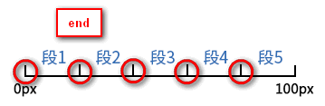
另外通过将<animation-fill-mode>设置为forwards,那么当<direciton>设置为end时,也会显示(保持)动画最后一个关键帧的样式。
事件
const target = document.getElementById("target")

target.addEventListener("animationstart", e => {

  // 动画开始时触发

})

target.addEventListener("animationiteration", e => {

  // 每次重复执行动画时触发

  // 当<animation-iteration-count>为1时,不会触发。

})

target.addEventListener("animationend", e => {

  // 当动画结束时触发

})
搞尽脑汁实现重播效果
到这里我们已经可以通过@keyframes定义和应用CSS Animation了,但我们能否获取对动画效果更多的控制权呢?如开始、暂停、继续、重播。通过<animation-play-state>我们能轻易实现开始、暂停和继续的效果,但重播却没那么容易。
function pause (target: HTMLElement):boolean {

  const isRunning = target.style.animationPlayState == "running"

  if (isRunning) {

    target.style.animationPlayState = "paused"

  }

  return isRunning

}

function play (target: HTMLElement):boolean {

  const isStop = target.style.animationPlayState == "paused"

  if (isStop) {

    target.style.animationPlayState = "running"

  }

  return isStop

}

function replay (target: HTMLElement, animationClassName: string):void {

  // 先移除动画效果

  target.classList.remove(animationName)

  // requestAnimationFrame的回调函数会在下一次界面渲染前执行

  requestAnimationFrame(_ => {

    // 这时动画的影响还在,所以要等界面渲染完后再重新启用动画效果,才能实现重播

	requestAnimationFrame(_ => {

	  target.classList.add(animationName)

	})

  })

}
总结
CSS3为我们提供了动画效果,除了提供比Transition更丰富的可控性,比JavaScript更简易的API,还让我们可以使用GPU来加速呢_
尊重原创,转载请注明来自:https://www.cnblogs.com/fsjohnhuang/p/9289618.html _肥仔John
参考
https://developer.mozilla.org/en-US/docs/Web/CSS/@keyframes
https://designmodo.com/steps-css-animations/
http://lea.verou.me/2011/09/pure-css3-typing-animation-with-steps/
http://jsfiddle.net/simurai/CGmCe/
https://www.zhangxinxu.com/wordpress/2018/06/css3-animation-steps-step-start-end/
CSS魔法堂:更丰富的前端动效by CSS Animation的更多相关文章
- CSS魔法堂:display:none与visibility:hidden的恩怨情仇
前言 还记得面试时被问起"请说说display:none和visibility:hidden的区别"吗?是不是回答完display:none不占用原来的位置,而visibilit ...
- CSS魔法堂:Box-Shadow没那么简单啦:)
前言 说起box-shadow那第一个想法当然就是用来实现阴影,其实它还能用于实现其他好玩的效果的,本篇就打算说说box-shadow的那些事. 二话不说看效果 3D小球 <style typ ...
- CSS魔法堂:重拾Border之——更广阔的遐想
前言 当CSS3推出border-radius属性时我们是那么欣喜若狂啊,一想到终于不用再添加额外元素来模拟圆角了,但发现border-radius还分水平半径和垂直半径,然后又发现border-t ...
- CSS魔法堂:重拾Border之——不仅仅是圆角
前言 当CSS3推出border-radius属性时我们是那么欣喜若狂啊,一想到终于不用再添加额外元素来模拟圆角了,但发现border-radius还分水平半径和垂直半径,然后又发现border-t ...
- CSS魔法堂:重拾Border之——图片作边框
前言 当CSS3推出border-radius属性时我们是那么欣喜若狂啊,一想到终于不用再添加额外元素来模拟圆角了,但发现border-radius还分水平半径和垂直半径,然后又发现border-t ...
- CSS魔法堂:重拾Border之——解构Border
前言 当CSS3推出border-radius属性时我们是那么欣喜若狂啊,一想到终于不用再添加额外元素来模拟圆角了,但发现border-radius还分水平半径和垂直半径,然后又发现border-t ...
- CSS魔法堂:"那不是bug,是你不懂我!" by inline-block
前言 每当来个需要既要水平排版又要设置固定高宽时,我就会想起display:inline-block,还有为了支持IE5.5/6/7的hack*display:inline;*zoom:1;.然后发 ...
- CSS魔法堂:小结一下Box Model与Positioning Scheme
前言 对于Box Model和Positioning Scheme中3种定位模式的细节,已经通过以下几篇文章记录了我对其的理解和思考. <CSS魔法堂:重新认识Box Model.IFC.B ...
- CSS魔法堂:说说Float那个被埋没的志向
前言 定位系统中第一难理解就是Normal flow,而第二就非Float莫属了,而Float难理解的原因有俩,1. 一开头我们就用错了:2. 它跟Normal flow靠得太近了.本文尝试理清Fl ...
随机推荐
- 【原创】c# socket 粘包 其实。。。
文章内容有错,请直接关闭~~~不要看了.丢人. private static Dictionary<string, Packet> cache = new Dictionary<st ...
- 伪分布式hadoop1.1.2和hbase0.94.11配置
Hadoop 1.1.2 和Hbase 0.94.11版本配置 测试时ip 172.19.32.128 这个版本需要把/etc/hosts的aa-vm改成127.0.0.1,也就是和localhos ...
- 查看当前的app运行的是哪个Activity
1.确认手机连接了adb-->检查方式:adb devices 2.手机运行任意app,随意进入一个页面 3.此时cmd运行:adb shell "dumpsys window | g ...
- gevent实现生产者消费者
from gevent import monkey;monkey.patch_all()from gevent.queue import Queue #队列 gevent中的队列import geve ...
- 平衡二叉树的java实现
转载请注明出处! 一.概念 平衡二叉树是一种特殊的二叉搜索树,关于二叉搜索树,请查看上一篇博客二叉搜索树的java实现,那它有什么特别的地方呢,了解二叉搜索树的基本都清楚,在按顺序向插入二叉搜索树中插 ...
- python实现链表(二)
class SingleNode(object): """单链表的结点""" def __init__(self,item): # _ite ...
- BZOJ-6-2460: [BeiJing2011]元素-线性基
链接 :https://www.lydsy.com/JudgeOnline/problem.php?id=2460 思路 :线性基不唯一,所以排序 进行贪心选择,价值最大的线性基, #include& ...
- SpringBoot使用事务
事务是很多项目中需要注意的东西,有些场景如果没有加事务控制就会导致一些脏数据进入数据库,本文简单介绍SpringBoot怎样使用事务. 本文使用的是之前整合JPA的文章,具体可以参考 传送门. 无论是 ...
- C++多态实现原理详解
C++的多态性用一句话概括就是:在基类的函数前加上virtual关键字,在派生类中重写该函数,运行时将会根据对象的实际类型来调用相应的函数.如果对象类型是派生类,就调用派生类的函数:如果对象类型是基类 ...
- 网络基础配置--开启SSH,关闭Telnet
1.Telnet和SSH对比 1.1.TELNET 使用Telnet这个用来访问远程计算机的TCP/IP协议以控制你的网络设备相当于在离开某个建筑时大喊你的用户名和口令.很快会有人进行监听,并且他们会 ...