自定义的圆形ProgressBar
之前已经详细讲解过自定义控件的使用方式了。这里我单独把定以好的控件列出来。
之前定义的各式各样的ProgressBar http://www.cnblogs.com/tianzhijiexian/p/3854346.html
各种属性:
  max                 最大进度

  progress            初始时的进度

  startAngle          进度从圆环的哪个角度开始走

  centreColor         圆环内部的填充色

  ringColor           圆环的颜色

  ringProgressColor   圆环进度的颜色

  ringWidth           圆环宽度

  textColor           中心文字的颜色

  textSize            中心文字的大小

  textIsDisplayable   中心文字是否显示

  style = FILL/STROKE 进度的风格,实心或者空心
attrs.xml
<?xml version="1.0" encoding="utf-8"?>

<resources>

    <!--

        max                 最大进度

        progress            初始时的进度

        startAngle             进度从圆环的哪个角度开始走

        centreColor         圆环内部的填充色

        ringColor             圆环的颜色

        ringProgressColor   圆环进度的颜色

        ringWidth             圆环宽度

        textColor             中心文字的颜色

        textSize             中心文字的大小

        textIsDisplayable     中心文字是否显示

        style = 0/1          进度的风格,实心或者空心

     -->

    <declare-styleable name="RoundProgressBar">

        <attr name="max" format="integer"></attr>

        <attr name="progress" format="integer"></attr>

        <attr name="startAngle" format="integer"></attr>

        <attr name="ringColor" format="color"/>

        <attr name="ringProgressColor" format="color"/>

        <attr name="ringWidth" format="dimension"></attr>

        <attr name="centreColor" format="color" />

        <attr name="textColor" format="color" />

        <attr name="textSize" format="dimension" />

        <attr name="textIsDisplayable" format="boolean"></attr>

        <attr name="style">

            <enum name="STROKE" value="0"></enum>

            <enum name="FILL" value="1"></enum>

        </attr>

    </declare-styleable>

</resources>
布局文件

<LinearLayout
xmlns:android="http://schemas.android.com/apk/res/android"
xmlns:tools="http://schemas.android.com/tools"
xmlns:pv="http://schemas.android.com/apk/res/com.eva.views"
android:layout_width="match_parent"
android:layout_height="match_parent"
android:orientation="vertical"> <TableLayout
android:layout_width="match_parent"
android:layout_height="wrap_content" > <TableRow
android:layout_width="wrap_content"
android:layout_height="wrap_content"
android:layout_marginTop="20dp"> <com.eva.views.RoundProgressBar
android:id="@+id/roundProgressBar01_id"
android:layout_width="80dp"
android:layout_height="80dp"
android:layout_marginLeft="50dp" pv:centreColor="#ffffff"
pv:progress="15"
pv:ringColor="#D1D1D1"
pv:ringProgressColor="#000000"
pv:ringWidth="10dp"
pv:startAngle="0"
pv:textColor="#000000"
pv:textSize="18sp" /> <TextView
android:layout_width="wrap_content"
android:layout_height="wrap_content"
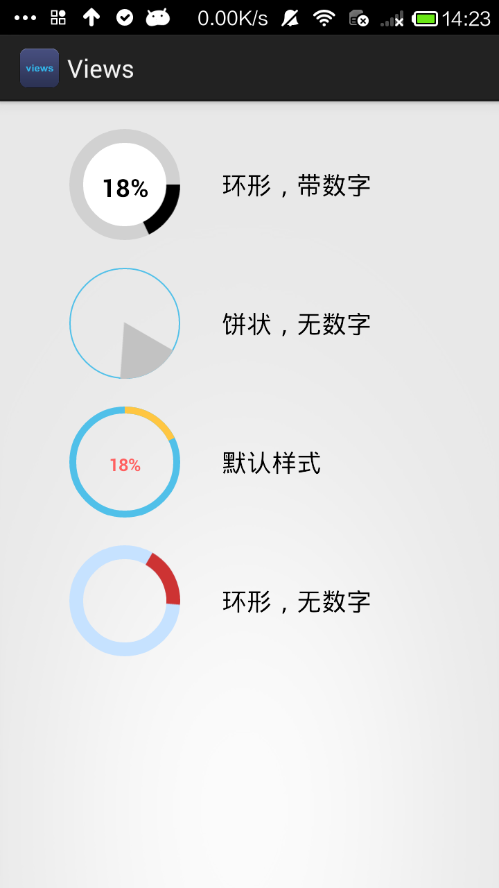
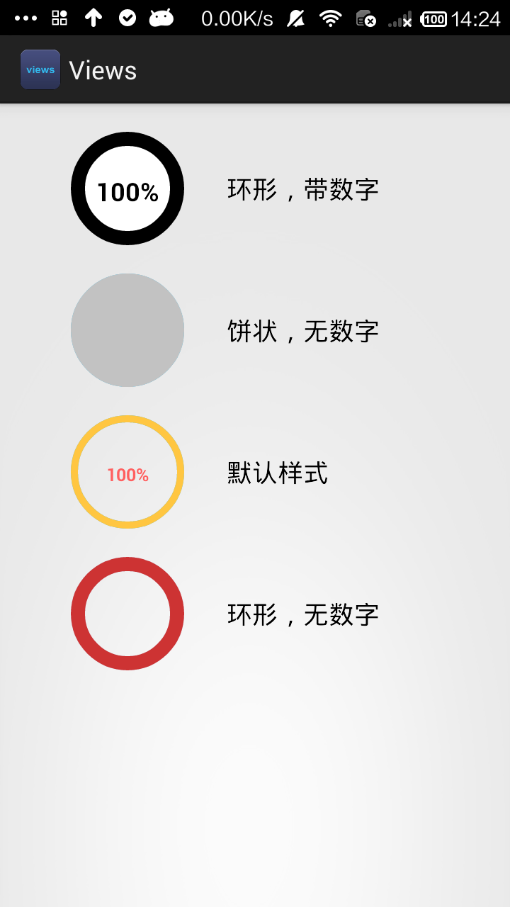
android:text="环形,带数字"
android:layout_gravity="center_vertical"
android:layout_marginLeft="30dp"
android:textAppearance="?android:attr/textAppearanceMedium" /> </TableRow> <TableRow
android:layout_width="wrap_content"
android:layout_height="wrap_content"
android:layout_marginTop="20dp"> <com.eva.views.RoundProgressBar
android:id="@+id/roundProgressBar02_id"
android:layout_width="80dp"
android:layout_height="80dp"
android:layout_marginLeft="50dp" pv:startAngle="30"
pv:style="FILL"
pv:ringProgressColor="#C2C2C2"
pv:ringWidth="1dp" /> <TextView
android:id="@+id/textView1"
android:layout_width="wrap_content"
android:layout_height="wrap_content"
android:text="饼状,无数字"
android:layout_gravity="center_vertical"
android:layout_marginLeft="30dp"
android:textAppearance="?android:attr/textAppearanceMedium" /> </TableRow> <TableRow
android:id="@+id/tableRow3"
android:layout_width="wrap_content"
android:layout_height="wrap_content"
android:layout_marginTop="20dp"> <com.eva.views.RoundProgressBar
android:id="@+id/roundProgressBar03_id"
android:layout_width="80dp"
android:layout_height="80dp"
android:layout_marginLeft="50dp"/> <TextView
android:layout_width="wrap_content"
android:layout_height="wrap_content"
android:text="默认样式"
android:layout_gravity="center_vertical"
android:layout_marginLeft="30dp"
android:textAppearance="?android:attr/textAppearanceMedium" />
</TableRow> <TableRow
android:id="@+id/tableRow4"
android:layout_width="wrap_content"
android:layout_height="wrap_content"
android:layout_marginTop="20dp"> <com.eva.views.RoundProgressBar
android:id="@+id/roundProgressBar04_id"
android:layout_width="80dp"
android:layout_height="80dp"
android:layout_marginLeft="50dp" pv:startAngle="-60"
pv:ringColor="#C6E2FF"
pv:ringWidth="10dip"
pv:ringProgressColor="#CD3333"
pv:textIsDisplayable="false" /> <TextView
android:layout_width="wrap_content"
android:layout_height="wrap_content"
android:text="环形,无数字"
android:layout_gravity="center_vertical"
android:layout_marginLeft="30dp"
android:textAppearance="?android:attr/textAppearanceMedium" /> </TableRow>
</TableLayout> </LinearLayout>
RoundProgressBar.java
package com.eva.views;

import android.content.Context;

import android.content.res.TypedArray;

import android.graphics.Canvas;

import android.graphics.Paint;

import android.graphics.RectF;

import android.graphics.Typeface;

import android.util.AttributeSet;

import android.view.View;

/**

 * 仿iphone带进度的进度条,线程安全的View,可直接在线程中更新进度

 * @author xiaanming

 * 作者博客:http://blog.csdn.net/xiaanming/article/details/10298163

 *

 */

public class RoundProgressBar extends View {

    /**

     * 画笔对象的引用

     */

    private Paint paint;

    /**

     * 圆环的颜色

     */

    private int ringColor;

    /**

     * 圆环进度的颜色

     */

    private int ringProgressColor;

    /**

     * 设置圆心进度条中间的背景色

     */

    private int centreColor;

    /**

     * 中间进度百分比的字符串的颜色

     */

    private int textColor;

    /**

     * 中间进度百分比的字符串的字体

     */

    private float textSize;

    /**

     * 圆环的宽度

     */

    private float ringWidth;

    /**

     * 最大进度

     */

    private int max;

    /**

     * 当前进度

     */

    private int progress;

    /**

     * 进度开始的角度数

     */

    private int startAngle;

    /**

     * 是否显示中间的数字进度

     */

    private boolean textIsDisplayable;

    /**

     * 进度的风格,实心或者空心

     */

    private int style;

    public static final int STROKE = 0;

    public static final int FILL = 1;

    public RoundProgressBar(Context context) {

        this(context, null);

    }

    public RoundProgressBar(Context context, AttributeSet attrs) {

        this(context, attrs, 0);

    }

    public RoundProgressBar(Context context, AttributeSet attrs, int defStyle) {

        super(context, attrs, defStyle);

        paint = new Paint();

        TypedArray mTypedArray = context.obtainStyledAttributes(attrs,

                R.styleable.RoundProgressBar);

        //获取自定义属性和默认值,第一个参数是从用户属性中得到的设置,如果用户没有设置,那么就用默认的属性,即:第二个参数

        //圆环的颜色

        ringColor = mTypedArray.getColor(R.styleable.RoundProgressBar_ringColor,0xff50c0e9);

        //圆环进度条的颜色

        ringProgressColor = mTypedArray.getColor(R.styleable.RoundProgressBar_ringProgressColor, 0xffffc641);

        //文字的颜色

        textColor = mTypedArray.getColor(R.styleable.RoundProgressBar_textColor, 0xffff5f5f);

        //文字的大小

        textSize = mTypedArray.getDimension(R.styleable.RoundProgressBar_textSize, 25);

        //圆环的宽度

        ringWidth = mTypedArray.getDimension(R.styleable.RoundProgressBar_ringWidth, 10);

        //最大进度

        max = mTypedArray.getInteger(R.styleable.RoundProgressBar_max, 100);

        //当前进度

        progress = mTypedArray.getInt(R.styleable.RoundProgressBar_progress, 30);

        //是否显示中间的进度

        textIsDisplayable = mTypedArray.getBoolean(R.styleable.RoundProgressBar_textIsDisplayable, true);

        //进度的风格,实心或者空心

        style = mTypedArray.getInt(R.styleable.RoundProgressBar_style, 0);

        //进度开始的角度数

        startAngle = mTypedArray.getInt(R.styleable.RoundProgressBar_startAngle, -90);

        //圆心的颜色

        centreColor = mTypedArray.getColor(R.styleable.RoundProgressBar_centreColor, 0);

        //回收资源

        mTypedArray.recycle();

    }

    @Override

    protected void onDraw(Canvas canvas) {

        super.onDraw(canvas);

        int centre = getWidth()/2; //获取圆心的x坐标

        int radius = (int) (centre - ringWidth/2); //圆环的半径

        /**

         * 画中心的颜色

         */

        if (centreColor != 0) {

            paint.setAntiAlias(true);

            paint.setColor(centreColor);

            paint.setStyle(Paint.Style.FILL);

            canvas.drawCircle(centre, centre, radius, paint);

        }

        /**

         * 画最外层的大圆环

         */

        paint.setColor(ringColor); //设置圆环的颜色

        paint.setStyle(Paint.Style.STROKE); //设置空心

        paint.setStrokeWidth(ringWidth); //设置圆环的宽度

        paint.setAntiAlias(true);  //消除锯齿

        canvas.drawCircle(centre, centre, radius, paint); //画出圆环

        /**

         * 画圆弧 ,画圆环的进度

         */

        //设置进度是实心还是空心

        paint.setStrokeWidth(ringWidth); //设置圆环的宽度

        paint.setColor(ringProgressColor);  //设置进度的颜色

        RectF oval = new RectF(centre - radius, centre - radius, centre

                + radius, centre + radius);  //用于定义的圆弧的形状和大小的界限

        switch (style) {

            case STROKE:{

                paint.setStyle(Paint.Style.STROKE);

                /*第二个参数是进度开始的角度,-90表示从12点方向开始走进度,如果是0表示从三点钟方向走进度,依次类推

                 *public void drawArc(RectF oval, float startAngle, float sweepAngle, boolean useCenter, Paint paint)

                    oval :指定圆弧的外轮廓矩形区域。

                    startAngle: 圆弧起始角度,单位为度。

                    sweepAngle: 圆弧扫过的角度,顺时针方向,单位为度。

                    useCenter: 如果为True时,在绘制圆弧时将圆心包括在内,通常用来绘制扇形。

                    paint: 绘制圆弧的画板属性,如颜色,是否填充等

                 *

                */

                canvas.drawArc(oval, startAngle, 360 * progress / max, false, paint);  //根据进度画圆弧

                break;

            }

            case FILL:{

                paint.setStyle(Paint.Style.FILL_AND_STROKE);

                if(progress !=0)

                    canvas.drawArc(oval, startAngle, 360 * progress / max, true, paint);  //根据进度画圆弧

                break;

            }

        }

        /**

         * 画进度百分比

         */

        paint.setStrokeWidth(0);

        paint.setColor(textColor);

        paint.setTextSize(textSize);

        paint.setTypeface(Typeface.DEFAULT_BOLD); //设置字体

        int percent = (int)(((float)progress / (float)max) * 100);  //中间的进度百分比,先转换成float在进行除法运算,不然都为0

        float textWidth = paint.measureText(percent + "%");   //测量字体宽度,我们需要根据字体的宽度设置在圆环中间

        if(textIsDisplayable && percent != 0 && style == STROKE){

            canvas.drawText(percent + "%", centre - textWidth / 2, centre + textSize/2, paint); //画出进度百分比

        }

    }

    public synchronized int getMax() {

        return max;

    }

    /**

     * 设置进度的最大值

     * @param max

     */

    public synchronized void setMax(int max) {

        if(max < 0){

            throw new IllegalArgumentException("max not less than 0");

        }

        this.max = max;

    }

    /**

     * 获取进度.需要同步

     * @return

     */

    public synchronized int getProgress() {

        return progress;

    }

    /**

     * 设置进度,此为线程安全控件,由于考虑多线的问题,需要同步

     * 刷新界面调用postInvalidate()能在非UI线程刷新

     * @param progress

     */

    public synchronized void setProgress(int progress) {

        if(progress < 0){

            throw new IllegalArgumentException("progress not less than 0");

        }

        if(progress > max){

            progress = max;

        }

        if(progress <= max){

            this.progress = progress;

            postInvalidate();

        }

    }

    public int getCircleColor() {

        return ringColor;

    }

    public void setCircleColor(int CircleColor) {

        this.ringColor = CircleColor;

    }

    public int getCircleProgressColor() {

        return ringProgressColor;

    }

    public void setCircleProgressColor(int CircleProgressColor) {

        this.ringProgressColor = CircleProgressColor;

    }

    public int getTextColor() {

        return textColor;

    }

    public void setTextColor(int textColor) {

        this.textColor = textColor;

    }

    public float getTextSize() {

        return textSize;

    }

    public void setTextSize(float textSize) {

        this.textSize = textSize;

    }

    public float getringWidth() {

        return ringWidth;

    }

    public void setringWidth(float ringWidth) {

        this.ringWidth = ringWidth;

    }

}
自定义的圆形ProgressBar的更多相关文章
- Glide加载图片到自定义的圆形ImageView中不显示
当使用自定义的圆形ImageView时,发现使用Glide加载并设置默认初始图片时,自定义的ImageView一直显示默认图片,无法更新到加载的图片. 使用下面代码可以解决这个问题 Glide.wit ...
- iview修改tabbar实现小程序自定义中间圆形导航栏及多页面登录功能
emmm,用iview改了个自定义中间圆形的tabbar. 如下图所示, 重点,什么鬼是“多页面登录”? 例如:我现在要做一个功能,要说自己长得帅才能进去页面. 一个两个页面还好,但是我现在要每个页面 ...
- android 自己定义水平和圆形progressbar 仅仅定义一些style就能够
效果图: watermark/2/text/aHR0cDovL2Jsb2cuY3Nkbi5uZXQv/font/5a6L5L2T/fontsize/400/fill/I0JBQkFCMA==/diss ...
- 自定义各式各样的圆形ProgressBar
上面三个图分别是 开始时的样子,走进度时候的样子,最后完成的样子 这是我在两个大神的Demo基础上修改后的结果,我们先来看看自定义view是怎么做到的. 1.自己写一个类继承View类,然后 ...
- Android自定义圆形ProgressBar
闲来无事做了一个自定义的进度条,大致效果图如下: progressbar.gif 废话不多说,下面直接上代码: 自定义控件代码CircleProgressBar.java: public class ...
- Android自定义View之ProgressBar出场记
关于自定义View,我们前面已经有三篇文章在介绍了,如果筒子们还没阅读,建议先看一下,分别是android自定义View之钟表诞生记.android自定义View之仿通讯录侧边栏滑动,实现A-Z字母检 ...
- 【转】 为SeekBar滑块设置固定值以及自定义Seekbar,progressbar样式--不错
原文网址:http://blog.csdn.net/jdsjlzx/article/details/7804080 最近在项目中使用到了seekbar和progressbar,且必须按照设计要求来进行 ...
- Android 自定义 View 圆形进度条总结
Android 自定义圆形进度条总结 版权声明:本文为博主原创文章,未经博主允许不得转载. 微博:厉圣杰 微信公众号:牙锅子 源码:CircleProgress 文中如有纰漏,欢迎大家留言指出. 最近 ...
- android自定义view实现progressbar的效果
一键清理是很多Launcher都会带有的功能,其效果也比较美观.实现方式也许有很多中,其中常见的是使用图片drawable来完成的,具体可以参考这篇文章:模仿实现360桌面水晶球式的一键清理特效.本文 ...
随机推荐
- Select查询语句1
一.语法结构 select[all|distinct]select_list from table_name[join join_condition] where search_condition g ...
- 【LOJ】#6433. 「PKUSC2018」最大前缀和
题解 神仙的状压啊QAQ 设一个\(f[S]\)表示数字的集合为\(S\)时\(sum[S]\)为前缀最大值的方案数 \(g[S]\)表示数字集合为\(S\)时所有前缀和都小于等于0的方案数 答案就是 ...
- XML与HTML区别
—————————— ASP.Net+Android+IOS开发..Net培训.期待与您交流!—————————— Xml简介 1. xml是什么? Xml 是eXtended markup lang ...
- fpm 制作rpm包
使用fpm命令制作rpm包并安装 工作中有如下情况需要将文件打包rpm: 避免重复工作,将源码程序打包为rpm 使用yum发布项目,项目打包为rpm 将自己写好的程序打包为rpm,提供给用户下载 其他 ...
- 使用Ajax方式POST JSON数据包(转)
add by zhj: 用ajax发送json数据时注意两点, 第一,使用JSON.stringify()函数将data转为json格式的字符串,如下 data: JSON.stringify({ ...
- Python 项目实践三(Web应用程序) 第三篇
接着上节的继续学习,现在要显示所有主题的页面 有了高效的网页创建方法,就能专注于另外两个网页了:显示全部主题的网页以及显示特定主题中条目的网页.所有主题页面显示用户创建的所有主题,它是第一个需要使用数 ...
- JSP(Servlet)中从连接池获取连接
1) 建立连接. 2) 执行SQL. 3) 处理结果. 4) 释放资源. Connection pool:连接池 DataSource: LDAP ( Light directory access p ...
- Go语言笔记:struct结构遍历
package main import ( "fmt" "reflect" ) type User struct { Id int Name string // ...
- RelativeSource的用法
绑定自身的数据 <Style TargetType="Button"> <Setter Property="Width" Value=&quo ...
- [NOIp2014提高组]解方程
思路: 系数的范围有$10^{10000}$,但是用高精度做显然不现实,因此可以考虑一个类似于“哈希”的做法, 对方程两边同时取模,如果取的模数足够多,正确率就很高了. 中间对多项式的计算可以使用$O ...