项目总结之echarts 使用
项目上需要使用echarts,对于一个新手前端来说,差点要爆炸了,自身前端基础就不好,echarts就更是不熟了,硬生生的逼着要一周做完一个系统。这算是个小总结吧,以后万一用的上捏。
渐变使用
项目中的echarts图,大多需要渐变,所以先了解一下渐变。echarts官方Demo里面有个例子[https://echarts.baidu.com/examples/editor.html?c=bar-gradient],可以在实例里面了解一下。有个echarts.graphic.LinearGradient这个类。示例中代码是这个样子的:(以下代码修改了一下)
- {
- type: 'bar',
- itemStyle: {
- normal: {
- color: new echarts.graphic.LinearGradient(
- 1, 0, 0, 0,
- [
- {offset: 0, color: 'green'},
- {offset: 0.5, color: '#0055FF'},
- {offset: 1, color: '#FF6600'}
- ]
- )
- },
- emphasis: {
- color: new echarts.graphic.LinearGradient(
- 0, 0, 0, 1,
- [
- {offset: 0, color: '#2378f7'},
- {offset: 0.7, color: '#2378f7'},
- {offset: 1, color: '#83bff6'}
- ]
- )
- }
- },
- }
效果如图:
echarts.graphic.LinearGradient中有五个参数,前四个参数分别代表变色的方位右下左上,0, 0, 0, 1,代表渐变色从正上方开始.1, 0, 0, 0,代表渐变色从右边开始渐变。0 1 0 0代表从正下方向正上方渐变,具体可以自己设置看下效果, 第5个参数则是一个数组, 用于配置颜色的渐变过程. 每一项为一个对象, 包含offset和color两个参数. offset的范围是0 ~ 1, 用于表示位置, color表示颜色.
渐变还有另一种写法:
- // 线性渐变,前四个参数分别是 x0, y0, x2, y2, (右下左上)范围从 0 - 1,相当于在图形包围盒中的百分比,如果 globalCoord 为 `true`,则该四个值是绝对的像素位置
- color: {
- type: 'linear',
- x: 0,
- y: 0,
- x2: 0,
- y2: 1,
- colorStops: [{
- offset: 0, color: 'red' // 0% 处的颜色
- }, {
- offset: 1, color: 'blue' // 100% 处的颜色
- }],
- global: false // 缺省为 false
- }
- // 径向渐变,前三个参数分别是圆心 x, y 和半径,取值同线性渐变
- color: {
- type: 'radial',
- x: 0.5,
- y: 0.5,
- r: 0.5,
- colorStops: [{
- offset: 0, color: 'red' // 0% 处的颜色
- }, {
- offset: 1, color: 'blue' // 100% 处的颜色
- }],
- global: false // 缺省为 false
- }
- // 纹理填充
- color: {
- image: imageDom, // 支持为 HTMLImageElement, HTMLCanvasElement,不支持路径字符串
- repeat: 'repeat' // 是否平铺, 可以是 'repeat-x', 'repeat-y', 'no-repeat'
- }
环形图
在做环形图时,发生了一个很智障的问题,以下会说明一下,先说明在做环形图时,要一次性生产三个环形图,之前项目中搭建的框架使用的时echarts4,在这个项目中使用的时echarts3的版本,结果使用dataset属性时,没有效果,当初以为是自己代码写的有问题,弄了一小时,最后发现版本不对,啊~~~QAQ当然这是一个小插曲。
上代码:
- option = {
- legend: {
- bottom: 0,
- left: "center",
- type: "scroll",
- show: true,
- data: ["黄岛滚筒", "天津波轮"]
- },
- tooltip: {},
- dataset: {
- source: [
- ["product", "2012", "2013", "2014",],
- ["黄岛滚筒", 41.1, 30.4, 65.1],
- ["天津波轮", 86.5, 92.1, 85.7]
- ]
- },
- series: [
- {
- type: "pie",
- center: ["17%", "45%"],
- radius: ["60%", "30%"],
- label:{
- show: false,
- },
- labelLine: {
- show: false
- },
- itemStyle: {
- color: function(params) {
- //自定义颜色
- var colorList = ["#3770DA", "#FB7293"];
- return colorList[params.dataIndex];
- }
- }
- },
- {
- type: "pie",
- center: ["50%", "45%"],
- radius: ["60%", "30%"],
- label:{
- show: false,
- },
- labelLine: {
- normal: {
- show: false
- }
- },
- itemStyle: {
- color: function(params) {
- //自定义颜色
- var colorList = ["#3770DA", "#FB7293"];
- return colorList[params.dataIndex];
- }
- },
- encode: {
- itemName: "product",
- value: "2013"
- }
- },
- {
- type: "pie",
- center: ["83%", "45%"],
- radius: ["60%", "30%"],
- label:{
- show: false,
- },
- labelLine: {
- normal: {
- show: false
- }
- },
- itemStyle: {
- color: function(params) {
- //自定义颜色
- var colorList = ["#3770DA", "#FB7293"];
- return colorList[params.dataIndex];
- }
- },
- encode: {
- itemName: "product",
- value: "2014"
- }
- }
- ]
- }
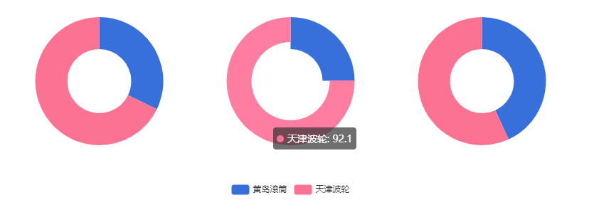
接下来就是智障的一个问题了,在series.radius设置["60%", "30%"],时,导致环状图的牵引线在里面,然后这个问题困扰了很久,然后问了一个大佬,他说我这两个值设置反了,内心mmp,没救了.
一个环状图代码:
- option = {
- legend: {
- bottom: 0,
- left: "center",
- type: "scroll",
- show: true,
- data: ["黄岛滚筒", "天津波轮"]
- },
- tooltip: {},
- graphic: [
- {
- type: "text",
- left: "center",
- top: "center",
- style: {
- text: `总开动率\n 89% `,
- textAlign: "center",
- fill: "#000",
- width: 30,
- height: 30
- }
- }
- ],
- dataset: {
- source: [
- ["product", "2012", "2013", "2014", "2015", "2016", "2017"],
- ["黄岛滚筒", 41.1, 30.4, 65.1, 53.3, 83.8, 98.7],
- ["天津波轮", 86.5, 92.1, 85.7, 83.1, 73.4, 55.1]
- ]
- },
- series: [
- {
- type: "pie",
- center: ["50%", "45%"],
- radius: ["30%", "60%"],
- label:{
- show: true,
- position: 'outside',
- formatter:function(params){
- return `${params.percent}% ${params.name}`
- }
- },
- labelLine: {
- normal: {
- show: true
- }
- },
- itemStyle: {
- color: function(params) {
- //自定义颜色
- var colorList = ["#3770DA", "#FB7293"];
- return colorList[params.dataIndex];
- }
- }
- }
- ]
- };
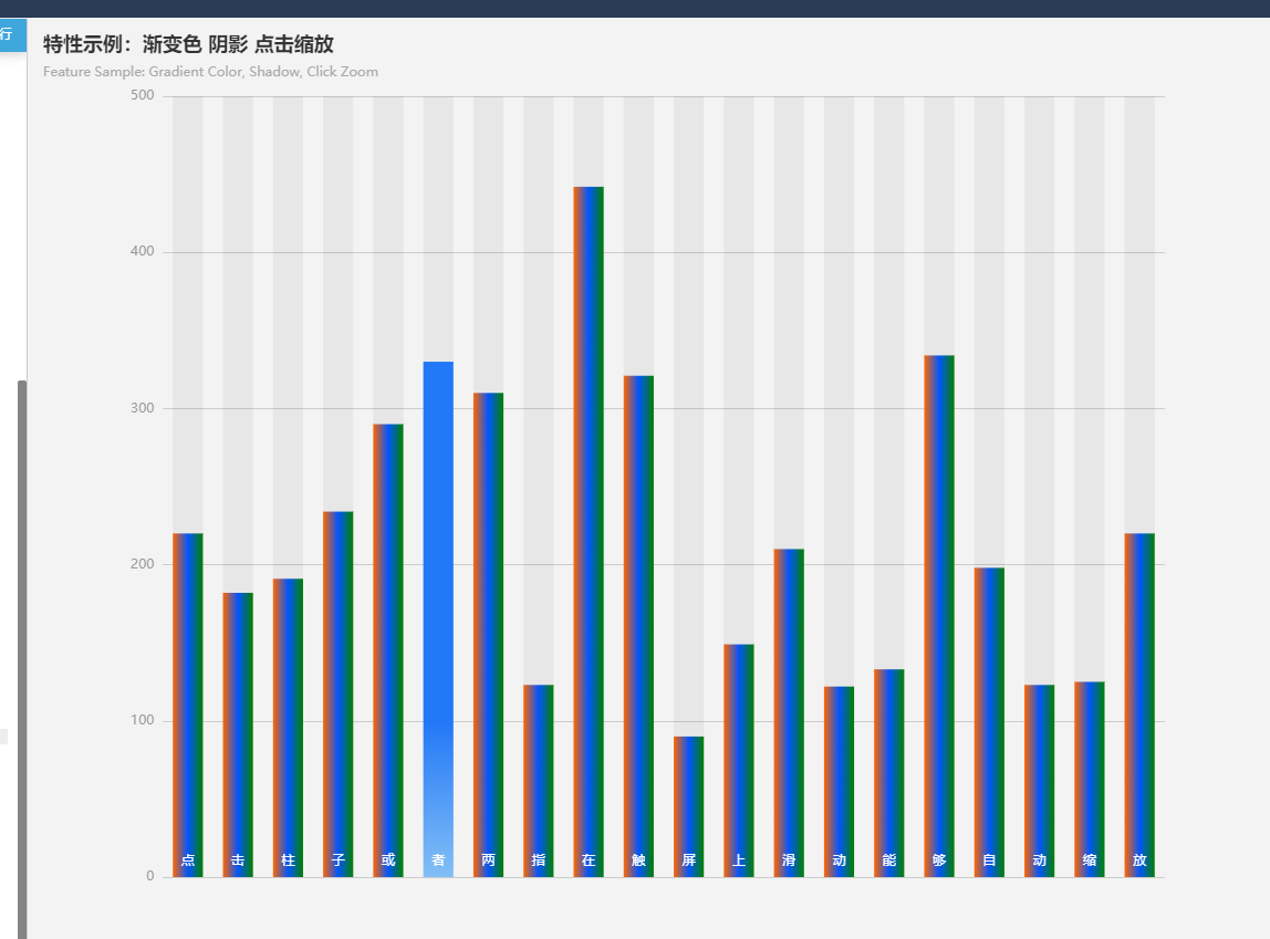
柱状图
先看原型图: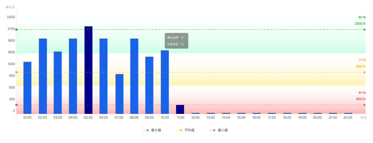
这个需要背景渐变,这个时候渐变就派上用场了,一二三上代码:
- var option =
- tooltip: {
- trigger: "axis"
- },
- legend: {
- show: false
- },
- grid: {
- top: "15%",
- left: "3%",
- right: "12%",
- bottom: "3%",
- containLabel: true
- },
- color: ["#1A62E8"],
- calculable: true,
- xAxis: [
- {
- type: "category",
- name: "时间",
- data: Array.apply(null, Array(24)).map(function(item, i) {
- return i + 1;
- })
- }
- ],
- yAxis: [
- {
- splitLine: { show: false },
- type: "value",
- interval: 1000,
- name: "单位:台",
- splitArea: {
- show: true,
- areaStyle: {
- opacity: 0.3,
- color: [
- // new this.$echarts.graphic.LinearGradient(0, 0, 0, 1, [
- // {
- // offset: 0,
- // color: "#FFFFFF"
- // },
- // {
- // offset: 1,
- // color: "#ff0500",
- // }
- // ]),
- // new this.$echarts.graphic.LinearGradient(0, 0, 0, 1, [
- // {
- // offset: 0,
- // color: "#FFFFFF"
- // },
- // {
- // offset: 1,
- // color: "#ff8400",
- // }
- // ]),
- // new this.$echarts.graphic.LinearGradient(0, 0, 0, 1, [
- // {
- // offset: 0,
- // color: "#FFFFFF"
- // },
- // {
- // offset: 1,
- // color: "#0fff01",
- // }
- // ])
- {
- type: "linear",
- x: 0,
- y: 0,
- x2: 1,
- y2: 1,
- colorStops: [
- {
- offset: 0,
- color: "#FFFFFF" // 0% 处的颜色
- },
- {
- offset: 1,
- color: "#ff0500" // 100% 处的颜色
- }
- ],
- global: false // 缺省为 false
- },
- {
- type: "linear",
- x: 0,
- y: 0,
- x2: 0,
- y2: 1,
- colorStops: [
- {
- offset: 0,
- color: "#FFFFFF" // 0% 处的颜色
- },
- {
- offset: 1,
- color: "#0fff01" // 100% 处的颜色
- }
- ],
- global: false // 缺省为 false
- },
- {
- type: "linear",
- x: 0,
- y: 0,
- x2: 0,
- y2: 1,
- colorStops: [
- {
- offset: 0,
- color: "#FFFFFF" // 0% 处的颜色
- },
- {
- offset: 1,
- color: "#ff8400" // 100% 处的颜色
- }
- ],
- global: false // 缺省为 false
- },
- ]
- }
- }
- }
- ],
- series: [
- {
- name: "黄岛滚筒",
- type: "bar",
- stack: "总量",
- data: [
- 122.0,
- 2234.9,
- 732.0,
- 2423.2,
- 2325.6,
- 762.7,
- 1335.6,
- 1262.2,
- 332.6,
- 220.0,
- 62.4,
- 33.3
- ],
- markPoint: {
- // data: [
- // { type: "max", name: "最大值" },
- // { type: "min", name: "最小值" }
- // ]
- },
- markLine: {
- data: [
- {
- type: "average",
- name: "平均值",
- lineStyle: { color: "#ff8400" }
- },
- {
- type: "min",
- name: "最小值",
- lineStyle: { color: "#ff0500" }
- },
- {
- type: "max",
- name: "最大值",
- lineStyle: { color: "#0fff01" }
- }
- ],
- label: {
- formatter: "{b}\n{c}/h"
- }
- },
- },
- {
- name: "天津波轮",
- type: "bar",
- stack: "总量",
- data: [
- 2.6,
- 5.9,
- 9.0,
- 26.4,
- 28.7,
- 70.7,
- 175.6,
- 182.2,
- 48.7,
- 18.8,
- 6.0,
- 2.3
- ],
- markPoint: {
- data: []
- },
- markLine: {}
- }
- ]
- };
效果就出来了。
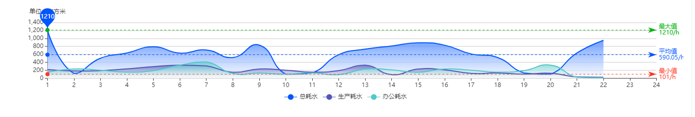
折线图
折线图是面积渐变
项目中使用vue,所以加了loading,将echarts绑在vue的原型实例上。使用_this.$echarts就可以得到echarts实例。
- <div ref="powerLineChart" style="height:220px;width: 100%;"></div>
- var _this = this;
- _this.myChart = _this.$echarts.init(_this.$refs.powerLineChart);
- _this.myChart.showLoading();
- var option = {
- tooltip: {
- trigger: "axis"
- },
- legend: {
- data: ["总耗电", "生产耗电", "办公耗电"],
- bottom:0,
- },
- color: ["#FF6600", "#5256B9", "#53C7C7"],
- grid: {
- left: "3%",
- right: "4%",
- bottom: "13%",
- containLabel: true
- },
- xAxis: {
- type: "category",
- boundaryGap: false,
- data: Array.from(new Array(24), (item, index) => index + 1)
- },
- yAxis: {
- type: "value",
- name: "单位:度"
- },
- series: [
- {
- name: "总耗电",
- type: "line",
- symbol: "none",
- smooth: true,
- data: [
- 120,
- 132,
- 101,
- 134,
- 90,
- 230,
- 210,
- 120,
- 132,
- 101,
- 134,
- 90,
- 230,
- 210,
- 90,
- 230,
- 210,
- 120,
- 132,
- 101,
- 134,
- 90
- ],
- markPoint: {
- data: [
- { type: "max", name: "最大值" }
- // {type: 'min', name: '最小值'}
- ]
- },
- markLine: {
- data: [
- {
- type: "average",
- name: "平均值",
- lineStyle: { color: "#FF6600" }
- },
- {
- type: "min",
- name: "最小值",
- lineStyle: { color: "#FE3824" }
- },
- {
- type: "max",
- name: "最大值",
- lineStyle: { color: "#07B211" }
- }
- ],
- label: {
- formatter: "{b}\n{c}/h"
- }
- },
- itemStyle: {
- normal: {
- color: "#5256B9",
- shadowBlur: 8,
- shadowColor: "#25d5f0",
- borderColor: "#5256B9",
- borderWidth: 3,
- backgroundColor: "transparent"
- }
- },
- areaStyle: {
- normal: {
- color: new _this.$echarts.graphic.LinearGradient(0, 0, 0, 1, [
- {
- offset: 0,
- color: "#5256B9"
- },
- {
- offset: 1,
- color: "#FFFFFF"
- }
- ])
- }
- }
- },
- {
- name: "生产耗电",
- type: "line",
- symbol: "none",
- smooth: true,
- data: [
- 220,
- 182,
- 191,
- 234,
- 290,
- 330,
- 310,
- 150,
- 232,
- 201,
- 154,
- 190,
- 330,
- 90,
- 230,
- 210,
- 120,
- 132,
- 101,
- 123,
- 32,
- 23
- ],
- markPoint: {
- data: [
- // {type: 'max', name: '最大值'},
- // {type: 'min', name: '最小值'}
- ]
- },
- markLine: {
- data: [
- // {type: 'average', name: '平均值'}
- ]
- },
- itemStyle: {
- normal: {
- color: "#FF6600",
- shadowBlur: 8,
- shadowColor: "#25d5f0",
- borderColor: "#FF6600",
- borderWidth: 3,
- backgroundColor: "transparent"
- }
- },
- areaStyle: {
- normal: {
- color: new _this.$echarts.graphic.LinearGradient(0, 0, 0, 1, [
- {
- offset: 0,
- color: "#FF6600"
- },
- {
- offset: 1,
- color: "#FFFFFF"
- }
- ])
- }
- }
- },
- {
- name: "办公耗电",
- type: "line",
- symbol: "none",
- smooth: true,
- data: [
- 150,
- 232,
- 201,
- 154,
- 190,
- 330,
- 410,
- 120,
- 132,
- 101,
- 134,
- 90,
- 230,
- 210,
- 150,
- 232,
- 201,
- 154,
- 190,
- 330,
- 23,
- 12
- ],
- markPoint: {
- data: [
- // {type: 'max', name: '最大值'},
- // {type: 'min', name: '最小值'}
- ]
- },
- markLine: {
- data: [
- // {type: 'average', name: '平均值'}
- ]
- },
- itemStyle: {
- normal: {
- color: "#53C7C7",
- shadowBlur: 8,
- shadowColor: "#FFFFFF",
- borderColor: "#53C7C7",
- borderWidth: 3,
- backgroundColor: "transparent"
- }
- },
- areaStyle: {
- normal: {
- color: new _this.$echarts.graphic.LinearGradient(0, 0, 0, 1, [
- {
- offset: 0,
- color: "#53C7C7"
- },
- {
- offset: 1,
- color: "#FFFFFF"
- }
- ])
- }
- }
- }
- ]
- };
- _this.myChart.hideLoading();
- _this.myChart.setOption(option, true);
- window.addEventListener("resize", function() {
- _this.myChart.resize();
- });
效果图:
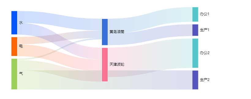
桑基图
直接上代码:可以直接使用,其实就是自己组装了一个data对象是 energylist数组 ,links 为组装好的data数组
- var energy = {
- 水: "#0055FF",
- 电: "#FF6600",
- 气: "#9BCF58",
- 办公1: "#53C7C7",
- 办公2: "#53C7C7",
- 生产1: "#5256BA",
- 生产2: "#5256BA",
- 黄岛滚筒: "#3770DA",
- 天津波轮: "#FB7293"
- };
- var tempData = [
- {
- source: "电",
- target: "黄岛滚筒",
- value: 5
- },
- {
- source: "电",
- target: "黄岛滚筒",
- value: 3
- },
- {
- source: "水",
- target: "黄岛滚筒",
- value: 8
- },
- {
- source: "水",
- target: "黄岛滚筒",
- value: 3
- },
- {
- source: "气",
- target: "黄岛滚筒",
- value: 1
- },
- {
- source: "气",
- target: "黄岛滚筒",
- value: 2
- },
- {
- source: "气",
- target: "黄岛滚筒",
- value: 8
- },
- {
- source: "黄岛滚筒",
- target: "办公1",
- value: 10
- },
- {
- source: "黄岛滚筒",
- target: "生产1",
- value: 8
- },
- {
- source: "电",
- target: "天津波轮",
- value: 8
- },
- {
- source: "电",
- target: "天津波轮",
- value: 4
- },
- {
- source: "水",
- target: "天津波轮",
- value: 8
- },
- {
- source: "水",
- target: "天津波轮",
- value: 2
- },
- {
- source: "气",
- target: "天津波轮",
- value: 7
- },
- {
- source: "气",
- target: "天津波轮",
- value: 5
- },
- {
- source: "天津波轮",
- target: "办公2",
- value: 20
- },
- {
- source: "气",
- target: "生产2",
- value: 13
- }
- ];
- //数据
- var data = [];
- var energylist = [];
- for (var key in energy) {
- energylist.push({ name: key, itemStyle: { color: energy[key] } });
- }
- for (var i = 0; i < tempData.length; i++) {
- var color = new _this.$echarts.graphic.LinearGradient(0, 0, 1, 0, [
- {
- offset: 0,
- color: energy[tempData[i].source]
- },
- {
- offset: 1,
- color: energy[tempData[i].target]
- }
- ]);
- data.push({
- source: tempData[i].source,
- target: tempData[i].target,
- value: tempData[i].value,
- lineStyle: {
- color: color
- }
- });
- }
- var option = {
- title: {
- text: "",
- top: "top",
- left: "35%"
- },
- tooltip: {
- trigger: "item",
- triggerOn: "mousemove"
- },
- series: [
- {
- type: "sankey",
- data: energylist,
- links: data,
- focusNodeAdjacency: "allEdges",
- itemStyle: {
- borderWidth: 1,
- color: "#1b6199",
- borderColor: "#fff"
- },
- lineStyle: {
- curveness: 0.5,
- opaenergy: 0.5
- }
- }
- ]
- };
效果图:
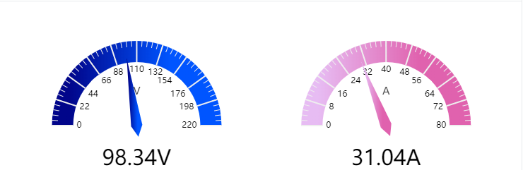
仪表盘
可以设置刻度标签和刻度样式,设置渐变时也是一样的,可以有两种方法,这里使用了第一种。
- mounted() {
- var _this = this;
- _this.myChart = _this.$echarts.init(_this.$refs.voltageGauge);
- _this.myChart.showLoading();
- var option = {
- tooltip: {
- formatter: "{a} <br/>{b} : {c}%"
- },
- series: [
- {
- name: "电压",
- type: "gauge",
- center: ["20%", "55%"],
- max: 220,
- startAngle: 180,
- endAngle: -0,
- center: ["27%", "50%"], // 默认全局居中
- // radius: '35%',
- detail: { formatter: "{value}V" },
- data: [{ value: 170, name: "V" }],
- axisLine: {
- show: true,
- lineStyle: {
- color: [
- [
- 1,
- new _this.$echarts.graphic.LinearGradient(0, 0, 1, 0, [
- {
- offset: 0.7,
- color: "#0055FF"
- },
- {
- offset: 0.1,
- color: "#01058A"
- }
- ])
- ]
- ]
- }
- }
- },
- {
- name: "电流",
- type: "gauge",
- center: ["20%", "55%"],
- max: 80,
- startAngle: 180,
- endAngle: -0,
- center: ["75%", "50%"], // 默认全局居中
- // radius: '35%',
- detail: { formatter: "{value}A" },
- data: [{ value: 36, name: "A" }],
- axisLine: {
- show: true,
- lineStyle: {
- color: [
- [
- 1,
- new _this.$echarts.graphic.LinearGradient(0, 0, 1, 0, [
- {
- offset: 0.1,
- color: "#E7BCF3"
- },
- {
- offset: 0.7,
- color: "#E062AE"
- }
- ])
- ]
- ]
- }
- }
- }
- ]
- };
- setInterval(function() {
- option.series[0].data[0].value = (Math.random() * 220).toFixed(2) - 0;
- option.series[1].data[0].value = (Math.random() * 88).toFixed(2) - 0;
- _this.myChart.setOption(option, true);
- }, 2000);
- _this.myChart.hideLoading();
- _this.myChart.setOption(option, true);
- window.addEventListener("resize", function() {
- _this.myChart.resize();
- });
- }
效果图:
总结
感觉做渐变时就是想好要哪块区域渐变,然后将color的值设置为渐变的效果,就ok了,这里还绑定了resize,当浏览器窗口变小时,图表也在变小。不过图表设置变色真的好好看。
项目总结之echarts 使用的更多相关文章
- Vue+Typescript项目中使用echarts
方案一:推荐 在typescript+Vue的项目中引用echarts,为了加强引用,引入echarts和@types/echarts两个包,一个是工程依赖,一个是声明依赖. npm install ...
- 在react项目中使用ECharts
这里我们要在自己搭建的react项目中使用ECharts,我们可以在ECharts官网上看到有一种方式是在 webpack 中使用 ECharts,我们需要的就是这种方法. 我们在使用ECharts之 ...
- 在ASP.NET MVC 项目中 使用 echarts 画统计图
echarts 官方地址:http://echarts.baidu.com/ 一.根据图中的数据怎么从数据库中获取并组装成对应格式: 从数据库中获取对应数据,然后在项目中引用Newtonsoft.Js ...
- AngularJS 项目里使用echarts 2.0 实现地图功能
项目中有一页是显示全国地图, echarts官网的地图实例里,有一个模拟迁徙的实例,比较符合项目需求.所以大部分配置项是参考此实例. angular 就不过多介绍了, Google出品的mvc(或者说 ...
- angular6项目中使用echarts图表的方法(有一个坑,引用报错)
1.安装相关依赖(采用的webpack) npm install ecahrts --save npm install ngx-echarts --save 2.angular.json 配置echa ...
- vue项目中引用echarts的几种方式
准备工作: 首先我们初始化一个vue项目,执行vue init webpack echart,接着我们进入初始化的项目下.安装echarts, npm install echarts -S //或 ...
- 在vue项目中封装echarts的正确姿势
为什么需要封装echarts 每个开发者在制作图表时都需要从头到尾书写一遍完整的option配置,十分冗余 在同一个项目中,各类图表设计十分相似,甚至是相同,没必要一直做重复工作 可能有一些开发者忘记 ...
- 在vue-cli项目中使用echarts
这个示例使用 vue-cli 脚手架搭建 安装echarts依赖 npm install echarts -S 或者使用国内的淘宝镜像: 安装 npm install -g cnpm --regist ...
- Vue系列——在vue项目中使用echarts
该示例使用 vue-cli 脚手架搭建 安装echarts依赖 npm install echarts -S 或者使用国内的淘宝镜像安装 npm install -g cnpm --registry= ...
随机推荐
- 字符串匹配:从机器到后缀自己主动KMP
后缀自己主动机(sam)对字符串匹配 ==== 我们已经配置了一个相对较短的模式字符串sam. 为P="abcabcacab", T[1..i]后缀.因此,它是sam最长前缀长度: ...
- Java 阅读TXT文件
public class GenCategoryAttrItemHandler { private final static String INPUT_FILE_PATH = "input/ ...
- Http请求格式(在Linux下使用telnet亲测,通过这篇我才明白)
命令行窗口中用telnet测试HTTP协议请求消息格式响应消息格式1. 命令行窗口中用telnet测试HTTP协议 HTTP消息是由普通ASCII文本组成.消息包括消息头和数据体部分.消息头以行为单位 ...
- abp.message
abp.message.success(app.localize('SomeMessage'), app.localize('Title')) .done(function() { //do some ...
- WPF 数据库增删改查
<Window x:Class="DataBindingExam.MainWindow" xmlns="http://schemas.microsof ...
- windows下的getopt/getoptlong函数(拷贝GNU C的库函数)
http://www.cnblogs.com/oloroso/p/4856104.html
- linux自动挂载远程网盘到本地
sudo vim /etc/fstab 添加如下内容 //192.168.1.110/MyFiles /path/to/mount cifs username=adminz,password=pas ...
- 2015元旦第一弹——WP8.1应用程序栏(C#后台代码编写)
//第一次写博文,以后还请各位道友互相关照哈.废话不多说,直接进入正题. 相信大家对于如何在XAML添加应用程序栏应该很清楚,不清楚的话,可以打开新建个Pviot应用 就有系统自带的菜单栏. 本文主要 ...
- QSqlQueryModel 居然默认是只读的!
The model is read-only by default. To make it read-write, you must subclass it and reimplement setDa ...
- Qt浅谈之二十七进程间通信之QtDBus good
一.简介 DBus的出现,使得Linux进程间通信更加便捷,不仅可以和用户空间应用程序进行通信,而且还可以和内核的程序进行通信,DBus使得Linux变得更加智能,更加具有交互性. DB ...