用CSS3动画特效实现弹窗效果
提示:如果大家觉得本篇实现的弹窗效果有用,可持续关注。接下会添加更多效果并且封装成插件,这样使用就方便了。效果查看:
https://heavis.github.io/hidialog/index.html
CSS3特殊效果
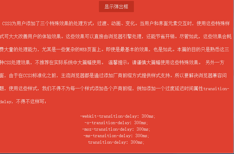
CSS3为用户添加了三个特殊效果的处理方式:过渡、动画、变化。当用户和界面元素交互时,使用这些特殊样式可大大改善用户的体验效果。这些效果直接由浏览器引擎处理,可以节省开销。尽管如此,它们也会耗费大量的处理能力,尤其是一些复杂的WEB页面上。即使是最基本的效果,也是如此。本篇的目的只是熟悉下这三种CSS处理效果,不推荐在实际系统中大篇幅使用。
温馨提示:请谨慎大篇幅使用这些特殊效果。
另外一方面,由于在CCS3标准化之前,主流浏览器都是通过添加厂商前缀方式提供样式支持。所以要解决浏览器兼容问题,使用这些样式,我们不得不为每一个样式添加各个产商前缀,例如添加一个过度延迟属性transition-delay,不得不这样写:
-webkit-transition-delay: 300ms;

-o-transition-delay: 300ms;

-moz-transition-delay: 300ms;

-ms-transition-delay: 300ms;

transition-delay: 300ms;
代码量增加,不利于阅读。
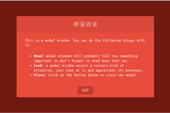
最终效果
先看看最终实现的效果:
效果比较简单,包括以下几点:
窗口透明度发生变化,从最初的0渐变到1。
窗口位置从浏览器底部渐变到浏览器居中位置。
窗口有一个90度的翻转效果。
窗口有遮挡层,弹窗时,遮挡层透明度从0渐变到0.7。
窗口关闭时所有动画反向执行。
弹窗布局
首先实现弹出窗口样式,弹窗在浏览器可见窗口显示,所有需要设置position为fixed。窗口容器样式如下:
.dialog-root{

            position: fixed;

            z-index:;

            left: 50%;

            top: 50%;

            transform: translate(-50%, -50%);

        }
直接设置left和top为50%可让元素左上角原点在浏览器居中,但是我们要以窗口的中心位置作为原点,使用CSS变换特效(transform)的平移translate函数可达到目的。这里补充下变换效果有哪些函数:
translate(x, y)(长度值或者百分比):在水平方向、垂直方向平移元素。
translateX(value):水平方向平移。
translateY(value):垂直方向平移。
scale(x, y)、scaleX(value)、scaleY(value):在水平方向、垂直方向或者两个方向上缩放元素。
rotate()、rotateX()、rotateY()、rotateZ():rotate支持3D效果,可在x、y、z轴上旋转元素。
skew()、skewX()、skewY():在水平方向、垂直方向或者两个方向倾斜一定的角度。
窗口布局完整样式:
<html lang="en">

<head>

    <meta charset="UTF-8">

    <title>CSS特殊效果</title>

    <style tpe="text/css">

        /* ---------------------公共样式 -------------------*/

        body{

            background: #000;

        }

        p {

            display: block;

            -webkit-margin-before: 1em;

            -webkit-margin-after: 1em;

            -webkit-margin-start: 0px;

            -webkit-margin-end: 0px;

        }

        a, button{

            outline: none;

        }

        button {

            border: none;

            padding: 0.6em 1.2em;

            background: #c0392b;

            color: #fff;

            font-size: 1em;

            cursor: pointer;

            display: block;

            margin: 3px auto;

            border-radius: 2px;

        }

        button:hover, button:active, button:focus{

            border: none;

        }

        /* ---------------------弹窗样式 -------------------*/

        /* 遮挡层样式 */

        .dialog-face{

            position: fixed;

            background: #A02418;

            height: 100%;

            width: 100%;

            z-index: 1000;

            top: 0;

            left: 0;

            opacity: 0.7;

        }

        /* 弹窗布局样式 */

        .dialog-root{

            position: fixed;

            z-index: 2000;

            left: 50%;

            top: 50%;

            transform: translate(-50%, -50%);

        }

        /* 弹窗容器 */

        .dialog-wrapper{

            background: #E74C3C;

            width: 635px;

            height: 375px;

            overflow: hidden;

            -webkit-border-radius: 5px;

            -moz-border-radius: 5px;

            border-radius: 5px;

        }

        /* 弹窗标题 */

        .dialog-header{

            height: 75px;

            background: #d94839;

            text-align: center;

        }

        .dialog-header span{

            font-size: 28px;

            line-height: 75px;

            color:#F6CBC6;

        }

        /* 弹窗内容 */

        .dialog-content{

            font-weight: 300;

            font-size: 1.15em;

            color: #fff;

            padding: 15px 40px 20px 40px;

            margin: 0;

        }

        .dialog-content p{

            margin: 0;

            padding: 10px 0;

        }

    </style>

</head>

<body>

    <div id="dialog-face" class="dialog-face">

    </div>

    <div id="dialog" class="dialog-root">

        <div id="dialog-wrapper" class="dialog-wrapper">

            <div class="dialog-header">

                <span>弹窗效果</span>

            </div>

            <div class="dialog-content">

                <p>This is a modal window. You can do the following things with it:</p>

                <ul>

                    <li><strong>Read:</strong> modal windows will probably tell you something important so don't forget to read what they say.</li>

                    <li><strong>Look:</strong> a modal window enjoys a certain kind of attention; just look at it and appreciate its presence.</li>

                    <li><strong>Close:</strong> click on the button below to close the modal.</li>

                </ul>

            </div>

            <div class="dialog-footer">

                <button>关闭</button>

            </div>

        </div>

    </div>

</body>

</html>
效果如下:
动画实现
先看看CSS3为我们提供了的动画属性:
animation-delay:设置动画开始前的延迟时间。
animation-direction:设置动画循环播放的时候是否方向播放,包含normal和alternate两个值。
animation-duration:设置动画播放持续的时间。
animation-interacion-count:设置动画的播放次数,可以为具体数据或者无限循环关键字infinite。
animation-name:指定动画名称。
animation-play-state:允许动画暂停和重新播放,包含running、paused。
animation-timing-function:指定如何计算中间动画值,
CSS3动画为我们提供了关键帧设置,我们可以按百分比设置动画。首先弹窗是从窗口底部向上平移到中间位置。设置的关键帧如下:
       @keyframes dialogSlipToUp  {

            0%{

                top: 100%;

                opacity: 0.3;

            }

            100%{

                top: 50%;

                opacity:;

            }

        }

        @keyframes dialogSlipToBottom  {

            0%{

                top: 50%;

                opacity:;

                -webkit-transform: translate(-50%, -50%);

                -moz-transform: translate(-50%, -50%);

                -ms-transform: translate(-50%, -50%);

                -o-transform: translate(-50%, -50%);

                transform: translate(-50%, -50%);

            }

            100%{

                top: 100%;

                opacity: 0.3;

                -webkit-transform: translate(-50%, 0);

                -moz-transform: translate(-50%, 0);

                -ms-transform: translate(-50%, 0);

                -o-transform: translate(-50%, 0);

                transform: translate(-50%, 0);

            }

        }
上面就是关键帧的定义代码,dialogSlipToBottom和dialogSlipToUp是关键帧名称,元素类可通过animation-name属性使用。dialogSlipToUp是弹窗时的动画效果,透明度从0.3渐变到1并且元素从浏览器底部位置渐变到居中位置。在关闭窗口时使用dialogSlipToBottom作为动画,效果和dialogSlipToUp反向,另外,还使用了变换效果的tranlate函数,因为窗口的中心点在窗口中心,移到窗口底部时有1/2的高度没有隐藏掉,所以使用translate(-50%, 0)让中心点移到顶部,这样整个窗口就可以完全隐藏了。
弹窗有一个3D旋转效果,使用CSS3的3D动画,我们必须选择一个容器作为透视容器,只有在这个容器中设置动画才有效。通过添加perspective属性设置容器为透视容器,我们把dialog-root作为3D动画容器,样式如下:
.dialog-root{

    position: fixed;

    z-index:;

    left: 50%;

    -webkit-animation-duration: 500ms;

    -moz-animation-duration: 500ms;

    -o-animation-duration: 500ms;

    animation-duration: 500ms;

    -webkit-perspective: 1300px;

    -moz-perspective: 1300px;

    perspective: 1300px;

}
通过perspective属性设置透视容器透视举例为1300像素,另外动画的周期(animation-duration)为500毫秒。
弹窗的旋转实现是从浏览器由内向外90度旋转,设置transform-origin: 50% 100%,让窗口以底线作为旋转轴。旋转容器样式如下:
.dialog-wrapper{

            background: #E74C3C;

            width: 635px;

            height: 375px;

            overflow: hidden;

            -webkit-border-radius: 5px;

            -moz-border-radius: 5px;

            border-radius: 5px;

            -webkit-animation-duration: 500ms;

            -moz-animation-duration: 500ms;

            -o-animation-duration: 500ms;

            animation-duration: 500ms;

            -webkit-transform-origin: 50% 100%;

            -moz-transform-origin: 50% 100%;

            -ms-transform-origin: 50% 100%;

            -o-transform-origin:50% 100%;

            transform-origin: 50% 100%;

        }

        .dialog-wrapper.slipUp{

            -webkit-transform: rotateX(0deg);

            -moz-transform: rotateX(0deg);

            -ms-transform: rotateX(0deg);

            -o-transform: rotateX(0deg);

            transform: rotateX(0deg);

            -webkit-animation-name: contentSlipToUp;

            -moz-animation-name: contentSlipToUp;

            -o-animation-name: contentSlipToUp;

            animation-name: contentSlipToUp;

        }

        .dialog-wrapper.slipBottom{

            -webkit-transform: rotateX(90deg);

            -moz-transform: rotateX(90deg);

            -ms-transform: rotateX(90deg);

            -o-transform: rotateX(90deg);

            transform: rotateX(90deg);

            -webkit-animation-name: contentSlipToBottom;

            -moz-animation-name: contentSlipToBottom;

            -o-animation-name: contentSlipToBottom;

            animation-name: contentSlipToBottom;

        }
添加弹出或关闭窗口函数函数:toggleDialog,传入一个布尔值,true表示弹窗,false表示关闭窗口。代码如下:
function toggleDialog(show){

    var animationClass = show ? "slipUp" : "slipBottom";

    var animation = function(){

        var ele = document.getElementById("dialog-face");

        ele.className = "dialog-face " + animationClass;

        ele = document.getElementById("dialog");

        ele.className = "dialog-root " + animationClass;

        ele = document.getElementById("dialog-wrapper");

        ele.className = "dialog-wrapper " + animationClass;

    };

    setTimeout(animation, 100);

}
完整代码
<!DOCTYPE html>

<html lang="en">

<head>

    <meta charset="UTF-8">

    <title>CSS特殊效果</title>

    <style tpe="text/css">

        /* ---------------------公共样式 -------------------*/

        body{

            background: #000;

        }

        .none{

            display: none;

        }

        .layout-root{

            position: fixed;

            background: #E74C3C;

            height: 100%;

            width: 100%;

            z-index: 1000;

            top: 0;

            left: 0;

        }

        .layout-content{

            line-height: 44px;

            font-weight: 300;

            font-size: 1em;

            color: #fff;

            text-indent: 10px;

        }

        .layout-content .code{

            line-height: 22px;

            text-align: center;

        }

        p {

            display: block;

            -webkit-margin-before: 1em;

            -webkit-margin-after: 1em;

            -webkit-margin-start: 0px;

            -webkit-margin-end: 0px;

        }

        a, button{

            outline: none;

        }

        button {

            border: none;

            padding: 0.6em 1.2em;

            background: #c0392b;

            color: #fff;

            font-size: 1em;

            cursor: pointer;

            display: block;

            margin: 3px auto;

            border-radius: 2px;

        }

        button:hover, button:active, button:focus{

            border: none;

        }

        /* ---------------------弹窗样式 -------------------*/

        .dialog-face{

            position: fixed;

            background: #A02418;

            height: 100%;

            width: 100%;

            z-index: 1000;

            top: 0;

            left: 0;

            -webkit-animation-duration: 500ms;

            -moz-animation-duration:500ms;

            -o-animation-duration:500ms;

            animation-duration: 500ms;

        }

        .dialog-face.slipBottom[opacity="0"]{

            display: none;

        }

        .dialog-face.slipUp{

            opacity: 0.7;

            -webkit-animation-name: dialogFaceSlipToUp;

            -moz-animation-name: dialogFaceSlipToUp;

            -o-animation-name: dialogFaceSlipToUp;

            animation-name: dialogFaceSlipToUp;

        }

        .dialog-face.slipBottom{

            opacity: 0;

            visibility: hidden;

            -webkit-animation-name: dialogFaceSlipToBottom;

            -moz-animation-name: dialogFaceSlipToBottom;

            -o-animation-name: dialogFaceSlipToBottom;

            animation-name: dialogFaceSlipToBottom;

        }

        .dialog-root{

            position: fixed;

            z-index: 2000;

            left: 50%;

            -webkit-animation-duration: 500ms;

            -moz-animation-duration: 500ms;

            -o-animation-duration: 500ms;

            animation-duration: 500ms;

            -webkit-perspective: 1300px;

            -moz-perspective: 1300px;

            perspective: 1300px;

        }

        .dialog-root.slipUp{

            top: 50%;

            opacity: 1;

            -webkit-animation-name: dialogSlipToUp;

            -moz-animation-name: dialogSlipToUp;

            -o-animation-name: dialogSlipToUp;

            animation-name: dialogSlipToUp;

            -webkit-transform: translate(-50%, -50%);

            -o-transform: translate(-50%, -50%);

            -moz-transform: translate(-50%, -50%);

            -ms-transform: translate(-50%, -50%);

            transform: translate(-50%, -50%);

        }

        .dialog-root.slipBottom{

            top: 100%;

            opacity: 0.3;

            -webkit-animation-duration: 500ms;

            -moz-animation-duration: 500ms;

            -o-animation-duration: 500ms;

            animation-duration: 500ms;

            -webkit-animation-name: dialogSlipToBottom;

            -moz-animation-name: dialogSlipToBottom;

            -o-animation-name: dialogSlipToBottom;

            animation-name: dialogSlipToBottom;

            -webkit-transform: translate(-50%, 0);

            -o-transform: translate(-50%, 0);

            -moz-transform: translate(-50%, 0);

            -ms-transform: translate(-50%, 0);

            transform: translate(-50%, 0);

        }

        .dialog-wrapper{

            background: #E74C3C;

            width: 635px;

            height: 375px;

            overflow: hidden;

            -webkit-border-radius: 5px;

            -moz-border-radius: 5px;

            border-radius: 5px;

            -webkit-animation-duration: 500ms;

            -moz-animation-duration: 500ms;

            -o-animation-duration: 500ms;

            animation-duration: 500ms;

            -webkit-transform-origin: 50% 100%;

            -moz-transform-origin: 50% 100%;

            -ms-transform-origin: 50% 100%;

            -o-transform-origin:50% 100%;

            transform-origin: 50% 100%;

        }

        .dialog-wrapper.slipUp{

            -webkit-transform: rotateX(0deg);

            -moz-transform: rotateX(0deg);

            -ms-transform: rotateX(0deg);

            -o-transform: rotateX(0deg);

            transform: rotateX(0deg);

            -webkit-animation-name: contentSlipToUp;

            -moz-animation-name: contentSlipToUp;

            -o-animation-name: contentSlipToUp;

            animation-name: contentSlipToUp;

        }

        .dialog-wrapper.slipBottom{

            -webkit-transform: rotateX(90deg);

            -moz-transform: rotateX(90deg);

            -ms-transform: rotateX(90deg);

            -o-transform: rotateX(90deg);

            transform: rotateX(90deg);

            -webkit-animation-name: contentSlipToBottom;

            -moz-animation-name: contentSlipToBottom;

            -o-animation-name: contentSlipToBottom;

            animation-name: contentSlipToBottom;

        }

        .dialog-header{

            height: 75px;

            background: #d94839;

            text-align: center;

        }

        .dialog-header span{

            font-size: 28px;

            line-height: 75px;

            color:#F6CBC6;

        }

        .dialog-content{

            font-weight: 300;

            font-size: 1.15em;

            color: #fff;

            padding: 15px 40px 20px 40px;

            margin: 0;

        }

        .dialog-content p{

            margin: 0;

            padding: 10px 0;

        }

        .dialog-footer{

        }

        /* ---------------------动画关键帧 -------------------*/

        @keyframes dialogFaceSlipToUp  {

            0%{

               opacity: 0;

            }

            100%{

                opacity: 0.7;

            }

        }

        @keyframes dialogFaceSlipToBottom {

            0%{

                opacity: 0.7;

                visibility:visible;

            }

            100%{

                visibility: hidden;

                opacity: 0;

            }

        }

        @keyframes dialogSlipToUp  {

            0%{

                top: 100%;

                opacity: 0.3;

            }

            100%{

                top: 50%;

                opacity: 1;

            }

        }

        @keyframes dialogSlipToBottom  {

            0%{

                top: 50%;

                opacity: 1;

                -webkit-transform: translate(-50%, -50%);

                -moz-transform: translate(-50%, -50%);

                -ms-transform: translate(-50%, -50%);

                -o-transform: translate(-50%, -50%);

                transform: translate(-50%, -50%);

            }

            100%{

                top: 100%;

                opacity: 0.3;

                -webkit-transform: translate(-50%, 0);

                -moz-transform: translate(-50%, 0);

                -ms-transform: translate(-50%, 0);

                -o-transform: translate(-50%, 0);

                transform: translate(-50%, 0);

            }

        }

        @keyframes contentSlipToUp  {

            0%{

                -webkit-transform: rotateX(90deg);

                -moz-transform: rotateX(90deg);

                -ms-transform: rotateX(90deg);

                -o-transform: rotateX(90deg);

                transform: rotateX(90deg);

            }

            100%{

                -webkit-transform: rotateX(0deg);

                -moz-transform: rotateX(0deg);

                -ms-transform: rotateX(0deg);

                -o-transform: rotateX(0deg);

                transform: rotateX(0deg);

            }

        }

        @keyframes contentSlipToBottom  {

            0%{

                -webkit-transform: rotateX(0deg);

                -moz-transform: rotateX(0deg);

                -ms-transform: rotateX(0deg);

                -o-transform: rotateX(0deg);

                transform: rotateX(0deg);

            }

            60%{

                -webkit-transform: rotateX(60deg);

                -moz-transform: rotateX(60deg);

                -ms-transform: rotateX(60deg);

                -o-transform: rotateX(60deg);

                transform: rotateX(60deg);

            }

            100%{

                -webkit-transform: rotateX(90deg);

                -moz-transform: rotateX(90deg);

                -ms-transform: rotateX(90deg);

                -o-transform: rotateX(90deg);

                transform: rotateX(90deg);

            }

        }

    </style>

</head>

<body>

    <div class="fixed layout-root">

        <div class="layout-content">

            <button onclick="toggleDialog(true)">显示弹出框</button>

        </div>

        <div class="layout-content">

            <p>

                CSS3为用户添加了三个特殊效果的处理方式:过渡、动画、变化。当用户和界面元素交互时,使用这些特殊样式可大大改善用户的体验效果。这些效果可以直接由浏览器引擎处理,还能节省开销。尽管如此,这些效果会耗费大量的处理能力,尤其是一些复杂的WEB页面上。即使是最基本的效果,也是如此。本篇的目的只是熟悉这三种CSS处理效果,不推荐在实际系统中大篇幅使用。

                温馨提示:请谨慎大篇幅使用这些特殊效果。

                另外一方面,由于在CCS3标准化之前,主流浏览器都是通过添加厂商前缀方式提供样式支持。所以要解决浏览器兼容问题,使用这些样式,我们不得不为每一个样式添加各个产商前缀,例如添加一个过度延迟时间属性transition-delay,不得不这样写:

            </p>

            <p class="code">

                -webkit-transition-delay: 300ms;<br>

                -o-transition-delay: 300ms;<br>

                -moz-transition-delay: 300ms;<br>

                -ms-transition-delay: 300ms;<br>

                transition-delay: 300ms;

            </p>

        </div>

    </div>

    <div id="dialog-face" class="none">

    </div>

    <div id="dialog" class="none">

        <div id="dialog-wrapper">

            <div class="dialog-header">

                <span>弹窗效果</span>

            </div>

            <div class="dialog-content">

                <p>This is a modal window. You can do the following things with it:</p>

                <ul>

                    <li><strong>Read:</strong> modal windows will probably tell you something important so don't forget to read what they say.</li>

                    <li><strong>Look:</strong> a modal window enjoys a certain kind of attention; just look at it and appreciate its presence.</li>

                    <li><strong>Close:</strong> click on the button below to close the modal.</li>

                </ul>

            </div>

            <div class="dialog-footer">

                <button onclick="toggleDialog(false)">关闭</button>

            </div>

        </div>

    </div>

    <script type="text/javascript">

        function toggleDialog(show){

            var animationClass = show ? "slipUp" : "slipBottom";

            var animation = function(){

                var ele = document.getElementById("dialog-face");

                ele.className = "dialog-face " + animationClass;

                ele = document.getElementById("dialog");

                ele.className = "dialog-root " + animationClass;

                ele = document.getElementById("dialog-wrapper");

                ele.className = "dialog-wrapper " + animationClass;

            };

            setTimeout(animation, 100);

        }

    </script>

</body>

</html>
如果本篇内容对大家有帮助,请点击页面右下角的关注。如果觉得不好,也欢迎拍砖。你们的评价就是博主的动力!下篇内容,敬请期待!
用CSS3动画特效实现弹窗效果的更多相关文章
- css3动画特效:上下晃动的div
css3动画特效:上下晃动的div <div id="square" class="container animated">上下晃动</div ...
- Magic CSS3 一款独特的CSS3动画特效包
插件描述: Magic CSS3 Animations 动画是一款独特的CSS3动画特效包,你可以自由地使用在您的网页中.只需简单的在页面上引入 CSS 文件: magic.css 或者压缩版本 ...
- 分享7款顶级的CSS3动画特效
1.CSS3 SVG文字背景动画 超酷的文字特效 今天我们来分享一款基于CSS3和SVG的文字特效,文字的背景可以定义一些动画特效,在背景动画播放的同时,我们还可以选中文字.本示例让文字背景展示水波和 ...
- jQuery插件css3动画模拟confirm弹窗
相比浏览器自带的alert.confirm,能力所及,我更喜欢所有的东西都是自定义:首先在head标签(当然喜欢其他地方自己看着办)内引入插件样式表和js.<link rel="sty ...
- CSS3动画中的animation-timing-function效果演示
CSS3动画(animation)属性有如下几个: 属性 值 说明 animation-name name 指定元素要使用的keyframes名称 animation-duration time(ms ...
- css3动画实现伪弹幕效果
如图所示: 效果还可以直接用麦唱APP把一首歌分享到微信里面看到,方法类似全民K歌的方法,都是用css3动画实现的, 代码如下:(这是我做真实效果前的一个dome) 直接粘代码就可以看到效果,里面有两 ...
- CSS3动画实现高亮光弧效果,文字和图片(一闪而过)
前言 好久没有写博客啦,高亮文字和图片一闪而过的特效,用CSS3来写 先看文字吧, 就上代码了 .shadow { /* 背景颜色线性渐变 */ /* 老式写法 */ /* linear为线性渐变,也 ...
- CSS3动画特效——transform详解
transform让css3可以做很优质的特效,transform的意思是:改变,使-变形,转换. 在css3中transform的作用也是改变,让元素倾斜,旋转,缩放,位移. 下面来一一分解tran ...
- css3动画特效:纯css3制作win8加载动画特效
Windows 8 完整效果如上图:这个里面可能是css冲突,喜欢的可以自己去体征一下: css特效代码: <style type="text/css"> ...
随机推荐
- 一图搞定【实战Java高并发程序设计】
来了解下java并发的技术点吧.这里面包括了并发级别.算法.定律,还有开发包.在过去单核CPU时代,单任务在一个时间点只能执行单一程序,随着多核CPU的发展,并行程序开发就显得尤为重要.这本书主要介绍 ...
- svn相关知识点
1.查找linux操作系统:uname -a 2.svn 安装:yum install -y subversion 3.svn操作命令 a.将文件checkout到本地目录: svn co svn:/ ...
- LINUX 下grep命令查找
当出现查找文件出现匹配到二进制文件时,大概是因为文件同时含有文本文件与二进制文件,需要加上 grep -a,就可以解决问题.
- like语句百分号前置会使用到索引吗?
like语句百分号前置会使用到索引吗? 前几天看了这篇文章:谈SQL Server对like '%关键词%' 处理时的索引利用问题 看完了之后,我很想知道这篇文章是不是临时工写的?还是网站的主人写的, ...
- 剑指Offer面试题:14.链表的倒数第k个节点
PS:这是一道出境率极高的题目,记得去年参加校园招聘时我看到了3次,但是每次写的都不完善. 一.题目:链表的倒数第k个节点 题目:输入一个链表,输出该链表中倒数第k个结点.为了符合大多数人的习惯,本题 ...
- 我只是想开个饭店—— JavaIO模型的演变
Java的IO...真的是我所见过的高级语言中.最最复杂的... 看着这个图我也是醉了. 但是不知不觉间,java的IO已经更新到了NIO.2了,IO库早已经不止是这个样子了,那么这个过程中,它们经历 ...
- 新开了一个ABP交流的QQ群(579765441 ),欢迎加入
因为ABP架构设计交流群人数一直爆满,很多想交流ABP的朋友无法加进群里, 刚新建了一个QQ群,群号579765441 (ABP架构设计交流群2),欢迎对ABP感兴趣的朋友加入. 欢迎加QQ群: AB ...
- 获取bing.com的图片并在gnome3中设置自动切换
发现 bing.com 上的图片很好看,因此打算每天把 bing.com 的图片下载下来,用作桌面. 需要做的是两个部分,爬取图片到目录和设置目录图片为桌面背景并可以自动切换. 第一部分,下载图片,使 ...
- java IO流 之 其他流
一.内存操作流(ByteArrayInputStream.ByteArrayOutputStream) (一). public class ByteArrayInputStream extends ...
- kafka 安装出现的几个问题
1.安装kafka的过程出现两个问题 1)错误: 找不到或无法加载主类 kafka.Kafka 原因: 下载的是源码包,需要编译.可以下载Binary downloads: 2) ERROR I ...