一些css小用法总结(持续更新~)
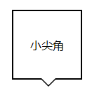
1、用:before和:after实现小尖角效果
<div class="div"></div>
.div{

    background: #fff;

    border: 2px solid #000;

    height: 100px;

    width: 100px;

    position: relative;

}

.div:after,.div:before{

    border:0 solid transparent;

    position: absolute;

    top: 100%;

    content: '';

}

.div:before{

    border-width: 12px;

    border-top-color: #000;

    left: 38px;

}

.div:after{

    border-width: 10px;

    border-top-color: #fff;

    left: 40px;

}
2、怎么只给盒子一侧加box-shadow
<div class="box-shadow">一侧阴影</div>
.box-shadow {

    position: absolute;

    top: 50%;

    left: 50px;

    width: 100px;

    height: 100px;

    background-color: #188eee;

}

.box-shadow:after {

    position: absolute;

    left: 10px;

    bottom:;

    width: 80px;

    height: 1px;

    display: block;

    z-index: -1;

    content: "";

    -webkit-box-shadow: 0px 0px 10px 5px #000;

       -moz-box-shadow: 0px 0px 10px 5px #000;

            box-shadow: 0px 0px 10px 5px #000;

}

3、在不改变box-sizing的情况下,怎么使用text-indent和padding-left来缩进内容
text-indent:首行缩进、不影响width(ie67下和inline-block使用有兼容性问题http://www.cnblogs.com/dothin/p/4979521.html)
用法:缩进,隐藏logo文字
.logo{

    text-indent: -9999px;

    width: 300px;

    height: 100px;

    background: transparent url("imgs/logo.png") no-repeat;

}
padding-left:整体缩进,影响width
4、行溢出内容以省略号形式显示
单行:{width: px; overflow: hidden; text-overflow: ellipsis; white-space: nowarp;}
鼠标移入显示:hover{ text-overflow: inherit; overflow: visible;}
多行:{display:-webkit-box;display:box;overflow: hidden;text-overflow: ellipsis;-webkit-box-orient:vertical;-webkit-line-clamp:4;}
5、表格溢出省略号显示
table{

    width:400px;

    border-collapse: collapse;

    table-layout: fixed;/*保持单元格的等宽*/

}

td{

    border: 1px solid #ccc;

   white-space:nowrap;

    overflow:hidden;

    text-overflow:ellipsis;

}
6、强制长英文单词换行
word-wrap: break-word; /*不会切断单词*/

word-break:break-all;/*要切断单词*/
7、用background-size:0 200%;给背景加渐变动画
<div class="button">背景切换</div>
.button {

    padding:10px 5px;

    border-radius: 4px;

    color: #fff;

    font: 16px sans-serif;

    width: 160px;

    text-align: center;

    background-image: linear-gradient(#155aaa, #188eee);

    background-size: auto 200%;

    background-position: 0 100%;

    -webkit-transition: background-position  .3s;

    -o-transition: background-position  .3s;

    transition: background-position  .3s;

}

.button:hover {

    background-position: 0 0;

}
8、我们可以用text-shadow给文本加阴影,那么你试过模糊文本吗
.text {

   color: transparent;

   text-shadow: 0 0 5px rgba(0,0,0,0.5);

}
9、强制显示页面滚动条
html {

    height: 101%

}
10、跨浏览器的min-height用法
.container {

    min-height: 400px;

    height: auto !important;

    height: 400px;

}
11、怎么给body顶部加固定阴影效果
body:before {

    content: "";

    position: fixed;

    top: -10px;

    left:;

    width: 100%;

    height: 10px;

    -webkit-box-shadow: 0px 0px 10px rgba(0,0,0,.8);

    -moz-box-shadow: 0px 0px 10px rgba(0,0,0,.8);

    box-shadow: 0px 0px 10px rgba(0,0,0,.8);

    z-index:;

}
12、活用:not来排除元素
在ie时代,要给一串li除了最后或者第一个以外都加border-right(border-left),我们需要单独给最后一个或者第一个添加class才可以实现,
现在是css3时代了,我们完全没必要这么做,仅仅只需要一个:not和一个:last-child或者:first-child

li:not(:last-child){border-right:1px solid red;}瞬间心情舒畅~~
13、居中所有元素
html, body {

  height: 100%;

  margin:;

}

body {

  -webkit-align-items: center;

  -ms-flex-align: center;

  align-items: center;

  display: -webkit-flex;

  display: flex;

}
其他居中方法:http://www.cnblogs.com/dothin/p/4971703.html
14、用负的 nth-child 选择元素1到元素n
li {

  /*……*/

}

/* 选择从1到n的元素 */

li:nth-child(-n+3) {

  /*……*/

}
15、清除浮动的常见做法有哪些
1)加高度(但是扩张性不好)
2)父级浮动(不固定宽度的情况下,宽度会变为自适应内容)
3)display:inline-block 清浮动方法(不固定宽度的情况下,宽度会变为自适应内容)
4):after伪类 清浮动方法(主流方法)
.clear:after{content:'';display:block;clear:both;}
.clear{zoom:1;}
5)overflow:hidden 清浮动方法(不允许溢出内容,在需要有溢出的时候这种方法不可行
6)position:absolute、fixed 清浮动。(不固定宽度的情况下,宽度会变为自适应内容,还可以使内联元素支持宽高)
所以以下内容不需要清浮动:
绝对定位或固定定位元素、浮动元素、固定高度的元素、添加了overflow溢出隐藏的元素
16、给元素加360翻转效果
.product li img {

    height:270px;

    width:200px;

    -webkit-transform: rotateY(360deg);

    -ms-transform: rotateY(360deg);

    transform: rotateY(360deg);

    -webkit-transition:-webkit-transform 1s;

    -ms-transition:-ms-transform 1s;

    transition:transform 1s;

}

.product li:hover img {

    -webkit-transform: rotateY(0);

    -ms-transform: rotateY(0);

    transform: rotateY(0);

}
/*要使鼠标移出也翻转,所以transition写在前面*/
17、css3外阴影输入框
input[type=text], textarea {

    -webkit-transition: all 0.30s ease-in-out;

    -moz-transition: all 0.30s ease-in-out;

    -ms-transition: all 0.30s ease-in-out;

    -o-transition: all 0.30s ease-in-out;

    outline: none;

    padding: 3px 0px 3px 3px;

    margin: 5px 1px 3px 0px;

    border: 1px solid #ddd;

}

input[type=text]:focus, textarea:focus {

    box-shadow: 0 0 5px rgba(81, 203, 238, 1);

    padding: 3px 0px 3px 3px;

    margin: 5px 1px 3px 0px;

    border: 1px solid rgba(81, 203, 238, 1);

}
18、网页变灰
html {

  -webkit-filter: grayscale(100%);

  -moz-filter: grayscale(100%);

  -ms-filter: grayscale(100%);

  -o-filter: grayscale(100%);

  filter: grayscale(100%);

 filter:progid:DXImageTransform.Microsoft.BasicImage(grayscale=1);

  -webkit-filter: grayscale(1);

}
19、修改chrome记住密码后自动填充表单的黄色背景
input:-webkit-autofill, textarea:-webkit-autofill, select:-webkit-autofill {

  background-color: rgb(250, 255, 189); /* #FAFFBD; */

  background-image: none;

  color: rgb(0, 0, 0);

}
一些css小用法总结(持续更新~)的更多相关文章
- C#、Java中的一些小知识点总结(持续更新......)
前言:在项目中,有时候一些小的知识,总是容易让人忽略,但是这些功能加在项目中往往十分的有用,因此笔者在这里总结项目中遇到的一些实用的小知识点,以备用,并持续更新...... 1.禁用DataGridV ...
- HTML+CSS - 前端设计的小技巧(持续更新......)
2015年7月6日20:28:20 1.设置文字的居中,非控件内的. :text-alain:center 2.图片在ASP.NET中,可以直接拖放到界面,自动形成img控件. 3.CSS直接在全局样 ...
- html+css常用小笔记(持续更新)
1 去掉input点击时的蓝色边框 outline:none; 2 禁止文本选中 -webkit-touch-callout: none; /* iOS Safari */ -webkit-user- ...
- CSS用法总结(持续更新)
一.html,body{height:100%} 解决了容器高度不足(容器高度由子元素高度决定,而%按照父元素的百分比),无法用%布局页面的问题 把html和body的高度设置为浏览器高度,此时会出现 ...
- 【小摘抄】关于C++11下 string各类用法(持续更新)
http://blog.csdn.net/autocyz/article/details/42391155 提供了最简单的详解 下列对本人近期开发中的一些心得体会进行摘抄 1.string按照字符进行 ...
- css用法(持续更新ing)
*:选择所有节点 #container:选取id为container的节点 .container:选取所有class包含container的节点 li a:选取li下的所有a节点 ul +p:选取ul ...
- 基于Taro与typescript开发的网易云音乐小程序(持续更新)
基于Taro与网易云音乐api开发,技术栈主要是:typescript+taro+taro-ui+redux,目前主要是着重小程序端的展示,主要也是借此项目强化下上述几个技术栈的使用,通过这个项目也可 ...
- iOS 小知识点(持续更新)
1.如何通过代码设置Button title的字体大小 设置Button.titleLabel.font = [UIFont systemFontOfSize:<#(CGFloat)#> ...
- 我的CSS布局之旅--持续更新
虽然我也接触前端一年之久了,但是无奈从切图布局下来的经验还真是很不足,因为之前比赛或者是做小项目时全部都是自己负责设计,所以都是编写边设计,哎呀,也是醉了:或者是有模板,然后从人家上面扒拉下来的,真的 ...
随机推荐
- 实战EntityFramework
删除对象一定要在同一个context 我尝试这在两个方法中使用两个context(Container)实例来进行一个获得一个删除,结果我获得的”The object cannot be deleted ...
- Obj-C的hello,world 2
https://github.com/facebook/facebook-ios-sdk/blob/master/src/FBAppEvents.h + (void)logEvent:(NSStrin ...
- BZOJ 1032 祖玛
Description 这是一个流行在Jsoi的游戏,名称为祖玛.精致细腻的背景,外加神秘的印加音乐衬托,彷佛置身在古老的国度里面,进行一个神秘的游戏——这就是著名的祖玛游戏.祖玛游戏的主角是一只石青 ...
- Yaroslav and Divisors
Codeforces Round #182 (Div. 1) D:http://codeforces.com/contest/301/problem/D 题意:给一个1-n,n个数的序列,然后查询一个 ...
- TWinControl的DoubleBuffered属性的作用与举例
留个爪,网上搜一篇,仔细分析一下.
- width:auto; 和 width:100%;的不同
width:auto:会将元素撑开至整个父元素width,但是会减去子节点自己的margin,padding或者border的大小.width:100%:会强制将元素变成和父元素一样的宽,并且添加额外 ...
- Record Locks
Record Locks 记录锁: 记录锁是一个锁在一个Index记录上,比如 SELECT c1 FOR UPDATE FROM t WHERE c1 = 10; 阻止任何其他事务inserting ...
- Unity 技能按钮触发特效
unity 版本:4.5.1 NGUI版本:3.6.5 首先,要导入特效资源包,导入应该是基本中的基础,但是对于初学者来说好像很少有这方面的介绍,也许是我现学现用书看的不够认真,因为导入这个问题卡了好 ...
- App自动更新之通知栏下载
见证过博客园的多次升级,你也希望你的软件通过更新发布新特性通知用户吧,是的.这篇文章是android开发人员的必备知识,是我特别为大家整理和总结的,不求完美,但是有用. 1.设计思路,使用Versio ...
- Summary Ranges —— LeetCode
Given a sorted integer array without duplicates, return the summary of its ranges. For example, give ...