Flutter基础Widget之按钮(RaisedButton、FlatButton、OutlineButton,IconButton)
- Flutter中给我们预先定义好了一些按钮控件给我们用,常用的按钮如下
- RaisedButton :凸起的按钮,其实就是Android中的Material Design风格的Button ,继承自MaterialButton
- FlatButton :扁平化的按钮,继承自MaterialButton
- OutlineButton :带边框的按钮,继承自MaterialButton
- IconButton :图标按钮,继承自StatelessWidget
- 我们先来看看MaterialButton中的属性,可以看到能设置的属性还是很多的。
- const MaterialButton({
- Key key,
- @required this.onPressed,
- this.onHighlightChanged,
- this.textTheme,
- this.textColor,
- this.disabledTextColor,
- this.color,
- this.disabledColor,
- this.highlightColor,
- this.splashColor,
- this.colorBrightness,
- this.elevation,
- this.highlightElevation,
- this.disabledElevation,
- this.padding,
- this.shape,
- this.clipBehavior = Clip.none,
- this.materialTapTargetSize,
- this.animationDuration,
- this.minWidth,
- this.height,
- this.child,
- }) : super(key: key);
- 下面我们来看看常用属性
- 属性 值类型 说明
- onPressed VoidCallback ,一般接收一个方法 必填参数,按下按钮时触发的回调,接收一个方法,传null表示按钮禁用,会显示禁用相关样式
- child Widget 文本控件
- textColor Color 文本颜色
- color Color 按钮的颜色
- disabledColor Color 按钮禁用时的颜色
- disabledTextColor Color 按钮禁用时的文本颜色
- splashColor Color 点击按钮时水波纹的颜色
- highlightColor Color 点击(长按)按钮后按钮的颜色
- elevation double 阴影的范围,值越大阴影范围越大
- padding EdgeInsetsGeometry (抽象类) 内边距
- shape ShapeBorder(抽象类) 设置按钮的形状
- minWidth double 最小宽度
- height double 高度
- 而在Android中如果我们要修改按钮样式的话,需要通过selector和Shape等方式进行修改,相比较Flutter来说是要麻烦不少的
- RaisedButton
- RaisedButton的构造方法如下,由于继承自MaterialButton,所以MaterialButton中的大多数属性这边都能用,且效果一致,这里就不在赘述了
- const RaisedButton({
- Key key,
- @required VoidCallback onPressed,
- ValueChanged<bool> onHighlightChanged,
- ButtonTextTheme textTheme,
- Color textColor,
- Color disabledTextColor,
- Color color,
- Color disabledColor,
- Color highlightColor,
- Color splashColor,
- Brightness colorBrightness,
- double elevation,
- double highlightElevation,
- double disabledElevation,
- EdgeInsetsGeometry padding,
- ShapeBorder shape,
- Clip clipBehavior = Clip.none,
- MaterialTapTargetSize materialTapTargetSize,
- Duration animationDuration,
- Widget child,
- })
- 下面我们来看一下属性
- onPressed
- 接收一个方法,点击按钮时回调该方法。如果传null,则表示按钮禁用
- return RaisedButton(
- onPressed: null,
- );
- 如下图所示

- 下面我们定义一个方法传给onPressed
- _log() {
- print("点击了按钮");
- }
- @override
- Widget build(BuildContext context) {
- return RaisedButton(
- onPressed: _log,
- );
- }

- 点击按钮后会调用log方法。

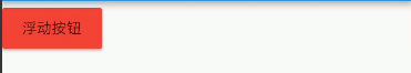
- child
- 按钮文本控件,一般都是传一个Text Widget
- return RaisedButton(
- onPressed: _log,
- child: Text("浮动按钮"),
- );

- color
- 按钮的颜色
- return RaisedButton(
- onPressed: _log,
- child: Text("浮动按钮"),
- color: Colors.red,
- );
- textColor
- 按钮的文本颜色
- return RaisedButton(
- onPressed: _log,
- child: Text("浮动按钮"),
- color: Colors.red,
- textColor: Colors.white,
- );

- splashColor
- 点击按钮时水波纹的颜色
- return RaisedButton(
- onPressed: _log,
- child: Text("浮动按钮"),
- color: Colors.red,
- textColor: Colors.white,
- splashColor: Colors.black,
- );

- highlightColor
- 高亮颜色,点击(长按)按钮后的颜色
- return RaisedButton(
- onPressed: _log,
- child: Text("浮动按钮"),
- color: Colors.red,
- textColor: Colors.white,
- splashColor: Colors.black,
- highlightColor: Colors.green,
- );

- elevation
- 阴影范围,一般不会设置太大
- return RaisedButton(
- onPressed: _log,
- child: Text("浮动按钮"),
- color: Colors.red,
- textColor: Colors.white,
- splashColor: Colors.black,
- highlightColor: Colors.green,
- elevation: 30,
- );

- padding
- 内边距,其接收值的类型是EdgeInsetsGeometry类型的,EdgeInsetsGeometry是一个抽象类,我们来看看其实现类

- 我们一般都用EdgeInsets类中的方法来设置padding
- 常用方法如下
- //单独设置左上右下的间距,四个参数都要填写
- const EdgeInsets.fromLTRB(this.left, this.top, this.right, this.bottom);
- //单独设置左上右下的间距,四个均为可选参数
- const EdgeInsets.only({
- this.left = 0.0,
- this.top = 0.0,
- this.right = 0.0,
- this.bottom = 0.0
- });
- //一次性设置上下左右的间距
- const EdgeInsets.all(double value)
- : left = value, top = value, right = value, bottom = value;
- 示例:
- EdgeInsets.all()
- padding: EdgeInsets.all(20)

- EdgeInsets.fromLTRB()
- padding: EdgeInsets.fromLTRB(0,30,20,40)

- EdgeInsets.only()
- padding: EdgeInsets.only(top: 30)

- shape
- shape用来设置按钮的形状,其接收值是ShapeBorder类型,ShapeBorder是一个抽象类,我们来看看有哪些实现类

- 可以看到,实现类还是很多的,我们主要来看看常用的即可。
- BeveledRectangleBorder 带斜角的长方形边框
- CircleBorder 圆形边框
- RoundedRectangleBorder 圆角矩形
- StadiumBorder 两端是半圆的边框
- 我们来简单用一用,在用之前我们先来看一下
- 常用的两个属性
- side 用来设置边线(颜色,宽度等)
- borderRadius 用来设置圆角
- side接收一个BorderSide类型的值,比较简单,这里就不介绍了,看一下构造方法
- const BorderSide({
- this.color = const Color(0xFF000000),
- this.width = 1.0,
- this.style = BorderStyle.solid,
- })
- borderRadius 接收一个BorderRadius类型的值,常用方法如下

- 我们可以把borderRadius分为上下左右四个方向,下面的方法都是对这四个方向进行设置,
- all 配置所有方向
- cricular 环形配置,跟all效果差不多,直接接收double类型的值
- horizontal 只配置左右方向
- only 可选左上,右上,左下,右下配置
- vertical 只配置上下方向
- 具体配置大家自行尝试
- 我们来简单用一下
- BeveledRectangleBorder
- 带斜角的长方形边框
- shape: BeveledRectangleBorder(
- side: BorderSide(
- color: Colors.white,
- ),
- borderRadius: BorderRadius.all(Radius.circular(10))
- ),

- CircleBorder
- 圆形边框
- shape: CircleBorder(
- side: BorderSide(
- color: Colors.white,
- ),
- ),

- RoundedRectangleBorder
- 圆角矩形
- shape: RoundedRectangleBorder(
- borderRadius: BorderRadius.all(Radius.circular(10)),
- ),

- StadiumBorder
- 两端是半圆的边框
- shape: StadiumBorder(),

- FlatButton
- FlatButton跟RaisedButton用法基本一致,下面我们就直接用一下
- /*扁平按钮*/
- class FlatBtn extends StatelessWidget {
- _log() {
- print("点击了扁平按钮");
- }
- @override
- Widget build(BuildContext context) {
- return FlatButton(
- onPressed: _log,
- child: Text("扁平按钮"),
- color: Colors.blue,
- textColor: Colors.black,
- shape: RoundedRectangleBorder(
- side: BorderSide(
- color: Colors.white,
- width: 1,
- ),
- borderRadius: BorderRadius.circular(8)),
- );
- }
- }

- OutlineButton
- 注意,OutlineButton是一个有默认边线且背景透明的按钮,也就是说我们设置其边线和颜色是无效的,其他属性跟MaterialButton中属性基本一致
- 下面我们直接来使用
- /*带边线的按钮*/
- class outlineBtn extends StatelessWidget {
- _log() {
- print("点击了边线按钮");
- }
- @override
- Widget build(BuildContext context) {
- // TODO: implement build
- return OutlineButton(
- onPressed: _log,
- child: Text("边线按钮"),
- textColor: Colors.red,
- splashColor: Colors.green,
- highlightColor: Colors.black,
- shape: BeveledRectangleBorder(
- side: BorderSide(
- color: Colors.red,
- width: 1,
- ),
- borderRadius: BorderRadius.circular(10),
- ),
- );
- }
- }
- 效果如下:

- IconButton
- IconButton是直接继承自StatelessWidget的,默认没有背景
- 我们来看一下他的构造方法
- const IconButton({
- Key key,
- this.iconSize = 24.0,
- this.padding = const EdgeInsets.all(8.0),
- this.alignment = Alignment.center,
- @required this.icon,
- this.color,
- this.highlightColor,
- this.splashColor,
- this.disabledColor,
- @required this.onPressed,
- this.tooltip
- })
- 可以看到,icon是必填参数
- icon接收一个Widget,但是一般我们都是传入一个Icon Widget
- final Widget icon;
- 其他属性跟MaterialButton中的属性用法基本一致
- 我们来用一下
- /*图标按钮*/
- class IconBtn extends StatelessWidget {
- _log() {
- print("点击了图标按钮");
- }
- @override
- Widget build(BuildContext context) {
- return IconButton(
- icon: Icon(Icons.home),
- onPressed: _log,
- color: Colors.blueAccent,
- highlightColor: Colors.red,
- );
- }
- }
- 效果如下

- 我们也可以传一个Text或其他Widget,这个大家自行尝试吧
- Flutter中Button内容大概就是这些
Flutter基础Widget之按钮(RaisedButton、FlatButton、OutlineButton,IconButton)的更多相关文章
- Flutter 基础组件:按钮
前言 Material组件库中提供了多种按钮组件如RaisedButton.FlatButton.OutlineButton等,它们都是直接或间接对RawMaterialButton组件的包装定制,所 ...
- Flutter 基础控件
内容: Button Image.Icon Switch.Checkbox TextField Form 1.Button RaisedButton 漂浮按钮 FlatButton 扁平按钮 Outl ...
- Flutter 基础组件:输入框和表单
前言 Material组件库中提供了输入框组件TextField和表单组件Form. 输入框TextField 接口描述 const TextField({ Key key, // 编辑框的控制器,通 ...
- Bootstrap<基础十四> 按钮下拉菜单
使用 Bootstrap class 向按钮添加下拉菜单.如需向按钮添加下拉菜单,只需要简单地在在一个 .btn-group 中放置按钮和下拉菜单即可.也可以使用 <span class=&qu ...
- Flutter基础用法解析
解析开始 Flutter中一切皆widget,一切皆组件.学习Flutter中,必须首先了解Flutter的widget.先从最基本的MaterialApp和Scaffold开始了解 1 Materi ...
- Flutter 基础组件:Widget简介
概念 在Flutter中几乎所有的对象都是一个Widget.与原生开发中"控件"不同的是,Flutter中的Widget的概念更广泛,它不仅可以表示UI元素,也可以表示一些功能性的 ...
- Flutter基础系列之混合开发(二)
1.混合开发的场景 1.1作为独立页面加入 这是以页面级作为独立的模块加入,而不是页面的某个元素. 原生页面可以打开Flutter页面 Flutter页面可以打开原生页面 1.2作为页面的一部分嵌入 ...
- Flutter中的浮动按钮 FloatingActionButton
FloatingActionButton 简称 FAB ,可以实现浮动按钮,也可以实现类似闲鱼 app 的底部凸起导航 . 常用属性 FloatingActionButton的常用属性,同flutte ...
- Flutter调研(1)-Flutter基础知识
工作需要,因客户端有部分页面要使用flutter编写,需要QA了解一下flutter相关知识,因此,做了flutter调研,包含安装,基础知识与demo编写,第二部分是安装与环境配置. —— Flut ...
随机推荐
- spring 配置中相关属性的含义:
1:parent元素属性 一个bean定义可能会包含大量的配置信息,包括容器相关的信息(比如初始化方法,静态工厂方法等等)以及构造函数参数和属性的值.一个child bean定义是一个能够从paren ...
- Phpstorm 无法自动断点 Exception
困扰了很久的问题了. ... 今天终于解决了,直接说解决方案吧. 在 php.ini 中增加一行配置: xdebug.default_enable = 1,然后重启Apache服务器:sudo ser ...
- Oracle数据库误删文件导致rman备份报错RMAN-06169解决办法
Oracle数据库误删文件导致rman备份报错RMAN-06169解决办法 可能是误删文件导致在使用rman备份时候出现以下提示 RMAN-06169: could not read file hea ...
- explain 分析 聚合统计语句的性能
EXPLAIN SELECT COUNT(1) FROM question; id select_type table partitions type possible_keys key key_le ...
- sql_q.format
field_q_insert = 'id, title, number, created,content'sql_q = 'INSERT INTO testquestion ({}) VALUES ( ...
- 关于Python装饰器内层函数为什么要return目标函数的一些个人见解
https://blog.csdn.net/try_test_python/article/details/80802199 前几天在学装饰器的时候,关于装饰器内层函数调用目标函数时是否return目 ...
- Spark-RDD算子
一.Spark-RDD算子简介 RDD(Resilient Distributed DataSet)是分布式数据集.RDD是Spark最基本的数据的抽象. scala中的集合.RDD相当于一个不可变. ...
- 【JEECG技术博文】JEECG表单配置-树形表单
表单配置支持树型表单了,详细效果例如以下图:
- IOS使用Core-Plot画折线图
关于Core-Plot的配置.大家能够參考我的上一篇博客:http://1.wildcat.sinaapp.com/?p=99 版权全部.转载请注明原文转自:http://blog.csdn.net/ ...
- innobackupex 还原和备份实例
InnoDB 和非 InnoDB 文件的备份都是通过拷贝文件来做的,但是实现的方式不同,前者是以page为粒度做的(xtrabackup),后者是 cp 或者 tar 命令(innobackupex) ...