EasyUI整理学习
参考博客: https://www.cnblogs.com/adc8868/p/6647680.html
http://www.jeasyui.com/documentation/#
jQuery EasyUI,Tabs(选项卡)组件

学习要点:
1.加载方式
2.属性列表
3.事件列表
4.方法列表
5.选项卡面板
本节课重点了解 EasyUI 中 Tabs(选项卡)组件的使用方法,这个组件依赖于 Panel(面 板)组件和 LinkButton(按钮)组件。
一.加载方式
class 加载方式

<div id="box" class="easyui-tabs" style="width:500px;height:250px;">

    <div title="Tab1">

        tab1

    </div>

    <div title="Tab2" data-options="closable:true">

        tab2

    </div>

    <div title="Tab3"

         data-options="iconCls:'icon-reload',closable:true">

        tab3

    </div>

</div>
tabs()将符合规则的元素实现选项卡方法
htnl
<div id="box">

    <div title="Tab1">

        tab1

    </div>

    <div title="Tab2">

        tab2

    </div>

    <div title="Tab3">

        tab3

    </div>

</div>
js代码
$('#box').tabs({

  //...

});
二.属性列表


width number 选项卡容器宽度。默认值 auto。
$(function () {

    $('#box').tabs({

        width:500,      //选项卡容器宽度

        height:400      //选项卡容器高度

    });

});
height number 选项卡容器高度。默认值 auto。
$(function () {

    $('#box').tabs({

        width:500,      //选项卡容器宽度

        height:400      //选项卡容器高度

    });

});
plain boolean 设置为 true 时,将不显示控制面板背景。默认值 false。
$(function () {

    $('#box').tabs({

        width:500,      //选项卡容器宽度

        height:400,      //选项卡容器高度

        plain:true      //设置为 true 时,将不显示控制面板背景。默认值 false。

    });

});
fit boolean 设置为 true 时,选项卡的大小将铺满它所在的容器。默认值 false。
$(function () {

    $('#box').tabs({

        width:500,      //选项卡容器宽度

        height:400,      //选项卡容器高度

        fit:true      //设置为 true 时,选项卡的大小将铺满它所在的容器。默认值 false。

    });

});
border boolean 设置为 true 时,显示选项卡容器边框。默认值 true。
$(function () {

    $('#box').tabs({

        width:500,      //选项卡容器宽度

        height:400,      //选项卡容器高度

        border:false      //设置为 true 时,显示选项卡容器边框。默认值 true。

    });

});
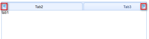
scrollIncrement number 选项卡滚动条每次滚动的像素值。默认值100。也就是按钮滚动的像素,按钮少时结合tabWidth属性使用
$(function () {

    $('#box').tabs({

        width:500,      //选项卡容器宽度

        height:400,      //选项卡容器高度

        tabWidth:300,    //设置按钮宽度

        scrollIncrement:50      //选项卡滚动条每次滚动的像素值。默认值100

    });

});
scrollDuration number 每次滚动动画持续的时间,单位:毫秒。默认值400。也就是按钮滚动的速度
$(function () {

    $('#box').tabs({

        width:500,      //选项卡容器宽度

        height:400,      //选项卡容器高度

        tabWidth:300,    //设置按钮宽度

        scrollIncrement:50,      //选项卡滚动条每次滚动的像素值。默认值100

        scrollDuration:500      //每次滚动动画持续的时间,单位:毫秒。默认值400。

    });

});
tools array,selector工具栏添加在选项卡面板头的左侧或右侧。可用的值有:1. 一个工具菜单数组,每个工具选项都和 linkbutton 相同。2. 一个指向<div/>容器工具菜单的选择器。默认值null。
给选项卡头部设置工具栏,接收一个数组,数组里接收一个对象,对象里是键值对设置图标和点击事件

$(function () {

    $('#box').tabs({

        width: 500,      //选项卡容器宽度

        height: 400,      //选项卡容器高度

        tools: [{           //给选项卡头部设置工具栏,接收一个数组,数组里接收一个对象,对象里是键值对设置图标和点击事件

            iconCls: 'icon-add',

            handler: function () {

                alert('添加!');

            }

        }]

    });

});
toolPosition string 工具栏位置。可用值:'left','right'。默认值 right。工具栏位置
$(function () {

    $('#box').tabs({

        width: 500,      //选项卡容器宽度

        height: 400,      //选项卡容器高度

        tools: [{           //给选项卡头部设置工具栏,接收一个数组,数组里接收一个对象,对象里是键值对设置图标和点击事件

            iconCls: 'icon-add',

            handler: function () {

                alert('添加!');

            }

        }],

        toolPosition:'left'     //工具栏位置。可用值:'left','right'。默认值 right。

    });

});
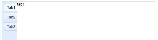
tabPosition string选 项 卡 位 置 。 可 用 值 :'top','bottom','left','right'。默认值:top。按钮位置
$(function () {

    $('#box').tabs({

        width: 500,      //选项卡容器宽度

        height: 400,      //选项卡容器高度

        tabPosition:'bottom' //string选 项 卡 位 置 。 可 用 值 :'top','bottom','left','right'。默认值:top。按钮位置

    });

});
headerWidth number选项卡标题宽度,在 tabPosition 属性设置为'left'或'right'的时候才有效。默认值:150。设置按钮标题宽度,只有在按钮设置左或者右的时候有效
$(function () {

    $('#box').tabs({

        width: 500,      //选项卡容器宽度

        height: 400,      //选项卡容器高度

        tabPosition:'left',

        headerWidth:50     //选项卡标题宽度,在 tabPosition 属性设置为'left'或'right'的时候才有效。默认值:150。设置按钮宽度

    });

});
tabWidth number 标签条的宽度。默认值:auto。设置按钮宽度
$(function () {

    $('#box').tabs({

        width: 500,      //选项卡容器宽度

        height: 400,      //选项卡容器高度

        tabWidth:200    //标签条的宽度。默认值:auto。

    });

});
tabHeight number 标签条的高度。默认值:27。设置按钮高度
$(function () {

    $('#box').tabs({

        width: 500,      //选项卡容器宽度

        height: 400,      //选项卡容器高度

        tabWidth:200,    //标签条的宽度。默认值:auto。

        tabHeight:100   //标签条的高度。默认值:27。

    });

});
selected number 初始化选中一个 tab 页。默认值:0。默认选择,值为索引
$(function () {

    $('#box').tabs({

        width: 500,      //选项卡容器宽度

        height: 400,      //选项卡容器高度

        selected:1      //初始化选中一个 tab 页。默认值:0。默认选择值为索引

    });

});
showHeader boolean 设置为 true 时,显示 tab 页标题。默认值:true。是否显示按钮
$(function () {

    $('#box').tabs({

        width: 500,      //选项卡容器宽度

        height: 400,      //选项卡容器高度

        selected:1,      //初始化选中一个 tab 页。默认值:0。默认选择值为索引

        showHeader :false   //设置为 true 时,显示 tab 页标题。默认值:true。是否显示按钮

    });

});
三.事件列表
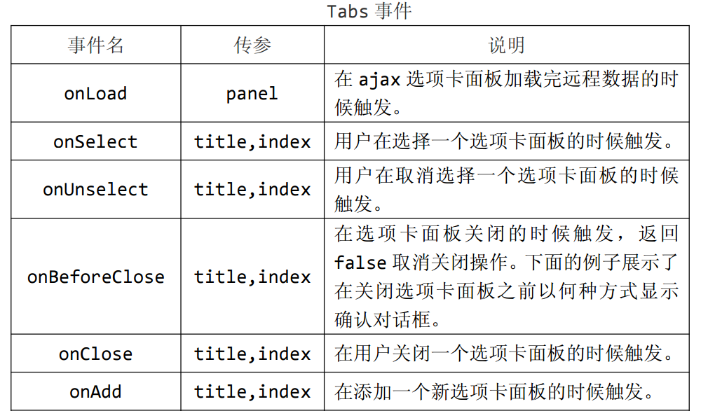

onLoad panel 在 ajax 选项卡面板加载完远程数据的时候触发。
$(function () {

    $('#box').tabs({

        width: 500,      //选项卡容器宽度

        height: 400,      //选项卡容器高度

        onLoad:function (panel) {

            alert('在 ajax 选项卡面板加载完远程数据的时候触发。');

            alert('接收当前选项卡的对象' + panel);

        }

    });

    $('#box').tabs('add',{      //添加一个新选项卡面板

        id:'xmb',           //设置新增id

        title:'新按钮',      //设置新增按钮标题

        content:'新内容',     //设置新增内容

        href :'is_user.php'  //加载一个外部文件

        //更多见第五节

    });

});
onSelect title,index 用户在选择一个选项卡面板的时候触发。title,index分别接收选择的按钮标题和按钮索引
$(function () {

    $('#box').tabs({

        width: 500,      //选项卡容器宽度

        height: 400,      //选项卡容器高度

        onSelect:function (title,index) {

            alert('用户在选择一个选项卡面板的时候触发。');

            alert('接收选择的按钮标题'+title);

            alert('接收选择的按钮索引'+index);

        }

    });

});
onUnselect title,index 用户在取消选择一个选项卡面板的时候触发。title,index分别接收选择的上一个按钮标题和按钮索引
$(function () {

    $('#box').tabs({

        width: 500,      //选项卡容器宽度

        height: 400,      //选项卡容器高度

        onUnselect:function (title,index) {

            alert('用户在取消选择一个选项卡面板的时候触发。');

            alert('接收选择的上一个按钮标题'+title);

            alert('接收选择的上一个按钮索引'+index);

        }

    });

});
onBeforeClose title,index在选项卡面板关闭的时候触发,返回false 取消关闭操作。下面的例子展示了在关闭选项卡面板之前以何种方式显示确认对话框。
$(function () {

    $('#box').tabs({

        width: 500,      //选项卡容器宽度

        height: 400,      //选项卡容器高度

        onBeforeClose:function (title,index) {

            alert('在选项卡面板关闭的时候触发');

            alert('接收选择的关闭按钮标题'+title);

            alert('接收选择的关闭按钮索引'+index);

        }

    });

});
onClose title,index 在用户关闭一个选项卡面板之后触发。
$(function () {

    $('#box').tabs({

        width: 500,      //选项卡容器宽度

        height: 400,      //选项卡容器高度

        onClose:function (title,index) {

            alert('在用户关闭一个选项卡面板之后触发。');

            alert('接收选择的关闭按钮标题'+title);

            alert('接收选择的关闭按钮索引'+index);

        }

    });

});
onAdd title,index 在添加一个新选项卡面板的时候触发。
$(function () {

    $('#box').tabs({

        width: 500,      //选项卡容器宽度

        height: 400,      //选项卡容器高度

        onAdd:function (title,index) {   //在添加一个新选项卡面板的时候触发。

            alert('获取新添加的面板标题:'+ title + '|' + '获取新添加的面板索引:' + index);

        }

    });

    $('#box').tabs('add',{      //添加一个新选项卡面板

        id:'xmb',           //设置新增id

        title:'新按钮',      //设置新增按钮标题

        content:'新内容'     //设置新增内容

        //更多见第五节

    });

});
onUpdate title,index 在更新一个选项卡面板的时候触发。修改时触发
$(function () {

    $('#box').tabs({

        width: 500,      //选项卡容器宽度

        height: 400,      //选项卡容器高度

        onUpdate:function (title,index) {

            alert('修改时触发');

            alert(title + '|' + index);  //接收选项卡的按钮和索引

        }

    });

    $('#box').tabs('update',{

        tab:$('#cfh'),  //要修改的面板id

        options:{       //要修改的属性

            title:'修改标题'

        }

    });

});
onContextMenu e,title,index 在右键点击一个选项卡面板的时候触发。
$(function () {

    $('#box').tabs({

        width: 500,      //选项卡容器宽度

        height: 400,      //选项卡容器高度

        onContextMenu:function (e,title,index) {

            alert('在右键点击一个选项卡面板的时候触发。');

            alert('接收右键点击按钮标题'+title);

            alert('接收右键点击按钮索引'+index);

        }

    });

});
四.方法列表 Tabs 方法


options none 返回选项卡属性。
$(function () {

    $('#box').tabs({

        width: 500,      //选项卡容器宽度

        height: 400,      //选项卡容器高度

    });

    alert($('#box').tabs('options'));  //返回选项卡属性。

});
tabs none 返回所有选项卡面板。也就是返回所有按钮对象
$(function () {

    $('#box').tabs({

        width: 500,      //选项卡容器宽度

        height: 400,      //选项卡容器高度

    });

    alert($('#box').tabs('tabs'));  //返回所有选项卡面板。也就是返回所有按钮对象

});
resize none 调整选项卡容器大小和布局。也就是选项卡如果因为什么原因变形了,可以重置这个选项卡
$(function () {

    $('#box').tabs({

        width: 500,      //选项卡容器宽度

        height: 400,      //选项卡容器高度

    });

    alert($('#box').tabs('resize'));  //也就是选项卡如果因为什么原因变形了,可以重置这个选项卡

});
add options添加一个新选项卡面板,选项参数是一个配置对象,查看选项卡面板属性的更多细节。在添加一个新选项卡面板的时候它将变成可选的。添加一个非选中状态的选项卡面板时,记得设
置'selected'属性为 false。第二个参数是一个对象,以键值对方式设置新增的面板属性,详情见第五节选项卡面板
$(function () {

    $('#box').tabs({

        width: 500,      //选项卡容器宽度

        height: 400,      //选项卡容器高度

    });

    $('#box').tabs('add',{      //添加一个新选项卡面板

        id:'xmb',           //设置新增id

        title:'新按钮',      //设置新增按钮标题

        content:'新内容'     //设置新增内容

        //更多见第五节

    });

});
close which关闭一个选项卡面板,'which'参数可以是选项卡面板的标题或者索引,以指定要关闭的面板。
$(function () {

    $('#box').tabs({

        width: 500,      //选项卡容器宽度

        height: 400      //选项卡容器高度

    });

    $('#box').tabs('close',1);  //关闭一个选项卡面板,'which'参数可以是选项卡面板的标题或者索引,以指定要关闭的面板。

});
getTab which 获取指定选项卡面板,'which'参数可以是选项卡面板的标题或者索引。获取指定选项卡面板对象
$(function () {

    $('#box').tabs({

        width: 500,      //选项卡容器宽度

        height: 400      //选项卡容器高度

    });

    alert($('#box').tabs('getTab',1));  //which 获取指定选项卡面板,'which'参数可以是选项卡面板的标题或者索引。

});
getTabIndex tab 获取指定选项卡面板的索引。获取指定id的按钮索引
$(function () {

    $('#box').tabs({

        width: 500,      //选项卡容器宽度

        height: 400      //选项卡容器高度

    });

    alert($('#box').tabs('getTabIndex','#cfh'));  //获取指定选项卡面板的索引

});
getSelected none获取选择的选项卡面板。下面的例子展示了如何获取选择的选项卡面板索引。获取以选定的选项卡面板对象
$(function () {

    $('#box').tabs({

        width: 500,      //选项卡容器宽度

        height: 400      //选项卡容器高度

    });

    alert($('#box').tabs('getSelected'));  //获取指定选项卡面板的对象

});
select which 选择一个选项卡面板,'which'参数可以是选项卡面板的标题或者索引。选择一个选项卡面板
$(function () {

    $('#box').tabs({

        width: 500,      //选项卡容器宽度

        height: 400      //选项卡容器高度

    });

    $('#box').tabs('select',1);  //选择一个选项卡面板

});
unselect which 取消选择一个选项卡面板,'which'参数可以是选项卡面板的标题或者索引。取消选择的选项卡
$(function () {

    $('#box').tabs({

        width: 500,      //选项卡容器宽度

        height: 400      //选项卡容器高度

    });

    $('#box').tabs('unselect',0);  //取消选择的选项卡

});
showHeader none 显示选项卡的标签头。
$(function () {

    $('#box').tabs({

        width: 500,      //选项卡容器宽度

        height: 400      //选项卡容器高度

    });

    $('#box').tabs('showHeader');  //显示选项卡的标签头。

});
hideHeader none 隐藏选项卡的标签头。
$(function () {

    $('#box').tabs({

        width: 500,      //选项卡容器宽度

        height: 400      //选项卡容器高度

    });

    $('#box').tabs('hideHeader');  //隐藏选项卡的标签头

});
exists which 表明指定的面板是否存在,'which'参数可以是选项卡面板的标题或索引。指定的面板是否存在,返回布尔值
$(function () {

    $('#box').tabs({

        width: 500,      //选项卡容器宽度

        height: 400      //选项卡容器高度

    });

    alert($('#box').tabs('exists',4));  //指定的面板是否存在

});
update param更新指定的选项卡面板,'param'参数包含2个属性:tab:要更新的选项卡面板。options:面板的属性。修改面板
$(function () {

    $('#box').tabs({

        width: 500,      //选项卡容器宽度

        height: 400      //选项卡容器高度

    });

    $('#box').tabs('update',{

        tab:$('#cfh'),  //要修改的面板id

        options:{       //要修改的属性

            title:'修改标题'

        }

    });

});
enableTab which 启用指定的选项卡面板,'which'参数可以是选项卡面板的标题或索引。
$(function () {

    $('#box').tabs({

        width: 500,      //选项卡容器宽度

        height: 400      //选项卡容器高度

    });

    $('#box').tabs('disableTab',1);  //禁用指定的选项卡面板

    $('#box').tabs('enableTab',1);  //启用指定的选项卡面板

});
disableTab which 禁用指定的选项卡面板,'which'参数可以是选项卡面板的标题或索引。
$(function () {

    $('#box').tabs({

        width: 500,      //选项卡容器宽度

        height: 400      //选项卡容器高度

    });

    $('#box').tabs('disableTab',1);  //禁用指定的选项卡面板

});
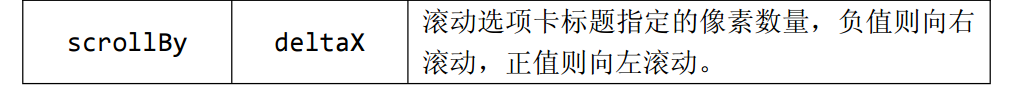
scrollBy deltaX 滚动选项卡标题指定的像素数量,负值则向右滚动,正值则向左滚动。就是网页一打开滚动选项卡移动多少

$(function () {

    $('#box').tabs({

        width: 500,      //选项卡容器宽度

        height: 400,      //选项卡容器高度

        tabWidth:200

    });

    $('#box').tabs('scrollBy',1);  //滚动选项卡标题指定的像素数量,负值则向右滚动,正值则向左滚动

});
五.选项卡面板,以下一般是在新增选项卡时使用
给选项卡属性一样的下面就不举例了
选项卡面板继承了 panel 一些属性,以下是公共属性。
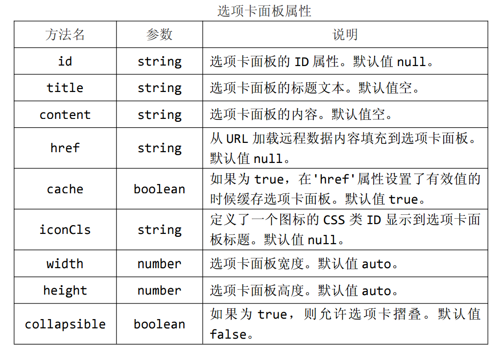
id string 选项卡面板的 ID 属性。默认值 null。
title string 选项卡面板的标题文本。默认值空。
content string 选项卡面板的内容。默认值空。
href string 从 URL 加载远程数据内容填充到选项卡面板。默认值 null。
cache boolean 如果为 true,在'href'属性设置了有效值的时候缓存选项卡面板。默认值 true。
iconCls string 定义了一个图标的 CSS 类 ID 显示到选项卡面板标题。默认值 null。
width number 选项卡面板宽度。默认值 auto。
height number 选项卡面板高度。默认值 auto。
collapsible boolean 如果为 true,则允许选项卡摺叠。默认值false。

closable boolean设置为 true 时,选项卡面板将显示一个关闭按钮,在点击的时候会关闭选项卡面板。默认为 false。
selected boolean 设置为 true 时,选项卡面板会被选中。默认为 false。
EasyUI message 的总结
                //显示

		$.messager.show({

			title:'提示',

			msg:'信息提示框将在4秒后关闭.',

			showType:'show'

		});

		//从下往上滑出

		$.messager.show({

			title:'提示',

			msg:'信息提示框将在5秒后关闭.',

			timeout:5000,

			showType:'slide'

		});

		//不主动关闭

		$.messager.show({

			title:'提示',

			msg:'信息提示框不会主动关闭.',

			timeout:0,

			showType:'fade'

		});

		//带滚动条等待提示框

		var win = $.messager.progress({

			title:'请等待',

			msg:'加载数据中...'

		});

		setTimeout(function(){

			$.messager.progress('close');

		},5000)
弹出框的位置:
              function topLeft(){//上左

			$.messager.show({

				title:'My Title',

				msg:'The message content',

				showType:'show',

				style:{

					right:'',

					left:0,

					top:document.body.scrollTop+document.documentElement.scrollTop,

					bottom:''

				}

			});

		}

		function topCenter(){//上中

			$.messager.show({

				title:'My Title',

				msg:'The message content',

				showType:'slide',

				style:{

					right:'',

					top:document.body.scrollTop+document.documentElement.scrollTop,

					bottom:''

				}

			});

		}

		function topRight(){//上右

			$.messager.show({

				title:'My Title',

				msg:'The message content',

				showType:'show',

				style:{

					left:'',

					right:0,

					top:document.body.scrollTop+document.documentElement.scrollTop,

					bottom:''

				}

			});

		}

		function centerLeft(){//中左

			$.messager.show({

				title:'My Title',

				msg:'The message content',

				showType:'fade',

				style:{

					left:0,

					right:'',

					bottom:''

				}

			});

		}

		function center(){//中间

			$.messager.show({

				title:'My Title',

				msg:'The message content',

				showType:'fade',

				style:{

					right:'',

					bottom:''

				}

			});

		}

		function centerRight(){//中右

			$.messager.show({

				title:'My Title',

				msg:'The message content',

				showType:'fade',

				style:{

					left:'',

					right:0,

					bottom:''

				}

			});

		}

		function bottomLeft(){//下左

			$.messager.show({

				title:'My Title',

				msg:'The message content',

				showType:'show',

				style:{

					left:0,

					right:'',

					top:'',

					bottom:-document.body.scrollTop-document.documentElement.scrollTop

				}

			});

		}

		function bottomCenter(){//下中

			$.messager.show({

				title:'My Title',

				msg:'The message content',

				showType:'slide',

				style:{

					right:'',

					top:'',

					bottom:-document.body.scrollTop-document.documentElement.scrollTop

				}

			});

		}

		function bottomRight(){//下右

			$.messager.show({

				title:'My Title',

				msg:'The message content',

				showType:'show'

			});

		}
EasyUI整理学习的更多相关文章
- JQuery EasyUI框架学习
前言 新项目的开发前端技术打算採用EasyUI框架(基于EasyUI较为丰富的UI组件库),项目组长将前端EasyUI这块的任务分配给了我.在进行开发之前,须要我这菜鸟对EasyUI框架进行一些基础的 ...
- Easyui tabs学习
前端时间花了一些时间学习easy ui,这个东西非常好用,界面也很美观,你都不需要在界面上花太多的工夫,例子程序也比较完善,基本上看下例子就能很好的使用easyui了,很方便. 特地分享一些使用时候遇 ...
- Deep Learning深入研究整理学习笔记五
Deep Learning(深度学习)学习笔记整理系列 zouxy09@qq.com http://blog.csdn.net/zouxy09 作者:Zouxy version 1.0 2013-04 ...
- 【微服务】使用spring cloud搭建微服务框架,整理学习资料
写在前面 使用spring cloud搭建微服务框架,是我最近最主要的工作之一,一开始我使用bubbo加zookeeper制作了一个基于dubbo的微服务框架,然后被架构师否了,架构师曰:此物过时.随 ...
- hibernate框架内容整理 学习
1.1 ORM概述 Object Relation Mapping 对象关系映射. 对象-关系映射(OBJECT/RELATIONALMAPPING,简称ORM),是随着面向对象的软件开发方法发展而产 ...
- AngularJS 整理学习
参考博客: https://blog.csdn.net/weixin_33178524/article/details/79179597 https://blog.csdn.net/qq_42128 ...
- easyUI datagrid学习笔记
1.easyUI表格的列属性 formatter:function(value,rowdata,rowindex) { return '['+value+']';//格式化,给每个值加上'[]': } ...
- jquery easyui combobox学习
今天尝试了一下jquery easy ui的combobox,感觉蛮好用的,直接上代码吧 HTML如下 <div> <input id="btnBind" typ ...
- EasyUi基础学习(一)—基本组件(上)
一.概述 jQuery EasyUI是一组基于jQuery的UI插件集合体,而jQuery EasyUI的目标就是帮助web开发者更轻松的打造出功能丰富并且美观的UI界面.开发者不需要编写复 ...
随机推荐
- ARC097E Sorted and Sorted
传送门 题目 There are 2N balls, N white and N black, arranged in a row. The integers from 1 through N are ...
- 安装json format插件
更多工具->扩展->搜索:son format插件 这样得到的json数据以一种美观的样式显示.
- Android 设计模式情景分析——观察者模式
观察者模式是一种使用频率非常高的模式,有时也被称作发布/订阅模式,属于行为型模式,它最常用的是 GUI 系统.订阅——发布系统,它一个重要作用就是解耦,使得它们之间的依赖性更小.观察者模式定义了对象间 ...
- 蚂蚁金服HR电话面
1.先自我介绍一下. 2.问到项目问题.(项目介绍,用到哪些技术,如何测试的.) 3.一些基础知识. a) list.map.set是继承了collection的吗? List:1.可以允许重复的对 ...
- vue入门(一)----组件
由于工作需要,最近在写一些前端的东西.经过向开发经验丰富的前端工程师的请教之后,得出一个结论----2016年前端被玩坏了,其实对于我来说我并不是太了解这句话的深刻含义,只是觉得是不是因为前端技术突飞 ...
- sqlalchemy字段与mysql数据库字段对应问题
字段类型是在定义模型时, 对每个 Column 的类型约定. 不同类型的字段类型在输入输出上, 及支持的操作方面, 有所区别. 这里只介绍 sqlalchemy.types.* 中的类型, SQL 标 ...
- uva 1614奇怪的股市(归纳法证明,贪心)
uva 1614奇怪的股市(归纳法证明,贪心) 输入一个长度为n的序列a,满足\(1\le a_i\le i\),要求确定每个数的正负号,使得所有数的总和为0.例如a={1, 2, 3, 4},则4个 ...
- 2017-11-8 NOIP模拟赛
1.足球联赛 #include<iostream> #include<cstdio> #include<cstring> #include<algorithm ...
- cmd与bat脚本的使用
零. bat cmd 命令大全 bat命令大全学习 一..定位到当前路径 1.定位到当前路径 2.方法二 3.win10下面 通解: %windir%\system32\cmd.exe 二 .使用命令 ...
- 移动web 的viewport设置注意事项的详细解释 六一快乐=-_-_
<!DOCTYPE html> <html lang="en"> <head> <meta charset="UTF-8&quo ...