[WPF 自定义控件]创建包含CheckBox的ListBoxItem
1. 前言
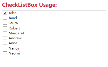
Xceed wpftoolkit提供了一个CheckListBox,效果如下:
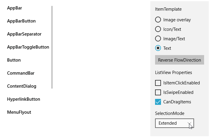
不过它用起来不怎么样,与其这样还不如参考UWP的ListView实现,而且动画效果也很好看:
它的样式如下:
<ListViewItemPresenter ContentTransitions="{TemplateBinding ContentTransitions}"x:Name="Root"Control.IsTemplateFocusTarget="True"FocusVisualMargin="{TemplateBinding FocusVisualMargin}"SelectionCheckMarkVisualEnabled="{ThemeResource ListViewItemSelectionCheckMarkVisualEnabled}"CheckBrush="{ThemeResource ListViewItemCheckBrush}"CheckBoxBrush="{ThemeResource ListViewItemCheckBoxBrush}"DragBackground="{ThemeResource ListViewItemDragBackground}"DragForeground="{ThemeResource ListViewItemDragForeground}"FocusBorderBrush="{ThemeResource ListViewItemFocusBorderBrush}"FocusSecondaryBorderBrush="{ThemeResource ListViewItemFocusSecondaryBorderBrush}"PlaceholderBackground="{ThemeResource ListViewItemPlaceholderBackground}"PointerOverBackground="{ThemeResource ListViewItemBackgroundPointerOver}"PointerOverForeground="{ThemeResource ListViewItemForegroundPointerOver}"SelectedBackground="{ThemeResource ListViewItemBackgroundSelected}"SelectedForeground="{ThemeResource ListViewItemForegroundSelected}"SelectedPointerOverBackground="{ThemeResource ListViewItemBackgroundSelectedPointerOver}"PressedBackground="{ThemeResource ListViewItemBackgroundPressed}"SelectedPressedBackground="{ThemeResource ListViewItemBackgroundSelectedPressed}"DisabledOpacity="{ThemeResource ListViewItemDisabledThemeOpacity}"DragOpacity="{ThemeResource ListViewItemDragThemeOpacity}"ReorderHintOffset="{ThemeResource ListViewItemReorderHintThemeOffset}"HorizontalContentAlignment="{TemplateBinding HorizontalContentAlignment}"VerticalContentAlignment="{TemplateBinding VerticalContentAlignment}"ContentMargin="{TemplateBinding Padding}"CheckMode="{ThemeResource ListViewItemCheckMode}"RevealBackground="{ThemeResource ListViewItemRevealBackground}"RevealBorderThickness="{ThemeResource ListViewItemRevealBorderThemeThickness}"RevealBorderBrush="{ThemeResource ListViewItemRevealBorderBrush}">
属性是很多了,但这里没有自定义CheckBox样式的方法,而且也没法参考它的动画如何实现。幸好UWP还提供了一个ListViewItemExpanded样式,里面有完整的布局、VisualState等,不过总共有差不多500行,只拿其中MultiSelectStates的部分也将近100行,这太过复杂了,这还是有些麻烦,在WPF中实现起来反而简单很多。
2. 实现
微软的文档中有介绍如何Create ListViewItems with a CheckBox,原理十分简单:
<DataTemplate x:Key="FirstCell"><StackPanel Orientation="Horizontal"><CheckBox IsChecked="{Binding Path=IsSelected,RelativeSource={RelativeSource FindAncestor, AncestorType={x:Type ListViewItem}}}"/></StackPanel></DataTemplate>
就是在控件模板中添加一个CheckBox并且这个CheckBox通过FindAncestor的Binding方式绑定到ListViewItem的IsSelected属性。虽然是ListView的方法,但它同样适用于ListBox。所以我使用这个方式封装了一个ListBox控件,目前基本上没什么功能,就只是在每个ListBoxItem前面加上一个CheckBox。以前介绍过如何自定义ItemsControl,要自定义一个ListBox控件,同样需要三部:
- 定义ListBox
- 关联ListBoxItem和ListBox
- 实现ListBox的逻辑
public class ExtendedListBox : ListBox{public static readonly DependencyProperty IsMultiSelectCheckBoxEnabledProperty =DependencyProperty.Register(nameof(IsMultiSelectCheckBoxEnabled), typeof(bool), typeof(ExtendedListBox), new PropertyMetadata(true));public bool IsMultiSelectCheckBoxEnabled{get { return (bool)GetValue(IsMultiSelectCheckBoxEnabledProperty); }set { SetValue(IsMultiSelectCheckBoxEnabledProperty, value); }}protected override DependencyObject GetContainerForItemOverride(){return new ExtendedListBoxItem();}}public class ExtendedListBoxItem : ListBoxItem{public ExtendedListBoxItem(){DefaultStyleKey = typeof(ExtendedListBoxItem);}}
上面就是全部代码。定义了ExtendedListBox和ExtendedListBoxItem两个类,然后重写GetContainerForItemOverride关联这两个类,最后在ExtendedListBox的代码里模仿UWP的ListView提供了IsMultiSelectCheckBoxEnabled属性,其他功能主要由XAML提供:
<Grid.ColumnDefinitions><ColumnDefinition Width="Auto"/><ColumnDefinition/></Grid.ColumnDefinitions><Primitives:KinoResizer><CheckBox Margin="{TemplateBinding Padding}"IsChecked="{Binding IsSelected, Mode=TwoWay, RelativeSource={RelativeSource TemplatedParent}}"VerticalAlignment="{TemplateBinding VerticalContentAlignment}"IsTabStop="False"x:Name="SelectionCheckMark"/></Primitives:KinoResizer><ContentPresenter HorizontalAlignment="{TemplateBinding HorizontalContentAlignment}" SnapsToDevicePixels="{TemplateBinding SnapsToDevicePixels}" VerticalAlignment="{TemplateBinding VerticalContentAlignment}" Grid.Column="1"Margin="{TemplateBinding Padding}"/>
ControlTemplate使用Resizer包装CheckBox,这是为了CheckBox隐藏或显示时有过渡动画。然后在ControlTemplate.Triggers里添加两个DataTrigger,根据所属的ListBox的IsMultiSelectCheckBoxEnabled和SelectionMode显示或隐藏SelectionCheckMark:
<DataTrigger Binding="{Binding RelativeSource={RelativeSource Mode=FindAncestor,AncestorType=ListBox},Path=SelectionMode}"Value="Single"><Setter Property="Visibility"TargetName="SelectionCheckMark"Value="Collapsed" /></DataTrigger><DataTrigger Binding="{Binding RelativeSource={RelativeSource Mode=FindAncestor,AncestorType=ListBox},Path=IsMultiSelectCheckBoxEnabled}"Value="False"><Setter Property="Visibility"TargetName="SelectionCheckMark"Value="Collapsed" /></DataTrigger>
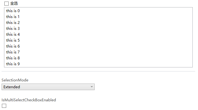
最终效果如下:
3. 添加VisualState
WPF的Button的ControlTemplate没有使用VisualState,但Button支持VisualState,用户可以自定义使用VisualState的ControlTemplate。ExtendedListBoxItem也模仿UWP提供了MultiSelectEnabled和MultiSelectDisabled两个VisualState,因为ListBoxItem需要知道承载它的ListBox的IsMultiSelectCheckBoxEnabled和SelectionMode,所以需要给ListBoxItem添加一个Owner属性,并重载ListBox的PrepareContainerForItemOverride函数,在这个函数中为ListBoxItem的Owner赋值:
protected override void PrepareContainerForItemOverride(DependencyObject element, object item){base.PrepareContainerForItemOverride(element, item);if (element is ExtendedListBoxItem listBoxItem)listBoxItem.Owner = this;}
ListBoxItem中使用监视Owner的IsMultiSelectCheckBoxEnabled和SelectionMode的改变,并在这两个值改变时更新VisualState:
protected virtual void OnOwnerChanged(ExtendedListBox oldValue, ExtendedListBox newValue){if (oldValue != null){var descriptor = DependencyPropertyDescriptor.FromProperty(ListBox.SelectionModeProperty, typeof(ExtendedListBox));descriptor.RemoveValueChanged(newValue, OnSelectionModeChanged);descriptor = DependencyPropertyDescriptor.FromProperty(ExtendedListBox.IsMultiSelectCheckBoxEnabledProperty, typeof(ExtendedListBox));descriptor.RemoveValueChanged(newValue, OnIsMultiSelectCheckBoxEnabledChanged);}if (newValue != null){var descriptor = DependencyPropertyDescriptor.FromProperty(ListBox.SelectionModeProperty, typeof(ExtendedListBox));descriptor.AddValueChanged(newValue, OnSelectionModeChanged);descriptor = DependencyPropertyDescriptor.FromProperty(ExtendedListBox.IsMultiSelectCheckBoxEnabledProperty, typeof(ExtendedListBox));descriptor.AddValueChanged(newValue, OnIsMultiSelectCheckBoxEnabledChanged);}}private void OnSelectionModeChanged(object sender, EventArgs args){UpdateVisualStates(true);}private void OnIsMultiSelectCheckBoxEnabledChanged(object sender, EventArgs args){UpdateVisualStates(true);}
为了使用VisualState我在ControlTemplate多写了80行代码,因为没有用上VisualTransition所以这个ControlTemplate有一些Bug,反正只是用来验证添加的两个VisualState是否有效。在ListBoxItem里用Trigger比使用VisualState更简洁有效。
4. 使用同样的原理为DataGrid的行添加ChechBox
DataGrid也可以用同样的原理为每一行添加CheckBox,只不过DataGrid的Template会负责很多。
首先自定义一个DataGrid类:
public class ExtendedDataGrid : DataGrid, IMultiSelector{// Using a DependencyProperty as the backing store for IsMultiSelectCheckBoxEnabled. This enables animation, styling, binding, etc...public static readonly DependencyProperty IsMultiSelectCheckBoxEnabledProperty =DependencyProperty.Register(nameof(IsMultiSelectCheckBoxEnabled), typeof(bool), typeof(ExtendedDataGrid), new PropertyMetadata(true));public ExtendedDataGrid(){DefaultStyleKey = typeof(ExtendedDataGrid);}public bool IsMultiSelectCheckBoxEnabled{get { return (bool)GetValue(IsMultiSelectCheckBoxEnabledProperty); }set { SetValue(IsMultiSelectCheckBoxEnabledProperty, value); }}}
然后定义一个RowHeaderTemplate
<DataTemplate x:Key="DataGridRowHeaderTemplate"><Grid><CheckBox IsChecked="{Binding IsSelected, Mode=TwoWay, RelativeSource={RelativeSource AncestorType={x:Type DataGridRow}, Mode=FindAncestor}}"x:Name="SelectionCheckBox"/></Grid></DataTemplate>
在DataGrid的Style上应用这个RowHeaderTemplate。最后再DataGrid的Style的Triggers中添加两个DataTrigger:
<Trigger Property="SelectionMode" Value="Single"><Setter Property="HeadersVisibility" Value="Column" /></Trigger><Trigger Property="IsMultiSelectCheckBoxEnabled" Value="False"><Setter Property="HeadersVisibility" Value="Column"/></Trigger>
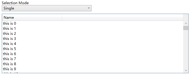
HeadersVisibility是个DataGridHeadersVisibility的属性,它用于控制DataGrid行和列的Header是否显示,因为我在每一行的开头放了CheckBox(就是使用上面定义的RowHeaderTempalte),所以定一只只显示Column的Header的话相当于隐藏了这个CheckBox,运行效果如下:
5. 结语
ListBox和DataGrid的自定义是个很大的话题,这里只实现最简单的功能,通常会根据业务需求逐渐增加更多需求。如果有更复杂的需求,我建议买商业的控件,毕竟DataGrid的自定义可以很复杂,花时间不如花钱。
6. 参考
How to_ Create ListViewItems with a CheckBox - WPF _ Microsoft Docs
ListBox Class (System.Windows.Controls) _ Microsoft Docs
DataGrid Class (System.Windows.Controls) _ Microsoft Docs
7. 源码
Kino.Toolkit.Wpf_ExtendedListBox.cs at master
Kino.Toolkit.Wpf_ExtendedDataGrid.cs at master
[WPF 自定义控件]创建包含CheckBox的ListBoxItem的更多相关文章
- WPF自定义控件创建
WPF自定义控件创建 本文简单的介绍一下WPF自定义控件的开发. 首先,我们打开VisualStudio创建一个WPF自定义控件库,如下图: 然后,我们可以看到创建的解决方案如下: 在解决方案中,我们 ...
- WPF自定义控件与样式(4)-CheckBox/RadioButton自定义样式
一.前言 申明:WPF自定义控件与样式是一个系列文章,前后是有些关联的,但大多是按照由简到繁的顺序逐步发布的等,若有不明白的地方可以参考本系列前面的文章,文末附有部分文章链接. 本文主要内容: Che ...
- WPF 如何创建自己的WPF自定义控件库
在我们平时的项目中,我们经常需要一套自己的自定义控件库,这个特别是在Prism这种框架下面进行开发的时候,每个人都使用一套统一的控件,这样才不会每个人由于界面不统一而造成的整个软件系统千差万别,所以我 ...
- 【转】WPF自定义控件与样式(4)-CheckBox/RadioButton自定义样式
一.前言 申明:WPF自定义控件与样式是一个系列文章,前后是有些关联的,但大多是按照由简到繁的顺序逐步发布的等 本文主要内容: CheckBox复选框的自定义样式,有两种不同的风格实现: RadioB ...
- WPF自定义控件与样式(8)-ComboBox与自定义多选控件MultComboBox
一.前言 申明:WPF自定义控件与样式是一个系列文章,前后是有些关联的,但大多是按照由简到繁的顺序逐步发布的等,若有不明白的地方可以参考本系列前面的文章,文末附有部分文章链接. 本文主要内容: 下拉选 ...
- 【转】WPF自定义控件与样式(8)-ComboBox与自定义多选控件MultComboBox
一.前言 申明:WPF自定义控件与样式是一个系列文章,前后是有些关联的,但大多是按照由简到繁的顺序逐步发布的等. 本文主要内容: 下拉选择控件ComboBox的自定义样式及扩展: 自定义多选控件Mul ...
- [WPF自定义控件]从ContentControl开始入门自定义控件
1. 前言 我去年写过一个在UWP自定义控件的系列博客,大部分的经验都可以用在WPF中(只有一点小区别).这篇文章的目的是快速入门自定义控件的开发,所以尽量精简了篇幅,更深入的概念在以后介绍各控件的文 ...
- WPF自定义控件与样式(3)-TextBox & RichTextBox & PasswordBox样式、水印、Label标签、功能扩展
一.前言.预览 申明:WPF自定义控件与样式是一个系列文章,前后是有些关联的,但大多是按照由简到繁的顺序逐步发布的等,若有不明白的地方可以参考本系列前面的文章,文末附有部分文章链接. 本文主要是对文本 ...
- WPF自定义控件与样式(5)-Calendar/DatePicker日期控件自定义样式及扩展
一.前言 申明:WPF自定义控件与样式是一个系列文章,前后是有些关联的,但大多是按照由简到繁的顺序逐步发布的等,若有不明白的地方可以参考本系列前面的文章,文末附有部分文章链接. 本文主要内容: 日历控 ...
随机推荐
- 【python系统学习08】for循环知识点合集
for循环 for简介 [循环]:就是依照某些我们编写的特定规则,重复的做一件事. 当你需要重复的"搬砖"的时候,可以用for循环进行遍历,让机器循环的帮你去"搬砖&qu ...
- 玩转Django2.0---Django笔记建站基础七(表单与模型)
第七章 表单与模型 表单是搜集用户数据信息的各种表单元素的集合,作用是实现网页上的数据交互,用户在网站输入信息,然后提交到网站服务器端进行处理(如数据录入和用户登录.注册等). 用户表单是web开发的 ...
- 深入NodeJS模块os - 与操作系统“打交道”
读了 os 模块的文档,研究了几个有意思的问题:
- 编写python程序读入1到100之间的整数,然后计算每个数出现的次数,输入0表示结束输人,输入数据不包括0。如果数出现的大现如果大于1,输出时使用复数times
#-*- coding:UTF-8 -*- #环境:python3 print("Enter the numbers between 1 and 100:") enterList= ...
- selenium获取页面源码,判断是否存在指定内容,执行不同的操作
本案例用于解决selenium UI自动化,判断页面是否存在指定文字,执行后续不同的操作 主要用到browser.page_source 如,保存百度分享文件到自己的百度盘中,会出现文件被删除无法保存 ...
- 百度API之路线规划
近期参加一个课题,聊到路线规划问题,需要搜索两地点的最短线路距离以及最短用时等情况,然后就想着用借用百度API,做个参考 环境: python 3.6 主要问题: 1. 分析百度官方路线规划API了解 ...
- 《即时消息技术剖析与实战》学习笔记10——IM系统如何应对高并发
一.IM 系统的高并发场景 IM 系统中,高并发多见于直播互动场景.比如直播间,在直播过程中,观众会给主播打赏.送礼.发送弹幕等,尤其是明星直播间,几十万.上百万人的规模一点也不稀奇.近期随着武汉新型 ...
- 双括号(()),shell与C++的桥梁
使用语法: ((表达式))用来扩展Shell中的算术运算,以及赋值运算,扩展for,while,if条件测试运算. 注意点: 1.在双括号结构中,所有的表达式可以像c语言一样,如a++,b-- 2.在 ...
- .net core3.1 webapi + vue.js + axios实现跨域
我所要讲述的是,基于.net core3.1环境下的webapi项目,如何去使用axios对接前端的vue项目 既然谈到axios,这里贴出axios的官方文档地址: http://www.axios ...
- 线程池之 Executors
线程池之 Executors + 面试题 线程池的创建分为两种方式:ThreadPoolExecutor 和 Executors,上一节学习了 ThreadPoolExecutor 的使用方式,本节重 ...