line-block代替float布局;
line-block代替float布局;
我们先看看float的一些特性(特征)
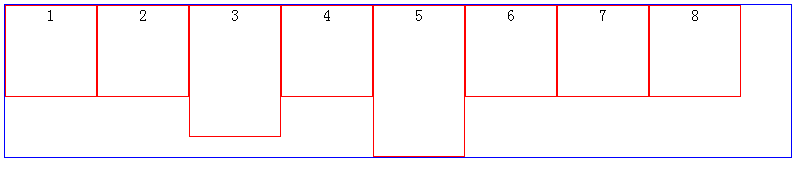
当我们改变浏览器的大小会出现这样的效果:

或则这样:
有时候,我们希望,以第一排最高的元素为换行基准时,我们就可以使用display:inline-block属性了滴呀
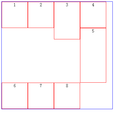
效果图

不能发现上图中有一个bug,那就是每个元素之间都有空白,解决方法;已经在我们另外一篇博客中记录了
这样的布局算是完成了,接下来,我们看如何实现两端对齐的效果滴啊
具体应用实例一(text-align:center)
css
 .container{

     width:100%;

     height:40px;

     padding:;

     margin:;

     list-style:none;

     background:#eee;

     text-align:center;

 }

 .liStyle{

     color:white;

     width:14px;

     height:14px;

     margin:15px 5px 0 5px;

     background:red;

     display:inline-block;

     cursor:pointer;

 }
html
 <ul class="container">

  <li class="liStyle">1</li>

  <li class="liStyle">2</li>

  <li class="liStyle">3</li>

  <li class="liStyle">4</li>

  <li class="liStyle">5</li>

  <li class="liStyle">6</li>

 </ul>
效果:

text-align
text-align是用于文字对齐的
接下来,我们看实例:
html
<div class="box1">There is clearly a need for CSS to be taken seriously by graphic artists. The Zen Garden aims to excite, inspire, and encourage participation. To begin, view some of the existing designs in the list. Clicking on any one will load the style sheet into this very page. The code remains the same, the only thing that has changed is the external .css file. Yes, really
</div>

<div class="box2">There is clearly a need for CSS to be taken seriously by graphic artists. The Zen Garden aims to excite, inspire, and encourage participation. To begin, view some of the existing designs in the list. Clicking on any one will load the style sheet into this very page. The code remains the same, the only thing that has changed is the external .css file. Yes, really
</div>

<div class="box3">There is clearly a need for CSS to be taken seriously by graphic artists. The Zen Garden aims to excite, inspire, and encourage participation. To begin, view some of the existing designs in the list. Clicking on any one will load the style sheet into this very page. The code remains the same, the only thing that has changed is the external .css file. Yes, really
</div>

<div class="box4">There is clearly a need for CSS to be taken seriously by graphic artists. The Zen Garden aims to excite, inspire, and encourage participation. To begin, view some of the existing designs in the list. Clicking on any one will load the style sheet into this very page. The code remains the same, the only thing that has changed is the external .css file. Yes, really
</div>
css
.box1{ width:500px; line-height:20px; margin:10px auto; background-color:#cdd; text-align:justify}

.box2{ width:500px; line-height:20px; margin:10px auto; background-color:#cdd; text-align:left;}

.box3{ width:500px; line-height:20px; margin:10px auto; background-color:#cdd; text-align:right;}

.box4{ width:500px; line-height:20px; margin:10px auto; background-color:#cdd; text-align:center;}
效果:

ps:有些人在测试text-align:justify的时候,发现无效,那是因为,文字还没有容器一行那么宽;
所以,至少要超过一行才能看到text-align:justify的效果滴呀
text-align:justify display:inline-block实现两端对齐
<!DOCTYPE HTML>

<html>

    <head>

        <title>文本两端对齐 by hongchenok</title>

        <meta http-equiv="Content-Type" content="text/html; charset=UTF-8">

        <style>

            .box{

                width:50%;

                padding:20px;

                margin:20px auto;

                background-color:#f0f3f9;

                text-align:justify;

                text-justify:distribute-all-lines;/*ie6-8*/

            }

            .list{

                width:120px;

                display:inline-block;

                *display: inline;

                *zoom:1;

                padding-bottom:20px;

                text-align:center;

                vertical-align:top;

            }

            .justify_fix{

                display:inline-block;

                *display: inline;

                *zoom:1; width:100%;

                height:0;

                overflow:hidden;

            }

            .list_head{

                height: 50px;

                width: 50px;

                background-color: red;

                float: left;

            }

            .list_content{

                width: 70px;

                height: 50px;

                float: left;

            }

            .clearfix:after {

                content: ".";

                display: block;

                height: 0;

                clear: both;

                visibility: hidden;

            }

            * html .clearfix {height: 1%;}

        </style>

    </head>

    <body>

        <div class="box">

            <div class="list clearfix">

                <div class="list_head"></div>

            </div>

            <div class="list clearfix">

                <div class="list_head"></div>

            </div>

            <span class="justify_fix"></span>

        </div>

        <div class="box">

            <div class="list clearfix">

                <div class="list_head"></div>

            </div>

            <div class="list clearfix">

                <div class="list_head"></div>

            </div>

            <div class="list clearfix">

                <div class="list_head"></div>

            </div>

            <div class="list clearfix">

                <div class="list_head"></div>

            </div>

            <span class="justify_fix"></span>

        </div>

    </body>

</html>
效果:

line-block代替float布局;的更多相关文章
- float布局打破标准流,神助攻clear清浮动
布局是什么?根据功能划分小块,再根据设计稿还原,书写静态页面,然后再在块里面填充内容,完善功能,js施加交互效果.div作为一个容器,独占一行,代码书写习惯从上至下属于标准流,而浮动float的css ...
- CSS布局:Float布局过程与老生常谈的三栏布局
原文见博客主站,欢迎大家去评论. 使用CSS布局网页,那是前端的基本功了,什么两栏布局,三栏布局,那也是前端面试的基本题了.一般来说,可以使用CSSposition属性进行布局,或者使用CSSfloa ...
- 转:CSS布局:Float布局过程与老生常谈的三栏布局
使用CSS布局网页,那是前端的基本功了,什么两栏布局,三栏布局,那也是前端面试的基本题了.一般来说,可以使用CSSposition属性进行布局,或者使用CSSfloat属性布局.前者适合布局首页,因为 ...
- 【深入BFC】 关于CSS中float布局,清除浮动,和margin合并的原理解析,解开你心中的那些困惑!
BFC的通俗理解: Block Formatting Context(块级格式化上下文)是W3C CSS 2.1 规范中的一个概念,它决定了元素如何对其内容进行定位,以及与其他元素的关系和相互作用. ...
- inline-block和float 布局的选择
浮动通常表现正常,但有时候搞起来会很纠结.特别是处理内部容器中的浮动,比如对一排图片使用浮动后对齐出现问题.Inline-block是我们的另一种选择.使用这种属性可以模拟部分浮动的特征,而不需要处理 ...
- inline-block,inline,block,table-cell,float
float:left ---------------------------------------------------------------------------------------- ...
- 关于CSS三列Float布局任务
任务目标 掌握HTML/CSS布局的概念 掌握盒模型的概念 掌握position与float的概念以及在布局时的用法 任务描述 使用 HTML 与 CSS 按照示意图;实现三栏式布局. 左右两栏宽度固 ...
- 十、一行多个:使用float布局的经典方法 ---接(一)
1.使用float必须要清除float:即在使用float元素的父级元素上清除float. 清除float的方法有三种,在父元素上加:1.width: 100% 或者固定宽度 +overflow:hi ...
- 布局方式-float布局
float的特性一 .元素‘浮动’ .脱离文档流 .但不脱离文本流 首先看一个案例,直观的了解下float的特性 <style> .container{ background: red; ...
随机推荐
- get和post方法的区别
在form表单提交数据的过程中,method属性提供了两个值:get,post,默认为get方式[参1] 即一种为get提交,一种是post提交.那么这两种提交方式有什么不同呢? 查询了一些资料后,总 ...
- linux系统tomcat启动正常访问不到主页面
环境: linux系统 tomcat 6.0.24 jdk 1.6 防火墙的问题: 查看防火墙命令:chkconfig --list | grep -i iptables 关闭防火墙命令:/sbin/ ...
- serv-u and hway3.0
一个非常好用的su提权脚本,在支持php的环境下,目录可读可写,基本秒杀. <? //HWay && Serv-U by r00t //r00t@007team.net //ww ...
- new NABCD
小组名称: 天天向上 项目名称:连连看 小组成员:王森(组长).胡丽娜.林莉.张政.张金生 新NABCD模型 N(需求) 传统的连连看有许多,玩法单一,感觉没意思,用户更希望连连看游戏增加更多的与众不 ...
- NBOJv2 Problem 1009 蛤玮的魔法(二分)
Problem 1009: 蛤玮的魔法 Time Limits: 1000 MS Memory Limits: 65536 KB 64-bit interger IO format: %ll ...
- 【转】asp.net c# 网上搜集面试题目大全(附答案)
asp.net c# 网上搜集面试题目大全(附答案) http://www.cnblogs.com/hndy/articles/2234188.html
- mapreduce运用
测试环境:192.168.1.55 mongo 192.168.1.55:30001show dbsuse gwgps 测试目标,求出两个班的总数,人数,平均分数等.可以根据不同的业务需求,定制map ...
- Frenetic Python实验(二)
实验3 packet_in_out 目的:模拟一个普通的双端口中继器. This application implements a very simple 2 port repeater where ...
- Direct基础学习系列3 绘制+实例
3.1.1顶点缓存 索引缓存 放置在显存中能够加快绘制速度 创建顶点缓存 HRESULT CreateVertexBuffer( UINT Length, //为缓存分配的字节数 DWORD Usag ...
- HTML: Css引入的四種方式
哪四種?這裏簡單進行下總結 ①寫在 style 標籤中 <style type="text/css"> 這裏是css代碼... </style> ②外部引入 ...