微信小程序相关三、css写小黄人
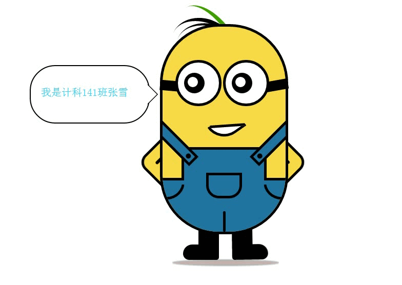
小程序上课第三天,因为今天院里有活动,所以没去上课,第四天上午又因为要召开入党转正大会,又耽误了一上午,下午去上课,要了资料。这两天讲了一些零零碎碎的东西,做的实例有上面这个小黄人
都是用的css,基本上都是用border,transform:rotate(),animation,和一些细节做的,左边的对话框那里的小尖头也是一个重点细节
下面附上代码:
 <!DOCTYPE html>

 <html>

 <head>

     <meta charset="utf-8">

     <meta http-equiv="X-UA-Compatible" content="IE=edge">

     <title>小黄人模仿</title>

     <link rel="stylesheet" href="">

     <link rel="stylesheet" type="text/css" href="css/index.css">

 </head>

 <body>

 <!-- 最外层的容器 -->

     <div class="wrapper">

         <!-- 身体的容器 -->

         <div class="bodyH">

             <!-- 将裤子分成两个部分,裤子下面其实是个矩形(超出身体容器的部分给隐藏了),裤子上面的矩形-->

             <div class="kuzi">

                 <div class="kuzi-bottom">

                 </div>

                 <!-- 裤子下面结束 -->

                 <div class="kuzi-top">

                 </div>

                 <!-- 裤子上面结束 -->

                 <!-- 衣服上面的线是通过1旋转,2设边框3弧度实现的 -->

                 <!-- 左边的线 -->

                 <div class="left-line">

                 </div>

                 <!-- 中间的线 -->

                 <div class="middle-line">

                 </div>

                 <!-- 右边的线 -->

                 <div class="right-line">

                 </div>

                 <!-- 小口袋 -->

                 <div class="koudai">

                 </div>

                 <!-- 左边的背带 -->

                 <div class="left-beidai">

                 </div>

                 <!-- 右边的背带 -->

                 <div class="right-beidai">

                 </div>

             </div>

             <!-- 裤子部分结束 -->

         </div>

         <!-- 身体容器结束 -->

         <!-- 脚的部分开始 -->

         <div class="foot">

             <div class="left-foot">

             </div>

             <div class="right-foot">

             </div>

         </div>

         <!-- 脚下面的阴影 -->

         <div class="foot-shadow">

         </div>

         <!-- 脚的部分结束 -->

         <!-- 嘴的部分开始 -->

         <div class="mouse">

         <!-- 嘴巴是一个矩形进行旋转,弧度,上面那个横线用after元素在加了一个矩形的bottom边框 -->

             <div class="mouse-shape">

             </div>

         </div>

         <!-- 眼睛开始 -->

         <div class="eye">

             <div class="left-eye">

                 <div class="eye-line"></div>

                 <div class="eye-circle">

                     <div class="eye-yanzhu">

                         <div class="eye-baidian">

                         </div>

                     </div>

                 </div>

             </div>

             <div class="right-eye">

                 <div class="eye-line"></div>

                 <div class="eye-circle">

                     <div class="eye-yanzhu">

                         <div class="eye-baidian">

                         </div>

                     </div>

                 </div>

             </div>

         </div>

         <!-- 眼睛结束 -->

         <!-- 胳膊开始 -->

         <div class="arm">

         <!-- after伪元素增加了一点胳膊肘的地方的线条 -->

             <div class="left-arm"></div>

             <div class="right-arm"></div>

         </div>

         <!-- 胳膊结束 -->

         <!-- 头发开始 -->

         <div class="hair">

             <div class="tophair"></div>

             <div class="middlehair"></div>

             <div class="bottomhair"></div>

         </div>

         <!-- 头发结束 -->

     </div>

     <!-- 对话框 -->

     <div class="duihuakuang">

         <span class="hello">

             我是计科141班张雪

         </span>

     </div>

 </body>

 </html>
 /*

 * @Author: ÐéÖñ

 * @Date:   2017-06-04 15:36:24

 * @Last Modified by:   虚竹

 * @Last Modified time: 2017-06-04 20:48:44

 */

 *{margin:;padding:;}

 .wrapper {

     width: 300px;

     margin: 50px auto;

     position: relative;

 }

 /*小黄人身体容器*/

 .bodyH{

     width: 240px;

     height: 400px;

     border: 5px solid black;

     border-radius: 115px;

     background: rgb(249, 217, 70);

     position: relative;

     /* 溢出 */

     overflow: hidden;

 }

 /*裤子*/

 .kuzi-bottom {

     height: 100px;

     width: 100%;

     position: absolute;

     background: #2074A0;

     bottom:;

     border-top: 5px solid black;

 }

 .kuzi-top {

     height: 60px;

     width: 65%;

     background: #2074A0;

     position: absolute;

     bottom: 100px;

     left: 0px;

     right: 0px;

     margin: auto;

     border: 5px solid black;

     border-bottom: none;

 }

 /* 裤子下面的线条*/

 .left-line{

     width: 30px;

     height: 30px;

     position: absolute;

     bottom: 60px;

     left: 5px;

     /*  1旋转*/

     transform: rotate(10deg);

     /*  2设置边框*/

     border-right: 5px solid black;

     border-bottom: 5px solid black;

     /*  3弧度*/

     border-radius: 0px 0px 60px 0px;

 }

 .right-line {

     width: 30px;

     height: 30px;

     position: absolute;

     bottom: 60px;

     right: 5px;

     transform: rotate(-10deg);

     border-left: 5px solid black;

     border-bottom: 5px solid black;

     border-radius: 0px 0px 0px 60px;

 }

 .middle-line {

     width: 5px;

     height: 40px;

     background: black;

     position: absolute;

     left:;

     right:;

     margin:  auto;

     bottom: 0px;

     border-radius: 2px;

 }

 /*裤子上的小口袋*/

 .koudai {

     width: 60px;

     height: 40px;

     border: 5px solid black;

     border-radius: 0px 0px 25px 25px;

     position: absolute;

     bottom: 65px;

     left: 0px;

     right: 0px;

     margin:  auto;

 }

 /*左右背带*/

 .left-beidai{

     width: 120px;

     height: 16px;

     border: 5px solid black;

     /*进行了旋转*/

     transform: rotate(45deg);

     position: absolute;

     left: -50px;

     bottom: 170px;

     background: #2074A0;

 }

 /*背带上面的小按扣*/

 .left-beidai::after{

     content: '';

     width: 10px;

     height: 10px;

     display: block;

     border-radius: 50%;

     background: black;

     position: absolute;

     right: 5px;

     top: 0px;

     bottom: 0px;

     margin: auto;

 }

 .right-beidai{

     width: 120px;

     height: 16px;

     border: 5px solid black;

     /*进行了旋转*/

     transform: rotate(-45deg);

     position: absolute;

     right: -50px;

     bottom: 170px;

     background: #2074A0;

 }

 .right-beidai::after{

     content: '';

     width: 10px;

     height: 10px;

     display: block;

     border-radius: 50%;

     background: black;

     position: absolute;

     left: 5px;

     top: 0px;

     bottom: 0px;

     margin: auto;

 }

 /*开始脚*/

 /*把脚分成了两部分,这是脚竖着的部分*/

 .left-foot{

     width: 40px;

     height: 60px;

     background: black;

     position: absolute;

     bottom: -30px;

     left: 75px;

     z-index: -1;

     border-radius: 0px 0px 5px 0px;

     /*

         leftfoot: 动画的名称;

         0.8s: 完成这一个动画所需要的时间;

         ease-in-out: 非匀速运动;

         infinite: 无限循环;

      */

     animation: leftfoot 0.8s ease-in-out infinite;

     /*设置旋转元素的基点位置*/

     transform-origin: right top;

 }

 /*脚横着的部分*/

 .left-foot::after{

     content: '';

     display: block;

     width: 40px;

     height: 30px;

     background: black;

     position: absolute;

     bottom:  -0px;

     left: -30px;

     border-radius: 30px 0px 0px 20px;

 }

 /*左脚的动画*/

 @keyframes leftfoot{

     /*不同的位置进行不同的旋转*/

     0% {

         transform: rotate(0deg);

     }

     30% {

         transform: rotate(10deg);

     }

     50% {

         transform: rotate(0deg);

     }

     100% {

         transform: rotate(0deg);

     }

 }

 .right-foot{

     width: 40px;

     height: 60px;

     background: black;

     position: absolute;

     bottom: -30px;

     right: 120px;

     z-index: -1;

     border-radius: 0px 0px 0px 5px;

     animation: rightfoot 0.8s ease-in-out infinite;

     /*设置旋转元素的基点位置*/

     transform-origin: left top;

 }

 .right-foot::after{

     content: '';

     display: block;

     width: 40px;

     height: 30px;

     background: black;

     position: absolute;

     bottom:  -0px;

     right: -30px;

     border-radius: 0px 30px 20px 0px;

 }

 /*右脚的动画*/

 @keyframes rightfoot{

     0% {

         transform: rotate(0deg);

     }

     50% {

         transform: rotate(0deg);

     }

     80% {

         transform: rotate(-10deg);

     }

     100% {

         transform: rotate(0deg);

     }

 }

 /*脚下面的阴影*/

 .foot-shadow{

     width: 200px;

     height: 5px;

     border-radius: 50%;

     /*加一个transtion,backfround是初始态,transtion是过渡本身*/

     background: rgba(0, 0, 0, 0.3);

     /*transtion:background 2s;*/

     position: absolute;

     bottom: -38px;

     left: 28px;

     /* 阴影 */

     box-shadow: 0 0 2px 4px rgba(0, 0, 0, 0.3);

     animation:change-shadow 1s ease-in-out infinite;

 }

 @keyframes change-shadow{

     0%{

         background:rgba(244, 154, 21, 0.9);

     }

     30%{

         background:rgba(100, 78, 96, 0.7);

     }

     50%{

         background:rgba(201, 115, 103,0.5);

     }

     70%{

         background:rgba(118, 28, 119, 0.7);

     }

     100%{

         background:rgba(150, 98, 82,0.5);

     }

 }

 /*嘴巴*/

 .mouse {

     width: 60px;

     height: 35px;

     border: 5px solid black;

     position: absolute;

     bottom: 210px;

     left:  -40px;

     right:;

     margin: auto;

     background: white;

     transform: rotate(-35deg);

     border-radius: 0px 0px 0px 50px;

     border-top: none;

     border-right: none;

     animation: mouse-move 2s ease-in-out infinite;

 }

 /* 伪元素 */

 .mouse::after {

     content: '';

     width: 68px;

     height: 50px;

     display: block;

     background: #F9D946;

     position: absolute;

     top: -30px;

     left:  8px;

     border-bottom: 5px solid black;

     transform: rotate(31deg);

     z-index:;

     animation: mouse-line-move 2s ease-in-out infinite;

 }

 /*嘴巴的动画*/

 @keyframes mouse-move{

     0% ,30%{

         width: 60px;

         height: 35px;

     }

     50% {

         width: 40px;

         height: 25px;

     }

     70%,100% {

         width: 60px;

         height: 35px;

     }

 }

 @keyframes mouse-line-move{

     0%,30% {

         width: 68px;

         top: -30px;

     }

     50% {

         width: 48px;

         top: -35px;

     }

     70%,100%{

         width: 68px;

         top: -30px;

     }

 }

 /*眼睛*/

 .eye {

     position: relative;

     top: -300px;

 }

 .eye-line {

     width: 35px;

     height: 20px;

     background: black;

     transform: rotate(5deg);

 }

 .eye-circle{

     width: 80px;

     height: 80px;

     border-radius: 50%;

     background: white;

     border: 5px solid black;

     position: absolute;

     top: -40px;

     left: 30px;

 }

 .eye-yanzhu{

     width: 40px;

     height: 40px;

     border-radius: 50%;

     background: black;

     position: absolute;

     left:;

     right:;

     top:;

     bottom:;

     margin: auto;

     animation: yanzhu 3s ease-in-out infinite;

 }

 .eye-baidian{

     width: 20px;

     height: 20px;

     border-radius: 50%;

     background: white;

     position: absolute;

     top: 5px;

     right: 5px;

     animation: baidian 3s ease-in-out infinite;

 }

 /*眼珠的动画*/

 @keyframes yanzhu{

     0% {

         transform: translateX(0px);

     }

     30% {

         transform: translateX(15px);

     }

     50% {

         transform: translateX(0px);

     }

     80% {

         transform: translateX(-15px);

     }

     100% {

         transform: translateX(0px);

     }

 }

 @keyframes baidian{

     0% {

     }

     30% {

         transform: translate3d(5px, 5px, 0px);

     }

     50% {

         transform: translate3d(0px, 0px, 0px);

     }

     80% {

         transform: translate3d(-15px, 5px, 0px);

     }

     100% {

         transform: translate3d(0, 0, 0);

     }

 }

 .right-eye>.eye-line{

     position: absolute;

     width: 50px;

     right: 50px;

     transform: rotate(-10deg);

     top: -0px;

 }

 .right-eye>.eye-circle{

     position: absolute;

     top: -40px;

     left: 123px;

 }

 /*胳膊*/

 .left-arm{

     width: 60px;

     height: 60px;

     border: 5px solid black;

     position: absolute;

     left: 5px;

     bottom: 140px;

     transform: rotate(45deg);

     border-radius: 0px 0px 0px 20px;

     z-index: -5;

     background: #F9D946;

     animation: left-arm-move 0.8s ease-in-out infinite;

     /*设置旋转元素的基点位置*/

     transform-origin: left top;

 }

 /*after是胳膊肘那里的一点点线条*/

 .left-arm::after {

     content: '';

     height: 15px;

     border: 3px solid black;

     display: block;

     position: absolute;

     top: 20px;

     left: 20px;

     border-radius: 5px;

 }

 @keyframes left-arm-move{

     0% {

     }

     50% {

         transform: rotate(40deg);

     }

 }

 .right-arm {

     width: 60px;

     height: 60px;

     border: 5px solid black;

     position: absolute;

     right: -10px;

     bottom: 140px;

     transform: rotate(45deg);

     border-radius: 0px 20px 0px 0px;

     z-index: -5;

     background: #F9D946;

     animation: right-arm-move 0.8s ease-in-out infinite;

     transform-origin: left top;

 }

 /* after, before */

 .right-arm::after {

     content: '';

     width: 15px;

     border: 3px solid black;

     display: block;

     position: absolute;

     top: 20px;

     right: 20px;

     border-radius: 5px;

 }

 @keyframes right-arm-move {

     0% {

     }

     50% {

         transform: rotate(40deg);

     }

 }

 /*头发*/

 .tophair{

     width: 130px;

     height: 100px;

     border-top: 8px solid black;

     border-radius: 50%;

     position: absolute;

     top: 0px;

     transform: rotate(25deg);

     left: 20px;

     top: -10px;

     z-index: -10;

 }

 .middlehair{

     width: 130px;

     height: 100px;

     border-top: 5px solid black;

     border-radius: 60%;

     position: absolute;

     top: 0px;

     transform: rotate(20deg);

     left: 30px;

     top: 0px;

     z-index: -10;

 }

 .bottomhair{

     width: 200px;

     height: 100px;

     border-top: 9px solid #3F9F00;

     border-radius: 60%;

     position: absolute;

     top: 0px;

     transform: rotate(60deg);

     left: 0px;

     top: 0px;

     z-index: -10;

 }

 /* 对话框*/

 .duihuakuang{

     width: 230px;

     height: 110px;

     border: 2px solid black;

     position: relative;

     top: -400px;

     left: 250px;

     border-radius: 50px;

 }

 .duihuakuang::before{

     content:"";

     width:0px;

     height:0px;

     border-width: 20px;

     border-style:solid;

     border-color:transparent transparent transparent black;

     position:absolute;

     top: 35px;

     left:99%;

 }

 .duihuakuang::after{

     content:"";

     width:0px;

     height:0px;

     border-width: 18px;

     border-style:solid;

     border-color:transparent transparent transparent white;

     position:absolute;

     top: 37px;

     left:99%;

 }

 .duihuakuang>.hello{

     color:black;

     position:absolute;

     top: 40px;

     left: 20px;

     font-size: 18px;

     animation:changeColor 4s ease-in-out infinite;

 }

 @keyframes changeColor{

     0%{

         color:black;

         font-size:20px;

     }

     30%{

         color:red;

         font-size:22px;

     }

     50%{

         color:#4C5C2F;

         font-size:24px;

     }

     80%{

         color:#F9AD23;

         font-size:22px;

     }

     100%{

         color:#36CFF5;

         font-size:20px;

     }

 }
微信小程序相关三、css写小黄人的更多相关文章
- 前端笔记之微信小程序(一)初识微信小程序&WXSS与CSS|WXML与HTML的差异&像素和DPR
一.小程序概述 2017 年 1 月 9 日小程序正式上线,腾讯开放了个人开发者开发小程序,小程序从此就开始火爆,这一年,小程序狂揽 4 亿用户.1.7 亿的日常活跃,上线 58 万个.这是一个巨大的 ...
- 我的微信小程序第三篇(app.json)
前言 端午节回家了,所以好多天没有更新,只想说还是待在家里舒服呀,妈妈各种做好吃的,小侄子侄女各种粘着我在室外玩,导致我三天下来不仅胖了一圈,还黑了一圈,上班第一天有同事就说我晒黑了,哭~~~,为了防 ...
- 微信小程序的布局css样式
微信小程序的布局css样式width: fit-content;font-size:20px; /*设置文字字号*/color:red; /*设置文字颜色*/font-w ...
- 家庭记账本之微信小程序(三)
继上篇注册阶段后,经过查阅资料学习后,以下介绍开发阶段 1.登录微信公众平台就能在菜单“开发”---“基本配置”中看到小程序的AppID了. 小程序的 AppID 相当于小程序平台的一个身份证,后续你 ...
- 微信小程序相关资料整理
微信小程序官方介绍https://mp.weixin.qq.com/debug/wxadoc/introduction/index.html?t=201818 微信小程序开发资源https://jue ...
- 微信小程序把玩(三)tabBar底部导航
原文:微信小程序把玩(三)tabBar底部导航 tabBar相对而言用的还是比较多的,但是用起来并没有难,在app.json中配置下tabBar即可,注意tabBar至少需要两个最多五个Item选项 ...
- 微信小程序相关操作
显示用户基本信息 在微信小程序中,经常会碰到需要展示微信用户的基本信息,如果只是为了显示用户信息,最简单有效的办法是使用open-data,这是微信小程序内置的用于展示微信开放数据的组件,通过改变ty ...
- 微信小程序——【百景游戏小攻略】
微信小程序--[百景游戏小攻略] 本次课程小项目中的图片以及文章还未获得授权!请勿商用!未经授权,请勿转载! 博客班级 https://edu.cnblogs.com/campus/zjcsxy/SE ...
- 微信小程序开发公测,小程序账号申请办法攻略
11月3号晚上 10 点,微信公众平台发布公告,宣布微信小程序正式开放公测.此次小程序公测允许开发者将产品提交至微信公众平台审核,但是暂时不支持发布,也就是说普通消费者若想体验小程序,还需要等待一段时 ...
随机推荐
- ssh连接至Ubuntu服务器时,提示以下错误:REMOTE HOST IDENTIFICATION HAS CHANGED!
今天在使用Ubuntu搭建自己的git仓库的时候,搭建完成后clone时出现以下错误 经过搜索问题出现原因的描述如下:第一次使用SSH连接时,会生成一个认证,储存在客户端的known_hosts中. ...
- bat总结1
获取当前目录 @echo offecho 当前盘符:%~d0echo 当前盘符和路径:%~dp0echo 当前盘符和路径的短文件名格式:%~sdp0echo 当前批处理全路径:%~f0echo 当前C ...
- ballerina 学习二 ballerina 命令参数
1. 目前支持的命令 run Run Ballerina program build Compile Ballerina program install Install packages to ho ...
- Spring Cloud feign 服务超时处理
Spring Cloud中,Feign和Ribbon在整合了Hystrix后,可能会出现首次调用失败的问题 造成该问题的原因 Hystrix默认的超时时间是1秒,如果超过这个时间尚未响应,将会进入fa ...
- 系列文章--Enterprise Library文章总结
自Enterprise Library 1.1 推出以来,Terry写了一系列的关于Enterprise Library的文章,其中得到了很多朋友的支持,在这里一并表示感谢.为了方便大家的阅读,这里我 ...
- Linux环境下安装Nexus
JDK的安装本文不在说了. 直接进入正题. 1. wget http://www.sonatype.org/downloads/nexus-2.13.0-01-bundle.tar.gz 获取nexu ...
- 构建docker私有库
前提: ip: 172.16.0.9 docker: Version: 18.05.0-ce 1下载registry docker pull registry 2 建库 将库像 ...
- bzoj 4530 [Bjoi2014]大融合——LCT维护子树信息
题目:https://www.lydsy.com/JudgeOnline/problem.php?id=4530 LCT维护子树 siz .设 sm[ ] 表示轻儿子的 siz 和+1(1是自己的si ...
- CF 360E Levko and Game——贪心
题目:http://codeforces.com/contest/360/problem/E 官方题解与证明:http://codeforces.com/blog/entry/9529 一条可以调整的 ...
- 洛谷3354(IOI2005)河流——“承诺”
题目:https://www.luogu.org/problemnew/show/P3354 虽说是几个月前曾经讲过的题,但没有题解而自己(花了两个多小时)A了好高兴!!! 这是一个很好的套路:“承诺 ...