css3 animation 属性众妙
转自:凹凸实验室(https://aotu.io/notes/2016/11/28/css3-animation-properties/)
本文不会详细介绍每个 css3 animation 属性(需要了解的同学可先移步 MDN),而是结合实际的开发经验,介绍 css3 animation 属性的一些使用场景及技巧。
1. animation-delay
MDN 中的介绍:
animation-delay CSS 属性定义动画于何时开始,即从动画应用在元素上到动画开始的这段时间的长度。
该属性值默认为 0s,可为正值,也可为负值。
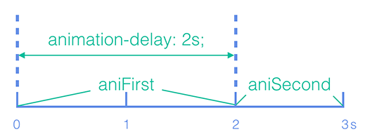
动画时间轴
由于 css3 动画没有时间轴,animation-delay 最常见的是用于将动画与其他动画的执行时机错开,将动画落到不同的时间点,形成动画时间轴。
.ani--first {

    animation-name: aniFirst;

    animation-duration: 2s;

    animation-delay: 0s;

}

.ani--second {

    animation-name: aniSecond;

    animation-duration: 1s;

    animation-delay: 2s; /* aniSecond 延迟 2s 执行*/

}
形成的时间轴如下图所示:
轮播
css3 animation 亦可实现一些 js 的效果,例如利用 animation-delay 可以实现一个简单的轮播。以下是一个三屏轮播的例子。
.slider__item {

    animation: ani 6s infinite linear both;

    @for $i from  to  {

      &:nth-child(#{$i}) {

        animation-delay: (-+$i)*2s;

      }

    }

}

@keyframes ani {

  %, 33.33% {opacity: ; visibility: visible;}

  33.34%, % {opacity: ; visibility: hidden;}

}
完整代码:
html
<!DOCTYPE html>

<html lang="en">

<head>

    <meta charset="UTF-8">

    <title>Document</title>

    <link rel="stylesheet" type="text/css" href="css/style.css">

</head>

<body>

<div class="slider">

  <img src="http://jdc.jd.com/img/500x300?color=6190e8&text=slider1&textColor=ffffff" class="slider__item" />

  <img src="http://jdc.jd.com/img/500x300?color=2ebaae&text=slider2&textColor=ffffff" class="slider__item" />

  <img src="http://jdc.jd.com/img/500x300?color=3d5a92&text=slider3&textColor=ffffff" class="slider__item" />

</div>

</body>

</html>
css
.slider {

  position: relative;

  width: 500px;

  height: 300px; }

  .slider:hover .slider__item {

    animation-play-state: paused; }

  .slider__item {

    position: absolute;

    width: %;

    height: %;

    left: ;

    top: ;

    opacity: ;

    animation: ani 6s infinite linear both; }

    .slider__item:nth-child() {

      animation-delay: 0s; }

    .slider__item:nth-child() {

      animation-delay: 2s; }

    .slider__item:nth-child() {

      animation-delay: 4s; }

@keyframes ani {

  %, 33.33% {

    opacity: ;

    visibility: visible; }

  33.34%, % {

    opacity: ;

    visibility: hidden; } }
序列动画
多个元素使用相同的动画效果时,将动画执行时机依次错开,可形成整齐有序的序列动画效果。
@for $i from  to  {

  .list__item:nth-child(#{$i}) {

    animation-delay: (-+$i)*.1s; /*计算每个元素的 animation-delay */

  }

}
完整代码
html
<!DOCTYPE html>

<html lang="en">

<head>

    <meta charset="UTF-8">

    <title>Document</title>

    <link rel="stylesheet" type="text/css" href="css/index1.css">

</head>

<body>

<div class="list">

  <div class="list__item"></div>

  <div class="list__item"></div>

  <div class="list__item"></div>

  <div class="list__item"></div>

  <div class="list__item"></div>

</div>

</body>

</html>
css
.list__item {

  width: 50px;

  height: 50px;

  background: #6180e9;

  margin-right: 10px;

  float: left;

  animation: listAni 1s ease both; }

@keyframes listAni {

  % {

    transform: scale(); }

  % {

    transform: scale(); } }

.list__item:nth-child() {

  animation-delay: 0s; }

.list__item:nth-child() {

  animation-delay: .2s; }

.list__item:nth-child() {

  animation-delay: .4s; }

.list__item:nth-child() {

  animation-delay: .6s; }

.list__item:nth-child() {

  animation-delay: .8s; }
以笔者开发的京东2017海外招聘项目为例,第二屏的菜单和第三屏的时间轴的进退场动画都运用了序列动画。下图展示第三屏时间轴的进场效果,有兴趣的同学亦可扫码观看完整案例。

无限循环的序列动画
animation-delay 可为负值。负值会让动画从它的动画序列中某位置立即开始。 巧用这个负值,可以解决实际开发中的一些问题。
如若上述的序列动画要进行无限循环,单纯将 animation-iteration-count 设置为 infinite,动画开始时会有延迟。此时,将 animation-delay 设置为负值,提前动画开始执行的时机,当用户看到动画时,动画便已经处于进行中的状态。
@for $i from  to  {

  .list__item:nth-child(#{$i}) {

    animation-delay: -$i*.1s; /* animation-delay 为负值*/

  }

}
完整代码
html同时
css
@charset "UTF-8";

.list__item {

  width: 50px;

  height: 50px;

  background: #6180e9;

  margin-right: 10px;

  float: left;

  animation: listAni .5s ease both alternate infinite; }

@keyframes listAni {

  % {

    transform: scale(); }

  % {

    transform: scale(); } }

.list__item:nth-child() {

  animation-delay: -.1s;

  /* animation-delay 为负值*/ }

.list__item:nth-child() {

  animation-delay: -.2s;

  /* animation-delay 为负值*/ }

.list__item:nth-child() {

  animation-delay: -.3s;

  /* animation-delay 为负值*/ }

.list__item:nth-child() {

  animation-delay: -.4s;

  /* animation-delay 为负值*/ }

.list__item:nth-child() {

  animation-delay: -.5s;

  /* animation-delay 为负值*/ }
调试动画
将 animation-play-state 设置为 paused,animation-delay 设置成不同的负值,可以查看动画在不同帧时的状态,便于进行动画调试。
.list__item {

    animation: listAni .5s linear both alternate infinite;

    animation-play-state: paused;

}

@for $i from  to  {

    .list--first .list__item:nth-child(#{$i}) {

        animation-delay: -$i*.1s;

    }

}

@for $i from  to  {

    .list--second .list__item:nth-child(#{$i}) {

        animation-delay: (--$i)*.1s;

    }

}

@for $i from  to  {

    .list--third .list__item:nth-child(#{$i}) {

        animation-delay: (--$i)*.1s;

    }

}
完整代码
<!DOCTYPE html>

<html lang="en">

<head>

    <meta charset="UTF-8">

    <title>Document</title>

    <link rel="stylesheet" type="text/css" href="css/index1.css">

</head>

<body>

<div class="list list--first">

  <div class="list__item"></div>

  <div class="list__item"></div>

  <div class="list__item"></div>

  <div class="list__item"></div>

  <div class="list__item"></div>

</div>

<div class="list list--second">

  <div class="list__item"></div>

  <div class="list__item"></div>

  <div class="list__item"></div>

  <div class="list__item"></div>

  <div class="list__item"></div>

</div>

<div class="list list--third">

  <div class="list__item"></div>

  <div class="list__item"></div>

  <div class="list__item"></div>

  <div class="list__item"></div>

  <div class="list__item"></div>

</div>

</body>

</html>
scss
.list {

  overflow: hidden;

  margin-bottom: 10px;

  &__item {

    width: 50px;

    height: 50px;

    background: #6180e9;

    margin-right: 10px;

    float: left;

    animation: listAni .5s linear both alternate infinite;

    animation-play-state: paused;

  }

}

@keyframes listAni {

    % {transform: scale(); }

    % {transform: scale(); }

}

@for $i from  to  {

    .list--first .list__item:nth-child(#{$i}) {

        animation-delay: -$i*.1s;

    }

}

@for $i from  to  {

    .list--second .list__item:nth-child(#{$i}) {

        animation-delay: (--$i)*.1s;

    }

}

@for $i from  to  {

    .list--third .list__item:nth-child(#{$i}) {

        animation-delay: (--$i)*.1s;

    }

}
2. animation-fill-mode
MDN 中的介绍:
animation-fill-mode 这个 CSS 属性用来指定在动画执行之前和之后如何给动画的目标应用样式。
animation-fill-mode 应该算是 animation 属性里比较难上手的一个,但它的作用却很大。
保持结束状态
“动画结束后,突然跳回第一帧!” 很多刚接触 css3 动画的同学,都是在这个场景下,接触了 animation-fill-mode 属性。将 animation-fill-mode 设置为 forwards,动画执行结束后保持最后一帧的样式。
.ani-area__item--forwards {

    animation: ani 1s ease;

    animation-fill-mode: forwards;

}
完整代码
html
<!DOCTYPE html>

<html lang="en">

<head>

    <meta charset="UTF-8">

    <title>Document</title>

    <link rel="stylesheet" type="text/css" href="css/index2.css">

</head>

<body>

<div class="ani-area">

  <div class="ani-area__item ani-area__item--forwards"></div>

  <div class="ani-area__item ani-area__item--none"></div>

</div>

</body>

</html>
scss
.ani-area {

  &__item {

    width: 50px;

    height: 50px;

    background: #6180e9;

    margin-right: 10px;

    float: left;

    animation: ani 1s ease;

    &--forwards {

      animation-fill-mode: forwards;

    }

    &--none {

      animation-fill-mode: none;

    }

  }

}

@keyframes ani {

  % { opacity:  }

  % { opacity: 0.5 }

}
开始前状态
开发动画时,我们都是先根据视觉稿做好构建,再来给元素加动画的。如上文所述,可通过 animation-delay 来延迟的动画的执行。而在执行前,元素往往需要先隐藏(translate 定位到视窗外 / opacity 设置为 0 / scale 设置为 0 等)。若将隐藏元素的样式直接应用到元素上,一来不利于构建,二来对于不支持动画的浏览器来说,只会呈现一片空白。此时,animation-fill-mode 的 backwards 属性值便派上用场。
对于 backwards 的解释,笔者见过不少文章的说法都有不妥之处,认为 backwards 与 forwards 相反,表示动画执行结束后保持第一帧的样式。实则不然,我们看下 w3c 的解释:
backwards:在 animation-delay 所指定的一段时间内,在动画显示之前,应用开始属性值(在第一个关键帧中定义)。
换句话说,backwards 作用的是 animation-delay 的时间段,应用第一个关键帧的样式。
.ani-area__item--backwards {

    animation: ani 1s 1s ease;

    animation-fill-mode: backwards;

}
完整代码
html
<!DOCTYPE html>

<html lang="en">

<head>

    <meta charset="UTF-8">

    <title>Document</title>

    <link rel="stylesheet" type="text/css" href="css/index2.css">

</head>

<body>

<div class="ani-area">

  <div class="ani-area__item ani-area__item--backwards">1s后出现</div>

  <div class="ani-area__item ani-area__item--none">1s后出现</div>

</div>

</body>

</html>
scss
.ani-area {

  &__item {

    width: 100px;

    height: 50px;

    color: #fff;

    line-height: 50px;

    text-align: center;

    background: #6180e9;

    margin-right: 10px;

    float: left;

    animation: ani 1s 1s ease;

    &--backwards {

      animation-fill-mode: backwards;

    }

    &--none {

      animation-fill-mode: none;

    }

  }

}

@keyframes ani {

  % { opacity:  }

  % { opacity:  }

}
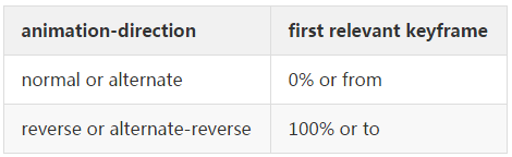
当然,动画的第一帧和最后一帧的计算还受 animation-direction 和 animation-iteration-count 的影响,MDN 中有详细解释:
forwarls:
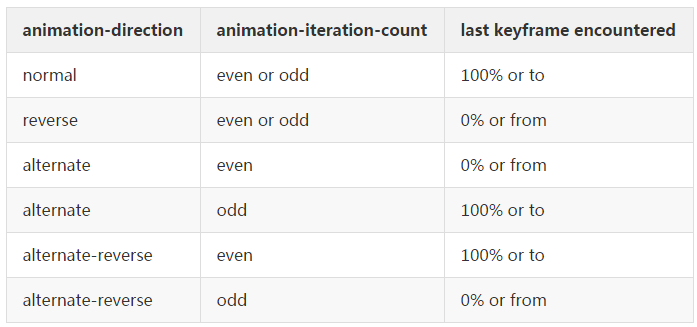
backwards:
3. animation-direction
既然上表中涉及了 animation-direction 属性,那我们就顺着来研究一下它。
MDN 中的介绍:
animation-direction CSS 属性指示动画是否反向播放。
进/退场动画复用
动画元素有进场动画,往往也会需要退场动画。比较常见的做法,退场时使用与进场动画反向的动画。animation-direction 的 reverse 属性值可简单实现反向动画。
先看MDN 中的介绍:
reverse:反向运行动画,每周期结束动画由尾到头运行。
.on {

  .ani--translate {

      animation: aniTranslate 1s ease forwards;

  }

}

.off {

  .ani--translate {

      animation: aniTranslate 1s ease forwards reverse;

  }

}

@keyframes aniTranslate {

  % { transform: translateY(300px) }

  % { transform: translateY() }

}
$wrap.removeClass('on');

$wrap.innerWidth($wrap.innerWidth); /* 使用 reflow 重新触发一下 animation */

$wrap.addClass('off');
完整实例代码:
html:
<div class="ani-wrap on J_wrap">

  <div class="ani ani--opacity"></div>

  <div class="ani ani--scale"></div>

  <div class="ani ani--translate"></div>

</div>

<a href="javascript:;" class="btn J_btn">退场</a>
scss
.btn {

  display: block;

  width: 100px;

  height: 30px;

  line-height: 30px;

  text-align: center;

  color: #6180e9;

  border: 1px solid #6180e9;

  float: left;

}

.ani {

  width: 50px;

  height: 50px;

  background: #6180e9;

  margin-right: 10px;

  float: left;

}

.on {

  .ani {

    &--opacity {

      animation: aniOpacity 1s ease forwards;

    }

    &--scale {

      animation: aniScale 1s ease forwards;

    }

    &--translate {

      animation: aniTranslate 1s ease forwards;

    }

  }

}

.off {

  .ani {

    &--opacity {

      animation: aniOpacity 1s ease forwards reverse;

    }

    &--scale {

      animation: aniScale 1s ease forwards reverse;

    }

    &--translate {

      animation: aniTranslate 1s ease forwards reverse;

    }

  }

}

@keyframes aniOpacity {

  % {

    opacity:

  }

  % {

    opacity:

  }

}

@keyframes aniScale {

  % {

    transform: scale()

  }

  % {

    transform: scale()

  }

}

@keyframes aniTranslate {

  % {

    transform: translateY(300px)

  }

  % {

    transform: translateY()

  }

}
js
var $btn = $('.btn'),

  $wrap = $('.J_wrap');

$btn.on('click', function(e) {

  $wrap.removeClass('on').innerWidth($wrap.innerWidth).addClass('off');

})
当然,上述例子为了演示方便,只是简单做了只有两帧的动画,这种效果用 transition 同样可以实现。
4. animation-play-state
MDN 中的介绍:
animation-play-state CSS 属性定义一个动画是否运行或者暂停。
翻页动画控制
在做翻页 h5 时,需要对动画的播放进行控制。只有当用户进入当前屏时,动画才开始播放。通常我们会给当前屏加上一个 acitve 类,用来给元素添加动画:
.active .ele {

    animation: ani 1s ease;

}
或者如上文“进/退场动画复用”中的例子,分别用 on 和 off 控制进/退场动画。这都是常见的思路。
如果是不需要重复触发的动画,用 animation-play-state 同样可以实现动画的控制。动画属性直接添加到元素上, animation-play-state 默认设置为 paused,当进入当前屏时,将 animation-play-state 设置为 running 即可。
.ani {

    animation: ani1 1s ease;

    animation-play-state: paused; /* animation-play-state 默认设置为 paused */

}

.active .ani {

    animation-play-state: running; /* 进入当前屏,animation-play-state 设置为 running */

}
完整实例代码:
html
<div class="page-wrap J_wraper">

  <div class="page page--first active">

    <div class="ani ani--first">

    </div>

  </div>

  <div class="page page--second">

    <div class="ani ani--second">

    </div>

  </div>

  <div class="page page--third">

    <div class="ani ani--third"></div>

  </div>

</div>
scss
.page-wrap{

  position: relative;

  width: 320px;

  height: 504px;

  overflow: hidden;

  background: #eee;

}

.page {

  position: absolute;

  width: %;

  height: %;

  top: ;

  left: ;

  &--first {

    background: #ddd;

  }

  &--second {

    background: #2ebaae;

  }

  &--third {

    background: #3d5a92;

  }

  &.active {

    z-index: ;

  }

}

.ani {

    width: 100px;

    height: 50px;

    color: #fff;

    line-height: 50px;

    text-align: center;

    background: #6190e8;

    margin: 110px;

    float: left;

  &--first {

    animation: ani1 2s ease both;

    animation-play-state: paused;

    -webkit-animation: ani1 2s ease both;

    -webkit-animation-play-state: paused;

  }

  &--second {

    animation: ani2 2s ease both;

    animation-play-state: paused;

    -webkit-animation: ani2 2s ease both;

    -webkit-animation-play-state: paused;

  }

  &--third {

    animation: ani3 2s ease both;

    animation-play-state: paused;

    -webkit-animation: ani3 2s ease both;

    -webkit-animation-play-state: paused;

  }

}

@keyframes ani1 {

  % { opacity:  }

  % { opacity:  }

}

@-webkit-keyframes ani1 {

  % { opacity:  }

  % { opacity:  }

}

@keyframes ani2 {

  % { transform: scale() }

  % { transform: scale() }

}

@-webkit-keyframes ani2 {

  % { -webkit-transform: scale() }

  % { -webkit-transform: scale() }

}

@keyframes ani3 {

  % { transform: translateY(1000px)  }

  % { transform: translateY() }

}

@-webkit-keyframes ani3 {

  % { -webkit-transform: translateY(1000px)  }

  % { -webkit-transform: translateY() }

}

.active .ani {

    animation-play-state: running;

    -webkit-animation-play-state: running;

}
js
var $page = $('.J_wraper .page');

$page.on('click',function(e) {

  $(this).next().addClass('active');

})
轮播的交互
在前文介绍 animation-delay 时,提到了一个轮播的例子,当用户 hover 时,轮播动画应该暂停,用 animation-play-state 属性便可轻松实现交互:
.slider:hover .slider__item{

    animation-play-state: paused;

}
5. animation-timing-function
MDN 中的介绍:
CSS animation-timing-function 属性定义 CSS 动画在每一动画周期中执行的节奏。
关于 animation-timing-function,有一个特别需要注意的点,MDN 中有强调:
对于关键帧动画来说,timing function 作用于一个关键帧周期而非整个动画周期,即从关键帧开始开始,到关键帧结束结束。
也就是说,animation-timing-function 是作用于 @keyframes 中设置的两个关键帧之间的,这一点在该属性值为 steps() 时可明显感知。
逐帧动画
animation-timing-function 最让人感到惊(beng)艳(kui)的莫过于 steps() 属性值。利用 steps(),可以轻松实现逐帧动画(又称“精灵动画”),从而告别不可控的 gif 时代。
关于逐帧动画,笔者之前在凹凸实验室平台已经发布过相关文章介绍,此处不再赘述,有兴趣的同学可前往围观:《CSS3逐帧动画》。
参考文章:
- Debugging CSS Keyframe Animations - SARAH DRASNER
- 多屏复杂动画CSS技巧三则 - zhangxinxu
- 打造H5动感影集的爱恨情仇(动画性能篇) -TQ
css3 animation 属性众妙的更多相关文章
- CSS3 animation属性中的steps实现GIF动图(逐帧动画)
相信 animation 大家都用过很多,知道是 CSS3做动画用的.而我自己就只会在 X/Y轴 上做位移旋转,使用 animation-timing-function 规定动画的速度曲线,常用到的 ...
- CSS3 animation属性 实现转动效果
<!DOCTYPE html> <html lang="en"> <head> <meta charset="UTF-8 ...
- 关于CSS3 animation 属性在ie edge浏览器中不能工作
我想要给div边框加一个闪烁,所以我将css中设置如下 给想要闪烁的div加上blink类 这样在firefox,chrome下是正常显示的,但是在ie下box-shadow属性不能被正常的展现 后 ...
- CSS3 border属性的妙用
.ribbon { background: #45c9c8; position: absolute; width: 75px; height: 25px; line-height: 25px; top ...
- animation属性
文章中转站,因为涉及到动画效果,还是看文笔比较好的博主吧~ CSS3(三)Animation 入门详解 css3中变形与动画(三) CSS3 Animation 是由三部分组成. 关键帧(keyfra ...
- 《众妙之门——精通CSS3》一书知识点剖析
不得不佩服京东的速度,昨天刚下单的两本书今天上午就到了.其中一本是全彩页的<众妙之门 - 精通CSS3>,细看了前几十页,书上的叙述方式给我的印象其实不如“彩页”来的讨喜——接连说上几个例 ...
- CSS3动画属性animation的用法
转载: 赞生博客 高端订制web开发工作组 » CSS3动画属性animation的用法 CSS3提供了一个令人心动的动画属性:animation,尽管利用animation做出来的动画没有flash ...
- 基于CSS3新属性Animation及transform实现类似翻书效果
注:本实例JS部分均以原生JS编写,不善用原生JS的,可用jQuery等对三方框架改写 先上效果图:(样式有点丑,可以忽略一下下,效果出来了就好,后期加到其他项目中方便更改0.0) 类似翻书效果,原本 ...
- CSS3学习之 animation 属性
发现animation这个新属性很有趣,在此学习,并整理下! 浏览器支持: Internet Explorer 10.Firefox 以及 Opera 支持 animation 属性: Safari ...
随机推荐
- SQL Server编程(04)基本语法【转载】
一.定义变量 --简单赋值 declare @a int set @a=5 print @a --使用select语句赋值 declare @user1 nvarchar(50) select @ ...
- 在C#中使用官方驱动操作MongoDB
MongoDB的官方驱动下载地址:https://github.com/mongodb/mongo-csharp-driver/releases 目前最新的版本是2.10,支持.NET 4.5以上.由 ...
- 使用Java中的动态代理实现数据库连接池
2002 年 12 月 05 日 作者通过使用JAVA中的动态代理实现数据库连接池,使使用者可以以普通的jdbc连接的使用习惯来使用连接池. 数据库连接池在编写应用服务是经常需要用到的模块,太过频繁的 ...
- asp.net json 与xml 的基础事例
//json序列化和反序列化 using System.Runtime.Serialization.Json; public static string JsonSerializer<T> ...
- 10月16日上午MySQL数据库作业设计表解析
作业设计表:多张表存储学生成绩及各种信息 需要从表里面体现: 关于学生的:代号 姓名 性别 年龄 班级 关于课程的:代号 名称 关于老师的:代号 姓名 关于成绩的:例如:闫超--网页--90 要能查看 ...
- MySQL外键使用需要注意的几点
最近刚刚接触MySQL,在建立表示遇到了一些问题,总是提示错误代码:150 can't create table ...,所以就到网上搜索了一下发现还有以下几点需要注意的: [CONSTRAINT [ ...
- C++中引用与指针的区别(详细介绍)
C++中引用与指针的区别(详细介绍) C++中的引用与指针的区别 指向不同类型的指针的区别在于指针类型可以知道编译器解释某个特定地址(指针指向的地址)中的内存内容及大小,而void*指针则只表示一 ...
- Unity逻辑热更新
http://www.xuanyusong.com/archives/3075 http://www.unitymanual.com/thread-36503-1-1.html http://www. ...
- iOS注册,找回密码时用到的获取验证码
#import "ViewController.h" #import "NSTimer+BlocksKit.h" @interface ViewControll ...
- Sql — CTE公用表表达式和With用法总结
CTE(Common Table Expression) 公用表表达式,它是在单个语句的执行范围内定义的临时结果集,只在查询期间有效.它可以自引用,也可在同一查询中多次引用,实现了代码段的重复利用. ...