[UWP]占领标题栏
1. 前言
每一个有理想的UWP应用都会打标题栏的主意,尤其当微软提供 将 Acrylic 扩展到标题栏 这个功能后,大部分Windows 10的原生应用都不乖了,纷纷占领了标题栏的一亩三分地。这篇博客将介绍在UWP中如何自定义标题栏。
2.示例代码
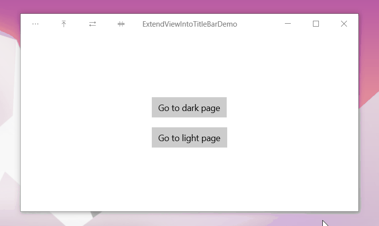
UWP的限制很多,标题栏的自定义几乎全部内容集中在 这篇文档 里面。但只参考这篇文章做起来还不够顺手,我参考了微软开源的计算器应用中的 TitleBar 写了一个示例应用,可以在 这里 查看它的源码。我也把TitleBar实际应用到了我的 OnePomodoro 应用里面了。
3. 简单的颜色自定义
如果只想简单地自定义标题栏的颜色可以通过ApplicationViewTitleBar,ApplicationViewTitleBar表示应用程序的标题栏,它提供了一些颜色属性用于控制标题栏的颜色,示例代码如下:
// using Windows.UI.ViewManagement;

var titleBar = ApplicationView.GetForCurrentView().TitleBar;

// Set active window colors

titleBar.ForegroundColor = Windows.UI.Colors.White;

titleBar.BackgroundColor = Windows.UI.Colors.Green;

titleBar.ButtonForegroundColor = Windows.UI.Colors.White;

titleBar.ButtonBackgroundColor = Windows.UI.Colors.SeaGreen;

titleBar.ButtonHoverForegroundColor = Windows.UI.Colors.White;

titleBar.ButtonHoverBackgroundColor = Windows.UI.Colors.DarkSeaGreen;

titleBar.ButtonPressedForegroundColor = Windows.UI.Colors.Gray;

titleBar.ButtonPressedBackgroundColor = Windows.UI.Colors.LightGreen;

// Set inactive window colors

titleBar.InactiveForegroundColor = Windows.UI.Colors.Gray;

titleBar.InactiveBackgroundColor = Windows.UI.Colors.SeaGreen;

titleBar.ButtonInactiveForegroundColor = Windows.UI.Colors.Gray;

titleBar.ButtonInactiveBackgroundColor = Windows.UI.Colors.SeaGreen;
有几点需要注意:
- 悬停和按下状态的Background定义对关闭按钮无效
- Foreground不能设置透明
4. 将内容扩展到标题栏
若要隐藏默认标题栏并将你的内容扩展到标题栏区域中,请将 CoreApplicationViewTitleBar.ExtendViewIntoTitleBar 属性设置为 true。CoreApplicationViewTitleBar允许应用定义在应用窗口中显示的自定义标题栏。示例代码如下:
// using Windows.ApplicationModel.Core;

// Hide default title bar.

var coreTitleBar = CoreApplication.GetCurrentView().TitleBar;

coreTitleBar.ExtendViewIntoTitleBar = true;
5. 将内容扩展到标题栏时自定义标题按钮颜色
将内容扩展到标题栏,标题按钮的颜色就变复杂了。因为应用内容的颜色可能和按钮的颜色冲突。这种情况下有几种方案,其中最简单的一种方案是写死为一个不会冲突的颜色,但切换主题时可能会让这些颜色出问题。计算器应用中订阅UISettings的ColorValuesChanged事件,动态地根据ThemeResources的值改变标题栏颜色,并且更进一步地考虑到使用高对比度主题的情况,所以订阅了AccessibilitySettings的HighContrastChanged事件:
if (_accessibilitySettings.HighContrast)

{

    // Reset to use default colors.

    applicationTitleBar.ButtonBackgroundColor = null;

    applicationTitleBar.ButtonForegroundColor = null;

    applicationTitleBar.ButtonInactiveBackgroundColor = null;

    applicationTitleBar.ButtonInactiveForegroundColor = null;

    applicationTitleBar.ButtonHoverBackgroundColor = null;

    applicationTitleBar.ButtonHoverForegroundColor = null;

    applicationTitleBar.ButtonPressedBackgroundColor = null;

    applicationTitleBar.ButtonPressedForegroundColor = null;

}

else

{

    Color bgColor = Colors.Transparent;

    Color fgColor = ((SolidColorBrush)Application.Current.Resources["SystemControlPageTextBaseHighBrush"]).Color;

    Color inactivefgColor = ((SolidColorBrush)Application.Current.Resources["SystemControlForegroundChromeDisabledLowBrush"]).Color;

    Color hoverbgColor = ((SolidColorBrush)Application.Current.Resources["SystemControlBackgroundListLowBrush"]).Color;

    Color hoverfgColor = ((SolidColorBrush)Application.Current.Resources["SystemControlForegroundBaseHighBrush"]).Color;

    Color pressedbgColor = ((SolidColorBrush)Application.Current.Resources["SystemControlBackgroundListMediumBrush"]).Color;

    Color pressedfgColor = ((SolidColorBrush)Application.Current.Resources["SystemControlForegroundBaseHighBrush"]).Color;

    applicationTitleBar.ButtonBackgroundColor = bgColor;

    applicationTitleBar.ButtonForegroundColor = fgColor;

    applicationTitleBar.ButtonInactiveBackgroundColor = bgColor;

    applicationTitleBar.ButtonInactiveForegroundColor = inactivefgColor;

    applicationTitleBar.ButtonHoverBackgroundColor = hoverbgColor;

    applicationTitleBar.ButtonHoverForegroundColor = hoverfgColor;

    applicationTitleBar.ButtonPressedBackgroundColor = pressedbgColor;

    applicationTitleBar.ButtonPressedForegroundColor = pressedfgColor;

}
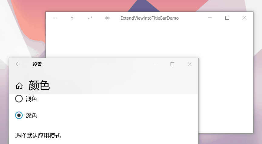
这段代码中,当使用高对比度主题时将标题栏的按钮颜色还原成默认值,否则设置成ThemeResource中对应的颜色,运行效果如下:
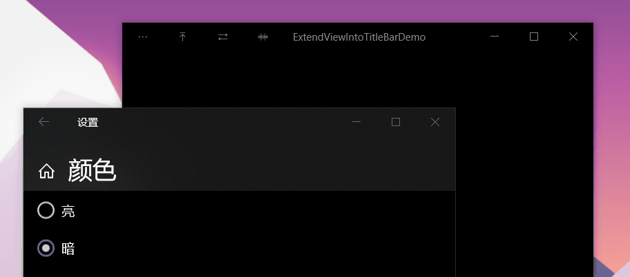
但现在的UWP应用常常在Dark和Light主题之间反复横跳,而Application.Current.Resources只能拿到程序加载时的ThemeResource的值,所以这段代码在应用内的主题切换后无效。我暂时不清楚怎么在代码里拿到最新的ThemeResource,为解决这个问题只好让TitleBar自己在XAML中获取当前的ThemeResource,代码如下:
<UserControl.Resources>

    <SolidColorBrush x:Key="ButtonForegroundColor"

                     Color="{ThemeResource SystemBaseHighColor}" />

    <SolidColorBrush x:Key="ButtonInactiveForegroundBrush"

                     Color="{ThemeResource SystemChromeDisabledLowColor}" />

    <SolidColorBrush x:Key="ButtonHoverBackgroundBrush"

                     Color="{ThemeResource SystemListLowColor}" />

    <SolidColorBrush x:Key="ButtonHoverForegroundBrush"

                     Color="{ThemeResource SystemBaseHighColor}" />

    <SolidColorBrush x:Key="ButtonPressedBackgroundBrush"

                     Color="{ThemeResource SystemListMediumColor}" />

    <SolidColorBrush x:Key="ButtonPressedForegroundBrush"

                     Color="{ThemeResource SystemBaseHighColor}" />

</UserControl.Resources>
Color fgColor = ((SolidColorBrush)Resources["ButtonForegroundColor"]).Color;

Color inactivefgColor = ((SolidColorBrush)Resources["ButtonInactiveForegroundBrush"]).Color;

Color hoverbgColor = ((SolidColorBrush)Resources["ButtonHoverBackgroundBrush"]).Color;

Color hoverfgColor = ((SolidColorBrush)Resources["ButtonHoverForegroundBrush"]).Color;

Color pressedbgColor = ((SolidColorBrush)Resources["ButtonPressedBackgroundBrush"]).Color;

Color pressedfgColor = ((SolidColorBrush)Resources["ButtonPressedForegroundBrush"]).Color;
6. 可拖动区域
都将内容扩展到标题栏了,肯定是想在标题栏上放置自己需要的UI元素,默认情况下标题栏的范围为拖动、点击等Windows的窗体行为保留,在这个范围的自定义UI内容没办法获取鼠标点击。 为了让自定义的UI内容获取鼠标,可以用Window.SetTitleBar方法指定某一元素能用于窗体的拖动和点击。
<Grid x:Name="LayoutRoot"

      Height="32"

      HorizontalAlignment="Stretch">

    <Grid x:Name="BackgroundElement"

          Height="32"

          Background="Transparent" />

    <StackPanel Orientation="Horizontal">

        <StackPanel x:Name="ItemsPanel" Orientation="Horizontal">

        </StackPanel>

        <TextBlock x:Name="AppName"

                   x:Uid="AppName"

                   Text="ExtendViewIntoTitleBarDemo"

        </StackPanel>

</Grid>
Window.Current.SetTitleBar(BackgroundElement);
上面的代码指定TitlaBar中的BackgroundElement元素为可拖动区域,而下面的StackPanel则用于放置交互内容,例如标题或后退按钮。这个StackPanel必须比BackgroundElement具有较高的Z顺序才能接收到用户的鼠标输入。
7. 标题的系统保留区域
标题栏的右边有188像素的系统保留区域,用于系统标题按钮(“后退”、“最小化”、“最大化”、“关闭”)。其实这几个按钮也就占用了141像素的控件,还有一小块空间是默认的可拖动区域,这小块空间确保了无论怎么设置都总有一个用户可拖动的区域。

上面说的188像素是100%缩放的情况,通过上面的截图可以看到实际上可能不一样,通常来说会在窗体加载时,或者订阅CoreApplicationViewTitleBar.LayoutMetricsChanged事件,然后通过CoreApplicationViewTitleBar获取具体的值。
_coreTitleBar.LayoutMetricsChanged += OnLayoutMetricsChanged;

private void OnLayoutMetricsChanged(CoreApplicationViewTitleBar sender, object args)

{

    LayoutRoot.Height = _coreTitleBar.Height;

    SetTitleBarPadding();

}

private void SetTitleBarPadding()

{

    double leftAddition = 0;

    double rightAddition = 0;

    if (FlowDirection == FlowDirection.LeftToRight)

    {

        leftAddition = _coreTitleBar.SystemOverlayLeftInset;

        rightAddition = _coreTitleBar.SystemOverlayRightInset;

    }

    else

    {

        leftAddition = _coreTitleBar.SystemOverlayRightInset;

        rightAddition = _coreTitleBar.SystemOverlayLeftInset;

    }

    LayoutRoot.Padding = new Thickness(leftAddition, 0, rightAddition, 0);

}
8. 可交互区域的内容
上面的StackPanel是可交互区域,详细的内容如下:
<StackPanel Orientation="Horizontal">

    <StackPanel x:Name="ItemsPanel" Orientation="Horizontal">

        <StackPanel.Resources>

            <Style TargetType="Button"

                   BasedOn="{StaticResource NavigationBackButtonNormalStyle}">

                <Setter Property="Foreground"

                        Value="{StaticResource TitleBarForeground}" />

                <Setter Property="FontSize"

                        Value="10" />

                <Setter Property="Width"

                        Value="46" />

                <Setter Property="Height"

                        Value="32" />

                <Setter Property="IsTabStop"

                        Value="False" />

            </Style>

        </StackPanel.Resources>

    </StackPanel>

    <TextBlock x:Name="AppName"

               x:Uid="AppName"

               Text="ExtendViewIntoTitleBarDemo"

               Margin="12,0,12,0"

               HorizontalAlignment="Left"

               VerticalAlignment="Center"

               Foreground="{ThemeResource SystemControlPageTextBaseHighBrush}"

               FontSize="12"

               IsHitTestVisible="False"

               TextAlignment="Left"

               TextTrimming="CharacterEllipsis" />

</StackPanel>
其中AppName用于显示标题栏,ItemsPanel用于放其它按钮。TitleBar里定义了Buttons属性,调用TitleBar可以通过Buttons属性指定按钮(这部分代码我凌晨两点写的,写得十分敷衍,但写完又懒得改了)。
public ObservableCollection<Button> Buttons { get; } = new ObservableCollection<Button>();

private void OnButtonsCollectionChanged(object sender, System.Collections.Specialized.NotifyCollectionChangedEventArgs e)

{

    ItemsPanel.Children.Clear();

    foreach (var button in Buttons)

    {

        ItemsPanel.Children.Add(button);

    }

}
<local:TitleBar>
<local:TitleBar.Buttons>
<Button x:Name="OptionsButton"
Content=""
ToolTipService.ToolTip="Options" />
<Button Content=""
ToolTipService.ToolTip="Options" />
<Button Content=""
ToolTipService.ToolTip="Options" />
<Button Content=""
ToolTipService.ToolTip="Options" />
</local:TitleBar.Buttons>
</local:TitleBar>

按钮的样式来自NavigationBackButtonNormalStyle并稍作修改,大致上做到和标准的标题栏按钮一样。
9. 非激活状态的标题栏颜色
当窗体处于非激活状态应该让按钮和标题都变灰,可以订阅Window的Activated事件,在非激活状态时改变颜色:
Window.Current.Activated += OnWindowActivated;

private void OnWindowActivated(Object sender, WindowActivatedEventArgs e)

{

    VisualStateManager.GoToState(

        this, e.WindowActivationState == CoreWindowActivationState.Deactivated ? WindowNotFocused.Name : WindowFocused.Name, false);

}
<UserControl.Resources>

    <SolidColorBrush x:Key="TitleBarForeground"

                     x:Name="TitleBarForeground"

                     Color="{ThemeResource SystemBaseHighColor}" />

</UserControl.Resources>

<Grid x:Name="LayoutRoot"

      Height="32"

      HorizontalAlignment="Stretch">

    <VisualStateManager.VisualStateGroups>

        <VisualStateGroup x:Name="WindowFocusStates">

            <VisualState x:Name="WindowFocused" />

            <VisualState x:Name="WindowNotFocused">

                <VisualState.Setters>

                    <Setter Target="AppName.Foreground"

                            Value="{ThemeResource SystemControlForegroundChromeDisabledLowBrush}" />

                    <Setter Target="TitleBarForeground.Color"

                            Value="{ThemeResource SystemChromeDisabledLowColor}" />

                </VisualState.Setters>

            </VisualState>

        </VisualStateGroup>

     </VisualStateManager.VisualStateGroups>
10. 全屏和平板模式
当应用在全屏或平板模式下运行时,系统将隐藏标题栏和标题控制按钮。 但是,用户可以调用标题栏,以使其以覆盖形式显示在应用的 UI 顶部。 你可以处理隐藏或调用标题栏时将通知的 CoreApplicationViewTitleBar.IsVisibleChanged 事件,并根据需要显示或隐藏你的自定义标题栏内容。
LayoutRoot.Visibility = _coreTitleBar.IsVisible ? Visibility.Visible : Visibility.Collapsed;
这部分比较难截图就不搞了,想看效果可以试玩我的番茄钟应用。
11.结语
就这样,令人头痛的自定义标题栏处理完了。还好微软开源了它的计算器里正好有我需要的代码,抄了个爽。有一些处理得不好,如果错误请指正。
12.参考
calculator_TitleBar.xaml.cpp at master
ApplicationViewTitleBar Class (Windows.UI.ViewManagement) - Windows UWP applications Microsoft Docs
13. 源码
DinoChan_ExtendViewIntoTitleBarDemo How to handle titlebar when ExtendViewIntoTitleBar
OnePomodoro_TitleBar.xaml at master
[UWP]占领标题栏的更多相关文章
- UWP更改标题栏颜色
你是否因为UWP标题栏太丑而想过改变?那么这篇文章或许可以帮助你美化UWP界面,让你的UWP的标题栏也变好看 这里的代码,都要在MainPage的构造函数中.如果你在App类中更改了首页,则在该首页的 ...
- Win10的UWP之标题栏的返回键(二)
原文:Win10的UWP之标题栏的返回键(二) 关于Win10的UWP的返回键的第二种处理的方法,是介于标题栏的强行修改,不是像上期的那样直接调用系统内置的API. - - - - - - - - - ...
- Win10的UWP之标题栏的返回键(一)
原文:Win10的UWP之标题栏的返回键(一) 关于返回键,放在标题栏是目前较为完美的一种方案.继前一篇的Hello World,博主进行一些修改实现该方法. - - - - - - - - - - ...
- Windows 10 UWP程序标题栏设置
在Windows 10程序中,以前只能用于全屏方式的Metro程序现在可以运行在窗口模式下了,并且改了个新名字,叫Windows 通用程序(Universal Windows app),简称UWP程序 ...
- WPF 应用完全模拟 UWP 的标题栏按钮
WPF 自定义窗口样式有多种方式,不过基本核心实现都是在修改 Win32 窗口样式.然而,Windows 上的应用就应该有 Windows 应用的样子嘛,在保证自定义的同时也能与其他窗口样式保持一致当 ...
- UWP 扩展/自定义标题栏的方法,一些概念和一些注意事项
原文 UWP 扩展/自定义标题栏的方法,一些概念和一些注意事项 在 Windows 10 的前几个版本中将页面内容扩展到标题栏上还算简单,主要是没什么坑.直到一些新控件的引入和一些外观设计趋势变化之后 ...
- win10 uwp 设置启动窗口大小 获取窗口大小
本文主要说如何设置我们窗口的启动大小,UWP启动窗口大小. 设置启动窗口 设置窗口大小 ApplicationView.PreferredLaunchViewSize = new Size(1000, ...
- WPF 很少人知道的科技
原文:WPF 很少人知道的科技 本文介绍不那么常见的 WPF 相关的知识. 本文内容 在 C# 代码中创建 DataTemplate 多个数据源合并为一个列表显示 使用附加属性做缓存,避免内存泄漏 使 ...
- 2018-2-13-win10-uwp-设置启动窗口大小--获取窗口大小
title author date CreateTime categories win10 uwp 设置启动窗口大小 获取窗口大小 lindexi 2018-2-13 17:23:3 +0800 20 ...
随机推荐
- Java NIO ByteBuffer 的使用与源码研究
一.结论 ByteBuffer 是Java NIO体系中的基础类,所有与Channel进行数据交互操作的都是以ByteBuffer作为数据的载体(即缓冲区).ByteBuffer的底层是byte数组, ...
- Oracle 统计信息介绍
统计信息自动执行需要以下条件满足: dba_autotask_task 字段status值ENABLED dba_autotask_client 字段status值ENABLED dba_auto ...
- web设计_3_可伸缩的导航栏
1. HTML5构建一个选项卡,需要<nav>标签包围一个无序列表,也可以添加role属性告诉辅助设备(如屏幕阅读器)这个元素所扮演的角色. 绝对不要基于图片的导航,对搜索引擎不友好,更新 ...
- (读论文)推荐系统之ctr预估-NFM模型解析
本系列的第六篇,一起读论文~ 本人才疏学浅,不足之处欢迎大家指出和交流. 今天要分享的是另一个Deep模型NFM(串行结构).NFM也是用FM+DNN来对问题建模的,相比于之前提到的Wide& ...
- 12. 集合类Collection和Map
*:first-child { margin-top: 0 !important; } body>*:last-child { margin-bottom: 0 !important; } /* ...
- Laravel 命令行工具之多线程同步大批量数据 DB连接混乱 解决方案
记一次大批量数据的多进程同步 背景:因为公司的用户标识不完整,所以需要从集团同步一次用户标记数据,用户数据来源是微信,数量级为一百五十万,集团用户数量级为六百万 方案确定下来是集团开了一个查询接口,访 ...
- Gunicorn-Django部署
1. 简单部署 1. sudo pip3 install gunicorn 2. cd 到django项目中 sudo python3 manage.py migrate 3.启动服务:sudo py ...
- JavaSE之——并没有多维数组
近日在读<疯狂Java讲义>精粹第二版,部分语述摘自其中,自己边敲边理解 前言 我们知道,Java语言支持的类型有两种: 1.基本类型(即八大基本数据类 ...
- kylin Retrieving hive dependency...
由于公司环境配置hive默认连接hiveserver2 ,不管hive cli 还是beeline cli都默认使用beeline cli,连接hive需要输入账号密码; 启动kylin 时会Retr ...
- Python Iterator and Generator
Python Iterator and Generator Iterator 迭代器(Iterator)和可迭代对象(Iterable)往往是绑定的.可迭代对象就是我们平时经常用的list ,st ...