CSS3 ::before和::after伪元素的实际应用
实例
1.清除浮动
通常我们清除清除浮动的方式就是在浮动元素后面添加一个空的Div标签,然后在设置它的清除浮动要是,使用after伪元素,我们就不需要添加无意义的div标签在html中了,下面的例子就使用了伪元素清除浮动
<!DOCTYPE html>

<html>

<head>

    <meta charset="UTF-8">

  <style type="text/css">

      ul {

          margin: 200px;

          background: #ccc;

          padding: 10px;

          border: 1px solid #;

          list-style:none;

      }

      ul::after {

          clear: both;

          content: '';

          display: block;

      }

      li {

          float: left;

          margin-left: 10px;

      }

      li::after {

          content: '/';

          margin-left: 10px;

      }

      li:last-child::after{

          content: none;

      }

  </style>

</head>

<body>

<ul>

    <li>篮球</li>

    <li>网球</li>

    <li>棒球</li>

</ul>

</body>

</html>
效果:

没有清除浮动:

2.常见消息框
注意,此时伪类content:' ',而非content:'',而且伪类4条边必须宽度相同,而且其他三条边为transparent才可以;对于-webkit-transform设置在之前的文章中已经讲过,可以通过设置定位元素left,top值为50%,translate(-50%,-50%) 来使任意宽高的元素居中。
<!DOCTYPE html>

<html>

<head>

    <meta charset="UTF-8">

  <style type="text/css">

      div{

          width:300px;

          background-color:rgba(,,,0.7);

          color:#fff;

          font-family:'Microsoft YaHei';

          text-align:center;

          padding:5px;

          margin:100px auto;

          position:relative;

           }

      div::before{

          content:' ';

          width:0px;

          height:0px;

          position:absolute;

          left:-12px;

          top:%;

          -webkit-transform:translate(0px,-%);

          border:6px solid rgba(,,,0.7);

          border-color:transparent rgba(,,,0.7) transparent transparent

              }

  </style>

</head>

<body>

<div>你好吗我哼好</div>

</body>

</html>
效果:

3..阴影
通过设置before,after不同位置,不同旋转角度,可以实现现在网络很流行的阴影效果,同时要保证伪类的颜色及z-index。有了这种方法 我们就可以扩展出各种各样的阴影效果
<!DOCTYPE html>

<html>

<head>

    <meta charset="UTF-8">

    <title></title>

    <style type="text/css">

        body{background-color:#ebebeb}

        div.outer{width:400px;

            height:250px;

            padding:5px;

            margin:100px auto;

            position:relative;

        }

        div.child{

            position:absolute;

            top:0px;

            left:0px;

            right:0px;

            bottom:0px;

            background-color:#fff;

            color:#000;

            line-height:250px;

            font-family:'Microsoft YaHei';

            text-align:center;

            z-index:2

        }

        div.outer::before,div.outer::after{content:'';

            z-index:1;

            width:50%;

            height:3px;

            position:absolute;

            left:10px;

            bottom:7px;

            background-color:transparent;

            box-shadow:5px 5px 10px rgba(0,0,0,0.5);

            -webkit-transform:rotate(-3deg);

        }

        div.outer::after{

            left:auto;

            right:10px;

            -webkit-transform:rotate(3deg)

        }

    </style>

</head>

<body>

<div class='outer'>

    <div class='child '>

        我是内容我是内容我是内容

    </div>

</div>

</body>

</html>
效果:

4.做出各种图形效果
<!DOCTYPE html>

<html lang="en">

<head>

    <meta charset="UTF-8">

    <title></title>

    <style type="text/css">

        #star-five {

            margin-top: 60px;

            width: ;

            height: ;

            border-left: 100px solid transparent;

            border-right: 100px solid transparent;

            border-bottom: 70px solid blue;

            position: relative;

            transform: rotate(35deg);

        }

        #star-five:before {

            border-bottom: 80px solid red;

            border-left: 30px solid transparent;

            border-right: 30px solid transparent;

            position: absolute;

            height: ;

            width: ;

            top: -45px;

            left: -65px;

            content: '';

            transform: rotate(-35deg);

        }

        #star-five:after {

            width: ;

            height: ;

            border-left: 100px solid transparent;

            border-right: 100px solid transparent;

            border-bottom: 70px solid yellow;

            top: 7px;

            left: -110px;

            position: absolute;

            display: block;

            content: '';

            transform: rotate(-70deg);

        }

    </style>

</head>

<body>

<div id='star-five'></div>

</body>

</html>
效果:
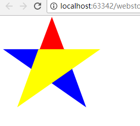
举例:一个六角星
<style>

#star-six {

  width: ;

  height: ;

  border-left: 50px solid transparent;

  border-right: 50px solid transparent;

  border-bottom: 100px solid red;

  position: relative;

}

#star-six::after {

  width: ;

  height: ;

  border-left: 50px solid transparent;

  border-right: 50px solid transparent;

  border-top: 100px solid red;

  position: absolute;

  content: "";

  top: 30px;

  left: -50px;

}

</style>

<body>

<div id="star-six"></div>

</body>
<style>

#star-six {

  width: 0;

  height: 0;

  border-left: 50px solid transparent;

  border-right: 50px solid transparent;

  border-bottom: 100px solid red;

  position: relative;

}

#star-six::after {

  width: 0;

  height: 0;

  border-left: 50px solid transparent;

  border-right: 50px solid transparent;

  border-top: 100px solid red;

  position: absolute;

  content: "";

  top: 30px;

  left: -50px;

}

</style>

<body>

<div id="star-six"></div>

</body>
#star-six的div是一个正三角行,#star-six::after是一个倒三角形,通过绝对定位,调整其位置即可实现六角星的效果。

5.content属性
::before和::after必须配合content属性来使用,content用来定义插入的内容,content必须有值,至少是空。默认情况下,伪类元素的display是默认值inline,可以通过设置display:block来改变其显示。
content可取以下值。
string
使用引号包一段字符串,将会向元素内容中添加字符串。如:a:after{content:""}
举例:
<!DOCTYPE html>

<meta charset="utf-8" />

<style type="text/css">

p::before{

    content: "《";

    color: red;

}

p::after{

    content: "》";

    color: red;

}

</style>

<p>平凡的世界</p>
效果:

attr()
通过attr()调用当前元素的属性,比如将图片alt提示文字或者链接的href地址显示出来。
<!DOCTYPE html>

<html lang="en">

<head>

    <meta charset="UTF-8">

    <title></title>

    <style type="text/css">

    a::after{

        content: "("attr(href)")";

    }

    </style>

</head>

<body>

<a href="http://www.baidu.com">百度</a>

</body>

</html>
效果:

rl()/uri()
用于引用媒体文件。
举例:“百度”前面给出一张图片,后面给出href属性。
<!DOCTYPE html>

<html lang="en">

<head>

    <meta charset="UTF-8">

    <title></title>

    <style type="text/css">

     a::before{

         content: url("https://www.baidu.com/img/baidu_jgylogo3.gif");

     }

    a::after{

        content: "("attr(href)")";

    }

    </style>

</head>

<body>

<a href="http://www.baidu.com">百度</a>

</body>

</html>
效果:

counter()
调用计数器,可以不使用列表元素实现序号功能。
配合counter-increment和counter-reset属性使用:
h2:before { counter-increment: chapter; content: "Chapter " counter(chapter) ". " }
<!DOCTYPE html>

<html lang="en">

<head>

    <meta charset="UTF-8">

    <title></title>

    <style type="text/css">

        body{

            counter-reset: section;

        }

        h1{

            counter-reset: subsection;

        }

        h1:before{

            counter-increment:section;

            content:counter(section) "、";

        }

        h2:before{

            counter-increment:subsection;

            content: counter(section) "." counter(subsection) "、";

        }

    </style>

</head>

<body>

<h1>HTML tutorials</h1>

<h2>HTML Tutorial</h2>

<h2>XHTML Tutorial</h2>

<h2>CSS Tutorial</h2>

<h1>Scripting tutorials</h1>

<h2>JavaScript</h2>

<h2>VBScript</h2>

<h1>XML tutorials</h1>

<h2>XML</h2>

<h2>XSL</h2>

</body>

</html>
效果:

6.给blockquote添加引号
经常用到给blockquote 引用段添加巨大的引号作为背景,可以用 ::before 来代替 background 。好处是即可以给背景留下空间,还可以直接使用文字而非图片:
<!DOCTYPE html>

<meta charset="utf-8" />

<style type="text/css">

    blockquote::before {

        content: open-quote;

        color: #ddd;

        z-index: -;

        font-size:80px;

    }

</style>

<body>

<blockquote>引用一个段落,双引号用::before伪元素实现</blockquote>

</body>

</html>
效果:

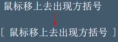
7、超链接特效
举例:配合 CSS定位实现一个鼠标移上去,超链接出现方括号的效果
<meta charset="utf-8" />

<style type="text/css">

body{

    background-color: #425a6c;

}

    a {

    position: relative;

    display: inline-block;

    outline: none;

    color: #fff;

    text-decoration: none;

    font-size: 32px;

    padding: 5px 20px;

}

a:hover::before, a:hover::after { position: absolute; }

a:hover::before { content: "\5B"; left: -10px; }

a:hover::after { content: "\5D"; right:  -10px; }

</style>

<a>鼠标移上去出现方括号</a>
效果:
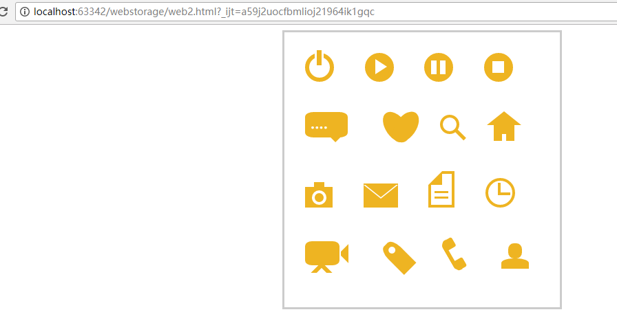
8.不使用图片创建小图标
<!doctype html>

<html>

<head>

    <title>伪类标签使用</title>

</head>

<style type="text/css">

    #wraper{padding:10px;width:380px;height:380px;border:3px solid #ccc;margin:auto;}

    #power{width: 30px;height: 30px;margin:20px;border: 6px solid #EEB422;border-radius: %;position: relative;display: inline-block;}

    #power:before{width:7px;height:22px;background:#EEB422;position: absolute;left:8px;top:-13px;content: "";border: 3px solid #fff;}

    #play{width: 30px;height: 30px;margin:20px;border: 6px solid #EEB422;border-radius: %;position:relative;display: inline-block;background: #EEB422;}

    #play:before{border:11px solid transparent;border-left:17px solid #fff;content: "";position: absolute;left:9px;top: 3px;}

    #pause{width: 30px;height: 30px;margin:20px;border: 6px solid #EEB422;border-radius: %;position:relative;display: inline-block;background: #EEB422;}

    #pause:before{height:20px;width:5px;border:0px solid transparent;border-left:8px solid #fff;border-right:8px solid #fff;content: "";position: absolute;left:4px;top: 5px;}

    #stop{width: 30px;height: 30px;margin:20px;border: 6px solid #EEB422;border-radius: %;position:relative;display: inline-block;background: #EEB422;}

    #stop:before{height:17px;width:17px;background:#fff;content: "";position: absolute;left:6px;top: 6px;}

    #comment{width: 50px;height: 25px;margin:20px;border: 6px solid #EEB422;border-radius: %;position:relative;display: inline-block;background: #EEB422;}

    #comment:before{border:10px solid transparent;border-top:10px solid #EEB422;content: "";position: absolute;left:28px;top: 28px;}

    #comment:after{content: "....";position: absolute;color: #fff;font-size: 26px;top: -10px;left: 2px;}

    #like{width: 50px;height: 30px;margin:20px;border-radius: %;transform:rotate(55deg);-webkit-transform:rotate(55deg);position:relative;display: inline-block;background: #EEB422;}

    #like:before{width:50px;height:30px;border-radius: %;transform:rotate(-110deg);-webkit-transform:rotate(-110deg);background:#EEB422;content: "";position: absolute;left:8px;top: -12px;}

    #search{width: 20px;height: 20px;border:4px solid #EEB422;border-radius:%;margin:20px;position:relative;display: inline-block;top: -5px;left: -5px;}

    #search:before{width:20px;height:5px;background:#EEB422;transform:rotate(45deg);-webkit-transform:rotate(45deg);content: "";position: absolute;left:15px;top: 22px;}

    #home{width: 30px;height: 30px;background:#EEB422;margin:20px;position:relative;display: inline-block;top: 5px;}

    #home:before{width:6px;height:12px;background:#fff;content: "";position: absolute;left:12px;top: 20px;}

    #home:after{border:25px solid transparent;border-bottom:20px solid #EEB422;content: "";position: absolute;top: -38px;left:-10px;}

    #photo{width:40px;height:30px;background:#EEB422;margin:20px;position:relative;display: inline-block;top: 5px;}

    #photo:before{width:13px;height:13px;border:4px solid #fff;border-radius:%;background:#EEB422;content: "";position: absolute;left:10px;top: 5px;}

    #photo:after{width:15px;height:10px;background:#EEB422;content: "";position: absolute;top: -7px;left:13px;}

    #photo{width:40px;height:30px;background:#EEB422;margin:20px;position:relative;display: inline-block;top: 5px;}

    #email{width:50px;height:35px;background:#EEB422;margin:20px;position:relative;display: inline-block;top: 5px;}

    #email:before{border:25px solid transparent;border-top:20px solid #fff;content: "";position: absolute;left:0px;top: 2px;}

    #email:after{border:25px solid transparent;border-top:20px solid #EEB422;content: "";position: absolute;top:0px;}

    #file{width:30px;height:45px;border:4px solid #EEB422;margin:20px;position:relative;display: inline-block;top: 5px;}

    #file:before{border:10px solid #fff;border-right:10px solid #EEB422;border-bottom:10px solid #EEB422;content: "";position: absolute;left:-4px;top: -4px;}

    #file:after{width:20px;height:5px;border-top:3px solid #EEB422;border-bottom:3px solid #EEB422;content: "";position: absolute;left: 5px;top: 25px;}

    #history{width:35px;height:35px;border:4px solid #EEB422;border-radius: %;margin:20px;position:relative;display: inline-block;top: 5px;}

    #history:before{width:14px;height:14px;border-bottom:4px solid #EEB422;border-left:4px solid #EEB422;content: "";position: absolute;left:14px;top: 3px;}

    #video{width:50px;height:35px;background:#EEB422;border-radius: %;margin:20px;position:relative;display: inline-block;top: -5px;}

    #video:before{width:6px;height:6px;border:11px solid transparent;border-right:11px solid #EEB422;content: "";position: absolute;left:35px;top: 4px;}

    #video:after{width:10px;height:10px;border:6px solid transparent;border-top:6px solid #EEB422;border-left:6px solid #EEB422;transform:rotate(45deg);-webkit-transform:rotate(45deg);content: "";position: absolute;left:13px;top: 35px;}

    #tags{width:50px;height:25px;background:#EEB422;border-radius: % % % %;transform:rotate(45deg);-webkit-transform:rotate(45deg);margin:20px;margin-left:35px;position:relative;display: inline-block;top: -5px;}

    #tags:before{width:10px;height:10px;border-radius:%;background:#fff;content: "";position: absolute;left:7px;top: 7px;}

    #phone{width:50px;height:50px;border-left:6px solid #EEB422;border-radius:%;transform:rotate(-30deg);-webkit-transform:rotate(-30deg);margin:20px;margin-right:0px;position:relative;display: inline-block;top: -5px;}

    #phone:before{width:15px;height:15px;background:#EEB422;border-radius: %;content: "";position: absolute;left:-2px;top: 1px;}

    #phone:after{width:15px;height:15px;background:#EEB422;border-radius: %;content: "";position: absolute;left:-3px;top: 34px;}

    #profile{width: 40px;height:15px;background:#EEB422;border-radius: % %  ;margin:20px;position:relative;display: inline-block;top: 0px;}

    #profile:before{width: 20px;height:22px;background:#EEB422;border-radius:%;content: "";position: absolute;left: 10px;top: -22px;}

</style>

<body>

    <div id="wraper">

        <div id="power"></div>

        <div id="play"></div>

        <div id="pause"></div>

        <div id="stop"></div>

        <div id="comment"></div>

        <div id="like"></div>

        <div id="search"></div>

        <div id="home"></div>

        <div id="photo"></div>

        <div id="email"></div>

        <div id="file"></div>

        <div id="history"></div>

        <div id="video"></div>

        <div id="tags"></div>

        <div id="phone"></div>

        <div id="profile"></div>

    </div>

</body>

</html>
效果:
9.模拟float:center的效果
float没有center这个取值,但是可以通过伪类来模拟实现。
这个效果实现很有意思,左右通过::before float各自留出一半图片的位置,再把图片绝对定位上去。
<!DOCTYPE html>

<html>

<head>

    <meta charset='UTF-8'>

    <title>Float Both</title>

    <style>

    * {

        margin: ;

        padding: ;

    }

    body {

        font: 14px/1.8 Georgia, serif;

    }

        #page-wrap { width: %; margin: 40px auto; position: relative; }

        #logo { position: absolute; top: ; left: %; margin-left: -125px; }

        #l, #r { width: %; }

        #l { float: left; }

        #r { float: right; }

        #l:before, #r:before { content: ""; width: 125px; height: 250px; }

        #l:before { float: right; }

        #r:before { float: left; }

    </style>

</head>

<body>

    <div id="page-wrap">

        <img src="img/cat.jpg" id="logo">

        <div id="l">

            <p>

                Pellentesque habitant morbi tristique senectus et netus et malesuada fames ac turpis egestas. Vestibulum tortor quam, feugiat vitae, ultricies eget, tempor sit amet, ante. Donec eu libero sit amet quam egestas semper. Aenean ultricies mi vitae est. Mauris placerat eleifend leo. Quisque sit amet est et sapien ullamcorper pharetra. Vestibulum erat wisi, condimentum sed, commodo vitae, ornare sit amet, wisi. Aenean fermentum, elit eget tincidunt condimentum, eros ipsum rutrum orci, sagittis tempus lacus enim ac dui. Donec non enim in turpis pulvinar facilisis. Ut felis. Praesent dapibus, neque id cursus faucibus, tortor neque egestas augue, eu vulputate magna eros eu erat. Aliquam erat volutpat. Nam dui mi, tincidunt quis, accumsan porttitor, facilisis luctus, metus

            </p>

        </div>

        <div id="r">

            <p>

                Pellentesque habitant morbi tristique senectus et netus et malesuada fames ac turpis egestas. Vestibulum tortor quam, feugiat vitae, ultricies eget, tempor sit amet, ante. Donec eu libero sit amet quam egestas semper. Aenean ultricies mi vitae est. Mauris placerat eleifend leo. Quisque sit amet est et sapien ullamcorper pharetra. Vestibulum erat wisi, condimentum sed, commodo vitae, ornare sit amet, wisi. Aenean fermentum, elit eget tincidunt condimentum, eros ipsum rutrum orci, sagittis tempus lacus enim ac dui. Donec non enim in turpis pulvinar facilisis. Ut felis. Praesent dapibus, neque id cursus faucibus, tortor neque egestas augue, eu vulputate magna eros eu erat. Aliquam erat volutpat. Nam dui mi, tincidunt quis, accumsan porttitor, facilisis luctus, metus

            </p>

        </div>

    </div>

</body>

</html>
效果:

CSS3 ::before和::after伪元素的实际应用的更多相关文章
- css3 盒模型与 伪元素综合应用案例
先来简略理解下盒模型: 在 css3 之前,盒模型默认为 box-sizing : content-box,这种模式下的盒模型计算大小方式为,width + padding + border : 而 ...
- CSS3新增选择器:伪元素选择器
一. ::first-letter 第一个字 二. ::first-line 第一行(以浏览器为准的第一行) 三. ::selection 被选中的字行(鼠标选中的字段)只能向 ::selectio ...
- 使用 CSS3 伪元素实现立体的照片堆叠效
CSS3 里引入的伪元素让 Web 开发人员能够在不需要额外添加 HTML 标签的情况下制作出复杂的视觉效果.例如,:before 和 :after 这个两个 CSS3 伪元素就可以帮助你实现很多有趣 ...
- CSS和CSS3中的伪元素和伪类(总结)
好多人伪类和伪元素分清楚,其实就是一句话,“伪类的效果可以通过添加一个实际的类来达到,而伪元素的效果则需要通过添加一个实际的元素才能达到”. CSS中伪类包括: :first-child :lang ...
- 【CSS进阶】伪元素的妙用--单标签之美
最近在研读 <CSS SECRET>(CSS揭秘)这本大作,对 CSS 有了更深层次的理解,折腾了下面这个项目: CSS3奇思妙想 -- Demo (请用 Chrome 浏览器打开,非常值 ...
- 你所不知的 CSS ::before 和 ::after 伪元素用法
CSS 有两个说不上常用的伪类 :before 和 :after,偶尔会被人用来添加些自定义格式什么的,但是它们的功用不仅于此.前几天发现了 Creative Link Effects 这个非常有意思 ...
- CSS ::before 和 ::after 伪元素另类用法
原文地址:http://justcoding.iteye.com/blog/2032627 CSS 有两个说不上常用的伪类 :before 和 :after,偶尔会被人用来添加些自定义格式什么的,但是 ...
- CSS伪类与CSS伪元素的区别及由来
关于两者的区别,其实是很古老的问题.但是时至今日,由于各种网络误传以及一些不负责任的书籍误笔,仍然有相当多的人将伪类与伪元素混为一谈,甚至不乏很多CSS老手.早些年刚入行的时候,我自己也被深深误导,因 ...
- css伪元素研究(::before/::after)
::before/::after和:before/:after实质上效果一样 不过,在 CSS3 中为了区别伪元素和伪类为伪元素使用了双冒号,因此如果使用了 display 或者 width 等属性时 ...
随机推荐
- Python爬虫数据保存到MongoDB中
MongoDB是一款由C++语言编写的非关系型数据库,是一个基于分布式文件存储的开源数据库系统,其内容存储方式类似于JSON对象,它的字段值可以是其它文档或数组,但其数据类型只能是String文本型. ...
- DRF的路由生成类的使用
DRF路由生成类的使用 对于视图集ViewSet,我们除了可以自己手动指明请求方式与动作action之间的对应关系外,还可以使用Routers来帮助我们快速实现路由信息. REST framework ...
- 006-Spring Boot自动配置-Condition、Conditional、Spring提供的Conditional自动配置
一.接口Condition.Conditional(原理) 主要提供一下方法 boolean matches(ConditionContext context, AnnotatedTypeMetada ...
- linux环境常用分析日志的几个命令
前言: 分析日志是定位问题的常用手段,但实际线上可能有大量日志,掌握一些常见查看.过滤和分析日志的命令能起到事半功倍的效果.下面列出工作中最常用的一些命令,可在具体使用是查看,尝试使用.实际使用使往往 ...
- 阶段1 语言基础+高级_1-3-Java语言高级_04-集合_08 Map集合_4_Map集合遍历键找值方式
键找值的方式 增强for 增强for的简化方式
- FineTuning机制的分析
FineTuning机制的分析 为什么用FineTuning 使用别人训练好的网络模型进行训练,前提是必须和别人用同一个网络,因为参数是根据网络而来的.当然最后一层是可以修改的,因为我们的数据可能并没 ...
- failed to open stream: HTTP request failed! HTTP/1.1 505 HTTP Version Not Supported
PHP模拟GET请求支付宝退款链接(未用sdk 自己拼接的请求链接与参数); 起初用file_get_contents();就报错 :failed to open stream: HTTP requ ...
- State Function Approximation: Linear Function
In the previous posts, we use different techniques to build and keep updating State-Action tables. B ...
- 个人对BFC的见解
BFC:块级格式化上下文,它是指一个独立的块级渲染区域,只有Block-level BOX参与,该区域拥有一套渲染规则来约束块级盒子的布局,且与区域外部无关. BFC的生成 既然上文提到BFC是一块渲 ...
- Spring MVC @RequestBody自动转JSON HTTP415错误解决方法
转自:http://blog.csdn.net/tiantiandjava/article/details/46125141 项目中想用@RequestBody直接接收json串转成对象 网上查了使用 ...