WPF:定制Checkbox样式,让“正确”绿得好看,让“错误”红的显眼
WPF提供了样式、模板、触发器、状态管理、矢量形状等方式,让我们不需要背景图片,也可以轻松定制控件的风格样式。下面是笔者针对Checkbox进行的样式定制,让“正确”绿得好看,让“错误”红的显眼。
本文提供了两种风格,如果不是很适应自己系统的整体风格,可以对样式代码进行修改。
源代码:http://download.csdn.net/download/wadexmy/8099685
(1)普通风格

样式资源代码:
- <Style x:Key="cbIsRight" TargetType="{x:Type CheckBox}">
- <Setter Property="Height" Value="40"/>
- <Setter Property="Width" Value="120"/>
- <Setter Property="Foreground" Value="White"/>
- <Setter Property="FontWeight" Value="Bold"/>
- <Setter Property="Template">
- <Setter.Value>
- <ControlTemplate TargetType="{x:Type CheckBox}">
- <Border x:Name="ForegroundPanel" CornerRadius="4" BorderBrush="#d4d5d5" BorderThickness="1" Padding="0">
- <StackPanel Orientation="Horizontal">
- <Border x:Name="CheckFlag" VerticalAlignment="Center" CornerRadius="10" Margin="10,0,0,0" BorderThickness="1" Width="20" Height="20">
- <Path x:Name="CheckMark" StrokeThickness="3" Stroke="White"></Path>
- </Border>
- <TextBlock x:Name="tbContent" VerticalAlignment="Center" Margin="2,0" Text="{TemplateBinding Content}"/>
- </StackPanel>
- </Border>
- <ControlTemplate.Triggers>
- <Trigger Property="IsChecked" Value="True">
- <Setter Property="Content" Value="正确"/>
- <Setter TargetName="CheckMark" Property="Data" Value="M 4 8 L 8 12 L 14 4"/>
- <Setter TargetName="ForegroundPanel" Property="Background">
- <Setter.Value>
- <LinearGradientBrush StartPoint="0,0" EndPoint="1,0">
- <GradientStop Color="#89b601" Offset="0.0"/>
- <GradientStop Color="#73a80c" Offset="1"/>
- </LinearGradientBrush>
- </Setter.Value>
- </Setter>
- <Setter TargetName="CheckFlag" Property="Background" Value="#559800"></Setter>
- </Trigger>
- <Trigger Property="IsChecked" Value="False">
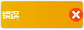
- <Setter Property="Content" Value="错误"/>
- <Setter TargetName="CheckMark" Property="Data" Value="M 5 5 L 14 14 M 5 14 L 14 5"/>
- <Setter TargetName="ForegroundPanel" Property="Background">
- <Setter.Value>
- <LinearGradientBrush StartPoint="0,0" EndPoint="1,0">
- <GradientStop Color="#edb200" Offset="0.0"/>
- <GradientStop Color="#ed9e00" Offset="1"/>
- </LinearGradientBrush>
- </Setter.Value>
- </Setter>
- <Setter TargetName="CheckFlag" Property="Background" Value="#F64708"></Setter>
- </Trigger>
- </ControlTemplate.Triggers>
- </ControlTemplate>
- </Setter.Value>
- </Setter>
- </Style>
主界面Checkbox控件对样式引用代码:
- <CheckBox Style="{StaticResource CheckStyle1}"/>
(2)左右滑动风格
样式资源代码:
- <Style x:Key="CheckStyle2" TargetType="{x:Type CheckBox}">
- <Setter Property="Height" Value="40"/>
- <Setter Property="Width" Value="120"/>
- <Setter Property="Foreground" Value="White"/>
- <Setter Property="FontWeight" Value="Bold"/>
- <Setter Property="Template">
- <Setter.Value>
- <ControlTemplate TargetType="{x:Type CheckBox}">
- <Border x:Name="ForegroundPanel" CornerRadius="4" BorderBrush="#d4d5d5" BorderThickness="1" Padding="0">
- <DockPanel>
- <TextBlock x:Name="Content" HorizontalAlignment="Left" VerticalAlignment="Center" Margin="2,0" />
- <Border x:Name="CheckFlag" HorizontalAlignment="Right" VerticalAlignment="Center" CornerRadius="10" BorderThickness="0" Width="20" Height="20">
- <Grid>
- <Path Visibility="Collapsed" Width="20" Height="20" x:Name="CheckMark" SnapsToDevicePixels="False" StrokeThickness="2"
- Stroke="White" Fill="White" Data="M 5 7 L 7 15 L 18 2 L 17 2 L 7 14 L 6 7 L 5 7">
- </Path>
- <Path Visibility="Collapsed" Width="20" Height="20" x:Name="InderminateMark" SnapsToDevicePixels="False" StrokeThickness="3"
- Stroke="White" Data="M 5 5 L 15 15 M 5 15 L 15 5">
- </Path>
- </Grid>
- </Border>
- </DockPanel>
- <VisualStateManager.VisualStateGroups>
- <VisualStateGroup x:Name="CommonStates">
- <VisualState x:Name="Normal" />
- <VisualState x:Name="MouseOver"></VisualState>
- <VisualState x:Name="Pressed"></VisualState>
- <VisualState x:Name="Disabled" />
- </VisualStateGroup>
- <VisualStateGroup x:Name="CheckStates">
- <VisualState x:Name="Checked">
- <Storyboard>
- <ObjectAnimationUsingKeyFrames Storyboard.TargetProperty="(UIElement.Visibility)" Storyboard.TargetName="CheckMark">
- <DiscreteObjectKeyFrame KeyTime="0" Value="{x:Static Visibility.Visible}" />
- </ObjectAnimationUsingKeyFrames>
- </Storyboard>
- </VisualState>
- <VisualState x:Name="Unchecked">
- <Storyboard>
- <ObjectAnimationUsingKeyFrames Storyboard.TargetProperty="(UIElement.Visibility)" Storyboard.TargetName="InderminateMark">
- <DiscreteObjectKeyFrame KeyTime="0" Value="{x:Static Visibility.Visible}" />
- </ObjectAnimationUsingKeyFrames>
- </Storyboard>
- </VisualState>
- <VisualState x:Name="Indeterminate"></VisualState>
- </VisualStateGroup>
- </VisualStateManager.VisualStateGroups>
- </Border>
- <ControlTemplate.Triggers>
- <Trigger Property="IsChecked" Value="True">
- <Setter TargetName="ForegroundPanel" Property="Background">
- <Setter.Value>
- <LinearGradientBrush StartPoint="0,0" EndPoint="1,0">
- <GradientStop Color="#89b601" Offset="0.0"/>
- <GradientStop Color="#73a80c" Offset="1"/>
- </LinearGradientBrush>
- </Setter.Value>
- </Setter>
- <Setter TargetName="Content" Property="Text" Value="正确"/>
- <Setter TargetName="CheckFlag" Property="Background" Value="#559800"></Setter>
- <Setter TargetName="Content" Property="DockPanel.Dock" Value="Right"/>
- <Setter TargetName="CheckFlag" Property="DockPanel.Dock" Value="Left"/>
- </Trigger>
- <Trigger Property="IsChecked" Value="False">
- <Setter TargetName="ForegroundPanel" Property="Background">
- <Setter.Value>
- <LinearGradientBrush StartPoint="0,0" EndPoint="1,0">
- <GradientStop Color="#edb200" Offset="0.0"/>
- <GradientStop Color="#ed9e00" Offset="1"/>
- </LinearGradientBrush>
- </Setter.Value>
- </Setter>
- <Setter TargetName="Content" Property="Text" Value="错误"/>
- <Setter TargetName="CheckFlag" Property="Background" Value="#F64708"></Setter>
- <Setter TargetName="Content" Property="DockPanel.Dock" Value="Left"/>
- <Setter TargetName="CheckFlag" Property="DockPanel.Dock" Value="Right"/>
- </Trigger>
- </ControlTemplate.Triggers>
- </ControlTemplate>
- </Setter.Value>
- </Setter>
- </Style>
主界面Checkbox控件对样式引用代码:
- <CheckBox Style="{StaticResource CheckStyle2}"/>
WPF:定制Checkbox样式,让“正确”绿得好看,让“错误”红的显眼的更多相关文章
- WPF 自定义CheckBox样式
自定义CheckBox样式,mark一下,方便以后参考复用 设计介绍: 1.一般CheckBox模板太难看了,肯定要重写其中的模板 2.模板状态为未选中状态和选中状态,设置为默认未选中就好了. 默认状 ...
- WPF CheckBox样式 ScrollViewer样式 WrapPanel、StackPanel、Grid布局
本节讲述布局,顺带加点样式给大家看看~单纯学布局,肯定是枯燥的~哈哈 那如上界面,该如何设计呢? 1.一些布局元素经常用到.Grid StackPanel Canvas WrapPanel等.如上这种 ...
- WPF自定义控件与样式(4)-CheckBox/RadioButton自定义样式
一.前言 申明:WPF自定义控件与样式是一个系列文章,前后是有些关联的,但大多是按照由简到繁的顺序逐步发布的等,若有不明白的地方可以参考本系列前面的文章,文末附有部分文章链接. 本文主要内容: Che ...
- 【转】WPF自定义控件与样式(4)-CheckBox/RadioButton自定义样式
一.前言 申明:WPF自定义控件与样式是一个系列文章,前后是有些关联的,但大多是按照由简到繁的顺序逐步发布的等 本文主要内容: CheckBox复选框的自定义样式,有两种不同的风格实现: RadioB ...
- 定制 input[type="radio"] 和 input[type="checkbox"] 样式
表单中,经常会使用到单选按钮和复选框,但是,input[type="radio"] 和 input[type="checkbox"] 的默认样式在不同的浏览器或 ...
- WPF自定义控件与样式(15)-终结篇 & 系列文章索引 & 源码共享
系列文章目录 WPF自定义控件与样式(1)-矢量字体图标(iconfont) WPF自定义控件与样式(2)-自定义按钮FButton WPF自定义控件与样式(3)-TextBox & Ric ...
- WPF自定义控件与样式(6)-ScrollViewer与ListBox自定义样式
一.前言 申明:WPF自定义控件与样式是一个系列文章,前后是有些关联的,但大多是按照由简到繁的顺序逐步发布的等,若有不明白的地方可以参考本系列前面的文章,文末附有部分文章链接. 本文主要内容: Scr ...
- WPF自定义控件与样式(13)-自定义窗体Window & 自适应内容大小消息框MessageBox
一.前言 申明:WPF自定义控件与样式是一个系列文章,前后是有些关联的,但大多是按照由简到繁的顺序逐步发布的等,若有不明白的地方可以参考本系列前面的文章,文末附有部分文章链接. 本文主要内容: 自定义 ...
- WPF编程学习——样式
本文目录 1.引言 2.怎样使用样式? 3.内联样式 4.已命名样式 5.元素类型样式 6.编程控制样式 7.触发器 1.引言 样式(Style),主要是用来让元素或内容呈现一定外观的属性.WPF中的 ...
随机推荐
- 开发者眼中最好的 22 款 GUI 测试工具
1.Abbot - Java GUI 测试框架 Abbot是一个基于GUI的简单的Java测试框架,它能够帮助开发者测试Java用户界面. 它提供事件自动生成和验证Java GUI组件,使您能够轻松地 ...
- Android开发-API指南-服务
Service 英文原文:http://developer.android.com/guide/components/services.html 采集(更新)日期:2014-12-23 原博客:htt ...
- 学习记录 java session保存用户登录
<%@ page language="java" contentType="text/html; charset=UTF-8" pageEncoding= ...
- Bug修复问题
采用下面的代码,访问网页:http://www.weather.com.cn/data/cityinfo/101010100.html,想读取下图中红框中的内容,但是抛出了IOException,通过 ...
- LSP“浏览器劫持概念
关于Winsock LSP“浏览器劫持”,中招者一直高居不下,由于其特殊性,直接删除而不恢复LSP的正常状态很可能会导致无法上网所以对其修复需慎重. 先说说什么是Winsock LSP“浏览器劫持 ...
- 用命令实现Win7远程桌面关机和重启
关机 shutdown -s -t 0 重启 shutdown -r -t 0 打开运行框(Win+R键),输入上述命令即可,后面的数字表示关机/重启延迟的时间 at 12:00 shutdown - ...
- PAT1013
#include<cstdio>#include<cstring>#include<vector>using namespace std;const int max ...
- Bootstrap布局
浮动 1.pull-left:左浮动;pull-right:右浮动;清除浮动:clearfix
- boost::asio 使用实例
#include <iostream> #include <boost/asio.hpp> using namespace std; using namespace boost ...
- ping 以及 traceroute 用法
目的:学习linux命令ping,traceroute的用法 1:ping的用法: man ping ping:判断某个主机是否有响应 linux-8o9i:~ # 119.29.29.29 PING ...