纯CSS美化的checkbox 和 radio
html
<!DOCTYPE HTML>

<html>

<head>

<title>纯CSS3实现自定义美化复选框和单选框</title>

<link rel="stylesheet" type="text/css" href="style2.css" />

</head>

<body>

<div id="holder">

    <div>

        <div class="tag">Checkbox Small</div>

        <input type="checkbox" id="checkbox-1-1" class="regular-checkbox" /><label for="checkbox-1-1"></label>

        <input type="checkbox" id="checkbox-1-2" class="regular-checkbox" /><label for="checkbox-1-2"></label>

        <input type="checkbox" id="checkbox-1-3" class="regular-checkbox" /><label for="checkbox-1-3"></label>

        <input type="checkbox" id="checkbox-1-4" class="regular-checkbox" /><label for="checkbox-1-4"></label>

    </div>

    <div>

        <div class="tag">Checkbox Big</div>

        <input type="checkbox" id="checkbox-2-1" class="regular-checkbox big-checkbox" /><label for="checkbox-2-1"></label>

        <input type="checkbox" id="checkbox-2-2" class="regular-checkbox big-checkbox" /><label for="checkbox-2-2"></label>

        <input type="checkbox" id="checkbox-2-3" class="regular-checkbox big-checkbox" /><label for="checkbox-2-3"></label>

        <input type="checkbox" id="checkbox-2-4" class="regular-checkbox big-checkbox" /><label for="checkbox-2-4"></label>

    </div>

    <div style="text-align:center;clear:both;margin:10px 0">

<script src="/gg_bd_ad_720x90.js" type="text/javascript"></script>

<script src="/follow.js" type="text/javascript"></script>

</div>

    <div>

        <div class="tag">Radio Small</div>

        <div class="button-holder">

            <input type="radio" id="radio-1-1" name="radio-1-set" class="regular-radio" checked /><label for="radio-1-1"></label><br />

            <input type="radio" id="radio-1-2" name="radio-1-set" class="regular-radio" /><label for="radio-1-2"></label><br />

            <input type="radio" id="radio-1-3" name="radio-1-set" class="regular-radio" /><label for="radio-1-3"></label><br />

            <input type="radio" id="radio-1-4" name="radio-1-set" class="regular-radio" /><label for="radio-1-4"></label><br />

        </div>

    </div>

    <div>

        <div class="tag">Radio Big</div>

        <div class="button-holder">

            <input type="radio" id="radio-2-1" name="radio-2-set" class="regular-radio big-radio" /><label for="radio-2-1"></label><br />

            <input type="radio" id="radio-2-2" name="radio-2-set" class="regular-radio big-radio" /><label for="radio-2-2"></label><br />

            <input type="radio" id="radio-2-3" name="radio-2-set" class="regular-radio big-radio" checked /><label for="radio-2-3"></label><br />

            <input type="radio" id="radio-2-4" name="radio-2-set" class="regular-radio big-radio" /><label for="radio-2-4"></label><br />

            <input type="radio" id="radio-2-5" name="radio-2-set" class="regular-radio big-radio" /><label for="radio-2-5"></label><br />

        </div>

    </div>

</div>

</body>

</html>
css
body {

    background: #fff;

    padding:; margin:;

}

#holder {

    width: 100%;

}

#holder > div {

    clear: both;

    padding: 2%;

    margin-bottom: 20px;

    border-bottom: 1px solid #eee;

    float: left;

    width: 96%;

}

label {

    display: inline;

}

.regular-checkbox {

    display: none;

}

.regular-checkbox + label {

    background-color: #fafafa;

    border: 1px solid #cacece;

    box-shadow: 0 1px 2px rgba(0,0,0,0.05), inset 0px -15px 10px -12px rgba(0,0,0,0.05);

    padding: 9px;

    border-radius: 3px;

    display: inline-block;

    position: relative;

}

.regular-checkbox + label:active, .regular-checkbox:checked + label:active {

    box-shadow: 0 1px 2px rgba(0,0,0,0.05), inset 0px 1px 3px rgba(0,0,0,0.1);

}

.regular-checkbox:checked + label {

    background-color: #e9ecee;

    border: 1px solid #adb8c0;

    box-shadow: 0 1px 2px rgba(0,0,0,0.05), inset 0px -15px 10px -12px rgba(0,0,0,0.05), inset 15px 10px -12px rgba(255,255,255,0.1);

    color: #99a1a7;

}

.regular-checkbox:checked + label:after {

    content: '\2714';

    font-size: 14px;

    position: absolute;

    top: 0px;

    left: 3px;

    color: #99a1a7;

}

.big-checkbox + label {

    padding: 18px;

}

.big-checkbox:checked + label:after {

    font-size: 28px;

    left: 6px;

}

.tag {

    font-family: Arial, sans-serif;

    width: 200px;

    position: relative;

    top: 5px;

    font-weight: bold;

    text-transform: uppercase;

    display: block;

    float: left;

}

.radio-1 {

    width: 193px;

}

.button-holder {

    float: left;

}

/* RADIO */

.regular-radio {

    display: none;

}

.regular-radio + label {

    -webkit-appearance: none;

    background-color: #fafafa;

    border: 1px solid #cacece;

    box-shadow: 0 1px 2px rgba(0,0,0,0.05), inset 0px -15px 10px -12px rgba(0,0,0,0.05);

    padding: 9px;

    border-radius: 50px;

    display: inline-block;

    position: relative;

}

.regular-radio:checked + label:after {

    content: ' ';

    width: 12px;

    height: 12px;

    border-radius: 50px;

    position: absolute;

    top: 3px;

    background: #99a1a7;

    box-shadow: inset 0px 0px 10px rgba(0,0,0,0.3);

    text-shadow: 0px;

    left: 3px;

    font-size: 32px;

}

.regular-radio:checked + label {

    background-color: #e9ecee;

    color: #99a1a7;

    border: 1px solid #adb8c0;

    box-shadow: 0 1px 2px rgba(0,0,0,0.05), inset 0px -15px 10px -12px rgba(0,0,0,0.05), inset 15px 10px -12px rgba(255,255,255,0.1), inset 0px 0px 10px rgba(0,0,0,0.1);

}

.regular-radio + label:active, .regular-radio:checked + label:active {

    box-shadow: 0 1px 2px rgba(0,0,0,0.05), inset 0px 1px 3px rgba(0,0,0,0.1);

}

.big-radio + label {

    padding: 16px;

}

.big-radio:checked + label:after {

    width: 24px;

    height: 24px;

    left: 4px;

    top: 4px;

}

/* ------- IGNORE */

#header {

    width: 100%;

    margin: 0px auto;

}

#header #center {

    text-align: center;

}

#header h1 span {

    color: #000;

    display: block;

    font-size: 50px;

}

#header p {

    font-family: 'Georgia', serif;

}

#header h1 {

    color: #892dbf;

    font: bold 40px 'Bree Serif', serif;

}

#travel {

    padding: 10px;

    background: rgba(0,0,0,0.6);

    border-bottom: 2px solid rgba(0,0,0,0.2);

    font-variant: normal;

    text-decoration: none;

    margin-bottom: 20px;

}

#travel a {

    font-family: 'Georgia', serif;

    text-decoration: none;

    border-bottom: 1px solid #f9f9f9;

    color: #f9f9f9;

}
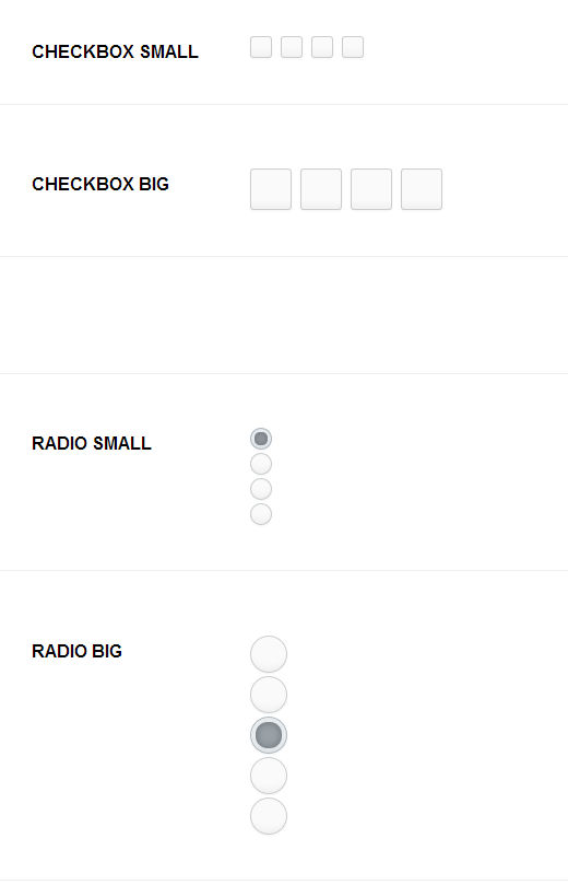
效果
纯CSS美化的checkbox 和 radio的更多相关文章
- 用纯CSS美化radio和checkbox
Radio和checkbox需要美化吗?答案是必须的,因为设计风格一直都会变化,原生的样式百年不变肯定满足不了需求. 先看看纯CSS美化过后的radio和checkbox效果:查看. 项目地址:mag ...
- 利用纯CSS美化checkbox和radio和滑动按钮的实现
W3C提供的CheckBox和radio的原始样式非常的丑,而且在不同的额浏览器表现还不一样,使用常规的方法添加样式没法进行修改样式 一, 单选按钮 <html> <head> ...
- 纯CSS+HTML实现checkbox的思路与实例
checkbox应该是一个比较常用的html功能了,不过浏览器自带的checkbox往往样式不怎么好看,而且不同浏览器效果也不一样.出于美化和统一视觉效果的需求,checkbox的自定义就被提出来了. ...
- CSS效果篇--纯CSS+HTML实现checkbox的思路与实例
checkbox应该是一个比较常用的html功能了,不过浏览器自带的checkbox往往样式不怎么好看,而且不同浏览器效果也不一样.出于美化和统一视觉效果的需求,checkbox的自定义就被提出来了. ...
- 自定义常用input表单元素一:纯css 实现自定义checkbox复选框
最下面那个是之前写的 今天在做项目的时候发现,之前写的貌似还是有点多,起码增加的span标签可以去掉,这样保持和原生相同的结构最好的,仅仅是样式上的变化.今天把项目中的这个给更新上来.下面就直接还是 ...
- 纯css美化下拉框、复选框以及单选框样式并用jquery获取到其被选中的val
具体样式如图所示: 注:获取val值时记得要先引入jquery库奥. 1.下拉框 css部分 #cargo_type_id{ font-size: 13px; border: solid 1px #b ...
- 原创:纯CSS美化单复选框(checkbox、radio)
最重要的一点,隐藏选择框本身.不多说了,上代码: <!doctype html> <html> <head> <meta charset="utf- ...
- 纯css美化复选框,单选框,滑动条(range)
<div class="box"> <!-- 借鉴地址:http://www.cnblogs.com/xiaoxianweb/p/5465607.html --& ...
- 纯css美化单选、复选框
<!doctype html> <html> <head> <meta charset="utf-8"> <title> ...
随机推荐
- Regex类
一.属性 CacheSize 获取或设置已编译的正则表达式的当前静态缓存中的最大项数. 默认是15个,最近使用的15个会存在缓存中,避免重新创建.当有第16个进来会替换掉第 1个.保持15个.Opt ...
- SQL Server 2008空间数据应用系列六:基于SQLCRL的空间数据可编程性
原文:SQL Server 2008空间数据应用系列六:基于SQLCRL的空间数据可编程性 友情提示,您阅读本篇博文的先决条件如下: 1.本文示例基于Microsoft SQL Server 2008 ...
- 【Xamarin挖墙脚系列:Xamarin 上台讲述PPT呵呵呵】
http://pan.baidu.com/s/1kUrwQft
- hash_map和map的区别
hash_map和map的区别 分类: STL2008-10-15 21:24 5444人阅读 评论(0) 收藏 举报 class数据结构编译器存储平台tree 这里列几个常见问题,应该对你理解和使用 ...
- Word Ladder 解答
Question Given two words (beginWord and endWord), and a dictionary's word list, find the length of s ...
- FVANCOP/ChartNew.js
FVANCOP/ChartNew.js FVANCOP/ChartNew.js
- 【转】android camera(二):摄像头工作原理、s5PV310 摄像头接口(CAMIF)
关键词:android camera CMM 模组 camera参数 CAMIF平台信息:内核:linux系统:android 平台:S5PV310(samsung exynos 4210) 作者 ...
- DataReader、Table、DataSet和Entity相互转化
public class CommonService { #region DataReader转化 /// <summary> /// 将DataReader转化为Table /// &l ...
- 为啥NSString的属性要用copy而不用retain
之前学习生活中,知道NSString的属性要用copy而不用retain,可是不知道为啥,这两天我研究了一下,然后最终明确了. 详细原因是由于用copy比用retain安全,当是NSString的时候 ...
- H5 视频直播相关技术
一.移动视频直播发展 大家首先来看下面这张图: 可以看到,直播从 PC 到一直发展到移动端,越来越多的直播类 App 上线,同时移动直播进入了前所未有的爆发阶段,但是对于大多数移动直播来说,还是要以 ...