css动画之波纹
样式定义:
#ContactAbout { height: auto; position: relative; overflow: hidden; }

#sectioncontact { display: block; width: %; position: relative; height: 700px; z-index: ; }

    #sectioncontact .map { width: 370px; height: 280px; position: absolute; left: %; margin-left: -105px; }

        #sectioncontact .map .button { width: 73px; height: 63px; background: url(../images/map-button.png) no-repeat; position: absolute; bottom: 0px; left: 165px; z-index: ; border-radius: 73px; }

        #sectioncontact .map .tips { width: 370px; height: 170px; background: rgba(,,,.); -moz-border-radius: 10px; -webkit-border-radius: 10px; border-radius: 10px; position: absolute; left: 20px;

top: 16px; z-index: ; -webkit-animation: Swing 2s ease-in-out infinite; -moz-animation: Swing 2s ease-in-out infinite; -ms-animation: Swing 2s ease-in-out infinite; -o-animation: Swing 2s ease-in-out

infinite; animation: Swing 2s ease-in-out infinite; }

            #sectioncontact .map .tips:before { content: ''; border: 26px solid; border-color: #; border-color: rgba(,,,); border-top-color: rgba(,,,.); position: absolute; left: %;

top: 170px; margin-left: -26px; }

            #sectioncontact .map .tips .container { padding: 10px; color: #fff; font-size: 16px; font-weight: ; line-height: 30px; }

                #sectioncontact .map .tips .container small { display: inline-block; width: 80px; color: #eee; font-size: 14px; }

@-webkit-keyframes Swing {

    % { -webkit-transform: rotate(0deg); }

    % { -webkit-transform: rotate(-2deg); }

    % { -webkit-transform: rotate(2deg) scaleY(); }

    % { -webkit-transform: rotate(-2deg); }

    % { -webkit-transform: rotate(1deg); }

    % { -webkit-transform: rotate(-1deg); }

    % { -webkit-transform: rotate(0deg); }

}

@-moz-keyframes Swing {

    % { -moz-transform: rotate(0deg); }

    % { -moz-transform: rotate(-2deg); }

    % { -moz-transform: rotate(2deg) scaleY(); }

    % { -moz-transform: rotate(-2deg); }

    % { -moz-transform: rotate(1deg); }

    % { -moz-transform: rotate(-1deg); }

    % { -moz-transform: rotate(0deg); }

}

@-ms-keyframes Swing {

    % { -ms-transform: rotate(0deg); }

    % { -ms-transform: rotate(-2deg); }

    % { -ms-transform: rotate(2deg) scaleY(); }

    % { -ms-transform: rotate(-2deg); }

    % { -ms-transform: rotate(1deg); }

    % { -ms-transform: rotate(-1deg); }

    % { -ms-transform: rotate(0deg); }

}

@keyframes Swing {

    % { transform: rotate(0deg); }

    % { transform: rotate(-2deg); }

    % { transform: rotate(2deg) scaleY(); }

    % { transform: rotate(-2deg); }

    % { transform: rotate(1deg); }

    % { transform: rotate(-1deg); }

    % { transform: rotate(0deg); }

}

.halo { -webkit-animation: Halo 6s linear infinite; -moz-animation: Halo 6s linear infinite; animation: Halo 6s linear infinite; }

@-webkit-keyframes Halo {

    % { box-shadow: inset   25px rgba(,,,0.25),    rgba(,,,),    rgba(,,,),    rgba(,,,); }

    % { box-shadow: inset   25px rgba(,,,0.25),    rgba(,,,.),   200px rgba(,,,.),    rgba(,,,.),   460px rgba(,,,.); }

    % { box-shadow: inset   25px rgba(,,,.),    rgba(,,,.),   200px rgba(,,,),   100px rgba(,,,),   1000px rgba(,,,); }

}

@-moz-keyframes Halo {

    % { box-shadow: inset   25px rgba(,,,0.25),    rgba(,,,),    rgba(,,,),    rgba(,,,); }

    % { box-shadow: inset   25px rgba(,,,0.25),    rgba(,,,.),   200px rgba(,,,.),    rgba(,,,.),   460px rgba(,,,.); }

    % { box-shadow: inset   25px rgba(,,,.),    rgba(,,,.),   200px rgba(,,,),   100px rgba(,,,),   1000px rgba(,,,); }

}

@keyframes Halo {

    % { box-shadow: inset   25px rgba(,,,0.25),    rgba(,,,),    rgba(,,,),    rgba(,,,); }

    % { box-shadow: inset   25px rgba(,,,0.25),    rgba(,,,.),   200px rgba(,,,.),    rgba(,,,.),   460px rgba(,,,.); }

    % { box-shadow: inset   25px rgba(,,,.),    rgba(,,,.),   200px rgba(,,,),   100px rgba(,,,),   1000px rgba(,,,); }

}
aspx:
<div id="ContactAbout">
<div id="sectioncontact">
<div class="baidumapsite" id="dituContent"></div>
<div class="map">
<div class="tips">
<div class="container">
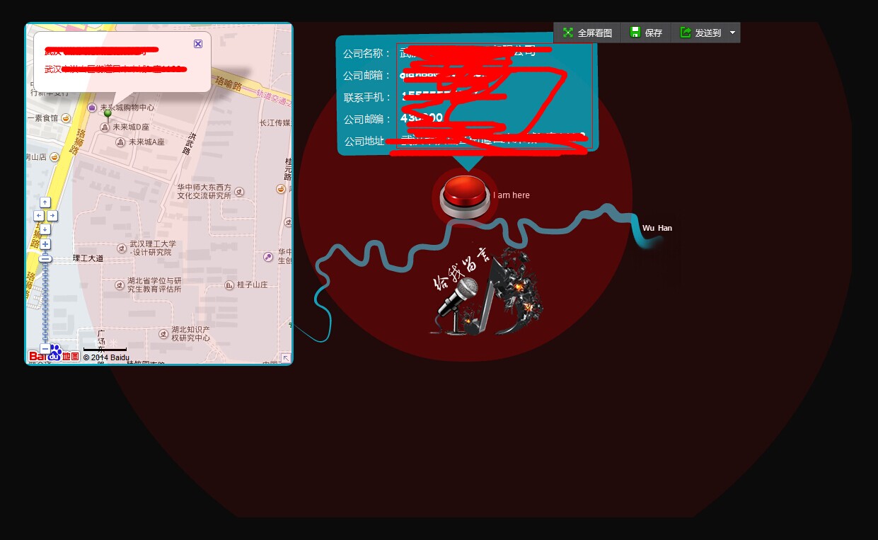
<p><small>公司名称:</small><asp:Literal ID="cName" runat="server"></asp:Literal></p>
<p><small>公司邮箱:</small><asp:Literal ID="cEmail" runat="server"></asp:Literal></p>
<p><small>联系手机:</small><asp:Literal ID="cTel" runat="server"></asp:Literal></p>
<p><small>公司邮编:</small><asp:Literal ID="cPostcode" runat="server"></asp:Literal></p>
<p><small>公司地址:</small><asp:Literal ID="cAddr" runat="server"></asp:Literal></p>
</div>
</div>
<div class="button halo"></div>
</div> <div id="messageus" title="点击给我留言吧"></div>
<div id="pop-login" style="display: none"> <div class="subline">
<span>客户姓名:</span>
<input name="txtName" runat="server" type="text" id="txtName" class="txtinput" />
</div>
<div class="subline">
<span>邮箱地址:</span>
<input name="txtEmail" runat="server" type="text" id="txtEmail" class="txtinput" />
</div>
<div class="subline">
<span>联系电话:</span>
<input name="txtTel" runat="server" type="text" id="txtTel" class="txtinput" />
</div>
<div class="subcontent">
<span>留言内容:</span>
<textarea name="txtMsgContent" id="txtMsgContent" runat="server" class="txtMsgContent" />
</div>
<div class="subline">
<span>验证码:</span>
<img src="VerifyImage.ashx" class="txtverity" onclick="this.src=this.src+'?'" />
<input name="txtCode" runat="server" type="text" id="txtCode" class="txtinput1" />
<asp:Button ID="Button1" runat="server" Text="提交" OnClientClick="return check()" class="btn" OnClick="btnSendMsg_Click" />
</div>
</div>
<script type="text/javascript" src="js/baidumap.js"></script>
</div>
</div>
页面效果:
css动画之波纹的更多相关文章
- 梅须逊雪三分白,雪却输梅一段香——CSS动画与JavaScript动画
CSS动画并不是绝对比JavaScript动画性能更优越,开源动画库Velocity.js等就展现了强劲的性能. 一.两者的主要区别 先开门见山的说说两者之间的区别. 1)CSS动画: 基于CSS的动 ...
- Css 动画的回调
在做项目中经常会遇到使用动画的情况.以前的情况是用js写动画,利用setTimeout函数或者window.requestAnimationFrame()实现目标元素的动画效果.虽然后者解决了刷新频率 ...
- 【译】css动画里的steps()用法详解
原文地址:http://designmodo.com/steps-c... 原文作者:Joni Trythall 我想你在css 动画里使用steps()会和我一样有很多困惑.一开始我不清楚怎样使用它 ...
- css动画属性性能
性能主要表现:流量.功耗与流畅度 在现有的前端动画体系中,通常有两种模式:JS动画与CSS3动画. JS动画是通过JS动态改写样式实现动画能力的一种方案,在PC端兼容低端浏览器中不失为一种推荐方案. ...
- Css动画形式弹出遮罩层,内容区上下左右居中于不定宽高的容器中
<!DOCTYPE html> <html> <head> </head> <body id="body"> <! ...
- css动画与js动画的区别
CSS动画 优点: (1)浏览器可以对动画进行优化. 1. 浏览器使用与 requestAnimationFrame 类似的机制,requestAnimationFrame比起setTimeout ...
- CSS动画与GPU
写在前面 满世界的动画性能优化技巧,例如: 只允许改变transform.opacity,其它属性不要动,避免重新计算布局(reflow) 对动画元素应用transform: translate3d( ...
- 15个来自 CodePen 的酷炫 CSS 动画效果【下篇】
CodePen 是一个在线的前端代码编辑和展示网站,能够编写代码并即时预览效果.你在上面可以在线分享自己的 Web 作品,也可以欣赏到世界各地的优秀开发者在网页中实现的各种令人惊奇的效果. 今天这篇文 ...
- 赞!15个来自 CodePen 的酷炫 CSS 动画效果
CodePen 是一个在线的前端代码编辑和展示网站,能够编写代码并即时预览效果.你在上面可以在线分享自己的 Web 作品,也可以欣赏到世界各地的优秀开发者在网页中实现的各种令人惊奇的效果. 今天这篇文 ...
随机推荐
- linux: 获取监听指定端口的进程PID
在 linux 下经常需要杀死(重启)监听某端口的进程, 因此就写了一个小脚本, 通过 ss 命令获取监听制定端口的进程 PID, 然后通过 kill 命令结束掉进程: #!/bin/sh # set ...
- 23 其它话题 - 《Python 核心编程》
- Sample MultipleFileWordcount CombineFileInputFormat
在旧版本的samples中,使用的是旧的api,mapred下面的MultiFileInputFormat,现在已经过时. 现在推荐使用mapreduce下面的CombineInputFormat来处 ...
- shell script 学习笔记-----命令执行
1.PATH变量:shell最主要的功能就是执行用户输入的命令,例如当用户输入一条“ls”命令之后,shell就要找到该命令对应的文件并执行.通常shell都会设置一个名叫PATH的环境变量,其中保存 ...
- 【MVC 4】6.SportsSore:导航
作者:[美]Adam Freeman 来源:<精通ASP.NET MVC 4> 前面的文章[MVC 4]5.SportsSore —— 一个真实的应用程序 建立了 Sports ...
- 双向广搜 POJ 3126 Prime Path
POJ 3126 Prime Path Time Limit: 1000MS Memory Limit: 65536K Total Submissions: 16204 Accepted ...
- hdu 5800 To My Girlfriend + dp
传送门:hdu 5800 To My Girlfriend 题意:给定n个物品,其中i,j必选,l,m必不选,问组成体积为s的方法一共有多少种 思路:定义dp[i][j][s1][s2],表示前i种物 ...
- PHP中的include和require
1.include语句 使用include语句可以告诉PHP提取特定的文件,并载入它的全部内容 <?php inlude "fileinfo.php"; //此处添加其他代码 ...
- 一个CentOS7的开发环境部署,包括防火墙|VPN|多IP多网关|HTTP代理服务器设置等
http://www.lenggirl.com/code/centos7.html layout: post title: "一个CentOS7的开发环境部署,包括防火墙|VPN|HTTP代 ...
- Unity3D实现赛车的灯光效果
车灯的需求 在赛车游戏中,遇到灯光弱的环境,赛车车可以打开前车灯照亮路边及前方,那一定是非常酷! 也见过虚拟现实项目通过Unity模拟汽车车灯的效果,但是我还没有想到好的思路来实现. 我的思路 使用( ...