CSS3动画第二式--组合动画
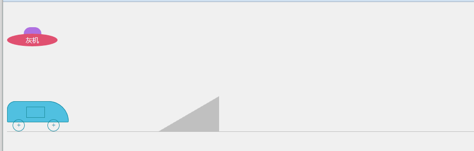
接第一式之后的进阶招式,加入一些组合动画,剧情、动画啥的都是随意瞎想的,纯粹是为了熟悉2D、3D和过渡等css3代码写法。效果见下图:
代码如下(有点长,折叠一下):
<!DOCTYPE html>
<html lang="zh-cn">
<head>
<meta charset="UTF-8">
<title>test</title>
<style>
ul,ol,li {
list-style: none;
margin: 0;
padding: 0;
}
.box {
position: relative;
margin-top: 50px;
height: 135px;
}
.talkBox {
position: absolute;
overflow: hidden;
}
.talkBox ul {
position: absolute;
left: 0;
width: 100%;
}
.talkBox ul li{
margin: 0;
padding: 0;
font:12px/22px Microsoft YaHei;
text-align: left;
}
.ufoBox {
position: absolute;
top: 0;
left: 0;
width: 100px;
height: 40px;
text-align: center;
color: #fff;
-webkit-animation-name: gogogo;
-webkit-animation-duration: 6s;
-webkit-animation-delay: 9.5s;
-webkit-animation-timing-function: ease;
-webkit-animation-iteration-count: 2;
animation-name: gogogo;
animation-duration: 6s;
animation-delay: 9.5s;
animation-timing-function:ease;
animation-iteration-count: 2;
}
.talkBox01 {
position: absolute;
top: 0;
left: 115px;
width: 150px;
height: 22px;
}
.talkBox01 ul {
top: 22px;
-webkit-animation-name: talk01;
-webkit-animation-duration: 9.5s;
-webkit-animation-delay: 0.5s;
-webkit-animation-timing-function: ease;
-webkit-animation-fill-mode: forwards;
animation-name: talk01;
animation-duration: 9.5s;
animation-delay: 0.5s;
animation-timing-function: ease;
animation-fill-mode: forwards;
}
.talkBox01 ul li{
color: #6978e6;
}
.ufoBox .ufoTop {
margin: 0 auto;
width: 35px;
height: 15px;
border-radius: 13px 13px 0 0;
background-color: #b37de6;
}
.ufoBox .ufoBody {
width: 100px;
height: 25px;
margin-top: -2px;
font:13px/25px Microsoft YaHei;
border-radius: 50%;
background-color: #eb5C7e;
}
@-webkit-keyframes talk01
{
0% {
top: 22px;
}
15% {
top: 0;
}
30% {
top: -22px;
}
45% {
top: -44px;
}
60%,85% {
top: -66px;
}
95% {
top: -88px;
}
100% {
top: -110px;
}
}
@keyframes talk01
{
0% {
top: 22px;
}
15% {
top: 0;
}
30% {
top: -22px;
}
45% {
top: -44px;
}
60% {
top: -66px;
}
90%, 95% {
top: -88px;
}
100% {
top: -110px;
}
}
@-webkit-keyframes gogogo
{
0%,10% {
-webkit-transform: rotate(0);
}
30%{
left: 0;
top: 0;
-webkit-transform: rotate(30deg);
}
50%{
left: 400px;
top: 55px;
-webkit-transform: rotate(0);
}
70%{
left: 400px;
-webkit-transform: rotate(0);
}
100%{
left:0;
-webkit-transform: rotate(-360deg);
}
}
@keyframes gogogo
{
0%,10 {
transform: rotate(0);
}
30%{
left: 0;
top: 0;
transform: rotate(30deg);
}
50%{
left: 400px;
top: 55px;
transform: rotate(0);
}
70%{
left: 400px;
transform: rotate(0);
}
100%{
left:0;
transform: rotate(-360deg);
}
}
.box02 {
position: relative;
height: 72px;
border-bottom: 1px solid #ccc;
}
.box02 .hill {
position: absolute;
left: 300px;
bottom: 0;
width: 0;
height: 0;
border-style: solid;
border-color: transparent #ccc #ccc transparent;
border-width: 35px 60px;
}
.carBox {
position: absolute;
left: 0;
bottom: 0;
width: 122px;
height: 60px;
-webkit-animation-name: boxGo;
-webkit-animation-duration: 5s;
-webkit-animation-delay: 8.5s;
-webkit-animation-timing-function: ease-in;
-webkit-animation-fill-mode: forwards;
animation-name: boxGo;
animation-duration: 5s;
animation-delay: 8.5s;
animation-timing-function: ease-in;
animation-fill-mode: forwards;
}
.carBox .carBody {
position: relative;
width: 120px;
height: 40px;
background-color: #59c4e6;
border: 1px solid #2094aa;
border-radius: 16px 40px 2px 2px;
}
.carBody .carDoorBox {
position: absolute;
top: 10px;
left: 37px;
width: 37px;
height: 22px;
background-color: #000;
}
.carBody .carDoor {
position: absolute;
left: 0;
top: 0;
display: inline-block;
width: 35px;
height: 20px;
border: 1px solid #2094aa;
background-color: #59c4e6;
-webkit-animation-name: doorGo;
-webkit-animation-duration: 0.5s;
-webkit-animation-delay: 12.5s;
-webkit-animation-timing-function: ease-in;
-webkit-animation-fill-mode: forwards;
animation-name: doorGo;
animation-duration: 0.5s;
animation-delay: 12.5s;
animation-timing-function: ease-in;
animation-fill-mode: forwards;
}
.carBox .carWheel {
position: absolute;
bottom: 0;
display: inline-block;
width: 22px;
height: 22px;
font: 14px/22px Simsun;
color: #2094aa;
text-align: center;
border: 1px solid #2094aa;
border-radius: 50%;
-webkit-animation-name: wheelGo;
-webkit-animation-duration: 2.5s;
-webkit-animation-delay: 8.5s;
-webkit-animation-timing-function: ease-in;
-webkit-animation-iteration-count: 3;
animation-name: wheelGo;
animation-duration: 2.5s;
animation-delay: 8.5s;
animation-timing-function: ease-in;
animation-iteration-count: 3;
}
.carBox .front { left: 11px; }
.carBox .back { right: 18px; }
.talkBox02 {
top: -10px;
left: 115px;
width: 240px;
height: 22px;
color: #1f9fbe;
}
.talkBox02 ul {
left: 240px;
height: 22px;
width: 9999px;
-webkit-animation-name: talk02;
-webkit-animation-duration: 8s;
-webkit-animation-delay: 2s;
-webkit-animation-timing-function: ease-in;
-webkit-animation-fill-mode: forwards;
animation-name: talk02;
animation-duration: 8s;
animation-delay: 2s;
animation-timing-function: ease-in;
animation-fill-mode: forwards;
}
.talkBox02 ul li {
float: left;
width: 220px;
margin-right: 20px;
}
.talkBox03 {
top: -10px;
width: 150px;
height: 44px;
left: 785px;
overflow: visible;
opacity: 0;
-webkit-animation-name: talk03;
-webkit-animation-duration: 4s;
-webkit-animation-delay: 14s;
-webkit-animation-timing-function: ease-in;
-webkit-animation-fill-mode: forwards;
animation-name: talk03;
animation-duration: 4s;
animation-delay: 14s;
animation-timing-function: ease-in;
animation-fill-mode: forwards;
}
.talkBox03 ul li {
color: #f30;
font-weight: 800;
white-space: nowrap;
}
.talkBox03 ul li:first-child {
-webkit-transform: rotate(-17deg);
-webkit-transform-origin: 10% 50%;
transform: rotate(-17deg);
transform-origin: 10% 50%;
}
.talkBox03 ul li:last-child {
-webkit-transform: rotate(17deg);
-webkit-transform-origin: 10% 50%;
transform-origin: 10% 50%;
transform: rotate(17deg);
}
@-webkit-keyframes talk02 {
0% {
left: 240px;
}
5%, 25% {
left: 0;
}
30%, 50% {
left: -240px;
}
55%, 75% {
left: -480px;
}
80%,100% {
left: -720px;
}
}
@keyframes talk02 {
0% {
left: 240px;
}
5%, 25% {
left: 0;
}
30%, 50% {
left: -240px;
}
55%, 75% {
left: -480px;
}
80%,100% {
left: -720px;
}
}
@-webkit-keyframes talk03 {
0% {
opacity: 0;
}
30%,70% {
opacity: 1;
}
100% {
opacity: 0;
}
}
@keyframes talk03 {
0% {
opacity: 0;
}
30%,70% {
opacity: 1;
}
100% {
opacity: 0;
}
}
@-webkit-keyframes boxGo {
0% {
-webkit-transform: rotate(0);
}
30% {
left: 205px;
bottom: 0;
-webkit-transform: rotate(0);
}
40% {
left: 240px;
bottom: 12px;
-webkit-transform: rotate(-20deg);
}
45% {
-webkit-transform: rotate(-28deg);
-webkit-transform-origin: 55% 20%;
}
52% {
-webkit-transform: rotate(-28deg);
}
60% {
bottom: 68px;
left: 350px;
-webkit-transform: rotate(-28deg);
-webkit-transform-origin: 52% 50%;
}
70% {
left: 450px;
-webkit-transform: rotate(90deg);
}
78% {
left: 520px;
bottom: 0;
-webkit-transform: rotate(180deg);
}
82% {
bottom: 18px;
-webkit-transform: rotate(200deg);
}
100% {
left: 650px;
bottom: 0;
-webkit-transform: rotate(180deg);
}
}
@keyframes boxGo {
0% {
transform: rotate(0);
}
30% {
left: 205px;
bottom: 0;
transform: rotate(0);
}
40% {
left: 240px;
bottom: 12px;
transform: rotate(-20deg);
}
45% {
transform: rotate(-28deg);
transform-origin: 55% 20%;
}
52% {
transform: rotate(-28deg);
}
60% {
bottom: 68px;
left: 350px;
transform: rotate(-28deg);
transform-origin: 52% 50%;
}
70% {
left: 450px;
transform: rotate(90deg);
}
78% {
left: 520px;
bottom: 0;
transform: rotate(180deg);
}
82% {
bottom: 18px;
transform: rotate(200deg);
}
100% {
left: 650px;
bottom: 0;
transform: rotate(180deg);
}
}
@-webkit-keyframes wheelGo {
0% {
-webkit-transform: rotate(0deg);
}
100% {
-webkit-transform: rotate(360deg);
}
}
@keyframes wheelGo {
0% {
transform: rotate(0deg);
}
100% {
transform: rotate(360deg);
}
}
@-webkit-keyframes doorGo {
0% {
top: 0;
-webkit-transform: rotate(0deg);
}
80% {
top:3px;
}
100% {
top: 3px;
left: 18px;
width: 17px;
height: 20px;
-webkit-transform: skew(0,-20deg);
}
}
@keyframes doorGo {
0% {
top: 0;
transform: rotate(0deg);
}
80% {
top:3px;
}
100% {
top: 3px;
left: 18px;
width: 17px;
height: 20px;
transform: skew(0,-20deg);
}
}
</style>
</head>
<body>
<div class="box">
<div class="talkBox talkBox01">
<ul>
<li>马:看见下面那辆车了吗?</li>
<li>黄:看见了,老大。</li>
<li>马:等会飞过去,撞他!</li>
<li>黄:遵命,老大!</li>
<li>黄.马:go!</li>
</ul>
</div>
<div class="ufoBox">
<div class="ufoTop"></div>
<div class="ufoBody">灰机</div>
</div>
</div>
<div class="box02">
<div class="hill">
</div>
<div class="talkBox talkBox02">
<ul>
<li>董:今天我们学习如何飞跃凤凰山哈!</li>
<li>陈:嗯好哒!</li>
<li>陈.董:油门飚起来~~~</li>
</ul>
</div>
<div class="talkBox talkBox03">
<ul>
<li>董:啊!!!雅蠛蝶~~~</li>
<li>陈:救命!救命!</li>
</ul>
</div>
<div class="carBox">
<div class="carBody">
<div class="carDoorBox"><span class="carDoor"></span></div>
</div>
<span class="carWheel front">+</span>
<span class="carWheel back">+</span>
</div>
</div>
</body>
</html>
只支持主流浏览器哈,让低版本IE见鬼去吧~~~
CSS3动画第二式--组合动画的更多相关文章
- CSS3鼠标滑过动画线条边框特效
基于CSS属性animation动画制作,效果流畅弹性十足 效果展示 http://hovertree.com/texiao/css3/32/ 源码下载:http://hovertree.com/h/ ...
- css3实现循环执行动画,且动画每次都有延迟
一.最终效果 需求:gift图片的小动画每隔2s执行一次. 需求就一句话,我们看一下实现过程. 二.实现过程 1.网页结构 <!DOCTYPE html> <html lang=&q ...
- 使用 CSS3 动感的图片标题动画效果【附源码下载】
在网站中,有很多地方会需要在图片上显示图片标题.使用 CSS3 过渡和变换可以实现动感的鼠标悬停显示效果.没有使用 JavaScript,所以只能在支持 CSS3 动画的现代浏览器中才能正常工作.您可 ...
- jQuery+CSS3实现404背景动画特效
效果:http://hovertree.com/texiao/jquery/74/ 源码下载:http://hovertree.com/h/bjaf/ko0gcgw5.htm 效果图如下: 代码如下: ...
- css3中变形与动画(三)
transform可以实现矩阵变换,transition实现属性的平滑过渡,animation意思是动画,动漫,这个属性才和真正意义的一帧一帧的动画相关.本文就介绍animation属性. anima ...
- css3 实现逐帧动画
css3 实现逐帧动画 实现逐帧动画需要使用到的是Animation动画,该CSS3的Animation有八个属性:分别是如下:1: animation-name2: animation-durati ...
- 纯css3 加载loading动画特效
最近项目中要实现当页面还没有加载完给用户提示正在加载的loading,本来是想做个图片提示的,但是图片如果放大电脑的分辨率就会感觉到很虚,体验效果很不好.于是就采用css3+js实现这个loading ...
- css3动画和jquery动画使用中要注意的问题
前一阵子写demo的时候遇到这样一个问题,就是给元素添加css3或者jquery动画时,在动画结束前不能准确取到元素的css属性. 1. css3动画讨论 先看代码: html: <div id ...
- 2款不同样式的CSS3 Loading加载动画 附源码
原文:2款不同样式的CSS3 Loading加载动画 附源码 我们经常看到的Loading加载很多都是转圈圈的那种,今天我们来换一种有创意的CSS3 Loading加载动画,一种是声波形状的动画,另一 ...
随机推荐
- CSS3文字渐变效果
background-clip + text-fill-color下的实现 如果您手头上的浏览器是Chrome或是Safari,则您可以在demo页面中看到类似下面的效果: <h2 class= ...
- rxjs5.X系列 —— filter系列 api 笔记
欢迎指导与讨论 :) 前言 本文是笔者翻译 RxJS 5.X 官网各类operation操作系列的的第二篇 -- filter转换.如有错漏,希望大家指出提醒O(∩_∩)O.更详细的资料尽在rxjs官 ...
- SQLite剖析之存储模型
前言 SQLite作为嵌入式数据库,通常针对的应用的数据量相对于DBMS的数据量小.所以它的存储模型设计得非常简单,总的来说,SQLite把一个数据文件分成若干大小相等的页面,然后以B树的形式来组织这 ...
- phpstorm 无法格式化代码
phpstorm 默认的格式化代码的快捷键是 Ctrl + Alt + L,但是按了没有反应. 原因是当时开着网易云音乐,占用了这个快捷键,关了就好了.另外其他的程序比如QQ也有可能占用这个快捷键.
- Unity 最佳实践
转帖:http://www.glenstevens.ca/unity3d-best-practices/ 另外可以参考:http://devmag.org.za/2012/07/12/50-tips- ...
- 【svn】在提交文件是报错:previous operation has not finished;run 'cleanup' if it was interrupted
1.svn在提交文件是报错:previous operation has not finished;run 'cleanup' if it was interrupted2.原因,工作队列被占用,只需 ...
- 使用Xunit进行单元测试
http://xunit.github.io/docs/getting-started-desktop.html 1. 新建一个类库项目 2. 通过NuGet引入xunit,Shouldly,xuni ...
- 【应用】_有道词典客户端一个后缀名为sql的数据库。
[缘起] 在清理电脑磁盘的时候,看一看各安装文件夹有占用了多大容量,发现有道词典居然达140MB了,于是进去看看. 发现个有趣的文件:XXX.sql. 首先我们看一看它的安装文件夹的结构: Dict ...
- XCode8 App上传AppStore更新
1.在这个网站中https://itunesconnect.apple.com 点击"我的APP" 选取需要更新的app 2.点击加号 版本或平台,填写对应的更新版本 3.配置Xc ...
- 红米3 TWRP-3.0.3-RECOVERY-7.1.1中文版 20170101更新修复版
1-刷7.1的包不再提示错误命令. 2-基于安卓7.1.1-r6适配. 3-支持屏蔽检验,刷官方包不卡米. 4-禁止恢复RECOVER. 下载地址: https://pan.baidu.com/s/1 ...