Seaborn分布数据可视化---散点分布图
散点分布图
综合表示散点图和直方分布图。
Jointplot()
绘制二变量或单变量的图形,底层是JointGrid()。
sns.jointplot(

    x,

    y,

    data=None,

    kind='scatter',

    stat_func=None,

    color=None,

    height=6,

    ratio=5,

    space=0.2,

    dropna=True,

    xlim=None,

    ylim=None,

    joint_kws=None,

    marginal_kws=None,

    annot_kws=None,

    **kwargs,

)

Docstring:

Draw a plot of two variables with bivariate and univariate graphs.

This function provides a convenient interface to the :class:`JointGrid`

class, with several canned plot kinds. This is intended to be a fairly

lightweight wrapper; if you need more flexibility, you should use

:class:`JointGrid` directly.

Parameters

----------

x, y : strings or vectors

    Data or names of variables in ``data``.

data : DataFrame, optional

    DataFrame when ``x`` and ``y`` are variable names.

kind : { "scatter" | "reg" | "resid" | "kde" | "hex" }, optional

    Kind of plot to draw.

stat_func : callable or None, optional

    *Deprecated*

color : matplotlib color, optional

    Color used for the plot elements.

height : numeric, optional

    Size of the figure (it will be square).

ratio : numeric, optional

    Ratio of joint axes height to marginal axes height.

space : numeric, optional

    Space between the joint and marginal axes

dropna : bool, optional

    If True, remove observations that are missing from ``x`` and ``y``.

{x, y}lim : two-tuples, optional

    Axis limits to set before plotting.

{joint, marginal, annot}_kws : dicts, optional

    Additional keyword arguments for the plot components.

kwargs : key, value pairings

    Additional keyword arguments are passed to the function used to

    draw the plot on the joint Axes, superseding items in the

    ``joint_kws`` dictionary.

Returns

-------

grid : :class:`JointGrid`

    :class:`JointGrid` object with the plot on it.

See Also

--------

JointGrid : The Grid class used for drawing this plot. Use it directly if

            you need more flexibility.
#综合散点分布图-jointplot
#创建DataFrame数组
rs = np.random.RandomState(3)
df = pd.DataFrame(rs.randn(200,2), columns=['A','B'])
#绘制综合散点分布图jointplot()
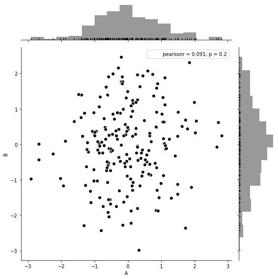
sns.jointplot(x=df['A'], y=df['B'], #设置x和y轴的数据
data=df, #设置数据
color='k',
s=50, edgecolor='w', linewidth=1, #散点大小、边缘线颜色和宽度(只针对scatter)
kind='scatter', #默认类型:“scatter”,其他有“reg”、“resid”、“kde”
space=0.2, #设置散点图和布局图的间距
height=8, #图表的大小(自动调整为正方形)
ratio=5, #散点图与布局图高度比率
stat_func= sci.pearsonr, #pearson相关系数
marginal_kws=dict(bins=15, rug=True)) #边际图的参数
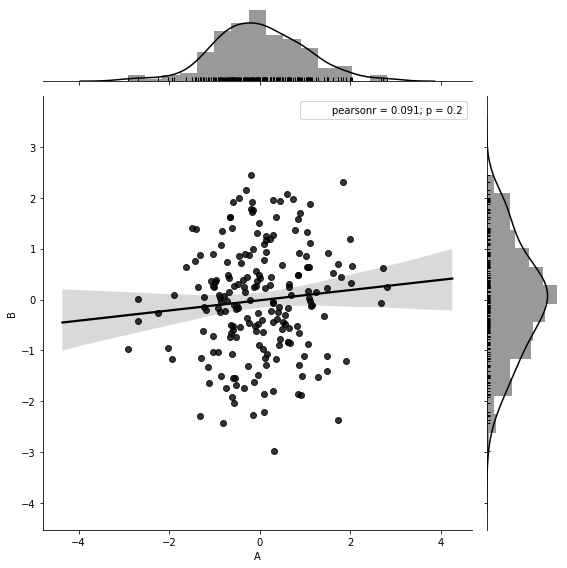
sns.jointplot(x=df['A'], y=df['B'],

              data=df,

              color='k',

              kind='reg',             #reg添加线性回归线

              height=8,

              ratio=5,

              stat_func= sci.pearsonr,

              marginal_kws=dict(bins=15, rug=True))
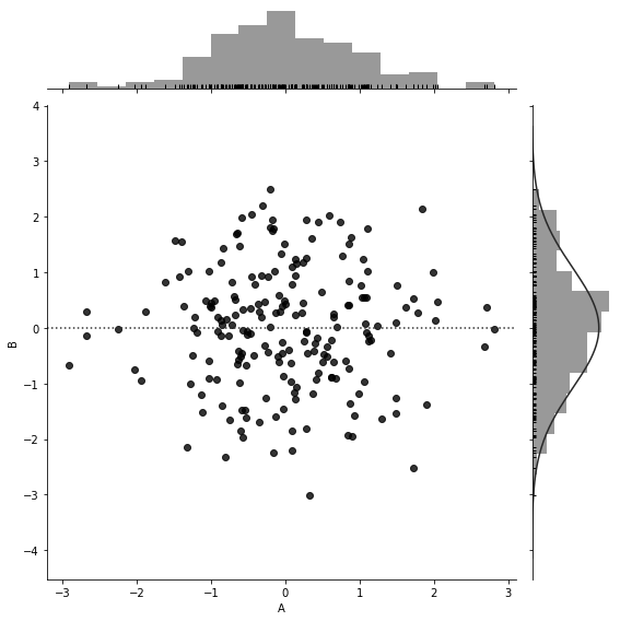
sns.jointplot(x=df['A'], y=df['B'],

              data=df,

              color='k',

              kind='resid',             #resid

              height=8,

              ratio=5,

              marginal_kws=dict(bins=15, rug=True))
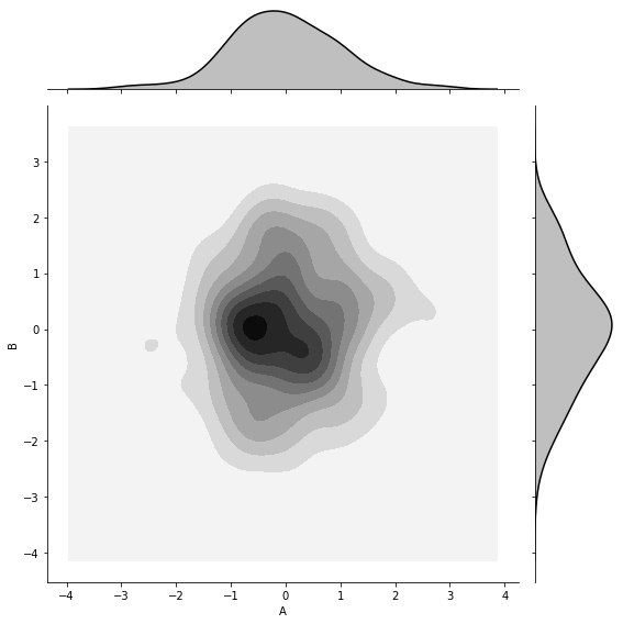
sns.jointplot(x=df['A'], y=df['B'],

              data=df,

              color='k',

              kind='kde',             #kde密度图

              height=8,

              ratio=5)
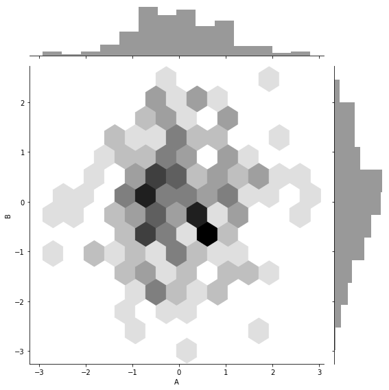
sns.jointplot(x=df['A'], y=df['B'],

              data=df,

              color='k',

              kind='hex',             #hex蜂窝图(六角形)

              height=8,

              ratio=5)
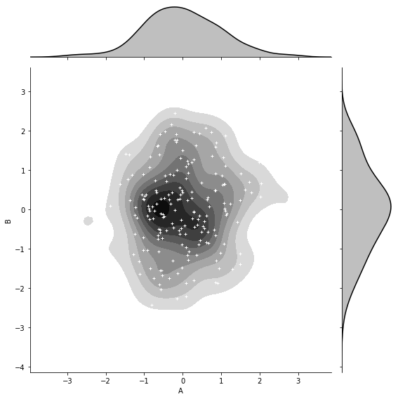
g = sns.jointplot(x=df['A'], y=df['B'],

              data=df,

              color='k',

              kind='kde',             #kde密度图

              height=8,

              ratio=5,

              shade_lowest=False)

#添加散点图(c-->颜色,s-->大小)

g.plot_joint(plt.scatter, c='w', s=10, linewidth=1, marker='+')
JointGrid()
创建图形网格,用于绘制二变量或单变量的图形,作用和Jointplot()一样,不过比Jointplot()更灵活。
sns.JointGrid(

    x,

    y,

    data=None,

    height=6,

    ratio=5,

    space=0.2,

    dropna=True,

    xlim=None,

    ylim=None,

    size=None,

)

Docstring:      Grid for drawing a bivariate plot with marginal univariate plots.

Init docstring:

Set up the grid of subplots.

Parameters

----------

x, y : strings or vectors

    Data or names of variables in ``data``.

data : DataFrame, optional

    DataFrame when ``x`` and ``y`` are variable names.

height : numeric

    Size of each side of the figure in inches (it will be square).

ratio : numeric

    Ratio of joint axes size to marginal axes height.

space : numeric, optional

    Space between the joint and marginal axes

dropna : bool, optional

    If True, remove observations that are missing from `x` and `y`.

{x, y}lim : two-tuples, optional

    Axis limits to set before plotting.

See Also

--------

jointplot : High-level interface for drawing bivariate plots with

            several different default plot kinds.
#设置风格
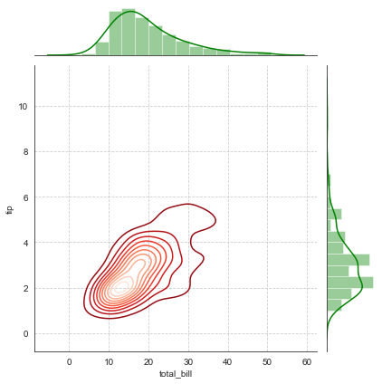
sns.set_style('white')
#导入数据
tip_datas = sns.load_dataset('tips', data_home='seaborn-data')
#绘制绘图网格,包含三部分:一个主绘图区域,两个边际绘图区域
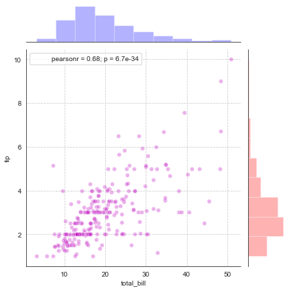
g = sns.JointGrid(x='total_bill', y='tip', data=tip_datas)
#主绘图区域:散点图
g.plot_joint(plt.scatter, color='m', edgecolor='w', alpha=.3)
#边际绘图区域:x和y轴
g.ax_marg_x.hist(tip_datas['total_bill'], color='b', alpha=.3)
g.ax_marg_y.hist(tip_datas['tip'], color='r', alpha=.3,
orientation='horizontal')
#相关系数标签
from scipy import stats
g.annotate(stats.pearsonr)
#绘制表格线
plt.grid(linestyle='--')
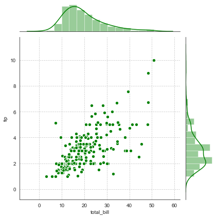
g = sns.JointGrid(x='total_bill', y='tip', data=tip_datas)

g = g.plot_joint(plt.scatter, color='g', s=40, edgecolor='white')

plt.grid(linestyle='--')

#两边边际图用统一函数设置统一风格

g.plot_marginals(sns.distplot, kde=True, color='g')
g = sns.JointGrid(x='total_bill', y='tip', data=tip_datas)

#主绘图设置密度图

g = g.plot_joint(sns.kdeplot, cmap='Reds_r')

plt.grid(linestyle='--')

#两边边际图用统一函数设置统一风格

g.plot_marginals(sns.distplot, kde=True, color='g')
Pairplot()
用于数据集的相关性图形绘制,如:矩阵图,底层是PairGrid()。
sns.pairplot(

    data,

    hue=None,

    hue_order=None,

    palette=None,

    vars=None,

    x_vars=None,

    y_vars=None,

    kind='scatter',

    diag_kind='auto',

    markers=None,

    height=2.5,

    aspect=1,

    dropna=True,

    plot_kws=None,

    diag_kws=None,

    grid_kws=None,

    size=None,

)

Docstring:

Plot pairwise relationships in a dataset.

By default, this function will create a grid of Axes such that each

variable in ``data`` will by shared in the y-axis across a single row and

in the x-axis across a single column. The diagonal Axes are treated

differently, drawing a plot to show the univariate distribution of the data

for the variable in that column.

It is also possible to show a subset of variables or plot different

variables on the rows and columns.

This is a high-level interface for :class:`PairGrid` that is intended to

make it easy to draw a few common styles. You should use :class:`PairGrid`

directly if you need more flexibility.

Parameters

----------

data : DataFrame

    Tidy (long-form) dataframe where each column is a variable and

    each row is an observation.

hue : string (variable name), optional

    Variable in ``data`` to map plot aspects to different colors.

hue_order : list of strings

    Order for the levels of the hue variable in the palette

palette : dict or seaborn color palette

    Set of colors for mapping the ``hue`` variable. If a dict, keys

    should be values  in the ``hue`` variable.

vars : list of variable names, optional

    Variables within ``data`` to use, otherwise use every column with

    a numeric datatype.

{x, y}_vars : lists of variable names, optional

    Variables within ``data`` to use separately for the rows and

    columns of the figure; i.e. to make a non-square plot.

kind : {'scatter', 'reg'}, optional

    Kind of plot for the non-identity relationships.

diag_kind : {'auto', 'hist', 'kde'}, optional

    Kind of plot for the diagonal subplots. The default depends on whether

    ``"hue"`` is used or not.

markers : single matplotlib marker code or list, optional

    Either the marker to use for all datapoints or a list of markers with

    a length the same as the number of levels in the hue variable so that

    differently colored points will also have different scatterplot

    markers.

height : scalar, optional

    Height (in inches) of each facet.

aspect : scalar, optional

    Aspect * height gives the width (in inches) of each facet.

dropna : boolean, optional

    Drop missing values from the data before plotting.

{plot, diag, grid}_kws : dicts, optional

    Dictionaries of keyword arguments.

Returns

-------

grid : PairGrid

    Returns the underlying ``PairGrid`` instance for further tweaking.

See Also

--------

PairGrid : Subplot grid for more flexible plotting of pairwise

           relationships.
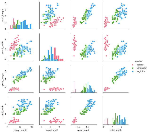
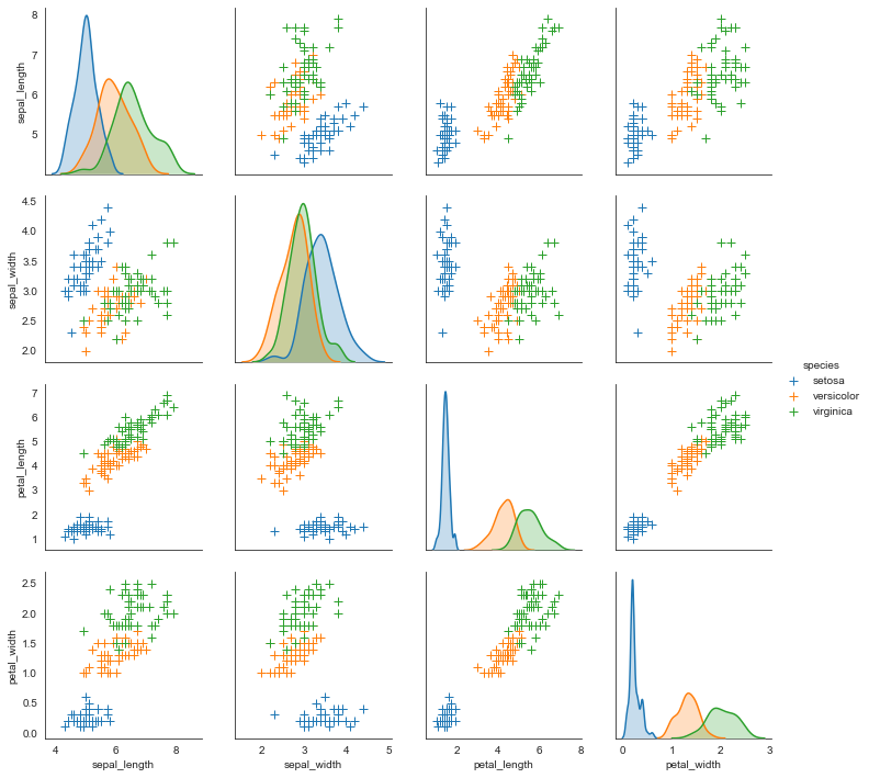
#导入鸢尾花数据

i_datas = sns.load_dataset('iris', data_home='seaborn-data')

i_datas

#矩阵散点图

sns.pairplot(i_datas,

             kind='scatter',                 #图形类型(散点图:scatter, 回归分布图:reg)

             diag_kind='hist',               #对角线的图形类型(直方图:hist, 密度图:kde)

             hue='species',                  #按照某一字段分类

             palette='husl',                 #设置调色板

             markers=['o','s','D'],          #设置点样式

             height=2)                       #设置图标大小
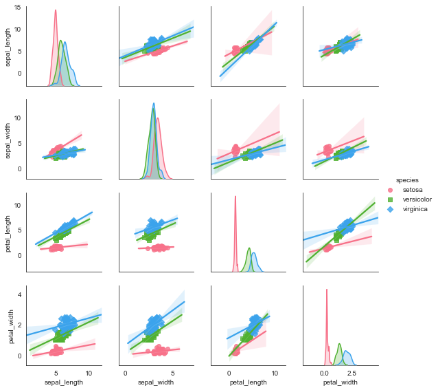
#矩阵回归分析图

sns.pairplot(i_datas,

             kind='reg',                     #图形类型(散点图:scatter, 回归分布图:reg)

             diag_kind='kde',                #对角线的图形类型(直方图:hist, 密度图:kde)

             hue='species',                  #按照某一字段分类

             palette='husl',                 #设置调色板

             markers=['o','s','D'],          #设置点样式

             height=2)                       #设置图标大小
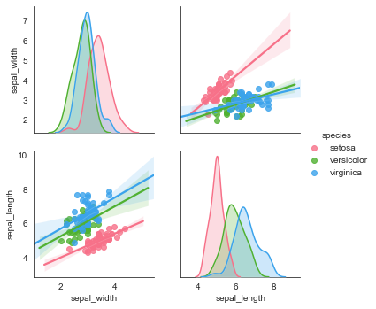
#局部变量选择,vars

g = sns.pairplot(i_datas, vars=['sepal_width', 'sepal_length'],

                 kind='reg', diag_kind='kde',

                 hue='species', palette='husl')
#综合参数设置

sns.pairplot(i_datas, diag_kind='kde', markers='+', hue='species',

             #散点图的参数

             plot_kws=dict(s=50, edgecolor='b', linewidth=1),

             #对角线图的参数

             diag_kws=dict(shade=True))
PairGrid()
用于数据集的相关性图形绘制,如:矩阵图。功能比Pairplot()更加灵活。
sns.PairGrid(

    data,

    hue=None,

    hue_order=None,

    palette=None,

    hue_kws=None,

    vars=None,

    x_vars=None,

    y_vars=None,

    diag_sharey=True,

    height=2.5,

    aspect=1,

    despine=True,

    dropna=True,

    size=None,

)

Docstring:

Subplot grid for plotting pairwise relationships in a dataset.

This class maps each variable in a dataset onto a column and row in a

grid of multiple axes. Different axes-level plotting functions can be

used to draw bivariate plots in the upper and lower triangles, and the

the marginal distribution of each variable can be shown on the diagonal.

It can also represent an additional level of conditionalization with the

``hue`` parameter, which plots different subets of data in different

colors. This uses color to resolve elements on a third dimension, but

only draws subsets on top of each other and will not tailor the ``hue``

parameter for the specific visualization the way that axes-level functions

that accept ``hue`` will.

See the :ref:`tutorial <grid_tutorial>` for more information.

Init docstring:

Initialize the plot figure and PairGrid object.

Parameters

----------

data : DataFrame

    Tidy (long-form) dataframe where each column is a variable and

    each row is an observation.

hue : string (variable name), optional

    Variable in ``data`` to map plot aspects to different colors.

hue_order : list of strings

    Order for the levels of the hue variable in the palette

palette : dict or seaborn color palette

    Set of colors for mapping the ``hue`` variable. If a dict, keys

    should be values  in the ``hue`` variable.

hue_kws : dictionary of param -> list of values mapping

    Other keyword arguments to insert into the plotting call to let

    other plot attributes vary across levels of the hue variable (e.g.

    the markers in a scatterplot).

vars : list of variable names, optional

    Variables within ``data`` to use, otherwise use every column with

    a numeric datatype.

{x, y}_vars : lists of variable names, optional

    Variables within ``data`` to use separately for the rows and

    columns of the figure; i.e. to make a non-square plot.

height : scalar, optional

    Height (in inches) of each facet.

aspect : scalar, optional

    Aspect * height gives the width (in inches) of each facet.

despine : boolean, optional

    Remove the top and right spines from the plots.

dropna : boolean, optional

    Drop missing values from the data before plotting.

See Also

--------

pairplot : Easily drawing common uses of :class:`PairGrid`.

FacetGrid : Subplot grid for plotting conditional relationships.
#绘制四个参数vars的绘图网格(subplots)

g = sns.PairGrid(i_datas, hue='species', palette='hls',

                 vars=['sepal_length', 'sepal_width', 'petal_length', 'petal_width'])

#对角线图形绘制

g.map_diag(plt.hist,

           histtype='step',             #可选:'bar'\ 'barstacked'\'step'\'stepfilled'

           linewidth=1)

#非对角线图形绘制

g.map_offdiag(plt.scatter, s=40, linewidth=1)

#添加图例

g.add_legend()

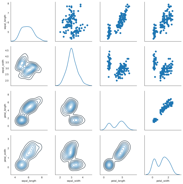
g = sns.PairGrid(i_datas)

#主对角线图形

g.map_diag(sns.kdeplot)

#上三角图形

g.map_upper(plt.scatter)

#下三角图形

g.map_lower(sns.kdeplot, cmap='Blues_d')
Seaborn分布数据可视化---散点分布图的更多相关文章
- seaborn分布数据可视化:直方图|密度图|散点图
系统自带的数据表格(存放在github上https://github.com/mwaskom/seaborn-data),使用时通过sns.load_dataset('表名称')即可,结果为一个Dat ...
- Python图表数据可视化Seaborn:1. 风格| 分布数据可视化-直方图| 密度图| 散点图
conda install seaborn 是安装到jupyter那个环境的 1. 整体风格设置 对图表整体颜色.比例等进行风格设置,包括颜色色板等调用系统风格进行数据可视化 set() / se ...
- Python图表数据可视化Seaborn:2. 分类数据可视化-分类散点图|分布图(箱型图|小提琴图|LV图表)|统计图(柱状图|折线图)
1. 分类数据可视化 - 分类散点图 stripplot( ) / swarmplot( ) sns.stripplot(x="day",y="total_bill&qu ...
- seaborn线性关系数据可视化:时间线图|热图|结构化图表可视化
一.线性关系数据可视化lmplot( ) 表示对所统计的数据做散点图,并拟合一个一元线性回归关系. lmplot(x, y, data, hue=None, col=None, row=None, p ...
- seaborn分类数据可视化
转载:https://cloud.tencent.com/developer/article/1178368 seaborn针对分类型的数据有专门的可视化函数,这些函数可大致分为三种: 分类数据散点图 ...
- seaborn分类数据可视化:散点图|箱型图|小提琴图|lv图|柱状图|折线图
一.散点图stripplot( ) 与swarmplot() 1.分类散点图stripplot( ) 用法stripplot(x=None, y=None, hue=None, data=None, ...
- 用seaborn对数据可视化
以下用sns作为seaborn的别名 1.seaborn整体布局设置 sns.set_syle()函数设置图的风格,传入的参数可以是"darkgrid", "whiteg ...
- Python Seaborn综合指南,成为数据可视化专家
概述 Seaborn是Python流行的数据可视化库 Seaborn结合了美学和技术,这是数据科学项目中的两个关键要素 了解其Seaborn作原理以及使用它生成的不同的图表 介绍 一个精心设计的可视化 ...
- Seaborn数据可视化入门
在本节学习中,我们使用Seaborn作为数据可视化的入门工具 Seaborn的官方网址如下:http://seaborn.pydata.org 一:definition Seaborn is a Py ...
- seaborn教程4——分类数据可视化
https://segmentfault.com/a/1190000015310299 Seaborn学习大纲 seaborn的学习内容主要包含以下几个部分: 风格管理 绘图风格设置 颜色风格设置 绘 ...
随机推荐
- 【Azure App Service】Web Job 报错 UNC paths are not supported. Defaulting to Windows directory.
问题描述 PHP的Web Job,通过artisan来配置路径启动PHP任务,相关启动脚本如下: artisan_path = "d:\\home\\site\\wwwroot"; ...
- 【Azure 微服务】新创建的Service Fabric集群,如何从本地机器上连接到Service Fabric Explorer(Service Fabric状态/错误查看工具)呢?
问题描述 当在Azure中成功创建一个Service Fabric Cluster 服务后,我们能够在它的Overview页面中发现 Service Fabric Explorer的终结点,但是打开后 ...
- 图数据库 NebulaGraph 的 Java 数据解析实践与指导
如何快速.即时.符合直觉地去处理 Nebula Java Client 中的数据解析?读这一篇就够了. 图数据库 NebulaGrpah 的论坛和微信群里,有不少用户问及了 Java 客户端数据解析的 ...
- [java] Tomcat 启动失败 Error: error while reading constant pool for .class: unexpected tag at #
表现 公司服务器今天启动tomcat失败, 看catalina.out文件里面报错 java.lang.ClassFormatError: Unknown constant tag 101 in cl ...
- Java 包装类的使用 + 小练习
1 package com.bytezreo.ut; 2 3 import org.junit.Test; 4 5 /** 6 * 7 * @Description 包装类的使用 8 * @autho ...
- Java 多态性的使用
1 package com.bytezreo.duotai3; 2 3 /*** 4 * 5 * @Description 练习多态性的使用 6 * @author Bytezero·zhenglei ...
- Java 自定义数组的工具类
1 /** 2 * 3 * @Description 自定义数组的工具类 4 * @author Bytezero·zhenglei! Email:420498246@qq.com 5 * @vers ...
- linux FTP服务搭建,匿名用户访问创建上传文件
1.安装vsftpd 首先确认本地是否安装vftpd rpm -qa|grep vftpd 安装vsftpd yum install vsftpd 为什么呢??因为写权限问题 root 用户. 这 ...
- Redis之数据持久化小结
一.概述 Redis作为内存型的数据库,虽然很快,依然有着很大的隐患,一旦服务器宕机重启,内存中数据还会存在吗? 很容易想到的一个方案是从后台数据恢复这些数据,如果数据量很小,这倒是一个可行的方案.但 ...
- 突破英语听说要塞-连读与变音 MP3 免费下载
学英语 连读 弱读,就是这本书最不错了. 网上这个音频 有下载,但是不好找,特此分享,拿走不谢. https://115.com/s/swns19o3359?password=df62&# 突 ...