前端案例分享(一):CSS+JS实现流星雨动画
引言
平常会做一些有意思的小案例练手,通常都会发到codepen上,但是codepen不能写分析。
所以就在博客上开个案例分享系列,对demo做个剖析。目的以分享为主,然后也希望各路大神能给出改进的想法,在review中提升技术,发现乐趣~
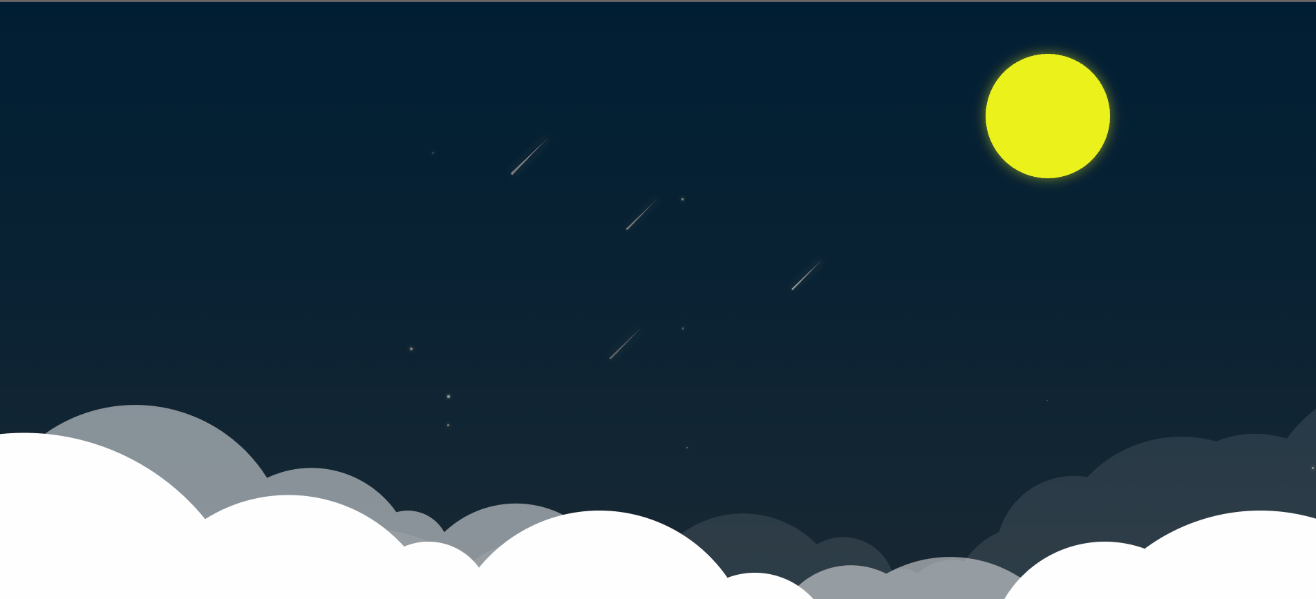
1、效果图
完整效果,请移步 codepen-流星雨案例
纯CSS案例及本篇案例完整源码,请移步The night of the metero
2、源码
- HTML
<body><div class="container"><div id="mask"></div><div id="sky"></div><div id="moon"></div><div id="stars"></div><div class="cloud cloud-1"></div><div class="cloud cloud-2"></div><div class="cloud cloud-3"></div></div></body>
- CSS
/* ------------reset------------ */* {margin: 0;padding: 0;}html,body {width: 100%;min-width: 1000px;height: 100%;min-height: 400px;overflow: hidden;}/* ------------画布 ------------ */.container {position: relative;height: 100%;}/* 遮罩层 */#mask {position: absolute;width: 100%;height: 100%;background: rgba(0, 0, 0, .8);z-index: 900;}/* 天空背景 */#sky {width: 100%;height: 100%;background: linear-gradient(rgba(0, 150, 255, 1), rgba(0, 150, 255, .8), rgba(0, 150, 255, .5));}/* 月亮 */#moon {position: absolute;top: 50px;right: 200px;width: 120px;height: 120px;background: rgba(251, 255, 25, 0.938);border-radius: 50%;box-shadow: 0 0 20px rgba(251, 255, 25, 0.5);z-index: 9999;}/* 闪烁星星 */.blink {position: absolute;background: rgb(255, 255, 255);border-radius: 50%;box-shadow: 0 0 5px rgb(255, 255, 255);opacity: 0;z-index: 10000;}/* 流星 */.star {position: absolute;opacity: 0;z-index: 10000;}.star::after {content: "";display: block;border: solid;border-width: 2px 0 2px 80px;/*流星随长度逐渐缩小*/border-color: transparent transparent transparent rgba(255, 255, 255, 1);border-radius: 2px 0 0 2px;transform: rotate(-45deg);transform-origin: 0 0 0;box-shadow: 0 0 20px rgba(255, 255, 255, .3);}/* 云 */.cloud {position: absolute;width: 100%;height: 100px;}.cloud-1 {bottom: -100px;z-index: 1000;opacity: 1;transform: scale(1.5);-webkit-transform: scale(1.5);-moz-transform: scale(1.5);-ms-transform: scale(1.5);-o-transform: scale(1.5);}.cloud-2 {left: -100px;bottom: -50px;z-index: 999;opacity: .5;transform: rotate(7deg);-webkit-transform: rotate(7deg);-moz-transform: rotate(7deg);-ms-transform: rotate(7deg);-o-transform: rotate(7deg);}.cloud-3 {left: 120px;bottom: -50px;z-index: 999;opacity: .1;transform: rotate(-10deg);-webkit-transform: rotate(-10deg);-moz-transform: rotate(-10deg);-ms-transform: rotate(-10deg);-o-transform: rotate(-10deg);}.circle {position: absolute;border-radius: 50%;background: #fff;}.circle-1 {width: 100px;height: 100px;top: -50px;left: 10px;}.circle-2 {width: 150px;height: 150px;top: -50px;left: 30px;}.circle-3 {width: 300px;height: 300px;top: -100px;left: 80px;}.circle-4 {width: 200px;height: 200px;top: -60px;left: 300px;}.circle-5 {width: 80px;height: 80px;top: -30px;left: 450px;}.circle-6 {width: 200px;height: 200px;top: -50px;left: 500px;}.circle-7 {width: 100px;height: 100px;top: -10px;left: 650px;}.circle-8 {width: 50px;height: 50px;top: 30px;left: 730px;}.circle-9 {width: 100px;height: 100px;top: 30px;left: 750px;}.circle-10 {width: 150px;height: 150px;top: 10px;left: 800px;}.circle-11 {width: 150px;height: 150px;top: -30px;left: 850px;}.circle-12 {width: 250px;height: 250px;top: -50px;left: 900px;}.circle-13 {width: 200px;height: 200px;top: -40px;left: 1000px;}.circle-14 {width: 300px;height: 300px;top: -70px;left: 1100px;}
- JS
//流星动画setInterval(function() {const obj = addChild("#sky", "div", 2, "star");for (let i = 0; i < obj.children.length; i++) {const top = -50 + Math.random() * 200 + "px",left = 200 + Math.random() * 1200 + "px",scale = 0.3 + Math.random() * 0.5;const timer = 1000 + Math.random() * 1000;obj.children[i].style.top = top;obj.children[i].style.left = left;obj.children[i].style.transform = `scale(${scale})`;requestAnimation({ele: obj.children[i],attr: ["top", "left", "opacity"],value: [150, -150, .8],time: timer,flag: false,fn: function() {requestAnimation({ele: obj.children[i],attr: ["top", "left", "opacity"],value: [150, -150, 0],time: timer,flag: false,fn: () => {obj.parent.removeChild(obj.children[i]);}})}});}}, 1000);//闪烁星星动画setInterval(function() {const obj = addChild("#stars", "div", 2, "blink");for (let i = 0; i < obj.children.length; i++) {const top = -50 + Math.random() * 500 + "px",left = 200 + Math.random() * 1200 + "px",round = 1 + Math.random() * 2 + "px";const timer = 1000 + Math.random() * 4000;obj.children[i].style.top = top;obj.children[i].style.left = left;obj.children[i].style.width = round;obj.children[i].style.height = round;requestAnimation({ele: obj.children[i],attr: "opacity",value: .5,time: timer,flag: false,fn: function() {requestAnimation({ele: obj.children[i],attr: "opacity",value: 0,time: timer,flag: false,fn: function() {obj.parent.removeChild(obj.children[i]);}});}});}}, 1000);//月亮移动requestAnimation({ele: "#moon",attr: "right",value: 1200,time: 10000000,});// 添加云const clouds = addChild(".cloud", "div", 14, "circle", true);for (let i = 0; i < clouds.children.length; i++) {for (let j = 0; j < clouds.children[i].length;) {clouds.children[i][j].classList.add(`circle-${++j}`);}}//云动画let flag = 1;setInterval(function() {const clouds = document.querySelectorAll(".cloud");const left = Math.random() * 5;bottom = Math.random() * 5;let timer = 0;for (let i = 0; i < clouds.length; i++) {requestAnimation({ele: clouds[i],attr: ["left", "bottom"],value: flag % 2 ? [-left, -bottom] : [left, bottom],time: timer += 500,flag: false,fn: function() {requestAnimation({ele: clouds[i],attr: ["left", "bottom"],value: flag % 2 ? [left, bottom] : [-left, -bottom],time: timer,flag: false})}});}flag++;}, 2000)
- 封装方法
//———————————————————————————————————————————动画———————————————————————————————————————————————————//运动动画,调用Tween.js//ele: dom | class | id | tag 节点 | 类名 | id名 | 标签名,只支持选择一个节点,class类名以及标签名只能选择页面中第一个//attr: attribute 属性名//value: target value 目标值//time: duration 持续时间//tween: timing function 函数方程//flag: Boolean 判断是按值移动还是按位置移动,默认按位置移动//fn: callback 回调函数//增加返回值: 将内部参数对象返回,可以通过设置返回对象的属性stop为true打断动画function requestAnimation(obj) {//—————————————————————————————————————参数设置—————————————————————————————————————————————//默认属性const parameter = {ele: null,attr: null,value: null,time: 1000,tween: "linear",flag: true,stop: false,fn: ""}//合并传入属性Object.assign(parameter, obj); //覆盖重名属性//—————————————————————————————————————动画设置—————————————————————————————————————————————//创建运动方程初始参数,方便复用let start = 0; //用于保存初始时间戳let target = (typeof parameter.ele === "string" ? document.querySelector(parameter.ele) : parameter.ele), //目标节点attr = parameter.attr, //目标属性beginAttr = parseFloat(getComputedStyle(target)[attr]), //attr起始值value = parameter.value, //运动目标值count = value - beginAttr, //实际运动值time = parameter.time, //运动持续时间,tween = parameter.tween, //运动函数flag = parameter.flag,callback = parameter.fn, //回调函数curVal = 0; //运动当前值//判断传入函数是否为数组,多段运动(function() {if (attr instanceof Array) {beginAttr = [];count = [];for (let i of attr) {const val = parseFloat(getComputedStyle(target)[i]);beginAttr.push(val);count.push(value - val);}}if (value instanceof Array) {for (let i in value) {count[i] = value[i] - beginAttr[i];}}})();//运动函数function animate(timestamp) {if (parameter.stop) return; //打断//存储初始时间戳if (!start) start = timestamp;//已运动时间let t = timestamp - start;//判断多段运动if (beginAttr instanceof Array) {// const len = beginAttr.length //存数组长度,复用//多段运动第1类——多属性,同目标,同时间/不同时间if (typeof count === "number") { //同目标//同时间if (typeof time === "number") {if (t > time) t = time; //判断是否超出目标值//循环attr,分别赋值for (let i in beginAttr) {if (flag) curVal = Tween[tween](t, beginAttr[i], count, time); //调用Tween,返回当前属性值,此时计算方法为移动到写入位置else curVal = Tween[tween](t, beginAttr[i], count + beginAttr[i], time); //调用Tween,返回当前属性值,此时计算方法为移动了写入距离if (attr[i] === "opacity") target.style[attr[i]] = curVal; //给属性赋值else target.style[attr[i]] = curVal + "px"; //给属性赋值if (t < time) requestAnimationFrame(animate); //判断是否运动完else callback && callback(); //调用回调函数}return;}//不同时间if (time instanceof Array) {//循环time,attr,分别赋值for (let i in beginAttr) {//错误判断if (!time[i] && time[i] !== 0) {throw new Error("The input time's length is not equal to attribute's length");}//判断是否已经完成动画,完成则跳过此次循环if (parseFloat(getComputedStyle(target)[attr[i]]) === (typeof value === "number" ? value : value[i]))continue;// t = timestamp - start; //每次循环初始化tif (t > time[i]) t = time[i]; //判断是否超出目标值if (flag || attr[i] === "opacity") curVal = Tween[tween](t, beginAttr[i], count, i); //调用Tween,返回当前属性值,此时计算方法为移动到写入位置else curVal = Tween[tween](t, beginAttr[i], count + beginAttr[i], i); //调用Tween,返回当前属性值,此时计算方法为移动了写入距离if (attr[i] === "opacity") target.style[attr[i]] = curVal; //给属性赋值else target.style[attr[i]] = curVal + "px"; //给属性赋值}if (t < Math.max(...time)) requestAnimationFrame(animate); //判断函数是否运动完else callback && callback(); //如果已经执行完时间最长的动画,则调用回调函数return;}}//多段运动第2类——多属性,不同目标,同时间/不同时间if (count instanceof Array) {//同时间if (typeof time === "number") {if (t > time) t = time; //判断是否超出目标值for (let i in beginAttr) { //循环attr,count,分别赋值//错误判断if (!count[i] && count[i] !== 0) {throw new Error("The input value's length is not equal to attribute's length");}if (flag || attr[i] === "opacity") curVal = Tween[tween](t, beginAttr[i], count[i], time); //调用Tween,返回当前属性值,此时计算方法为移动到写入位置else curVal = Tween[tween](t, beginAttr[i], count[i] + beginAttr[i], time); //调用Tween,返回当前属性值,此时计算方法为移动了写入距离if (attr[i] === "opacity") target.style[attr[i]] = curVal; //给属性赋值else target.style[attr[i]] = curVal + "px"; //给属性赋值}if (t < time) requestAnimationFrame(animate); //判断函数是否运动完else callback && callback(); //如果已经执行完时间最长的动画,则调用回调函数return;}//不同时间if (time instanceof Array) {for (let i in beginAttr) {//错误判断if (!time[i] && time[i] !== 0) {throw new Error("The input time's length is not equal to attribute's length");}//判断是否已经完成动画,完成则跳过此次循环if (parseFloat(getComputedStyle(target)[attr[i]]) === (typeof value === "number" ? value : value[i]))continue;if (t > time[i]) t = time[i]; //判断是否超出目标值//错误判断if (!count[i] && count[i] !== 0) {throw new Error("The input value's length is not equal to attribute's length");}if (flag || attr[i] === "opacity") curVal = Tween[tween](t, beginAttr[i], count[i], time[i]); //调用Tween,返回当前属性值,此时计算方法为移动到写入位置else curVal = Tween[tween](t, beginAttr[i], count[i] + beginAttr[i], time[i]); //调用Tween,返回当前属性值,此时计算方法为移动了写入距离if (attr[i] === "opacity") target.style[attr[i]] = curVal;else target.style[attr[i]] = curVal + "px";}if (t < Math.max(...time)) requestAnimationFrame(animate);else callback && callback();return;}}}//单运动模式if (t > time) t = time;if (flag || attr === "opacity") curVal = Tween[tween](t, beginAttr, count, time); //调用Tween,返回当前属性值,此时计算方法为移动到写入位置else curVal = Tween[tween](t, beginAttr[i], count + beginAttr, time); //调用Tween,返回当前属性值,此时计算方法为移动了写入距离if (attr === "opacity") target.style[attr] = curVal;else target.style[attr] = curVal + "px";if (t < time) requestAnimationFrame(animate);else callback && callback();}requestAnimationFrame(animate);return parameter; //返回对象,供打断或其他用途}//Tween.js/** t : time 已过时间* b : begin 起始值* c : count 总的运动值* d : duration 持续时间** 曲线方程** http://www.cnblogs.com/bluedream2009/archive/2010/06/19/1760909.html* */let Tween = {linear: function(t, b, c, d) { //匀速return c * t / d + b;},easeIn: function(t, b, c, d) { //加速曲线return c * (t /= d) * t + b;},easeOut: function(t, b, c, d) { //减速曲线return -c * (t /= d) * (t - 2) + b;},easeBoth: function(t, b, c, d) { //加速减速曲线if ((t /= d / 2) < 1) {return c / 2 * t * t + b;}return -c / 2 * ((--t) * (t - 2) - 1) + b;},easeInStrong: function(t, b, c, d) { //加加速曲线return c * (t /= d) * t * t * t + b;},easeOutStrong: function(t, b, c, d) { //减减速曲线return -c * ((t = t / d - 1) * t * t * t - 1) + b;},easeBothStrong: function(t, b, c, d) { //加加速减减速曲线if ((t /= d / 2) < 1) {return c / 2 * t * t * t * t + b;}return -c / 2 * ((t -= 2) * t * t * t - 2) + b;},elasticIn: function(t, b, c, d, a, p) { //正弦衰减曲线(弹动渐入)if (t === 0) {return b;}if ((t /= d) == 1) {return b + c;}if (!p) {p = d * 0.3;}if (!a || a < Math.abs(c)) {a = c;var s = p / 4;} else {var s = p / (2 * Math.PI) * Math.asin(c / a);}return -(a * Math.pow(2, 10 * (t -= 1)) * Math.sin((t * d - s) * (2 * Math.PI) / p)) + b;},elasticOut: function(t, b, c, d, a, p) { //正弦增强曲线(弹动渐出)if (t === 0) {return b;}if ((t /= d) == 1) {return b + c;}if (!p) {p = d * 0.3;}if (!a || a < Math.abs(c)) {a = c;var s = p / 4;} else {var s = p / (2 * Math.PI) * Math.asin(c / a);}return a * Math.pow(2, -10 * t) * Math.sin((t * d - s) * (2 * Math.PI) / p) + c + b;},elasticBoth: function(t, b, c, d, a, p) {if (t === 0) {return b;}if ((t /= d / 2) == 2) {return b + c;}if (!p) {p = d * (0.3 * 1.5);}if (!a || a < Math.abs(c)) {a = c;var s = p / 4;} else {var s = p / (2 * Math.PI) * Math.asin(c / a);}if (t < 1) {return -0.5 * (a * Math.pow(2, 10 * (t -= 1)) *Math.sin((t * d - s) * (2 * Math.PI) / p)) + b;}return a * Math.pow(2, -10 * (t -= 1)) *Math.sin((t * d - s) * (2 * Math.PI) / p) * 0.5 + c + b;},backIn: function(t, b, c, d, s) { //回退加速(回退渐入)if (typeof s == 'undefined') {s = 1.70158;}return c * (t /= d) * t * ((s + 1) * t - s) + b;},backOut: function(t, b, c, d, s) {if (typeof s == 'undefined') {s = 3.70158; //回缩的距离}return c * ((t = t / d - 1) * t * ((s + 1) * t + s) + 1) + b;},backBoth: function(t, b, c, d, s) {if (typeof s == 'undefined') {s = 1.70158;}if ((t /= d / 2) < 1) {return c / 2 * (t * t * (((s *= (1.525)) + 1) * t - s)) + b;}return c / 2 * ((t -= 2) * t * (((s *= (1.525)) + 1) * t + s) + 2) + b;},bounceIn: function(t, b, c, d) { //弹球减振(弹球渐出)return c - Tween['bounceOut'](d - t, 0, c, d) + b;},bounceOut: function(t, b, c, d) {if ((t /= d) < (1 / 2.75)) {return c * (7.5625 * t * t) + b;} else if (t < (2 / 2.75)) {return c * (7.5625 * (t -= (1.5 / 2.75)) * t + 0.75) + b;} else if (t < (2.5 / 2.75)) {return c * (7.5625 * (t -= (2.25 / 2.75)) * t + 0.9375) + b;}return c * (7.5625 * (t -= (2.625 / 2.75)) * t + 0.984375) + b;},bounceBoth: function(t, b, c, d) {if (t < d / 2) {return Tween['bounceIn'](t * 2, 0, c, d) * 0.5 + b;}return Tween['bounceOut'](t * 2 - d, 0, c, d) * 0.5 + c * 0.5 + b;}}//———————————————————————————————————————————DOM操作———————————————————————————————————————————————————// 添加节点// ele: 父节点,支持输入变量,id值,class值,标签值。除变量外,其余值必须为字符串// node: 添加的标签名,值为字符串// n: 节点添加个数// className: 节点绑定的class名,,值为字符串,多个class名用空格隔开// boolean: 是否选中所有目标父节点。可选参数,不输入则判定为false,则只匹配选中的第一个节点function addChild(ele, node, n, className, boolean) {//获取节点let parent = null;if (typeof ele !== "string") parent = ele;else if (ele[0] === "#") parent = document.getElementById(ele.slice(1));else if (ele[0] === ".") {if (boolean === false) parent = document.getElementsByClassName(ele.slice(1))[0];else parent = document.getElementsByClassName(ele.slice(1));} else {if (boolean === false) parent = docuemnt.getElementsByTagName(ele)[0];else parent = document.getElementsByTagNameNS(ele);}//声明用于存储父节点及子节点的对象const obj = {"parent": parent,"children": []};//添加节点if (boolean) {for (let i = 0; i < parent.length; i++) {//创建容器碎片const fragment = document.createDocumentFragment();//保存子节点,用于返回值obj.children[i] = [];for (let j = 0; j < n; j++) {const target = document.createElement(node);target.className = className;fragment.appendChild(target);//添加子节点到数组,用于返回值obj.children[i][j] = target;}parent[i].appendChild(fragment)}} else {//创建碎片容器const fragment = document.createDocumentFragment();for (let i = 0; i < n; i++) {const target = document.createElement(node);target.className = className;fragment.appendChild(target);//添加子节点,用于返回值obj.children[i] = target;}//将碎片容器一次性添加到父节点parent.appendChild(fragment);}//返回参数,供动画函数调用return obj;}
3、案例解析
- HTML
由于节点很多,并且我想尽量做得逼真有趣一点,就给节点加了随机位置。所以节点的输出都是用JS控制的,HTML这边只写了几个父元素盒子,加上相应的id名和class类名,结构相对简单。
- CSS
CSS部分的难点就是流星的样式和用圈圈画云层,然后将云层堆叠出立体效果。
首先说一下流星的样式:
#sky .star {position: absolute;opacity: 0;z-index: 10000;}.star::after {content: "";display: block;border: solid;border-width: 2px 0 2px 80px;/*流星随长度逐渐缩小*/border-color: transparent transparent transparent rgba(255, 255, 255, 1);border-radius: 2px 0 0 2px;transform: rotate(-45deg);transform-origin: 0 0 0;box-shadow: 0 0 20px rgba(255, 255, 255, .3);}
先提取了公共样式,添加定位属性;
然后在star后通过after伪类添加流星,用border特性画:
1)模型绘制: border-width的顺序为四边top、right、bottom、left,同理border-color的顺序也为四边top、right、bottom、left。这样将border-width与border-color一一对应后,就能看出2px是流星的宽度,80px是流星的长度,而0px就是流星的尾巴。这样就形成了一个头部2px宽,尾部0px,长度80px的流星模型;
2)稍微逼真: 通过border-radius给流星的头部增加个圆角,让它看起来emmmmmmm更逼真?最后通过roteta旋转一个角度,让它看起来像是往下掉;
3)增加闪光: 通过box-shadow 给流星增加一点光晕,让它看起来有闪光的效果;
通过以上3步,一个流星就画好了。
然后是画云:
因为云的代码比较长,这里就不贴出来了。方法无非是通过一个一个的圆,相互叠加覆盖,完成一个云朵的形状;完成一个云层之后,copy一个,然后多个云层通过rotate、opacity、left定位等,做出一个渐隐叠加的立体效果;
- JS
JS部分以流星举例说明
setInterval(function() {const obj = addChild("#sky", "div", 2, "star"); //插入流星for (let i = 0; i < obj.children.length; i++) {//随机位置const top = -50 + Math.random() * 200 + "px",left = 200 + Math.random() * 1200 + "px",scale = 0.3 + Math.random() * 0.5;const timer = 1000 + Math.random() * 1000;obj.children[i].style.top = top;obj.children[i].style.left = left;obj.children[i].style.transform = `scale(${scale})`;//添加动画requestAnimation({ele: obj.children[i],attr: ["top", "left", "opacity"],value: [150, -150, .8],time: timer,flag: false,fn: function() {requestAnimation({ele: obj.children[i],attr: ["top", "left", "opacity"],value: [150, -150, 0],time: timer,flag: false,fn: () => {obj.parent.removeChild(obj.children[i]); //动画结束删除节点}})}});}}, 1000);
这里边用到了我自己封装的两个方法,一个是基于requestAnimationFrame的requestAnimation,以及基于appendChild的addChild。
为了达成星星位置随机的效果,通过定时器setInterval不停的插入与删除流星:
首先,每次添加2个流星到页面,但是定时器的间隔时间小于流星的动画时间,这样就能保证页面中的流星的数量不是一个固定值,但肯定是大于2的。不然一次2个流星略显冷清;
然后,通过for循环(也可以用for-in,for-of,都行。for-of最简单)给每个新添加到页面中的流星一个随机的位置(top、left)、随机的大小(scale)、随机的动画执行时间(timer);
最后,在for循环中,给每个新添加到页面中的流星加上动画,并通过回调函数在执行完动画后删除节点。这里要注意的是,动画要分成两个阶段(出现与消失,主要是opacity控制)。另外我这里的处理,每个流星都移动相同的距离300px,这个距离我觉得也可以通过随机数控制,但我犯了个懒,就没有做。
4、小问题
目前我发现的问题有2个:
一是DOM操作本身的问题。页面不停的添加与删除节点,造成不停地回流与重绘,很耗性能;
二是requestAnimationFrame本身的问题。因为定时器不断在添加节点,而requestAnimationFrame的特性——当离开当前页面去浏览其他页面时,动画会暂停。这就造成了一个问题,节点一直在加,但动画全停在那没有执行。那么下次再回到这个页面的时候,就boom!!!动画就炸了,你会看到画面一卡,很多小蝌蚪集体出动去找妈妈;
5、结语
这个小案例虽然从难度上来看很简单,但是它可拓展性很高——比如表个白啊、寄个相思、耍个浪漫啊等等(手动狗头doge),而且用纯CSS也可以实现(我也写了一版纯CSS的,因为不能随机位置随机大小,所以看起来比较静态一点,就不贴了)。所以对于了解CSS动画与JS动画,是个很不错的练手小案例。
感谢看完这篇文章的可爱的人儿,希望你能从中获得灵感如果能给你带来帮助,那我是极高兴地如果你把灵感告诉我,那我就can't happniess anymore了~
最后,再次感谢,如果有优化写法,欢迎指导~
前端案例分享(一):CSS+JS实现流星雨动画的更多相关文章
- CSS+JS实现流星雨动画
引言 平常会做一些有意思的小案例练手,通常都会发到codepen上,但是codepen不能写分析. 所以就在博客上开个案例分享系列,对demo做个剖析.目的以分享为主,然后也希望各路大神 ...
- WEB前端性能优化:HTML,CSS,JS和服务器端优化
对前端开发工程师来说,前端性能优化的重要性是不言而喻的,最为大家所知的是YSLOW的23条优化规则,在我的理解中,性能优化不纯粹是指用户访问网站的速度,也包括开发的效率,这里我总结下我理解中的WEB前 ...
- Mikit前端框架,轻量级CSS&JS前端框架
Mikit CSS Framework Mikit介绍 Mikit是前端开发人员和前端设计师所喜爱的Web框架.Mikit的创建和设计旨在为前端社区提供最灵活而强大的CSS框架. 与许多其他网络框架不 ...
- 前端常用场景总结CSS/JS/插件(实用篇更新中...)
<div class="box box1"> <span>垂直居中</span> </div> .box1{ display: ta ...
- H5案例分享:使用JS判断客户端、浏览器、操作系统类型
使用JS判断客户端.浏览器.操作系统类型 一.JS判断客户端类型 JS判断客户端是否是iOS或者Android手机移动端 通过判断浏览器的userAgent,用正则来判断手机是否是ios和Androi ...
- 【HTML响应式项目】成人教育官网前端页面(HTML+CSS+JS实现三端适应)
这个页面是在校参赛的小组项目,除首页和所有课程页面以外由组内成员编写,发博客纯属记录. 项目源码已上传至码云仓库:https://gitee.com/ynavc/sss 项目演示地址:http://y ...
- 2. web前端开发分享-css,js进阶篇
一,css进阶篇: 等css哪些事儿看了两三遍之后,需要对看过的知识综合应用,这时候需要大量的实践经验, 简单的想法:把qq首页全屏另存为jpg然后通过ps工具切图结合css转换成html,有无从下手 ...
- 1. web前端开发分享-css,js入门篇
关注前端这么多年,没有大的成就,就入门期间积累了不少技巧与心得,跟大家分享一下,不一定都适合每个人,毕竟人与人的教育背景与成长环境心理活动都有差别,但就别人的心得再结合自己的特点,然后探索适合自己的学 ...
- web前端开发分享-css,js入门篇(转)
转自:http://www.cnblogs.com/jikey/p/3600308.html 关注前端这么多年,没有大的成就,就入门期间积累了不少技巧与心得,跟大家分享一下,不一定都适合每个人,毕竟人 ...
随机推荐
- In-band Network Function Telemetry
文章名称:In-band Network Function Telemetry 发表时间:2018 期刊来源:SIGCOMM I Introduction (介绍) NFV运行在商品服务器上,在网络功 ...
- beat冲刺(4/7)
目录 摘要 团队部分 个人部分 摘要 队名:小白吃 组长博客:hjj 作业博客:beta冲刺(4/7) 团队部分 后敬甲(组长) 过去两天完成了哪些任务 整理博客 ppt模板 接下来的计划 做好机动. ...
- java对文件的操作
1.按字节读取文件内容2.按字符读取文件内容3.按行读取文件内容 4.随机读取文件内容 public class ReadFromFile { /** * 以字节为单位读取文件,常用 ...
- Maya学习笔记
软件: Maya 2016 : 参考教材: Maya 2016 中文版标准教程 ; 改变视图颜色 [窗口]|[设置/首项选择]|[颜色设置]|[3D视图]: 观察视图 旋转视图 Alt + 鼠标左键 ...
- Excel中用REPT函数制作图表
本文从以下七个方面,阐述在Excel中用REPT函数制作图表: 一. 图形效果展示 二. REPT语法解释 三. REPT制作条形图 四. REPT制作漏斗图 五. REPT制作蝴蝶图 六. REPT ...
- [转帖].net 4.8 将不再支持win7 win8 版本
ZT:https://blogs.msdn.microsoft.com/dotnet/2018/07/18/announcing-net-framework-4-8-early-access-buil ...
- RHEL/Centos下Sendmail服务器搭建
目的 Linux下配置Sendmail服务器,并通过客户端验证. 环境 Cento6 局域网(可访问互联网) 内容 配置Sendmail服务器,使得客户端能够通过foxmail或者outlook ex ...
- hdu6438 Buy and Resell
多少年不写题了... (我把每一天看作是一个商品,第i天是第i个商品) 一开始看了半天看出来一个性质:买的所有商品中最贵的不会比卖的所有商品中最便宜的贵,然后似乎没有什么用处.... 所以最后还是看题 ...
- DAY6-Flask项目
1.ViewModel:处理原始数据:裁剪修饰合并 2.访问静态资源 默认情况下,访问的路径为app根目录的下的static文件,为什么说app是根目录而不是fisher.py下,因为在实例化对象的时 ...
- Web前端开发神器--WebStorm(JavaScript 开发工具) 8.0.3 中文汉化破解版
WebStorm(JavaScript 开发工具) 8.0.3 中文汉化破解版 http://www.jb51.net/softs/171905.html WebStorm 是jetbrains公司旗 ...