纯CSS3冒泡动画按钮实现教程
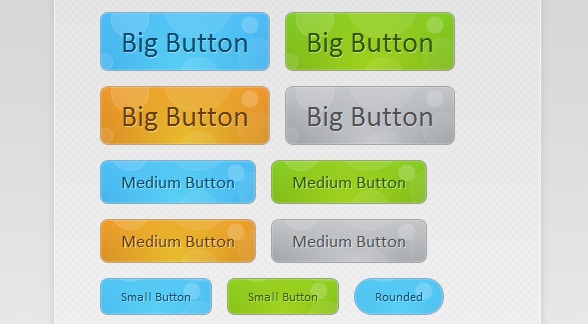
这款CSS3动画按钮非常的有创意,鼠标在滑过按钮时并不像其他按钮那样仅仅改变按钮的背景颜色,而是出现很酷的冒泡动画。这么惊艳的CSS3动画按钮,这篇文章主要将按钮实现的过程和代码分享给大家,希望能给在学习CSS3的同学带来实质性的帮助。可以下来看看在线演示效果:
接下来我们来讲解一下这款CSS3气泡动画的按钮实现过程,主要由HTML代码和CSS代码组成。
HTML代码:
<div id="buttonContainer">

    <a href="#">Big Button</a>

    <a href="#">Big Button</a>

    <a href="#">Big Button</a>

    <a href="#">Big Button</a>

    <a href="#">Medium Button</a>

    <a href="#">Medium Button</a>

    <a href="#">Medium Button</a>

    <a href="#">Medium Button</a>

    <a href="#">Small Button</a>

    <a href="#">Small Button</a>

    <a href="#">Rounded</a>

    <a href="#">Small Button</a>

    <a href="#">Small Button</a>

    <a href="#">Rounded</a>

</div>
HTML代码相对比较简单,即用一个个a链接构造按钮,当然演示中的效果还需要CSS的大力渲染才行。
接下来的重点是CSS代码,首先我们来为每一个button渲染基础的样式,这些样式都是每一个按钮所共有的:
.button{

    font:15px Calibri, Arial, sans-serif;

    /* A semi-transparent text shadow */

    text-shadow:1px 1px 0 rgba(255,255,255,0.4);

    /* Overriding the default underline styling of the links */

    text-decoration:none !important;

    white-space:nowrap;

    display:inline-block;

    vertical-align:baseline;

    position:relative;

    cursor:pointer;

    padding:10px 20px;

    background-repeat:no-repeat;

    /* The following two rules are fallbacks, in case

       the browser does not support multiple backgrounds. */

    background-position:bottom left;

    background-image:url('button_bg.png');

    /* Multiple backgrounds version. The background images

       are defined individually in color classes */

    background-position:bottom left, top right, 0 0, 0 0;

    background-clip:border-box;

    /* Applying a default border raidus of 8px */

    -moz-border-radius:8px;

    -webkit-border-radius:8px;

    border-radius:8px;

    /* A 1px highlight inside of the button */

    -moz-box-shadow:0 0 1px #fff inset;

    -webkit-box-shadow:0 0 1px #fff inset;

    box-shadow:0 0 1px #fff inset;

    /* Animating the background positions with CSS3 */

    /* Currently works only in Safari/Chrome */

    -webkit-transition:background-position 1s;

    -moz-transition:background-position 1s;

    transition:background-position 1s;

}

.button:hover{

    /* The first rule is a fallback, in case the browser

       does not support multiple backgrounds

    */

    background-position:top left;

    background-position:top left, bottom right, 0 0, 0 0;

}

.button:active{

    /* Moving the button 1px to the bottom when clicked */

    bottom:-1px;

}
同样也定义了按钮在鼠标滑过和被激活时的样式。
最后是气泡动画特效,我们拿其中一个按钮为例,代码如下:
.blue.button{

    color:#0f4b6d !important;

    border:1px solid #84acc3 !important;

    /* A fallback background color */

    background-color: #48b5f2;

    /* Specifying a version with gradients according to */

    background-image:    url('button_bg.png'), url('button_bg.png'),

                        -moz-radial-gradient(    center bottom, circle,

                                                rgba(89,208,244,1) 0,rgba(89,208,244,0) 100px),

                        -moz-linear-gradient(#4fbbf7, #3faeeb);

    background-image:    url('button_bg.png'), url('button_bg.png'),

                        -webkit-gradient(    radial, 50% 100%, 0, 50% 100%, 100,

                                            from(rgba(89,208,244,1)), to(rgba(89,208,244,0))),

                        -webkit-gradient(linear, 0% 0%, 0% 100%, from(#4fbbf7), to(#3faeeb));

}

.blue.button:hover{

    background-color:#63c7fe;

    background-image:    url('button_bg.png'), url('button_bg.png'),

                        -moz-radial-gradient(    center bottom, circle,

                                                rgba(109,217,250,1) 0,rgba(109,217,250,0) 100px),

                        -moz-linear-gradient(#63c7fe, #58bef7);

    background-image:    url('button_bg.png'), url('button_bg.png'),

                        -webkit-gradient(    radial, 50% 100%, 0, 50% 100%, 100,

                                            from(rgba(109,217,250,1)), to(rgba(109,217,250,0))),

                        -webkit-gradient(linear, 0% 0%, 0% 100%, from(#63c7fe), to(#58bef7));

}
从代码中我们可以看出,当鼠标滑过按钮时,按钮中的气泡背景图片将实现渐变的动画效果,并加以一定的透明效果,这样便出现了气泡上升的动画特效。所有的代码就是这样,你可以下载源代码来研究。
纯CSS3冒泡动画按钮实现教程的更多相关文章
- 冒泡动画按钮的简单实现(使用CSS3)
冒泡动画按钮的简单实现(使用CSS3) 原始的参考文章是 http://tutorialzine.com/2010/10/css3-animated-bubble-buttons/ ,基本原理是利用了 ...
- 一款基于css3的动画按钮
之前为大家分享了 推荐10款纯css3实现的实用按钮.今天给大家带来一款基于css3的动画按钮.实现的效果图如下: 在线预览 源码下载 实现的代码. html代码: <div class=& ...
- 超酷!纯CSS3烧烤动画实现教程
今天在老外的网站上看到一款很有创意的纯CSS3动画,是模拟烧烤活动的.款动画模拟了一个烧烤架,烧烤架上的食物也都是用纯CSS3绘制而成,没有用一张图片,效果相当逼真.另外一个有意思的是,这个CSS3烧 ...
- 纯CSS3带动画效果导航菜单
随着互联网的发展,网页能表现的东西越来越多.由最开始单纯的文字和链接构成的网页,到后来的表格布局,再到div+css模式,现在发展到了html+css3.网页能表达的东西越来越多,css3兴起已经很多 ...
- 纯css3云彩动画效果
效果描述: 纯CSS3实现的云彩动画飘动效果 非常逼真实用 使用方法: 1.将body中的代码部分拷贝到你的页面中 2.引入对应的CSS文件即可
- 纯css3天气动画场景特效
CSS3超强大,以下是纯用CSS3+HTML实现的场景效果图: 查看效果:http://hovertree.com/h/bjaf/cssrotate.htm css3 3d展示中rotate()介绍与 ...
- 纯CSS3垂直动画菜单
在线演示 本地下载
- 8个超炫酷的纯CSS3动画及源码分享
在现代网页中,我们已经越来越习惯使用大量的CSS3元素,而现在的浏览器也基本都支持CSS3,所以很多时候我们不妨思考一下是否可以用纯CSS3制作一些有趣或者实用的网页.本文要分享8个超炫酷的纯CSS3 ...
- 纯CSS3超酷3D旋转立方体动画特效
简要教程 这是一款神奇的纯 CSS3 立方体动画特效插件.使用CSS3来制作动画效果已经成为WEB前端开发的一种时尚,从简单的颜色和尺寸动画,到复杂的旋转.翻转动画, CSS3 展现了它无穷的魅力.使 ...
随机推荐
- [BalticOI2014]Friends/[BZOJ4287]新三个和尚
[BalticOI2014]Friends/[BZOJ4287]新三个和尚 题目大意: 一个字符串\(A\),将\(A\)复制一遍并在任意位置插入一个新字符得到\(B\).给出\(B(|B|\le2\ ...
- 关于WEB前端开发的工具
俗话说:"工谷善其事,先必利其器."一个用得顺手的工具,确实能为我们的开发带来方 便,更重要的是会让我们更加享受工具开发过程中所带来的乐趣. 1.编码工具: 记事本之类的编辑器都可 ...
- [模板][P3377]杜教筛
Description: 求 $ \sum_{i=1}^n \phi(i) ,\sum_{i=1}^n \mu(i)$ Hint: \(n<=10^{10}\) Solution: 考虑积性函 ...
- FTP和TCP的文件传输效率对比测试分析
前言 最近因项目需要,需要把一定数量的中等文件从开发板上传到电脑上,分别选择了FTP和TCP自定义协议两种方式进行传输,进行了简单的对比测试,故做如下记录. 测试环境 开发板:Linux,ARMv7 ...
- ES6语法篇(其一)
转载链接:http://www.ncloud.hk/%E6%8A%80%E6%9C%AF%E5%88%86%E4%BA%AB/es6-grammar-part-one/ 一.let命令 基本用法:ES ...
- CentOS 7.0关闭默认防火墙启用iptables防火墙
转自:https://www.cnblogs.com/lixuwu/p/6087023.html 阅读目录 1 配置防火墙,开启80端口.3306端口 2 关闭SELINUX 3 CentOS 配置防 ...
- 64位电脑上启动程序出现丢失MSVCR110.dll的解决办法
启动程序报错如下: 无法启动此程序,因为计算机中丢失MSVCR110.dll.尝试重新安装该程序以解决此问题. 应该很容易就搜索到,缺少这样的dll文件,是没有安装Visual C++ Redistr ...
- Excel分组快速自动填充编号
在Excel自动填充很简单,但如果按分组等条件进行填充就有点麻烦了 说麻烦可能是你并没有搞清楚到底如何才能实现你的需求 下图是客户提供的Excel数据,我需要将下面的数据导入到数据库中,因为客户在 ...
- 【Yaml】Yaml学习笔记
转载:https://blog.csdn.net/moshenglv/article/details/52084899 YAML何许物也?在XML泛滥的情况下,YAML的出现的确让人眼前一亮,在初步学 ...
- 使用 vmstat, mpstat 和 sar 查看系统运行参数
vmstat 字段含义 Procs r: The number of processes waiting for run time. 等待执行的进程, 数字越大意味着CPU越忙, 果该数字经常大于逻辑 ...