我的Vue之旅、04 CSS媒体查询完全指南(Media Quires)
什么是SCSS
Sass: Sass Basics (sass-lang.com)
SCSS 是 CSS 的预处理器,它比常规 CSS 更强大。
- 可以嵌套选择器,更好维护、管理代码。
- 可以将各种值存储到变量中,方便复用。
- 可以使用 Mixins 混合重复代码,方便复用。
scss导入html
方法一 VSCODE 插件
方法二 手动编译
npm install -g sass

sass input.scss output.css ::单次编译

sass --watch scss/index.scss css/index.css ::多次编译

<link rel="stylesheet" href="css/index.css"> ::写在HTML里
可能遇到的问题
Refused to apply style from 'http://127.0.0.1:5500/CSS媒体查询/css/style.css' because its MIME type ('text/html') is not a supported stylesheet MIME type, and strict MIME checking is enabled.
解决方法: 404 Not Found,提供的文件地址有误。
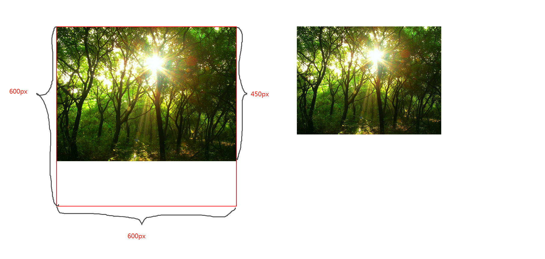
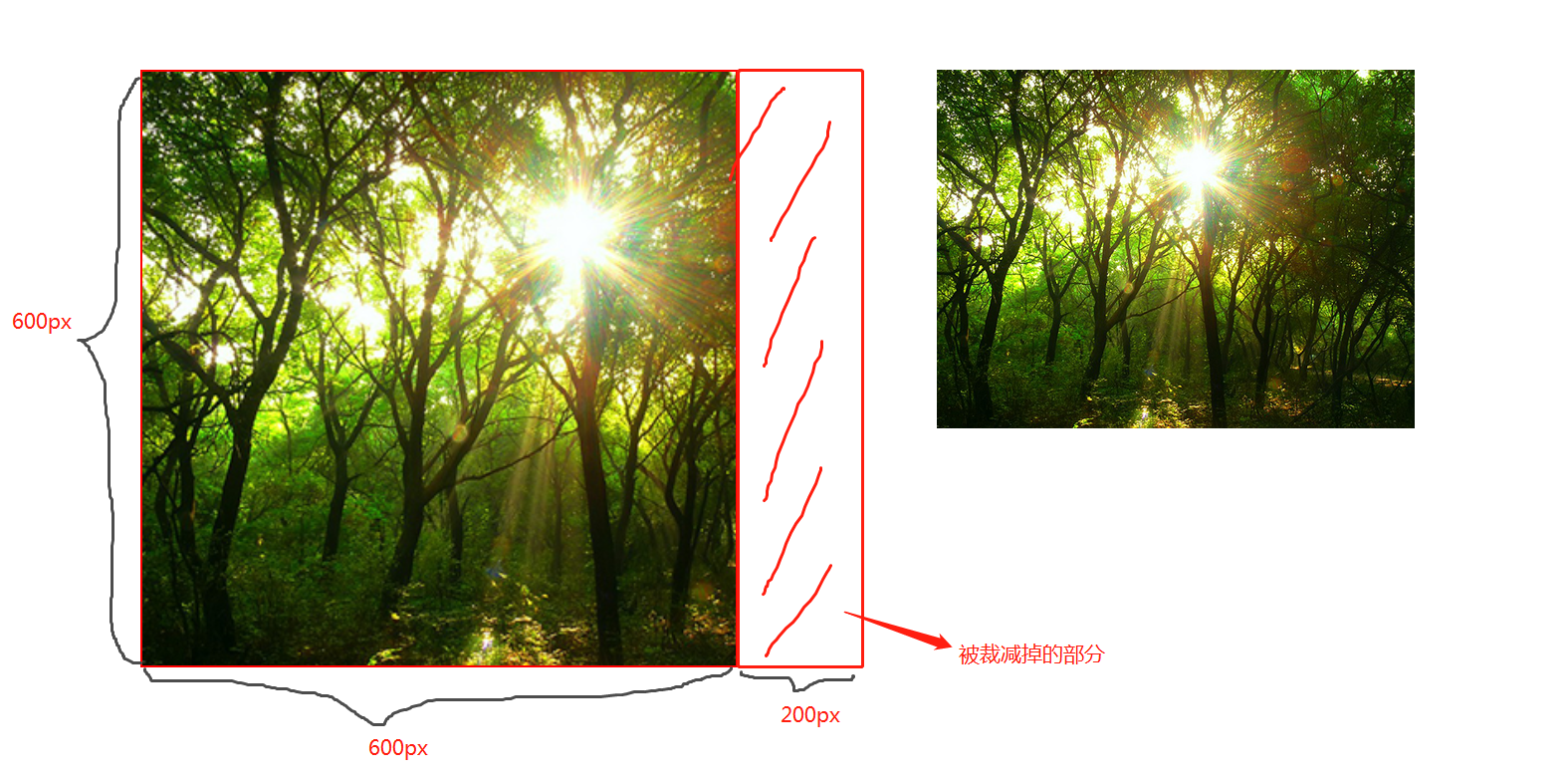
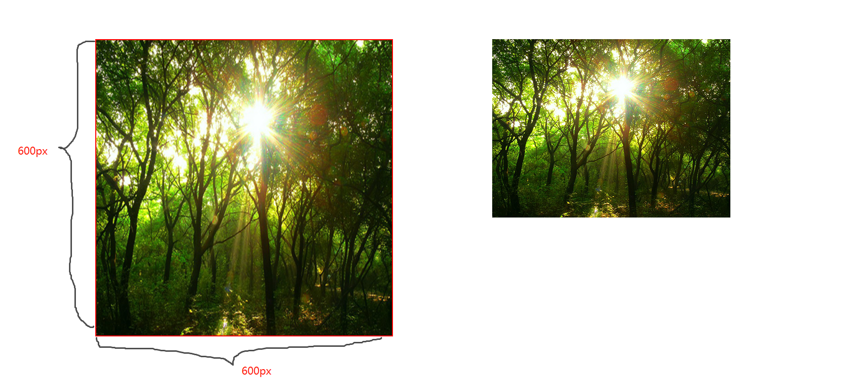
CSS属性 background-size
contain;
图片宽高比不变,缩放至图片自身能完全显示出来,所以容器会有留白区域
cover;
图片宽高比不变,铺满整个容器的宽高,而图片多出的部分则会被截掉
100%;
图片宽高比改变,缩放至和div宽高一致的尺寸。
CSS媒体查询
CSS媒体查询允许您创建从桌面到移动设备的所有屏幕尺寸的响应式网站。
语法
定义
@media screen and (max-width: 768px){

  .container{

   // 你的代码

  }

}
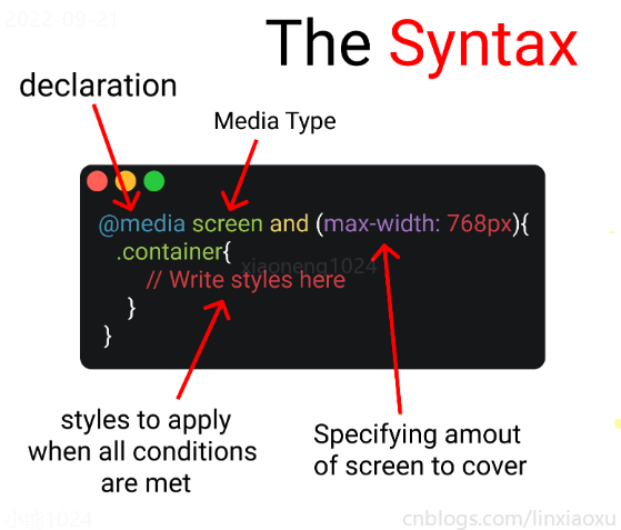
- 媒体查询声明, @media
- 媒体查询类型, screen
- 覆盖的屏幕范围, max-width: 768px
- 更改样式, Write styles here
深入
媒体查询声明
媒体查询以@media声明开头。目的是告诉浏览器我们已指定媒体查询。
媒体查询类型
- all 所有媒体设备
- print 打印设备
- screen 电脑、平板、手机屏幕
- speech 屏幕阅读器
@media screen
为什么要加and
在肯德基买东西,你想要炸鸡和汉堡,这是两个需求条件。
现在你已经确定了一个条件,即 screen 媒体查询类型。你要指定其他条件,比如想要规定在某一个屏幕范围内,那么就可以用 and 来连接。
@media screen and (max-width : 768px) {

  .container{

     // 在screen媒体类型,屏幕宽度<=768px时这部分代码将被触发

  }

}
跳过查询类型
你可以只用 min-width & max-width 来跳过媒体查询类型。
@media (min-width : 480px) and (max-width : 768px) {

  .container{

     // 在屏幕宽度为 480px 和 768px 之间这部分代码将被触发

  }

}
多个条件需求
当条件大于等于三个时,可以用 comma 连接。
//Targeting screen sizes between 480px & 768px

@media screen, (min-width : 480px) and (max-width : 768px) {

  .container{

     // 在screen媒体类型,屏幕宽度为 480px 和 768px 之间这部分代码将被触发

  }

}
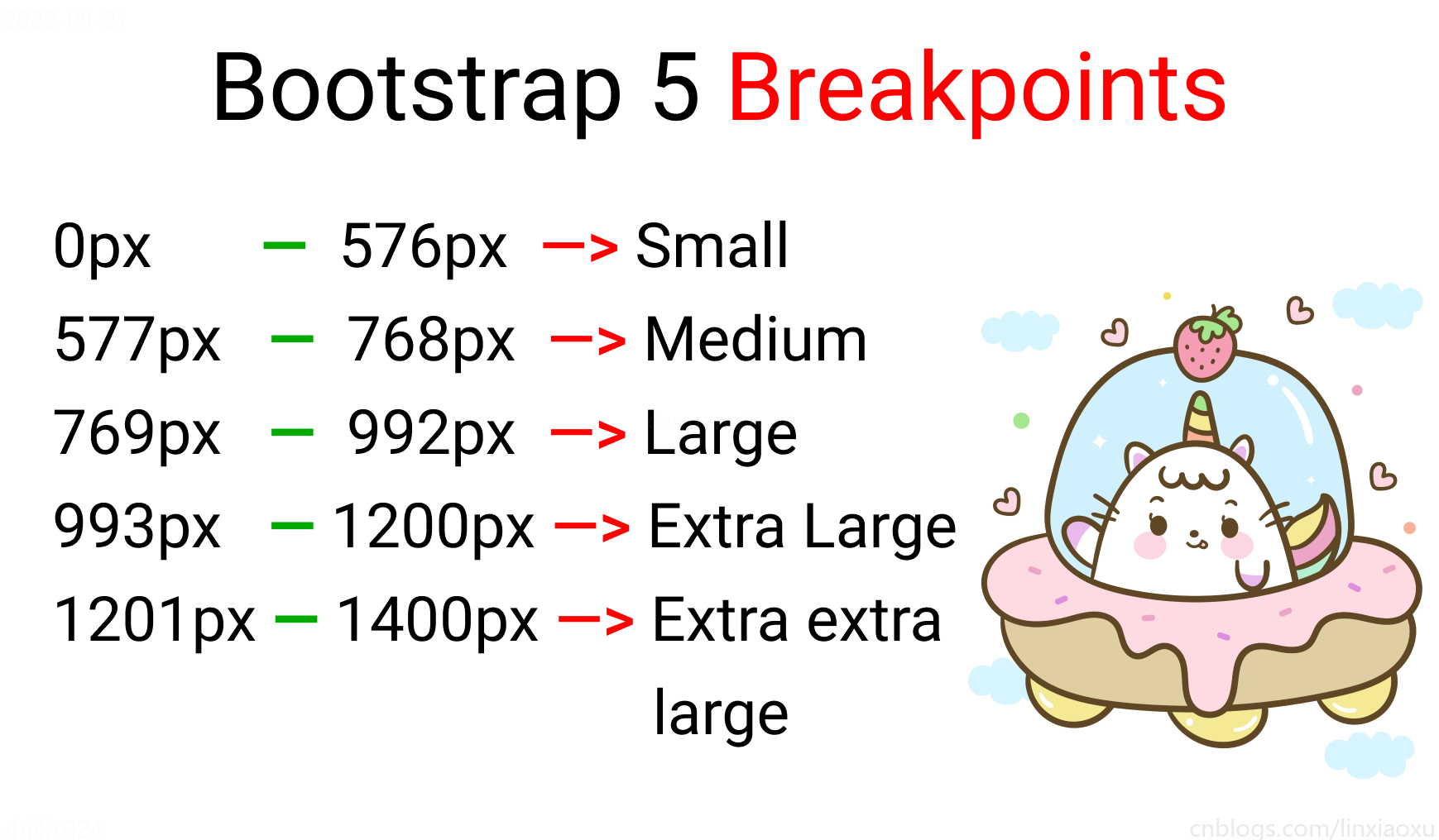
屏幕断点
屏幕断点(screen break-point)用于规定一个范围内的屏幕宽度所属类别,目前没有标准的屏幕断点。
学习使用、案例代码下载
学习使用①初入响应式
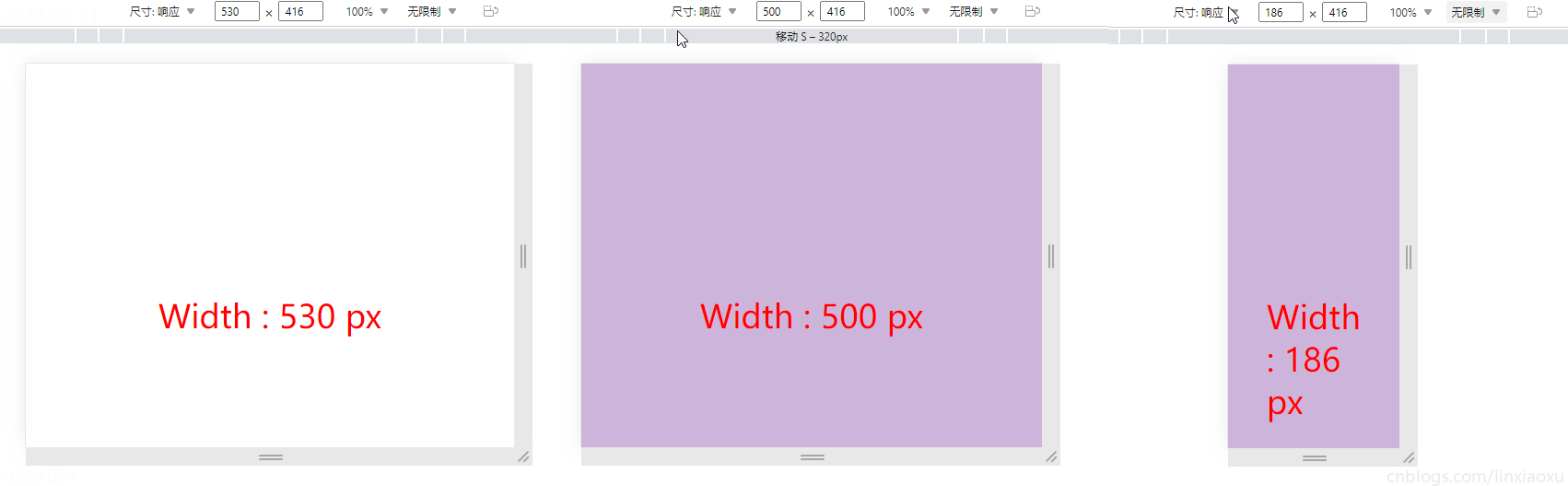
让我们试着写一个响应式页面 。新建main.js、media.html、style.scss,即时编译并watch style.scss。
main.js
// 当改变窗口大小、窗口加载时触发 screen

window.onresize = screen;

window.onload = screen;

// 一个函数获取当前屏幕宽度并将内容设置在ID为size的元素上

function screen() {

  Width = window.innerWidth;

  document.getElementById("size").innerHTML

   = "Width : " + Width + " px"

}
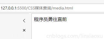
media.html
首先我们先建立一个media.html。然后导入刚刚写的main.js。导入style.css,是scss即时编译的css文件。
<!DOCTYPE html>

<html lang="en">

<head>

  <title></title>

  <meta charset="UTF-8">

  <meta name="viewport" content="width=device-width, initial-scale=1">

  <link href="./style.css" rel="stylesheet">

  <script type="text/javascript" src="./main.js"></script>

</head>

<body>

  <div class="container">

    <div id="size">

      程序员勇往直前,当导入main.js后,这句话会被替换掉

    </div>

  </div>

</body>

</html>
保存颜色变量
SCSS创建四个变量分别保存十六进制RGB
$color-1 : #cdb4db ; // 手机端

$color-2 : #fff1e6 ; // 平板端

$color-3 : #52b788 ; // 笔记本端

$color-4 : #bee1e6 ; // 台式大屏
居中container元素
.container {

  display: grid;

  place-items: center;

  background-color: $color-1;

  height: 100vh;

}
place-items 是 align-items 、 justify-items 的简写。
max-width 媒体查询
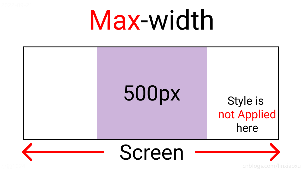
@media screen and (max-width : 500px) {

  .container {

    background-color: $color-1;

  }

}
当前完整scss代码
$color-1 : #cdb4db; // 手机端

$color-2 : #fff1e6; // 平板端

$color-3 : #52b788; // 笔记本端

$color-4 : #bee1e6; // 台式大屏

* {

  margin: 0px;

  padding: 0px;

  box-sizing: border-box;

  body {

    font-size: 35px;

    font-family: sans-serif;

  }

}

.container {

  //元素居中

  display: grid;

  place-items: center;

  background-color: $color-1;

  height: 100vh;

}

#size {

  position: absolute;

  top: 60%;

  left: 50%;

  transform: translateX(-50%);

  color: red;

  font-size: 35px;

}

.text {

  // 还没添加内容

}

.container {

  background-color: white;

  height: 100vh;

  display: grid;

  place-items: center;

}

@media screen and (max-width : 500px) {

  .container {

    background-color: $color-1;

  }

}
min-width 媒体查询
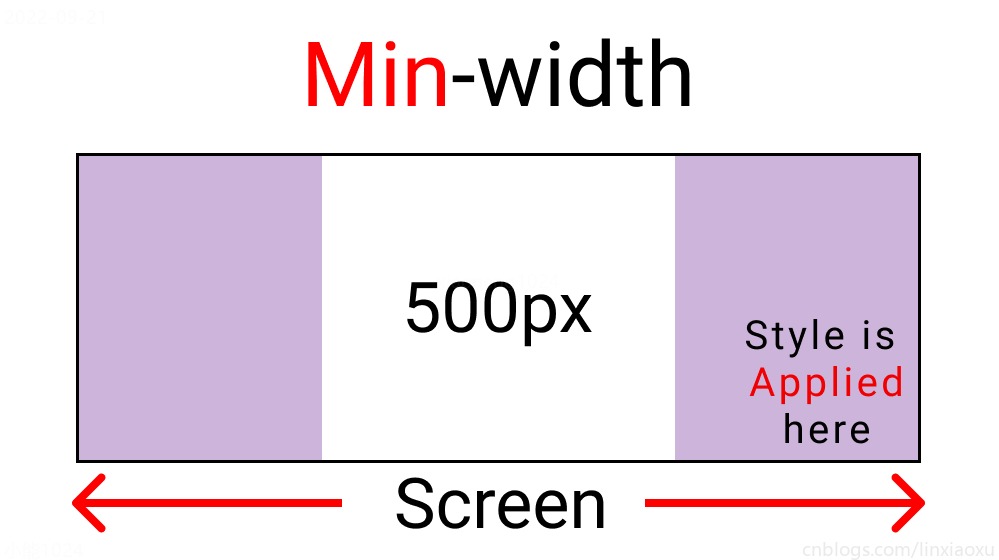
@media screen and (min-width : 500px){

  .container{

    background-color: $color-1;

  }

}
与max-width相反。宽度>=500px时代码生效。
屏幕断点
根据四种类型,我们将有四个媒体查询。
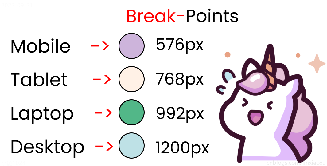
给scss添加新的变量
$mobile : 576px;

$tablet : 768px;

$laptop : 992px;

$desktop : 1200px;
添加一系列媒体查询
在添加媒体查询时,需要遵循正确的数据,从最大宽度到最小宽度。
@media screen and (max-width: $desktop){

  .container{

    background-color: $color-4;

  }

}

@media screen and (max-width: $laptop){

  .container{

    background-color: $color-3;

  }

}

@media screen and (max-width: $tablet){

  .container{

    background-color: $color-2;

  }

}

@media screen and (max-width : $mobile){

  .container{

    background-color: $color-1;

  }

}
现在改变屏幕宽度将显示不同的背景颜色。
学习使用②响应式个人介绍
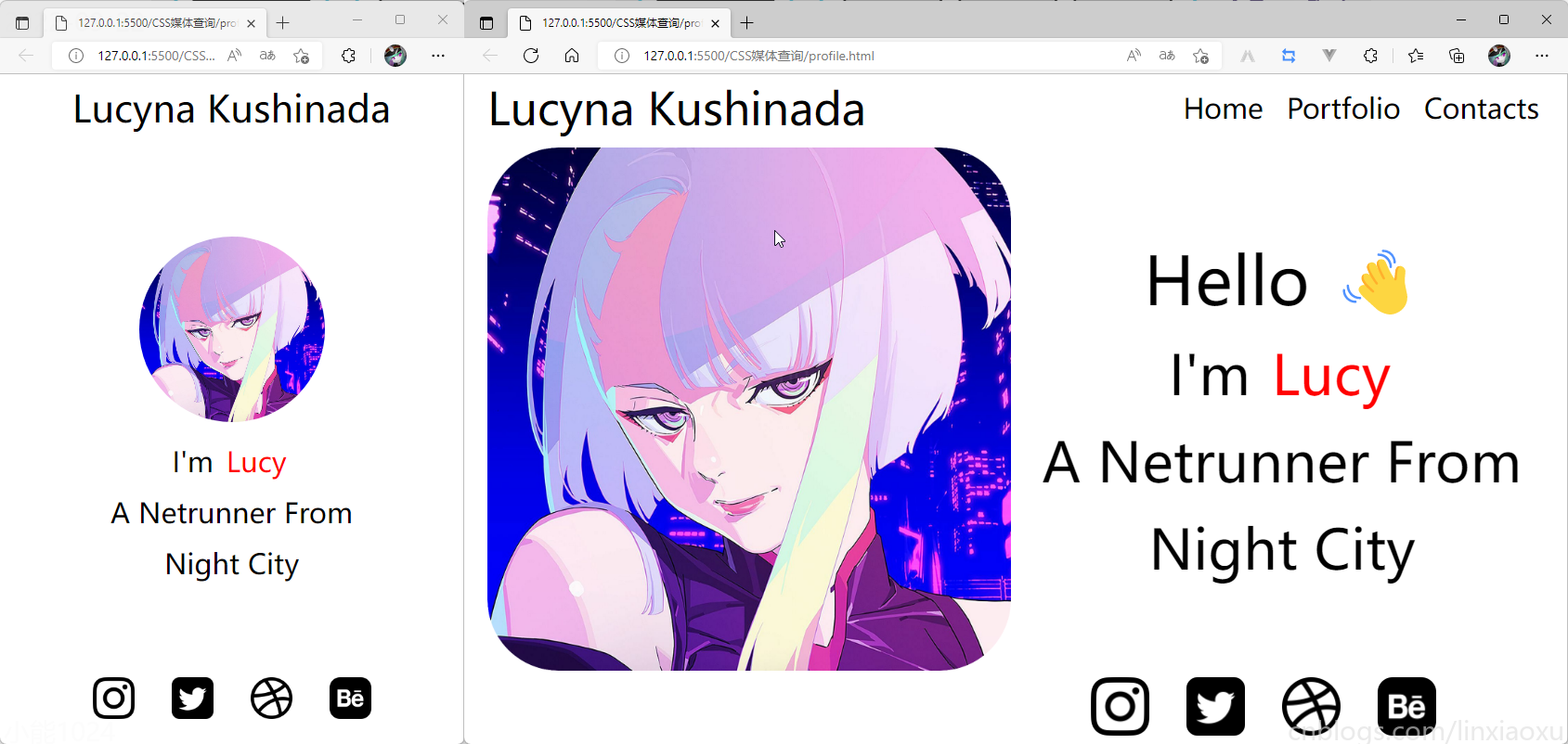
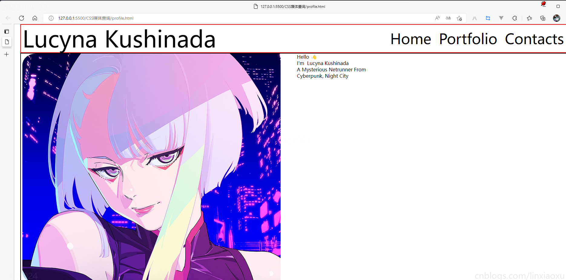
profile.html
<!DOCTYPE html>

<html lang="en">

<head>

  <title></title>

  <meta charset="UTF-8">

  <meta name="viewport" content="width=device-width, initial-scale=1">

</head>

<body>

  <div class="container">

    <div class="header"></div>

    <div class="header__logo">Lucyna Kushinada</div>

    <div class="header__menu">

      <div class="header__menu-1"> Home </div>

      <div class="header__menu-2"> Portfolio </div>

      <div class="header__menu-3"> Contacts </div>

    </div>

    <div class="main">

      <div class="main">

        <div class="main__image"></div>

        <div class="main__text">

            <div class="main__text-1">Hello </div>

            <div class="main__text-2">I'm <span>Lucy</span></div>

            <div class="main__text-3">A Netrunner From</div>

            <div class="main__text-4">Night City</div>

        </div>

      </div>

    </div>

    <div class="footer">

      <div class="footer__instagram">

        <img src="./images/instagram.png" alt="">

      </div>

      <div class="footer__twitter">

        <img src="./images/twitter-sign.png" alt="">

      </div>

      <div class="footer__dribbble">

        <img src="./images/dribbble-logo.png" alt="">

      </div>

      <div class="footer__behance">

        <img src="./images/behance.png" alt="">

      </div>

    </div>

  </div>

</body>

</html>
profile.scss
scss需要编译成css再导入到html中,我们先修改全局默认样式。
* {

  margin: 0px 5px;

  padding: 0px;

  box-sizing: border-box;

  body {

    font-family: sans-serif;

  }

}
如果你不会Flexbox属性请看 我的Vue之旅、01 深入Flexbox布局完全指南 - 小能日记
先把所有样式类与子级结构写好。嵌套在样式类中的&__logo是.header__logo的快捷方式
.header{

  &__logo{}

  &__menu{}

}

.main{

  &__image{}

  &__text{}

}

.footer{

  [class ^="footer__"]{}

}
然后添加样式,.container采用flex布局,按列布局。.header__menu也采用flex布局的方式。
.container{

  height: 100vh;

  display: flex;

  flex-direction: column;

}

.header{

  display: flex;

  flex-direction: row;

  border: 2px solid red;

  height: 10%;

  &__logo{}

  &__menu{

    display: flex;

    flex-direction: row;

  }

}

.main{

  border: 2px solid black;

  height: 80%;

}

.footer{

  border: 2px solid green;

  height: 10%;

}
我们修改 .header
.header {

  display: flex;

  flex-direction: row;

  border: 2px solid red;

  height: 10%;

  // 元素垂直居中

  align-items: center;

  // 元素均匀分布

  justify-content: space-between;

  &__logo {

    font-size: 4vw;

  }

  &__menu {

    display: flex;

    flex-direction: row;

    font-size: 2.5vw;

    // 让各个元素产生一定间隔距离

    gap: 15px;

  }

}
再修改 .main
.main {

  // 图片和文字块排版会采用行形式

  display: flex;

  flex-direction: row;

  border: 2px solid black;

  height: 80%;

  &__image {

    // 添加图片

    background-image: url("./images/Portrait.jpg");

    // 宽度为main宽度的50%

    width: 50%;

    // 缩放至图片自身能完全显示出来,足够大的容器会有留白区域

    background-size: contain;

    // 不重复平铺图片

    background-repeat: no-repeat;

    background-position: left center;

  }

  &__text {

    // 宽度为main宽度的50%

    width: 50%;

  }

}
给文字加样式
  &__text {

    // 宽度为main一半宽度

    width: 50%;

    // 让每行字按列排列

    display: flex;

    flex-direction: column;

    // 居中

    justify-content: center;

    align-items: center;

    gap: 15px;

    &-1 {

      font-size: 10vw;

    }

    &-2,

    &-3,

    &-4 {

      font-size: 5vw;

    }

  }

  span {

    color: red;

  }

}
接下来给图片添加样式
.footer{

  // 类匹配器,能够选择一个类的集合,如style class 为footer__1、footer__2

  [class^="footer__"] {

    img {

      width: 5.3vw;

    }

  }

}

.footer{

  display: flex;

  flex-direction: row;

  align-items: center;

  justify-content: flex-end;

  gap: 20px;

  margin-right: 10%;

}
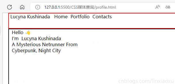
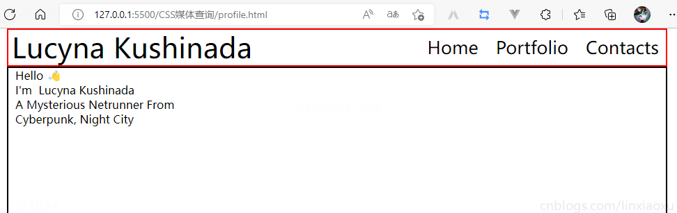
我们还需要添加媒体查询
@media (max-width: 650px) {

  .header {

    justify-content: center;

    &__logo {

      font-size: 40px;

    }

    // 隐藏menu

    &__menu {

      display: none;

    }

  }

  .main {

    flex-direction: column;

    justify-content: center;

    align-items: center;

    &__image {

      // 图片大小

      height: 200px;

      width: 200px;

      background-size: 100%;

      // 圆形图片

      border-radius: 100%;

      background-position: center;

      margin-bottom: 5%;

    }

    // 修改字体样式

    &__text {

      width: 100%;

      &-1 {

        // 让hello不显示

        display: none;

      }

      &-2,

      &-3,

      &-4 {

        font-size: 30px;

      }

    }

  }

  .footer {

    // 元素按中心对齐

    justify-content: center;

    margin: 0px;

    // gap: 20px;  注意这个没有改,默认还是生效的

    [class^="footer__"] {

      // 重新修改图片大小适应移动端

      img {

        width: 45px;

        height: 45px;

      }

    }

  }

}
当前完整scss代码
* {

  margin: 0px 5px;

  padding: 0px;

  box-sizing: border-box;

  body {

    font-family: sans-serif;

  }

}

.container {

  height: 100vh;

  display: flex;

  flex-direction: column;

}

.header {

  display: flex;

  flex-direction: row;

  height: 10%;

  // 元素垂直居中

  align-items: center;

  // 元素均匀分布

  justify-content: space-between;

  &__logo {

    font-size: 4vw;

  }

  &__menu {

    display: flex;

    flex-direction: row;

    font-size: 2.5vw;

    // 让各个元素产生一定间隔距离

    gap: 15px;

  }

}

.main {

  // 图片和文字块排版会采用行形式

  display: flex;

  flex-direction: row;

  height: 80%;

  &__image {

    // 添加图片

    background-image: url("./images/Portrait.png");

    // 宽度为main宽度的50%

    width: 50%;

    // 缩放至图片自身能完全显示出来,足够大的容器会有留白区域

    background-size: contain;

    // 不重复平铺图片

    background-repeat: no-repeat;

    background-position: left center;

  }

  &__text {

    // 宽度为main一半宽度

    width: 50%;

    // 让每行字按列排列

    display: flex;

    flex-direction: column;

    // 居中

    justify-content: center;

    align-items: center;

    gap: 15px;

    &-1 {

      font-size: 6vw;

    }

    &-2,

    &-3,

    &-4 {

      font-size: 5vw;

    }

  }

  span {

    color: red;

  }

}

.footer {

  [class^="footer__"] {

    img {

      width: 5.3vw;

    }

  }

}

.footer {

  display: flex;

  flex-direction: row;

  align-items: center;

  justify-content: flex-end;

  gap: 20px;

  margin-right: 10%;

  [class^="footer__"] {

    img {

      width: 5.3vw;

    }

  }

}

@media (max-width: 650px) {

  .header {

    justify-content: center;

    &__logo {

      font-size: 40px;

    }

    // 隐藏menu

    &__menu {

      display: none;

    }

  }

  .main {

    flex-direction: column;

    justify-content: center;

    align-items: center;

    &__image {

      // 图片大小

      height: 200px;

      width: 200px;

      background-size: 100%;

      // 圆形图片

      border-radius: 100%;

      background-position: center;

      margin-bottom: 5%;

    }

    // 修改字体样式

    &__text {

      width: 100%;

      &-1 {

        // 让hello不显示

        display: none;

      }

      &-2,

      &-3,

      &-4 {

        font-size: 30px;

      }

    }

  }

  .footer {

    // 元素按中心对齐

    justify-content: center;

    margin: 0px;

    // gap: 20px;  注意这个没有改,默认还是生效的

    [class^="footer__"] {

      // 重新修改图片大小适应移动端

      img {

        width: 45px;

        height: 45px;

      }

    }

  }

}
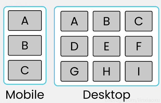
学习使用③卡片布局
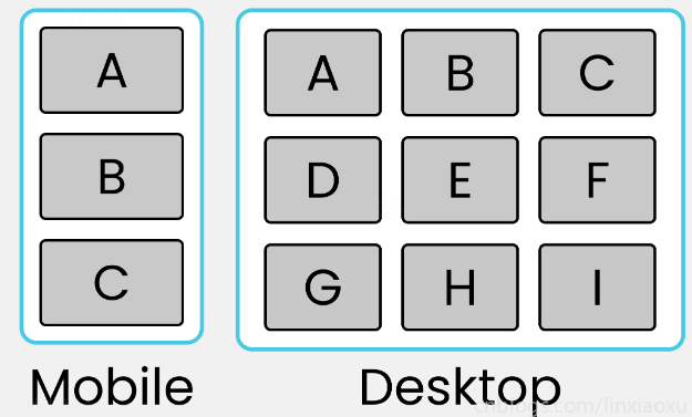
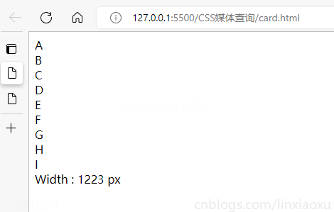
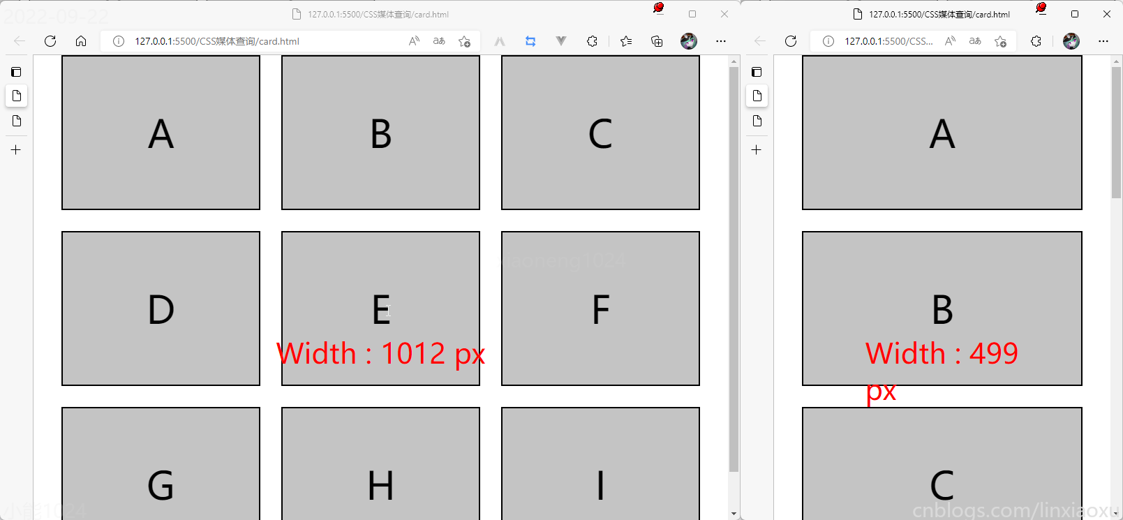
我们会用到第一个例子中的 main.js 函数来显示窗口宽度。
card.html
<!DOCTYPE html>

<html lang="en">

<head>

  <title></title>

  <meta charset="UTF-8">

  <meta name="viewport" content="width=device-width, initial-scale=1">

  <link href="css/style.css" rel="stylesheet">

  <script type="text/javascript" src="./main.js"></script>

</head>

<body>

  <div class="container">

    <div class="row-1">

      <div class="box-1">A</div>

      <div class="box-2">B</div>

      <div class="box-3">C</div>

    </div>

    <div class="row-2">

      <div class="box-4">D</div>

      <div class="box-5">E</div>

      <div class="box-6">F</div>

    </div>

    <div class="row-3">

      <div class="box-7">G</div>

      <div class="box-8">H</div>

      <div class="box-9">I</div>

    </div>

  </div>

  <div id="size"></div>

</body>

</html>
card.scss
* {

  margin: 0px;

  padding: 0px 10px;

  box-sizing: border-box;

  body {

    font-family: sans-serif;

    font-size: 55px;

  }

}

#size {

  position: absolute;

  // 设置为绝对定位

  top: 60%;

  left: 50%;

  // 水平居中

  transform: translateX(-50%);

  color: red;

  font-size: 40px;

}

.container {

  display: flex;

  flex-direction: column;

  height: 100vh;

  gap: 30px;

}

[class ^="row-"] {

  display: flex;

  flex-direction: row;

  gap: 30px;

}

[class ^="box-"] {

  background-color: #c4c4c4;

  border: 2px solid black;

  width: (100%)/3;

  // 设置为当前视窗大小的三分之一

  height: (100vh)/3;

  // 元素居中

  display: grid;

  place-items: center;

}

@media (max-width: 650px) {

  [class ^="row-"] {

    flex-direction: column;

  }

  [class ^="box-"] {

    width: 100%;

  }

}
我的Vue之旅、04 CSS媒体查询完全指南(Media Quires)的更多相关文章
- CSS:使用CSS媒体查询创建响应式布局
现如今在Web前端领域,BootStrap是一个最流行的UI库,其12列的栅栏系统为响应式布局提供了一种对程序员来说很好操作的模式. 追究Bootstrap的内在原理,其实就是通过媒体查询来完成对不同 ...
- 使用 CSS 媒体查询创建响应式网站
简介 现今每天都有更多的手机和平板电脑问市.消费者能够拥有可想象到的各种规格和形状的设备,但是网站开发人员却面临一个挑战:如何使他们的网站在传统浏览器.手机和平板电脑浏览器上有很好的效果,如何在各种大 ...
- css媒体查询:响应式网站
css媒体查询:响应式网站 媒体查询 包含了一个媒体类型和至少一个使用如宽度.高度和颜色等媒体属性来限制样式表范围的表达式.CSS3加入的媒体查询使得无需修改内容便可以使样式应用于某些特定的设备范围. ...
- CSS 媒体查询创建响应式网站
使用 CSS 媒体查询创建响应式网站 适用于所有屏幕大小的设计 固定宽度的静态网站很快被灵活的响应式设计所取代,该设计可以根据屏幕大小进行上扩和下扩.利用响应式设计,无论您采用什么设备或屏幕来访问网 ...
- 纯CSS + 媒体查询实现网页导航特效
纯css+媒体查询实现网页导航特效 附上效果图: 代码如下,复制即可使用: <!DOCTYPE html> <html lang="en"> <hea ...
- 巧妙使用CSS媒体查询(Media Queries)和JavaScript判断浏览器设备类型的好方法
有无数的理由要求我们在任何时候都应该知道用户是使用的什么设备浏览我们的网站——宽屏,普通屏,平板,手机?知道这些特征,我们web应用的CSS和JavaScript才能同步做相应的操作.在给Mozill ...
- CSS 媒体查询 响应式
媒体查询 从 CSS 版本 2 开始,就可以通过媒体类型在 CSS 中获得媒体支持.如果您曾经使用过打印样式表,那么您可能已经使用过媒体类型.清单 1 展示了一个示例. 清单 1. 使用媒体类型 &l ...
- css媒体查询aspect-ratio宽高比在less中的使用
css媒体查询有一个 宽高比很方便,aspect-ratio ,可以直接使用宽/高 来进行页面适配 使用样例如下: // 宽高比在((320/50)+(728/90))/2 两个尺寸中间值以内 适 ...
- CSS媒体查询,CSS根据不同的分辨率显示不同的样式
在写自适应网页的时候,我们需要网页有几种显示方式,我们可以用CSS实现这个功能 使用CSS提供的媒体查询,我们可以根据屏幕分辨率来使用相应的CSS样式 @media screen and (max-w ...
随机推荐
- charles(CA证书)的app端安装
在使用charles进行的app抓包的时候势必需要对他进行配置: 1. pc端: 第一步: http请求接收charles > proxy > proxy setting > por ...
- Tapdata 携手精诚瑞宝,共拓 Real Time DaaS 蓝海市场
2021年10月22日,深圳钛铂数据有限公司「Tapdata」 与精诚瑞宝计算机系统有限公司「精诚瑞宝」战略合作签约仪式在深圳举行,Tapdata 创始人唐建法先生与精诚瑞宝副总经理余灿雄先生签署 ...
- 2、MYSQL介绍
一.mysql优点 1.成本低:开放源代码,一般可以免费试用,采用的是gpl协议 2.性能高:执行很快 3.简单:很容易安装和使用 二.DBMS分为两类: 1.基于共享文件系统的DBMS(Acce ...
- Thread类的常用方法_获取线程名称的方法和Thread类的常用方法_设置线程名称的方法
构造方法: public Thread();分配一个新的线程对象 public Thread(String name);分配一个指定名字的新的线程对象 public Thread(Runnable t ...
- 模板库 ~ Template library
TOC 建议使用 Ctrl+F 搜索 . 目录 小工具 / C++ Tricks NOI Linux 1.0 快速读入 / 快速输出 简易小工具 无序映射器 简易调试器 文件 IO 位运算 Smart ...
- reduce累加实现
与map端的模式类似,map端要重写Mapper方法,reduce端也要重写Reduce方法,这里有一个泛型,我们先看参数类型 分别对应输入keyin,valuein,keyout,valueout. ...
- 自定义bean对象实现序列化接口
上一个word count的案例中,我们为了理解mapreduce的流程,写了上面的代码.现在我们要把一个实体类序列化.比如现在有这么一个文件,里面的数据格式是这样的: 第一列是时间戳,第二列是手机号 ...
- php date函数和首位带0问题
一.带零 echo date('Y-m-d'); 2012-08-08 二.不带零 echo date('Y-n-j'); 2012-8-8 以下为参数详解(转载): a - "am&quo ...
- mysql grant命令
增删改查的权限grant select on testdb.* to common_user@'%' grant insert on testdb.* to common_user@'%' grant ...
- typora的第一天
一级标题 二级标题 三级标题 ..... 表格 java spring mybatis 代码 java代码 public void Hello(){ } 字体 hello word! hello wo ...