可视化库-Matplotlib-条形图(第四天)
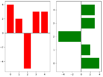
1.画两个条形图,bar和barh, 同时axes[0].axhline画一条横线,axes[1].axvline画一条竖线
- import numpy as np
- import matplotlib.pyplot as plt
np.random.seed(0)- x = np.arange(5)
- y = np.random.randint(-5, 5, 5)
- # 分成两个方框,一行两列
- fig,axes = plt.subplots(ncols=2)
- # 对第一个方框进行画图bar
- axes[0].bar(x, y, color='r')
- # 对第二个方框进行画图barh
- axes[1].barh(x, y, color='g')
- # 对第一个方框画一条横线,axhline
- axes[0].axhline(0, color='grey', linewidth=2)
- # 对第二个方框画一条竖线, axvline
- axes[1].axvline(0, color='grey', linewidth=2)
- plt.show()
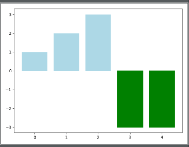
2.根据条形图y的大小设置每个条形图的颜色
- np.random.seed(0)
- fig, ax = plt.subplots()
- v_bars = ax.bar(x, y, color='lightblue')
- for bars, height in zip(v_bars, y):
- if height < 0:
- bars.set(edgecolor='darkred', color='green', linewidth=2)
- plt.show()
3.fill_between 进行填充操作, .consum 表示的是进行累加操作,将前一个值累加到当前值
- x = np.random.randn(100).cumsum()
- y = np.linspace(0, 100, 100)
- fig, ax = plt.subplots()
- ax.fill_between(x, y, color='lightblue')
- plt.show()
4. fill_between 对两个函数之间进行填充操作
- x = np.linspace(0, 10, 200)
- y1 = 2*x + 1
- y2 = 3*x + 1.2
- y_mean = 0.5*x*np.cos(2*x) + 2.5*x + 1.1
- fig, ax = plt.subplots()
# 填充函数之间的值- ax.fill_between(x, y1, y2, color='red')
- plt.plot(x, y_mean, color='black')
- plt.show()

5. 误差棒的设置plt.bar(yerr=variance) # variance表示误差的大小
- mean_values = [1, 2, 3]
- # variance表示误差
- variance = [0.2, 0.4, 0.5]
- bar_label = ['bar1', 'bar2', 'bar3']
- # 设置x轴的范围
- x_pos = list(range(len(mean_values)))
- # yerr用来设置误差棒
- plt.bar(x_pos, mean_values, color='r', yerr=variance)
- max_y = max(zip(mean_values, variance))
- # 设置y轴的显示范围
- plt.ylim([0, (max_y[0] + max_y[1]) * 1.2])
- # 设置x轴的标签,x_pos表示标签的位置,bar_label表示标签名
- plt.xticks(x_pos, bar_label)
- plt.ylabel('variable_y')
- plt.show()
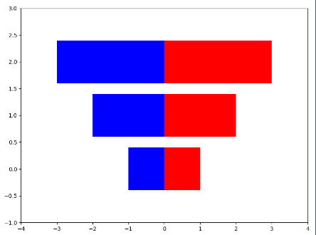
6. 画横向并排的条形图
- x1 = np.array([1, 2, 3])
- x2 = np.array([1, 2, 3])
- bar_label = ['bar1', 'bar2', 'bar3']
- fig = plt.figure(figsize=[8, 6])
- y_pos = list(np.arange(len(x1)))
- plt.barh(y_pos, x1, color='r',)
- plt.barh(y_pos, -x2, color='b',)
- # 为了使得图形美观,设置xlim和ylim的范围
- plt.xlim([-max(x2)-1, max(x1) + 1])
- plt.ylim(-1, max(y_pos) + 1)
- plt.show()
7.设置位置的宽度进行并排
- green_data = [1, 2, 3]
- blue_data = [3, 2, 1]
- red_data = [2, 3, 3]
- labels = ['group1', 'group2', 'group3']
- # 设置x_pos的位置
- x_pos = list(range(len(green_data)))
- print(x_pos)
- width = 0.2
- plt.bar(x_pos, green_data, width=width, color='g', label=labels[0], alpha=0.6)
- plt.bar([x+width for x in x_pos], blue_data, width=width, color='b', label=labels[1], alpha=0.6)
- plt.bar([x+2*width for x in x_pos], red_data, width=width, color='r', label=labels[2], alpha=0.6)
- plt.legend(loc='best', framealpha=0.05)
- plt.show()
8. 在画的条形图上加竖线ax.axvline(data.min()) 在条形图的后面加上%plt.text 通过获得每个条形图的位置信息
- data = np.arange(200, 225, 5)
- bar_labels = ['a', 'b', 'c', 'd', 'e']
- y_pos = list(np.arange(len(data)))
- fig, ax = plt.subplots()
- # ax.spines['top'].set_visible(False)
- # 去除右边的框图
- ax.spines['right'].set_visible(False)
- plt.yticks(y_pos, bar_labels)
- v_bars = plt.barh(y_pos, data)
- # 加横线
- ax.axvline(data.min(), linestyle='--', color='k')
- # 进行对每一个条形块文本标注
- for b, d in zip(v_bars, data):
- plt.text(b.get_width(), b.get_y()+b.get_height()/2, '{0:.2%}'.format(d/min(data)))
- plt.show()

9. 构造colormap来建立条形图的颜色 使用colormap构造条形图cm.ScalarMappable(col.Normalize())
- import matplotlib.colors as col
- import matplotlib.cm as cm
- mean_values = range(10, 18)
- x_pos = range(len(mean_values))
- # 构造colormap, cm.hot表示风格
- cmap1 = cm.ScalarMappable(col.Normalize(min(mean_values), max(mean_values), cm.hot))
- cmap2 = cm.ScalarMappable(col.Normalize(0, 20, cm.hot))
- plt.subplot(121)
- # cmap1.to_rgba(mean_values) # 将color_map使用到mean_values
- plt.bar(x_pos, mean_values, color=cmap1.to_rgba(mean_values))
- plt.subplot(122)
- plt.bar(x_pos, mean_values, color=cmap2.to_rgba(mean_values))
- plt.show()
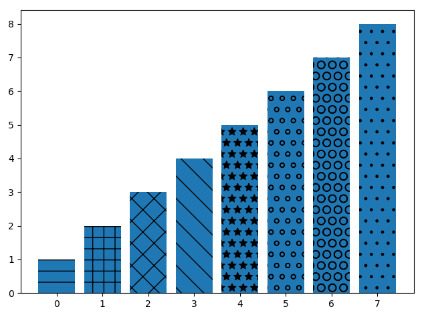
10. b.set_hatch('o') # 画出不同填充风格的条形图
- patterns = ('-', '+', 'x', '\\', '*', 'o', 'O', '.')
- data = range(1, len(patterns) + 1 )
- x_pow = range(len(data))
- bars = plt.bar(x_pow, data)
- for b, p in zip(bars, patterns):
- b.set_hatch(p)
- plt.show()
可视化库-Matplotlib-条形图(第四天)的更多相关文章
- Python数据可视化库-Matplotlib(一)
今天我们来学习一下python的数据可视化库,Matplotlib,是一个Python的2D绘图库 通过这个库,开发者可以仅需要几行代码,便可以生成绘图,直方图,功率图,条形图,错误图,散点图等等 废 ...
- Python可视化库-Matplotlib使用总结
在做完数据分析后,有时候需要将分析结果一目了然地展示出来,此时便离不开Python可视化工具,Matplotlib是Python中的一个2D绘图工具,是另外一个绘图工具seaborn的基础包 先总结下 ...
- Python可视化库Matplotlib的使用
一.导入数据 import pandas as pd unrate = pd.read_csv('unrate.csv') unrate['DATE'] = pd.to_datetime(unrate ...
- python的数据可视化库 matplotlib 和 pyecharts
Matplotlib大家都很熟悉 不谈. ---------------------------------------------------------------------------- ...
- 数据分析处理库pandas及可视化库Matplotlib
一.读取文件 1)读取文件内容 import pandas info = pandas.read_csv('1.csv',encoding='gbk') # 获取文件信息 print(info) pr ...
- 可视化库-Matplotlib-3D图(第四天)
1. 画三维图片图 axes = Axes3D(fig)这一步将二维坐标转换为三维坐标,axes.plot_surface() import matplotlib.pyplot as plt impo ...
- Python数据可视化库-Matplotlib(二)
我们接着上次的继续讲解,先讲一个概念,叫子图的概念. 我们先看一下这段代码 import matplotlib.pyplot as plt fig = plt.figure() ax1 = fig.a ...
- python可视化库 Matplotlib 01 figure的详细用法
1.上一章绘制一幅最简单的图像,这一章介绍figure的详细用法,figure用于生成图像窗口的方法,并可以设置一些参数 2.先看此次生成的图像: 3.代码(代码中有详细的注释) # -*- enco ...
- python可视化库 Matplotlib 00 画制简单图像
1.下载方式:直接下载Andaconda,简单快捷,减少准备环境的时间 2.图像 3.代码:可直接运行(有详细注释) # -*- encoding:utf-8 -*- # Copyright (c) ...
- 可视化库-Matplotlib-盒图(第四天)
盒图由五个数值点组成,最小观测值,下四分位数,中位数,上四分位数,最大观测值 IQR = Q3 - Q1 Q3表示上四分位数, Q1表示下四分位数,IQR表示盒图的长度 最小观测值 min =Q1 ...
随机推荐
- 剑指offer面试题19 二叉树的镜像
题目描述 操作给定的二叉树,将其变换为源二叉树的镜像. 输入描述 二叉树的镜像定义:源二叉树 8 / \ 6 10 / \ / \ 5 7 9 11 镜像二叉树 8 / \ 10 6 / \ / \ ...
- 非ie浏览器必备函数常识
场景描述: 我们都知道IE浏览器和非IE浏览器都有很多功能一样但写法不同,或者各自都有一些自己独特的方法,那么为了保持兼容性和便于编写,我们可以通过这两个方法给非IE浏览器的对象增加自己没有,但IE有 ...
- 045——VUE中组件之父组件使用scope定义子组件模板结构
<!DOCTYPE html> <html lang="en"> <head> <meta charset="UTF-8&quo ...
- ipvsadm命令介绍
为了更好的让大家理解这份命令手册,将手册里面用到的几个术语先简单的介绍一下: 1,virtual-service-address:是指虚拟服务器的ip 地址 2,real-service-addres ...
- 发现TypeScript中同名interface接口会自动合并的特性
今天在学习怎么用TypeScript给jQuery写扩展插件时发现一个很有趣的事情
- 433.92 TX RX module design and test recording。。
This paper records the process of 433.92 TX RX module design and test,fyi. 1 RX module The circuit ...
- 分布式机器学习系统笔记(一)——模型并行,数据并行,参数平均,ASGD
欢迎转载,转载请注明:本文出自Bin的专栏blog.csdn.net/xbinworld. 技术交流QQ群:433250724,欢迎对算法.技术.应用感兴趣的同学加入. 文章索引::"机器学 ...
- 怎么定位bug
测试发现bug,怎么定位?不同领域不同的测试对象,具体定位方法都不一样.自己定位bug的方法通常是以下过程: 1.发现bug,首先要查看bug的详细信息,根据描述初步分析是哪个模块哪段代码的问题 2. ...
- BZOJ4033: [HAOI2015]树上染色(树形DP)
4033: [HAOI2015]树上染色 Time Limit: 10 Sec Memory Limit: 256 MBSubmit: 3461 Solved: 1473[Submit][Stat ...
- Android 开发有哪些新技术出现?
这里记录一下在知乎回答的<Android 开发有哪些新技术出现?>.知乎链接在这里. 原问题如下: Android 开发有哪些新技术出现?可以从UI设计或者一些核心的算法之类的说起 这是我 ...