Bootstrap实现弹出框和提示框效果代码
一、Bootstrap弹出框
使用过JQuery UI应该知道,它里面有一个dialog的弹出框组件,功能也很丰富。与jQuery UI的dialog类似,Bootstrap里面也内置了弹出框组件。打开bootstrap 文档可以看到它的dialog是直接嵌入到bootstrap.js和bootstrap.css里面的,也就是说,只要我们引入了bootstrap的文件,就可以直接使用它的dialog组件,是不是很方便。本篇我们就结合新增编辑的功能来介绍下bootstrap dialog的使用。废话不多说,直接看来它如何使用吧。
1、cshtml界面代码
|
1
2
3
4
5
6
7
8
9
10
11
12
13
14
15
16
17
18
19
20
21
22
23
24
25
26
27
28
29
30
31
32
33
|
<div class="modal fade" id="myModal" tabindex="-1" role="dialog" aria-labelledby="myModalLabel"> <div class="modal-dialog" role="document"> <div class="modal-content"> <div class="modal-header"> <button type="button" class="close" data-dismiss="modal" aria-label="Close"><span aria-hidden="true">×</span></button> <h4 class="modal-title" id="myModalLabel">新增</h4> </div> <div class="modal-body"> <div class="form-group"> <label for="txt_departmentname">部门名称</label> <input type="text" name="txt_departmentname" class="form-control" id="txt_departmentname" placeholder="部门名称"> </div> <div class="form-group"> <label for="txt_parentdepartment">上级部门</label> <input type="text" name="txt_parentdepartment" class="form-control" id="txt_parentdepartment" placeholder="上级部门"> </div> <div class="form-group"> <label for="txt_departmentlevel">部门级别</label> <input type="text" name="txt_departmentlevel" class="form-control" id="txt_departmentlevel" placeholder="部门级别"> </div> <div class="form-group"> <label for="txt_statu">描述</label> <input type="text" name="txt_statu" class="form-control" id="txt_statu" placeholder="状态"> </div> </div> <div class="modal-footer"> <button type="button" class="btn btn-default" data-dismiss="modal"><span class="glyphicon glyphicon-remove" aria-hidden="true"></span>关闭</button> <button type="button" id="btn_submit" class="btn btn-primary" data-dismiss="modal"><span class="glyphicon glyphicon-floppy-disk" aria-hidden="true"></span>保存</button> </div> </div> </div> </div> |
最外面的div定义了dialog的隐藏。我们重点来看看第二层的div
|
1
|
<div class="modal-dialog" role="document"> |
这个div定义了dialog,对应的class有三种尺寸的弹出框,如下:
|
1
2
3
|
<div class="modal-dialog" role="document"><div class="modal-dialog modal-lg" role="document"><div class="modal-dialog modal-full" role="document"> |
第一种表示默认类型的弹出框;第二种表示增大的弹出框;第三种表示满屏的弹出框。role="document"表示弹出框的对象的当前的document。
2、js里面将dialog show出来。
默认情况下,我们的弹出框是隐藏的,只有在用户点击某个操作的时候才会show出来。来看看js里面是如何处理的吧:
|
1
2
3
4
5
|
//注册新增按钮的事件 $("#btn_add").click(function () { $("#myModalLabel").text("新增"); $('#myModal').modal(); }); |
对,你没有看错,只需要这一句就能show出这个dialog.
|
1
|
$('#myModal').modal(); |
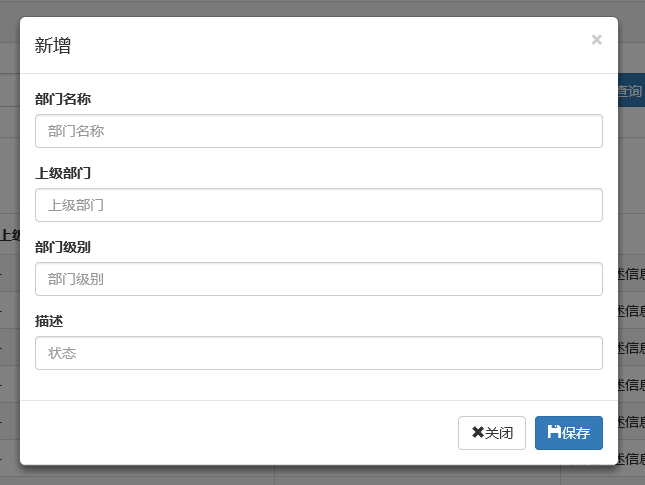
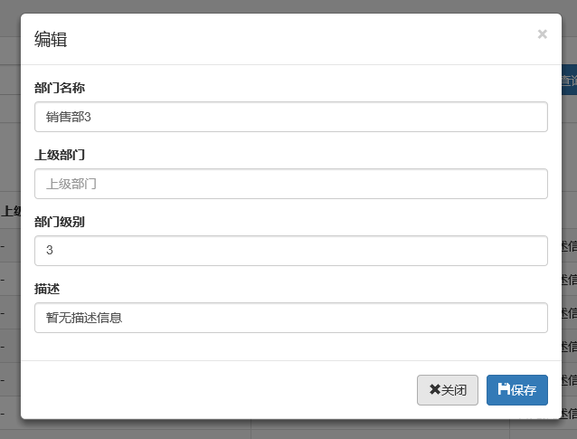
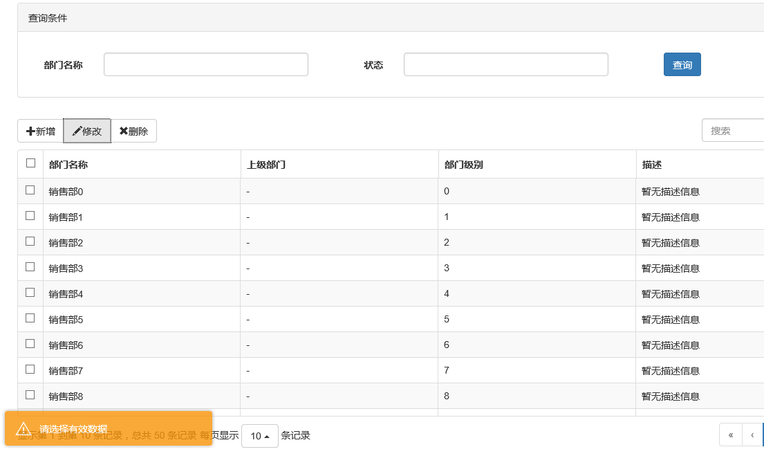
3、效果展示
新增效果
编辑效果
4、说明
弹出框显示后,点击界面上其他地方以及按Esc键都能隐藏弹出框,这样使得用户的操作更加友好。关于dialog里面关闭和保存按钮的事件的初始化在项目里面一般是封装过的,这个我们待会来看。
二、确认取消提示框
这种类型的提示框一般用于某些需要用户确定才能进行的操作,比较常见的如:删除操作、提交订单操作等。
1、使用bootstrap弹出框确认取消提示框
介绍这个组件之前,就得说说组件封装了,我们知道,像弹出框、确认取消提示框、信息提示框这些东西项目里面肯定是多处都要调用的,所以我们肯定是要封装组件的。下面就来看看我们封装的缺乏取消提示框。
|
1
2
3
4
5
6
7
8
9
10
11
12
13
14
15
16
17
18
19
20
21
22
23
24
25
26
27
28
29
30
31
32
33
34
35
36
37
38
39
40
41
42
43
44
45
46
47
48
49
50
51
52
53
54
55
56
57
58
59
60
61
62
63
64
65
66
67
68
69
70
71
72
73
74
75
76
77
78
79
80
81
82
83
84
85
86
87
88
89
90
91
92
93
94
95
96
97
98
99
100
101
102
103
104
105
106
107
108
109
110
111
112
113
114
115
116
117
118
119
120
121
122
123
124
125
126
127
128
129
130
131
132
133
134
135
136
137
138
139
140
141
142
143
144
145
146
147
148
149
150
151
152
153
|
(function ($) { window.Ewin = function () { var html = '<div id="[Id]" class="modal fade" role="dialog" aria-labelledby="modalLabel">' + '<div class="modal-dialog modal-sm">' + '<div class="modal-content">' + '<div class="modal-header">' + '<button type="button" class="close" data-dismiss="modal"><span aria-hidden="true">×</span><span class="sr-only">Close</span></button>' + '<h4 class="modal-title" id="modalLabel">[Title]</h4>' + '</div>' + '<div class="modal-body">' + '<p>[Message]</p>' + '</div>' + '<div class="modal-footer">' + '<button type="button" class="btn btn-default cancel" data-dismiss="modal">[BtnCancel]</button>' + '<button type="button" class="btn btn-primary ok" data-dismiss="modal">[BtnOk]</button>' + '</div>' + '</div>' + '</div>' + '</div>'; var dialogdHtml = '<div id="[Id]" class="modal fade" role="dialog" aria-labelledby="modalLabel">' + '<div class="modal-dialog">' + '<div class="modal-content">' + '<div class="modal-header">' + '<button type="button" class="close" data-dismiss="modal"><span aria-hidden="true">×</span><span class="sr-only">Close</span></button>' + '<h4 class="modal-title" id="modalLabel">[Title]</h4>' + '</div>' + '<div class="modal-body">' + '</div>' + '</div>' + '</div>' + '</div>'; var reg = new RegExp("\\[([^\\[\\]]*?)\\]", 'igm'); var generateId = function () { var date = new Date(); return 'mdl' + date.valueOf(); } var init = function (options) { options = $.extend({}, { title: "操作提示", message: "提示内容", btnok: "确定", btncl: "取消", width: 200, auto: false }, options || {}); var modalId = generateId(); var content = html.replace(reg, function (node, key) { return { Id: modalId, Title: options.title, Message: options.message, BtnOk: options.btnok, BtnCancel: options.btncl }[key]; }); $('body').append(content); $('#' + modalId).modal({ width: options.width, backdrop: 'static' }); $('#' + modalId).on('hide.bs.modal', function (e) { $('body').find('#' + modalId).remove(); }); return modalId; } return { alert: function (options) { if (typeof options == 'string') { options = { message: options }; } var id = init(options); var modal = $('#' + id); modal.find('.ok').removeClass('btn-success').addClass('btn-primary'); modal.find('.cancel').hide(); return { id: id, on: function (callback) { if (callback && callback instanceof Function) { modal.find('.ok').click(function () { callback(true); }); } }, hide: function (callback) { if (callback && callback instanceof Function) { modal.on('hide.bs.modal', function (e) { callback(e); }); } } }; }, confirm: function (options) { var id = init(options); var modal = $('#' + id); modal.find('.ok').removeClass('btn-primary').addClass('btn-success'); modal.find('.cancel').show(); return { id: id, on: function (callback) { if (callback && callback instanceof Function) { modal.find('.ok').click(function () { callback(true); }); modal.find('.cancel').click(function () { callback(false); }); } }, hide: function (callback) { if (callback && callback instanceof Function) { modal.on('hide.bs.modal', function (e) { callback(e); }); } } }; }, dialog: function (options) { options = $.extend({}, { title: 'title', url: '', width: 800, height: 550, onReady: function () { }, onShown: function (e) { } }, options || {}); var modalId = generateId(); var content = dialogdHtml.replace(reg, function (node, key) { return { Id: modalId, Title: options.title }[key]; }); $('body').append(content); var target = $('#' + modalId); target.find('.modal-body').load(options.url); if (options.onReady()) options.onReady.call(target); target.modal(); target.on('shown.bs.modal', function (e) { if (options.onReady(e)) options.onReady.call(target, e); }); target.on('hide.bs.modal', function (e) { $('body').find(target).remove(); }); } } }();})(jQuery); |
不了解组件封装的朋友可以先看看相关文章。这里我们的确认取消提示框主要用到了confirm这个属性对应的方法。还是来看看如何调用吧:
|
1
2
3
4
5
6
7
8
9
10
11
12
13
14
15
16
17
18
19
20
21
22
23
24
25
26
27
28
29
30
31
32
33
|
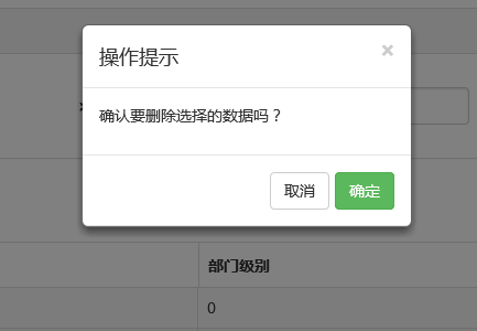
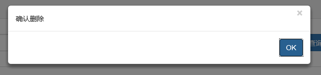
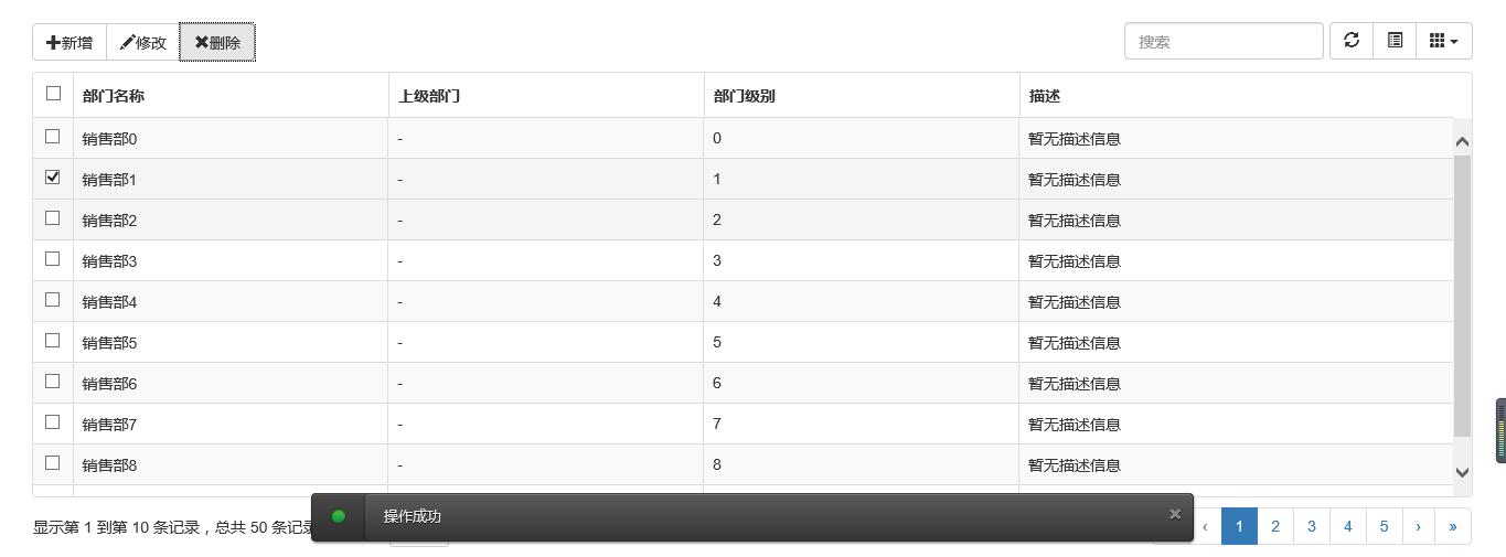
//注册删除按钮的事件$("#btn_delete").click(function () { //取表格的选中行数据 var arrselections = $("#tb_departments").bootstrapTable('getSelections'); if (arrselections.length <= 0) { toastr.warning('请选择有效数据'); return; } Ewin.confirm({ message: "确认要删除选择的数据吗?" }).on(function (e) { if (!e) { return; } $.ajax({ type: "post", url: "/api/DepartmentApi/Delete", data: { "": JSON.stringify(arrselections) }, success: function (data, status) { if (status == "success") { toastr.success('提交数据成功'); $("#tb_departments").bootstrapTable('refresh'); } }, error: function () { toastr.error('Error'); }, complete: function () { } }); }); }); |
message属性传入提示的信息,on里面注入点击按钮后的回调事件。
生成的效果:
2、bootbox组件的使用
在网上找bootstrap的弹出组件时总是可以看到bootbox这么一个东西,确实是一个很简单的组件,还是来看看如何使用吧。
当然要使用它必须要添加组件喽。无非也是两种方式:引入源码和Nuget。
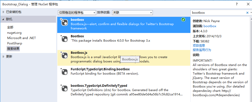
接下来就是使用它了。首先当然是添加bootbox.js的引用了。然后就是在相应的地方调用了。
|
1
2
3
4
5
6
7
8
9
10
11
12
13
14
15
16
17
18
|
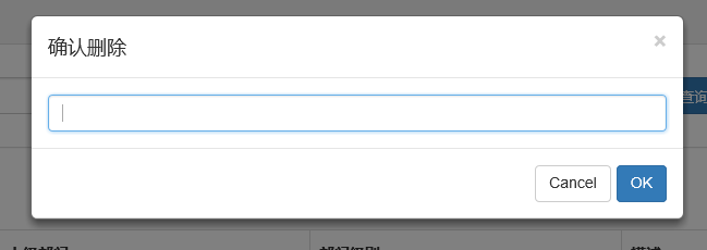
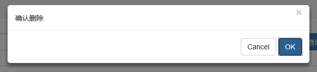
$("#btn_delete").click(function () { var arrselections = $("#tb_departments").bootstrapTable('getSelections'); if (arrselections.length <= 0) { toastr.warning('请选择有效数据'); return; } bootbox.alert("确认删除", function () { var strResult = ""; }) bootbox.prompt("确认删除", function (result) { var strResult = result; }) bootbox.confirm("确认删除", function (result) { var strResult = result; }) }); |
效果展示:
更多用法可以参见api。使用起来基本很简单。这个组件最大的特点就是和bootstrap的风格能够很好的保持一致。
3、在网上还找到一个效果比较炫一点的提示框:sweetalert
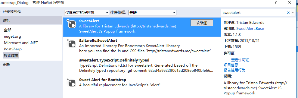
要使用它,还是老规矩:Nuget。
(1)文档
(2)在cshtml页面引入js和css
<link href="~/Styles/sweetalert.css" rel="stylesheet" />
<script src="~/Scripts/sweetalert.min.js"></script>
(3)js使用
|
1
2
3
4
5
6
7
8
9
10
11
12
13
14
15
16
17
18
19
20
21
22
23
24
25
26
27
28
29
|
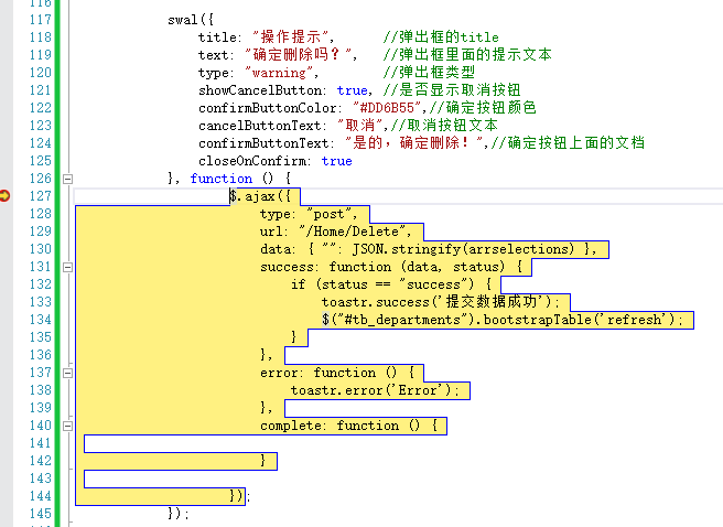
swal({ title: "操作提示", //弹出框的title text: "确定删除吗?", //弹出框里面的提示文本 type: "warning", //弹出框类型 showCancelButton: true, //是否显示取消按钮 confirmButtonColor: "#DD6B55",//确定按钮颜色 cancelButtonText: "取消",//取消按钮文本 confirmButtonText: "是的,确定删除!",//确定按钮上面的文档 closeOnConfirm: true }, function () { $.ajax({ type: "post", url: "/Home/Delete", data: { "": JSON.stringify(arrselections) }, success: function (data, status) { if (status == "success") { toastr.success('提交数据成功'); $("#tb_departments").bootstrapTable('refresh'); } }, error: function () { toastr.error('Error'); }, complete: function () { } }); }); |
(4)效果展示:
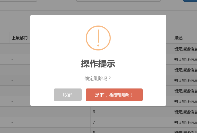
点击确定后进入回调函数:
组件很多,用哪种园友没可以自行决定,不过博主觉得像一些互联网、电子商务类型的网站用sweetalert效果比较合适,一般的内部系统可能也用不上。
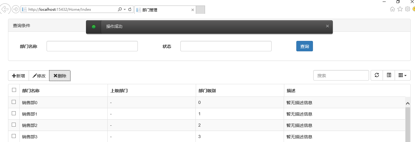
三、操作完成提示框
1、toastr.js组件
关于信息提示框,博主项目中使用的是toastr.js这么一个组件,这个组件最大的好处就是异步、无阻塞,提示后可设置消失时间,并且可以将消息提示放到界面的各个地方。先来看看效果。
显示在不同位置:
top-center位置
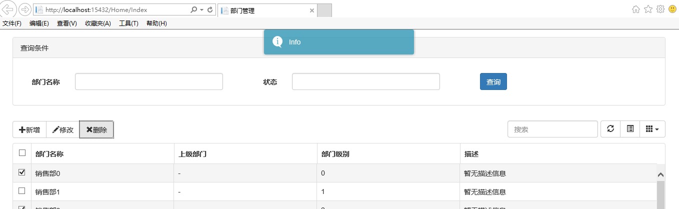
bottom-left位置
关于它的使用。
(1)、引入js和css
|
1
2
|
<link href="~/Content/toastr/toastr.css" rel="stylesheet" /><script src="~/Content/toastr/toastr.min.js"></script> |
(2)、js初始化
|
1
2
3
|
<script type="text/javascript"> toastr.options.positionClass = 'toast-bottom-right'; </script> |
将这个属性值设置为不同的值就能让提示信息显示在不同的位置,如toast-bottom-right表示下右、toast-bottom-center表示下中、toast-top-center表示上中等,更过位置信息请查看文档。
(3)、使用
|
1
2
3
4
5
6
7
8
9
10
11
12
13
14
15
16
|
//初始化编辑按钮$("#btn_edit").click(function () { var arrselections = $("#tb_departments").bootstrapTable('getSelections'); if (arrselections.length > 1) { toastr.warning('只能选择一行进行编辑'); return; } if (arrselections.length <= 0) { toastr.warning('请选择有效数据'); return; } $('#myModal').modal(); }); |
使用起来就如下一句:
toastr.warning('只能选择一行进行编辑');
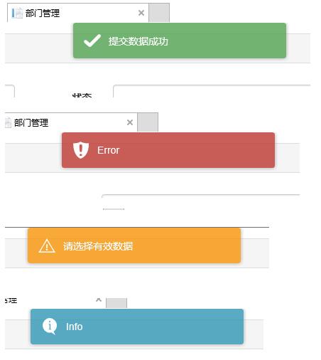
是不是很简单~~这里的有四种方法分别对应四种不同颜色的提示框。
toastr.success('提交数据成功');
toastr.error('Error');
toastr.warning('只能选择一行进行编辑');
toastr.info('info');
分别对应上图中的四种颜色的提示框。
2、Messenger组件
在Bootstrap中文网里面提到了一个alert组件:Messenger。
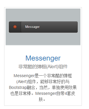
它的使用和toastr.js这个组件基本相似,只不过效果有点不太一样。我们还是来看看它是如何使用的。
(1)效果展示
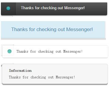
可以定位到网页的不同位置,例如下图中给出的下中位置、上中位置。
提示框的样式有三种状态:Success、Error、Info
并且支持四种不同样式的提示框:Future、Block、Air、Ice
(2)组件使用以及代码示例
关于它的使用和toastr大同小异,首先引入组件:
|
1
2
3
|
<script src="~/Content/HubSpot-messenger-a3df9a6/build/js/messenger.js"></script> <link href="~/Content/HubSpot-messenger-a3df9a6/build/css/messenger.css" rel="stylesheet" /> <link href="~/Content/HubSpot-messenger-a3df9a6/build/css/messenger-theme-future.css" rel="stylesheet" /> |
初始化它的位置
|
1
2
3
4
5
|
<script type="text/javascript"> $._messengerDefaults = { extraClasses: 'messenger-fixed messenger-theme-future messenger-on-bottom messenger-on-right' }</script> |
然后js里面使用如下:
|
1
2
3
4
5
6
7
8
9
|
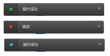
$("#btn_delete").click(function () { $.globalMessenger().post({ message: "操作成功",//提示信息 type: 'info',//消息类型。error、info、success hideAfter: 2,//多长时间消失 showCloseButton:true,//是否显示关闭按钮 hideOnNavigate: true //是否隐藏导航 });}); |
如果提示框使用默认样式,也只有一句就能解决
|
1
2
3
4
|
$.globalMessenger().post({ message: "操作成功",//提示信息 type: 'info',//消息类型。error、info、success }); |
很简单很强大有木有~~
Bootstrap实现弹出框和提示框效果代码的更多相关文章
- vue 百度地图实现标记多个maker,并点击任意一个maker弹出对应的提示框信息, (附: 通过多个地址,标记多个marker 的 方法思路)
通过点击不同筛选条件,筛选出不同企业所在的地点, 根据每个企业的经纬度 在地图上标记多个maker,点击任意一个maker,会弹出infoWindow 信息窗口: 说明: 因每个人写法不同.需求不同 ...
- Process启动.exe,当.exe内部抛出异常时,总会弹出一个错误提示框,阻止Process进入结束
public class TaskProcess { [DllImport("kernel32.dll", SetLastError = true)] public static ...
- 解决IE9弹出json下载提示框
<!-- 开启注解 --> <mvc:annotation-driven> <mvc:message-converters> <bean class=&quo ...
- JS组件系列——Bootstrap寒冬暖身篇:弹出框和提示框效果以及代码展示
前言:对于Web开发人员,弹出框和提示框的使用肯定不会陌生,比如常见的表格新增和编辑功能,一般常见的主要有两种处理方式:行内编辑和弹出框编辑.在增加用户体验方面,弹出框和提示框起着重要的作用,如果你的 ...
- Bootstrap:弹出框和提示框效果以及代码展示
前言:对于Web开发人员,弹出框和提示框的使用肯定不会陌生,比如常见的表格新增和编辑功能,一般常见的主要有两种处理方式:行内编辑和弹出框编辑.在增加用户体验方面,弹出框和提示框起着重要的作用,如果你的 ...
- JS组件Bootstrap实现弹出框和提示框效果代码
这篇文章主要介绍了JS组件Bootstrap实现弹出框和提示框效果代码,对弹出框和提示框感兴趣的小伙伴们可以参考一下 前言:对于Web开发人员,弹出框和提示框的使用肯定不会陌生,比如常见的表格新增和编 ...
- Bootstrap篇:弹出框和提示框效果以及代码展示
前言:对于Web开发人员,弹出框和提示框的使用肯定不会陌生,比如常见的表格新增和编辑功能,一般常见的主要有两种处理方式:行内编辑和弹出框编辑.在增加用户体验方面,弹出框和提示框起着重要的作用,如果你 ...
- [Bootstrap]modal弹出框
写在前面 在实际开发中,为了友好,更需要一种美观的弹出框,js原生的alert,很难满足需求.这里推荐一个bootstrap的弹出框. 一个例子 先看效果吧 代码: <!DOCTYPE html ...
- Bootstrap模态弹出框
前面的话 在 Bootstrap 框架中把模态弹出框统一称为 Modal.这种弹出框效果在大多数 Web 网站的交互中都可见.比如点击一个按钮弹出一个框,弹出的框可能是一段文件描述,也可能带有按钮操作 ...
随机推荐
- uva 11181 - Probability|Given
条件概率公式:P( A|B ) = P( AB ) / P( B ) 表示在事件B发生的前提,事件A发生的可能性: 问题的: 复位事件E:r个人买东西: 事件Ei:文章i个人买东西: 的要求是P( E ...
- 扩展ToolBarManager、ListView和Grid控件以实现气球式的ToolTip
原文:扩展ToolBarManager.ListView和Grid控件以实现气球式的ToolTip infragistics是全球领先的UI工具和用户体验的专家,Infragistics开发了一系列的 ...
- SSMS2008插件开发(3)--部署调试SSMS2008插件
原文:SSMS2008插件开发(3)--部署调试SSMS2008插件 上一次说到VS2008中的插件开发,最终结果插件是部署在VS2008中,现在我们将插件部署到SSMS2008(Microsoft ...
- Jumony快速抓取网页
Jumony快速抓取网页 --- Jumony使用笔记--icode 作者:郝喜路 个人主页:http://www.cnicode.com 博客地址:http://haoxilu.c ...
- Android开发方法学
这是Cyril Mottier最近更新的一篇文章,原谅地址在这里:Android开发方法学. 这篇文章是他介绍自己所在项目小组(Capitaine Train Android Team)设计.开发时的 ...
- AngularJS中数据双向绑定(two-way data-binding)
1.切换工作目录 git checkout step-4 #切换分支,切换到第4步 npm start #启动项目 2.代码 app/index.html Search: <input ng-m ...
- SZU : A18 (Climb Well)
Judge Info Memory Limit: 32768KB Case Time Limit: 10000MS Time Limit: 10000MS Judger: Number Only Ju ...
- JS菜单条智能定位效果
JS仿淘宝详情页菜单条智能定位效果 2014-01-15 15:40 by 龙恩0707, 1366 阅读, 9 评论, 收藏, 编辑 类似于淘宝详情页菜单条智能定位 对于每个人来说并不陌生!如下截图 ...
- java web项目基础
listener,filter,servlet的初始化顺序 web.xml中可以配置如下信息: context-param,listener,filter,servlet. 他们的加载顺序和在we ...
- ubuntu 下面手动安装jdk
ubuntu 下面手动安装jdk 刚才在ubuntu安装jdk和eclipse,感觉主要安装jdk比较麻烦,记录一下笔记以备后面查看 先在官网上下载jdk的tar包:http://www.oracle ...