WPF 10天修炼 第七天- WPF资源、样式、控件模板
WPF资源
对象资源
WPF允许在XAML标记的任意位置定义资源。比如在特定的控件、窗口或应用程序级别定义资源,WPF资源系统提供的对象资源有如下好处:
1、 高效:使用对象资源可以在一个地方定义而在多个地方使用,这使得WPF代码可重用一些对象信息。
2、 可维护:可以将一些设置信息放置在一个中心位置,并在多个地方使用。如果需要进行更改时,只需要在中心位置进行更改,方便代码的维护工作。
3、 可适应性:当确定的信息从应用程序中分离出来放在资源中,就可以动态地被改变。例如可以基于用户的偏好设置当前语言来更改信息。
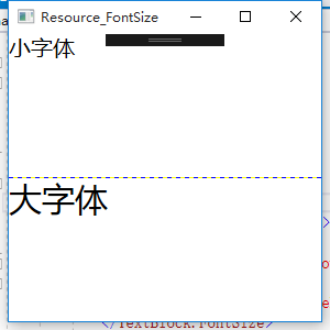
下面是一个在Grid级别的资源,设置textblock的字体大小。
<Window x:Class="WPFDemo.Resource_FontSize"

        xmlns="http://schemas.microsoft.com/winfx/2006/xaml/presentation"

        xmlns:x="http://schemas.microsoft.com/winfx/2006/xaml"

        xmlns:d="http://schemas.microsoft.com/expression/blend/2008"

        xmlns:mc="http://schemas.openxmlformats.org/markup-compatibility/2006"

        xmlns:local="clr-namespace:WPFDemo"

        xmlns:s="clr-namespace:System;assembly=mscorlib"

        mc:Ignorable="d"

        Title="Resource_FontSize" Height="300" Width="300"

        >

    <Grid ShowGridLines="True">

        <Grid.RowDefinitions>

            <RowDefinition />

            <RowDefinition />

        </Grid.RowDefinitions>

        <!---Grid级别的资源-->

        <Grid.Resources>

            <s:Double x:Key="SmallSize" >20</s:Double>

            <s:Double x:Key="LargeSize">30</s:Double>

        </Grid.Resources>

        <TextBlock Text="小字体" Grid.Row="0">

            <TextBlock.FontSize>

                <StaticResource ResourceKey="SmallSize" />

            </TextBlock.FontSize>

        </TextBlock>

        <TextBlock Text="大字体" Grid.Row="1">

            <TextBlock.FontSize>

                <StaticResource ResourceKey="LargeSize" />

            </TextBlock.FontSize>

        </TextBlock>

    </Grid>

</Window>
静态资源
静态资源就是上面使用StaticResource标记引用的资源。这种资源一旦被创建就不会被改变。静态资源必须先定义资源,否则会抛出异常。
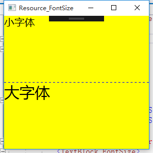
应用程序资源
应用程序的资源作用域覆盖整个WPF应用程序,WPF将按照元素、窗口、应用程序、系统资源的顺序进行资源查找。当新建一个WPF项目时,在APP.xaml中会自动添加<Application.Resources>标签,可以在标签内添加应用程序级别的资源。
定义BackgroundColor系统资源
<Application x:Class="WPFDemo.App"

             xmlns="http://schemas.microsoft.com/winfx/2006/xaml/presentation"

             xmlns:x="http://schemas.microsoft.com/winfx/2006/xaml"

             StartupUri="Resource-FontSize.xaml"

             >

    <Application.Resources>

        <SolidColorBrush x:Key="BackgroundColor" Color="Yellow">

       </SolidColorBrush>

    </Application.Resources>

</Application>
调用BackgrouundColor资源
在Window标签添加引用 Background="{StaticResource BackgroundColor}"
<Window x:Class="WPFDemo.Resource_FontSize"

        xmlns="http://schemas.microsoft.com/winfx/2006/xaml/presentation"

        xmlns:x="http://schemas.microsoft.com/winfx/2006/xaml"

        xmlns:d="http://schemas.microsoft.com/expression/blend/2008"

        xmlns:mc="http://schemas.openxmlformats.org/markup-compatibility/2006"

        xmlns:local="clr-namespace:WPFDemo"

        xmlns:s="clr-namespace:System;assembly=mscorlib"

        mc:Ignorable="d"

        Title="Resource_FontSize" Height="300" Width="300"

        Background="{StaticResource BackgroundColor}"

        >

    <Grid ShowGridLines="True">

        <Grid.RowDefinitions>

            <RowDefinition />

            <RowDefinition />

        </Grid.RowDefinitions>

        <!---Grid级别的资源-->

        <Grid.Resources>

            <s:Double x:Key="SmallSize" >20</s:Double>

            <s:Double x:Key="LargeSize">30</s:Double>

        </Grid.Resources>

        <TextBlock Text="小字体" Grid.Row="0">

            <TextBlock.FontSize>

                <StaticResource ResourceKey="SmallSize" />

            </TextBlock.FontSize>

        </TextBlock>

        <TextBlock Text="大字体" Grid.Row="1">

            <TextBlock.FontSize>

                <StaticResource ResourceKey="LargeSize" />

            </TextBlock.FontSize>

        </TextBlock>

    </Grid>

</Window>
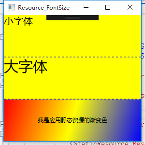
使用资源字典组织资源
可以在一个单独的XAML文件中定义资源,然后该资源可以在多个项目进行共享。独立的资源文件使用ResourceDictionary作为根元素。该XAML文件除了用于存储资源外,不能做任何其他的工作。
下面定义一个线性渐变的背景色
1、 首先新建WPF资源文件添加资源内容
2、 将资源文件设置生成操作位Page以确保资源被作为BAML文件编译。也可以将其指定为Reesource,这种方式将内嵌在程序集中,不被编译,运行时编译,性能开支较大。
3、为了使用该资源,需要将其合并到应用程序资源集合中,可以合并到指定窗口资源集合,但是通常合并到应用程序级别的集合。
新建WPF资源文件并添加内容
<ResourceDictionary xmlns="http://schemas.microsoft.com/winfx/2006/xaml/presentation"

                    xmlns:x="http://schemas.microsoft.com/winfx/2006/xaml"

                    xmlns:local="clr-namespace:WPFDemo">

    <!--定义渐变的背景色-->

    <LinearGradientBrush x:Key="brushLinear">

        <LinearGradientBrush.GradientStops>

            <GradientStop Color="Red" Offset="0" />

            <GradientStop Color="Yellow" Offset="0.5" />

            <GradientStop Color="Blue" Offset="1" />

        </LinearGradientBrush.GradientStops>

    </LinearGradientBrush>

</ResourceDictionary>
将资源文件合并到应用程序资源中
<Application x:Class="WPFDemo.App"

             xmlns="http://schemas.microsoft.com/winfx/2006/xaml/presentation"

             xmlns:x="http://schemas.microsoft.com/winfx/2006/xaml"

             StartupUri="Resource-FontSize.xaml"

             >

    <Application.Resources>

        <ResourceDictionary>

            <SolidColorBrush x:Key="BackgroundColor" Color="Yellow"></SolidColorBrush>

            <ResourceDictionary.MergedDictionaries>

                <ResourceDictionary Source="DictionaryDemo.xaml" />

            </ResourceDictionary.MergedDictionaries>

        </ResourceDictionary>

    </Application.Resources>

</Application>
在上面的例子中增加一个button按钮将其背景颜色设置为渐变
<Window x:Class="WPFDemo.Resource_FontSize"

        xmlns="http://schemas.microsoft.com/winfx/2006/xaml/presentation"

        xmlns:x="http://schemas.microsoft.com/winfx/2006/xaml"

        xmlns:d="http://schemas.microsoft.com/expression/blend/2008"

        xmlns:mc="http://schemas.openxmlformats.org/markup-compatibility/2006"

        xmlns:local="clr-namespace:WPFDemo"

        xmlns:s="clr-namespace:System;assembly=mscorlib"

        mc:Ignorable="d"

        Title="Resource_FontSize" Height="300" Width="300"

        Background="{StaticResource BackgroundColor}"

        >

    <Grid ShowGridLines="True">

        <Grid.RowDefinitions>

            <RowDefinition />

            <RowDefinition />

            <RowDefinition />

        </Grid.RowDefinitions>

        <!---Grid级别的资源-->

        <Grid.Resources>

            <s:Double x:Key="SmallSize" >20</s:Double>

            <s:Double x:Key="LargeSize">30</s:Double>

        </Grid.Resources>

        <TextBlock Text="小字体" Grid.Row="0">

            <TextBlock.FontSize>

                <StaticResource ResourceKey="SmallSize" />

            </TextBlock.FontSize>

        </TextBlock>

        <TextBlock Text="大字体" Grid.Row="1">

            <TextBlock.FontSize>

                <StaticResource ResourceKey="LargeSize" />

            </TextBlock.FontSize>

        </TextBlock>

        <Button Grid.Row="2" Content="我是应用静态资源的渐变色">

            <Button.Background>

                <StaticResource ResourceKey="brushLinear" />

            </Button.Background>

        </Button>

    </Grid>

</Window>
WPF样式
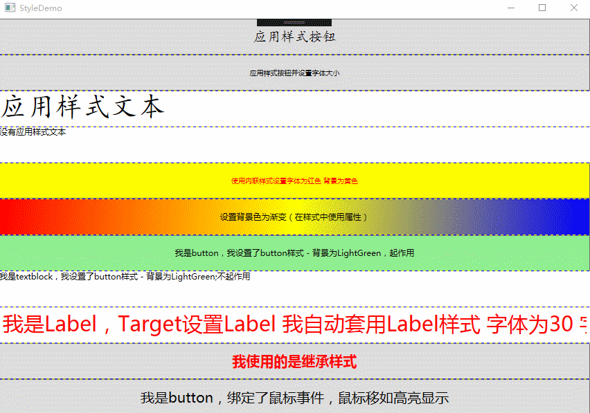
样式是WPF中功能强大的特性,样式基于资源,但是比资源提供了更多重用代码特性。样式与资源相比,提供了额外的好处来使XAML更具可重用性和扩展性。假设在UI中有几个button控件。需要提供3中不同的显示风格。例如不同的FontSize ,FontFamily 和FontWeight 3个属性。此时可能会考虑使用资源的办法,使用该资源可以完成该功能,但是如果每个属性设置3中资源,将会有9中资源出现。在这里使用WPF的样式功能可以轻松解决这些问题。
样式设置优先级:
|
优先级 |
描述 |
|
元素(高) |
元素本身定义的属性具有最高的优先级 |
|
样式(中) |
在样式中定义的相同属性 |
|
父元素(低) |
从视觉树的父元素中继承下来的属性 |
下面实例中会将样式的各种用法都涉及到:主要包括基本的样式、内联样式、在样式中设置属性的复杂应用、根据指定类型自动应用样式。
<Window x:Class="WPFDemo.StyleDemo"

        xmlns="http://schemas.microsoft.com/winfx/2006/xaml/presentation"

        xmlns:x="http://schemas.microsoft.com/winfx/2006/xaml"

        xmlns:d="http://schemas.microsoft.com/expression/blend/2008"

        xmlns:mc="http://schemas.openxmlformats.org/markup-compatibility/2006"

        xmlns:local="clr-namespace:WPFDemo"

        mc:Ignorable="d"

        Title="StyleDemo" Height="300" Width="300">

    <Window.Resources>

        <!--基本样式 button 按钮样式-->

        <Style x:Key="ButtonStyle">

            <Setter Property="Control.FontFamily" Value="楷体"></Setter>

            <Setter Property="Control.FontSize" Value="20"></Setter>

        </Style>

        <!--基本样式 Textblock样式-->

        <Style x:Key="TextBlockStyle">

            <Setter Property="Control.FontFamily" Value="楷体"></Setter>

            <Setter Property="Control.FontSize" Value="40"></Setter>

        </Style>

        <!--仅限Button使用-->

        <Style x:Key="buttonBackgroundColor">

            <Setter Property="Button.Background" Value="LightGreen"></Setter>

        </Style>

        <!--使用TargetType指定样式使用的控件类型  自动套用样式-->

        <Style TargetType="{x:Type Label}">

            <Setter Property="Foreground" Value="Red"></Setter>

            <Setter Property="FontSize" Value="30"></Setter>

        </Style>

        <!--控件基类样式-->

        <Style x:Key="BaseStyle">

            <Setter Property="Control.FontSize" Value="20"></Setter>

        </Style>

        <!--继承BaseStyle-->

        <Style x:Key="BaseButtonSyle" BasedOn="{StaticResource BaseStyle}">

            <Setter Property="Control.Foreground" Value="Red"></Setter>

            <Setter Property="Control.FontWeight" Value="Bold"></Setter>

        </Style>

    </Window.Resources>

    <Grid ShowGridLines="True">

        <Grid.RowDefinitions>

            <RowDefinition />

            <RowDefinition />

            <RowDefinition />

            <RowDefinition />

            <RowDefinition />

            <RowDefinition />

            <RowDefinition />

            <RowDefinition />

            <RowDefinition />

            <RowDefinition />

        </Grid.RowDefinitions>

        <Button Grid.Row="0" Content="应用样式按钮" Style="{StaticResource ButtonStyle}"></Button>

        <Button Grid.Row="1" FontSize="10" Content="应用样式按钮并设置字体大小" ></Button>

        <TextBlock Grid.Row="2" Text="应用样式文本" Style="{StaticResource TextBlockStyle}"></TextBlock>

        <TextBlock Grid.Row="3" Text="没有应用样式文本" ></TextBlock>

        <Button Grid.Row="4"  FontSize="10" Content="使用内联样式设置字体为红色 背景为黄色" >

            <!--内联样式-->

            <Button.Style>

                <Style>

                    <Setter Property="Control.Foreground" Value="Red"></Setter>

                    <Setter Property="Control.Background" Value="Yellow"></Setter>

                </Style>

            </Button.Style>

        </Button>

        <Button Grid.Row="5" Content="设置背景色为渐变(在样式中使用属性)">

            <!--样式中使用属性-->

            <Button.Style>

                <Style>

                    <Setter Property="Button.Background">

                        <Setter.Value>

                            <LinearGradientBrush  StartPoint="0,0" EndPoint="1,1">

                                <LinearGradientBrush.GradientStops>

                                    <GradientStop Color="Red" Offset="0"/>

                                    <GradientStop Color="Yellow" Offset="0.5"/>

                                    <GradientStop Color="Blue" Offset="1"/>

                                </LinearGradientBrush.GradientStops>

                            </LinearGradientBrush>

                        </Setter.Value>

                    </Setter>

                </Style>

            </Button.Style>

        </Button>

        <Button Grid.Row="6" Content="我是button,我设置了button样式 - 背景为LightGreen,起作用" Style="{StaticResource buttonBackgroundColor}"></Button>

        <TextBlock Grid.Row="7" Text="我是textblock,我设置了button样式 - 背景为LightGreen;不起作用" Style="{StaticResource buttonBackgroundColor}"></TextBlock>

        <Label Grid.Row="8"   Content="我是Label,Target设置Label 我自动套用Label样式 字体为30 字体为红色"></Label>

        <Button Grid.Row="9" Style="{StaticResource BaseButtonSyle}" Content="我使用的是继承样式"></Button>

    </Grid>

</Window>
样式触发器
Style类提供了Triggers集合,每个样式可以有多个触发器,每个触发器是一个派生自System.Windows.TriggerBase类的实例。在WPF中,继承自TriggerBase的触发器有下面的类型(属性触发器、数据触发器、事件触发器):
1、Trigger:简单触发器,该触发器检查特定的依赖的属性的值是否发生变化来使用Setter改变样式。
2、MultiTrigger:类似于简单触发器,但是组合了多个条件,所有的条件必须被满足才会改变样式。
3、DataTrigger:与简单触发器类似,该触发器与数据绑定一起运行。但是该触发器是检测任何绑定的数据是否发生变化。
4、MultiDataTrigger:组合了多个DataTrigger。
5、EventTrigger:这是最常用的触发器,当某个事件触发时来改变样式。
在触发器中如果多个触发器修改相同的属性,则最后触发的触发器优先。
<Window x:Class="WPFDemo.StyleTriggerDemo"
xmlns="http://schemas.microsoft.com/winfx/2006/xaml/presentation"
xmlns:x="http://schemas.microsoft.com/winfx/2006/xaml"
xmlns:d="http://schemas.microsoft.com/expression/blend/2008"
xmlns:mc="http://schemas.openxmlformats.org/markup-compatibility/2006"
xmlns:local="clr-namespace:WPFDemo"
mc:Ignorable="d"
Title="StyleTriggerDemo" Height="300" Width="300">
<Window.Resources>
<!--属性触发器 按下鼠标后字体增大 按钮旋转20度-->
<Style x:Key="buttonStyle" TargetType="{x:Type Button}">
<Style.Triggers>
<Trigger Property="IsPressed" Value="True">
<Setter Property="RenderTransform">
<Setter.Value>
<RotateTransform Angle="20" />
</Setter.Value>
</Setter>
<Setter Property="Foreground" Value="Black"/>
<Setter Property="FontSize" Value="20"></Setter>
</Trigger>
</Style.Triggers>
<Setter Property="FontSize" Value="10"></Setter>
<Setter Property="Foreground" Value="White"/>
<Setter Property="Background" Value="#FF87F16F"/>
<Setter Property="Width" Value="100"></Setter>
<Setter Property="Height" Value="50" />
</Style> <!--多条件属性触发器 鼠标经过时显示字体颜色为黄色;鼠标按下并且字体为20时设置字体颜色为红色-->
<Style x:Key="buttonStyle-Multi" TargetType="{x:Type Button}">
<Setter Property="FontSize" Value="20" />
<Style.Triggers>
<Trigger Property="IsMouseOver" Value="True">
<Setter Property="Foreground" Value="Yellow" />
</Trigger>
<MultiTrigger>
<MultiTrigger.Conditions>
<Condition Property="IsPressed" Value="True"/>
<Condition Property="FontSize" Value="20"/>
</MultiTrigger.Conditions>
<MultiTrigger.Setters>
<Setter Property="Foreground" Value="Red"></Setter>
</MultiTrigger.Setters>
</MultiTrigger>
</Style.Triggers> </Style> <!--事件触发器-->
<Style x:Key="buttonClickStyle">
<Setter Property="Control.FontSize" Value="20"></Setter>
<!--定义事件触发器-->
<Style.Triggers>
<EventTrigger RoutedEvent="Button.Click">
<BeginStoryboard>
<Storyboard>
<DoubleAnimation Storyboard.TargetProperty="Opacity" From="0.1" To="1" Duration="0:0:2"></DoubleAnimation>
</Storyboard>
</BeginStoryboard>
</EventTrigger>
</Style.Triggers>
</Style>
<!--数据触发器-->
<Style x:Key="DataTextTrigger">
<!---将控件的背景色设置为文本框中输入的颜色-->
<Setter Property="Control.Background" Value="{Binding RelativeSource={RelativeSource Self},Path=Text}"></Setter>
<Style.Triggers>
<!--当文本中输入的字符超过20时,则文本框的Enable为false-->
<DataTrigger Binding="{Binding RelativeSource={RelativeSource Self},Path=Text.Length}" Value="20">
<Setter Property="Control.IsEnabled" Value="False"></Setter>
</DataTrigger>
</Style.Triggers>
</Style>
<!--多条件数据触发器-->
<Style x:Key="DataTextTrigger-Multi">
<Setter Property="Control.FontSize" Value="20"></Setter>
<Setter Property="Control.Margin" Value="10" ></Setter>
<Style.Triggers>
<MultiDataTrigger>
<MultiDataTrigger.Conditions>
<Condition Binding="{Binding ElementName=cb1,Path=IsChecked}" Value="True"></Condition>
<Condition Binding="{Binding ElementName=cb2,Path=IsChecked}" Value="True"></Condition>
</MultiDataTrigger.Conditions>
<MultiDataTrigger.Setters>
<Setter Property="Control.Background" Value="Red"></Setter>
</MultiDataTrigger.Setters>
</MultiDataTrigger>
</Style.Triggers>
</Style>
</Window.Resources>
<Grid ShowGridLines="True">
<Grid.RowDefinitions>
<RowDefinition />
<RowDefinition />
<RowDefinition />
<RowDefinition />
<RowDefinition />
<RowDefinition />
<RowDefinition />
</Grid.RowDefinitions>
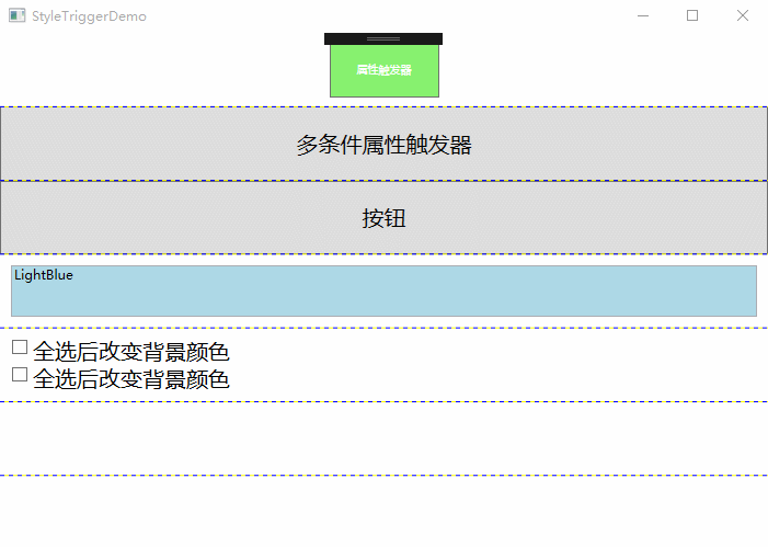
<Button Grid.Row="0" Name="but" Style="{StaticResource buttonStyle}" Content="属性触发器"/>
<Button Grid.Row="1" Style="{StaticResource buttonStyle-Multi}" Content="多条件属性触发器"/>
<Button Grid.Row="2" Content="按钮" Style="{StaticResource buttonClickStyle}"></Button>
<TextBox Grid.Row="3" Margin="10" Style="{StaticResource DataTextTrigger}" Text="LightBlue"></TextBox>
<StackPanel Grid.Row="4" Name="panel1" Style="{StaticResource DataTextTrigger-Multi}">
<CheckBox Name="cb1" >全选后改变背景颜色</CheckBox>
<CheckBox Name="cb2" >全选后改变背景颜色</CheckBox>
</StackPanel>
</Grid>
</Window>
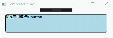
控件模板
在WPF中,每个控件都有一个默认的控件模板,用于定义控件的基本外观和行为。WPF使用ControlTemplate定义控件的外观,每个控件都有一个Template的属性。默认情况下。控件通过该属性获取呈现的外观,通过更改ControlTemplate,可以为控件定义一个新的样式
<Window x:Class="WPFDemo.TemplateDemo"

        xmlns="http://schemas.microsoft.com/winfx/2006/xaml/presentation"

        xmlns:x="http://schemas.microsoft.com/winfx/2006/xaml"

        xmlns:d="http://schemas.microsoft.com/expression/blend/2008"

        xmlns:mc="http://schemas.openxmlformats.org/markup-compatibility/2006"

        xmlns:local="clr-namespace:WPFDemo"

        mc:Ignorable="d"

        Title="TemplateDemo" Height="300" Width="300">

    <Window.Resources>

        <ControlTemplate x:Key="ButtomTemplate" TargetType="{x:Type Button}">

            <Border Name="Border" BorderBrush="{TemplateBinding Foreground}"

                    BorderThickness="{TemplateBinding BorderThickness}"

                    CornerRadius="5" Background="{TemplateBinding Background}"

                    TextBlock.Foreground="{TemplateBinding Foreground}"

                    Margin="{TemplateBinding Margin}">

                <ContentPresenter RecognizesAccessKey="True"

                                  HorizontalAlignment="{TemplateBinding HorizontalAlignment}"

                                  VerticalAlignment="{TemplateBinding VerticalAlignment}">

                </ContentPresenter>

            </Border>

            <!--设置模板触发器-->

            <ControlTemplate.Triggers>

                <Trigger Property="IsMouseOver"  Value="True">

                    <Setter TargetName="Border" Property="Background" Value="Red"></Setter>

                </Trigger>

                <Trigger Property="IsPressed" Value="True">

                    <Setter TargetName="Border" Property="Background" Value="Yellow"></Setter>

                </Trigger>

            </ControlTemplate.Triggers>

        </ControlTemplate>

    </Window.Resources>

    <Grid>

        <Button   Template="{StaticResource ButtomTemplate}" Margin="10" Background="LightBlue" Content="我是套用模板的button"></Button>

    </Grid>

</Window>
WPF 10天修炼 第七天- WPF资源、样式、控件模板的更多相关文章
- WPF 10天修炼 第十天- WPF数据绑定
WPF数据绑定 数据绑定到元素属性是将源对象指定为一个WPF元素,并且源属性是一个依赖属性,依赖属性内置了变更通知.当改变源对象依赖属性值之后,绑定目标可以立即得到更新,开发人员不需要手动编写响应事件 ...
- WPF 10天修炼 第四天- WPF布局容器
WPF布局 WPF的窗口也就是Window类,是一个内容控件,该控件派生自ContentControl.内容控件有一个Content属性,该属性有一个限制,只能放置一个用户界面元素,或一个字符串.为了 ...
- WPF控件模板
引言:在进行WPF项目开发过程中,由于项目的需要,经常要对某个控件进行特殊的设定,其中就牵涉到模板的相关方面的内容.本文也是在自己进行项目开发过程中遇到控件模板设定时集中搜集资料后整理出来的,以供在以 ...
- 《Programming WPF》翻译 第5章 7.控件模板
原文:<Programming WPF>翻译 第5章 7.控件模板 如果仔细的看我们当前的TTT游戏,会发现Button对象并没有完全为我们工作.哪些TTT面板有内圆角? 图5-14 这里 ...
- C# WPF 低仿网易云音乐(PC)歌词控件
原文:C# WPF 低仿网易云音乐(PC)歌词控件 提醒:本篇博客记录了修改的过程,废话比较多,需要项目源码和看演示效果的直接拉到文章最底部~ 网易云音乐获取歌词的api地址 http://music ...
- 【WPF学习】第六十章 创建控件模板
经过数十天的忙碌,今天终于有时间写博客. 前面一章通过介绍有关模板工作方式相关的内容,同时介绍了FrameWorkElement下所有控件的模板.接下来将介绍如何构建一个简单的自定义按钮,并在该过程中 ...
- WPF中的ControlTemplate(控件模板)(转)
原文地址 http://www.cnblogs.com/zhouyinhui/archive/2007/03/28/690993.html WPF中的ControlTemplate(控件模板) ...
- WPF加载Winform窗体时 报错:子控件不能为顶级窗体
一.wpf项目中引用WindowsFormsIntegration和System.Windows.Forms 二.Form1.Designer.cs 的 partial class Form1 设置为 ...
- WPF笔记(1.9 样式和控件模板)——Hello,WPF!
原文:WPF笔记(1.9 样式和控件模板)--Hello,WPF! 资源的另一个用途是样式设置: <Window > <Window.Resources> <St ...
随机推荐
- webmagic保存数据
使用多线程:
- 清北学堂(2019 4 28 ) part 1
今天主要用来铺路,打基础 枚举 没什么具体算法讲究,但要考虑更优的暴力枚举方法,例如回文质数,有以下几种思路: 1.挨个枚举自然数,再一起判断是否是回文数和质数,然而一看就不是最优 2.先枚举质数再判 ...
- 图片的HTML
Code <center> <img style="border-radius: 0.3125em; box-shadow: 0 2px 4px 0 rgba(34,36, ...
- odoo10源码 windows环境安装
odoo10-windows开发环境(源码安装) 安装node 下载地址 http://nodejs.cn/download/ 安装教程https://www.cnblogs.com/zhouyu20 ...
- Plugin Kotlin was not installed: Cannot download
到 https://plugins.jetbrains.com/plugin/6954-kotlin下载对应版本(右键复制链接地址,用迅雷下载),放到androidstudio安装目录下的plugin ...
- 【THUSC2017】【LOJ2981】如果奇迹有颜色 DP BM 打表 线性递推
题目大意 有一个 \(n\) 个点的环,你要用 \(m\) 中颜色染这 \(n\) 个点. 要求连续 \(m\) 个点的颜色不能是 $1 \sim m $ 的排列. 两种环相同当且仅当这两个环可以在旋 ...
- spring IOC与AOP
Spring IOC容器 spring IOC 容器有两种,分别是 BeanFactory 容器和 ApplicationContext 容器. BeanFactory如下: /*第一步,利用Clas ...
- 关于 iOS 性能优化方面的面试题,
这是我前面几天碰到的面试题: 如何对定位和分析项目中影响性能的地方?以及如何进行性能优化? 我的答案: 定位方法: instruments 在iOS上进行性能分析的时候,首先考虑借助instrum ...
- linux通过expect工具来实现自动登录服务器,并执行相关操作
参考地址:https://www.cnblogs.com/liyuanhong/articles/7728034.html EOF的使用参考:https://www.cnblogs.com/liyua ...
- 如何部署WebSphere服务器的开发环境
WebSphere Liberty 简介 IBM WebSphere Application Server Liberty 或WebSphere Liberty Profile Server(简称 L ...