一款纯css3实现的机器人看书动画效果
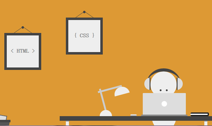
今天要给大家介绍一款纯css3实现的机器人看书动画效果。整个画面完全由css3实现的绘制,没有使用任何图片元素。机器人的眼睛使用了动画元素。我们一起看下效果图:
实现的代码。
html代码:
 <div class='szene'>

        <div class='image i1'>

            < HTML >

            <div class='nail'>

            </div>

        </div>

        <div class='image i2'>

            { CSS }

            <div class='nail'>

            </div>

        </div>

        <div class='head'>

            <div class='eyes'>

            </div>

        </div>

        <div class='body'>

        </div>

        <div class='table'>

        </div>

        <div class='laptop'>

        </div>

        <div class='mouse'>

        </div>

        <div class='notes'>

        </div>

        <div class='lamp'>

            <div class='top'>

            </div>

        </div>

        <div class='headphones'>

        </div>

        <div class='trash'>

            <div class='paper p1'>

            </div>

            <div class='paper p2'>

            </div>

            <div class='paper p3'>

            </div>

            <div class='paper p4'>

            </div>

        </div>

    </div>
css代码:
* {

  margin:;

  padding:;

  -moz-box-sizing: border-box;

       box-sizing: border-box;

}

*:before, *:after {

  content: '';

  display: block;

  position: absolute;

  -moz-box-sizing: border-box;

       box-sizing: border-box;

}

html, body {

  height: 100%;

}

body {

  background: #d93;

}

.szene {

  position: absolute;

  left: 50%;

  bottom:;

  width: 800px;

  height: 400px;

  margin-left: -400px;

  overflow: hidden;

}

.szene div {

  position: absolute;

}

.image {

  width: 120px;

  height: 120px;

  line-height: 100px;

  text-align: center;

  font-family: 'Open Sans', sans-serif;

  font-size: 18px;

  font-weight:;

  color: #888;

  border: 8px solid #444;

  background: #eee;

}

.image.i1 { top: 100px; left: 100px; }

.image.i2 { top: 50px; left: 300px; }

.image .nail {

  top: -30px;

  left: 50%;

  width: 8px;

  height: 8px;

  margin-left: -4px;

  border-radius: 50%;

  background: #444;

}

.image .nail:before,

.image .nail:after {

  top: -5px;

  width: 1px;

  height: 35px;

  background: #444;

}

.image .nail:before { left: -11px; -webkit-transform: rotate(55deg); -ms-transform: rotate(55deg); transform: rotate(55deg); }

.image .nail:after { left: 19px; -webkit-transform: rotate(-55deg); -ms-transform: rotate(-55deg); transform: rotate(-55deg); }

.head {

  bottom: 90px;

  left: 575px;

  width: 85px;

  height: 85px;

  border-radius: 50%;

  background: #eee;

}

.head .eyes {

  top: 58px;

  left: 30px;

  width: 6px;

  height: 6px;

  border-radius: 50%;

  background: #444;

  box-shadow: 20px 0 0 #444;

  -webkit-animation: 8s eyes ease infinite;

          animation: 8s eyes ease infinite;

}

@-webkit-keyframes eyes {

  0% { -webkit-transform: translate3d(0,0,0); transform: translate3d(0,0,0); }

  5% { -webkit-transform: translate3d(0,-18px,0); transform: translate3d(0,-18px,0); }

  10% { -webkit-transform: translate3d(0,-19px,0); transform: translate3d(0,-19px,0); }

  15% { -webkit-transform: translate3d(-15px,-18px,0); transform: translate3d(-15px,-18px,0); }

  20% { -webkit-transform: translate3d(-15px,-18px,0); transform: translate3d(-15px,-18px,0); }

  25% { -webkit-transform: translate3d(15px,-18px,0); transform: translate3d(15px,-18px,0); }

  30% { -webkit-transform: translate3d(15px,-18px,0); transform: translate3d(15px,-18px,0); }

  35% { -webkit-transform: translate3d(0,-18px,0); transform: translate3d(0,-18px,0); }

  40% { -webkit-transform: translate3d(0,-18px,0); transform: translate3d(0,-18px,0); }

  45% { -webkit-transform: translate3d(0,0,0); transform: translate3d(0,0,0); }

  100% { -webkit-transform: translate3d(0,0,0); transform: translate3d(0,0,0); }

}

@keyframes eyes {

  0% { -webkit-transform: translate3d(0,0,0); transform: translate3d(0,0,0); }

  5% { -webkit-transform: translate3d(0,-18px,0); transform: translate3d(0,-18px,0); }

  10% { -webkit-transform: translate3d(0,-19px,0); transform: translate3d(0,-19px,0); }

  15% { -webkit-transform: translate3d(-15px,-18px,0); transform: translate3d(-15px,-18px,0); }

  20% { -webkit-transform: translate3d(-15px,-18px,0); transform: translate3d(-15px,-18px,0); }

  25% { -webkit-transform: translate3d(15px,-18px,0); transform: translate3d(15px,-18px,0); }

  30% { -webkit-transform: translate3d(15px,-18px,0); transform: translate3d(15px,-18px,0); }

  35% { -webkit-transform: translate3d(0,-18px,0); transform: translate3d(0,-18px,0); }

  40% { -webkit-transform: translate3d(0,-18px,0); transform: translate3d(0,-18px,0); }

  45% { -webkit-transform: translate3d(0,0,0); transform: translate3d(0,0,0); }

  100% { -webkit-transform: translate3d(0,0,0); transform: translate3d(0,0,0); }

}

.body {

  bottom: -20px;

  left: 578px;

  width: 82px;

  height: 110px;

  border-radius: 0 0 50% 50%;

  background: #eee;

}

.table {

  bottom: 15px;

  left: 280px;

  width: 500px;

  height: 15px;

  background: #444;

}

.table:before,

.table:after {

  top: 15px;

  width: 10px;

  height: 20px;

  border-top: 3px solid #aaa;

  background: #eee;

}

.table:before { left: 20px; }

.table:after { right: 20px; }

.laptop {

  bottom: 35px;

  left: 550px;

  width: 140px;

  height: 70px;

  border-radius: 2px 2px 0 0;

  background: #ddd;

}

.laptop:before {

  top: 50%;

  left: 50%;

  width: 18px;

  height: 18px;

  margin: -9px 0 0 -9px;

  border-radius: 50%;

  background: #fff;

}

.laptop:after {

  top: 70px;

  left: -5px;

  width: 150px;

  height: 5px;

  border-radius: 2px 2px 0 0;

  background: #888;

}

.mouse {

  bottom: 30px;

  left: 510px;

  width: 20px;

  height: 6px;

  border-bottom: 2px solid #888;

  border-radius: 25%;

  background: #ddd;

}

.notes {

  bottom: 30px;

  left: 705px;

  width: 60px;

  height: 12px;

  background: #fff;

  border: 4px solid #222;

  border-radius: 4px;

  border-left:;

}

.lamp {

  bottom: 30px;

  left: 410px;

  width: 40px;

  height: 20px;

  border-radius: 80px 80px 0 0;

  background: #eee;

}

.lamp:before,

.lamp:after {

  z-index: -1;

  width: 6px;

  height: 80px;

  background: #ccc;

}

.lamp:before { top: -70px; left: 8px; -webkit-transform: rotate(-15deg); -ms-transform: rotate(-15deg); transform: rotate(-15deg); }

.lamp:after { top: -108px; left: 30px; -webkit-transform: rotate(75deg); -ms-transform: rotate(75deg); transform: rotate(75deg) }

.lamp .top {

  top: -75px;

  left: 45px;

  width: 50px;

  height: 25px;

  border-radius: 100px 100px 0 0;

  background: #eee;

  -webkit-transform: rotate(-15deg);

      -ms-transform: rotate(-15deg);

          transform: rotate(-15deg);

}

.headphones {

  bottom: 85px;

  left: 563px;

  width: 110px;

  height: 100px;

  border-radius: 50%;

  border-top: 10px solid #444;

}

.headphones:before,

.headphones:after {

  width: 20px;

  height: 40px;

  top: 20px;

  background: #ddd;

}

.headphones:before {

  left: -8px;

  border-radius: 80px 0 0 80px;

  border-right: 3px solid #444;

}

.headphones:after {

  right: -7px;

  border-radius: 0 80px 80px 0;

  border-left: 3px solid #444;

}

.trash {

  bottom: 10px;

  left: 20px;

  width: 100px;

  height: 8px;

  background: #444;

}

.trash:after {

  top: 8px;

  left: 3px;

  width: 94px;

  height: 25px;

  border-radius: 0 0 50px 50px;

  background: #555;

}

.trash .paper {

  z-index: -1;

  width: 25px;

  height: 50px;

  border: 2px solid #555;

  background: #ddd;

}

.trash .paper.p1 {

  top: -15px;

  left: 10px;

  -webkit-transform: rotate(-20deg);

      -ms-transform: rotate(-20deg);

          transform: rotate(-20deg);

}

.trash .paper.p2 {

  top: -12px;

  left: 30px;

  -webkit-transform: rotate(-40deg);

      -ms-transform: rotate(-40deg);

          transform: rotate(-40deg);

}

.trash .paper.p3 {

  top: -15px;

  left: 60px;

  -webkit-transform: rotate(10deg);

      -ms-transform: rotate(10deg);

          transform: rotate(10deg);

}

.trash .paper.p4 {

  top: -12px;

  left: 30px;

  -webkit-transform: rotate(65deg);

      -ms-transform: rotate(65deg);

          transform: rotate(65deg);

}
注:本文爱编程原创文章,转载请注明原文地址:http://www.w2bc.com/Article/8316
一款纯css3实现的机器人看书动画效果的更多相关文章
- 16款纯CSS3实现的loading加载动画
分享16款纯CSS3实现的loading加载动画.这是一款实用的可替代GIF格式图片的CSS3加载动画代码.效果图如下: 在线预览 源码下载 实现的代码. html代码: <div clas ...
- 纯css3圆形从中心向四周扩散动画效果
查看效果:http://hovertree.com/texiao/css3/37/ 先来个简单的示例,例如: @keyframes hovertreemove{from {top:30px;}to { ...
- 纯css3实现的win8加载动画
今天给大家分享一款纯css3实现的win8加载动画.在这款实例中动画效果完全由css3实现.一起看下效果图: 在线预览 源码下载 实现的代码. html代码: <div class=&quo ...
- 一款纯css3实现的漂亮的404页面
之前为大家分享了那些创意有趣的404页面, html5和css3打造一款创意404页面, HTML5可爱的404页面动画很逗的机器人.今天再给大家分享一款纯css3实现的漂亮的404页面.效果图如下: ...
- 一款纯css3实现的动画按钮
今天给大家分享一款纯css3实现的动画按钮.第一排的按钮当鼠标经过的背景色动画切换,图标从右侧飞入,第二排的按钮当鼠标经过的时候边框动画切换,图标右侧飞入,效果非常好,一起看下效果图: 在线预览 ...
- 一款纯css3实现的颜色渐变按钮
之前为大家分享了推荐10款纯css3实现的实用按钮,今天给大家带来一款纯css3实现的颜色渐变按钮.这款按钮的边框和文字的颜色通过css3实现两种颜色的渐变,效果非常好看,一起看下效果图: 在线预览 ...
- 推荐10款纯css3实现的实用按钮
在2014年的双11即将来临之季,爱编程小编为大家整理10款纯css3实现的按钮.希望这对坚守在前端的码农们有所帮助.亲,如果你有好的资源也可在本文留言,让从事编码的程序员们抱团.工作更轻松. No1 ...
- 一款纯css3实现的数字统计游戏
今天给大家分享一款纯css3实现的数字统计游戏.这款游戏的规则的是将所有的数字相加等于72.这款游戏的数字按钮做得很美观,需要的时候可以借用下.一起看下效果图: 在线预览 源码下载 实现的代码. ...
- 一款纯css3实现的鼠标经过按钮特效
今天再给大家带来一款纯css3实现的鼠标经过按钮特效.这款按钮非常简单,但效果很好,非常漂亮.一起看下效果图: 在线预览 源码下载 实现的代码. html代码: <div align=&qu ...
随机推荐
- HDUOJ----2159 FATE
FATE Time Limit: 2000/1000 MS (Java/Others) Memory Limit: 32768/32768 K (Java/Others)Total Submis ...
- 测试化工具XCTestCase
layout: post title: "Xcode 7智能测试化工具XCTest学习" subtitle: "Xcode 7智能测试化工具XCTest学习" ...
- Swift和Objective-C混编的注意啦
文/仁伯安(授权) 原文链接:http://www.jianshu.com/p/2ed48b954612 前言 Swift已推出数年,与Objective-C相比Swift的语言机制及使用简易程度上更 ...
- 房产地图google map的初步应用点滴.4)(转)
房产地图google map的初步应用点滴.1) 房产地图google map的初步应用点滴.2) 房产地图google map的初步应用点滴.3) 房产地图google map的初步应用点滴.4) ...
- xcode 在哪里新建category、protocol等文件
1.和以前新建新文件一样.2.当然选IOS啦,不过OS X也有这个选项,然后Objctive-C File. 3.在File Type里选就OK啦.
- [转]Ubuntu上安装TL-WN725N 2.0无线网卡驱动
笔者使用的Ubuntu操作系统是13.04版本的,这个版本下,笔者使用朋友的TL-WN725N 1.0版本的无线网卡,直接插上就可以使用.正是由于这个方便性,不用去折腾什么驱动,所以笔者从京东上买了一 ...
- 多进程对 MySQL update的影响
今天要做数据清洗的时候,要更新一个数据库字段,考虑到用多进程去更新数据库,也许程序会跑得快一些,结果开了64个进程, 结果是其他程序更新的时候,速度非常慢,最后发现的原因是,数据库中有64个SQL语句 ...
- javascript Set data structures
集合(set)是一组无序的,但彼此之间又有一定相关性的数据集.每个成员在数组中只能出现一次. 在使用集合(set)之前最好先理解一下内容: 1.不包含任何成员的集合称为空集合. 2.如果两个集合的成员 ...
- shu_1232 老王赛马
http://202.121.199.212/JudgeOnline/problem.php?cid=1078&pid=2 分析:贪心. 用我方最好的马去解决可以解决的对方的最好的马,如是才干 ...
- jquery图片放大功能简单实现
图片放大在某些例如商品细节放大图比较常见,本文写了一个图片放大的示例适合日常应付,有需求的朋友可以参考下 <div class="jqzoom"> <img sr ...