Seaborn数据可视化入门
在本节学习中,我们使用Seaborn作为数据可视化的入门工具
Seaborn的官方网址如下:http://seaborn.pydata.org
一:definition
Seaborn is a Python data visualization library based on matplotlib. It provides a high-level interface for drawing attractive and informative statistical graphics.
Seaborn是基于matplotlib的数据可视化库,它的主要功能是做数据可视化
二:Setup the notebook
对数据进行初始化,引入相应的包
import pandas as pd
import matplotlib.pyplot as plt
%matplotlib inline
import seaborn as sns
pirnt("Setup Complete")
三: Load the data
加载数据
file_path = "../input/fifa.csv"
fifa_data = pd.read_csv(file_path, index_col="Date", parse_Dates=True)

注:
file_path:
表示dataset的路径
idnex_col="Date" :
When we load the dataset, we want each entry in the first column to denote a different row. To do this, we set the value of index_col to the name of the first column ("Date", found in cell A1 of the file when it's opened in Excel).
parse_dates=True:
This tells the notebook to understand the each row label as a date (as opposed to a number or other text with a different meaning).
四: Examine the data
列出数据的前5行检验:
fifa_data.head()

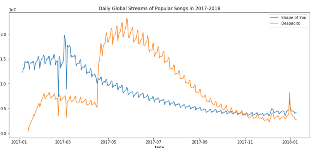
五: Plot the data
- Line Chart
plt.figure(figsize=(16,6))
sns.lineplot(data=fifa_data)

注:
plt.figure(figsize=(16,6))
设定的是图形的宽度和高度
plt.title("name") 增加title,并命名为name
sns.lineplot(data=fifa_data)画出数据的线状图
若想plot a subset of the data (仅仅画出一部分图线):
sns.lineplot(data=spotify["shape of you"],label=shape of you")
sns.lineplot(data=spotify["despacito"], label="despatito")
plt.xlabel("name X")
plt.blabel("name Y")
注:
plt.xlabel
plt.ylabel
是分别对label x, y 进行命名
- Bar Charts
plt.title("Average Arrival Delay for Spirit Airlines Flights, by Month")
sns.barplot(x=flight_data.index, y=flight_data['NK'])
plt.ylabel("Arrival delay (in minutes)"

注:
x=flight_data.index :
This determines what to use on the horizontal axis. In this case, we have selected the column that indexes the rows (in this case, the column containing the months).
- Heat Maps
plt.figure(figsize=(16,6))
plt.title("Average Arrival Delay for Each Airline, by Month")
sns.heatmap(data=flight_data,annot=True)
plt.xlabel("Airline")
注:
sns.heatmap:
This tells the notebook that we want to create a heatmap.
data=flight_data:
This tells the notebook to use all of the entries in flight_data to create the heatmap
annot=Ture:
This ensures that the vlaues for each cell appear on the chart.

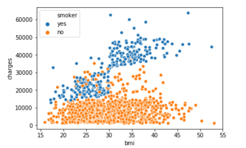
- Scatter plots
(1) sns.scatterplot (x=insurance_data['bmi'], y=insurance_data['charges'])

注:
the horizontal x-axis (x=insurance_data['bmi'])
the vertical y-axis (y=insurance_data['charges'])
(2) 为了看出点的关系强度,可以使用regression line(回归线)
sns.regplot(x=insurance_data['bmi'], y=insurance_data['charges'])

(3) sns.scatterplot(x=insurance_data['bmi'], y=insurance_data['charges'], hue=insurance_data['smoker'])
hue=insurance_data['smoker']:按照hue来对数据进行标色
- Histograms
sns.distplot(a=iris_data['Petal Length (cm)'], kde=False)

- Density plots
更平滑的图:
sns.kdeplot(data=iris_data['Petal Length(cm)'], shade=True)

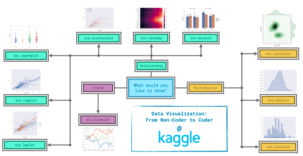
六:Conclusion
下图显示,在seaborn中,选择图形需要根据需求来决定
Seaborn数据可视化入门的更多相关文章
- 数据可视化入门之show me the numbers
数据的可视化一直是自己瞎玩着学,近来想系统的学数据可视化的东西,于是搜索资料时看到有人推荐<show me the numbers>作为入门. 由于搜不到具体的书籍内容,只能 ...
- seaborn 数据可视化(一)连续型变量可视化
一.综述 Seaborn其实是在matplotlib的基础上进行了更高级的API封装,从而使得作图更加容易,图像也更加美观,本文基于seaborn官方API还有自己的一些理解. 1.1.样式控制: ...
- python学习笔记(2):科学计算及数据可视化入门
一.NumPy 1.NumPy:Numberical Python 2.高性能科学计算和数据分析的基础包 3.ndarray,多维数组(矩阵),具有矢量运算的能力,快速.节省空间 (1)ndarray ...
- seaborn 数据可视化(二)带有类别属性的数据可视化
Seaborn的分类图分为三类,将分类变量每个级别的每个观察结果显示出来,显示每个观察分布的抽象表示,以及应用统计估计显示的权重趋势和置信区间: 第一个包括函数swarmplot()和stripplo ...
- PoPo数据可视化周刊第4期
PoPo数据可视化 聚焦于Web数据可视化与可视化交互领域,发现可视化领域有意思的内容.不想错过可视化领域的精彩内容, 就快快关注我们吧 :) 微信号:popodv_com 由于国庆节的原因,累计 ...
- Python数据可视化-seaborn库之countplot
在Python数据可视化中,seaborn较好的提供了图形的一些可视化功效. seaborn官方文档见链接:http://seaborn.pydata.org/api.html countplot是s ...
- kaggle入门项目:Titanic存亡预测(三)数据可视化与统计分析
---恢复内容开始--- 原kaggle比赛地址:https://www.kaggle.com/c/titanic 原kernel地址:A Data Science Framework: To Ach ...
- 数据可视化 seaborn绘图(1)
seaborn是基于matplotlib的数据可视化库.提供更高层的抽象接口.绘图效果也更好. 用seaborn探索数据分布 绘制单变量分布 绘制二变量分布 成对的数据关系可视化 绘制单变量分布 se ...
- Python图表数据可视化Seaborn:3. 线性关系数据| 时间线图表| 热图
1. 线性关系数据可视化 lmplot( ) import numpy as np import pandas as pd import matplotlib.pyplot as plt import ...
随机推荐
- hadoop学习(二)----HDFS简介及原理
前面简单介绍了hadoop生态圈,大致了解hadoop是什么.能做什么.带着这些目的我们深入的去学习他.今天一起看一下hadoop的基石--文件存储.因为hadoop是运行与集群之上,处于分布式环境之 ...
- Flink 源码解析 —— 如何获取 ExecutionGraph ?
https://t.zsxq.com/UnA2jIi 博客 1.Flink 从0到1学习 -- Apache Flink 介绍 2.Flink 从0到1学习 -- Mac 上搭建 Flink 1.6. ...
- 天气预报APP(2)
之前实现了能够罗列可以罗列出全国所有的省.市.县,然后就是查询全国任意城市的天气信息.查询天气信息使用的是和风天气的api,这个api获得的天气信息是JSON格式的. 使用GSON库解析JSON数据的 ...
- python --- 零碎
1.匿名输出: lambda x : print(x))(100) #冒号前输入量 ,冒号后是输出量结果:100 2.导入调用其他python文件: test1.py #第一个python文件 def ...
- h5微信分享
h5分享的步骤(前端需要完成的部分) 1.绑定域名 登录微信公众平台进入“公众号设置”的“功能设置”里填写“JS接口安全域名”. 2.引入Js文件 在需要调用JS接口的页面引入如下JS文件,(支持ht ...
- Java内存映射,上G大文件轻松处理
内存映射文件(Memory-mapped File),指的是将一段虚拟内存逐字节映射于一个文件,使得应用程序处理文件如同访问主内存(但在真正使用到这些数据前却不会消耗物理内存,也不会有读写磁盘的操作) ...
- React 多副本问题
Element ref was specified as a string (MySider) but no owner was set. This could happen for one of t ...
- 使用flash2print 代替 printflash 将office文档 转为flash 在页面中播放
前一些日子公司需求把用户上传的一些word等 文档 能像百度文库那样 显示给用户, 但是如果是直接显示office文档的话就需要 些控件的支持 .非常的不友好,所以 一开始我就想能不能转成pdf 来 ...
- vue 实现数据绑定原理
案例: Vue 底层原理 // 目的: 使用原生js来实现Vue深入响应式 var box = document.querySelector('.box') var button = ...
- 前端中的设计模式 JavaScript
最近再准备秋招,然后顺便把过去空白的设计模式相关概念补一补,这些内容都是从<JavaScript设计模式与开发实践>一书中整理出来的 (1)单例模式 定义:保证一个类仅有一个实例,并提供一 ...