44.Android之Shape设置虚线、圆角和渐变学习
Shape在Android中设定各种形状,今天记录下,由于比较简单直接贴代码。
Shape子属性简单说明一下:
gradient -- 对应颜色渐变。 startcolor、endcolor就不多说了。 android:angle是指从哪个角度开始变.
solid -- 填充。
stroke -- 描边。
corners -- 圆角。
padding -- 定义内容离边界的距离。 与android:padding_left、android:padding_right这些是一个道理.
activity_main.xml
 <LinearLayout xmlns:android="http://schemas.android.com/apk/res/android"

     xmlns:tools="http://schemas.android.com/tools"

     android:layout_width="match_parent"

     android:layout_height="match_parent"

     android:background="#fff"

     android:orientation="vertical" >

     <RelativeLayout

         android:layout_width="fill_parent"

         android:layout_height="45dip"

         android:background="@drawable/title_back">

         <TextView

             android:layout_width="wrap_content"

             android:layout_height="wrap_content"

             android:textSize="20sp"

             android:textColor="#000"

             android:layout_centerInParent="true"

             android:text="线条样式"/>

     </RelativeLayout>

     <TextView

          android:layout_width="wrap_content"

          android:layout_height="wrap_content"

          android:textSize="16sp"

          android:textColor="#333"

          android:layout_marginLeft="10dp"

          android:layout_marginTop="10dp"

          android:layout_marginBottom="5dp"

          android:layout_centerInParent="true"

          android:text="虚线样式1"/>

     <!-- 虚线1 -->

        <LinearLayout

         android:layout_width="fill_parent"

         android:layout_height="2dp"

         android:background="@drawable/dotted_line"

         android:layout_marginLeft="10dp"

         android:layout_marginRight="10dp"/>

     <TextView

          android:layout_width="wrap_content"

          android:layout_height="wrap_content"

          android:textSize="16sp"

          android:textColor="#333"

          android:layout_marginLeft="10dp"

          android:layout_marginTop="10dp"

          android:layout_marginBottom="5dp"

          android:layout_centerInParent="true"

          android:text="虚线样式2"/>

     <!-- 虚线2 -->

        <LinearLayout

         android:layout_width="fill_parent"

         android:layout_height="2dp"

         android:background="@drawable/dotted_line_2"

         android:layout_marginLeft="10dp"

         android:layout_marginRight="10dp"/>

     <!-- 实线圆角框 -->

        <LinearLayout

         android:layout_width="fill_parent"

         android:layout_height="45dp"

         android:background="@drawable/rect_gray"

         android:gravity="center"

         android:layout_marginTop="5dp"

         android:layout_marginLeft="10dp"

         android:layout_marginRight="10dp">

         <TextView

              android:layout_width="wrap_content"

              android:layout_height="wrap_content"

              android:textSize="17sp"

              android:textColor="#333"

              android:text="实线圆角框"/>

     </LinearLayout>

     <!-- 虚线圆角框 -->

        <LinearLayout

         android:layout_width="fill_parent"

         android:layout_height="45dp"

         android:background="@drawable/rect_gray_2"

         android:gravity="center"

         android:layout_marginTop="5dp"

         android:layout_marginLeft="10dp"

         android:layout_marginRight="10dp">

         <TextView

              android:layout_width="wrap_content"

              android:layout_height="wrap_content"

              android:textSize="17sp"

              android:textColor="#333"

              android:text="虚线圆角框"/>

     </LinearLayout>

     <!-- 漸變圆角框 -->

        <LinearLayout

         android:layout_width="fill_parent"

         android:layout_height="45dp"

         android:background="@drawable/rect_gray_3"

         android:gravity="center"

         android:layout_marginTop="5dp"

         android:layout_marginLeft="10dp"

         android:layout_marginRight="10dp">

         <TextView

              android:layout_width="wrap_content"

              android:layout_height="wrap_content"

              android:textSize="17sp"

              android:textColor="#fff"

              android:text="漸變+部分圆角框"/>

     </LinearLayout>

        <LinearLayout

         android:layout_width="fill_parent"

         android:layout_height="45dp"

         style="@style/list_item_top"

         android:gravity="center"

         android:layout_marginTop="5dp"

         android:layout_marginLeft="10dp"

         android:layout_marginRight="10dp">

         <TextView

              android:layout_width="wrap_content"

              android:layout_height="wrap_content"

              android:textSize="17sp"

              android:textColor="#333"

              android:text="部分圆角框+点击效果"/>

     </LinearLayout>

        <LinearLayout

         android:layout_width="fill_parent"

         android:layout_height="45dp"

         style="@style/list_item_middle"

         android:gravity="center"

         android:layout_marginTop="5dp"

         android:layout_marginLeft="10dp"

         android:layout_marginRight="10dp">

         <TextView

              android:layout_width="wrap_content"

              android:layout_height="wrap_content"

              android:textSize="17sp"

              android:textColor="#333"

              android:text="部分圆角框+点击效果"/>

     </LinearLayout>

        <LinearLayout

         android:layout_width="fill_parent"

         android:layout_height="45dp"

         style="@style/list_item_bottom"

         android:gravity="center"

         android:layout_marginTop="5dp"

         android:layout_marginLeft="10dp"

         android:layout_marginRight="10dp">

         <TextView

              android:layout_width="wrap_content"

              android:layout_height="wrap_content"

              android:textSize="17sp"

              android:textColor="#333"

              android:text="部分圆角框+点击效果"/>

     </LinearLayout>

 </LinearLayout>
styles.xml文件一些添加:
 <resources>

     <!--

         Base application theme, dependent on API level. This theme is replaced

         by AppBaseTheme from res/values-vXX/styles.xml on newer devices.

     -->

     <style name="AppBaseTheme" parent="android:Theme.Light">

         <!--

             Theme customizations available in newer API levels can go in

             res/values-vXX/styles.xml, while customizations related to

             backward-compatibility can go here.

         -->

     </style>

     <!-- Application theme. -->

     <style name="AppTheme" parent="AppBaseTheme">

         <!-- All customizations that are NOT specific to a particular API-level can go here. -->

     </style>

      <style name="list_item_top">

         <item name="android:clickable">true</item>

         <item name="android:focusable">true</item>

         <item name="android:paddingTop">10dip</item>

         <item name="android:paddingBottom">10dip</item>

         <item name="android:paddingLeft">10dip</item>

         <item name="android:paddingRight">10dip</item>

         <item name="android:gravity">center_vertical</item>

         <item name="android:background">@drawable/background_view_rounded_top</item>

     </style>

     <style name="list_item_middle">

         <item name="android:clickable">true</item>

         <item name="android:paddingTop">10dip</item>

         <item name="android:paddingBottom">10dip</item>

         <item name="android:paddingLeft">10dip</item>

         <item name="android:paddingRight">10dip</item>

         <item name="android:gravity">center_vertical</item>

         <item name="android:background">@drawable/background_view_rounded_middle</item>

     </style>

     <style name="list_item_bottom">

         <item name="android:clickable">true</item>

         <item name="android:paddingTop">10dip</item>

         <item name="android:paddingBottom">10dip</item>

         <item name="android:paddingLeft">10dip</item>

         <item name="android:paddingRight">10dip</item>

         <item name="android:gravity">center_vertical</item>

         <item name="android:background">@drawable/background_view_rounded_bottom</item>

     </style>

     <style name="list_item_single">

         <item name="android:clickable">true</item>

         <item name="android:paddingTop">10dip</item>

         <item name="android:paddingBottom">10dip</item>

         <item name="android:paddingLeft">10dip</item>

         <item name="android:paddingRight">10dip</item>

         <item name="android:gravity">center_vertical</item>

         <item name="android:background">@drawable/background_view_rounded_single</item>

     </style>

 </resources>
color.xml:
 <?xml version="1.0" encoding="utf-8"?>

 <resources>

     <!-- LIST BORDER COLOR -->

     <color name="rounded_container_border">#ffb7babb</color>

     <!-- ITEM BACKGROUND COLOR - STATE - DEFAULT -->

     <color name="base_start_color_default">#FFFFFF</color>

     <color name="base_end_color_default">#FFFFFF</color>

     <!-- ITEM BACKGROUND COLOR - STATE - PRESSED -->

     <color name="base_start_color_pressed">#fffcfcfc</color>

     <color name="base_end_color_pressed">#ffd7d7d7</color>

     <!-- ITEM TEXT COLORS - STATES - PRESSED AND DEFAULT -->

     <color name="text_color_default">#000000</color>

     <color name="text_color_pressed">#ffffff</color>

 </resources>
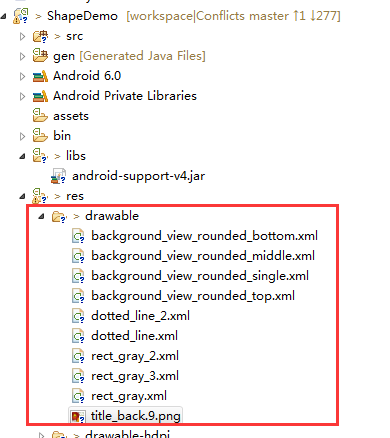
加入drawable资源文件,如图:
具体代码如下:
1.background_view_rounded_bottom.xml
 <?xml version="1.0" encoding="UTF-8"?>

 <inset xmlns:android="http://schemas.android.com/apk/res/android"

     android:insetLeft="1.0px"

     android:insetRight="1.0px" >

     <selector>

         <item android:state_pressed="true">

             <shape>

                 <gradient

                     android:angle="270.0"

                     android:endColor="@color/base_end_color_pressed"

                     android:startColor="@color/base_start_color_pressed" />

                 <corners

                     android:bottomLeftRadius="10.0dip"

                     android:bottomRightRadius="10.0dip"

                     android:radius="2.0dip"

                     android:topLeftRadius="0.0dip"

                     android:topRightRadius="0.0dip" />

                 <stroke

                     android:width="1dp"

                     android:color="#eededede" />

             </shape>

         </item>

         <item>

             <shape>

                 <gradient

                     android:angle="270.0"

                     android:endColor="@color/base_end_color_default"

                     android:startColor="@color/base_start_color_default" />

                 <corners

                     android:bottomLeftRadius="11.0dip"

                     android:bottomRightRadius="11.0dip"

                     android:radius="2.0dip"

                     android:topLeftRadius="0.0dip"

                     android:topRightRadius="0.0dip" />

                 <stroke

                     android:width="1dp"

                     android:color="#eededede" />

             </shape>

         </item>

     </selector>

 </inset>
2.background_view_rounded_middle.xml
 <?xml version="1.0" encoding="UTF-8"?>

 <inset xmlns:android="http://schemas.android.com/apk/res/android"

     android:insetBottom="0.0px"

     android:insetLeft="1.0px"

     android:insetRight="1.0px" >

     <selector>

         <item android:state_pressed="true">

             <shape>

                 <gradient

                     android:angle="270.0"

                     android:endColor="@color/base_end_color_pressed"

                     android:startColor="@color/base_start_color_pressed" />

                 <corners android:radius="0.0dip" />

                 <stroke

                     android:width="1dp"

                     android:color="#eededede" />

             </shape>

         </item>

         <item>

             <shape>

                 <gradient

                     android:angle="270.0"

                     android:endColor="@color/base_end_color_default"

                     android:startColor="@color/base_start_color_default" />

                 <corners android:radius="0.0dip" />

                 <stroke

                     android:width="1dp"

                     android:color="#eededede" />

             </shape>

         </item>

     </selector>

 </inset>
3.background_view_rounded_single.xml
 <?xml version="1.0" encoding="UTF-8"?>

 <inset xmlns:android="http://schemas.android.com/apk/res/android"

     android:insetBottom="1.0px"

     android:insetLeft="1.0px"

     android:insetRight="1.0px"

     android:insetTop="0.0px" >

     <selector>

         <item android:state_pressed="true">

             <shape>

                 <gradient

                     android:angle="270.0"

                     android:endColor="@color/base_end_color_pressed"

                     android:startColor="@color/base_start_color_pressed" />

                 <corners android:radius="11.0dip" />

             </shape>

         </item>

         <item>

             <shape>

                 <stroke

                     android:width="1.0px"

                     android:color="@color/rounded_container_border" />

                 <gradient

                     android:angle="270.0"

                     android:endColor="@color/base_end_color_default"

                     android:startColor="@color/base_start_color_default" />

                 <corners android:radius="10.0dip" />

             </shape>

         </item>

     </selector>

 </inset>
4.background_view_rounded_top.xml
 <?xml version="1.0" encoding="UTF-8"?>

 <inset xmlns:android="http://schemas.android.com/apk/res/android"

     android:insetLeft="1.0px"

     android:insetRight="1.0px" >

     <selector>

         <item android:state_pressed="true">

             <shape>

                 <gradient

                     android:angle="270.0"

                     android:endColor="@color/base_end_color_pressed"

                     android:startColor="@color/base_start_color_pressed" />

                 <corners

                     android:bottomLeftRadius="0.0dip"

                     android:bottomRightRadius="0.0dip"

                     android:radius="2.0dip"

                     android:topLeftRadius="10.0dip"

                     android:topRightRadius="10.0dip" />

                 <stroke

                     android:width="1dp"

                     android:color="#eededede" />

             </shape>

         </item>

         <item>

             <shape>

                 <gradient

                     android:angle="270.0"

                     android:endColor="@color/base_end_color_default"

                     android:startColor="@color/base_start_color_default" />

                 <corners

                     android:bottomLeftRadius="0.0dip"

                     android:bottomRightRadius="0.0dip"

                     android:radius="2.0dip"

                     android:topLeftRadius="11.0dip"

                     android:topRightRadius="11.0dip" />

                 <stroke

                     android:width="1dp"

                     android:color="#eededede" />

             </shape>

         </item>

     </selector>

 </inset>
5.dotted_line_2.xml
 <?xml version="1.0" encoding="utf-8"?>

 <shape xmlns:android="http://schemas.android.com/apk/res/android"

     android:shape="line" >

     <!--显示一条虚线,破折线的宽度为dashWith,破折线之间的空隙的宽度为dashGap,当dashGap=0dp时,为实线 -->

     <stroke

         android:dashGap="7dp"

         android:dashWidth="3dp"

         android:width="1dp"

         android:color="#63a219" />

     <!-- 虚线的高度 -->

     <size android:height="1dp" />

 </shape>
6.dotted_line.xml
 <?xml version="1.0" encoding="utf-8"?>

 <shape xmlns:android="http://schemas.android.com/apk/res/android"

     android:shape="line" >

     <!--显示一条虚线,破折线的宽度为dashWith,破折线之间的空隙的宽度为dashGap,当dashGap=0dp时,为实线 -->

     <stroke

         android:dashGap="3dp"

         android:dashWidth="6dp"

         android:width="1dp"

         android:color="#63a219" />

     <!-- 虚线的高度 -->

     <size android:height="1dp" />

 </shape>
7.rect_gray_2.xml
 <?xml version="1.0" encoding="utf-8"?>

 <shape xmlns:android="http://schemas.android.com/apk/res/android"

     android:shape="rectangle">

     <!-- 填充颜色 -->

     <solid android:color="#FFFFFF"></solid>

     <!-- 线的宽度,颜色灰色 -->

     <stroke android:width="1dp" android:color="#63a219" android:dashGap="3dp" android:dashWidth="6dp"></stroke>

     <!-- 矩形的圆角半径 -->

     <corners android:radius="10dp" />

 </shape>
8.rect_gray_3.xml
 <shape xmlns:android="http://schemas.android.com/apk/res/android"

     android:shape="rectangle">

     <!--分別對應上面左圆角的半径,上面右圆角的半径,下面左圆角的半径,下面右圆角的半径-->

     <corners

           android:topLeftRadius="0dp"

           android:topRightRadius="7dp"

           android:bottomLeftRadius="0dp"

           android:bottomRightRadius="7dp"/>

     <!--設置漸變-->

     <gradient android:startColor="#9cff00"

           android:endColor="#197600"

           android:angle="270"/>

     <stroke

         android:width="1dp"

         android:color="#63a219" />

 </shape>
9.rect_gray.xml
<?xml version="1.0" encoding="utf-8"?>

<shape xmlns:android="http://schemas.android.com/apk/res/android"

    android:shape="rectangle">

    <!-- 填充颜色 -->

    <solid android:color="#FFFFFF"></solid>

    <!-- 线的宽度,颜色灰色 -->

    <stroke android:width="1dp" android:color="#63a219"></stroke>

    <!-- 矩形的圆角半径 -->

    <corners android:radius="10dp" />

</shape>
10.title_back.9.png

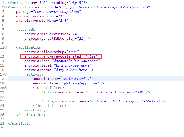
运行我们发现虚线1和虚线2没有看到虚线效果,这是因为从android3.0开始安卓关闭了硬件加速功能,所以就不能显示了,解决方法在 AndroidManifest.xml,或者是在activity中把硬件加速的功能关掉就可以了。我采用第一种方法改下AndroidMainfest.xml, 设置下android:hardwareAccelerated="false",如图:
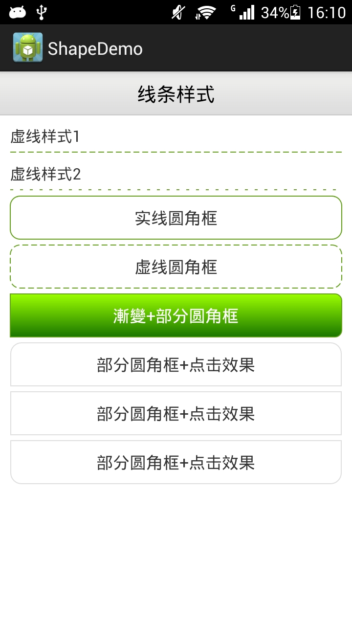
最后运行效果:
44.Android之Shape设置虚线、圆角和渐变学习的更多相关文章
- Android 中shape的使用(圆角矩形)
一.在res/drawable文件夹下创建一个名为gradient_box的xml文件: <?xml version="1.0" encoding="utf-8&q ...
- android 通过shape设置圆形按钮
Android中常常使用shape来定义控件的一些显示属性来美化UI: shape的常用属性有: (1)solid:填充,设置填充的颜色: (2)stroke:描边,设置边界的宽度.颜色等: (3)c ...
- android用shape画虚线,怎么也不显示
一直以为android的shape能画直线.虚线.矩形,圆形等.画直线也就算了.用一个view设一下高度和颜色,就能够出来一条直线了.所以说这个对我来说常常不用,圆形是能够,看看我应用里的消息提 ...
- 【Android使用Shape绘制虚线,在4.0以上的手机显示实线】解决方式
问题描写叙述: 用下面代码绘制虚线: <span style="font-family:Comic Sans MS;font-size:18px;"><? xml ...
- Android中使用shape实现EditText圆角
之前看到手机上的百度editText控件是圆角的就尝试做了一下,看了看相关的文章. 因为代码少,看看就知道了.所以下面我就直接贴上代码供大家参考,有其他的好方法记得分享哦~ 整个代码不涉及JAVA代码 ...
- 【转】Android设置虚线、圆角、渐变
Android虚线圆角渐变 有图又真相,先上图再说. 点击效果: 设置虚线: <?xml version="1.0" encoding="utf-8" ...
- Android设置虚线、圆角、渐变
有图又真相,先上图再说. 点击效果: 设置虚线: <?xml version="1.0" encoding="utf-8"?> <shape ...
- Android GradientDrawable(shape标签定义) 静态使用和动态使用(圆角,渐变实现)
Android GradientDrawable使用优势: 1. 快速实现一些基本图形(线,矩形,圆,椭圆,圆环) 2. 快速实现一些圆角,渐变,阴影等效果 3. 代替图片设置为View的背景 4. ...
- Android Shape自定义纯色圆角按钮
版权声明:分享技术,传播快乐.如果本博客对你有帮助,请在我的博客首页为我打赏吧! 在Android开发中,为响应美化应用中控件的效果,使用Shape定义图形效果,可以解决图片过多的问题. 首先看一下效 ...
随机推荐
- 经典71道Android试题及答案
本文为开发者奉献了70道经典Android面试题加答案--重要知识点几乎都涉及到了,你还等啥,赶紧收藏吧!! 1. 下列哪些语句关于内存回收的说明是正确的? (b) A. 程序员必须创建一个线程来释放 ...
- 纯CSS3制作九款可爱复古相机
前言 掐指一算,快两个月没写博客分享了.好吧,我就只是在准备校招而已.现在已经有满意的offer了,所以我就回来啦!这两个月过得挺煎熬也挺充实的.具体细说估计得长篇大论,我就不闲扯了.总之呢,越努力, ...
- RDLC系列之六 打印纸张的大小(未解决)
问题: 当报表的宽度大于高度的时候,RDLC就默认成横向打印了,把打印纸竖着放就可以正常打印了,但是如果是针式打印机的话,纸张不能连续打印. 如果把宽度和高度值对调,然后横向放纸,打印机里选择“竖打” ...
- android 合并两个jar包
你所要导出的类里边用到了别的jar包.比如说你写的类连接了数据库,用到数据库驱动包oracl.jar(也就是你导入到Myeclipse或eclipse的jdbc包).. .在dos环境下,进入到D盘的 ...
- 客户端缓存(Client Cache)
通常在服务器端大家都已经做了很多缓存的工作,ASP.NET CACHE也好MemeryCache也好却总是忽略了客户端缓存. 因为大家都知道不管哪个client都会缓存已经访问过的站点,但是浏览器缓存 ...
- Python自动化测试 (二) ConfigParser模块读写配置文件
ConfigParser 是Python自带的模块, 用来读写配置文件, 用法及其简单. 直接上代码,不解释,不多说. 配置文件的格式是: []包含的叫section, section 下有op ...
- RequiredFieldValidator 根据group组来触发验证
今天在开发过程中遇到了这样一个问题 在这个用户添加界面中,我使用了多个验证控件RequiredFieldValidator,分别控制用户名密码.在默认情况下,当单击“检查用户名”时,密码的验证控件也被 ...
- linux(centos 6.4)下安装php memcache服务端及其客户端(详细教程)
前言 在搭建个人博客时,由于没有使用任何框架,纯手工code前台和后台,导致遇到许多问题,其中一个问题就是mysql连接导致的页面相应速度异常低.在查询各种途径后,只能考虑使用memcache缓存.在 ...
- WindowsService(Windows服务)开发步骤附Demo
1.打开VS,新建项目,选择Windows服务,然后设置目录及项目名称后点击确定. 2.展开Service1服务文件,编写service1.cs类文件,不是Service1[设计].然后修改OnSta ...
- 20135202闫佳歆--week 7 深入理解计算机系统第七章--读书笔记
参见上学期的学习笔记: http://www.cnblogs.com/20135202yjx/p/4836058.html