微信小程序—Flex布局
参考:
语法:
一、Flex 布局是什么?
Flex 是 Flexible Box 的缩写,意为"弹性布局",用来为盒状模型提供最大的灵活性。
任何一个容器都可以指定为 Flex 布局。
.box{

  display: flex;

}
行内元素也可以使用 Flex 布局。
.box{

  display: inline-flex;

}
Webkit 内核的浏览器 (苹果系统),必须加上
-webkit前缀。
.box{

  display: -webkit-flex; /* Safari */

  display: flex;

}
注意,设为 Flex 布局以后,子元素的
float、clear和vertical-align属性将失效。二、基本概念
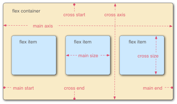
采用 Flex 布局的元素,称为 Flex 容器(flex container),简称"容器"。它的所有子元素自动成为容器成员,称为 Flex 项目(flex item),简称"项目"。
容器默认存在两根轴:水平的主轴(main axis)和垂直的交叉轴(cross axis)。主轴的开始位置(与边框的交叉点)叫做
main start,结束位置叫做main end;交叉轴的开始位置叫做cross start,结束位置叫做cross end。项目默认沿主轴排列。单个项目占据的主轴空间叫做
main size,占据的交叉轴空间叫做cross size。三、容器的属性
以下6个属性设置在容器上。
- flex-direction
- flex-wrap
- flex-flow
- justify-content
- align-items
- align-content
3.1 flex-direction属性
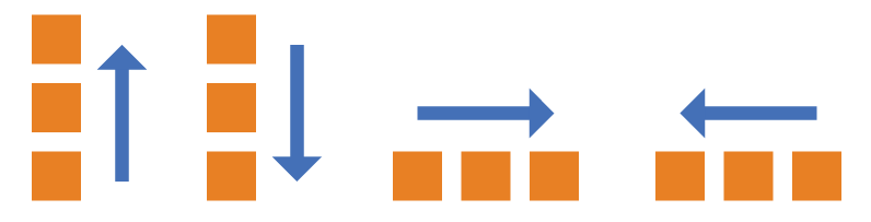
flex-direction属性决定主轴的方向(即项目的排列方向)。
.box {

  flex-direction: row | row-reverse | column | column-reverse;

}
它可能有4个值。
row(默认值):主轴为水平方向,起点在左端。row-reverse:主轴为水平方向,起点在右端。column:主轴为垂直方向,起点在上沿。column-reverse:主轴为垂直方向,起点在下沿。1、不用flex布局
 1 <!--pages/index/index.wxml-->

 2 <view class="container">

 3

 4   <view class="txt01">

 5     <text >pages</text>

 6   </view>

 7

 8   <view class="txt02">

 9     <text >pages</text>

10   </view>

11

12   <view class="txt03">

13     <text >pages</text>

14   </view>

15

16   <view class="txt04">

17     <text >pages</text>

18   </view>

19

20 </view>

21 /* pages/index/index.wxss */

22 .txt01{

23   width: 150rpx;

24   height: 150rpx;

25   background-color: red;

26 }

27 .txt02{

28   width: 150rpx;

29   height: 150rpx;

30   background-color: green;

31 }

32 .txt03{

33   width: 150rpx;

34   height: 150rpx;

35   background-color: blue;

36 }

37 .txt04{

38   width: 150rpx;

39   height: 150rpx;

40   background-color: yellow;

41 }
2、加上flex-direction
1 /* pages/index/index.wxss */

2 .container{

3   display: flex;

4   flex-direction: row;   // 默认row

5 }

6 。。。。。。。。
1 /* pages/index/index.wxss */

2 .container{

3   display: flex;

4   flex-direction: column;  //

5 }
1 /* pages/index/index.wxss */

2 .container{

3   display: flex;

4   flex-direction: row-reverse;

5 }
 1 /* pages/index/index.wxss */
2 .container{
3 display: flex;
4 flex-direction: column-reverse;
5 }
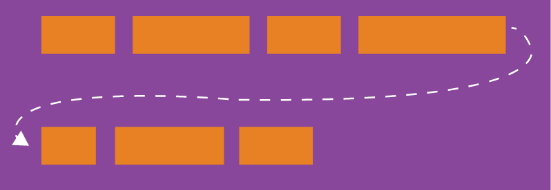
3.2 flex-wrap属性
默认情况下,项目都排在一条线(又称"轴线")上。
flex-wrap属性定义,如果一条轴线排不下,如何换行。
.box{

  flex-wrap: nowrap | wrap | wrap-reverse;

}
它可能取三个值。
(1)
nowrap:默认值,表示不换行,如果单行内容过多,项目宽度可能会被压缩
(2)
wrap:换行,第一行在上方。
(3)
wrap-reverse:换行,第一行在下方。
3、加上flex-wrap
1 /* pages/index/index.wxss */

2 .container{

3   display: flex;

4   flex-wrap: nowrap //默认,不换行 自动调整

5 }

6 。。。。。。。。。。
1 /* pages/index/index.wxss */

2 .container{

3   display: flex;

4   flex-direction: column;  //纵向

5   flex-wrap: nowrap;

6 }
1 /* pages/index/index.wxss */

2 .container{

3   display: flex;

4   flex-wrap: wrap;  //换行

5 }

6 。。。。。
1 /* pages/index/index.wxss */

2 .container{

3   display: flex;

4   flex-direction: column;

5   flex-wrap: wrap;

6 }
1 /* pages/index/index.wxss */

2 .container{

3   display: flex;

4   flex-wrap: wrap-reverse; //换行 逆

5 }
1 /* pages/index/index.wxss */

2 .container{

3   display: flex;

4   flex-direction: column;

5   flex-wrap: wrap-reverse;

6 }
3.3 flex-flow
flex-flow属性是flex-direction属性和flex-wrap属性的简写形式,默认值为row nowrap。
.box {

  flex-flow: <flex-direction> || <flex-wrap>;

}
4、加上flex-flow
1 /* pages/index/index.wxss */

2 .container{

3   display: flex;

4   flex-flow: row nowrap  // 相当于:flex-direction:row; flex-wrap:nowrap

5 }
1 /* pages/index/index.wxss */

2 .container{

3   display: flex;

4   flex-flow: row wrap   //相当于  flex-direction:row; flex-wrap:wrap

5 }
1 /* pages/index/index.wxss */

2 .container{

3   display: flex;

4   flex-flow: row wrap-reverse  // 相当于flex-direction:row;flex-wrap:wrap-reverse

5 }
 1 /* pages/index/index.wxss */

 2 .container{

 3   display: flex;

 4   flex-flow: column nowrap    //相当于:flex-direction:column; flex-wrap:nowrap

 5 }

 6 。。。。。。。

 7 /* pages/index/index.wxss */

 8 .container{

 9   display: flex;

10   flex-flow: column wrap    //相当于:flex-direction:column; flex-wrap:wrap

11 }

12 。。。。。。。

13 /* pages/index/index.wxss */

14 .container{

15   display: flex;

16   flex-flow: column wrap-rever  //相当于:flex-direction:column;flex-wrap:wrap-reverse

17 }
3.4 justify-content属性
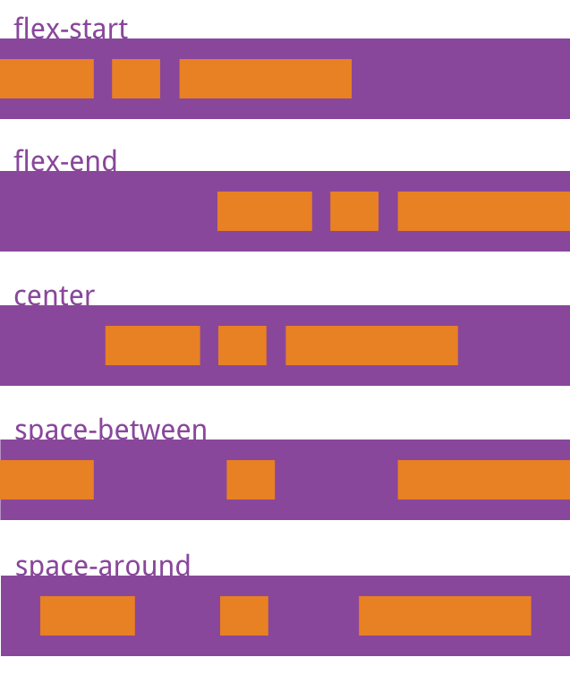
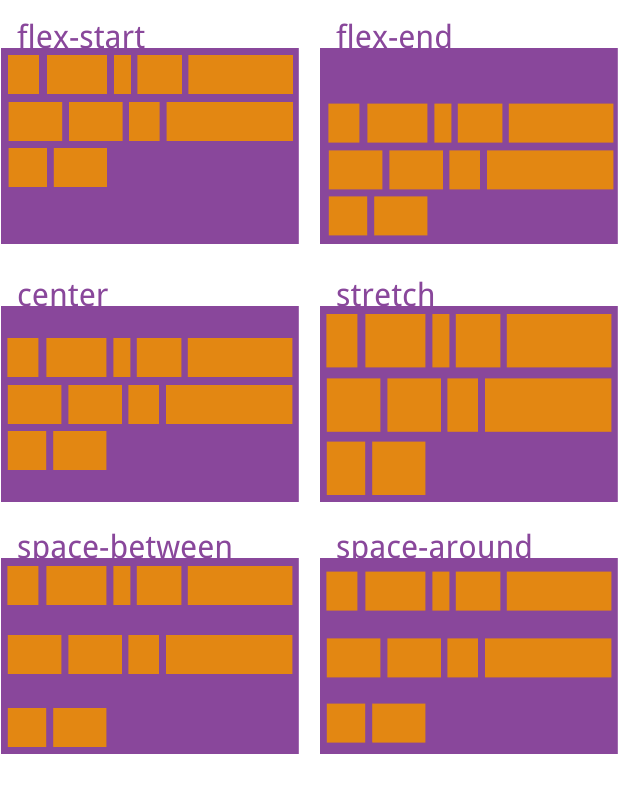
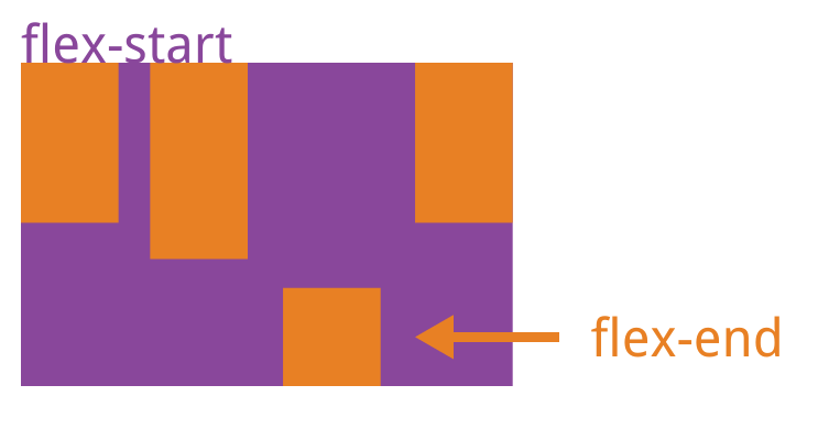
justify-content属性定义了项目在主轴上的对齐方式,以及分配项目之间及其周围多余的空间
.box {

  justify-content: flex-start | flex-end | center | space-between | space-around;

}
它可能取5个值,具体对齐方式与轴的方向有关。下面假设主轴为从左到右。
flex-start:默认值,表示项目对齐主轴起点,项目间不留空隙
center:项目在主轴上居中排列,项目间不留空隙。主轴上第一个项目离主轴起点的距离等于最后一个项目离主轴终点的距离
flex-end:项目对齐主轴终点,项目间不留空隙
space-between:项目间距相等,第一个和最后一个项目分别离起点/终点的距离为0
space-around:与space-between相似,不同之处为第一个项目离主轴七点和最后一个项目离终点的距离为中间项目间距的一半
5、加上justify-content 定义了项目在主轴上的对齐方式
1 /* pages/index/index.wxss */

2 .container{

3   display: flex;

4   flex-direction: row;

5   justify-content: flex-start  //  项目对齐主轴起点,项目间不留空隙
6 }
1 /* pages/index/index.wxss */

2 .container{

3   display: flex;

4   flex-direction: row;

5   justify-content: flex-end  // 项目对齐主轴起点,无间隙
6 }
1 /* pages/index/index.wxss */

2 .container{

3   display: flex;

4   flex-direction: row;

5   justify-content: center   //居中,无间隙,主轴上第一个项目离主轴起点的距离等于最后一个项目离主轴终点的距离

6 }
1 /* pages/index/index.wxss */

2 .container{

3   display: flex;

4   flex-direction: row;

5   justify-content: space-between  //两端对齐,第一个和最后一个项目分别离起点/终点的距离为0

6 }
 1 /* pages/index/index.wxss */
2 .container{
3 display: flex;
4 flex-direction: row;
5 justify-content: space-around //每个项目两侧的间隔相等,第一个项目离主轴七点和最后一个项目离终点的距离为中间项目间距的一半
6 }

3.5 align-items属性
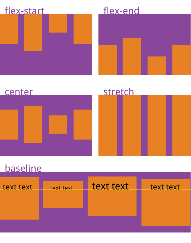
align-items属性定义项目在交叉轴上如何对齐。
.box {

  align-items: flex-start | flex-end | center | baseline | stretch;

}
它可能取5个值。具体的对齐方式与交叉轴的方向有关,下面假设交叉轴从上到下。
flex-start:交叉轴的起点对齐。flex-end:交叉轴的终点对齐。center:交叉轴的中点对齐。baseline: 项目的第一行文字的基线对齐。stretch(默认值):如果项目未设置高度或设为auto,将占满整个容器的高度。6、加上align-items 定义项目在交叉轴上如何对齐
1 /* pages/index/index.wxss */

2 .container{

3   display: flex;

4   flex-direction:column;
5 align-items: flex-start; //交叉轴的起点对齐
6 }
1 /* pages/index/index.wxss */

2 .container{

3   display: flex;

4   flex-direction: column;

5   align-items: flex-end;//交叉轴的终点对齐
6 }
 1 /* pages/index/index.wxss */
2 .container{
3 display: flex;
4 flex-direction: column;
5 align-items: center //交叉轴的中点对齐6 }
 1 /* pages/index/index.wxss */
2 .container{
3 display: flex;
4 flex-direction: column;
5 align-items: baseline; //项目的第一行文字的基线对齐
6 }
 1 /* pages/index/index.wxss */

 2 .container{

 3   display: flex;

 4   flex-direction: column;

 5   align-items: stretch;   // 如果项目未设置高度或设为auto,将占满整个容器的高度

 6 }

 7 .txt01{

 8   /* width: 200rpx; */

 9   height: 200rpx;

10   background-color: red;

11 }

12 .txt02{

13   /* width: 200rpx; */

14   height: 200rpx;

15   background-color: green;

16 }

17 .txt03{

18   /* width: 200rpx; */

19   height: 200rpx;

20   background-color: blue;

21 }
3.6 align-content属性
align-content属性定义了多根轴线的对齐方式。如果项目只有一根轴线,该属性不起作用。
.box {

  align-content: flex-start | flex-end | center | space-between | space-around | stretch;

}
该属性可能取6个值。
flex-start:首行在交叉轴起点开始排列,行间不留间距flex-end:与交叉轴的终点对齐尾行在交叉轴终点开始排列,行间不留间距center:行在交叉轴终点开始排列,行间不留间距,首行离交叉轴起点和行尾离交叉轴终点的距离相等space-between:行间间距、首行离交叉轴起点和尾行离交叉轴终点的距离相等space-around:行与行间距相等,首行离交叉轴起点和尾行离交叉轴终点的距离为行与行间间距的一半。stretch:默认值,未设置项目尺寸时将各行中的项目拉伸至填满交叉轴。当设置了项目尺寸时项目尺寸不变,项目行拉伸至填满交叉轴加上align-content :用于多行排列时设置项目在交叉轴方向上的对齐方式,以及分配项目之间及其周围多余的空间。
/* pages/index/index.wxss */

.container{

  display: flex;

  flex-direction: row;

  align-content: flex-start;

  flex-wrap: wrap;

}

.txt01{

  /* align-self: flex-start; */

  width: 200rpx;

  height: 200rpx;

  background-color: red;

}

.txt02{

  /* align-self: flex-end; */

  width: 200rpx;

  height: 200rpx;

  background-color: green;

}

.txt03{

  /* align-self: flex-start; */

  width: 500rpx;

  height: 200rpx;

  background-color: blue;

}

.txt04{

  /* flex: none; */

  width: 300rpx;

  height: 200rpx;

  background-color: yellow;

}

.txt05{

  /* flex-shrink: 1;   */

  width: 300rpx;

  height: 200rpx;

  background-color:greenyellow;

}
/* pages/index/index.wxss */

.container{

  height: 100vh;

  display: flex;

  flex-direction: row;

  align-content: flex-end;

  flex-wrap: wrap;

}

。。。。。。。。
/* pages/index/index.wxss */

.container{

  height: 100vh;

  display: flex;

  flex-direction: row;

  align-content: center;

  flex-wrap: wrap;

}

。。。。。
/* pages/index/index.wxss */

.container{

  height: 100vh;

  display: flex;

  flex-direction: row;

  align-content: space-around;

  flex-wrap: wrap;

}

。。。。。。
/* pages/index/index.wxss */

.container{

  height: 100vh;

  display: flex;

  flex-direction: row;

  align-content: space-between;

  flex-wrap: wrap;

}

。。。。。。。。。。。
四、项目的属性
以下6个属性设置在项目上。
orderflex-growflex-shrinkflex-basisflexalign-self4.1 order属性
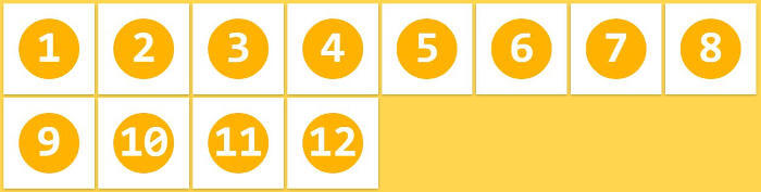
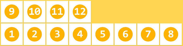
order属性定义项目的排列顺序。数值越小,排列越靠前,默认为0。
.item {

  order: <integer>;

}
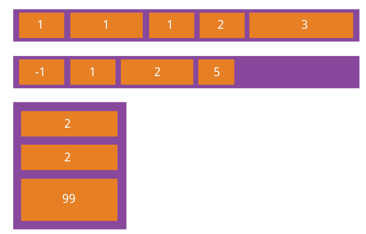
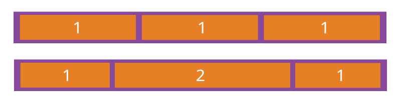
4.2 flex-grow属性
flex-grow属性定义项目的放大比例,默认为0,即如果存在剩余空间,也不放大。
.item {

  flex-grow: <number>; /* default 0 */

}
如果所有项目的
flex-grow属性都为1,则它们将等分剩余空间(如果有的话)。如果一个项目的flex-grow属性为2,其他项目都为1,则前者占据的剩余空间将比其他项多一倍。4.3 flex-shrink属性
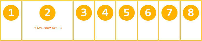
flex-shrink属性定义了项目的缩小比例,默认为1,即如果空间不足,该项目将缩小。
.item {

  flex-shrink: <number>; /* default 1 */

}
如果所有项目的
flex-shrink属性都为1,当空间不足时,都将等比例缩小。如果一个项目的flex-shrink属性为0,其他项目都为1,则空间不足时,前者不缩小。负值对该属性无效。
4.4 flex-basis属性
flex-basis属性定义了在分配多余空间之前,项目占据的主轴空间(main size)。浏览器根据这个属性,计算主轴是否有多余空间。它的默认值为auto,即项目的本来大小。
.item {

  flex-basis: <length> | auto; /* default auto */

}
它可以设为跟
width或height属性一样的值(比如350px),则项目将占据固定空间。4.5 flex属性
flex属性是flex-grow,flex-shrink和flex-basis的简写,默认值为0 1 auto。后两个属性可选。
.item {

  flex: none | [ <'flex-grow'> <'flex-shrink'>? || <'flex-basis'> ]

}
该属性有两个快捷值:
auto(1 1 auto) 和 none (0 0 auto)。建议优先使用这个属性,而不是单独写三个分离的属性,因为浏览器会推算相关值。
4.6 align-self属性
align-self属性允许单个项目有与其他项目不一样的对齐方式,可覆盖align-items属性。默认值为auto,表示继承父元素的align-items属性,如果没有父元素,则等同于stretch。
.item {

  align-self: auto | flex-start | flex-end | center | baseline | stretch;

}
该属性可能取6个值,除了auto,其他都与align-items属性完全一致。


项目属性
1、
order属性定义项目的排列顺序。数值越小,排列越靠前,默认为0
 /* pages/index/index.wxss */

 .container{

   display: flex;

   flex-direction: row;

   flex-wrap: wrap;

 }

 .txt01{

   order: 2;

   width: 200rpx;

   height: 200rpx;

   background-color: red;

 }

 .txt02{

   order: 1;

   width: 200rpx;

   height: 200rpx;

   background-color: green;

 }

 .txt03{

   order: 0;

   width: 200rpx;

   height: 200rpx;

   background-color: blue;

 }

 .txt04{

   order: 4;

   width: 200rpx;

   height: 200rpx;

   background-color: yellow;

 }

 .txt05{

   order: 5;

   width: 300rpx;

   height: 300rpx;

   background-color: snow;

 }
2、
flex-grow属性定义项目的放大比例,默认为
0,即如果存在剩余空间,也不放大。如果所有项目的
flex-grow属性都为0,则它们将等分剩余空间(如果有的话)。如果一个项目的flex-grow属性为1,其他项目都为0,则前者占据的剩余空间将比其他项多一倍。/* pages/index/index.wxss */
.container{
display: flex;
flex-direction: row;
flex-wrap: wrap;
}
.txt01{
flex-grow: 0;
width: 200rpx;
height: 200rpx;
background-color: red;
}
.txt02{
flex-grow: 1;
width: 200rpx;
height: 200rpx;
background-color: green;
}
.txt03{
flex-grow: 0;
width: 200rpx;
height: 200rpx;
background-color: blue;
}
3、
flex-shrink属性定义了项目的缩小比例,默认为1,即如果空间不足,该项目将缩小。
如果所有项目的
flex-shrink属性都为1,当空间不足时,都将等比例缩小。如果一个项目的flex-shrink属性为0,其他项目都为1,则空间不足时,前者不缩小。 负值对该属性无效rap: nowrap;
}
.txt01{
flex-shrink: 1;
width: 200rpx;
height: 200rpx;
background-color: red;
}
.txt02{
flex-shrink: 0;
width: 200rpx;
height: 200rpx;
background-color: green;
}
.txt03{
flex-shrink: 1;
width: 200rpx;
height: 200rpx;
background-color: blue;
}
.txt04{
flex-shrink: 1;
width: 200rpx;
height: 200rpx;
background-color: yellow;
}
.txt05{
flex-shrink: 1;
width: 300rpx;
height: 300rpx;
background-color: snow;
}
4、
flex-basis属性定义了在分配多余空间之前,项目占据的主轴空间(main size)。浏览器根据这个属性,计算主轴是否有多余空间。它的默认值为
auto,即项目的本来大小。/* pages/index/index.wxss */
.container{
display: flex;
flex-direction: row;
flex-wrap: nowrap;
}
.txt01{
flex-basis: auto;
/* width: 200rpx;
height: 200rpx; */
background-color: red;
}
.txt02{
flex-basis: auto;
/* width: 200rpx;
height: 200rpx; */
background-color: green;
}
.txt03{
flex-basis: 350rpx;
/* width: 200rpx;
height: 200rpx; */
background-color: blue;
}
5、flex
属性是
flex-grow,flex-shrink和flex-basis的简写,默认值为0 1 auto。后两个属性可选。该属性有两个快捷值:
auto(1 1 auto) 和 none (0 0 auto)。建议优先使用这个属性,而不是单独写三个分离的属性,因为浏览器会推算相关值
 /* pages/index/index.wxss */

 .container{

   display: flex;

   flex-direction: row;

   flex-wrap: nowrap;

 }

 .txt01{

   flex:0 1 auto; // flex-grow:0;flex-shrink:1;flex-basis:auto

   width: 200rpx;

   height: 200rpx;

   background-color: red;

 }

 .txt02{

   flex: 0 1 auto;

   width: 200rpx;

   height: 200rpx;

   background-color: green;

 }

 .txt03{

   flex: 0 1 auto;

   width: 200rpx;

   height: 200rpx;

   background-color: blue;

 }
 /* pages/index/index.wxss */

 .container{

   display: flex;

   flex-direction: row;

   flex-wrap: nowrap;

 }

 .txt01{

   flex:auto;   // flex-grow:1;flex-shrink:1;flex-basis:auto

   width: 200rpx;

   height: 200rpx;

   background-color: red;

 }

 .txt02{

   flex: auto;

   width: 200rpx;

   height: 200rpx;

   background-color: green;

 }

 .txt03{

   flex: auto;

   width: 200rpx;

   height: 200rpx;

   background-color: blue;

 }
 1 /* pages/index/index.wxss */

 2 .container{

 3   display: flex;

 4   flex-direction: row;

 5   flex-wrap: nowrap;

 6 }

 7 .txt01{

 8   flex:none;   // flex-grow:0;flex-shrink:0;flex-basis:auto

 9   width: 200rpx;

10   height: 200rpx;

11   background-color: red;

12 }

 .txt02{

   flex: none;

   width: 200rpx;

   height: 200rpx;

   background-color: green;

 }

 .txt03{

   flex: none;

   width: 200rpx;

   height: 200rpx;

   background-color: blue;

 }

 .txt04{

   flex: none;

   width: 200rpx;

   height: 200rpx;

   background-color: yellow;

 }
6、
align-self属性允许单个项目有与其他项目不一样的对齐方式,可覆盖
align-items属性。默认值为auto,表示继承父元素的align-items属性,如果没有父元素,则等同于stretch该属性可能取6个值(
auto | flex-start | flex-end | center | baseline | stretch;),除了auto,其他都与align-items属性完全一致/* pages/index/index.wxss */
.container{
display: flex;
flex-direction: column; }
.txt01{
align-self: flex-start;
width: 200rpx;
height: 200rpx;
background-color: red;
}
.txt02{
align-self: flex-end;
width: 200rpx;
height: 200rpx;
background-color: green;
}
.txt03{
align-self: flex-start;
width: 200rpx;
height: 200rpx;
background-color: blue;
}


微信小程序—Flex布局的更多相关文章
- 微信小程序~Flex布局
有一点需要注意的是,你的小程序要求兼容到iOS8以下版本,需要开启样式自动补全.开启样式自动补全,在“设置”—“项目设置”—勾选“上传代码时样式自动补全”.
- 微信小程序flex布局
一.flex布局基础 二.相对定位和绝对定位 flex的容器和元素 主轴(左-右),交叉轴(上-下) flex容器属性详解 flex-direction 决定元素的排列方向(默认row ...
- 微信小程序-flex布局中align-items和align-self区别
首先看看菜鸟教程中关于align-items和align-self的定义 align-items:align-items 属性定义flex子项在flex容器的当前行的侧轴(纵轴)方向上的对齐方式.(对 ...
- 微信小程序 | flex布局属性
flex-direction 主轴方向 row: 横向 row-reverse: 横向倒序 column: 纵向 column-reverse: 纵向倒序; flex-wrap 元素排列换行 nowr ...
- 微信小程序的布局css样式
微信小程序的布局css样式width: fit-content;font-size:20px; /*设置文字字号*/color:red; /*设置文字颜色*/font-w ...
- uniapp 小程序 flex布局 v-for 4栏展示
注:本项目的图片资源来源于后端接口,所以使用的是v-for. 关键词:uniapp 小程序 flex布局 v-for 4栏展示 自适应 <view style="display: fl ...
- 关于微信小程序<radio-group>布局排列
微信小程序更新以后今天<radio>全部变成垂直排列了,布局乱了. 一开始尝试给外层<view>添加display:flex;flex-direction:row:未果. 后来 ...
- 微信小程序页面布局之弹性布局-Flex介绍
布局的传统解决方案,基于盒状模型,依赖 display 属性 + position属性 + float属性.它对于那些特殊布局非常不方便,比如,垂直居中就不容易实现. 2009年,W3C 提出了一种新 ...
- 小程序Flex布局
容器属性 容器支持的属性有:display:通过设置display属性,指定元素是否为Flex布局.flex-direction:指定主轴方向,决定了项目的排列方式.flex-wrap:排列换行设置. ...
随机推荐
- CS系列(一):Cobalt Strike初体验
0X01 环境准备 Cobalt Strike安装包(链接:https://pan.baidu.com/s/1wCHJcJrF6H0wUCdetz3Xjg 提取码:rjuj) Cobalt Strik ...
- Kubernetes 会不会“杀死” DevOps?
作者丨孙健波(天元) 阿里巴巴技术专家 导读:DevOps 这个概念最早是在 2007 年提出的,那时云计算基础设施的概念也才刚刚提出没多久,而随着互联网的逐渐普及,应用软件的需求爆发式增长,软件开 ...
- kmp算法初步理解
123456789 abbdaxnds Next 01212 第三位看第二位b,第二位和第三位相同,都是b,所以第三位的next是第二位的next加1,即1+1=2 第四位看第三位b,第四位d与第 ...
- 【官方文档翻译】SpringBootActuator生产特性
翻译自 spring-boot 官方文档(版本:2.2.2.RELEASE) Spring Boot包含了许多附加功能,可以帮助您在将应用程序推送到生产环境时监视和管理它.您可以选择使用HTTP端点或 ...
- 如何在ArcGIS中恢复MapGIS制图表达信息
1.输出符号信息 Map2Shp软件中提供了图示表达转换功能,提供对MapGIS图形特征可视表达信息的跨平台支持.若要使用该功能,必须在转换时,"图元参数输出方式"选定为[图元参数 ...
- python爬虫——urllib使用代理
收到粉丝私信说urllib库的教程还没写,好吧,urllib是python自带的库,没requests用着方便.本来嘛,python之禅(import this自己看)就说过,精简,效率,方便也是大家 ...
- 关于爬虫的日常复习(18)——scrapy系列3
- Vue 组件复用性和slot
1.组件可复用 2.slot元素作为组件模板之中的内容分发插槽,元素自身可以被替换 <!DOCTYPE html> <html lang="en"> < ...
- 「 从0到1学习微服务SpringCloud 」01 一起来学呀!
有想学微服务的小伙伴没?一起来从0开始学习微服务SpringCloud,我会把学习成果总结下来,供大家参考学习,有兴趣可以一起来学!如有错误,望指正! Spring .SpringBoot.Sprin ...
- 12、python文件的操作
前言:本文主要介绍python中文件的操作,包括打开文件.读取文件.写入文件.关闭文件以及上下文管理器. 一.打开文件 Python open() 方法用于打开一个文件,并返回文件对象,在对文件进行处 ...