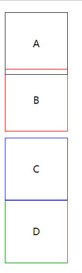
position定位及实际应用
position: static; 静态定位 / 常规定位 / 自然定位
忽略top/right/bottom/left/z-index的影响,使元素回到自然流中
<!DOCTYPE html>

<html lang="en">

<head>

    <meta charset="UTF-8">

    <title>Document</title>

    <style>

        .block{

            width:100px;

            height:100px;

            line-height:100px;

            text-align:center;

            position: relative;

            top:10px;

        }

        .block:first-child{

            border:1px solid;

        }

        .block:nth-child(2){

            position: static;

            border:1px solid red;

        }

        .block:nth-child(3){

            border:1px solid blue;

        }

        .block:nth-child(4){

            border:1px solid green;

        }

    </style>

</head>

<body>

    <div class="block">A</div>

    <div class="block">B</div>

    <div class="block">C</div>

    <div class="block">D</div>

</body>

</html>
设置margin:auto为水平居中
<!DOCTYPE html>

<html lang="en">

<head>

    <meta charset="UTF-8">

    <title>Document</title>

    <style>

        .block{

            width:100px;

            height:100px;

            line-height:100px;

            text-align:center;

            position: static;

            margin:auto;

        }

        .block:first-child{

            border:1px solid;

        }

        .block:nth-child(2){

            border:1px solid red;

        }

        .block:nth-child(3){

            border:1px solid blue;

        }

        .block:nth-child(4){

            border:1px solid green;

        }

    </style>

</head>

<body>

    <div class="block">A</div>

    <div class="block">B</div>

    <div class="block">C</div>

    <div class="block">D</div>

</body>

</html>

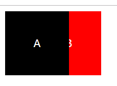
position:relative 相对定位
相对于自己在常规流中的位置,进行偏移
原来的空间依然预留
可以使浮动元素发生偏移,并控制堆叠顺序
<!DOCTYPE html>

<html lang="en">

<head>

    <meta charset="UTF-8">

    <title>Document</title>

    <style>

        .block{

            width:100px;

            height:100px;

            line-height:100px;

            text-align:center;

            color:white;

            float:left;

            position: relative;

        }

        .block:first-child{

            background:black;

            z-index:2;

        }

        .block:nth-child(2){

            background:red;

            left:-50px;

            z-index:1;

        }

    </style>

</head>

<body>

    <div class="block">A</div>

    <div class="block">B</div>

</body>

</html>
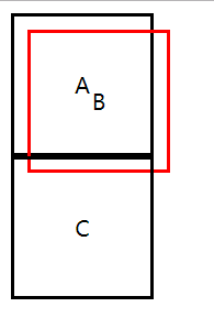
position:absolute;
参照物是最近定位的祖先元素
如果没有祖先元素被定位,则默认为body
<!DOCTYPE html>

<html lang="en">

<head>

    <meta charset="UTF-8">

    <title>Document</title>

    <style>

        .block{

            width:100px;

            height:100px;

            line-height:100px;

            text-align:center;

            border:2px solid;

            position: relative;

        }

        .block:nth-child(2){

            border-color:red;

            position: absolute;

            top:20px;

            left:20px;

        }

    </style>

</head>

<body>

    <div class="block">A</div>

    <div class="block">B</div>

    <div class="block">C</div>

</body>

</html>
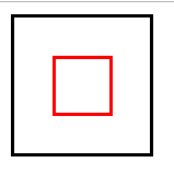
实现水平垂直居中定位:
1、给父元素设置:position: relative;
2、给子元素设置:
position: absolute;
top:0;
left:0;
right:0;
bottom:0;
margin:auto auto;
<!DOCTYPE html>

<html lang="en">

<head>

    <meta charset="UTF-8">

    <title>Document</title>

    <style>

        .parent{

            width:100px;

            height:100px;

            border:2px solid;

            position: relative;

        }

        .child{

            width:40px;

            height:40px;

            border:2px solid;

            border-color:red;

            position: absolute;

            top:0;

            left:0;

            right:0;

            bottom:0;

            margin:auto auto;

        }

    </style>

</head>

<body>

    <div class="parent">

        <div class="child"></div>

    </div>

</body>

</html>
position:fixed;
继承position:absolute;的所有特征,区别是以视口做参照来定位
position:sticky;
与top偏移量结合使用
如果最近祖先元素有定位,则参考最近祖先元素;否则参考视口
<!DOCTYPE html>

<html lang="en">

<head>

    <meta charset="UTF-8">

    <title>Document</title>

    <style>

        .banner{

            width:1200px;

            height:100px;

            background:#abcdef;

            margin:0 auto;

        }

        .nav{

            width:1200px;

            height:50px;

            background:orange;

            margin:0 auto;

            position: sticky;

            top:0;

        }

        .container{

            width:1200px;

            height:1000px;

            background:pink;

            margin:0 auto;

        }

    </style>

</head>

<body>

    <div class="banner">海报大图</div>

    <div class="nav">导航呀</div>

    <div class="container">内容。。。</div>

</body>

</html>
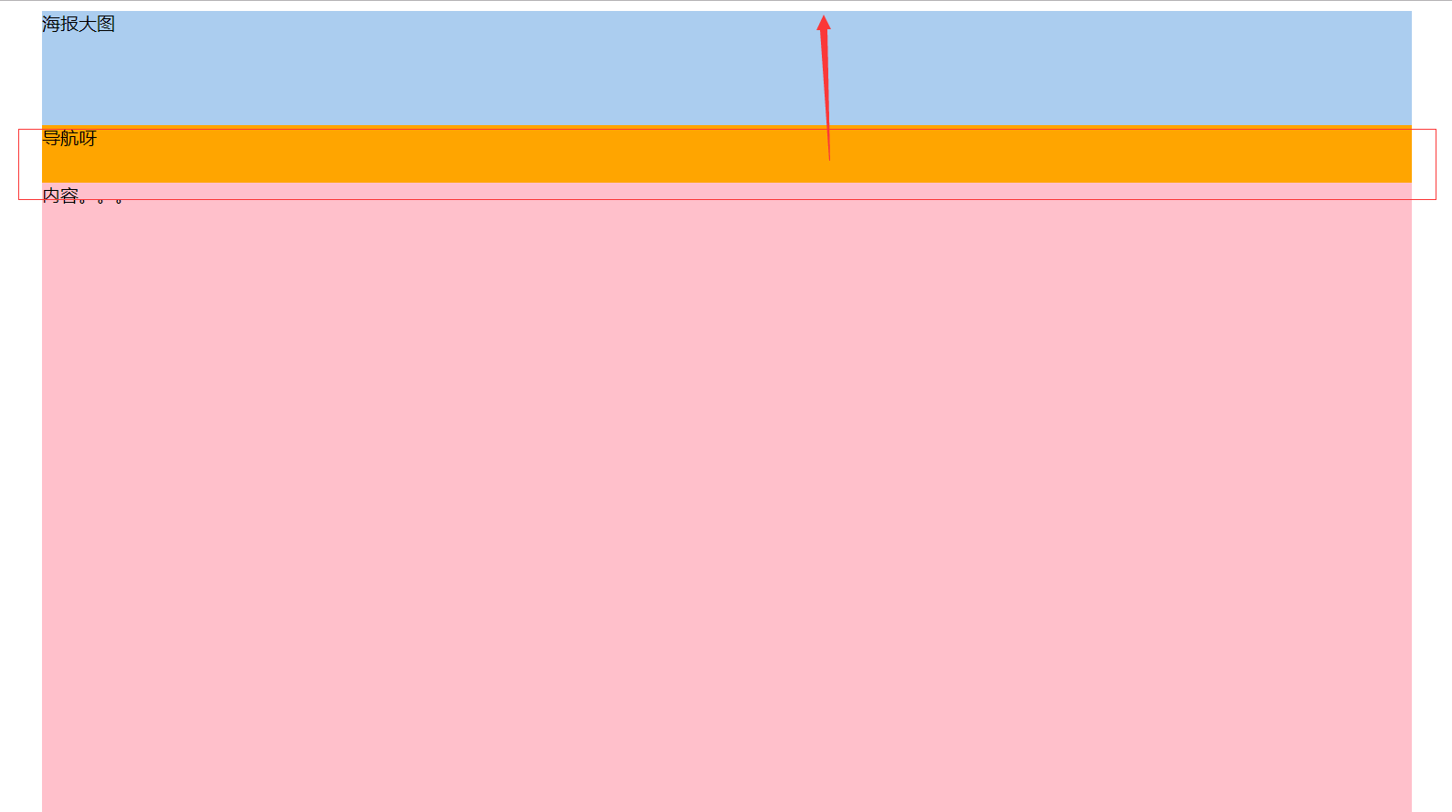
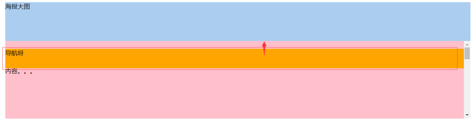
相对于最近定位的祖先元素做参考:
<!DOCTYPE html>

<html lang="en">

<head>

    <meta charset="UTF-8">

    <title>Document</title>

    <style>

        .banner{

            width:1200px;

            height:100px;

            background:#abcdef;

            margin:0 auto;

        }

        .nav{

            width:1200px;

            height:50px;

            background:orange;

            margin:0 auto;

            position: sticky;

            top:20px;

        }

        .container{

            width:1200px;

            height:200px;

            background:pink;

            margin:0 auto;

            position: relative;

            overflow-y: scroll;

            overflow-x: hidden;

        }

        p{

            height:1000px;

        }

    </style>

</head>

<body>

    <div class="banner">海报大图</div>

    <div class="container">

        <div class="nav">导航呀</div>

        <p>内容。。。</p>

    </div>

</body>

</html>
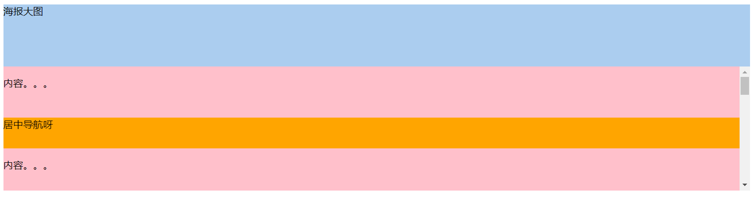
导航在居中位置
<!DOCTYPE html>

<html lang="en">

<head>

    <meta charset="UTF-8">

    <title>Document</title>

    <style>

        .banner{

            width:1200px;

            height:100px;

            background:#abcdef;

            margin:0 auto;

        }

        .nav{

            width:1200px;

            height:50px;

            background:orange;

            margin:0 auto;

            position: sticky;

            top:20px;

        }

        .container{

            width:1200px;

            height:200px;

            background:pink;

            margin:0 auto;

            position: relative;

            overflow-y: scroll;

            overflow-x: hidden;

        }

        p{

            height:1000px;

        }

        p:first-child{

            height:50px;

        }

    </style>

</head>

<body>

    <div class="banner">海报大图</div>

    <div class="container">

        <p>内容。。。</p>

        <div class="nav">居中导航呀</div>

        <p>内容。。。</p>

    </div>

</body>

</html>
www.caniuse.com 检测浏览器兼容性
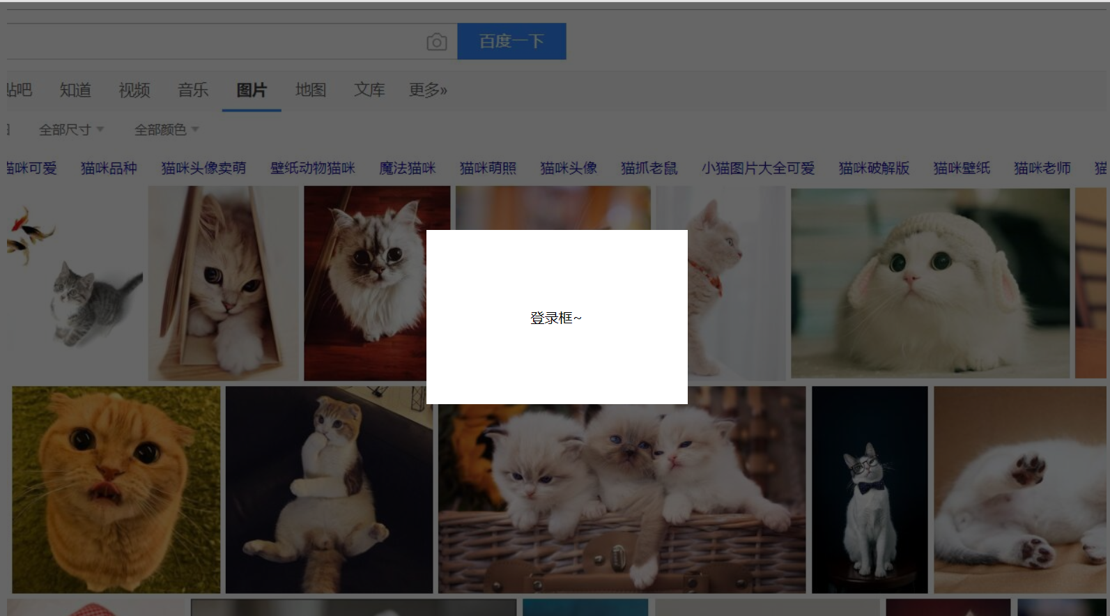
弹出层的简单实例
<!DOCTYPE html>

<html lang="en">

<head>

    <meta charset="UTF-8">

    <title>Document</title>

    <style>

        .content{

            width:100%;

            height:1000px;

            background:url(bg.jpg) top center no-repeat;

        }

        .opacity{

            width:100%;

            height:100%;

            background-color:rgba(0,0,0,.6);

            position: fixed;

            top:0;

            left:0;

        }

        .login{

            width:300px;

            height:200px;

            text-align:center;

            line-height:200px;

            position: fixed;

            background-color:#fff;

            top:50%;

            left:50%;

            margin-top:-100px;

            margin-left:-150px;

        }

    </style>

</head>

<body>

    <div class="content"></div>

    <div class="opacity"></div>

    <div class="login">登录框~</div>

</body>

</html>
侧边栏导航实例
<!DOCTYPE html>

<html lang="en">

<head>

    <meta charset="UTF-8">

    <title>Document</title>

    <style>

        *{

            margin:0;

            padding:0;

        }

        ul{

            list-style:none;

        }

        .content{

            width:100%;

            height:1000px;

            background:url(bg.jpg) top center no-repeat;

        }

        .nav{

            width:160px;

            height:205px;

            position: fixed;

            left:0;

            top:50%;

            margin-top:-102px;

        }

        .nav-li{

            width:160px;

            height:auto;

            line-height:40px;

            border-bottom:1px solid #fff;

            color:#fff;

            background:#333;

            text-align: center;

            cursor:pointer;

        }

        .tit{

            width:160px;

            height:40px;

        }

        .nav-li ul{

            width:160px;

            height:auto;

            background:#fff;

            display: none;

        }

        .nav-li:hover ul{

            display: block

        }

        .nav-li ul li{

            width:160px;

            height:40px;

            color:#333;

            border-bottom:1px dashed #666;

            text-align: center;

            line-height:40px;

            position: relative;

        }

        .nav-li ul li:hover .subnav{

            display: block;

        }

        .subnav{

            position: absolute;

            width:160px;

            height:auto;

            top:0;

            left:160px;

            background:#444;

            display: none;

        }

        .subnav-item{

            width:160px;

            height:40px;

            border-bottom:1px solid #fff;

            color:#fff;

        }

    </style>

</head>

<body>

    <div class="content">

        <div class="nav">

            <div class="nav-li">

                <div class="tit">导航</div>

                <ul>

                    <li>

                        二级导航

                        <div class="subnav">

                            <div class="subnav-item">三级导航</div>

                            <div class="subnav-item">三级导航</div>

                            <div class="subnav-item">三级导航</div>

                            <div class="subnav-item">三级导航</div>

                        </div>

                    </li>

                    <li>二级导航</li>

                    <li>二级导航</li>

                    <li>二级导航</li>

                </ul>

            </div>

            <div class="nav-li">导航</div>

            <div class="nav-li">导航</div>

            <div class="nav-li">导航</div>

            <div class="nav-li">

                <div class="tit">导航</div>

                <ul>

                    <li>

                        二级导航

                        <div class="subnav">

                            <div class="subnav-item">三级导航</div>

                            <div class="subnav-item">三级导航</div>

                            <div class="subnav-item">三级导航</div>

                            <div class="subnav-item">三级导航</div>

                        </div>

                    </li>

                    <li>二级导航</li>

                    <li>二级导航</li>

                    <li>二级导航</li>

                </ul>

            </div>

        </div>

    </div>

</body>

</html>
position定位及实际应用的更多相关文章
- CSS Position 定位属性
本篇文章主要介绍元素的Position属性,此属性可以设置元素在页面的定位方式. 目录 1. 介绍 position:介绍position的值以及辅助属性. 2. position 定位方式:介绍po ...
- position定位
CSS盒模型和定位的类型 为了搞清楚定位首先你得了解CSS盒模型.在上一句中的链接是我写在InstantShift 中的一篇关于盒模型的文章.我在那篇文章做了详细的讲解并会在这篇文章中做一个快速的总结 ...
- 浅析CSS——元素重叠及position定位的z-index顺序
多次在项目中遇到html页面元素的非期待重叠错误,多数还是position定位情况下z-index的问题.其实每次解决类似问题思路大致都是一样的,说到底还是对z-index的理解比较模糊,可以解决问题 ...
- position定位的小问题
css中position定位有四个属性,分别是:static.fixed.relative.absolute. 其中,static是默认值,未脱离文档流,元素的位置即按照文档结构的顺序进行定位排序: ...
- (转)Position定位:relative | absolute
原文:http://hi.baidu.com/zxc0420/item/9ada5110845ba1e89c778a08 Position定位:relative | absolute 定位一直是WEB ...
- 元素重叠及position定位的z-index顺序
元素位置重叠的背景常识 (x)html文档中的元素默认处于普通流(normal flow)中,也就是说其顺序由元素在文档中的先后位置决定,此时一般不会产生重叠(但指定负边距可能产生重叠).当我们用cs ...
- 盒子模型&position定位
有时候深深的感觉语文这门课程其实很有用, 至少以前学的时候没有感觉到 直到现在阅读大量的别人的资料文章的时候或者是看一些题目....... 总之:认真阅读小心品味 当然,前面的孤言自语和本文无关,只是 ...
- CSS定位:几种类型的position定位的元素
当人们刚接触布局的时候都比较倾向于使用定位的方式.因为定位的概念看起来好像比较容易掌握.表面上你确切地指定了一个块元素所处的位置那么它就会坐落于那里.可是定位比你刚看到的时候要稍微复杂一点.对于定位来 ...
- 归纳篇(一)CSS的position定位和float浮动
近期会更新一系列博客,对基础知识再度做个巩固和梳理. 一.position定位 (一):position的属性 1.absolute:生成绝对定位的元素,相对于最近一级定位不是static的父元素来进 ...
- (转)浅析CSS——元素重叠及position定位的z-index顺序
多次在项目中遇到html页面元素的非期待重叠错误,多数还是position定位情况下z-index的问题.其实每次解决类似问题思路大致都是一样的,说到底还是对z-index的理解比较模糊,可以解决问题 ...
随机推荐
- screen配置窗口显示
screen的下方不显示,可以复制如下的代码 cd /root && vim .screenrc 贴上如下内容 hardstatus on hardstatus alwayslastl ...
- MGR监控报警
一.报警思路 m.conf文件记录配置信息,只需要修改这个文件的内容即可(需要将mysql_stat.sh里面的信息写到这里,进行中) mysql_stat.sh文件作为MGR状态监测脚本,加入定时任 ...
- Gloang Swagger
功能 自动化生产接口文档 安装 # 安装swaggo get -u github.com/swaggo/swag/cmd/swag # 安装 gin-swagger go get -u github. ...
- python写的用WMI检测windows系统信息的脚本
脚本如下: #!/usr/bin/env python #coding:utf- import wmi import sys,time,platform def get_system_info(os) ...
- esp跟ebp跟踪记录
发现文字描述还是太没有快感.上几幅图,来说明这个调试过程更好.此文对于深刻理解ebp,esp是具有长远意义的 可以看到,初始情况下,ebp此时值为0012FEDC,也就是栈帧的地址,而栈顶地址esp值 ...
- 《Android Studio实战 快速、高效地构建Android应用》--五、备忘录实验(1/2)
通过开发App熟悉Android Studio的用法 开发一款用于管理备忘事项列表的App,核心功能: 创建.删除备忘 将某些备忘标记为重要(左侧带颜色标签突出显示) 涉及:操作栏菜单.上下文菜单.用 ...
- css: line-height 与box-sizing
css 1.line-hight: 行高line-height,是文本行基线这件的距离,不是字体大小,它确定了各个元素框的高度增加或减少多少. 对于块级元素:定义了元素中文本基线之间的最小距离. li ...
- Go语言实现:【剑指offer】二叉树的下一个结点
该题目来源于牛客网<剑指offer>专题. 给定一个二叉树和其中的一个结点,请找出中序遍历顺序的下一个结点并且返回. 注意,树中的结点不仅包含左右子结点,同时包含指向父结点的指针. Go语 ...
- rabbitmq在kubernetes中持久化集群部署
背景 Javashop电商系统的消息总线使用的事rabbitmq,在订单创建.静态页生成.索引生成等等业务中大量采用异步消息系统,这个对于mq高可用的要求有两个重要的考量: 1.集群化 2.可扩容 3 ...
- golang 自定义结构体(与其他语言对象类似)
/* 结构体变量: 结构体的定义只是一种内存布局的描述,只有当结构体实例化时,才会真正地分配内存, 因此必须在定义结构体并实例化后才能使用结构体的字段. type 类型名 struct { 字段1 字 ...