纯CSS画的基本图形(圆形、三角形、多边形、爱心、八卦等)
1.圆形
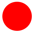
.circle {

 width: 100px;

 height: 100px;

 background: red;

 border-radius: 50px;

}
2.椭圆
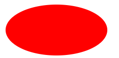
.oval {

  width: 200px;

  height: 100px;

  background: red;

  border-radius: 100px / 50px;

}
3.上三角
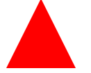
.triangle-up {

  width:;

  height:;

  border-left: 50px solid transparent;

  border-right: 50px solid transparent;

  border-bottom: 100px solid red;

}
4.左上三角

.triangle-topleft {

  width:;

  height:;

  border-top: 100px solid red;

  border-right: 100px solid transparent;

}
5.平行四边形

.parallelogram {

  width: 150px;

  height: 100px;

  margin-left:20px;

  transform: skew(20deg);

  background: red;

}
6.梯形
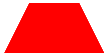
.trapezoid {

  border-bottom: 100px solid red;

  border-left: 50px solid transparent;

  border-right: 50px solid transparent;

  height:;

  width: 100px;

}
7.六角星

.star-six {

  position: relative;

  width:;

  height:;

  border-left: 50px solid transparent;

  border-right: 50px solid transparent;

  border-bottom: 100px solid red;

}

.star-six:after {

  content: "";

  position: absolute;

  top: 30px;

  left: -50px;

  width:;

  height:;

  border-left: 50px solid transparent;

  border-right: 50px solid transparent;

  border-top: 100px solid red;

}
8.五角星

.star-five {

  position: relative;

  margin: 50px 0;

  display: block;

  color: red;

  width: 0px;

  height: 0px;

  border-right: 100px solid transparent;

  border-bottom: 70px solid red;

  border-left: 100px solid transparent;

  transform: rotate(35deg);

}

.star-five:before {

  content: '';

  position: absolute;

  top: -45px;

  left: -65px;

  border-bottom: 80px solid red;

  border-left: 30px solid transparent;

  border-right: 30px solid transparent;

  height:;

  width:;

  display: block;

  transform: rotate(-35deg);

}

.star-five:after {

  content: '';

  position: absolute;

  display: block;

  color: red;

  top: 3px;

  left: -105px;

  width: 0px;

  height: 0px;

  border-right: 100px solid transparent;

  border-bottom: 70px solid red;

  border-left: 100px solid transparent;

  transform: rotate(-70deg);

}
9.五角大楼
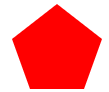
.pentagon {

  position: relative;

  width: 54px;

  border-width: 50px 18px 0;

  border-style: solid;

  border-color: red transparent;

}

.pentagon:before {

  content: "";

  position: absolute;

  height:;

  width:;

  top: -85px;

  left: -18px;

  border-width: 0 45px 35px;

  border-style: solid;

  border-color: transparent transparent red;

}
10.六边形

.hexagon {

  position: relative;

  width: 100px;

  height: 55px;

  background: red;

}

.hexagon:before {

  content: "";

  position: absolute;

  top: -25px;

  left:;

  width:;

  height:;

  border-left: 50px solid transparent;

  border-right: 50px solid transparent;

  border-bottom: 25px solid red;

}

.hexagon:after {

  content: "";

  position: absolute;

  bottom: -25px;

  left:;

  width:;

  height:;

  border-left: 50px solid transparent;

  border-right: 50px solid transparent;

  border-top: 25px solid red;

}
11.八角形
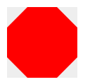
.octagon {

  position: relative;

  width: 100px;

  height: 100px;

  background: red;

}

.octagon:before {

  content: "";

  position: absolute;

  top:;

  left:;

  border-bottom: 29px solid red;

  border-left: 29px solid #eee;

  border-right: 29px solid #eee;

  width: 42px;

  height:;

}

.octagon:after {

  content: "";

  position: absolute;

  bottom:;

  left:;

  border-top: 29px solid red;

  border-left: 29px solid #eee;

  border-right: 29px solid #eee;

  width: 42px;

  height:;

}
12.爱心

.heart {

  position: relative;

  width: 100px;

  height: 90px;

}

.heart:before, .heart:after {

  position: absolute;

  content: "";

  left: 50px;

  top:;

  width: 50px;

  height: 80px;

  background: red;

  border-radius: 50px 50px 0 0;

  transform: rotate(-45deg);

  transform-origin: 0 100%;

}

.heart:after {

  left:;

  transform: rotate(45deg);

  transform-origin :100% 100%;

}
13.无穷大符号

.infinity {

  position: relative;

  width: 212px;

  height: 100px;

}

.infinity:before, .infinity:after {

  content: "";

  position: absolute;

  top:;

  left:;

  width: 60px;

  height: 60px;

  border: 20px solid red;

  border-radius: 50px 50px 0 50px;

  transform: rotate(-45deg);

}

.infinity:after {

  left: auto;

  right:;

  border-radius: 50px 50px 50px 0;

  transform: rotate(45deg);

}
14.鸡蛋
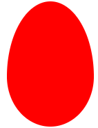
.egg {

  display:block;

  width: 126px;

  height: 180px;

  background-color: red;

  -webkit-border-radius: 63px 63px 63px 63px / 108px 108px 72px 72px;

  border-radius: 50% 50% 50% 50% / 60% 60% 40% 40%;

}
15.食逗人(Pac-Man)

.pacman {

  width: 0px;

  height: 0px;

  border-right: 60px solid transparent;

  border-top: 60px solid red;

  border-left: 60px solid red;

  border-bottom: 60px solid red;

  border-top-left-radius: 60px;

  border-top-right-radius: 60px;

  border-bottom-left-radius: 60px;

  border-bottom-right-radius: 60px;

}
16.提示对话框

.talkbubble {

  position: relative;

  width: 120px;

  height: 80px;

  background: red;

  border-radius: 10px;

}

.talkbubble:before {

  content:"";

  position: absolute;

  right: 100%;

  top: 26px;

  width:;

  height:;

  border-top: 13px solid transparent;

  border-right: 26px solid red;

  border-bottom: 13px solid transparent;

}
17. 12角星

.burst-12 {

  background: red;

  width: 80px;

  height: 80px;

  position: relative;

  text-align: center;

}

.burst-12:before, .burst-12:after {

  content: "";

  position: absolute;

  top:;

  left:;

  height: 80px;

  width: 80px;

  background: red;

}

.burst-12:before {

  transform: rotate(30deg);

}

.burst-12:after {

  transform: rotate(60deg);

}
18.钻石
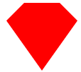
.cut-diamond {

  border-style: solid;

  border-color: transparent transparent red transparent;

  border-width: 0 25px 25px 25px;

  height:;

  width: 50px;

  position: relative;

  margin: 20px 0 50px 0;

}

.cut-diamond:after {

  content: "";

  position: absolute;

  top: 25px;

  left: -25px;

  width:;

  height:;

  border-style: solid;

  border-color: red transparent transparent transparent;

  border-width: 70px 50px 0 50px;

}
19. 阴阳八卦
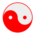
.yin-yang {

  position: relative;

  width: 96px;

  height: 48px;

  background: #eee;

  border-color: red;

  border-style: solid;

  border-width: 2px 2px 50px 2px;

  border-radius: 100%;

}

.yin-yang:before {

  content: "";

  position: absolute;

  top: 50%;

  left:;

  background: #eee;

  border: 18px solid red;

  border-radius: 100%;

  width: 12px;

  height: 12px;

}

.yin-yang:after {

  content: "";

  position: absolute;

  top: 50%;

  left: 50%;

  background: red;

  border: 18px solid #eee;

  border-radius:100%;

  width: 12px;

  height: 12px;

}
纯CSS画的基本图形(圆形、三角形、多边形、爱心、八卦等)的更多相关文章
- CSS之纯CSS画的基本图形(矩形、圆形、三角形、多边形、爱心、八卦等)
图形包括基本的矩形.圆形.椭圆.三角形.多边形,也包括稍微复杂一点的爱心.钻石.阴阳八卦等.当然有一些需要用到CSS3的属性,所以在你打开这篇文章的时候,我希望你用的是firefox或者chrome, ...
- 纯CSS画的基本图形
图形包括基本的矩形.圆形.椭圆.三角形.多边形,也包括稍微复杂一点的爱心.钻石.阴阳八卦等.当然有一些需要用到CSS3的属性,所以在你打开这篇文章的时候,我希望你用的是firefox或者chrome, ...
- 纯CSS画的基本图形(矩形、圆形、三角形、多边形、爱心、八卦
http://css-tricks.com/examples/ShapesOfCSS/
- 用纯css画个三角形
用纯css画个三角形以下是源代码: <!DOCTYPE html PUBLIC "-//W3C//DTD XHTML 1.0 Transitional//EN" " ...
- 纯css画三角形
纯css画三角形与border元素相关 设置border的属性 width: 100px; height: 100px; border-style: solid; border-width: 100p ...
- 用CSS画一个带阴影的三角形的示例代码
1. 思路 怎么用CSS3画一个带阴影的三角形呢 ? 有童鞋说, 这还不简单吗 网上有很多解决方案, 但其实大多都是实现不太完美的, 存在一些问题 假设我们做一个向下的三角形箭头 常见的方法大致有两种 ...
- 【原创】纯CSS画黄金梅丽号!
代码如下 <!DOCTYPE html> <!-- saved from url=(0055)http://jadyoap.bj.bcebos.com/ife%2FcssCatAni ...
- 用纯CSS画大白
纯CSS打造网页大白知识点: 首先要把大白分割,整体baymax中包含header(eye1,eye2,mouth),torso(heart),belly(cover),l-bigfinge ...
- 理解纯CSS画三角形
pure css draw a triangle code { display: inline-block; width: 300px; background-color: #E0E0E0 } .te ...
随机推荐
- stark组件数据库管理软件的总结
1.stark - 总结 用到的知识点: 1.单例模式 2.继承 3.反射 4.面向对象 5.modelform 1.注册表 单例模式 site = StarkSite() 2.生成url url ...
- 转:Linux(Centos)之安装Nginx及注意事项
1.Nginx的简单说明 a. Nginx是一个高性能的HTTP和反向代理服务器,也是一个IMAP/POP3/SMTP服务器,期初开发的目的就是为了代理电子邮件服务器室友:Igor Sysoev开发 ...
- 查找文献的BibTex
BibTex可以通过Google Scholar来查找. 注意,默认情况下,Google scholar 关闭了显示BibTex链接. 打开Google Scholar 选择右上角菜单按钮 选择set ...
- K8S入门学习
一.k8s是个什么鬼? k8s全名:kubernetes 它是一个工具,在linux上管理应用生命周期的一个工具. 二.k8s有什么卵用? 1.当你把项目部署到服务器集群上,一台服务器挂了,k8s它可 ...
- 在linux上安装Scala详细步骤
scala在linux安装很简单,就是下载,解压,配置环境变量,source一下成功. 提君博客原创 >>提君博客原创 http://www.cnblogs.com/tijun/ < ...
- windows环境下protobuf的java操作{编译,序列化,反序列化}
google protocol buffer的使用和原理 概况: Protocol Buffers(也就是protobuf)是谷歌的语言中立的.平台中立的.可扩展的用于序列化结构化的数据: windo ...
- Flutter常用插件
Dio Dio是一个强大的Dart Http请求库,支持Restful API.FormData.拦截器.请求取消等操作.视频中将全面学习和使用Dio的操作. Flutter_swiper swipe ...
- 建议1---理解Pythonic的概念
对于Pythonic的概念,众人都有自己的看法,但大家心中都认同一个更具体的指南,即Tim Peters的<The Zen of Python>.在这一篇充满禅意的诗篇中,有几点非常深入人 ...
- linux之硬盘管理fdisk
1.首先我们用虚拟机模拟服务器加入一块新的硬盘,硬盘容量入下图5GB硬盘. 2.首先我们要对它进行分区,我们从上面知道需要分区格式化的是第二块硬盘. 3.输入n回车是新建分区,p是主分区(只能建立4个 ...
- 如何抓取电商的数据 & Python
如何抓取电商的数据 & Python https://www.zhihu.com/question/40720286 https://www.zhihu.com/question/382455 ...