CSS水平居中与垂直居中的方法
一、水平居中
1、行内元素水平居中
在父元素里添加text-align:center即可。代码如下:
<style>

.container-1 {

        height: 50px;

        border: 2px solid grey;

        margin-bottom: 50px;

        /* 行内元素水平居中  */

        text-align: center;

    }

</style>

<div class="container-1">

        <span>this is item1</span>

</div>
效果图:

2、块级元素水平居中
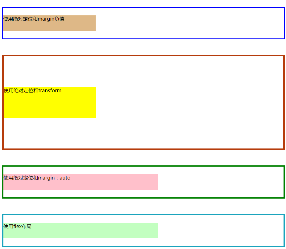
(1)方法一:使用绝对定位和margin负值(缺点:若子元素宽高改变,margin值也要跟着改变)
(2)方法二:使用绝对定位和transform(缺点:存在兼容性问题)
(3)方法三:使用绝对定位和margin:auto(推荐)
(4)方法四:使用flex布局的justify-content:center(缺点:存在兼容性问题)
代码如下:


 1 <style>

 2 /* @块级元素水平居中方法: */

 3     /*  方法一:使用绝对定位和margin负值*/

 4     .container-2 {

 5         position: relative;

 6         height: 100px;

 7         border: 3px solid blue;

 8         margin-bottom: 50px;

 9     }

10

11     .item2 {

12         position: absolute;

13         height: 50px;

14         width: 300px;

15         left: 50%;

16        /* 向左平移宽度的一半 */

17         margin-left: -150px;

18         background-color: burlywood;

19     }

20

21     /* 方法二:使用绝对定位和transform */

22     .container-3 {

23         position: relative;

24         height: 200px;

25         border: 5px solid rgb(182, 60, 12);

26         margin-bottom: 50px;

27     }

28

29     .item3 {

30         position: absolute;

31         left: 50%;

32         /*水平方向向左平移自身宽度的50%*/

33         transform: translateX(-50%);

34         background-color: yellow;

35     }

36

37     /* 方法三:使用绝对定位和margin:auto*/

38     .container-4 {

39         position: relative;

40         height: 100px;

41         border: 4px solid green;

42         margin-bottom: 50px;

43     }

44

45     .item4 {

46         position: absolute;

47         left: 0%;

48         right: 0%;

49         height: 50px;

50         width: 500px;

51         background-color: pink;

52         /* 平分子元素左右的剩余空间 */

53         margin: auto;

54     }

55

56     /* 方法四:使用flex布局 */

57     .container-5 {

58         display: flex;

59         height: 100px;

60         border: 4px solid rgb(27, 164, 189);

61         margin-bottom: 50px;

62         /* 主轴方向默认为水平方向,使用justify-content实现居中对齐 */

63         justify-content: center;

64     }

65

66     .item5 {

67         height: 50px;

68         width: 500px;

69         background-color: rgb(194, 255, 192);

70     }

71 </style>

72 <div class="container-2">

73         <div class="item2">使用绝对定位和margin负值</div>

74 </div>

75 <div class="container-3">

76         <div class="item3">使用绝对定位和transform</div>

77 </div>

78 <div class="container-4">

79         <div class="item4">使用绝对定位和margin:auto</div>

80 </div>

81 <div class="container-5">

82         <div class="item5">使用flex布局</div>

83 </div>
效果图:

二、垂直居中
1、行内元素垂直居中
当line-hight等于height时,可实现行内元素垂直居中,代码如下:
 1 <style>

 2 .container-1 {

 3         height: 50px;

 4         border: 2px solid grey;

 5         margin-bottom: 50px;

 6         /* 行内元素水平垂直居中  */

 7         text-align: center;

 8         line-height: 50px;//行高与高相等可实现垂直居中

 9     }

10 </style>

11 <div class="container-1">

12         <span class="item1">this is item1</span>

13 </div>
效果图:

2、块级元素垂直居中
(1)方法一:使用绝对定位和margin负值(缺点:若子元素宽高改变,margin值也要跟着改变)
(2)方法二:使用绝对定位和transform(缺点:存在兼容性问题)
(3)方法三:使用绝对定位和margin:auto(推荐)
(4)方法四:使用flex布局,改变主轴方向为垂直方向再使用justify-content:center(缺点:存在兼容性问题)
代码如下:
<style>

 /* @块级元素垂直居中方法: */

    /*  方法一:使用绝对定位和margin负值*/

    .container-2 {

        position: relative;

        height: 100px;

        border: 3px solid blue;

        margin-bottom: 50px;

    }

    .item2 {

        position: absolute;

        height: 50px;

        width: 300px;

        top: 50%;

        /* 向上平移高度的一半 */

        margin-top: -25px;

        background-color: burlywood;

    }

    /* 方法二:使用绝对定位和transform */

    .container-3 {

        position: relative;

        height: 300px;

        border: 5px solid rgb(182, 60, 12);

        margin-bottom: 50px;

    }

    .item3 {

        position: absolute;

        height: 100px;

        width: 300px;

        top: 50%;

        /* 垂直方向向上平移自身高度的50% */

        transform: translateY(-50%);

        background-color: yellow;

    }

    /* 方法三:使用绝对定位和margin:auto*/

    .container-4 {

        position: relative;

        height: 100px;

        border: 4px solid green;

        margin-bottom: 50px;

    }

    .item4 {

        position: absolute;

        top: 0%;

        bottom: 0%;

        height: 50px;

        width: 500px;

        background-color: pink;

        /* 自动平分上下的剩余空间 */

        margin: auto;

    }

    /* 方法四:使用flex布局 */

    .container-5 {

        display: flex;

        height: 100px;

        border: 4px solid rgb(27, 164, 189);

        margin-bottom: 50px;

        /* 将主轴方向改为垂直方向 */

        flex-direction: column;

        /* 对齐方式对居中对齐 */

        justify-content: center;

    }

    .item5 {

        height: 50px;

        width: 500px;

        background-color: rgb(194, 255, 192);

    }

</style>

<div class="container-2">

        <div class="item2">使用绝对定位和margin负值</div>

</div>

<div class="container-3">

        <div class="item3">使用绝对定位和transform</div>

</div>

<div class="container-4">

        <div class="item4">使用绝对定位和margin:auto</div>

</div>

<div class="container-5">

        <div class="item5">使用flex布局</div>

</div>
效果图:
若想实现水平垂直居中,结合二者一起使用即可。
参考文档
https://www.jianshu.com/p/7bbc4860a45c
CSS水平居中与垂直居中的方法的更多相关文章
- CSS中元素水平居中和垂直居中的方法
#CSS中水平居中和垂直居中的方法 一. 水平居中 1.行内元素(文本,图片等) 如果被设置元素为文本.图片等行内元素时,可以通过给父元素设置` text-align:center;` 来实现 2.定 ...
- css样式水平居中和垂直居中的方法
水平居中(包含块中居中) 1. 定宽,左右margin为auto.(常规流块盒.弹性项目[不用定宽]) 例子:在box1盒子上设置宽,再设置margin:auto: <style> .bo ...
- CSS水平居中和垂直居中解决方案
一.CSS 居中 — 水平居中 DIV等标签本身没有定义自己居中的属性,网上很多的方法都是介绍用上级的text-align: center,然后嵌套一层DIV来解决问题. 可是这个方法有时候完全不起作 ...
- CSS设置图片垂直居中的方法
如果是应用了表格,那么设置单元格为align="center"就可以使其中的一切内容居中.如果没有应用表格要想设置图片居中就有点困难了.困难来自不按"常规出牌" ...
- CSS 水平居中/布局 垂直居中 (月经问题)
水平居中 如果它是一个行内元素 对其父元素使用 text-align:center 即可实现. <p style = " text-align:center; width:300px; ...
- css的div垂直居中的方法,百分比div垂直居中
前言 我们都知道,固定高宽的div在网页中垂直居中很简单,相信大家也很容易的写出来,但是不是固定高宽的div如何垂直居中呢?我们在网页布局,特别是手机等web端网页经常是不固定高宽的div,那么这些d ...
- 使用CSS完美实现垂直居中的方法
使用XHTML+CSS来实现元素的垂直居中一直是前端开发中的一个比较复杂且棘手的问题,作为网页设计师或前端开发工程师,这个垂直居中问题也是必须掌握的技巧之一,一些互联网公司面试题中也会出现这类题目.今 ...
- css水平居中和垂直居中
水平居中:内联元素:text-align:center;相对于父级居中显示块级元素:margin:0 auto;但是需要同时width,否则无法看到效果多个块级元素居中:在此想要探讨一下display ...
- CSS 水平居中与垂直居中
前言 在CSS布局中,水平居中与垂直居中一直是用到比较多的,在本篇中将介绍水平居中.垂直居中的几种方式. 示例 HTML: <div class="parent"> & ...
随机推荐
- Linux命令行欢迎界面美化
默认的SSH命令行登录欢迎界面如下 [c:\~]$ Connecting to 10.x.13.x:22... Connection established. To escape to local s ...
- python基础之包、模块、命名空间和作用域
一.模块介绍 模块就是一组功能的集合体,我们的程序可以导入模块来复用模块里的功能. 模块的作用: (1)从文件级别组织程序,更方便管理:随着程序的发展,功能越来越多,为了方便管理,我们通常将程序分成一 ...
- git OpenSSL SSL_connect问题
遇到这个问题,查找别人也遇到,省时间不写了直接复制 在使用Git来克隆仓库报了错误,如下: fatal: unable to access 'https://github.com/xingbuxing ...
- 90%的人都不知道的Node.js 依赖关系管理(上)
转载请注明出处:葡萄城官网,葡萄城为开发者提供专业的开发工具.解决方案和服务,赋能开发者. 原文参考:https://dzone.com/articles/nodejs-dependency-mana ...
- 图解CSS布局(一)- Grid布局
图解CSS布局(一)- Grid布局 先上图 简介 Grid 布局是将容器划分成"行"和"列",产生单元格,然后指定"项目所在"的单元格,可 ...
- Docker学习(8) Docker的CS模式
Docker的CS模式 链接方式 socket
- 用Microsoft DirectX光线跟踪改善渲染质量
用Microsoft DirectX光线跟踪改善渲染质量 Implementing Stochastic Levels of Detail with Microsoft DirectX Raytrac ...
- 『动善时』JMeter基础 — 40、JMeter中ForEach控制器详解
目录 1.什么是逻辑控制器 2.ForEach控制器介绍 3.ForEach控制器的使用 (1)测试计划内包含的元件 (2)获取学院列表请求内容 (3)JSON提取器内容 (4)ForEach控制器内 ...
- Webflux请求处理流程
spring mvc处理流程 在了解SpringMvc的请求流程源码之后,理解WebFlux就容易的多,毕竟WebFlux处理流程是模仿Servlet另起炉灶的. 下面是spring mvc的请求处理 ...
- 「Spring Boot架构」集成Mybatis-Plus的实例详解
MyBatis-Plus(简称 MP)是一个 MyBatis 的增强工具,在 MyBatis 的基础上只做增强不做改变,为简化开发.提高效率而生. 特性 无侵入:只做增强不做改变,引入它不会对现有工程 ...