bootstrap 常用类名
一、 常用类
1、container
居中的内容展示
2、row 行内容显示
3、col 列内容显示, 列必须在row 中
xs 宽度小于768 ,sm宽度小于990 大于768 ,md 宽度大于990,小于1200, lg宽度大于1200
col-xs-4 代表 小屏下显示为4列,
col-xs-4 col-md-2 代表小屏下占4列,大屏下占2列
<</span>div class="container"> <</span>h1>Hello, world!</</span>h1> <</span>div class="row"><</span>div class="col-xs-4"> <</span>h2 class="page-header">区域一</</span>h2><</span>p>Bootstrap has a few easy ways to quickly get started, each one appealing to a different skill level and use case. Read through to see what suits your particular needs.</</span>p></</span>div> <</span>div class="col-xs-4"> <</span>h2 class="page-header">区域二</</span>h2><</span>p>If you work with Bootstrap's uncompiled source code, you need to compile the LESS files to produce usable CSS files. For compiling LESS files into CSS, we only officially support Recess, which is Twitter's CSS hinter based on less.js.</</span>p> </</span>div> <</span>div class="col-xs-4"> <</span>h2 class="page-header">区域三</</span>h2> <</span>p>Within the download you'll find the following directories and files, logically grouping common resources and providing both compiled and minified variations.</</span>p> </</span>div> </</span>div> </</span>div>\ 4、h1-H6 排版
5、pageHeader
6、small 小一号的深灰色 ,用作副标题。lead 处理一个段落的文字,让其显示效果显著。 8、文字class <</span>h1>强调Class</</span>h1> <</span>p class="text-muted">Maecenas sed diam eget risus varius blandit sit amet non magna.</</span>p> <</span>p class="text-primary">Maecenas sed diam eget risus varius blandit sit amet non magna.</</span>p> <</span>p class="text-success">.Maecenas sed diam eget risus varius blandit sit amet non magna.</</span>p> <</span>p class="text-info">Maecenas sed diam eget risus varius blandit sit amet non magna..</</span>p> <</span>p class="text-warning">Maecenas sed diam eget risus varius blandit sit amet non magna..</</span>p> <</span>pclass="text-danger">.Maecenas sed diam eget risus varius blandit sit amet non magna.</</span>p><</span>h1></</span>h1>
7、

9、list-unstyled  无样式的列表

10、list-inline 横向水平列表

11、table 基本使用一致。table-hover 某行鼠标变色;table-condensed 表格紧缩,实际padding减半。

.table包裹在.table-responsive中即可创建响应式表格,其会在小屏幕设备上(小于768px)水平滚动。当屏幕大于768px宽度时,水平滚动条消失。

12、form

<</span>form role="form"> <</span>div class="form-group"> <</span>labelfor="exampleInputEmail1">Email address</</span>label> <</span>input type="email" class="form-control" id="exampleInputEmail1" placeholder="Enter email"> </</span>div> <</span>div class="form-group"> <</span>label for="exampleInputPassword1">Password</</span>label> <</span>inputtype="password" class="form-control" id="exampleInputPassword1" placeholder="Password"></</span>div> <</span>div class="form-group"> <</span>label for="exampleInputFile">File input</</span>label> <</span>input type="file" id="exampleInputFile"> <</span>p class="help-block">Example block-level help text here.</</span>p> </</span>div> <</span>div class="checkbox"><</span>label> <</span>input type="checkbox"> Check me out </</span>label> </</span>div><</span>button type="submit" class="btn btn-default">Submit</</span>button> </</span>form>

class="form-inline"   将表单内容横向紧缩排列 。

input  class="form-control" id="disabledInput" type="text" placeholder="Disabled input here..."disabled>  设为不可用。

Bootstrap对表单控件的校验状态,如error、warning和success状态,都定义了样式。使用时,添加.has-warning、.has-error或.has-success到这些控件的父元素即可。任何包含在此元素之内的.control-label、.form-control和.help-block都将接受这些校验状态的样式。

div class="form-group has-success"> class="control-label" for="inputSuccess">Input with success"text" class="form-control" id="inputSuccess">
13、按钮

btn-lg、.btn-sm、.btn-xs大中小三种按钮尺寸
active 激活状态 disabled="disabled" 不可用状态
button type="button" class="close" aria-hidden="true">×span class="caret"> class="center-block" 居中并 display:block class="clearfix" 清除浮动 14 img
"http://placehold.it/150x150" alt="..." class="img-rounded">
"http://placehold.it/150x150" alt="..." class="img-circle">
"http://placehold.it/150x150" alt="..." class="img-thumbnail

img src="..." class="img-responsive" alt="Responsive image"
为图片赋予了max-width: 100%;和height: auto;属性,可以让图片按比例缩放,不超过其父元素的尺寸

通过单独或联合使用以下列出的class,可以针对不同屏幕尺寸隐藏或显示页面内容。

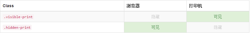
打印class
和常规的响应式class一样,使用下面的class可以针对打印机隐藏或显示某些内容。
15 下拉菜单 dropdown
- class="dropdown-menu" role="menu" aria-labelledby="dropdownMenu1">
- "presentation">"menuitem" tabindex="-1" href="#">Action
- "presentation">"menuitem" tabindex="-1" href="#">Another action
- "presentation">"menuitem" tabindex="-1" href="#">Something else here
- "presentation" class="divider">
- "presentation">"menuitem" tabindex="-1" href="#">Separated link

改为右对齐
- class="dropdown-menu text-right" role="menu" aria-labelledby="dropdownMenu1">
下拉菜单
class="dropdown"> class="btn dropdown-toggle" type="button" id="dropdownMenu1" data-toggle="dropdown"> Dropdownclass="caret">- class="dropdown-menu text-right" role="menu" aria-labelledby="dropdownMenu1">
- "presentation" class="dropdown-header">Dropdown header
- "presentation">"menuitem" tabindex="-1" href="#">Action
- "presentation">"menuitem" tabindex="-1" href="#">Another action
- "presentation">"menuitem" tabindex="-1" href="#">Something else here
- "presentation" class="divider">
- "presentation" class="dropdown-header">Dropdown header
- "presentation">"menuitem" tabindex="-1" href="#">Separated link

主要是添加了
- Dropdown header
- 里面有个.dropdown-header的样式类。

16 、 导航 nav
Bootstrap中可用的导航有相似的标记,用基类
.nav开头,这是相似的部分。改变修饰类可以改变样式。1、标签页
注意.nav-tabs类需要.nav基类。
- class="nav nav-tabs">
- class="active">"#">Home
- "#">Profile
- "#">Messages

在这里暂时只进行探讨简单的样式。
2、胶囊式标签页
用相同的 HTML 标记,但要用
.nav-pills代替。- class="nav nav-pills">
- class="active">"#">Home
- "#">Profile
- "#">Messages

Pills 可以竖直堆叠。只要加上
.nav-stacked。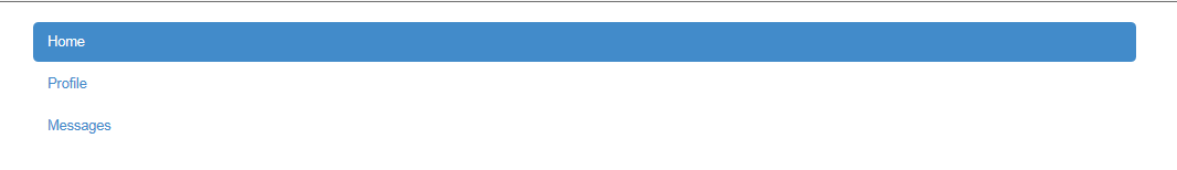
使用下拉菜单
- class="nav nav-tabs">
- class="dropdown"> class="dropdown-toggle" data-toggle="dropdown" href="#">Dropdown class="caret">
- class="dropdown-menu">
- "#">Home
- "#">Profile
- "#">Messages
- "#">Home
- "#">Profile
- "#">Messages

6、带下拉菜单的胶囊式标签页
- class="nav nav-pills">
- class="dropdown active"> class="dropdown-toggle" data-toggle="dropdown" href="#">Dropdown class="caret">
- class="dropdown-menu">
- "#">Home
- "#">Profile
- "#">Messages
- "#">Home
- "#">Profile
- "#">Messages

标签
简单案例
Example heading class="label label-default">New
Example heading class="label label-default">New
Example heading class="label label-default">New
Example heading class="label label-default">New
Example heading class="label label-default">New
Example heading class="label label-default">New

可用的变体
用下面的任何一个class即可改变标签的外观。
class="label label-default">Default class="label label-primary">Primary class="label label-success">Success class="label label-info">Info class="label label-warning">Warningclass="label label-danger">Danger

面包屑导航
用一个带方向的层次表明当前页面的位置。
分割符自动地通过CSS的
:before和content添加上了。- class="breadcrumb">
- "#">Home
- "#">Library
- class="active">Data

17 、分页 pagination
- class="pagination">
- class="disabled">"#">«
- class="active">1 class="sr-only">(current)
- "#">2
- "#">3
- "#">4
- "#">5
- "#">»

- class="pager">
- class="previous">"#">← Older
- class="next">"#">Newer →

18、 警示
可关闭的警告框
可以用一个可选的
.alert-dismissable和关闭按钮。class="alert alert-warning alert-dismissable"> "button" class="close" data-dismiss="alert" aria-hidden="true">× Warning! Best check yo self, you're not looking too good.
确定在所有设备上的正确行为
一定要给
data-dismiss="alert"属性用上。警告框中的链接
用
.alert-link工具类,可以快速提供在任何警告框中相符的颜色。class="alert alert-success">Well done! "#" class="alert-link">You successfully read this important alert message.class="alert alert-info">Well done! "#" class="alert-link">You successfully read this important alert message.class="alert alert-warning">Well done! "#" class="alert-link">You successfully read this important alert message.class="alert alert-danger">Well done! "#" class="alert-link">You successfully read this important alert message.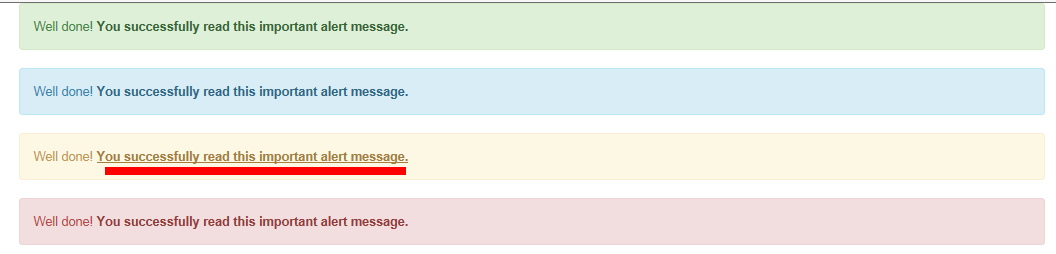
19、进度条
class="progress">class="progress-bar" role="progressbar" aria-valuenow="60" aria-valuemin="0" aria-valuemax="100" style="width: 60%;"> class="sr-only">60% Complete
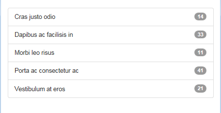
20、列表组加入徽章,它会自动地放在右面。
- class="list-group">
- class="list-group-item">class="badge">14Cras justo odio
- class="list-group-item">class="badge">33Dapibus ac facilisis in
- class="list-group-item">class="badge">11Morbi leo risus
- class="list-group-item">class="badge">41Porta ac consectetur ac
- class="list-group-item">class="badge">21Vestibulum at eros
- 标签(也就是说父元素是
而不是)。没必要给每个元素都加一个父元素。class="list-group"> "#" class="list-group-item active"> Cras justo odio "#" class="list-group-item">Dapibus ac facilisis in "#" class="list-group-item">Morbi leo risus "#" class="list-group-item">Porta ac consectetur ac "#" class="list-group-item">Vestibulum at eros

定制内容
在里面可以加几乎任何HTML,甚至是像下面的带链接的列表组。
class="list-group"> "#" class="list-group-item active">class="list-group-item-heading">List group item heading
class="list-group-item-text">Cras sit amet nibh libero, in gravida nulla. n vulputate at, tempus viverra turpis. Fusce condimentum nunc ac nisi vulputate fringilla. Donec lacinia congue felisin faucibus.
class="list-group-item-heading">List group item heading
class="list-group-item-text">Cras sit amet nibh libero, in gravida nulla. n vulputate at, tempus viverra turpis. Fusce condimentum nunc ac nisi vulputate fringilla. Donec lacinia congue felisin faucibus.
class="list-group-item-heading">List group item heading
class="list-group-item-text">Cras sit amet nibh libero, in gravida nulla. n vulputate at, tempus viverra turpis. Fusce condimentum nunc ac nisi vulputate fringilla. Donec lacinia congue felisin faucibus.

21、面板
带表格的面版
为了无缝的设计,在面版中加入
.table。如果有.panel-body,就在表格的上方加上一个用于分割的边界。class="panel panel-default">class="panel-heading">Panel headingclass="panel-body">Some default panel content here. Nulla vitae elit libero, a pharetra augue. Aenean lacinia bibendum nulla sed consectetur. Aenean eu leo quam. Pellentesque ornare sem lacinia quam venenatis vestibulum. Nullam id dolor id nibh ultricies vehicula ut id elit.
class="table">
First Name Last Name User Name aehyok leo @aehyok lynn thl @lynn 
22 、提示

主要实现了按钮的上下左右的ToolTip,然后是文本框和链接的ToolTip。<</span>div class="container" style="margin-top:40px;"> <</span>div class="bs-example tooltip-demo"> <</span>div class="bs-example-tooltips"> <</span>button type="button"class="btn btn-default" data-toggle="tooltip" data-placement="left" title="Tooltip on left">左侧Tooltip</</span>button> <</span>button type="button" class="btn btn-default"data-toggle="tooltip" data-placement="top" title="Tooltip on top">上方Tooltip</</span>button> <</span>button type="button" class="btn btn-default" data-toggle="tooltip" data-placement="bottom" title="Tooltip on bottom">下方Tooltip</</span>button> <</span>button type="button" class="btn btn-default" data-toggle="tooltip" data-placement="right" title="Tooltip on right">右侧Tooltip</</span>button> </</span>div> </</span>div> <</span>input type="text" id="testt"rel="tooltip" title="123456" /> <</span>a href="#" data-toggle="tooltip" title="Default tooltip" >dsafsdfasdfasdfasd</</span>a> </</span>div>
23、弹出框

四个方向
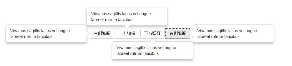 "margin-left:200px;margin-top:100px;margin-bottom:200px;" class="bs-example tooltip-demo">class="bs-example-tooltips"> "button" class="btn btn-default" data-container="body"data-toggle="popover" data-placement="left" data-content="Vivamus sagittis lacus vel augue laoreet rutrum faucibus."> 左侧弹框 "button" class="btn btn-default" data-container="body" data-toggle="popover" data-placement="top" data-content="Vivamus sagittis lacus vel augue laoreet rutrum faucibus."> 上方弹框 "button" class="btn btn-default" data-container="body" data-toggle="popover" data-placement="bottom" data-content="Vivamus sagittis lacus vel augue laoreet rutrum faucibus."> 下方弹框 "button"class="btn btn-default" data-container="body" data-toggle="popover" data-placement="right" data-content="Vivamus sagittis lacus vel augue laoreet rutrum faucibus.">右侧弹框
然后用JavaScript来激活
bootstrap 常用类名的更多相关文章
- BootStrap常用组件及响应式开发
BootStrap常用组件 PS:所有的代码必须写在<class="container/container-fluid">容器当中 常用组件包含内容: 字体图标 下拉菜 ...
- bootstrap常用知识点总结
api地址:https://v3.bootcss.com/css/#forms 栅格参数: bootstrap 其实 是把 网页等 分为 了 12分,bootstrap把 根据屏 幕 大小 把屏 幕分 ...
- Bootstrap表格类名及对应图形
.table:基础表格 不管制作哪种表格都离不开类名“table”.所以大家在使用Bootstrap表格时,千万注意,你的<table>元素中一定不能缺少类名“table”. .table ...
- Bootstrap常用插件
Bootstrap自带的那些常用插件. 模态框 模态框的HTML代码放置的位置 务必将模态框的HTML代码放在文档的最高层级内(也就是说,尽量作为 body 标签的直接子元素),以避免其他组件影响模态 ...
- Bootstrap常用的自带插件
Bootstrap自带的那些常用插件. 模态框 模态框的HTML代码放置的位置 务必将模态框的HTML代码放在文档的最高层级内(也就是说,尽量作为 body 标签的直接子元素),以避免其他组件影响模态 ...
- Bootstrap 常用组件汇总
Bootstrap 官方文档:http://www.bootcss.com/ Bootstrap Multiselect 多选下拉组件 官方文档:http://www.kuitao8.com/demo ...
- Bootstrap常用单词组
布局容器 .container 固定宽度 .container-fluid 全屏 .row 行 .col-lg- 大屏幕 .col-md- 中屏幕 变量 @grid-columns: 12 列数 @g ...
- bootstrap常用的定义风格
primary() 首选项 success() 成功 info() 一般信息 warning() 警告 danger() 危险 <bod ...
- django搭建Bootstrap常用问题解决方法
1.进入页面,提示Creating a ModelForm without either the 'fields' attribute or the 'exclude'时 解决方法:打开forms.p ...
随机推荐
- 配置错误--分析器错误消息: 无法识别的属性“targetFramework”。请注意属性名称区分大小写。
在部署网站的时候,很容易遇到这个一样错误:分析器错误消息: 无法识别的属性“targetFramework”.请注意属性名称区分大小写. 错误如图: 错误原因: 部署网站时,使用的应用程序池版本不对 ...
- .net 网站发布 Web.Config中的<compilation debug="true"/>
Web.Config中的<compilation debug="true"/> <compilation debug="true"/> ...
- C#中new和override的区别
override是指“覆盖”,是指子类覆盖了父类的方法.子类的对象无法再访问父类中的该方法.(签名必须相同) new是指“隐藏”,是指子类隐藏了父类的方法,当然,通过一定的转换,可以在子类的对象中访问 ...
- AVT Vimba与OpenCV环境配置
近来,由于项目需求,需要使用AVT的一款相机采集图像并进行相应的算法处理.环境的配置过程较为复杂,特此记录,以做备忘.也给有需要的小伙伴们一些key point的分享. 搭建环境:Windows7 + ...
- asp.net 如何改变GridView搜索出来关键字的颜色?就像百度似的,我获得的是一个集合,改变集合中关键字的集合
输入“产量”查询,将“产量”拆分,产.量 string strColNameCnDt = string.Empty; for (int j = 0; j < dtTemp. ...
- angularjs字符串插值($interpolate)
<!DOCTYPE html> <html lang="zh-CN" ng-app="app"> <head> <me ...
- hdu Repositoryti
算法:字典树 题意:给你一些字符串,然后会有一些询问,输出询问在给定的字符串中出现了多少次(字串也是): 例如 add,子串有:a ,d,d,ad ,dd,add:你会发现子串d出现了两次,那么怎么办 ...
- Linux下运行C++程序出现"段错误(核心已转储)"的原因
今天写程序出现了“段错误(核心已转储)"的问题,查了一下资料,加上自己的实践,总结了以下几个方面的原因. 1.内存访问出错 这类问题的典型代表就是数组越界. 2.非法内存访问 出现这类问题 ...
- Mysql int(11) 和 int(1)
Mysql 可以为整数类型制定宽度,例如:int(11) ,对大多数应用这是没有意义的:它不会限制值的合法范围,它只是规定了Mysql的一些交互工具(例如mysql命令行客户端)用来显示字符个数.对于 ...
- 02—从Cocos2DX视角看游戏组成
Cocos2DX引擎按照层次逻辑将游戏元素细分为:导演CCDirector.场景CCScene.图层CCLayer.精灵CCSprite.在上面篇中我们已经知道除导演CCDirector外都继承了CC ...