【CSS】创建布局
随着对分离HTML元素的语义重要性与其表现的影响的不断强调,CSS在HTML5元素布局方面的作用越来越重要。
1. 定位内容
控制内容最简单的方式就是通过定位,这允许你使用浏览器改变元素的布局方式。
1.1 设置定位类型
position 属性设置了元素的定位方法。
position 属性的不同值指定了元素定位所针对的不同元素。使用 top、bottom、left 和 right 属性设置元素的偏移量的时候,指的是相对与 position 属性指定的元素的偏移量。
- <!DOCTYPE html>
- <html lang="en">
- <head>
- <meta charset="UTF-8">
- <title>Example</title>
- <style type="text/css">
- img {top: 15px; left: 150px; border: medium double black; width: 150px;}
- </style>
- </head>
- <body>
- <p>
- There are lots of different kinds of fruit - there are over 500 varieties of banana alone.
- By the time we add the countless types of apples, oranges, and other well-know fruit, we are faced with thousands of choices.
- </p>
- <p>
- One of the most interesting aspects of fruit is the variety available in each country.
- I live near London, in an area which is know for its apples.
- </p>
- <img src="imgs/banana.png" id="banana" alt="small banana" />
- <p>
- When travelling Asia, I was struck by how many different kinds of banana were available
- - many of which had unique flavours and which were only available within a small region.
- </p>
- <p>
- <button>Static</button>
- <button>Relative</button>
- <button>Absolute</button>
- <button>Fixed</button>
- </p>
- <script>
- var buttons = document.getElementsByTagName("button");
- for( var i = ; i < buttons.length; i++){
- buttons[i].onclick = function(e){
- document.getElementById("banana").style.position = e.target.innerHTML;
- }
- }
- </script>
- </body>
- </html>
在上面的代码中,为页面添加了一个小脚本,它可以基于被按下的按钮改变img元素的position属性的值。这里将left属性设置为150px,将top属性设置为5px,意思是只要position值不设为static,img元素就将沿水平轴偏移150像素,沿垂直轴偏移15像素。下图展示了 position 值从static到relative的变化。
relative值为元素应用top、bottom、left和 right属性,相对于 static 值确定的位置重新定位元素。从图中可以看到,left属性和top属性的取值引起img元素向右、向下移动。
absolute值根据position值不是static的最近祖先元素的位置来定位元素。在这个示例中不存在这样的元素,也就是说元素是相对于body元素定位的,如下图所示:
注意一下,如果滚动浏览器页面,img元素会跟剩余的内容一起移动。可以将这个情况跟fixed值比较一下,如下图就是fixed值定位效果:

使用fixed值,元素是相对于浏览器窗口定位的。也就是说元素始终占据同样的位置,无论剩余内容是否向上向下滚动。
1.2 设置元素的层叠顺序
z-index 属性指定元素显示的层叠顺序。
z-index 属性的值是数值,且允许取负值。值越小,在层叠顺序中就越靠后。这个属性只有在元素重叠的情况下才会派上用场。
- <!DOCTYPE html>
- <html lang="en">
- <head>
- <meta charset="UTF-8">
- <title>Example</title>
- <style type="text/css">
- img {border: medium double black; background-color: lightgray; position: fixed;}
- #banana { z-index:; top: 15px; left: 150px; }
- #apple { z-index:; top: 25px; left: 120px; }
- </style>
- </head>
- <body>
- <p>
- There are lots of different kinds of fruit - there are over 500 varieties of banana alone.
- By the time we add the countless types of apples, oranges, and other well-know fruit, we are faced with thousands of choices.
- </p>
- <p>
- One of the most interesting aspects of fruit is the variety available in each country.
- I live near London, in an area which is know for its apples.
- </p>
- <img src="imgs/banana-small.png" id="banana" alt="small banana" />
- <img src="imgs/apple.png" id="apple" alt="small apple" />
- <p>
- When travelling Asia, I was struck by how many different kinds of banana were available
- - many of which had unique flavours and which were only available within a small region.
- </p>
- </body>
- </html>
此例中,创建了两个固位置的img元素,设置了它们top 和left 值使两者部分图像重叠。id值为apple的img元素的z-index值比id值为banana元素的z-index值要大,因此苹果图像显示在香蕉图像上面。

z-index 属性的默认值是0,因此浏览器默认将图像显示在p元素上。
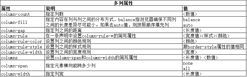
2. 创建多列布局
多列特性允许在多个垂直列中布局内容,跟报纸的排版方式类似。
- <!DOCTYPE html>
- <html lang="en">
- <head>
- <meta charset="UTF-8">
- <title>Example</title>
- <style type="text/css">
- div {
- column-count:;
- column-fill: balance;
- column-rule: medium solid black;
- column-gap: 1.5em;
- }
- img {
- float: left;
- border: medium double black;
- background-color: lightgray;
- padding: 2px;
- margin: 2px;
- }
- </style>
- </head>
- <body>
- <div>
- There are lots of different kinds of fruit - there are over 500 varieties of banana alone.
- By the time we add the countless types of apples, oranges, and other well-know fruit, we are faced with thousands of choices.
- <img src="imgs/banana-small.png" id="banana" alt="small banana" />
- One of the most interesting aspects of fruit is the variety available in each country.
- I live near London, in an area which is know for its apples.
- <img src="imgs/apple.png" id="apple" alt="small apple" />
- When travelling Asia, I was struck by how many different kinds of banana were available
- - many of which had unique flavours and which were only available within a small region.
- And, of course, there are fruits which are unique
- - I am put in mind of the durian, which is widely consumed in SE Asia and is know as the "king of fruits".
- The durian is largely unknow in Europe and the USA
- - if it is know at all, it is for the overwhelming smell, which is compared to a combination of almonds,
- rotten onions and gym socks.
- </div>
- </body>
- </html>
PS:暂发现IE、Edge、Opera浏览器显示有效,火狐和谷歌不支持。
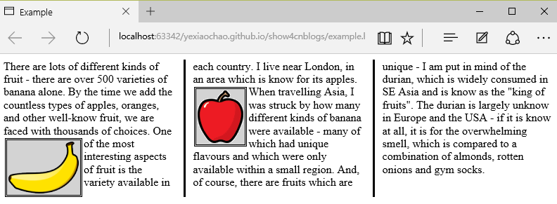
从上图可以看出,div元素中的内容从一列流向另一列,跟报纸中排版很像。在这个例子中,为img元素应用了float属性,这样div元素中的文本内容就可以流畅地环绕在图像周围。
上面的示例中使用了column-count属性将页面布局分为三列。如果窗口大小调整,浏览器会自行调整宽度,从而保留布局中的列数。另一种方法是指定列宽度。
- <style type="text/css">
- p {
- column-width: 10em;
- column-fill: balance;
- column-rule: medium solid black;
- column-gap: 1.5em;
- }
- img {
- float: left;
- border: medium double black;
- background-color: lightgray;
- padding: 2px;
- margin: 2px;
- }
- </style>
如果应用column-width 属性,浏览器会通过添加或者删除列数维持指定宽度。
3. 创建弹性盒布局
弹性盒布局(也称伸缩盒)在CSS3中得到了进一步加强,为display属性添加了一个新值(flexbox),并定义了其他几个属性。使用弹性布局可以创建对浏览器窗口调整响应良好的流动页面。这是通过在包含元素之间分配容器块中未使用的空间来实现的。规范为弹性布局定义了如下新属性:
* flex-align
* flex-direction
* flex-order
* flex-pack
不过建议规范和实现之间还有差异,顶定义一下弹性盒要解决的问题。下面代码展示了一个有问题的简单布局。
- <!DOCTYPE html>
- <html lang="en">
- <head>
- <meta charset="UTF-8">
- <title>Example</title>
- <style type="text/css">
- p {
- float: left;
- width: 150px;
- border: medium double green;
- }
- </style>
- </head>
- <body>
- <div>
- <p id="first">
- There are lots of different kinds of fruit - there are over 500 varieties of banana alone.
- By the time we add the countless types of apples, oranges, and other well-know fruit, we are faced with thousands of choices.
- </p>
- <p id="second">
- One of the most interesting aspects of fruit is the variety available in each country.
- I live near London, in an area which is know for its apples.
- </p>
- <p id="third">
- When travelling Asia, I was struck by how many different kinds of banana were available
- - many of which had unique flavours and which were only available within a small region.
- </p>
- </div>
- </body>
- </html>
在上面代码中,div元素包含了三个p元素。将p元素显示在水平行中,用float属性很容易就能做到这一点。

这里能使用弹性盒解决的问题是处理页面上p元素右边的空间块。解决这个问题有很多方式。在这个例子中,可以使用百分比宽度,但弹性盒解决方案更优雅,页面看起来流动性也会好很多。下表列出了实现弹性盒核心功能的三个 -webkit 属性(简单起见,表中省略了-webkit前缀):

3.1 创建简单的弹性盒
可以使用 display属性创建弹性盒。标准值是 flexbox, 不过在标准完成和实现之前,必须使用 -webkit-box 。 使用 box-flex 属性告诉浏览器如何分配元素之间的未使用空间。 display 属性的新值和 box-flex 属性如下面代码所示:
- <!DOCTYPE html>
- <html lang="en">
- <head>
- <meta charset="UTF-8">
- <title>Example</title>
- <style type="text/css">
- p {
- width: 150px;
- border: medium double green;
- background-color: lightgray;
- margin: 2px;
- }
- #container{ display: -webkit-box;}
- #second {-webkit-box-flex:;}
- </style>
- </head>
- <body>
- <div id="container">
- <p id="first">
- There are lots of different kinds of fruit - there are over 500 varieties of banana alone.
- By the time we add the countless types of apples, oranges, and other well-know fruit, we are faced with thousands of choices.
- </p>
- <p id="second">
- One of the most interesting aspects of fruit is the variety available in each country.
- I live near London, in an area which is know for its apples.
- </p>
- <p id="third">
- When travelling Asia, I was struck by how many different kinds of banana were available
- - many of which had unique flavours and which were only available within a small region.
- </p>
- </div>
- </body>
- </html>
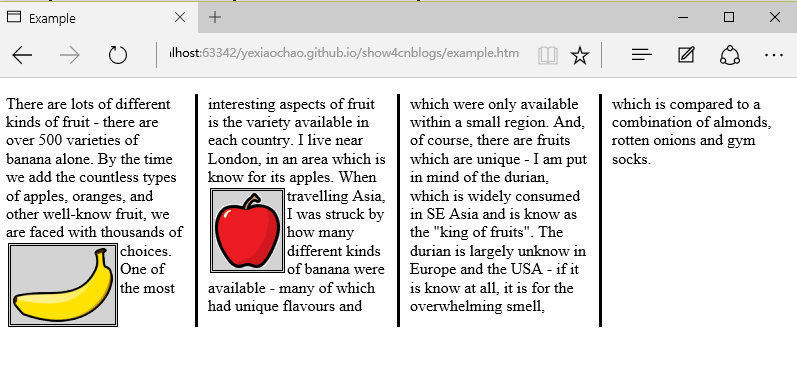
display 属性会应用到弹性盒容器。弹性盒容器是具有多余空间,且想对其中的内容应用弹性布局的元素。box-flex 属性会应用到弹性盒容器内的元素,告诉浏览器当容器大小改变时哪些元素的尺寸是弹性的。在这个例子中,选择了id值为second的p元素。
PS:从p元素样式声明中删除了float属性。可伸缩元素不能包含浮动元素。
可以从下图看出浏览器如何伸缩选择元素的尺寸:

3.2 伸缩多个元素
应用box-flex 告诉浏览器伸缩多个元素的尺寸。设置的值决定了浏览器分配空间的比例。修改前面例子的CCS文件如下:
- <style type="text/css">
- p {
- width: 150px;
- border: medium double green;
- background-color: lightgray;
- margin: 2px;
- }
- #container{ display: -webkit-box;}
- #first { -webkit-box-flex:;}
- #second {-webkit-box-flex: 1;}
- </style>
这里将box-flex 属性应用到了id值为first的p元素。此处box-flex属性的值是3,意思是浏览器为其分部的多余空间是为id值为second的p元素的三倍。当创建此类比例时,指的是元素的可伸缩性。只是使用这个比例来分配多余的空间,或者减少元素的尺寸,而不是改变它的首选尺寸。从下图可以看到这个比例时怎么应用到元素的。
3.3 处理垂直空间
box-align 属性告诉浏览器如何处理多余的垂直空间。默认情况下垂直拉伸元素以填充多余的空间。上面的例子就是这种情况,前两个p元素的尺寸是调整过的,内容下面多出了空的空间。

下面的代码展示了元素样式变为应用box-align属性。注意这个属性应用到可伸缩容器上,而不是内容元素。
- p {
- width: 150px;
- border: medium double green;
- background-color: lightgray;
- margin: 2px;
- }
- #container{
- display: -webkit-box;
- -webkit-box-direction: reverse;
- -webkit-box-align: end;
- }
- #first { -webkit-box-flex:;}
- #second {-webkit-box-flex:;}
此例中,使用了 end 值,这代表内容元素会沿着容器元素的底边放置,垂直方向任何多余的空间都会显示到内容元素上方。其呈现效果如下图所示:

3.4 处理最大尺寸
弹性盒伸缩时不会超过内容元素的最大尺寸。如果存在多余空间,浏览器会伸展元素,知道达到最大允许尺寸。box-pack属性定义了在所有的可伸缩元素均可达到最大尺寸的情况下,多余空间仍未分配完毕时应该如何处理。
修改前面示例的CSS文件如下:
- p {
- width: 150px;
- max-width: 250px;
- border: medium double green;
- background-color: lightgray;
- margin: 2px;
- }
- #container{
- display: -webkit-box;
- -webkit-box-direction: reverse;
- -webkit-box-align: end;
- -webkit-box-pack: justify;
- }
- #first { -webkit-box-flex:;}
- #second {-webkit-box-flex:;}
这属性的效果如下图所示。在可伸缩p元素达到最大宽度后,浏览器开始在元素之间分配多余空间。注意,多余空间只是分配到元素与元素之间,第一个元素之前或者最后一个元素之后都没有分配。

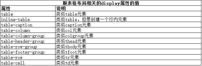
4. 创建表格布局
使用 table 元素如此普遍的原因是它解决了一种常见的布局问题:创建承载内容的简单网格。幸好,我们可以使用CCS表格布局特性来设置页面布局,这很像使用 table 元素,但不会破坏语义重要性。创建CSS表格布局使用display属性。下表列出了跟这个特性相关的值。表中的每个值都与一个HTML元素对应。
其中几个值的用法如下面代码所示:
- <!DOCTYPE html>
- <html lang="en">
- <head>
- <meta charset="UTF-8">
- <title>Example</title>
- <style type="text/css">
- #table { display: table;}
- div.row {display: table-row; background-color:lightgray; }
- p { display: table-cell; border: thin solid green; padding: 15px; margin: 15px;}
- img { float: left;}
- </style>
- </head>
- <body>
- <div id="table">
- <div class="row">
- <p id="first">
- There are lots of different kinds of fruit - there are over 500 varieties of banana alone.
- By the time we add the countless types of apples, oranges, and other well-know fruit, we are faced with thousands of choices.
- </p>
- <p id="second">
- One of the most interesting aspects of fruit is the variety available in each country.
- I live near London, in an area which is know for its apples.
- </p>
- <p id="third">
- When travelling Asia, I was struck by how many different kinds of banana were available
- - many of which had unique flavours and which were only available within a small region.
- </p>
- </div>
- <div class="row">
- <p>
- This is an apple. <img src="imgs/apple.png" alt="apple" />
- </p>
- <p>
- This is a banana. <img src="imgs/banana-small.png" alt="banana" />
- </p>
- <p>
- No picture here.
- </p>
- </div>
- </div>
- </body>
- </html>
这些取值的效果如下图所示:
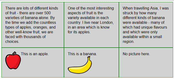
CSS表格布局的一个优点是自动调整单元格大小,因此,行是由该行中内容最高的单元格决定的,列是由该列中内容最宽的单元格决定的,这从上图也能看出来。
来源:《HTML5权威指南》(《The Definitive Guide to HTML5》)
【CSS】创建布局的更多相关文章
- 不用bootstrap,只用CSS创建网格布局
本文译自[http://j4n.co/blog/Creating-your-own-css-grid-system],英语好的,可直接查看原网页,不需要FQ. 翻译拿不准的地方会有英文原文,方便大家理 ...
- 奇妙的CSS之布局与定位
前言 关于布局与定位是Web前端开发里非常基础而又重要的部分.介绍相关知识的文章,很容易就可以找到.虽然,这方面的知识点不是很多,但我们如果不弄清楚,在运用时候往往会出现预料之外的布局,这些“意外”有 ...
- 用css进行布局
用css进行布局 一,开始布局的注意事项 1.作为最佳实践,应把html(内容)和css(显示)分离: 2.网站设计主要有两大类型:固定宽度(基于像素)和响应式(也称流式,使用百分数定义) 二,构建 ...
- 《CSS网站布局实录》学习笔记(一)
今天开始,认真学习前端技术,哈哈哈~~~加油~~~ 推荐这本<CSS网站布局实录>(第2版)给初级入门选手,虽然这本书年代有点久远,不过很经典. 注明一下:这里讲述的CSS均为CSS 2. ...
- css table 布局
使用CSS表格 CSS表格能够解决所有那些我们在使用绝对定位和浮动定位进行多列布局时所遇到的问题.例如,“display:table;”的CSS声明能够让一个HTML元素和它的子节点像table元素一 ...
- 【图片版】学习CSS网格布局
简言 CSS网格布局(Grid)是一套二维的页面布局系统,它的出现将完全颠覆页面布局的传统方式.传统的CSS页面布局 一直不够理想.包括table布局.浮动.定位及内联块等方式,从本质上都是Hack的 ...
- WEB前端 CSS(非布局)
目录 WEB前端 CSS CSS引入方式 CSS结构 CSS选择器 直接选择器 组合选择器 分组选择器 也叫并集选择器 属性选择器 伪类选择器 伪元素选择器 CSS选择器是一个查找的过程,高效的查找影 ...
- CSS Grid 布局完全指南(图解 Grid 详细教程)
CSS Grid 布局是 CSS 中最强大的布局系统.与 flexbox 的一维布局系统不同,CSS Grid 布局是一个二维布局系统,也就意味着它可以同时处理列和行.通过将 CSS 规则应用于 父元 ...
- 快速使用CSS Grid布局,实现响应式设计
常用Grid布局属性介绍 下面从一个简单Grid布局例子说起. CSS Grid 布局由两个核心组成部分是 wrapper(父元素)和 items(子元素). wrapper 是实际的 grid(网格 ...
随机推荐
- 生成树形结构的json字符串代码(c#)供前端angular tree使用.
框架是使用EF6.0.可以针对返回的值使用Newtonsoft.Json.dll(百度搜一下)来对返回的值序列化为json字符串,如果对以下值那就是使用JsonConvert.SerializeObj ...
- aspx后台传递Json到前台的两种接收方法
第一种:前台接收 dataType: "json", success: function (data) { va ...
- No.007:Reverse Integer
问题: Reverse digits of an integer.Example1:x = 123, return 321Example2:x = -123, return -321 官方难度: Ea ...
- java web学习总结(二十) -------------------监听器属性详解
一.监听域对象中属性的变更的监听器 域对象中属性的变更的事件监听器就是用来监听 ServletContext, HttpSession, HttpServletRequest 这三个对象中的属性变更信 ...
- 码代码新神器-Github Atom
周末闲着没事,逛论坛发现了一个新的编辑器,由github发布的Atom编辑器.瞬间被吸引了,所以就去尝试着折腾了一下,后来发现这个编辑器确实很不错,他的特点就是两个字:优美!!! 下载地址,官方网站下 ...
- mfc学习之路--如何删除通过控件新增的变量
刚刚学校mfc的人都会遇到这样一个问题(比如我),在照做书做一个mfc程序,给控件新增变量时变量类型错了,但是变量名对了,然后想要加个正确的时候提示"已经存在该对象",然后就傻了, ...
- UITextFieldDelegate协议
很多人都认为UITextField很简单,为什么会写这个协议呢? 因为在实际开发中可能会用到: 比如要做到下图的效果: 文本框下面的下划线的颜色要随着输入的状态变化: 点击对应的文本框,其下面的线条变 ...
- Jdk 环境搭建
在安装完jdk后,还需要对jdk的环境变量进行配置才能正常使用,下面教大家如何配置jdk环境变量: 1.右键选择 计算机→属性→高级系统设置→高级→环境变量
- iOS 10 都有什么改变?
iOS 10 都有什么改变? 看这一个贴就够了 最全面的试用 苹果在 WWDC 2016 发布会上正式发布了 iOS 10 操作系统,iOS 与 macOS.tvOS 和 watchOS 构建了苹果四 ...
- iOS 学习 - 22 异步解析 JSON,使用 FMDB 存储,TableView 显示
前提是已经知道了有哪些 key 值 Model 类: .h @interface ListModel : NSObject @property (nonatomic, copy)NSString *t ...