CSS常用布局方式-两列布局、三列布局
CSS基础
2.几种布局方式
1)table布局
当年主流的布局方式,第一种是通过table tr td布局
示例:
<style type="text/css">

table{

width: 800px;

height: 300px;

border-collapse: collapse;

}

.left{

background-color: red;

}

.right{

background-color: blue;

}

</style>

<body>

<table>

<tr>

<td class="left">左</td>

<td class="right">右</td>

</tr>

</table>

</body>
页面效果: 文字自动垂直居中,很方便 同样可以设置左右的width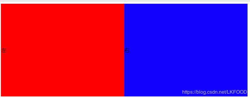
第二种是类比表格的table class
示例:
<style type="text/css">

.table{

display: table;

width: 800px;

height: 300px;

/*border-collapse: collapse;*/

}

.tb_row{

display: table-row;

}

.tb_cell{

display: table-cell;

vertical-align: middle;

}

.left{

background-color: red;

}

.right{

background-color: blue;

}

table

</style>

<body>

<div class="table">

<div class="tb_row">

<div class="left tb_cell">左</div>

<div class="right tb_cell">右</div>

</div>

</div>

</body>
页面效果: 跟表格布局一样 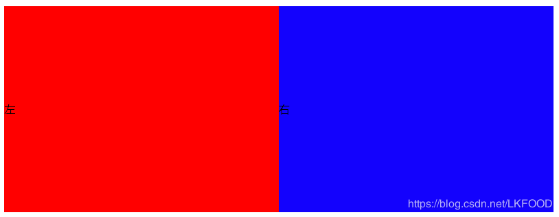
2)flexbox布局
- 两列布局
**关键:父级元素设置display:flex**
示例:
<style type="text/css">

*{

margin: 0;

padding: 0;

}

.parent{

width: 800px;

height: 300px;

display: flex;

}

.left{

width: 300px;

height: 100%;

background: red;

}

.right{

flex: 1;

height: 100%;

background: blue;

}

</style>

<body>

<div class="parent">

<div class="left">左</div>

<div class="right">右</div>

</div>

</body>
页面效果: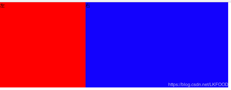
- 三列布局
**关键:父级元素设置display:flex**
示例:
<style type="text/css">

*{

margin: 0;

padding: 0;

}

.parent{

width: 800px;

height: 300px;

display: flex;

}

.left{

width: 300px;

height: 100%;

background: red;

}

.middle{

width: 200px;

height: 100%;

}

.right{

flex: 1;

height: 100%;

background: blue;

}

</style>

<body>

<div class="parent">

<div class="left">左</div>

<div class="middle">中</div>

<div class="right">右</div>

</div>

</body>
页面效果: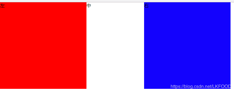
3)float布局 (float+margin)
兼容性好 但是要注意清楚浮动(clear: both display:block)
- 两列布局——左侧定宽,右侧自适应
**关键:**
*左侧设置float:left
右侧:margin-left: leftWidth*
示例:
<style>

*{

margin: 0;

padding: 0;

}

.parent{

width:800px;

height:200px;

}

.left{

width:200px;

height:100%;

float:left;

background-color:red;

}

.right{

height:100%;

margin-left:200px;

background-color:blue;

}

</style>

<body>

<div class="parent">

<div class="left">左</div>

<div class="left">右</div>

</div>

</body>
页面效果: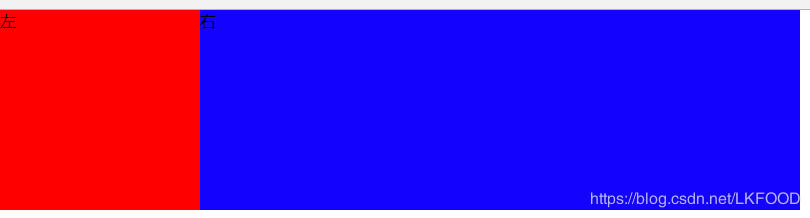
- 三列布局
**关键:**
*左侧设置float:left
右侧设置float:right
中间:margin-left: leftWidth;margin-right:rightWidth*
示例:
<style type="text/css">

*{

margin: 0;

padding: 0;

}

.parent{

width: 800px;

height: 200px;

}

.left{

width: 200px;

height: 100%;

background-color: red;

float: left;

}

.right{

float: right;

width: 200px;

background-color: blue;

height: 100%;

}

.middle{

margin-left: 200px;

margin-right: 200px;

}

</style>

<body>

<div class="parent">

<div class="left">左</div>

<div class="right">右</div>

<div class="middle">中</div>

</div>

</body>
页面效果: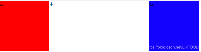
**注意:float特点:尽量靠上,尽量靠左(右),所以右侧浮动div要先写,中间div后写**
4)inline-block布局——不存在清除浮动问题 适用与定宽的布局
<style type="text/css">

.parent{

font-size: 0;

width: 800px;

height: 200px;

}

.left{

font-size: 14px;

width: 300px;

height: 200px;

display: inline-block;

background-color: red;

}

.right{

font-size: 14px;

width: 500px;

height: 200px;

display: inline-block;

background-color: blue;

}

</style>

<div class="parent">

<div class="left">左</div>

<div class="right">右</div>

</div>
页面效果:
注意: 想要父级元素的宽度等于两个子元素宽度之和,需要设置父级元素的 font-size:0 否则两个子元素不会再一行展示
同时,需要设置两个子元素的font-size: 14px; 否则子元素内的文字不会展示!
**想象成文字,注意间隙的处理!!!** 间隙存在于两个div间的空白: 
5)响应式布局
让前台页面可以再不同的设备,不同大小的屏幕上正常展示,一般都是指处理屏幕大小问题
首先设置viewport
利用rem 1rem=html.font-size
<meta name="viewport" content="width=device-width,initial-scale=1.0">
利用media query
@media (max-width: 640px){

.left{

display: none;

}

}
三.Q&A
1) position: absolute 和fixed 的区别:
前者是相对于最近的relative/absolute 元素
后者是相对于屏幕 (viewport)
2) display:inline-block 间隙的原因
原因: 空白字符间距
解决:清除空白字符或者消灭间距
—中间不留空白
<div>

</div></div>

</div>
—将空白字符注释
<div>

</div><!--

--><div></div>
—消灭间距
font-size: 0
3)如何清除浮动以及原因
浮动的元素不占用父元素的空间,有可能会超出父元素进而对其他元素产生影响,所以要清除父元素浮动
方法:
让盒子负责自己的布局:
overflow: hidden(auto)
在元素后面加上:
::after{clear: both}
4)如何适配移动端页面
- viewport
- rem/viewport/media query
- 设计上: 隐藏 折行 自适应
CSS常用布局方式-两列布局、三列布局的更多相关文章
- web标准(复习)--3 二列和三列布局
今天学习二列和三列布局,将涉及到以下内容和知识点 二列自适应宽度 二列固定宽度 二列固定宽度居中 xhtml的块级元素(div)和内联元素(span) float属性 三列自适应宽度 三列固定宽度 三 ...
- CSS两列及三列自适应布局方法整理
布局 自适应 两列 三列 在传统方法的基础上加入了Flex布局并阐述各方法的优缺点,希望对大家有所帮助.先上目录: 两列布局:左侧定宽,右侧自适应 方法一:利用float和负外边距 方法二:利用外边距 ...
- css 左右固定宽度,中间自适应的三列布局
float——浮动布局: 使用浮动,先渲染左右两个元素,分别让他们左右浮动,然后再渲染中间元素,设置它的margin左右边距分别为左右两个元素的宽度. <!DOCTYPE html> &l ...
- ccs之经典布局(二)(两栏,三栏布局)
接上篇ccs之经典布局(一)(水平垂直居中) 四.两列布局 单列宽度固定,另一列宽度是自适应. 1.float+overflow:auto; 固定端用float进行浮动,自适应的用overflow:a ...
- CSS布局:Float布局过程与老生常谈的三栏布局
原文见博客主站,欢迎大家去评论. 使用CSS布局网页,那是前端的基本功了,什么两栏布局,三栏布局,那也是前端面试的基本题了.一般来说,可以使用CSSposition属性进行布局,或者使用CSSfloa ...
- 转:CSS布局:Float布局过程与老生常谈的三栏布局
使用CSS布局网页,那是前端的基本功了,什么两栏布局,三栏布局,那也是前端面试的基本题了.一般来说,可以使用CSSposition属性进行布局,或者使用CSSfloat属性布局.前者适合布局首页,因为 ...
- Web标准:三、二列和三列布局
知识点: 1.二列自适应宽度 2.二列固定宽度 3.二列固定宽度居中 4.xhtml的块级元素(div)和内联元素(span) 5.float属性 6.三列自适应宽度 7.三列固定宽度 8.三列固定宽 ...
- css常用居中方式
一.水平居中 1.内联元素 父级元素加 text-align: center 即可 html <div class="container"> <a>内联元素 ...
- CSS 布局实例系列(三)如何实现一个左右宽度固定,中间自适应的三列布局——也聊聊双飞翼
今天聊聊一个经典的布局实例: 实现一个三列布局,其中左侧和右侧的部分宽度固定,中间部分宽度随浏览器宽度的变化而自适应变化 可能很多朋友已经笑了,这玩意儿通过双飞翼布局就能轻松实现.不过,还请容我在双飞 ...
随机推荐
- Github使用总结(添加ssh-key,新建仓库,添加协作者) 转
http://jingyan.baidu.com/article/ab0b5630936ab6c15afa7d1c.html https://help.github.com/articles/gene ...
- [转]Eclipse插件开发之基础篇(2) 第一个Eclipse插件
原文地址:http://www.cnblogs.com/liuzhuo/archive/2010/08/15/eclipse_plugin_1_1_1.html 在Eclipse中使用PDE(Plug ...
- Web服务器—Nginx
Nginx常用命令: 启动nginx服务 [root@localhost ~]# service nginx start [root@localhost ~]# systemctl start ngi ...
- CentOS 7 Apache 绑定域名和网站
CentOS 7 Apache 绑定域名和网站适用场景一台服务器,运行有多个网站,每个网站都希望用户直接通过二级域名来访问,而不是同一个域名通过子目录来访问 配置过程确定自己的 Apache 服务器的 ...
- OpenTelemetry项目中的Observability
最近,在实操zipkin,jaeger,opencensus,opentracing,opentelemetry等. opentelemetry将Observability提到了重要页面, 并进行了讲 ...
- HTTP与HTTPS初识
HTTP HTTP是一个属于应用层的协议,特点是简介.快速 HTTP客户端发起请求,创建端口HTTP服务器在端口监听客户端请求HTTP服务器向客户端返回状态和内容 网络请求,页面渲染 1.域名解析 ...
- 2. Go语言—包概念
一.包的概念 和python一样,把相同功能的代码放到一个目录,称之为包 包可以被其他包引用(若包中变量/函数被其他包调用,名需大写) main包是用来生成可执行文件,每个程序只有一个main包 包的 ...
- Maven更改本地默认仓库时遇到的问题。 No implementation for org.apache.maven.model.path.PathTranslator was bound
按照提示去查看log日志 2019-10-22 16:52:08,646 [ 161168] ERROR - #org.jetbrains.idea.maven - com.google. ...
- 如何在Pycharm中添加新的模块
在使用Pycharm编写程序时,我们时常需要调用某些模块,但有些模块事先是没有的,我们需要把模块添加上去. 最近在学习爬虫,写了下面几行代码: 结果出现错误 错误ModuleNotFoundError ...
- python3.5.3rc1学习十:网络请求
#sys模块import sys sys.stderr.write('This is stderr text\n')# 因为从定向有缓冲区,所以需要以下这行代码sys.stderr.flush()sy ...