AntD01 Angular2整合AntD、Angular2整合Material、利用Angular2,AntD,Material联合打造后台管理系统 ???
待更新...
2018-5-21 13:53:52
1 环境说明
2 搭建Angular项目
3 创建共享模块
ng g m shared
共享模块主要用来简化导入的目的,例如:多个模块都需要导入一些模块,我们可以在跟模块中进行导入;但是这种方式不推荐使用,因为比较Low;所以我们可以将一些常用的模块在共享模块导入,然后从共享模块进行导出操作,这样其它模块只需要导入共享模块就可以将其它的所需模块以通导入啦
技巧01:只用支持多次导入的模块才可以在共享模块中进行导入导出操作,例如:CommonModule;只支持导入一次的模块不能通过共享模块进行导入,例如:BrowserModule;不支持多次导入的模块只能导入一次,如果多个模块都需要用到这个模块就必须在根模块进行导入。
3 引入常用工具
3.1 安装jquery
npm install --save jquery
3.2 安装bootstrap
npm install --save bootstrap
坑01:我使用的时angular5,所以在下载bootstrap的时候的下载的时bootstrap4;bootstrap4这个版本和之前的版本有比较大的不同
3.3 引入jQuery和bootstrap
在.angular-cli.json 文件中引入bootstrap的CSS文件和JS文件,以及jQuery的JS文件
技巧01:bootstrap需要jqeury的支持,所以在导入bootstrap和jQuery的js文件时将jquery的文件先导入
"../node_modules/bootstrap/dist/css/bootstrap.min.css"
        "../node_modules/jquery/dist/jquery.min.js",

        "../node_modules/bootstrap/dist/js/bootstrap.min.js"
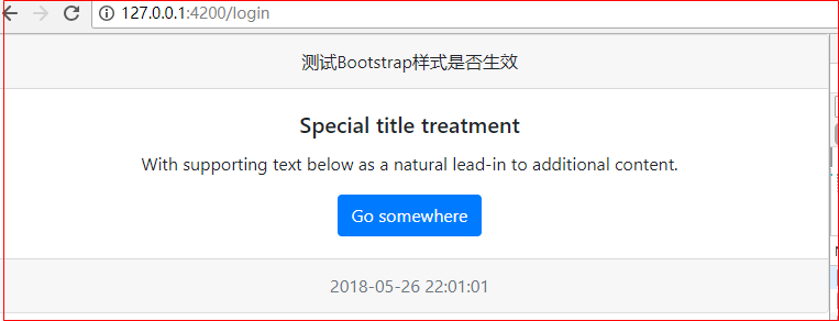
3.4 测试demo
在主组件中使用bootstrap4的相关样式
4 angular集成 Ant Design
Ant Design 官网(angular部分) -> 点击前往
4.1 安装 Ant Design
技巧01:下载 Ant Design 时会默认帮我们下载angular-cdk
npm install ng-zorro-antd --save
{

  "name": "frame",

  "version": "0.0.0",

  "license": "MIT",

  "scripts": {

    "ng": "ng",

    "start": "ng serve",

    "build": "ng build --prod",

    "test": "ng test",

    "lint": "ng lint",

    "e2e": "ng e2e"

  },

  "private": true,

  "dependencies": {

    "@angular/animations": "^5.2.0",

    "@angular/common": "^5.2.0",

    "@angular/compiler": "^5.2.0",

    "@angular/core": "^5.2.0",

    "@angular/forms": "^5.2.0",

    "@angular/http": "^5.2.0",

    "@angular/platform-browser": "^5.2.0",

    "@angular/platform-browser-dynamic": "^5.2.0",

    "@angular/router": "^5.2.0",

    "bootstrap": "^4.1.1",

    "core-js": "^2.4.1",

    "jquery": "^3.3.1",

    "ng-zorro-antd": "^0.7.1",

    "rxjs": "^5.5.6",

    "zone.js": "^0.8.19"

  },

  "devDependencies": {

    "@angular/cli": "~1.7.0",

    "@angular/compiler-cli": "^5.2.0",

    "@angular/language-service": "^5.2.0",

    "@types/jasmine": "~2.8.3",

    "@types/jasminewd2": "~2.0.2",

    "@types/node": "~6.0.60",

    "codelyzer": "^4.0.1",

    "jasmine-core": "~2.8.0",

    "jasmine-spec-reporter": "~4.2.1",

    "karma": "~2.0.0",

    "karma-chrome-launcher": "~2.2.0",

    "karma-coverage-istanbul-reporter": "^1.2.1",

    "karma-jasmine": "~1.1.0",

    "karma-jasmine-html-reporter": "^0.2.2",

    "protractor": "~5.1.2",

    "ts-node": "~4.1.0",

    "tslint": "~5.9.1",

    "typescript": "~2.5.3"

  }

}
package.json
4.2 引入 Ant Design 模块
技巧01:在根 module 中需要使用 NgZorroAntdModule.forRoot(),在子 module 需要使用 NgZorroAntdModule(官方推荐的做法)
技巧02:在共享模块中导入NgZorroAntdModule时使用 NgZorroAntdModule.forRoot(),在共享模块中导出 NgZorroAntdModule 时使用 NgZorroAntdModule;这样在需要用到 Ant Design 的模块中直接导入共享模块就可以啦。(三少推荐做法)
import { NgModule } from '@angular/core';

import { CommonModule } from '@angular/common';

import { RouterModule } from '@angular/router/src/router_module';

import { NgZorroAntdModule } from 'ng-zorro-antd';

// 注册语言包

import { registerLocaleData } from '@angular/common';

import zh from '@angular/common/locales/zh';

registerLocaleData(zh);

@NgModule({

  imports: [

    CommonModule,

    NgZorroAntdModule.forRoot()

  ],

  exports: [

    CommonModule,

    NgZorroAntdModule

  ],

  declarations: []

})

export class SharedModule { }
shared.module.ts
4.3 引入 Ant Design 样式
在 angular-cli.json 文件中引入 Ant Design 样式
"../node_modules/ng-zorro-antd/src/ng-zorro-antd.less"
{

  "$schema": "./node_modules/@angular/cli/lib/config/schema.json",

  "project": {

    "name": "frame"

  },

  "apps": [

    {

      "root": "src",

      "outDir": "dist",

      "assets": [

        "assets",

        "favicon.ico"

      ],

      "index": "index.html",

      "main": "main.ts",

      "polyfills": "polyfills.ts",

      "test": "test.ts",

      "tsconfig": "tsconfig.app.json",

      "testTsconfig": "tsconfig.spec.json",

      "prefix": "app",

      "styles": [

        "styles.css",

        "../node_modules/ng-zorro-antd/src/ng-zorro-antd.less",

        "../node_modules/bootstrap/dist/css/bootstrap.min.css"

      ],

      "scripts": [

        "../node_modules/jquery/dist/jquery.min.js",

        "../node_modules/bootstrap/dist/js/bootstrap.min.js"

      ],

      "environmentSource": "environments/environment.ts",

      "environments": {

        "dev": "environments/environment.ts",

        "prod": "environments/environment.prod.ts"

      }

    }

  ],

  "e2e": {

    "protractor": {

      "config": "./protractor.conf.js"

    }

  },

  "lint": [

    {

      "project": "src/tsconfig.app.json",

      "exclude": "**/node_modules/**"

    },

    {

      "project": "src/tsconfig.spec.json",

      "exclude": "**/node_modules/**"

    },

    {

      "project": "e2e/tsconfig.e2e.json",

      "exclude": "**/node_modules/**"

    }

  ],

  "test": {

    "karma": {

      "config": "./karma.conf.js"

    }

  },

  "defaults": {

    "styleExt": "css",

    "component": {}

  }

}
angular-cli.json
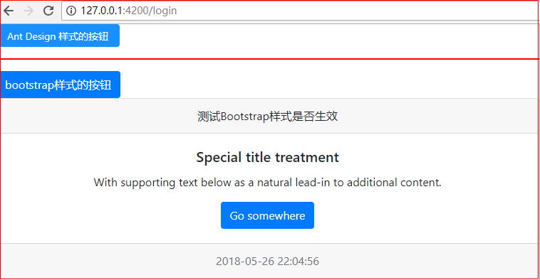
4.4 测试Demo
在主组件中使用 Ant Design 样式
<button nz-button nzType="primary">Ant Design 样式的按钮</button>

<hr style="border: 1px solid red" />

<button type="button" class="btn btn-primary">bootstrap样式的按钮</button>
5 路由配置和模块懒加载
5.1 home模块
5.1.1 创建home模块
ng g m home
5.1.2 创建home组件
技巧01:当angular应用中有多个模块时,创建组件时需要制定一个所属模块
ng g c home/home -module home
5.1.3 创建home路由
技巧01:子模块的路由文件中要用 RouterModule.forChild(homeRoutes)
import { NgModule } from "@angular/core";

import { RouterModule, Routes } from "@angular/router";

import { HomeComponent } from "./home/home.component";

export const homeRoutes: Routes = [

    {

        path: '',

        component: HomeComponent

    }

]

@NgModule({

    imports: [RouterModule.forChild(homeRoutes)],

    exports: [RouterModule]

})

export class HomeRoutesModule {}
HomeRoutesModule.ts
5.1.3 引入home路由
技巧01:由于我们是采用路由实现模块的懒加载,所以不用在主模块中引入子模块;直接将子模块的路由引入到子模块并在主模块的主路由中配置子模块的懒加载即可
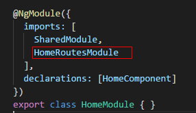
import { NgModule } from '@angular/core';

import {  } from '@angular/common';

import { HomeComponent } from './home/home.component';

import { SharedModule } from '../shared/shared.module';

import { HomeRoutesModule } from './home.routes.module';

@NgModule({

  imports: [

    SharedModule,

    HomeRoutesModule

  ],

  declarations: [HomeComponent]

})

export class HomeModule { }
HomeModule.java
5.2 登录组件
技巧01:由于登录模块只有一个登录组件,所以三少就没有单独将其设置成一个模块;直接将登录组件在主模块中进行声明即可
技巧02:如果登录逻辑比较复杂,三少建议将登录先关单独设置一个登录模块
创建一个登录组件即可
ng g c login
5.3 共享模块配置
import { NgModule } from '@angular/core';

import { CommonModule } from '@angular/common';

import { RouterModule } from '@angular/router/src/router_module';

import { NgZorroAntdModule } from 'ng-zorro-antd';

// 注册语言包

import { registerLocaleData } from '@angular/common';

import zh from '@angular/common/locales/zh';

registerLocaleData(zh);

@NgModule({

  imports: [

    CommonModule,

    NgZorroAntdModule.forRoot()

  ],

  exports: [

    CommonModule,

    NgZorroAntdModule

  ],

  declarations: []

})

export class SharedModule { }
SharedModule.ts
5.4 主模块
5.4.1 主路由
技巧01:在主模块的路由中要使用:imports: [RouterModule.forRoot(routes)]
import { NgModule } from '@angular/core';

import { RouterModule, Routes } from '@angular/router';

import { LoginComponent } from './login/login.component';

/** 路由项 */

export const routes: Routes = [

    {

        path: '',

        redirectTo: 'login',

        pathMatch: 'full'

    },

    {

        path: 'login',

        component: LoginComponent

    },

    {

        path: 'home',

        loadChildren: './home/home.module#HomeModule'

        // loadChildren:'./user/user.module#UserModule'

    },

    {

        path: '**',

        component: LoginComponent

    }

]

/** 路由组件 */

@NgModule({

    imports: [RouterModule.forRoot(routes)],

    exports: [RouterModule]

})

export class AppRoutesModule {}
AppRoutesModule.ts
5.4.2 主模块配置
import { NgModule } from '@angular/core';

import { BrowserModule } from '@angular/platform-browser';

import { BrowserAnimationsModule } from "@angular/platform-browser/animations";

import { AppComponent } from './app.component';

import { AppRoutesModule } from './app.routes.module';

import { LoginComponent } from './login/login.component';

import { SharedModule } from './shared/shared.module';

@NgModule({

  declarations: [

    AppComponent,

    LoginComponent

  ],

  imports: [

    BrowserModule,

    BrowserAnimationsModule,

    SharedModule,

    AppRoutesModule,

  ],

  providers: [],

  bootstrap: [AppComponent]

})

export class AppModule { }
AppModule.ts
5.5 主组件页面
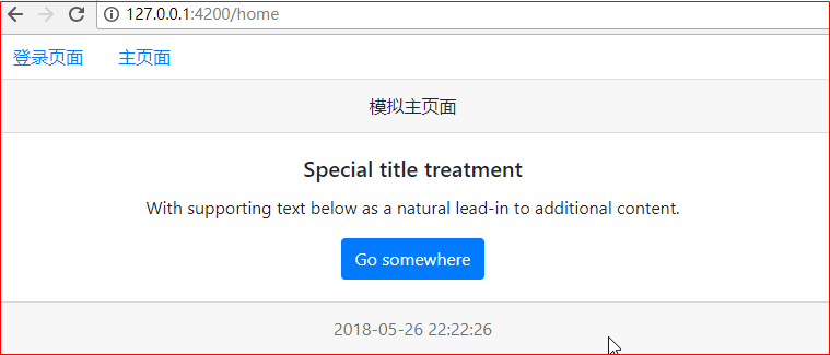
需求:根据导航栏进行跳转
5.5.1 代码
<nav class="nav">

  <a class="nav-link" [routerLink]="['/login']">登录页面</a>

  <a class="nav-link" [routerLink]="['/home']">主页面</a>

</nav>

<router-outlet></router-outlet>
5.5.2 效果展示
6 主页面布局
6.1 引入 Ant Design 页面布局
选择一款合适的布局页面后直接复制到项目中即可
    <nz-layout>

      <nz-sider nzCollapsible [(nzCollapsed)]="isCollapsed" [nzTrigger]="triggerTemplate">

        <div class="logo">

        </div>

        <ul nz-menu [nzTheme]="'dark'" [nzMode]="'inline'" [nzInlineCollapsed]="isCollapsed">

          <li nz-submenu>

            <span title><i class="anticon anticon-user"></i><span class="nav-text">User</span></span>

            <ul>

              <li nz-menu-item>Tom</li>

              <li nz-menu-item>Bill</li>

              <li nz-menu-item>Alex</li>

            </ul>

          </li>

          <li nz-submenu>

            <span title><i class="anticon anticon-team"></i><span class="nav-text">Team</span></span>

            <ul>

              <li nz-menu-item>Team 1</li>

              <li nz-menu-item>Team 2</li>

            </ul>

          </li>

          <li nz-menu-item><span><i class="anticon anticon-file"></i><span class="nav-text">File</span></span></li>

        </ul>

      </nz-sider>

      <nz-layout>

        <nz-header style="background: #fff; padding:0;">

          <i class="anticon trigger" [class.anticon-menu-fold]="!isCollapsed" [class.anticon-menu-unfold]="isCollapsed" (click)="isCollapsed=!isCollapsed"></i>

        </nz-header>

        <nz-content style="margin:0 16px;">

          <nz-breadcrumb style="margin:16px 0;">

            <nz-breadcrumb-item>User</nz-breadcrumb-item>

            <nz-breadcrumb-item>Bill</nz-breadcrumb-item>

          </nz-breadcrumb>

          <div style="padding:24px; background: #fff; min-height: 360px;">

            Bill is a cat.

          </div>

        </nz-content>

        <nz-footer style="text-align: center;">Ant Design ©2017 Implement By Angular</nz-footer>

      </nz-layout>

    </nz-layout>

    <ng-template #trigger>

      <i class="anticon anticon-up"></i>

    </ng-template>
HTML
:host ::ng-deep .trigger {

    font-size: 18px;

    line-height: 64px;

    padding: 0 24px;

    cursor: pointer;

    transition: color .3s;

  }

  :host ::ng-deep .trigger:hover {

    color: #1890ff;

  }

  :host ::ng-deep .logo {

    height: 32px;

    background: rgba(255, 255, 255, .2);

    margin: 16px;

  }
TS
6.2 效果展示
坑01:由于Ant Design 默认的布局样式是根据内容进行灵活控制的,如果内容比较少就会出现下面的不理想效果
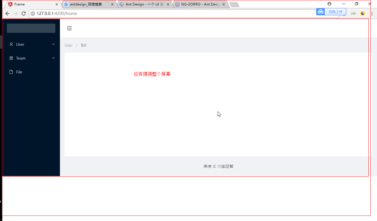
6.3 改进 -> 页面布局撑满品目
让页面盛满整个屏幕
技巧01:Ant Design 的布局容器 nz-layout 可以通过样式来让其撑满整个屏幕(PS: 默认是根据内容来自动调整大小的)
技巧02:nz-layout 标签有一个 默认的 ant-layout 样式,我们可以通过指定它的高度为100%来实现撑满整个屏幕的效果,例如:
.ant-layout{

    height: 100%;

}
效果展示

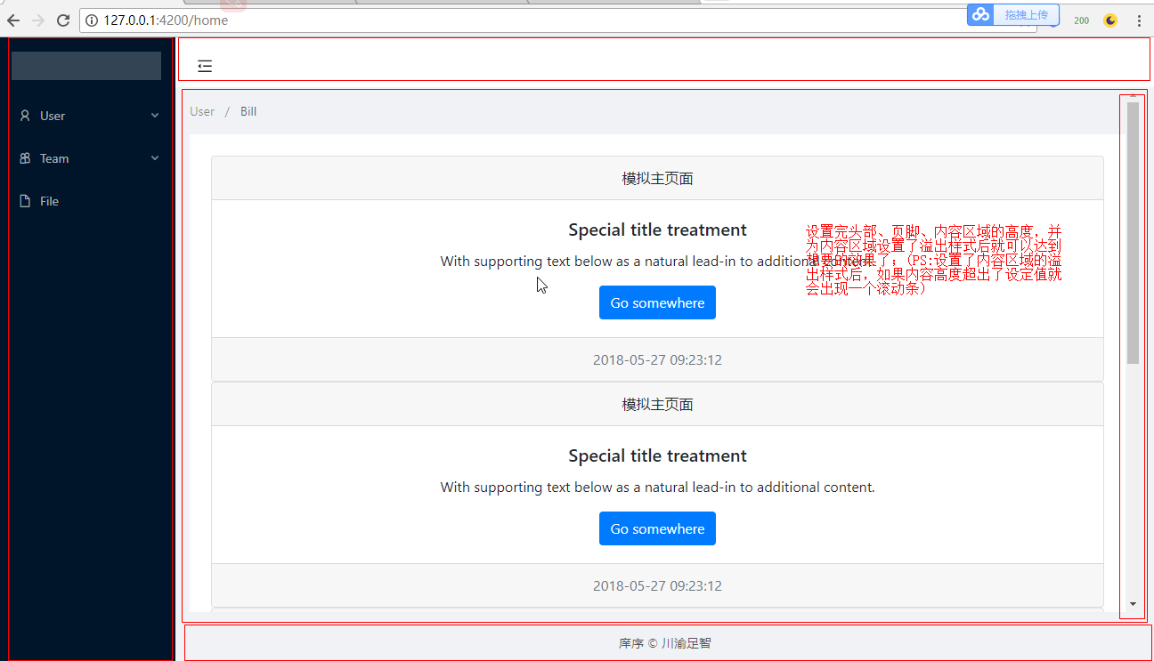
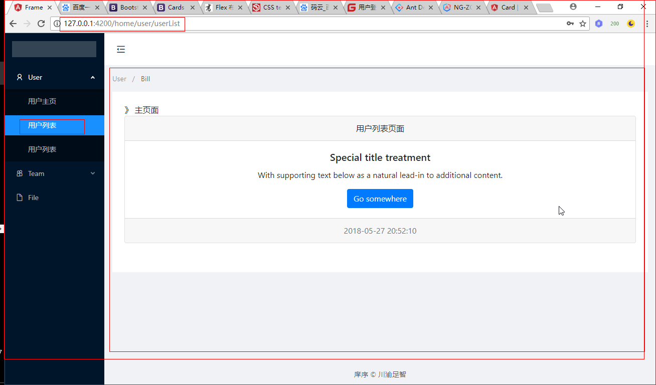
6.4 改进 -> 设定内容区域的大小
默认的内容区域有一个默认值,但是随着内容的不断增加,整个内容区域的高度值会不断增加,从而将页脚挤到看不见
<!-- <div class="card text-center">
<div class="card-header">
模拟主页面
</div>
<div class="card-body">
<h5 class="card-title">Special title treatment</h5>
<p class="card-text">With supporting text below as a natural lead-in to additional content.</p>
<a href="#" class="btn btn-primary">Go somewhere</a>
</div>
<div class="card-footer text-muted">
{{currentData | date: "yyyy-MM-dd HH:mm:ss"}}
</div>
</div> -->
<nz-layout>
<nz-sider nzCollapsible [(nzCollapsed)]="isCollapsed" [nzTrigger]="triggerTemplate">
<div class="logo">
</div>
<ul nz-menu [nzTheme]="'dark'" [nzMode]="'inline'" [nzInlineCollapsed]="isCollapsed">
<li nz-submenu>
<span title><i class="anticon anticon-user"></i><span class="nav-text">User</span></span>
<ul>
<li nz-menu-item>Tom</li>
<li nz-menu-item>Bill</li>
<li nz-menu-item>Alex</li>
</ul>
</li>
<li nz-submenu>
<span title><i class="anticon anticon-team"></i><span class="nav-text">Team</span></span>
<ul>
<li nz-menu-item>Team 1</li>
<li nz-menu-item>Team 2</li>
</ul>
</li>
<li nz-menu-item><span><i class="anticon anticon-file"></i><span class="nav-text">File</span></span></li>
</ul>
</nz-sider>
<nz-layout>
<nz-header style="background: #fff; padding:0;">
<i class="anticon trigger" [class.anticon-menu-fold]="!isCollapsed" [class.anticon-menu-unfold]="isCollapsed" (click)="isCollapsed=!isCollapsed"></i>
</nz-header>
<nz-content style="margin:0 16px;">
<nz-breadcrumb style="margin:16px 0;">
<nz-breadcrumb-item>User</nz-breadcrumb-item>
<nz-breadcrumb-item>Bill</nz-breadcrumb-item>
</nz-breadcrumb>
<div style="padding:24px; background: #fff; min-height: 360px;"> <!-- 模拟内容 start -->
<div class="card text-center">
<div class="card-header">
模拟主页面
</div>
<div class="card-body">
<h5 class="card-title">Special title treatment</h5>
<p class="card-text">With supporting text below as a natural lead-in to additional content.</p>
<a href="#" class="btn btn-primary">Go somewhere</a>
</div>
<div class="card-footer text-muted">
{{currentData | date: "yyyy-MM-dd HH:mm:ss"}}
</div>
</div>
<!-- 模拟内容 end --> </div>
</nz-content>
<nz-footer style="text-align: center;">庠序 © 川渝足智</nz-footer>
</nz-layout>
</nz-layout>
<ng-template #trigger>
<i class="anticon anticon-up"></i>
</ng-template>
HTML
技巧01:为 nz-header、nz-footer、nz-content 设置高度百分比,例如
nz-header {

    height: 8%;

}

nz-footer {

    height: 8%;

}

nz-content {

    height: 84%;

}
坑01:即使设置了高度,仍然不会生效;因为内容超出了高度;所以必须为内容区域设置溢出样式,例如
nz-content {

    height: 84%;

    overflow-y: auto;

}
:host ::ng-deep .trigger {

    font-size: 18px;

    line-height: 64px;

    padding: 0 24px;

    cursor: pointer;

    transition: color .3s;

  }

  :host ::ng-deep .trigger:hover {

    color: #1890ff;

  }

  :host ::ng-deep .logo {

    height: 32px;

    background: rgba(255, 255, 255, .2);

    margin: 16px;

  }

.ant-layout{

    height: 100%;

}

nz-header {

    height: 8%;

}

nz-footer {

    height: 8%;

}

nz-content {

    height: 84%;

    overflow-y: auto;

}
CSS
效果展示:
6.5 布局技巧
Ant Design 的布局采用了Flex布局,这一点和material的布局采用的方式相同
技巧01:我们可将 ant-layout、nz-header、nz-footer、nz-content这些样式放到style.css中,这样就可以达到重复利用的效果了
/* You can add global styles to this file, and also import other style files */

.ant-layout{

    height: 100%;

}

nz-header {

    height: 8%;

}

nz-footer {

    height: 8%;

}

nz-content {

    height: 84%;

    overflow-y: auto;

}
style.css
7 angular整合material
7.1 下载material
技巧01:material需要angular-cdk的支持
坑01:利用 npm 进行下载时默认时下载最新的版本,所以下载时还需要指定下载的版本
npm install --save @angular/material@5.2.0
7.2 下载angular-cdk
技巧01:由于我们下载的angular-cdk版本必须和angular/material的版本保持一致
坑01:利用 npm 进行下载时默认时下载最新的版本,所以下载时还需要指定下载的版本
npm install --save @angular/cdk@^5.0.0
7.3 下载@angular/animations
技巧01:利用 ng-cli创建angular项目时会默认帮我们下载一些依赖包,其中就包括了 @angular/animations
npm install --save @angular/animations
技巧02:下载好 @angular/animations 后需要在主模块引入 BrowserAnimationsModule
坑01:BrowserAnimationsModule 和 BrowserModule 一样不能进行重复引入,所以不能通过共享模块导入它们
import { BrowserModule } from '@angular/platform-browser';

import { BrowserAnimationsModule } from "@angular/platform-browser/animations";
import { NgModule } from '@angular/core';

import { BrowserModule } from '@angular/platform-browser';

import { BrowserAnimationsModule } from "@angular/platform-browser/animations";

import { AppComponent } from './app.component';

import { AppRoutesModule } from './app.routes.module';

import { LoginComponent } from './login/login.component';

import { SharedModule } from './shared/shared.module';

@NgModule({

  declarations: [

    AppComponent,

    LoginComponent

  ],

  imports: [

    BrowserModule,

    BrowserAnimationsModule,

    SharedModule,

    AppRoutesModule,

  ],

  providers: [],

  bootstrap: [AppComponent]

})

export class AppModule { }
技巧03:利用 ng-cli 创建项目时默认给我们下载的依赖包列表如下(PS:以angular5为例)
{

  "name": "angulardemo02",

  "version": "0.0.0",

  "license": "MIT",

  "scripts": {

    "ng": "ng",

    "start": "ng serve",

    "build": "ng build --prod",

    "test": "ng test",

    "lint": "ng lint",

    "e2e": "ng e2e"

  },

  "private": true,

  "dependencies": {

    "@angular/animations": "^5.2.0",

    "@angular/common": "^5.2.0",

    "@angular/compiler": "^5.2.0",

    "@angular/core": "^5.2.0",

    "@angular/forms": "^5.2.0",

    "@angular/http": "^5.2.0",

    "@angular/platform-browser": "^5.2.0",

    "@angular/platform-browser-dynamic": "^5.2.0",

    "@angular/router": "^5.2.0",

    "core-js": "^2.4.1",

    "rxjs": "^5.5.6",

    "zone.js": "^0.8.19"

  },

  "devDependencies": {

    "@angular/cli": "~1.7.0",

    "@angular/compiler-cli": "^5.2.0",

    "@angular/language-service": "^5.2.0",

    "@types/jasmine": "~2.8.3",

    "@types/jasminewd2": "~2.0.2",

    "@types/node": "~6.0.60",

    "codelyzer": "^4.0.1",

    "jasmine-core": "~2.8.0",

    "jasmine-spec-reporter": "~4.2.1",

    "karma": "~2.0.0",

    "karma-chrome-launcher": "~2.2.0",

    "karma-coverage-istanbul-reporter": "^1.2.1",

    "karma-jasmine": "~1.1.0",

    "karma-jasmine-html-reporter": "^0.2.2",

    "protractor": "~5.1.2",

    "ts-node": "~4.1.0",

    "tslint": "~5.9.1",

    "typescript": "~2.5.3"

  }

}
默认安装的依赖
7.4 下载 hammerjs (可选)
hammerjs 主要用于动作效果,有的material组件需要用到动作效果
npm install --save hammerjs
7.5 引入material主题
有两种方式引入material主题;外部样式引入 -> 点击前往
7.5.1 在style.css 中引入
@import "~@angular/material/prebuilt-themes/indigo-pink.css";
7.5.2 在 angular-cli.json 中引入
7.6 引入material图标支持
在主页面中添加相关引用即可
技巧01:是在index.html中进行添加
<link href="https://fonts.googleapis.com/icon?family=Material+Icons" rel="stylesheet">
7.7 引入所需的matrial模块
技巧01:由于每个material组件都需要导入一个相关的模块后才可以使用,所以三少建议将material相关组件的对应模块通过共享模块进行导入;然后在需要用到material组件的模块导入共享模块即可
技巧02:之前导入material组件的对应模块时书写的导入路径只需要写到 @angular/material 即可;但是从angular5集成material5后导入路径就必须写全,已导入button组件对应的material模块为例:
import {MatButtonModule} from '@angular/material/button'; // 现在的写法

import {MatButtonModule} from '@angular/material'; // 之前的写法
8 利用material打造登录页面
8.1 引入material先关模块
需要引入 MatCardModule MatInputModule MatButtonModule
import { NgModule } from '@angular/core';

import { CommonModule } from '@angular/common';

import { RouterModule } from '@angular/router/src/router_module';

import { NgZorroAntdModule } from 'ng-zorro-antd';

// 注册语言包

import { registerLocaleData } from '@angular/common';

import zh from '@angular/common/locales/zh';

registerLocaleData(zh);

// import { MatButtonModule } from '@angular/material'; // 之前的写法

import {MatButtonModule} from '@angular/material/button'; // angular5 集成 material5 后的写法

import {MatCardModule} from '@angular/material/card';

import {MatInputModule} from '@angular/material/input';

import { FormsModule, ReactiveFormsModule } from '@angular/forms';

@NgModule({

  imports: [

    CommonModule,

    FormsModule,

    ReactiveFormsModule,

    NgZorroAntdModule.forRoot(),

    MatButtonModule,

    MatCardModule,

    MatInputModule

  ],

  exports: [

    CommonModule,

    FormsModule,

    ReactiveFormsModule,

    NgZorroAntdModule,

    MatButtonModule,

    MatCardModule,

    MatInputModule

  ],

  declarations: []

})

export class SharedModule { }
shared.module.ts
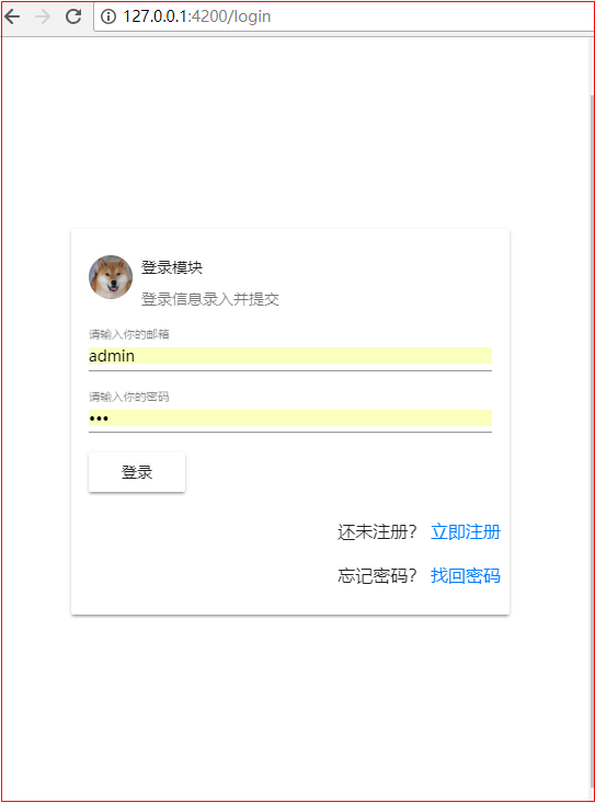
8.2 编写登录页面HTML
技巧01:material采用了Flex布局
<!-- <div class="card text-center">
<div class="card-header">
模拟登录页面
</div>
<div class="card-body">
<h5 class="card-title">Special title treatment</h5>
<p class="card-text">With supporting text below as a natural lead-in to additional content.</p>
<a href="#" class="btn btn-primary">Go somewhere</a>
<button mat-button>Click me!</button>
</div>
<div class="card-footer text-muted">
{{currentData | date: "yyyy-MM-dd HH:mm:ss"}}
</div>
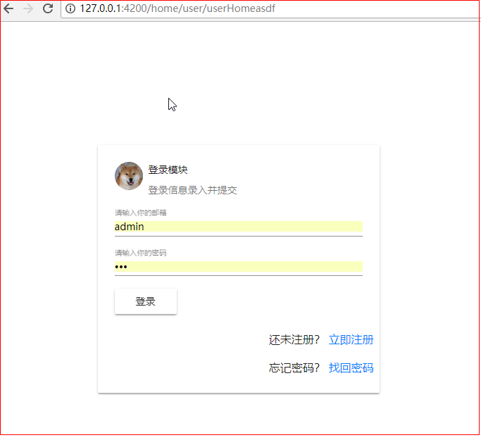
</div> --> <form [formGroup]="loginGroup" class="login-div">
<mat-card class="login-card">
<mat-card-header>
<div mat-card-avatar class="example-header-image"></div>
<mat-card-title>登录模块</mat-card-title>
<mat-card-subtitle>登录信息录入并提交</mat-card-subtitle>
</mat-card-header>
<!-- <img mat-card-image src="https://material.angular.io/assets/img/examples/shiba2.jpg" alt="Photo of a Shiba Inu"> -->
<mat-card-content>
<mat-form-field class="full-width">
<!-- <span matPrefix>XiangXu.</span> -->
<input matInput type="text" placeholder="请输入你的邮箱" formControlName="username" />
<!-- <span matSuffix>@163.com</span> -->
</mat-form-field> <mat-form-field class="full-width">
<input matInput type="password" placeholder="请输入你的密码" formControlName="password" />
</mat-form-field> <button mat-raised-button type="button" (click)="on_login_click()">登录</button>
</mat-card-content>
<mat-card-actions class="text-right">
<p>还未注册? <a href="">立即注册</a></p>
<p>忘记密码? <a href="">找回密码</a></p>
</mat-card-actions>
</mat-card>
</form>
HTML
8.3 编写登录页面CSS
.login-card {

    max-width: 400px;

}

.example-header-image {

    background-image: url('https://material.angular.io/assets/img/examples/shiba1.jpg');

    background-size: cover;

}

/* 父容器采用Flex布局(PS: 父容器必须指定高度和宽度,否则项目的效果体验较差) */

.login-div {

    height: 100%;

    width: 100%;

    display: flex;

    flex-direction: row;

    justify-content: center;

    align-items: center;

}

/** 宽度充满 */

.full-width {

    width: 100%;

}

/** 文本右对齐 */

.text-right {

    text-align: end;

}
CSS
8.4 编写登录页面的TS文件
import { Component, OnInit } from '@angular/core';

import {FormGroup, FormControl, Validators} from '@angular/forms';

import { Router } from '@angular/router';

@Component({

  selector: 'app-login',

  templateUrl: './login.component.html',

  styleUrls: ['./login.component.css']

})

export class LoginComponent implements OnInit {

  loginGroup: FormGroup;

  currentData: Date;

  constructor(

    private _router: Router

  ) { }

  ngOnInit() {

    this.currentData = new Date();

    this.loginGroup = new FormGroup({

      username: new FormControl("admin", [Validators.required], []),

      password: new FormControl("111", [Validators.required], [])

    });

  }

  on_login_click() {

    console.log(this.loginGroup.value); // 获取所有数据

    console.log(this.loginGroup.controls['username'].value) // 获取某个数据

    console.log(this.loginGroup.get('username').value); // 获取某个数据

    if ((this.loginGroup.controls['username'].value !== "admin") || this.loginGroup.get('password').value != "111") {

      this._router.navigate(['/login']);

    } else {

      this._router.navigate(['/home']);

    }

    alert("提交登录信息");

  }

}
TS
8.5 效果展示
9 集成loading插件
AntD01 Angular2整合AntD、Angular2整合Material、利用Angular2,AntD,Material联合打造后台管理系统 ???的更多相关文章
- 利用Angular2的Observables实现交互控制
在Angular1.x中,我们使用Promise来处理各种异步.但是在angular2中,使用的是Reactive Extensions (Rx)的Observable.对于Promise和Obser ...
- Angular14 利用Angular2实现文件上传的前端、利用springBoot实现文件上传的后台、跨域问题
一.angular2实现文件上传前端 Angular2使用ng2-file-upload上传文件,Angular2中有两个比较好用的上传文件的第三方库,一个是ng2-file-upload,一个是ng ...
- SpringMVC+Spring+Mybatis整合程序之整合
因为每个人思路不一样,所以我在这边先分享自己的思路对于mybatis开发持久层(DAO:DataBase Access Object 持久层访问对象)有两种.第一种:传统的开发持久层方式即需要程序员开 ...
- 一 SSH整合:Spring整合Struts2的两种方式,struts.xml管理Action&Bean管理Action
SSH回顾 1 引入jar包 Struts2的jar包 D:\Struts2\struts-2.3.35\apps\struts2-blank\WEB-INF\lib 开发基本包 Struts2有一 ...
- SpringBoot + Vue + ElementUI 实现后台管理系统模板 -- 后端篇(一): 搭建基本环境、整合 Swagger、MyBatisPlus、JSR303 以及国际化操作
相关 (1) 相关博文地址: SpringBoot + Vue + ElementUI 实现后台管理系统模板 -- 前端篇(一):搭建基本环境:https://www.cnblogs.com/l-y- ...
- 【Saas-export项目】--项目整合(spring整合MVC)
转: [Saas-export项目]--项目整合(spring整合MVC) 文章目录 Spring整合SpringMVC(export_web_manager子工程) (1)log4j.propert ...
- 利用MVC Chart 打造后台图表、前端图表
应用场景是这个样子的:要做导出数据到PDF的功能,涉及到文本.表格.图表等内容.在做图表功能时,发现之前用Highcharts做的图表根本就不能集成到PDF中.这里需要一个能在程序后台就生成图表的功能 ...
- 《React后台管理系统实战 :一》:目录结构、引入antd、引入路由、写login页面、使用antd的form登录组件、form前台验证、高阶函数/组件
实战 上接,笔记:https://blog.csdn.net/u010132177/article/details/104150177 https://gitee.com/pasaulis/react ...
- C语言利用结构体数组实现学生成绩管理系统
这篇文章主要为大家详细介绍了C语言利用结构体数组实现学生成绩管理系统,文中示例代码介绍的非常详细,具有一定的参考价值,感兴趣的小伙伴们可以参考一下 要求: 某班有最多不超过30人(具体人数由键盘输入) ...
随机推荐
- (十二)break,continue
class Break { //break,continue public static void main(String[] args) { //break for(int i =0;i<=5 ...
- CodeForces - 662A:Gambling Nim (求有多少个子集其异或为S)(占位)
As you know, the game of "Nim" is played with n piles of stones, where the i-th pile initi ...
- linux上编写运行 dotnet core api
安装 Ubuntu dotnet core 跨平台已不再是梦,它带来的意义非凡,比如api接口可以在linux上编写及部署,也可以在windows上编写好,打包发布,然后copy到lin ...
- springmvc中拦截器与springmvc全局异常处理器的问题
最近在做一个练手的小项目, 系统架构中用了springmvc的全局异常处理器, 做了系统的统一异常处理. 后来加入了springmvc的拦截器, 为了一些需求, 在拦截器中的 preHandle 方法 ...
- webpack新版本4.12应用九(配置文件之入口和上下文(entry and context))
entry 对象是用于 webpack 查找启动并构建 bundle.其上下文是入口文件所处的目录的绝对路径的字符串. context string 基础目录,绝对路径,用于从配置中解析入口起点(en ...
- 前端mvc mvp mvvm 架构介绍(vue重构项目一)
首先 我们为什么重构这个项目 1:我们现有的技术是前后台不分离,页面上采用esayUI+jq构成的单页面,每个所谓的单页面都是从后台胜场的唯一Id 与前端绑定,即使你找到了那个页面元素,也找不到所在的 ...
- PHP echo汉字出现乱码的情况之一
当然首先要理清楚到底是web服务端造成,php造成的,还是数据库造成的. 需要在头文件里UTF-8 <head> <meta http-equiv="Content-Typ ...
- 73个word使用终极技巧
1.问:Word里边怎样设置每页不同的页眉?如何使不同的章节显示的页眉不同? 答:分节,每节可以设置不同的页眉.文件——页面设置——版式——页眉和页脚——首页不同 2.问:请问Word中怎样让每一章用 ...
- Mongodb3.0 新增用户身份验证db.createUser()
定义:创建一个数据库新用户用db.createUser()方法,如果用户存在则返回一个用户重复错误. 语法:db.createUser(user, writeConcern) user这个文档创 ...
- ubuntu安装composer
1.下载composer.phar wget https://getcomposer.org/composer.phar 2.重命名composer.phar为composer mv composer ...